Module 25 – Using Visuals
Module 25
Using Visuals
LO 25-1 Identify stories for business visuals.
LO 25-2 Select visuals for stories.
LO 25-3 Apply principles for good design.
LO 25-4 Apply principles for effective color and clip art use.
LO 25-5 Apply principles for accurate and ethical visuals.
LO 25-6 Synthesize visuals with text.
LO 25-7 Prepare print visuals for use in presentations.
Module Overview
Module 25 focuses on using visuals common in business documents, including charts, graphs,
and clip art. Pair this module with Module 5 to deliver a strong discussion on creating visually
appealing documents and presentations.
Teaching Tip: For further information on using graphics, students might consider
taking a graphic design course, or one on a specific graphics software program.
Help them by pointing out such classes available at your school.
Neither Kitty nor Steve expects students to be great artists (although some of them will amaze
you). In fact, numerous software packages offer pre-made clip art so users don’t have to be
artists at all, and most word processing programs have tools to create simple charts, tables, and
graphs. However, a general appreciation of good design is important, regardless of artistic skill.
And with so much emphasis on visuals in communication today, many people expect
sophistication when using visuals.
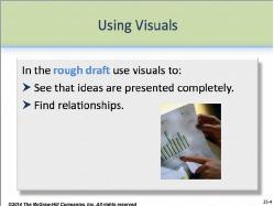
Use PP 25-4 and PP 25-5 to show students that visuals are used in the
rough draft to:
See that ideas are presented completely.
Find relationships.
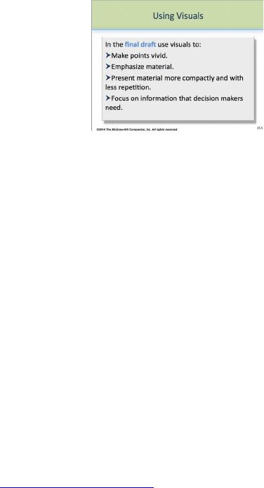
And in the final draft to:
© 2014 by McGraw-Hill Education. This is proprietary material solely for authorized instructor use. Not authorized for sale or distribution in any
manner. This document may not be copied, scanned, duplicated, forwarded, distributed, or posted on a website, in whole or part.
25-1
Module 25 – Using Visuals
Make points vivid.
Emphasize material.
Present material more compactly and with less repetition.
Focus on information decision makers need.
Teaching Tip: The film industry commonly uses
storyboards—conceptual pre-production art organized in comic-book-like panels—
to “rough out” ideas before they are filmed, saving time and money through
planning. In fact, directors such as Alfred Hitchcock and Steven Spielberg used
storyboards for many of their most successful films. Use this application to further
explain how visuals can help in the planning of documents and presentations—
“seeing” ideas and relationships early can help the writer make the final product
stronger.
What’s in This Supplement
This supplement is organized around the major questions posed in Module 25. It covers
Part 1: Key Lecture Points, Teaching Tips, and In-Class Exercises Page 416
Part 2: Answers to Textbook Assignments Page 425
PowerPoint presentations can be found at our Web page at www.mhhe.com/bcs6e.
Questions (with answers) suitable for quizzes are in the Instructor’s Test Bank. For student
practice quizzes with answers, see our Web page.
Part 1: Key Lecture Points, Teaching Tips, and In-Class Exercises
What are stories, and how do I find them? LO 25-1
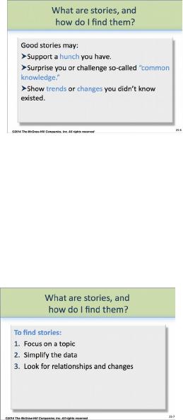
A story is something that is happening, according to the data.
To find stories, look for relationships and changes.
© 2014 by McGraw-Hill Education. This is proprietary material solely for authorized instructor use. Not authorized for sale or distribution in any
manner. This document may not be copied, scanned, duplicated, forwarded, distributed, or posted on a website, in whole or part.
25-2
Module 25 – Using Visuals
Every visual should tell a story, that is, show the reader that something is
happening, according to the data (PP 25-6). Stories are often expressed
as the title of the visual—Salaries Grew by 27 Percent from 1999 to
2011. Good stories use strong verbs to clearly show action. Titles
without verbs—Salaries from 1999 to 2011—tell the reader little or
nothing about what has happened.
In-Class Exercise: Have students bring to class a copy of your school’s or a daily
paper (a good publication for this assignment is USA Today). Have them locate a
visual and analyze it for the story it tells. How effectively is the story
communicated? Are other interpretations of the title and data possible? Does
everyone agree that the story makes sense? Of the student examples, which is the
best at telling a story? The worst?
To find stories, writers should analyze their data carefully. As PP 25-7
shows, specifically writers should
1. Focus on a topic.
2. Simplify the data.
3. Look for relationships and changes.
In-Class Exercise: In groups of 3-5, have students complete Exercise 25.8 (p. 426).
Afterward, have groups share their solutions with the rest of the class. Ask students
to decide which solutions work best. Why? For other solutions, what could be done
to improve them?
Sometimes, a graphic alone does not tell the complete story. In such cases, writers can use
paired graphs—side-by-side comparisons that together tell the complete story. Figure 25.1 (p.
419) shows an example.
Because data can tell more than one story, writers must choose carefully which story they wish to
tell. Data alone will not tell a story, and left to interpretation, data can confuse and frustrate
audiences.
Does it matter what kind of visual I use? LO 25-2
Yes! The visual must match the kind of story.
© 2014 by McGraw-Hill Education. This is proprietary material solely for authorized instructor use. Not authorized for sale or distribution in any
manner. This document may not be copied, scanned, duplicated, forwarded, distributed, or posted on a website, in whole or part.
25-3
Module 25 – Using Visuals
Visuals are not interchangeable, even if some students use them
interchangeably! As PP 25-9 suggests:
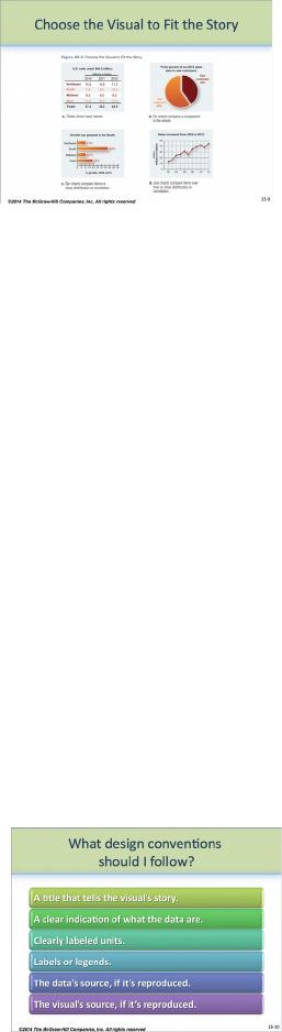
Use tables when the reader needs to be able to identify exact
values.
Use a chart or graph when you want the reader to focus on
relationships.
Use a pie chart to compare a part to the whole.
Use a bar chart or line graph to compare one item to another item or items over time.
In-Class Exercise: Have students bring examples of these types of visuals to class,
from newspapers, work reports, class projects, or other sources. Let them analyze
their samples and share the results with the rest of the class. How many of these
examples follow the correct principles? Which do not? In the case of those that do
not, which type of visual should have been used? Why?
In-Class Exercise: In groups of 3-5, have students complete Exercise 25.9 (p. 426).
Afterward, have groups share their solutions with the rest of the class. Ask students
to decide which solutions work best. Why? For other solutions, what could be done
to improve them?
What design conventions should I follow? LO 25-3
Check your visuals against the lists that follow.
Use PP 25-10 to show students that every visual should contain the
following six components:
1. A title that tells the story that the visual shows.
2. A clear indication of what the data are.
3. Clearly labeled units.
4. Labels or legends for axes, colors, symbols, and so forth.
5. The source of the data.
6. The source of the visual, if it’s reproduced.
Tables are numbers or words arranged in rows and columns; figures are everything else.
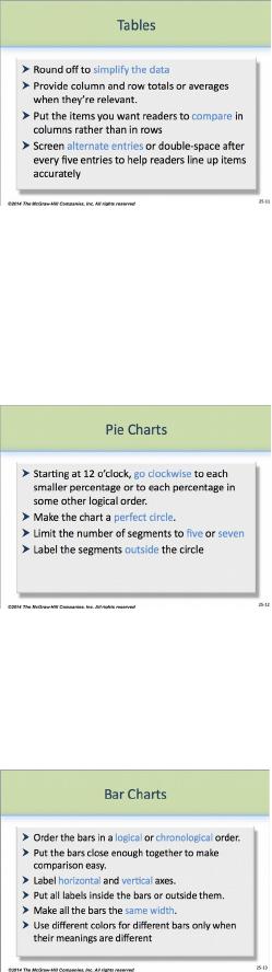
As PP 25-11 shows, for effective tables, writers should
© 2014 by McGraw-Hill Education. This is proprietary material solely for authorized instructor use. Not authorized for sale or distribution in any
manner. This document may not be copied, scanned, duplicated, forwarded, distributed, or posted on a website, in whole or part.
25-4
Module 25 – Using Visuals
Use tables only when they want the audience to focus on specific
numbers. Graphs convey less specific information but are always
more memorable.
Use common, understandable units. Round off to simplify the data
(e.g., 35% rather than 35.27%; 34,000 rather than 33,942).
Provide column and row totals or averages when they’re relevant.
Put the items they want readers to compare in columns rather than in rows to facilitate
mental subtraction and division.
When they have many rows, screen alternate entries or double space after every five
entries to help readers line up items accurately.
As PP 25-12 shows, to use pie charts effectively, writers should
Start at 12 o’clock with the largest percentage or the percentage
they want to focus on. Go clockwise to each smaller percentage or
to each percentage in some other logical order.
Make the chart a perfect circle. Perspective circles distort the data.
Limit the number of segments to five or seven. If their data have
more divisions, combine the smallest or the least important into a
single “miscellaneous” or “other” category.
Label the segments outside the circle. Internal labels are hard to read.
As PP 29-13 shows, to use bar charts effectively, writers should
Order the bars in a logical or chronological order.
Put the bars close enough together to make comparison easy.
Label both horizontal and vertical axes.
Put all labels inside the bars or outside them. When some labels
are inside and some are outside, the labels carry the visual weight
of longer bars, distorting the data.
Make all the bars the same width.
Use different colors for different bars only when their meanings are different: estimates
as opposed to known numbers, negative as opposed to positive numbers.
Avoid using perspective. Perspective makes the values harder to read and can make
comparison difficult.
© 2014 by McGraw-Hill Education. This is proprietary material solely for authorized instructor use. Not authorized for sale or distribution in any
manner. This document may not be copied, scanned, duplicated, forwarded, distributed, or posted on a website, in whole or part.
25-5
Module 25 – Using Visuals
Teaching Tip: Use Figure 25.3 (p. 421) to show students the different kinds of bar
charts that exist, including grouped bar charts, segmented, subdivided or stacked
bars, deviation bar charts, paired bar charts, and histograms or pictograms. Divide
students into groups of 3-5 students each and have them explain the basic qualities of
these charts to the rest of the class.
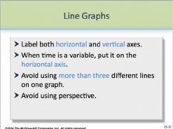
As PP 25-15 shows, to use line graphs effectively, writers should
Label both horizontal and vertical axes.
When time is a variable, put it on the horizontal axis.
Avoid using more than three different lines on one graph. Even
three lines may be too many if they cross each other.
Avoid using perspective. Perspective makes the values harder to
read and can make comparison difficult.
As suggested here, writers should use the specific visual that best expresses the data they have.
They should avoid mixing and matching types, instead using the particular visual that fits their
needs.
Can I use color and clip art? LO 25-4
Use color carefully.
Avoid decorative clip art in memos and reports.
Help students to resist the temptation to use color entirely for decorative purposes by reminding
them of cultural interpretations of color (see p. 45). In fact, though computer programs offer
almost limitless palettes of colors, writers must carefully choose the colors they use, as well as
the number.
Teaching Tip: To show cultural differences, ask students to name characters in
movies or television programs where colors are especially important in suggesting
the nature of the character. A good example might be Star Wars, where
blonde-haired hero Luke Skywalker dresses entirely in white, while the masked and
villainous Darth Vader is draped entirely in black. Ask students who’ve seen this
film or others whether they were conscious of the strong use of color. If not, did
they still understand the natures of the characters? What does this suggest about the
subconscious effects of color? Would these characters make sense to people outside
of western cultures?
© 2014 by McGraw-Hill Education. This is proprietary material solely for authorized instructor use. Not authorized for sale or distribution in any
manner. This document may not be copied, scanned, duplicated, forwarded, distributed, or posted on a website, in whole or part.
25-6
Module 25 – Using Visuals
Teaching Tip: Ask students to share what colors they should dress in while on the
job. Why? What do these colors suggest to peers and customers? Why?
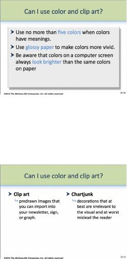
As PP 25-16 shows, to use color effectively, writers should
Use no more than five colors when colors have meanings.
Use glossy paper to make colors more vivid.
Be aware that colors on a computer screen always look brighter
than colors on paper.
Likewise, writers must take care when selecting and using clip art. Like color, clip art used for
decorative purposes only may hurt a document or presentation rather than help it. For instance,
clip art that is biased—that shows only European-American males, for instance, to represent a
company that may be more than 50% female—can offend readers or viewers.
Clip art that is only decorative is called chartjunk (PP 25-17). Writers
should avoid using chartjunk in business documents, as it can confuse or
mislead readers trying to interpret the data. Internal presentations that are
informal may use chartjunk; however, most business documents are better
without chartjunk.
What else do I need to check for? LO 25-5
Be sure that the visual is accurate and ethical.
Students should double check visuals for accuracy and make sure they’re ethical. Use Figure
25.4 (p. 423) to show students that chartjunk often distorts data—in this case, the monthly visits
to the Pinterest website, but the graphics suggest the 2012 visits were is 34 times bigger than the
2011 visits.
Even simple bar and line graphs can be misleading if part of the scale is missing, or truncated.
Truncated graphs are most acceptable when the audience knows the basic data set well. Data can
also be distorted when the context is omitted.
© 2014 by McGraw-Hill Education. This is proprietary material solely for authorized instructor use. Not authorized for sale or distribution in any
manner. This document may not be copied, scanned, duplicated, forwarded, distributed, or posted on a website, in whole or part.
25-7
Module 25 – Using Visuals
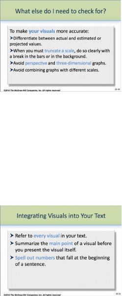
As PP 25-18 shows, writers can take steps to make visuals more accurate:
Differentiate between actual and estimated or projected values.
When you must truncate a scale, do so clearly with a break in the
bars or in the background.
Avoid perspective and three-dimensional graphs.
Avoid combining graphs with different scales.
Use images of people carefully in histographs to avoid sexist, racist,
or other exclusionary visual statements.
Integrating visuals into your text LO 25-6
Help your students to understand that using visuals effectively means more than just putting
them in a document—it means integrating them effectively. As PP 25-21 shows, that means
writers should
Refer to every visual in the text.
Summarize the main point of a visual before you present the visual
itself.
How much discussion a visual needs depends on the
audience.
complexity of the visual.
importance of the point it makes.
Spell out numbers that fall at the beginning of a sentence.
In-Class Exercise: Have students bring examples of badly integrated visuals to
class. Then divide the class into groups of 3-4 students and give them 10-15 minutes
to revise the visuals, using the concepts discussed in this BCS box and throughout
the module. Let the class vote on which group improved the visual best.
Can I use the same visuals in my document and my presentation? LO 25-7
Only if the table or graph is simple.
© 2014 by McGraw-Hill Education. This is proprietary material solely for authorized instructor use. Not authorized for sale or distribution in any
manner. This document may not be copied, scanned, duplicated, forwarded, distributed, or posted on a website, in whole or part.
25-8

Module 25 – Using Visuals
As PP 25-22 shows, visuals in presentations should be simple. Remind
students that they can use the visuals from the document if they are simple.
To simplify a complex table, writers can cut out some of the information
round off the data even more, or present the material in a chart rather than a
table.
Last Word: Work with students to understand that visuals in
documents and presentations are not decorative—they convey important information.
While many students may consider themselves visually savvy, some may be surprised
to learn that just because a visual is pretty doesn’t mean it works.
© 2014 by McGraw-Hill Education. This is proprietary material solely for authorized instructor use. Not authorized for sale or distribution in any
manner. This document may not be copied, scanned, duplicated, forwarded, distributed, or posted on a website, in whole or part.
25-9