
Chapter 2 – Descriptive Statistics: Tabular and Graphical Displays
Multiple Choice
1. The minimum number of variables represented in a bar chart is
a.
1
b.
2
c.
3
d.
4
a
1
2. The minimum number of variables represented in a histogram is
a.
1
b.
2
c.
3
d.
4
a
1
3. Which of the following graphical methods is most appropriate for categorical data?
a.
ogive
b.
pie chart
c.
histigram
d.
scatter diagram
b
1
4. In a stem-and-leaf display,
a.
a single digit is used to define each stem, and a single digit is used to define each leaf
b.
a single digit is used to define each stem, and one or more digits are used to define each leaf
c.
one or more digits are used to define each stem, and a single digit is used to define each leaf
d.
one or more digits are used to define each stem, and one or more digits are used to define each leaf
c
1
5. A graphical method that can be used to show both the rank order and shape of a data set simultaneously is a
a.
relative frequency distribution
b.
pie chart
c.
stem-and-leaf display
d.
pivot table
c
1
6. The proper way to construct a stem-and-leaf display for the data set {62, 67, 68, 73, 73, 79, 91, 94, 95, 97} is to
a.
exclude a stem labeled ‘8’
b.
include a stem labeled ‘8’ and enter no leaves on the stem

Chapter 2 – Descriptive Statistics: Tabular and Graphical Displays
c.
include a stem labeled ‘(8)’ and enter no leaves on the stem
d.
include a stem labeled ‘8’ and enter one leaf value of ‘0’ on the stem
7. Data that provide labels or names for groupings of like items are known as
a.
categorical data
b.
quantitative data
c.
label data
d.
generic data
8. A researcher is gathering data from four geographical areas designated: South = 1; North = 2; East = 3; West = 4. The
designated geographical regions represent
a.
categorical data
b.
quantitative data
c.
directional data
d.
either quantitative or categorical data
9. Data that indicate how much or how many are know as
a.
categorical data
b.
quantitative data
c.
label data
d.
category data
10. The ages of employees at a company represent
a.
categorical data
b.
quantitative data
c.
label data
d.
time series data
11. A frequency distribution is
a.
a tabular summary of a set of data showing the fraction of items in each of several nonoverlapping classes
b.
a graphical form of representing data
c.
a tabular summary of a set of data showing the number of items in each of several nonoverlapping classes
d.
a graphical device for presenting categorical data

12. The sum of frequencies for all classes will always equal
a.
1
b.
the number of elements in a data set
c.
the number of classes
d.
a value between 0 and 1
b
1
13. In constructing a frequency distribution, as the number of classes are decreased, the class width
a.
decreases
b.
remains unchanged
c.
increases
d.
can increase or decrease depending on the data values
c
1
14. If several frequency distributions are constructed from the same data set, the distribution with the widest class width
will have the
a.
fewest classes
b.
most classes
c.
same number of classes as the other distributions since all are constructed from the same data
d.
None of the other answers are correct.
a
1
15. Excel’s __________ can be used to construct a frequency distribution for categorical data.
a.
DISTRIBUTION function
b.
SUM function
c.
FREQUENCY function
d.
COUNTIF function
d
1
16. A tabular summary of a set of data showing the fraction of the total number of items in several nonoverlapping classes
is a
a.
frequency distribution.
b.
relative frequency distribution.
c.
frequency.
d.
cumulative frequency distribution.
b
1
17. The relative frequency of a class is computed by
a.
dividing the midpoint of the class by the sample size.

Chapter 2 – Descriptive Statistics: Tabular and Graphical Displays
b.
dividing the frequency of the class by the midpoint.
c.
dividing the sample size by the frequency of the class.
d.
dividing the frequency of the class by the sample size.
18. The sum of the relative frequencies for all classes will always equal
a.
the sample size
b.
the number of classes
c.
one
d.
100
19. A tabular summary of data showing the percentage of items in each of several nonoverlapping classes is a
a.
frequency distribution
b.
relative frequency distribution
c.
percent frequency distribution
d.
cumulative percent frequency distribution
20. The percent frequency of a class is computed by
a.
multiplying the relative frequency by 10
b.
dividing the relative frequency by 100
c.
multiplying the relative frequency by 100
d.
adding 100 to the relative frequency
21. The sum of the percent frequencies for all classes will always equal
a.
one
b.
the number of classes
c.
the number of items in the study
d.
100
22. In a cumulative frequency distribution, the last class will always have a cumulative frequency equal to
a.
one
b.
100%
c.
the total number of elements in the data set
d.
None of the other answers are correct.

23. In a cumulative relative frequency distribution, the last class will have a cumulative relative frequency equal to
a.
one
b.
zero
c.
100
d.
None of the other answers are correct.
a
24. In a cumulative percent frequency distribution, the last class will have a cumulative percent frequency equal to
a.
one
b.
100
c.
the total number of elements in the data set
d.
None of the other answers are correct.
25. The difference between the lower class limits of adjacent classes provides the
a.
number of classes
b.
class limits
c.
class midpoint
d.
class width
Exhibit 2-1
The numbers of hours worked (per week) by 400 statistics students are shown below.
Number of hours
Frequency
0 − 9
20
10 − 19
80
20 − 29
200
30 − 39
100
26. Refer to Exhibit 2-1. The class width for this distribution
a.
is 9
b.
is 10
c.
is 39, which is: the largest value minus the smallest value or 39 − 0 = 39
d.
varies from class to class
27. Refer to Exhibit 2-1. The midpoint of the last class is
a.
50
b.
34
c.
35
d.
34.5

Chapter 2 – Descriptive Statistics: Tabular and Graphical Displays
28. Refer to Exhibit 2-1. The number of students working 19 hours or less
a.
is 80
b.
is 100
c.
is 180
d.
is 300
29. Refer to Exhibit 2-1. The relative frequency of students working 9 hours or less
a.
is 20
b.
is 100
c.
is 0.95
d.
0.05
30. Refer to Exhibit 2-1. The cumulative relative frequency for the class of 20 − 29
a.
is 300
b.
is 0.25
c.
is 0.75
d.
is 0.5
c
31. Refer to Exhibit 2-1. The percentage of students working 10 − 19 hours is
a.
20%
b.
25%
c.
75%
d.
80%
a
32. Refer to Exhibit 2-1. The percentage of students working 19 hours or less is
a.
20%
b.
25%
c.
75%
d.
80%
33. Refer to Exhibit 2-1. The cumulative percent frequency for the class of 30 − 39 is
a.
100%

Chapter 2 – Descriptive Statistics: Tabular and Graphical Displays
b.
75%
c.
50%
d.
25%
a
1
34. Refer to Exhibit 2-1. The cumulative frequency for the class of 20 − 29
a.
is 200
b.
is 300
c.
is 0.75
d.
is 0.50
b
1
35. Refer to Exhibit 2-1. If a cumulative frequency distribution is developed for the above data, the last class will have a
cumulative frequency of
a.
100
b.
1
c.
30 − 39
d.
400
d
1
36. Refer to Exhibit 2-1. The percentage of students who work at least 10 hours per week is
a.
50%
b.
5%
c.
95%
d.
100%
c
1
Exhibit 2-2
Information on the type of industry is provided for a sample of 50 Fortune 500 companies.
Industry Type
Frequency
Banking
7
Consumer Products
15
Electronics
10
Retail
18
37. Refer to Exhibit 2-2. The number of industries that are classified as retail is
a.
32
b.
18
c.
0.36
d.
36%
b
1

38. Refer to Exhibit 2-2. The relative frequency of industries that are classified as banking is
a.
7
b.
0.07
c.
0.70
d.
0.14
d
1
39. Refer to Exhibit 2-2. The percent frequency of industries that are classified as electronics is
a.
10
b.
20
c.
0.10
d.
0.20
b
1
Exhibit 2-3
The number of sick days taken (per month) by 200 factory workers is summarized below.
Number of Days
Frequency
0 − 5
120
6 − 10
65
11 − 15
14
16 − 20
1
40. Refer to Exhibit 2-3. The class width for this distribution
a.
is 5
b.
is 6
c.
is 20, which is: the largest value minus the smallest value or 20 − 0 = 20
d.
varies from class to class
b
1
41. Refer to Exhibit 2-3. The midpoint of the first class is
a.
10
b.
2
c.
2.5
d.
3
c
1
42. Refer to Exhibit 2-3. The number of workers who took less than 11 sick days per month
a.
was 15
b.
was 200
c.
was 185
d.
was 65

Chapter 2 – Descriptive Statistics: Tabular and Graphical Displays
43. Refer to Exhibit 2-3. The number of workers who took at most 10 sick days per month
a.
was 15
b.
was 200
c.
was 185
d.
was 65
44. Refer to Exhibit 2-3. The number of workers who took more than 10 sick days per month
a.
was 15
b.
was 200
c.
was 185
d.
was 65
45. Refer to Exhibit 2-3. The number of workers who took at least 11 sick days per month
a.
was 15
b.
was 200
c.
was 185
d.
was 65
46. Refer to Exhibit 2-3. The relative frequency of workers who took 10 or fewer sick days
a.
was 185
b.
was 0.925
c.
was 93
d.
was 15
47. Refer to Exhibit 2-3. The cumulative relative frequency for the class of 11 − 15
a.
is 199
b.
is 0.07
c.
is 1
d.
is 0.995
48. Refer to Exhibit 2-3. The percentage of workers who took 0 – 5 sick days per month was
a.
20%

Chapter 2 – Descriptive Statistics: Tabular and Graphical Displays
b.
120%
c.
75%
d.
60%
49. Refer to Exhibit 2-3. The cumulative percent frequency for the class of 16 − 20 is
a.
100%
b.
65%
c.
92.5%
d.
0.5%
a
50. Refer to Exhibit 2-3. The cumulative frequency for the class of 11 − 15
a.
is 200
b.
is 14
c.
is 199
d.
is 1
c
Exhibit 2-4
A survey of 400 college seniors resulted in the following crosstabulation regarding their undergraduate major and whether
or not they plan to go to graduate school.
Undergraduate Major
Graduate School
Business
Engineering
Others
Total
Yes
35
42
63
140
No
91
104
65
260
Total
126
146
128
400
51. Refer to Exhibit 2-4. What percentage of the students does not plan to go to graduate school?
a.
280
b.
520
c.
65
d.
32
c
52. Refer to Exhibit 2-4. What percentage of the students’ undergraduate major is engineering?
a.
292
b.
520
c.
65
d.
36.5

53. Refer to Exhibit 2-4. Of those students who are majoring in business, what percentage plans to go to graduate school?
a.
27.78
b.
8.75
c.
70
d.
72.22
a
54. Refer to Exhibit 2-4. Among the students who plan to go to graduate school, what percentage indicated “Other”
majors?
a.
15.75
b.
45
c.
54
d.
35
55. A graphical device for depicting categorical data that have been summarized in a frequency distribution, relative
frequency distribution, or percent frequency distribution is a(n)
a.
histogram
b.
stem-and-leaf display
c.
ogive
d.
bar chart
56. A graphical device for presenting categorical data summaries based on subdivision of a circle into sectors that
correspond to the relative frequency for each class is a
a.
histogram
b.
stem-and-leaf display
c.
pie chart
d.
bar chart
c
57. Categorical data can be graphically represented by using a(n)
a.
histogram
b.
frequency polygon
c.
ogive
d.
bar chart
58. Fifteen percent of the students in a School of Business Administration are majoring in Economics, 20% in Finance,
35% in Management, and 30% in Accounting. The graphical device(s) that can be used to present these data is (are)

Chapter 2 – Descriptive Statistics: Tabular and Graphical Displays
a.
a line graph
b.
only a bar chart
c.
only a pie chart
d.
both a bar chart and a pie chart
59. Methods that use simple arithmetic and easy–to-draw graphs to summarize data quickly are called
a.
exploratory data analysis
b.
relative frequency distributions
c.
bar charts
d.
pie charts
a
60. The total number of data items with a value less than or equal to the upper limit for the class is given by the
a.
frequency distribution
b.
relative frequency distribution
c.
cumulative frequency distribution
d.
cumulative relative frequency distribution
c
61. Excel’s __________ can be used to construct a frequency distribution for quantitative data.
a.
COUNTIF function
b.
SUM function
c.
PivotTable Report
d.
AVERAGE function
c
62. A graphical presentation of a frequency distribution, relative frequency distribution, or percent frequency distribution
of quantitative data constructed by placing the class intervals on the horizontal axis and the frequencies on the vertical
axis is a
a.
histogram
b.
bar chart
c.
stem-and-leaf display
d.
pie chart
a
63. A common graphical presentation of quantitative data is a
a.
histogram
b.
bar chart
c.
relative frequency

Chapter 2 – Descriptive Statistics: Tabular and Graphical Displays
d.
pie chart
a
64. When using Excel to create a __________ one must edit the chart to remove the gaps between rectangles.
a.
scatter diagram
b.
bar chart
c.
histogram
d.
pie chart
c
65. A __________ can be used to graphically present quantitative data.
a.
histogram
b.
pie chart
c.
stem-and-leaf display
d.
both a histogram and a stem-and-leaf display are correct
66. A(n) __________ is a graph of a cumulative distribution.
a.
histogram
b.
pie chart
c.
stem-and-leaf display
d.
ogive
67. Excel’s Chart Tools can be used to construct a
a.
bar chart
b.
pie chart
c.
histogram
d.
All of these can be constructed using Excel’s Chart Tools.
68. To construct a bar chart using Excel’s Chart Tools, choose __________ as the chart type.
a.
column
b.
pie
c.
scatter
d.
line
a
69. To construct a pie chart using Excel’s Chart Tools, choose __________ as the chart type.

Chapter 2 – Descriptive Statistics: Tabular and Graphical Displays
a.
column
b.
pie
c.
scatter
d.
line
70. To construct a histogram using Excel’s Chart Tools, choose __________ as the chart type.
a.
column
b.
pie
c.
scatter
d.
line
a
71. Excel’s Chart Tools does not have a chart type for constructing a
a.
bar chart
b.
pie chart
c.
histogram
d.
stem-and-leaf display
72. A tabular method that can be used to summarize the data on two variables simultaneously is called
a.
simultaneous equations
b.
a crosstabulation
c.
a histogram
d.
a dot plot
73. Excel’s __________ can be used to construct a crosstabulation.
a.
Chart Tools
b.
SUM function
c.
PivotTable Report
d.
COUNTIF function
c
74. In a crosstabulation
a.
both variables must be categorical
b.
both variables must be quantitative
c.
one variable must be categorical and the other must be quantitative
d.
either or both variables can be categorical or quantitative

75. A graphical presentation of the relationship between two quantitative variables is
a.
a pie chart
b.
a histogram
c.
a crosstabulation
d.
a scatter diagram
d
1
76. Excel’s __________ can be used to construct a scatter diagram.
a.
Chart Tools
b.
SUM function
c.
CROSSTAB function
d.
RAND function
a
1
77. When the conclusions based upon the aggregated crosstabulation can be completely reversed if we look at the
unaggregated data, the occurrence is known as
a.
reverse correlation
b.
inferential statistics
c.
Simpson’s paradox
d.
disaggregation
c
1
78. Before drawing any conclusions about the relationship between two variables shown in a crosstabulation, you should
a.
investigate whether any hidden variables could affect the conclusions
b.
construct a scatter diagram and find the trendline
c.
develop a relative frequency distribution
d.
construct an ogive for each of the variables
a
1
79. A histogram is not appropriate for displaying which of the following types of information?
a.
frequency
b.
relative frequency
c.
cumulative frequency
d.
percent frequency
c
1
80. For stem-and-leaf displays where the leaf unit is not stated, the leaf unit is assumed to equal
a.
0
1

Chapter 2 – Descriptive Statistics: Tabular and Graphical Displays
b.
.1
c.
1
d.
10
c
1
81. Which of the following graphical methods is not intended for quantitative data?
a.
ogive
b.
dot plot
c.
scatter diagram
d.
pie chart
d
1
82. Which of the following is least useful in studying the relationship between two variables?
a.
trendline
b.
stem-and-leaf display
c.
crosstabulation
d.
scatter diagram
b
1
83. The sum of the relative frequencies in any relative frequency distribution always equals
a.
the number of observation
b.
1.00
c.
100
d.
the number of variables
b
1
84. The sum of the frequencies in any frequency distribution always equals
a.
the number of observations
b.
1.00
c.
100
d.
the number of variables
a
1
85. In quality control applications, bar charts are used to identify the most important causes of problems. When the bars
are arranged in descending order of height from left to right with the most frequently occurring cause appearing first, the
bar chart is called a
a.
cause-and-effect diagram
b.
histogram
c.
Pareto diagram
d.
ogive
Chapter 2 – Descriptive Statistics: Tabular and Graphical Displays
c
1
86. A graphical tool typically associated with the display of key performance indicators is a
a.
side-by-side bar chart
b.
stem-and-leaf display
c.
dot plot
d.
data dashboard
d
1
87. The approximately class width for a frequency distribution involving quantitative data can be determined using the
expression
a.
mean frequency ÷ total frequency
b.
total frequency ÷ class midpoint
c.
range ÷ desired number of classes
d.
desired number of classes ÷ class midpoint
c
1
88. A display used to compare the relative frequency or percent frequency of two categorical variables is a
a.
side-by-side bar chart
b.
stacked bar chart
c.
pie chart
d.
stem-and-leaf display
b
1
Subjective Short Answer
89. Thirty students in the School of Business were asked what their majors were. The following represents their responses
(M = Management; A = Accounting; E = Economics; O = Others).
A
M
M
A
M
M
E
M
O
A
E
E
M
A
O
E
M
A
M
A
M
A
O
A
M
E
E
M
A
M
a.
Construct a frequency distribution and a bar chart.
b.
Construct a relative frequency distribution and a pie chart.
a. and b.
Major
Frequency
Relative Frequency
M
12
0.4
A
0.3
0.2
O
0.1
Total
30
1.0
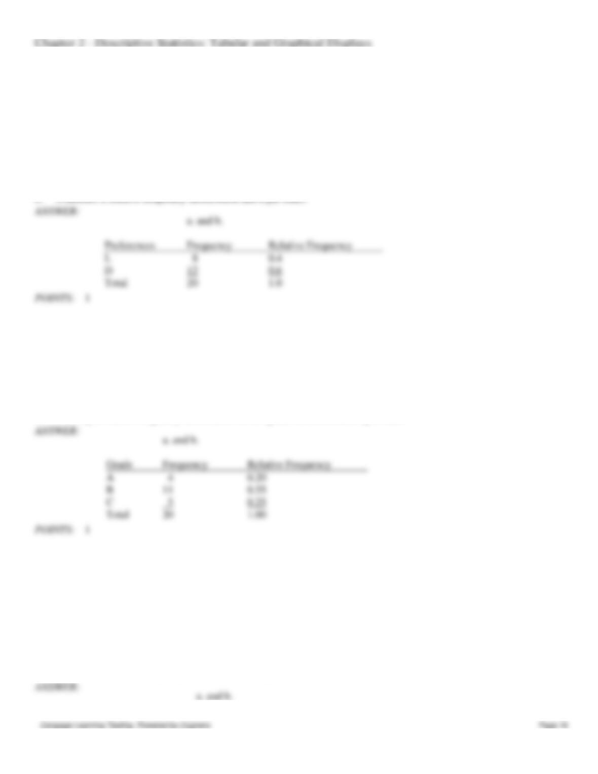
POINTS:
1
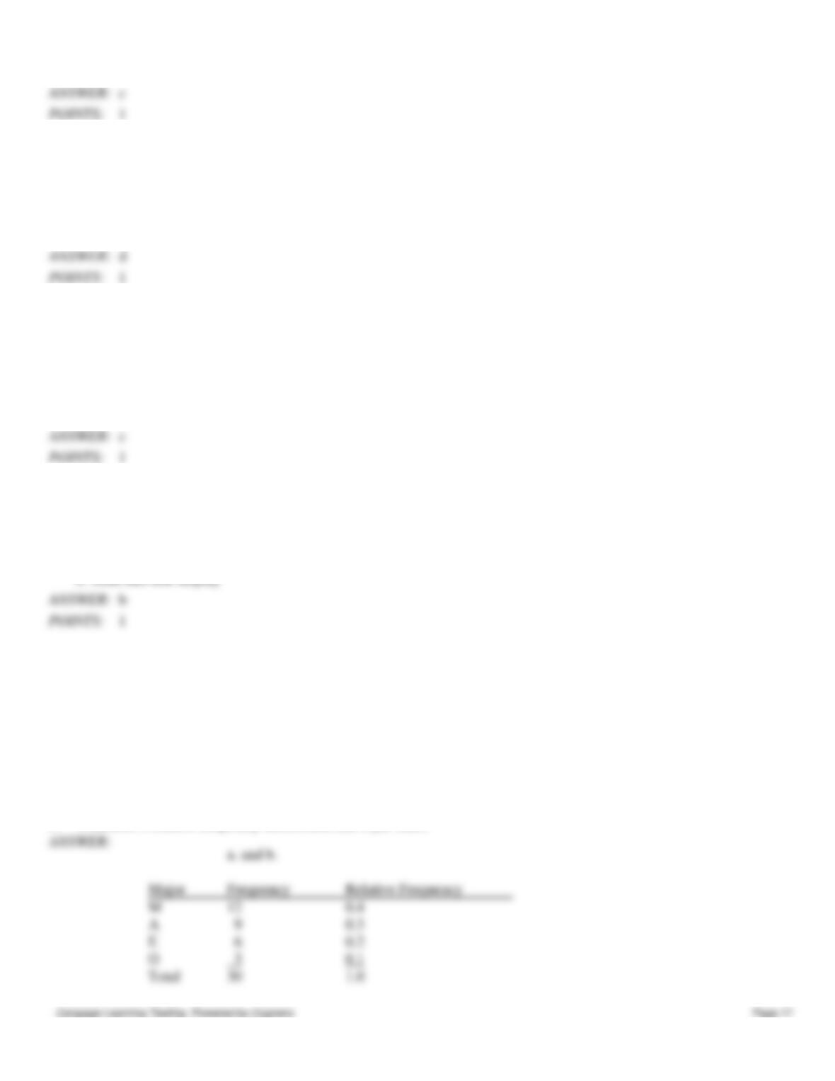
90. Twenty employees of ABC Corporation were asked if they liked or disliked the new district manager. Below are their
responses. Let L represent liked and D represent disliked.
L
L
D
L
D
D
D
L
L
D
D
L
D
D
L
D
D
D
D
L
a.
Construct a frequency distribution and a bar chart.
b.
Construct a relative frequency distribution and a pie chart.
a. and b.
Preferences
Frequency
Relative Frequency
0.4
12
0.6
Total
20
1.0
POINTS:
1
91. A student has completed 20 courses in the School of Arts and Sciences. Her grades in the 20 courses are shown below.
A
B
A
B
C
C
C
B
B
B
B
A
B
B
B
C
B
C
B
A
a.
Develop a frequency distribution and a bar chart for her grades.
b.
Develop a relative frequency distribution for her grades and construct a pie chart.
a. and b.
Grade
Frequency
Relative Frequency
A
0.20
B
11
0.55
C
0.25
Total
20
1.00
POINTS:
1
92. A sample of 50 TV viewers were asked, “Should TV sponsors pull their sponsorship from programs that draw
numerous viewer complaints?” Below are the results of the survey. (Y = Yes; N = No; W = Without Opinion)
N
W
N
N
Y
N
N
N
Y
N
N
Y
N
N
N
N
N
Y
N
N
Y
N
Y
W
N
Y
W
W
N
Y
W
W
N
W
Y
W
N
W
Y
W
N
Y
N
Y
N
W
Y
Y
N
Y
a.
Construct a frequency distribution and a bar chart.
b.
Construct a relative frequency distribution and a pie chart.
a. and b.