Chapter 2—Graphical and tabular descriptive methods
MULTIPLE CHOICE
1. The most appropriate type of chart for determining the number of observations at or below a specific
value is:
A.
a histogram.
B.
a pie chart.
C.
a time-series chart.
D.
a cumulative frequency ogive.
2. The best type of chart for illustrating the GDP of Australia from 1960 to 2010 is:
A.
a time-series chart.
B.
a scatter plot.
C.
a histogram.
D.
a bar chart.
3. If a relative frequency histogram has five bars and the width of each bar is one unit, then the total area
of the five bars is:
A.
10.
B.
5.
C.
6.
D.
1.
4. Which of the following statements about pie charts is false?
A.
Pie charts are graphical representations of cumulative relative frequency distributions.
B.
Pie charts are usually used to display the relative sizes of categories for qualitative data.
C.
Pie charts always have the shape of a circle.
D.
The area of each slice of a pie chart is proportional to the relative frequency of the
corresponding category.
5. The total area of the bars in a relative frequency histogram:
A.
depends on the sample size.
B.
depends on the number of bars.
C.
depends on the width of each bar.
D.
Both A and B are correct.
6. Which of the following statements is false?
A.
All calculations are permitted on numerical (quantitative) data.
B.
All calculations are permitted on nominal (categorical) data.
C.
The most important aspect of ordinal data is the order of the data values.
D.
The only permissible calculations on ordinal data are ones involving a ranking process.
7. Which of the following statements is false?
A.
A frequency distribution counts the number of observations that fall into each of a series
of intervals, called classes, that cover the complete range of observations.
B.
The intervals in a frequency distribution must not overlap to ensure that each observation
is assigned to an interval.
C.
Although the frequency distribution provides information about how the numbers in the
data set are distributed, the information is more easily understood and imparted by
drawing a histogram.
D.
The number of class intervals in a frequency distribution must be the same as the number
of observations so that we make use of all information provided by the data set.
8. In general, the incomes of employees in large firms tend to be:
A.
positively skewed.
B.
negatively skewed.
C.
symmetric.
D.
None of the above are correct.
9. The relative frequency of a class is computed by:
A.
dividing the frequency of the class by the number of classes.
B.
dividing the frequency of the class by the class width.
C.
dividing the frequency of the class by the total number of observations in the data set.
D.
subtracting the lower limit of the class from the upper limit and multiplying the difference
by the number of classes.
10. A modal class is the class that includes:
A.
the largest number of observations.
B.
the smallest number of observations.
C.
the largest observation in the data set.
D.
the smallest observation in the data set.
11. The sum of the relative frequencies for all classes will always equal:
A.
the number of classes.
B.
the class width.
C.
the total number of observations in the data set.
D.
one.
12. The two graphical techniques we usually use to present nominal (categorical) data are:
A.
bar chart and histogram.
B.
pie chart and ogive.
C.
bar chart and pie chart.
D.
histogram and ogive.
13. The most important and commonly used graphical presentation of numerical (quantitative) data is a:
A.
bar chart.
B.
histogram.
C.
pie chart.
D.
ogive.
14. The relationship between two numerical (quantitative) variables is graphically displayed as a:
A.
scatter diagram.
B.
histogram.
C.
bar chart.
D.
pie chart.
TRUE/FALSE
1. A relative frequency distribution describes the proportion of data values that fall within each class, and
may be presented in histogram form.
2. A cumulative frequency distribution lists the proportion of observations that are within or below each
of the classes.
3. The stem-and-leaf display reveals far more information about individual values than does the
histogram.
4. Individual observations within each class may be found in a frequency distribution.
5. Compared to the frequency distribution, the stem-and-leaf display provides more details, since it can
describe the individual data values as well as show how many are in each group, or stem.
6. A relative frequency distribution describes the proportion of data values that fall within each category.
7. A frequency distribution shows the number of data values falling within each class.
8. Class intervals of equal width make the interpretation of a frequency distribution easier.
9. The difference between a histogram and a bar chart is that the histogram represents nominal
(categorical) data while the bar chart represents numerical (quantitative) data.
10. The lowest value in a set of data is 140, and the largest value is 270. If the resulting frequency
distribution is to have ten classes of equal width, the common class width will be 27.
11. A stem-and-leaf display describes two-digit integers between 20 and 70. For one of the classes
displayed, the row appears as 4 | 2 5 6. The numerical values being described are 24, 54 and 64.
12. The total area of the six bars in a relative frequency histogram for which the width of each bar is five
units is 1.
13. The following ‘character histogram’ has been generated by a statistical software package. The median
class is 150.
Histogram of C1 N = 75
Midpoint
Count
–150
1
*
–100
1
*
–50
3
***
0
2
**
50
7
*******
100
12
************
150
18
******************
200
20
********************
250
5
*****
300
5
*****
350
1
*
14. A frequency distribution is a listing of the individual observations arranged in ascending or descending
order.
15. A cumulative frequency distribution presented in graphical form is called an ogive.
16. Nominal (categorical) data are also called qualitative data.
17. A variable is some characteristic of a population, while data are the observed values of a variable
based on a sample.
18. Numerical (quantitative) data, such as heights, weights and incomes, are also referred to as interval
data.
19. Ordinal data may be treated as numerical (quantitative) but not as nominal (categorical).
20. Numerical (quantitative) data may be treated as ordinal or categorical.
21. Nominal (categorical) data may be treated as ordinal or numerical (quantitative).
22. A histogram is said to be symmetric if, when we draw a vertical line down the center of the histogram,
the two sides are mirror images of each other.
23. A skewed histogram is one with a long tail extending either to the right or left. The former is called
negatively skewed, and the later is called positively skewed.
24. The modal class (classes) of a frequency distribution is the class (are the classes) with the highest
frequency.
25. Bar and pie charts are graphical formats for the presentation of nominal (categorical) data. The former
focus the attention on the frequency of the occurrences of the categories, and the latter emphasise the
proportion of occurrences of each category.
26. The graphical format used to display the relationship between two numerical (quantitative) variables is
the scatter diagram.
27. If we draw a straight line through the points in a scatter diagram and most of the points fall relatively
close to the line, we say that there is a linear relationship between the two variables.
28. Time-series data are often graphically depicted on a line chart, which is a plot of the variable of
interest over time.
29. Numerical variables usually represent membership of groups or categories.
30. An automobile insurance agent believes that company A is more reliable than company B. The scale of
measurement that this information represents is the ordinal scale.
31. When a distribution tails to the right, we say that it is positively skewed.
32. Nominal data can be represented graphically either with bar a bar chart or with a pie chart.
SHORT ANSWER
1. Identify the type of data for which each of the following graphs is appropriate.
a. Histogram.
b. Pie chart.
c. Bar chart.
2. Students in a business statistics class are asked to respond to the questions listed below. For each
question, determine whether the possible responses are numerical (quantitative), nominal (categorical)
or ordinal.
a. What is your age?
b. What is your nationality?
c. How often do you attend the lectures: never, occasionally, most of the time or always?
d. What is your major area of study: accounting, economics, finance, marketing or management?
e. How do you rate this subject on a 1 to 5 scale where 1 = worst and 5 = best?
3. For each of the following examples, identify the data type as nominal (categorical), ordinal or
numerical (quantitative).
a. The letter grades received by students in a computer science class.
b. The number of students in a statistics course.
c. The starting salaries of new PhD graduates from a statistics program.
d. The size of fries (small, medium, large) ordered by a sample of Hungry Jacks customers.
e. The degree (Arts, Science, Business, etc.) you are enrolled in.
4. At the end of a bus tour holiday, the tour operator asks the tourists to respond to the questions listed
below. For each question, determine whether the possible responses are numerical, nominal or ranked.
a. How many bus tour holidays have you taken prior to this one?
b. Do you feel that the stay in Adelaide was sufficiently long?
c. Which of the following features of the hotel in Adelaide did you find most attractive: location,
facilities, room size or price?
d. What is the maximum number of hours per day that you would like to spend traveling?
e. Would your overall rating of this tour be excellent, good, fair or poor?
5. Provide one example each of nominal (categorical), ordinal and numerical (quantitative) data.
6. For each of the following, indicate whether the variable of interest would be nominal (categorical) or
numerical (quantitative).
a. Your gender.
b. Your weight.
c. Number of households in your suburb.
d. Your favourite holiday destination.
e. Your highest qualification.
f. Number of days you came to the campus last week.
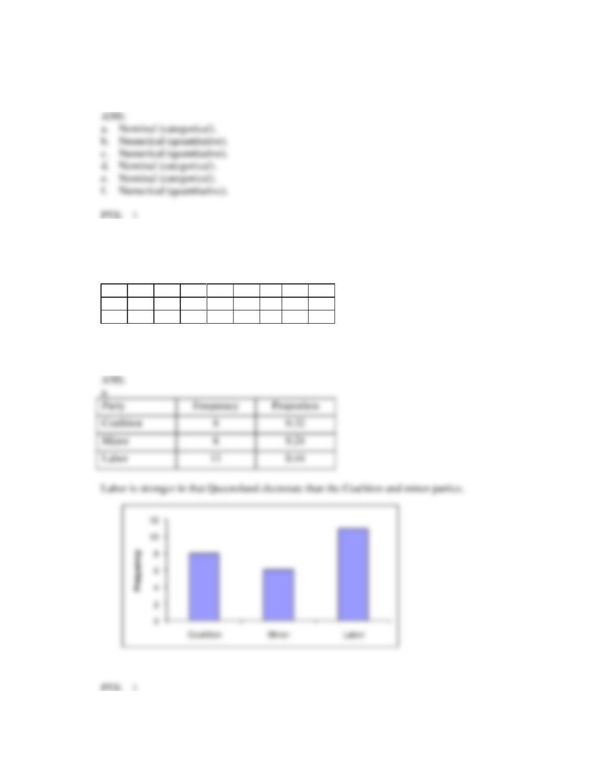
7. Voters participating in a recent election exit poll in a Queensland electorate were asked to state their
political party affiliation. Coding the data 1 for Coalition, 2 for minor parties and 3 for Labor, the data
collected were as follows:
3
1
2
3
1
3
3
2
1
3
3
2
1
1
3
2
3
1
3
2
3
2
1
1
3
a. Develop a frequency distribution and a proportion distribution for the data. What does the data
suggest about the strength of the political parties in that Queensland electorate?
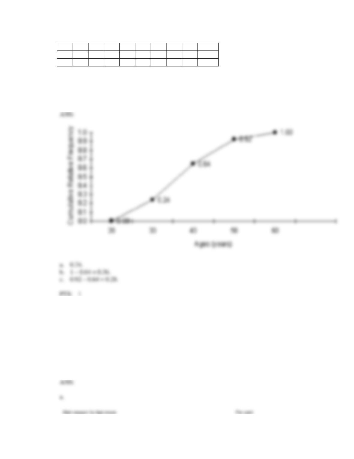
8. The ages of 25 salespersons in an organisation are given below.
47
21
37
53
28
40
30
32
34
26
34
24
24
35
45
38
35
28
43
45
30
45
31
41
56
Construct an ogive for the data, and estimate the proportion of salespersons who are:
a. less than 30 years of age.
b. more than 40 years of age.
c. between 40 and 50 years of age.
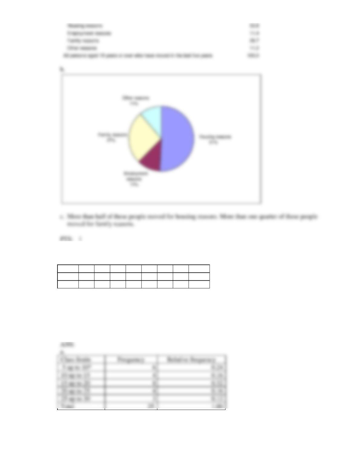
9. According to the Housing Mobility section of the General Social Survey, Victoria, 2006 (ABS,
Catalogue Number: 4159.2.55.001), about 1493 thousand people aged 18 years or over moved in the
last five years. Of these people, 758.4 thousand moved for housing reasons, 170.2 thousand moved for
employment reasons, 398.6 thousand moved for family reasons and 167.2 thousand moved for other
reasons.
a. Construct a relative frequency distribution for this data.
b. Illustrate this relative frequency distribution with a pie chart.
c. What conclusion can you draw from this relative frequency distribution?
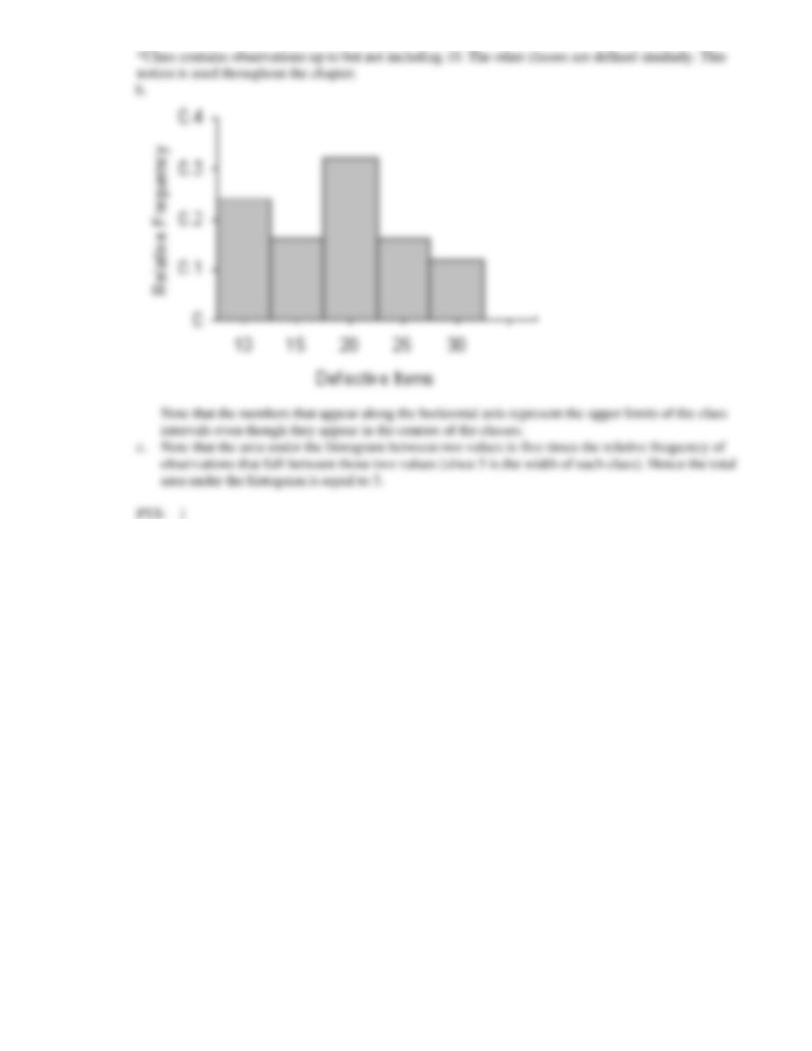
10. The numbers of defective items produced by a machine over the last 25 days are as follows:
19
6
15
20
17
16
17
12
15
29
23
17
7
10
14
14
27
22
8
5
23
19
9
28
5
a. Construct a frequency distribution and a relative frequency distribution for these data. Use five
class intervals, with the lower boundary of the first class being five items.
b. Construct a relative frequency histogram for these data.
c. What is the relationship between the total area under the histogram you have constructed and the
relative frequencies of observations?
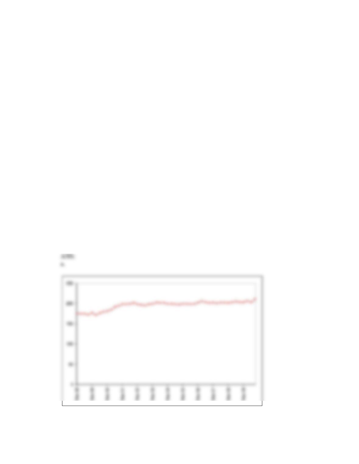
11. The table below shows the number of licensed hotels with at least 15 rooms in New South Wales from
March 1998 to December 2009.
Mar-1998
175
Jun-1998
174
Sep-1998
174
Dec-1998
172
Mar-1999
177
Jun-1999
171
Sep-1999
176
Dec-1999
179
Mar-2000
181
Jun-2000
184
Sep-2000
191
Dec-2000
194
Mar-2001
198
Jun-2001
198
Sep-2001
199
Dec-2001
201
Mar-2002
198
Jun-2002
196
Sep-2002
195
Dec-2002
198
Mar-2003
199
Jun-2003
202
Sep-2003
201
Dec-2003
201
Mar-2004
199
Jun-2004
199
Sep-2004
198
Dec-2004
197
Mar-2005
199
Jun-2005
199
Sep-2005
198
Dec-2005
199
Mar-2006
202
Jun-2006
205
Sep-2006
203
Dec-2006
201
Mar-2007
202
Jun-2007
200
Sep-2007
202
Dec-2007
202
Mar-2008
201
Jun-2008
203
Sep-2008
204
Dec-2008
203
Mar-2009
203
Jun-2009
206
Sep-2009
203
Dec-2009
210
a. Plot the time series.
b. When did the number of licensed hotels with at least 15 rooms in New South Wales grow fastest?
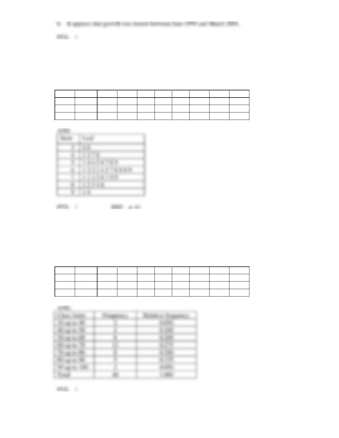
12. Construct a stem-and-leaf display for the data in Data Set 1.
Data Set 1
The following data are test grades for a university business statistics class.
63
74
42
65
51
54
36
56
68
57
62
64
76
67
79
61
81
77
59
38
84
68
71
94
71
86
69
75
91
55
48
82
83
54
79
62
68
58
41
47
3
4
5
6
7
8
9
13. Construct a frequency distribution and relative frequency distribution for the data in Data Set 1, using
seven class intervals.
Data Set 1
The following data are test grades for a university business statistics class.
63
74
42
65
51
54
36
56
68
57
62
64
76
67
79
61
81
77
59
38
84
68
71
94
71
86
69
75
91
55
48
82
83
54
79
62
68
58
41
47
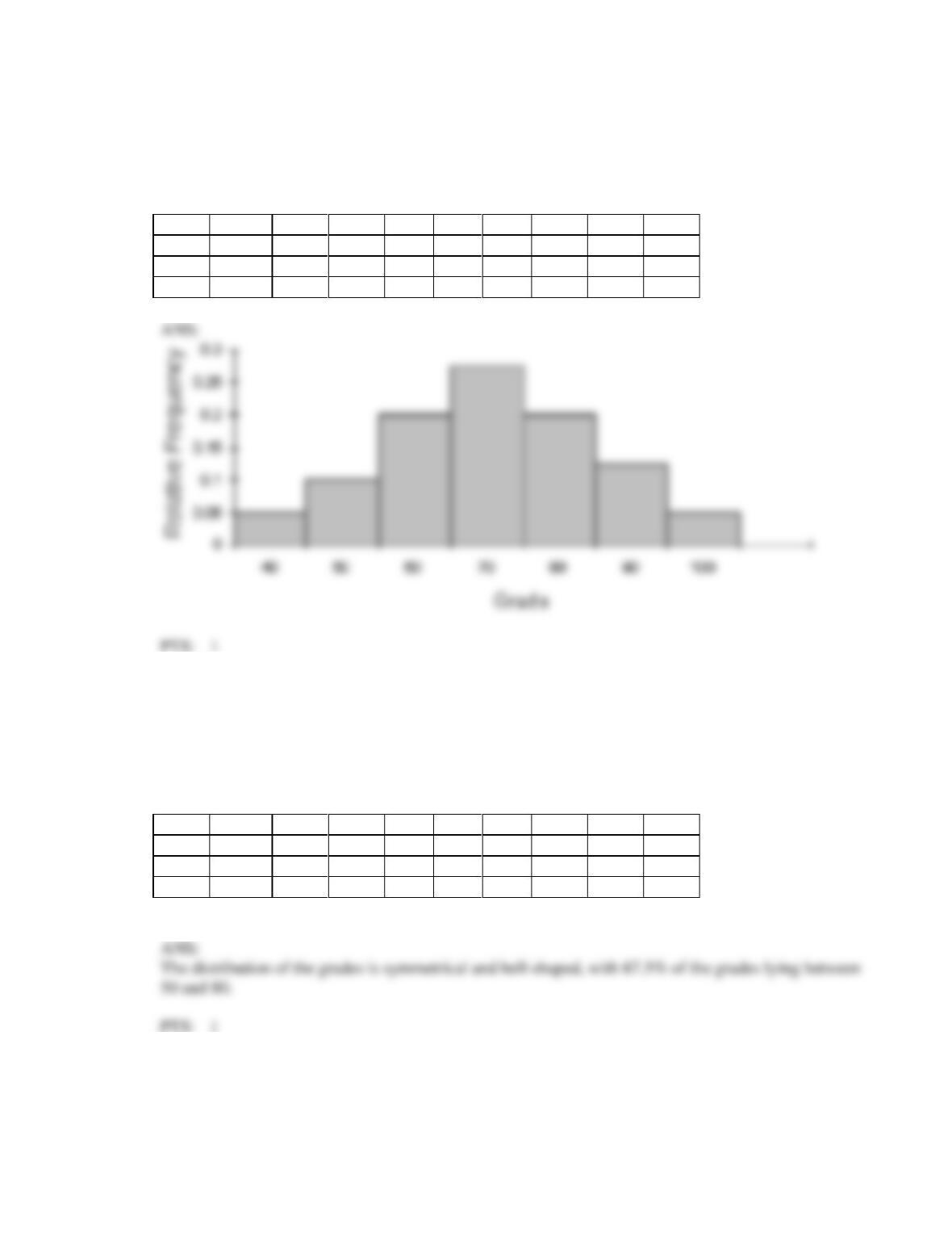
14. Construct a relative frequency histogram for the data in Data Set 1.
Data Set 1
The following data are test grades for a university business statistics class.
63
74
42
65
51
54
36
56
68
57
62
64
76
67
79
61
81
77
59
38
84
68
71
94
71
86
69
75
91
55
48
82
83
54
79
62
68
58
41
47
15. Describe briefly what the histogram and the stem-and-leaf displays tell you about the data in Data Set
1.
Data Set 1
The following data are test grades for a university business statistics class.
63
74
42
65
51
54
36
56
68
57
62
64
76
67
79
61
81
77
59
38
84
68
71
94
71
86
69
75
91
55
48
82
83
54
79
62
68
58
41
47