8) Which type of graph is most useful in determining if two variables are correlated?
A) time-series
B) scatter diagram
C) cross-section
D) variable-correlation igure
E) None of the above answers is correct.
Skill: Level 1: Deinition
Section: Chapter 1 Appendix – Checkpoint 1
Status: Old
AACSB: Analytical thinking
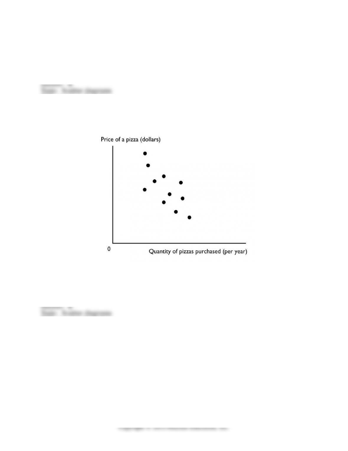
9) The igure above shows a
A) time-series graph.
B) scatter diagram.
C) cross-section graph.
D) slope.
E) trend diagram.
Skill: Level 1: Deinition
Section: Chapter 1 Appendix – Checkpoint 1
Status: Old
AACSB: Analytical thinking
51

10) A time-series graph measures
A) the value of one variable against the value of another variable.
B) the value of an economic variable for diferent groups in a population at a point in time.
C) time on the x-axis and the variable or variables in which we are interested on the y-axis.
D) time on the y-axis and the variable or variables in which we are interested on the x-axis.
E) time on both the x-axis and y-axis and the variable or variables in which we are
interested in the rest of the igure.
Skill: Level 1: Deinition
Section: Chapter 1 Appendix – Checkpoint 1
Status: Old
AACSB: Analytical thinking
11) A time series graph
A) shows how a variable changes over time.
B) uses bars rather than lines.
C) shows points in a scatter diagram.
D) is similar to a cross-section graph because both can show trends over time.
E) is in the shape of a pie.
Skill: Level 1: Deinition
Section: Chapter 1 Appendix – Checkpoint 1
Status: Old
AACSB: Analytical thinking
12) A steep slope in a time series graph means the variable is
A) high.
B) falling.
C) rising or falling quickly.
D) rising or falling slowly.
E) very close to its trend point.
Skill: Level 1: Deinition
Section: Chapter 1 Appendix – Checkpoint 1
Status: Old
AACSB: Analytical thinking
52

13) Which type of economic graph reveals trends in data?
A) cross-section graph
B) time-series graph
C) scatter diagram
D) Answers A and C are correct.
E) Answers A, B, and C are all correct.
Skill: Level 1: Deinition
Section: Chapter 1 Appendix – Checkpoint 1
Status: Old
AACSB: Analytical thinking
14) A time series graph
A) shows how a certain variable changes over time.
B) uses bars rather than lines.
C) shows points that are scattered.
D) depicts a series of good economic times a nation had.
E) is not useful if the goal is to determine a variable’s trend.
Skill: Level 1: Deinition
Section: Chapter 1 Appendix – Checkpoint 1
Status: Old
AACSB: Analytical thinking
15) A time-series graph displays the price of gold. The slope of the line is negative for
periods when the
A) price of gold is falling.
B) price of gold is rising.
C) quantity of gold is falling.
D) price of gold is low and not changing.
E) price of gold luctuates.
Skill: Level 3: Using models
Section: Chapter 1 Appendix – Checkpoint 1
Status: Old
AACSB: Analytical thinking
53

16) A graph shows the wage rate of factory workers. The slope of the line is positive for
periods when the wage rate is
A) falling.
B) rising.
C) high and not changing.
D) low and falling.
E) high and falling.
Skill: Level 3: Using models
Section: Chapter 1 Appendix – Checkpoint 1
Status: Old
AACSB: Analytical thinking
17) A trend is
A) a measure of closeness on a scatter diagram.
B) a general tendency for a variable to rise or fall.
C) the maximum value of a variable.
D) the minimum value of a variable.
E) the diference between the maximum value of a variable and the minimum value of the
variable.
Skill: Level 1: Deinition
Section: Chapter 1 Appendix – Checkpoint 1
Status: Old
AACSB: Analytical thinking
18) A time series graph reveals whether there is a ________ , which represents ________.
A) trend in a variable; a general tendency for the variable to rise or fall
B) relationship between two variables; a cross-section relationship
C) trends in two variables; unrelated variables
D) relationship between two variables; a trend in a variable
E) cross-section relationship; a general tendency for the variables to rise or fall
Skill: Level 1: Deinition
Section: Chapter 1 Appendix – Checkpoint 1
Status: Old
AACSB: Analytical thinking
54
19) Trend refers to
A) the scale used on the x– and y-axes.
B) increases but not decreases of a variable.
C) decreases but not increases of a variable.
D) a general tendency for a variable to rise or fall.
E) the diference between the maximum value of the variable and the minimum value of the
variable.
Skill: Level 1: Deinition
Section: Chapter 1 Appendix – Checkpoint 1
Status: Old
AACSB: Analytical thinking
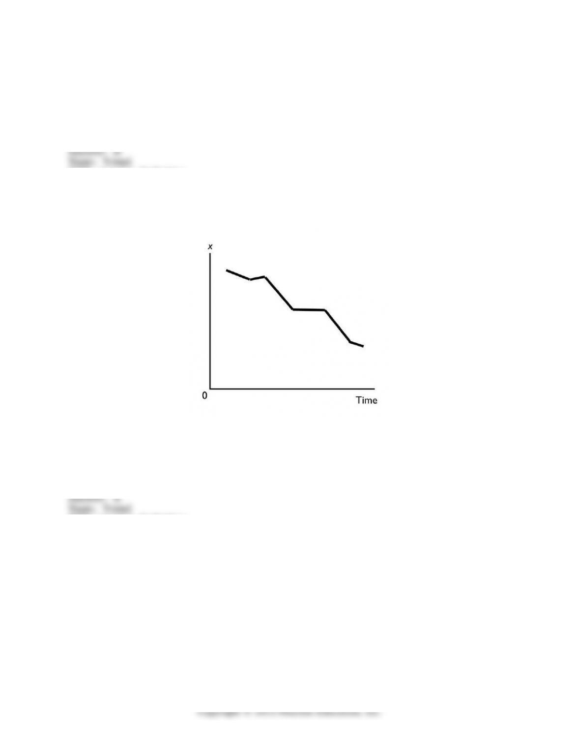
20) In the above igure, the diagram shows
A) a downward trend in x.
B) an upward trend in x.
C) a scatter diagram.
D) a two-variable scatter diagram.
E) a cross-section graph between x and time.
Skill: Level 1: Deinition
Section: Chapter 1 Appendix – Checkpoint 1
Status: Old
AACSB: Analytical thinking
55

21) A cross-section graph
A) is divided into diferent sections.
B) shows the values of an economic variable for diferent groups in a population at a point
in time.
C) measures time on the x-axis and the variable in which we are interested on the y-axis.
D) Both answers A and C are correct.
E) Both answers A and B are correct.
Skill: Level 1: Deinition
Section: Chapter 1 Appendix – Checkpoint 1
Status: Old
AACSB: Analytical thinking
22) A graph that shows the value of an economic variable for diferent groups in a
population at a given time is called a
A) scatter diagram.
B) time-series graph.
C) pie chart.
D) cross-section graph.
E) ixed-time diagram.
Skill: Level 1: Deinition
Section: Chapter 1 Appendix – Checkpoint 1
Status: Old
AACSB: Analytical thinking
23) A graph shows the average wage of various demographic groups in 2012. The kind of
graph used to show these data would be a
A) scatter diagram.
B) time-series graph.
C) cross-section graph.
D) Venn diagram.
E) ixed-year igure.
Skill: Level 3: Using models
Section: Chapter 1 Appendix – Checkpoint 1
Status: Old
AACSB: Analytical thinking
56
24) A graph showing the values of an economic variable for diferent groups in a population
at a point in time is called a
A) cross-section graph.
B) time-series graph.
C) scatter diagram.
D) Venn diagram.
E) None of the above answers is correct.
Skill: Level 1: Deinition
Section: Chapter 1 Appendix – Checkpoint 1
Status: Old
AACSB: Analytical thinking
25) ________ shows the values of a variable for diferent groups in the population at a
certain point in time.
A) A time-series graph
B) The origin
C) A cross-section graph
D) A scatter plot
E) A trend-line graph
Skill: Level 1: Deinition
Section: Chapter 1 Appendix – Checkpoint 1
Status: Old
AACSB: Analytical thinking
26) A cross-section graph
A) is divided into diferent sections.
B) shows values of an economic variable for diferent groups in a population at a point in
time.
C) measures time on the x-axis and the variable in which we are interested on the y-axis.
D) Both answers A and C are correct.
E) Both answers B and C are correct.
Skill: Level 1: Deinition
Section: Chapter 1 Appendix – Checkpoint 1
Status: Old
AACSB: Analytical thinking
57

27) You have data for the amount of rainfall in 50 cities for the month of June. The type of
graph to best display these data would be a
A) time-series graph.
B) multi-variable time series graph.
C) cross-section graph.
D) scatter diagram.
E) trend-line diagram.
Skill: Level 3: Using models
Section: Chapter 1 Appendix – Checkpoint 1
Status: Old
AACSB: Analytical thinking
28) You have data for sales of pizza for each of the 50 states in 2011. The type of graph to
best display these data would be a
A) cross-section graph.
B) time-series graph.
C) scatter diagram.
D) multi-variable time-series graph.
E) trend-line diagram.
Skill: Level 3: Using models
Section: Chapter 1 Appendix – Checkpoint 1
Status: Old
AACSB: Analytical thinking
29) A graph shows the average SAT scores for males and females in 2012. The kind of
graph used to show these data would be a
A) scatter diagram.
B) time-series graph.
C) cross-section graph.
D) time-stationary graph.
E) trend igure.
Skill: Level 3: Using models
Section: Chapter 1 Appendix – Checkpoint 1
Status: Old
AACSB: Analytical thinking
58
30) Demonstrating how an economic variable changes from one year to the next is best
illustrated by a
A) scatter diagram.
B) time-series graph.
C) linear graph.
D) cross-section graph.
E) Venn diagram.
Skill: Level 1: Deinition
Section: Chapter 1 Appendix – Checkpoint 1
Status: Old
AACSB: Analytical thinking
31) To show the values of an economic variable for diferent groups in a population at a
point in time, it is best to use a
A) scatter diagram.
B) time-series graph.
C) linear graph.
D) cross-section graph.
E) trend-section diagram.
Skill: Level 1: Deinition
Section: Chapter 1 Appendix – Checkpoint 1
Status: Old
AACSB: Analytical thinking
32) A graph that shows how the amount of advertising expenditure difers among various
industries can be shown
A) by a cross-section graph.
B) by a time-series graph.
C) as a trend.
D) by a scatter diagram.
E) by a trend-section graph.
Skill: Level 3: Using models
Section: Chapter 1 Appendix – Checkpoint 1
Status: Old
AACSB: Analytical thinking
59
33) A linear relationship
A) when graphed, is a straight line.
B) when graphed, is a line whose slope changes.
C) can be a positive or a negative relationship.
D) Both answers A and C are correct.
E) Both answers A and B are correct.
Skill: Level 1: Deinition
Section: Chapter 1 Appendix – Checkpoint 2
Status: Old
AACSB: Analytical thinking
34) A positive relationship exists between two variables if
A) one variable has “positively” no efect on the other variable.
B) a decrease in one variable is associated with an increase in the other variable.
C) a decrease in one variable is associated with a decrease in the other variable.
D) an increase in one variable is associated with both a decrease and an increase in the
other variable.
E) None of the above answers is correct.
Skill: Level 1: Deinition
Section: Chapter 1 Appendix – Checkpoint 2
Status: Old
AACSB: Analytical thinking
35) If two variables are positively related, then
A) one variable causes the other.
B) an increase in one variable is accompanied by a decrease in the other.
C) an increase in one variable is accompanied by an increase in the other.
D) they change together, but not necessarily in the same direction.
E) neither variable can be positively related to any other variable.
Skill: Level 1: Deinition
Section: Chapter 1 Appendix – Checkpoint 2
Status: Old
AACSB: Analytical thinking
60