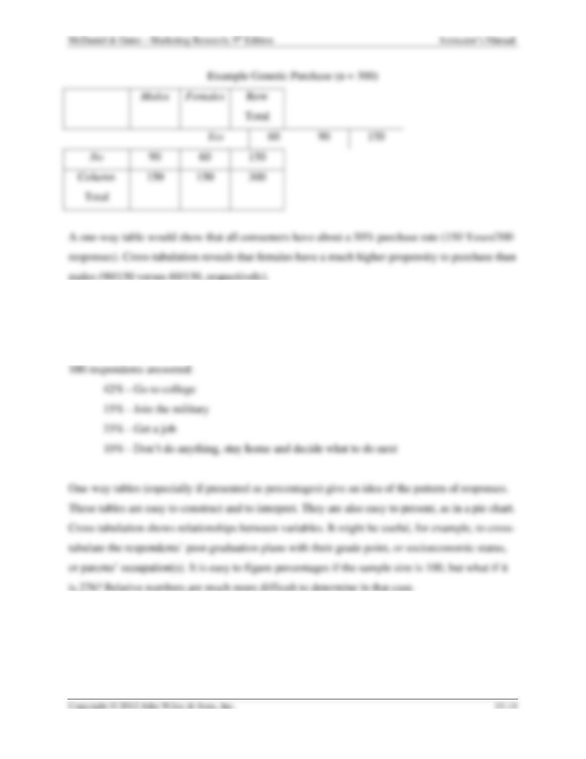
9. Illustrate the various alternatives for using percentages in one-way frequency tables.
Explain the logic of using one alternative method over another.
In response to the question, “What do you plan to do when you graduate from High School?”
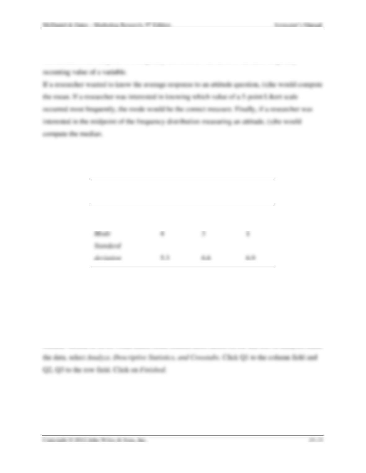
10. Explain the differences among the mean, median, and mode. Give an example in which
the researcher might be interested in each of these measures of central tendency.
Instructor’s Manual
The mean is the arithmetic average of a frequency distribution for interval and ratio scale data.
The median is the midpoint of a frequency distribution. The mode is the most frequently
11. Calculate the mean, median, mode, and standard deviation from the following data set
(p 511):
Whitehill
Mall
Northpark
Mall
Sampson
Mall
Mean
8.0
7.9
8.6
Median
7
7
8
Mode
4
3
1
5.3
6.6
6.9
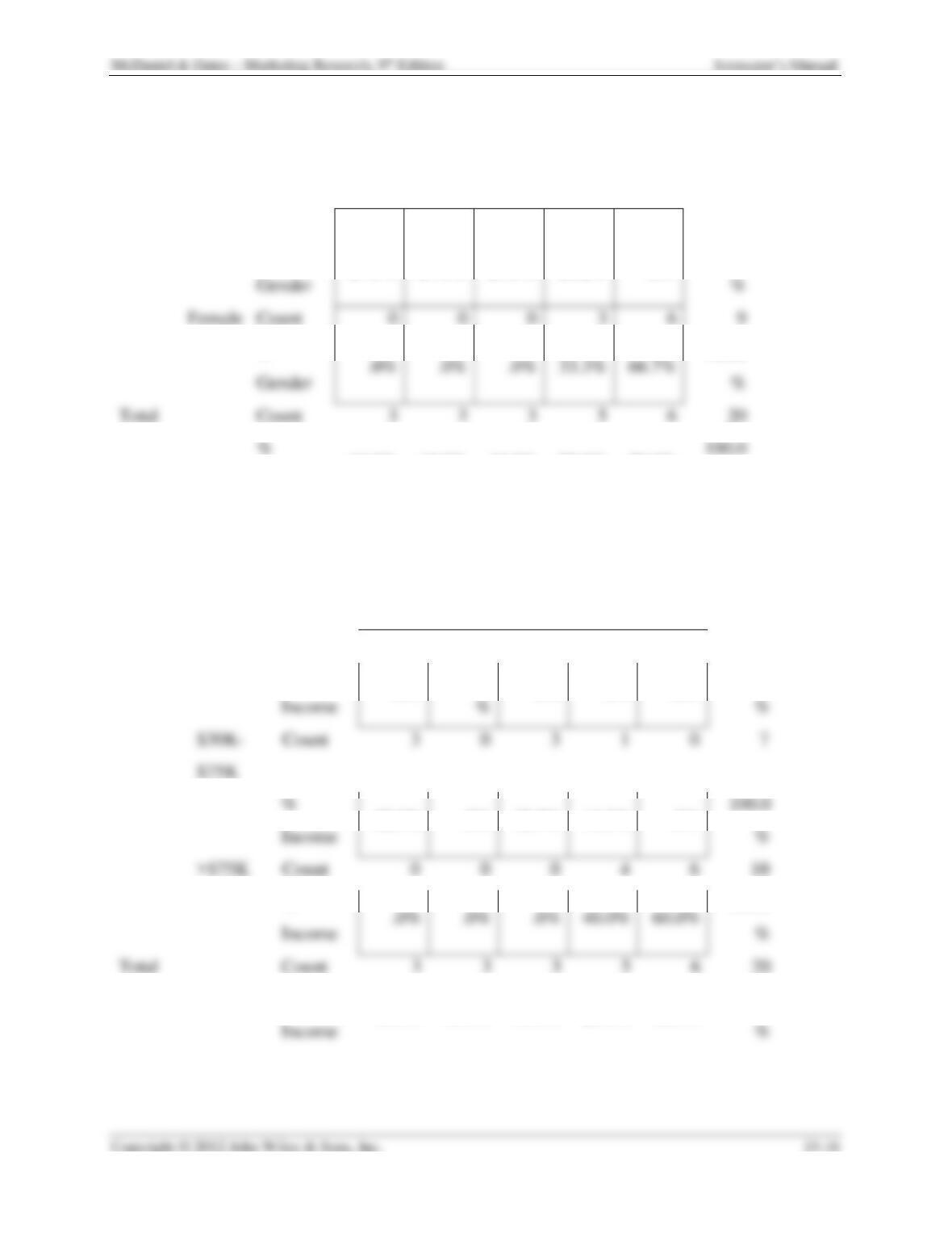
12. Enter the following data into an Excel spreadsheet. Include the column headings (Q1,
Q2, and Q3), as well as the numeric values. The definitions of the numeric values are
provided at the bottom of the table. Use the Pivot Table feature in Excel (found under the
Data option) to cross-tabulate the likelihood of purchase (row) by gender (column) and
income level (column). What conclusions can you draw about the relationship between
gender and likelihood of purchase and that between income and likelihood of purchase?
Student version of SPSS works much better (easier, more intuitive) for this sort of analysis, Enter
Instructor’s Manual
Likelihood of Purchase
Total
1.00
2.00
3.00
4.00
5.00
1.00
Gender
Male
Count
3
3
3
2
0
11
%
Gender
%
Female
Count
0
0
0
3
6
9
27.3%
27.3%
27.3%
18.2%
.0%
100.0
%
Gender
.0%
.0%
.0%
33.3%
66.7%
%
Total
Count
3
3
3
5
6
20
100.0
%
100.0
Gender
15.0%
15.0%
15.0%
25.0%
30.0%
%
Likelihood of Purchase
Total
1.00
2.00
3.00
4.00
5.00
1.00
Income
<$30K
Count
0
3
0
0
0
3
%
Income
%
%
.0%
100.0
.0%
.0%
.0%
100.0
%
100.0
Income
%
42.9%
.0%
42.9%
14.3%
.0%
%
Income
.0%
.0%
.0%
40.0%
60.0%
%
Total
Count
3
3
3
5
6
20
100.0
%
15.0%
15.0%
15.0%
25.0%
30.0%
100.0

13. Using data from a newspaper or magazine article, create the following types of graphs:
Line graph, Pie chart, Bar chart
Responses will vary.
WORKING THE NET
1. Microsoft Office Online offers data graphics software called Microsoft Office Visio 2007
enabling users to construct their own data graphic, adjust color shapes to fit the data, and
customize data format; try out the downloadable demonstration offered at:
http://office.microsoft.com/en-us/visio/HA101829791033.aspx
Experiences will vary.
2. To stay updated on the newest software and algorithms for statistical uses, visit the Web
site of the Journal of Statistical Software at: www.jstatsoft.org
Experiences will vary.
REAL-LIFE RESEARCH
Case 15.1 – PrimeCare (p 464-465)
Key Points:
• PrimeCare, a group of emergency medical care clinics, wants to boost awareness of their
services.
Questions
1. Which theme appears to have more appeal overall? Justify your answer.
2. How does the appeal of the campaign differ between men and women? What is your
basis for that conclusion?
3. Are the campaign themes equally attractive to residents of Columbus and Toledo? Why
do you say that?
Case 15.2 – Tico Taco (p 465)
Key Points:
Tico Taco has recently opened its 17th store in Wyoming. Currently, the chain offers tacos,
fajitas, and burritos. Management is considering offering a super taco that would be two times as
Questions
1. How would you code the following responses?
a. I usually add a green, avocado-tasting hot sauce.
b. I cut up a mixture of lettuce and spinach.
c. I’m a vegetarian; I don’t use meat at all. My taco is filled only with guacamole.
d. Every now and then I use a little lettuce, but normally I like cilantro.
Students can complete this exercise in class.
2. Is there anything wrong with having a great number of responses in the “Other”
category? What problem does this present for the researcher?
Yes. This indicates that there are many more choices that need their own codes.
SPSS EXERCISE FOR CHAPTER 14
1. Go to the Wiley Web site at www.wiley.com/college/mcdaniel and download the
Segmenting the College Student Market for Movie Attendance database to SPSS Windows.
This database will have several errors for you to correct. In the SPSS Data Editor, go to the
variable view option and notice the computer coding for each variable.
2. Also from the Wiley Web site, download a copy of the Segmenting the College Student
Market for Movie Attendance questionnaire. Notice the computer coding for each of the
variables, which is the same as that in the variable view option on the SPSS Data Editor.
This information will be important in finding errors in the database.
3. In the SPSS Data Editor, invoke the analyze/descriptive statistics/frequencies sequence to
obtain frequencies for all of the variables in the database.
4. From the SPSS Viewer output screen, determine which variables have input errors.
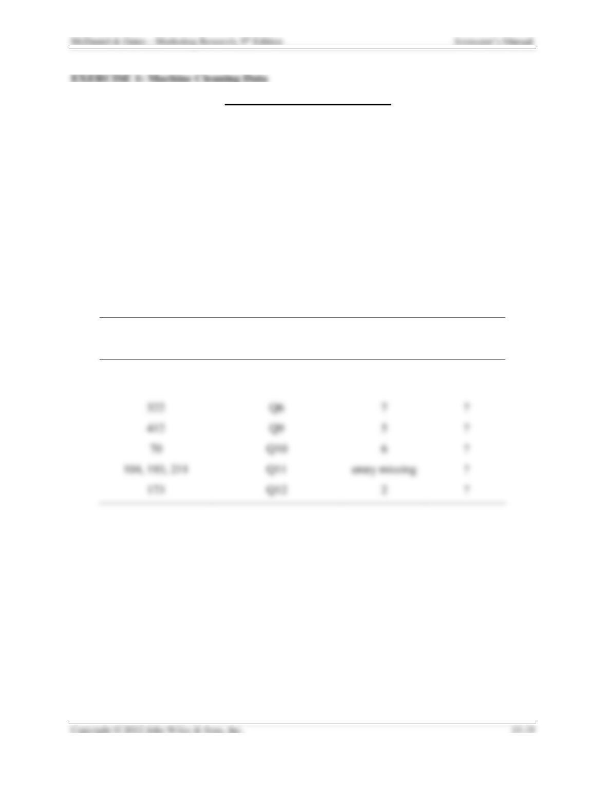
Summarize the errors using the template below as a guide.
Questionnaire
Number
Variable Containing
Error
Incorrect
Value
Correct Value
82
Q1
2
1
377
Q5f
7
?
412
Q9
5
?
70
6
?
?
173
2
?
Go back to the data view screen of the SPSS Data Editor:
5. Another possible source of errors is in question 8. Notice that in this question the sum of
the answers should be 100 percent. Create a summated variable for question 8 (Q8a + Q8b
+ Q8c + Q8d) to check for errors invoking the transform/compute sequence. Now compute a
frequency distribution for Q8sum. The values that are not “100″ indicate an input error.
(Such an error could be the result of the respondent not totaling percentages to 100, but for
this machine cleaning exercise, the assumption is that it is an input error). Summarize the
errors using the template above.
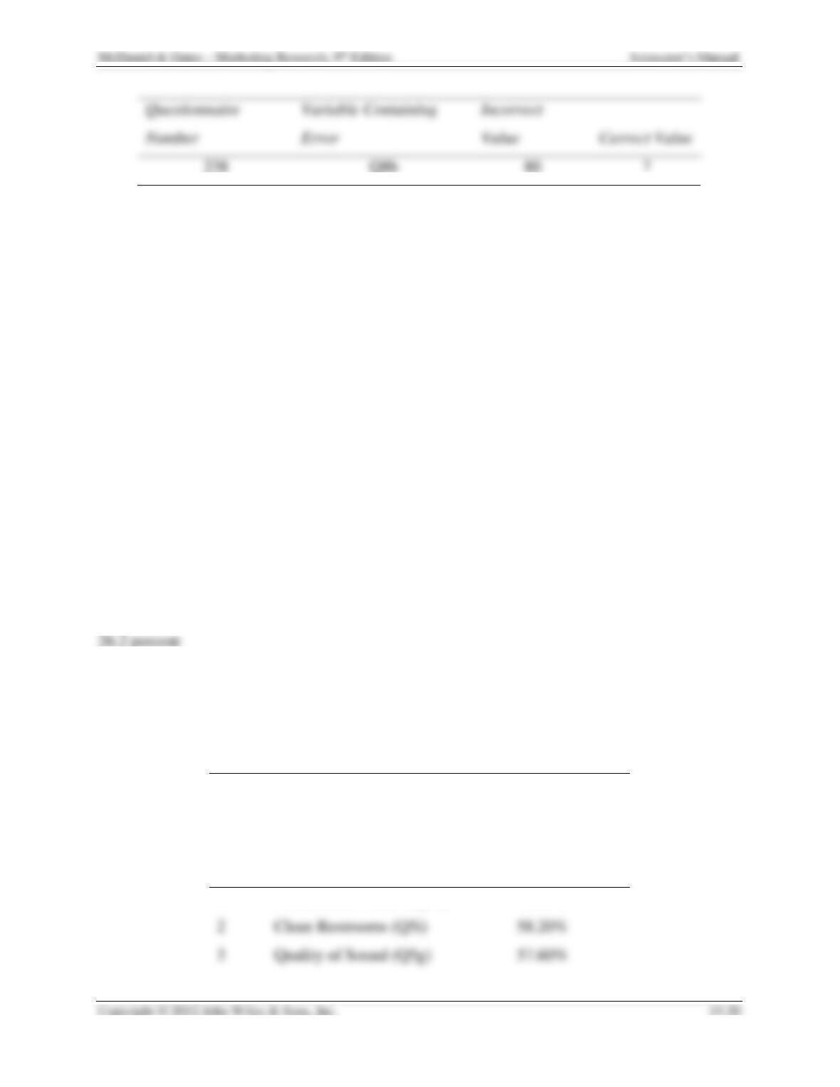
6. Once you have completed summarizing the variables containing errors, go back to the
data view screen of the SPSS Data Editor. Position the cursor on each of the variables
containing errors. Use the ctrl-f function to find the questionnaire numbers where the
errors occurred. At this point, you will need the corrected or the database with no errors.
Your professor has access to this database with no errors. After getting the corrected
database, finish filling in the table in (4) above with the correct values. Then make the
changes in your database, so that you have a database with no errors. Be sure to resave
your database after correcting it for errors.
7. After machine cleaning your data, rerun the analyze/descriptive statistics/frequencies
sequence to obtain frequencies for your corrected database.
8. You will use the results of this exercise to answer the questions in Exercises 2 and 4.
EXERCISE 2: Analysis of Data with Frequency Distributions
1. What percentage of all respondents attended at least 1 movie in the past year?
90.0 percent
2. What percentage of all respondents never buy food items at a movie?
3. Produce a table indicating the percentage of all respondents that consider each of the
movie theater items in question 5 of the questionnaire very important. List the top 5 movie
items in descending order (start with the movie items that have the highest percentage of
the very important responses).
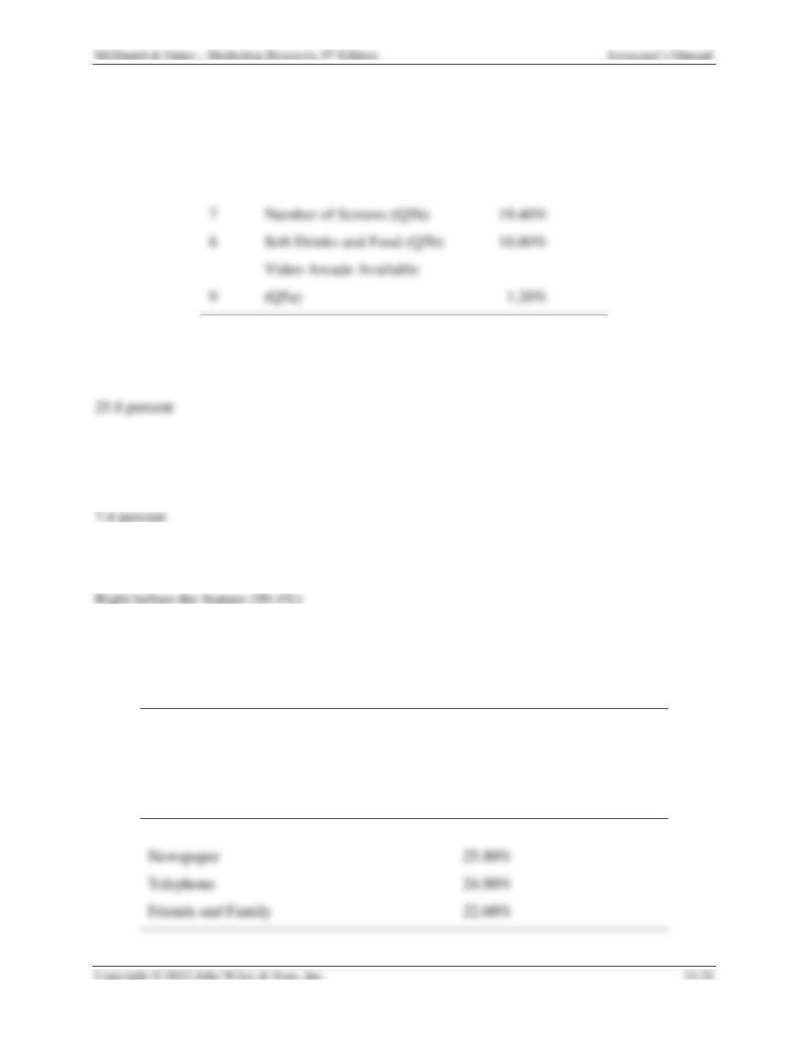
Most Important Movie Theater Selection Factors
Rank
Selection Factor
Percentage
favoring
1
Comfortable Chairs (Q5d)
63.00%
2
Clean Restrooms (Q5i)
58.20%
Instructor’s Manual
4
Size of Screen (Q5f)
50.20%
5
Auditorium Type Seating
(Q5e)
46.60%
6
Plentiful Restrooms (Q5c)
30.20%
7
Number of Screens (Q5h)
19.40%
8
Soft Drinks and Food (Q5b)
10.80%
9
Video Arcade Available
(Q5a)
4. What percentage of respondents consider the “newspaper” a very important source of
information about movies playing at movie theaters?
5. What percentage of respondents considers the “Internet” a very unimportant source of
information about movies playing at movie theaters?
6. By observing the distribution of responses for Q8a, Q8b, Q8c, and Q8d, which is the
most popular purchase option for movie theater tickets?
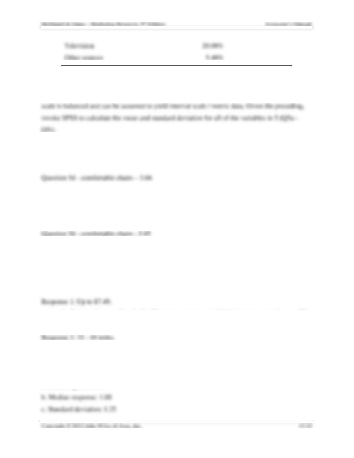
7. Produce a table listing in descending order the percentage of respondents that consider
each of the movie theater information sources (Q7) very important?
Most Popular Sources for Movie Theater Information
Movie theater information
source
Percent of Respondents Indicating Very
Important
Internet
44.40%
Newspaper
25.80%
Telephone
24.80%
EXERCISE 3: Analysis of Data with Descriptive Statistics
On the questionnaire, question 5 utilizes a 4-point Itemized Rating scale (illustrated below). This
1. Using only the mean for each of the variables, which of the movie theater items was
considered “most important”?
2. Using only the standard deviation for each of the variables, for which question was there
the greatest amount of agreement? Hint: Least amount of dispersion regarding the
response to the movie item.
3. Questions 4 and 6 utilize multiple-choice questions that yield nonmetric data but that are
ordinal scale. The appropriate measure of central tendency for nonmetric data are the
median and the mode.
a. What is the median response for question 4, concerning the amount a person
spends on food / drink items at a movie?
b. Concerning question 6, the distance a person would drive to see a movie on a “big
screen,” what is the mode of that distribution of responses?
4. In this question, the objective will be to compare the results of median and mean
responses for Q3.
a. Mean response: 1.58
5. When the responses to a question contain extreme values, the mean response can lie in
the upper or lower quartile of the response distribution. In such a case, the median value
would be a better indicator of an average response than the mean value. Given the
information you obtained from answering #4 above, is the mean or median a better
representative of the “average” response to Q3?
With a range of 0 to 12, the median (1.00) would seem to be a better measure as it is less
EXERCISE 4: Analysis of Demographic Characteristics Using Charts
If you completed Exercise #1 and/or Exercise #2 you will have the information to complete this
1. Display the demographic data for each of the four demographic variables in tables.
Ethnic Background
Frequenc
y
Percent
Valid
Percent
Cumulative
Percent
Valid
African-
American
73
14.6
14.7
14.7
Caucasian
380
76.0
76.5
91.1
Hispanic
92.6
Other
Total
497
99.4
Instructor’s Manual
Total
500
100.0
Gender
Frequenc
y
Percent
Valid
Percent
Cumulative
Percent
Valid
Male
227
45.4
45.4
45.4
Female
272
54.4
54.4
99.8
2
Total
500
100.0
Classification
Frequenc
y
Percent
Valid
Percent
Cumulative
Percent
Valid
Freshman
71
14.2
14.2
14.2
Sophomore
86
17.2
17.2
31.4
Junior
128
25.6
25.6
57.0
Senior
153
30.6
30.6
87.6
Student
Total
500
100.0
Age
Frequenc
y
Percent
Valid
Percent
Cumulative
Percent
Valid
0 to 18
50
10.0
10.0
10.0
19-20
113
22.6
22.6
32.6
21-23
210
42.0
42.0
74.6
24-26
46
9.2
9.2
83.8
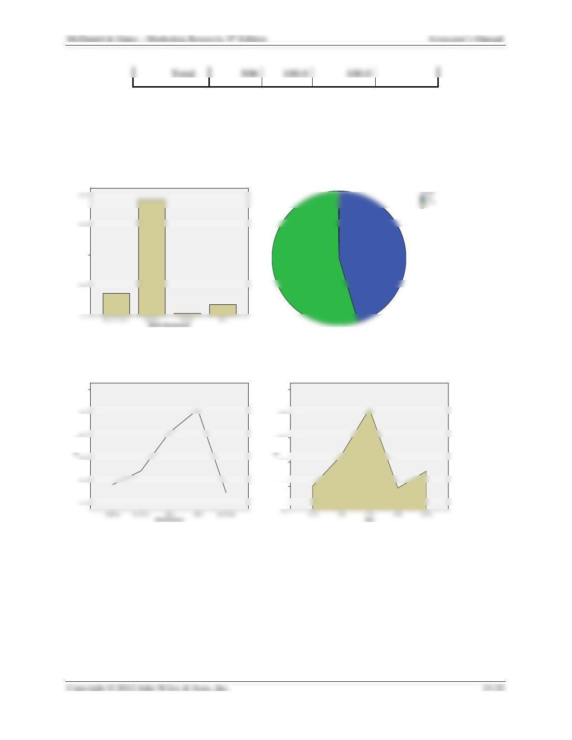
2. For each of the demographic variables, illustrate the table results using some type of
graphic representation of the data (pie charts, line charts, or bar charts).
Responses will vary. SPSS, Excel, Quattro Pro, and some word processing packages can
accomplish the task.
Percent
40.0%
35.0%
50.0%
40.0%
30.0%
20.0%
10.0%