
ANSWERS TO CASE QUESTIONS
QUALITY CONTROL IN CANDY MANUFACTURING
Develop a set of measurements that a candy manufacturer might use to monitor and
control their processes in order to meet FDA regulations.
Students should use the guidelines in the tables to propose key quality measures for control. For
example, routine audits of the workplace might measure the following attributes associated with
these guidelines:
• Wearing outer garments suitable to the operation in a manner that protects against the
contamination of food, food-contact surfaces, or food-packaging materials. (conforming or
nonconforming)
Other measures might be based on the following guidelines:
• Egg and milk products must be pasteurized before use or otherwise treated during
For cocoa processing:
Determine in detail the firm’s cocoa bean processing to include:
• Pre-cleaning – Use of magnets to remove metal. (% removal – should be 100%)
• Blending – Determine percent of different beans in blend. (percent)
• Roasting – Time temperature relationship. Determine if ovens have recording
Chapter 8 – Measuring and Controlling Quality
KIRKLAND HOSPITAL
See the Kirkland Hospital Excel file in the Ch 08 – Case Solution Files folder
1. Using the data in Table 8.8, what is the average percentage of infections?
2. Construct an appropriate control chart, compute the upper and lower control limits, plot
the data on a control chart, and determine if the process is in statistical control. Based on
your analysis, what action, if any, should management take?
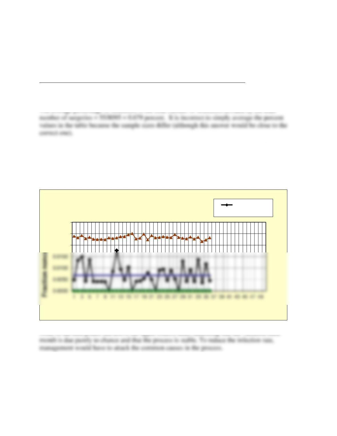
A p-chart with variable sample size is the correct chart to use.
None of the data points fall above the upper control limit, indicating that the variation each
3. What TFE should management use to monitor future data?
0.0200
0.0250
0.0300
Sample number
Kirkland Hospital
Attribute (p) Chart Fraction
nonconforming
Chapter 8 – Measuring and Controlling Quality
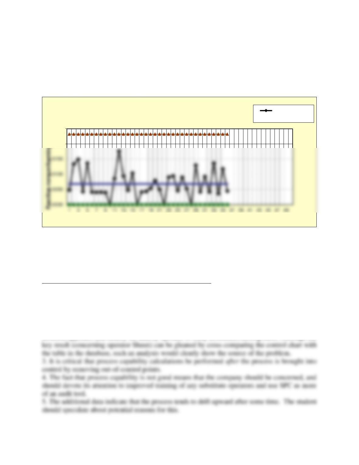
The upper control limit using the average sample size calculation is computed to be 2.32 percent.
The upper control limit would be a logical TFE to use, because any value beyond this limit is
unlikely to occur by chance.
MORELIA MORTGAGE COMPANY
See the Excel files in the Ch 08 – Case Solution Files folder
1. The student should be able to apply the formulas from this chapter to construct an x-bar and R-
chart and to determine the state of control, remove out–of-control points, and compute new control
limits.
2. A key aspect of the case is to recognize potential differences among operators. This is going
beyond the computations and using the data for diagnosis. The astute student might even take a
different approach and stratify the data by operator to study differences among them. Although the
0.0200
0.0250
Sample number
Kirkland Hospital
Attribute (p) Chart (approx. limits)
Fraction
nonconforming
Chapter 8 – Measuring and Controlling Quality
1. Interpret the data available in the C08 Case Data workbook, establish a state of statistical
control, and evaluate the capability of the process to meet specifications. Consider the
following questions: What do the initial control charts tell you? Do any out-of-control
conditions exist? If the process is not in control, what might be the likely causes, based on
the information that is available? What is the process capability? What do the process
capability indexes tell the company? Is MMC facing a serious problem that it needs to
address? How might the company eliminate the problems of slow loan processing?
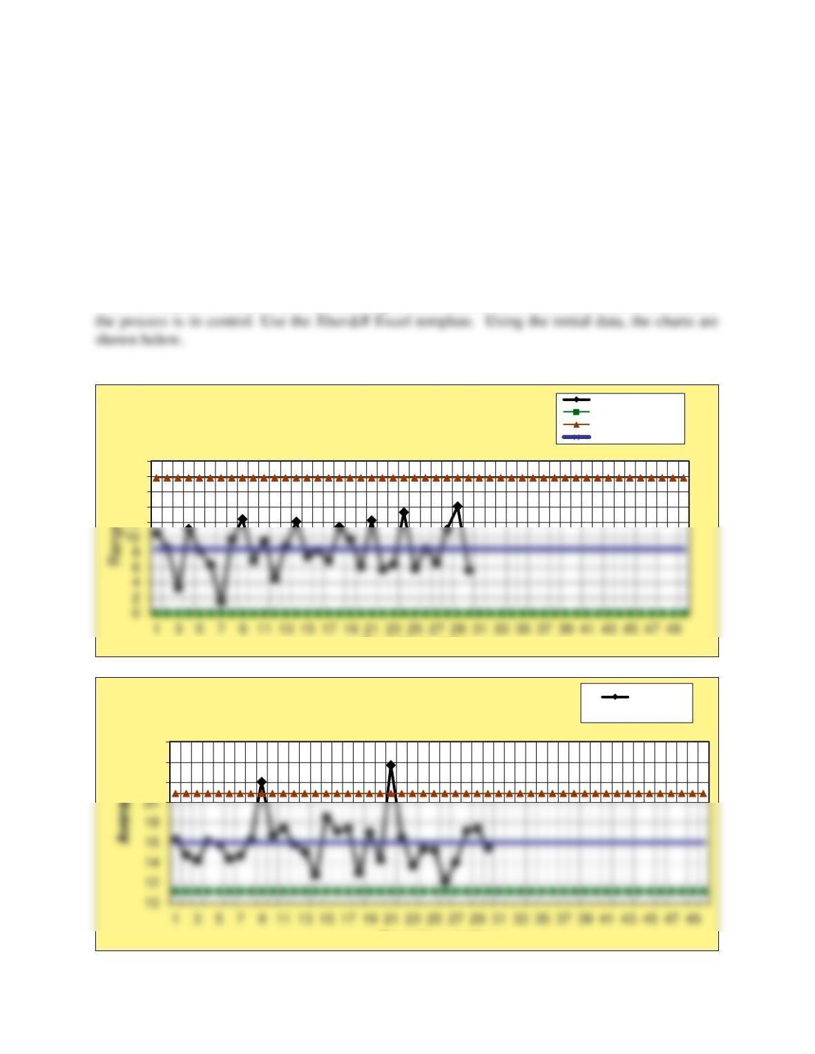
Since the data are variables data, the first step is to construct x-bar and R-charts and determine if
12
14
16
18
20
Sample number
MMC– R-Chart
Ranges
Lower control limit
Upper control limit
Center line
22
24
26
Sample number
MMC– X-bar Chart Averages
Chapter 8 – Measuring and Controlling Quality
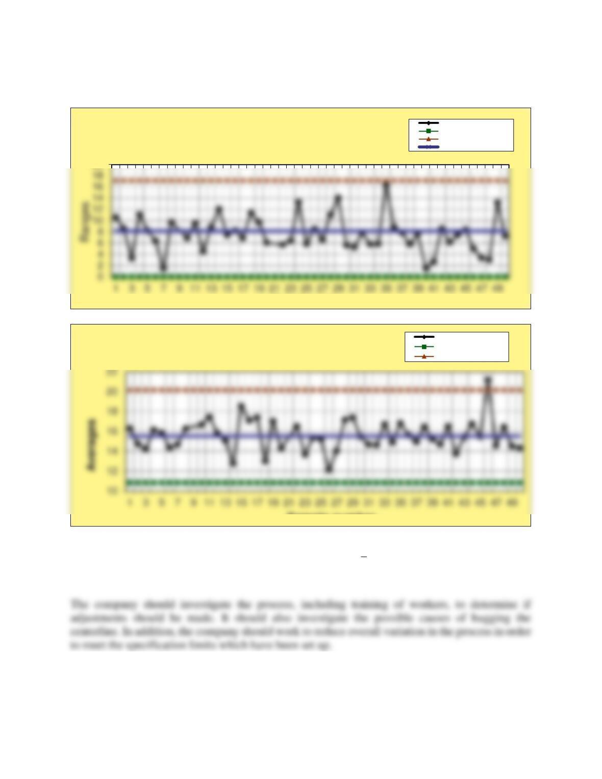
The range chart does not have any obvious out of control points. However, the
x
– chart has two
points above the upper control limit, point 9 and point 21. Inspecting the production records, we
see that when each of these samples were taken, a different mortgage analyst, Shaun was
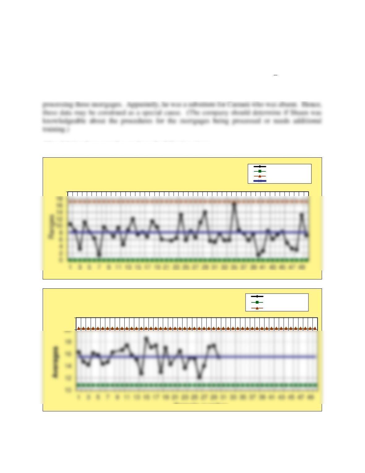
After deleting these samples, we have the following charts.
20
Sample number
Revised R-Chart
Ranges
Lower control limit
Upper control limit
Center line
22
Sample number
Revised X-bar Chart
Averages
Lower control limit
Upper control limit
Chapter 8 – Measuring and Controlling Quality
The process now appears to be in control.
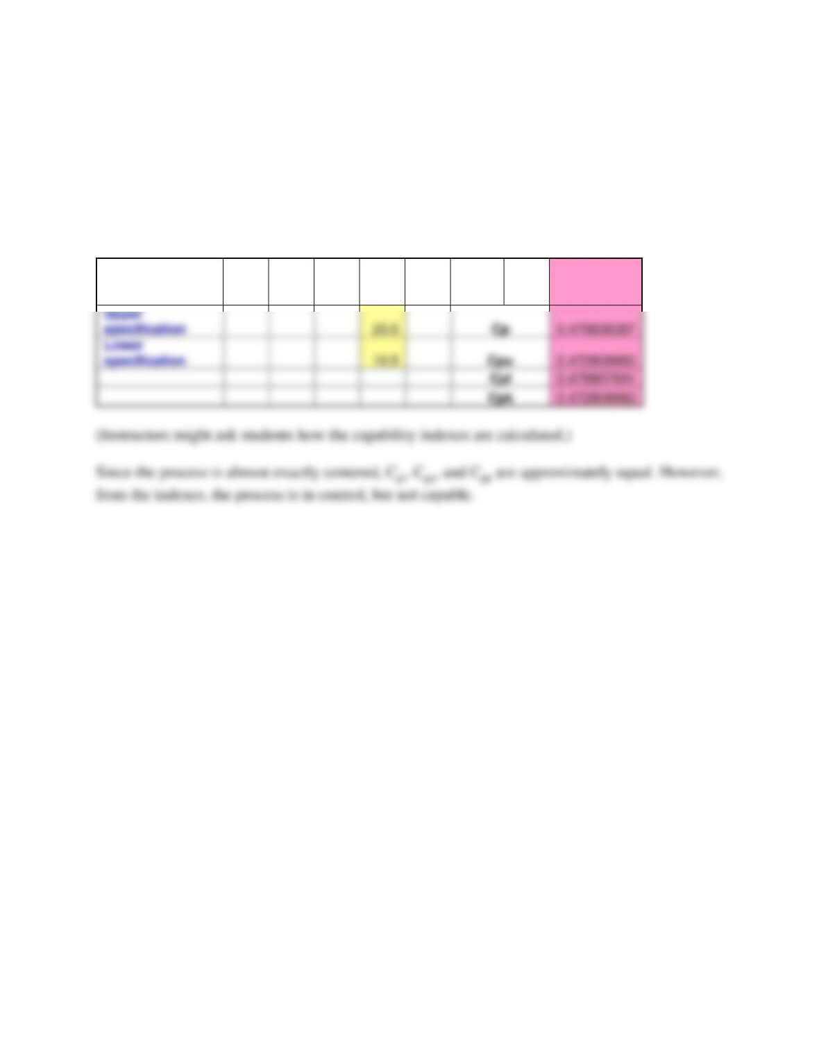
Process capability may now be evaluated.
Process
Capability
Calculations
Six
sigma
21.01553863
2. The process manager who initiated the trial project implemented the recommendations
that resulted from the initial study. Because of her success in using control charts, MMC
made a decision to continue using them on that process. After establishing control, one
additional sample was taken over the next 20 shifts, shown in second part of the table in the
MMC Case worksheet. Evaluate whether the process remains in control, and suggest any
actions that should be taken. Consider the following issues: Does any evidence suggest that
the process has changed relative to the established control limits? If any out-of-control
patterns are suspected, what might be the cause? What should the company investigate?
The additional 20 samples must be plotted using established control limits. It is incorrect to use
the additional data to find new control limits as control was already established.
0.475838387
0.472808882
0.478867891
0.472808882
Chapter 8 – Measuring and Controlling Quality
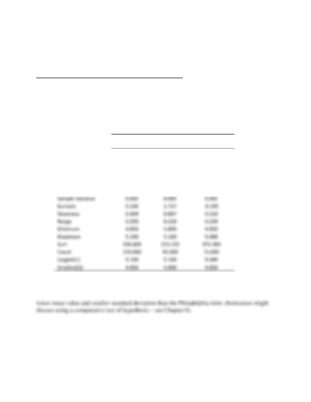
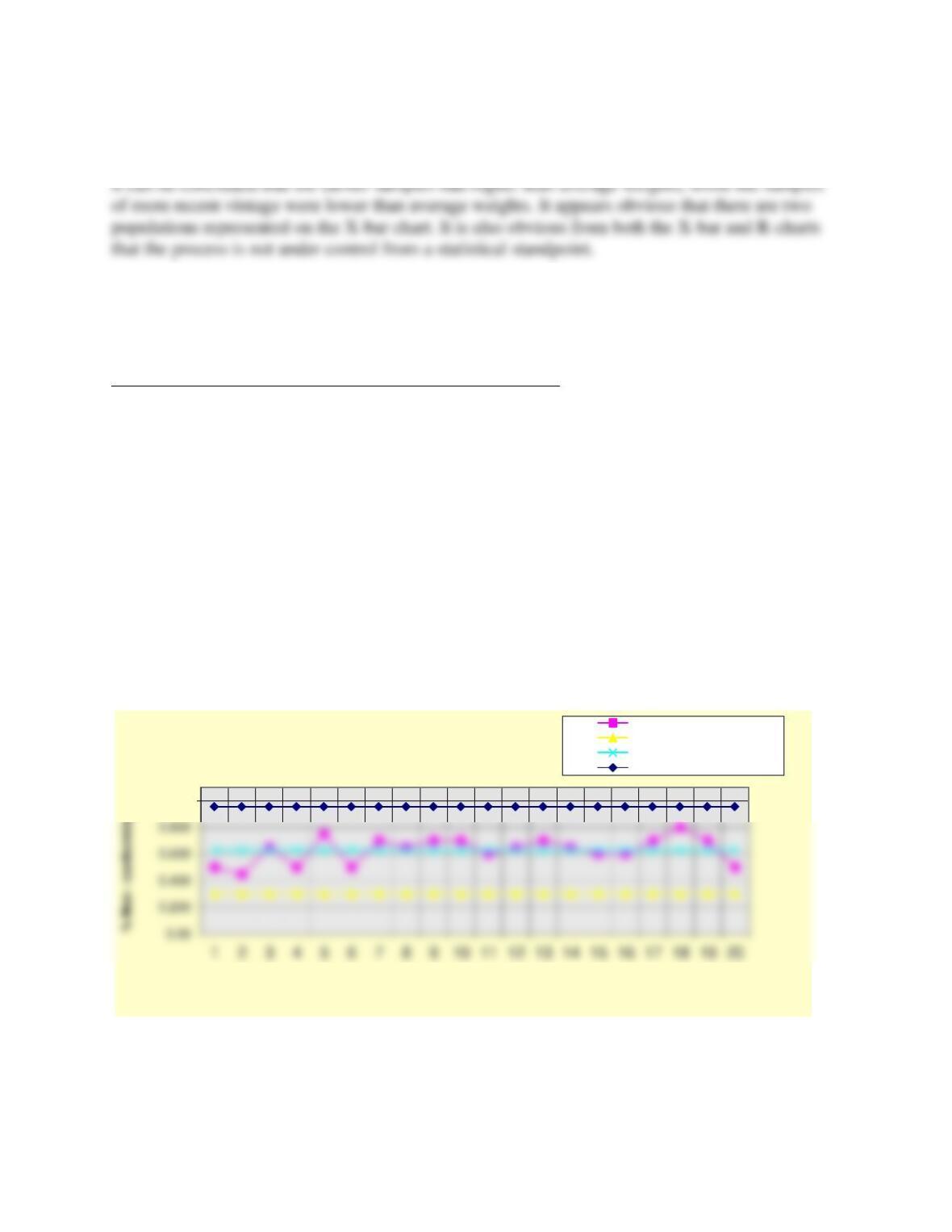
The R-chart is in control. Sample 46 is out of control on the
x
– chart. In addition, it appears that
the new values are “hugging” the centerline, except for sample 46.
20
Sample number
R-Chart with additional data
Ranges
Lower control limit
Upper control limit
Center line
Sample number
X-bar Chart with additional data
Averages
Lower control limit
Upper control limit
Chapter 8 – Measuring and Controlling Quality
The Nickel Experiment
See the Excel files in the Ch 08 – Case Solution Files folder
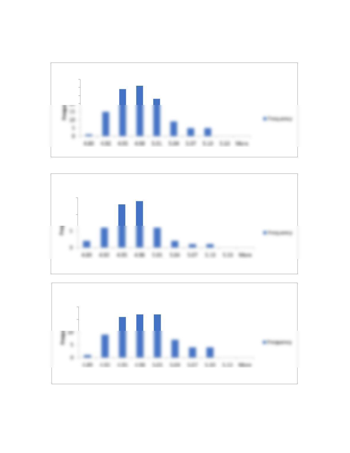
1. Compute descriptive statistics and a frequency distribution and histogram for the weight
of the overall sample and by the mint where the nickels were produced. Are there any
significant differences by mint?
Descriptive
Statistics
Total Sample
Denver Mint
Philadelphia
Mint
Mean
4.972
4.960
4.978
Standard Error
0.004
0.006
0.006
Median
4.970
4.960
4.980
Mode
4.940
4.960
5.000
Standard Deviation
0.047
0.043
0.049
The descriptive statistics show that there are 1.67 times as many nickels from the Philadelphia
mint versus the Denver mint (75 versus 45). The Denver mint sample appears to have a slightly
Sample Variance
0.002
0.002
0.002
Kurtosis
0.106
1.717
Skewness
0.439
0.867
0.210
Range
0.250
0.210
0.230
Minimum
4.850
4.890
4.850
Maximum
5.100
5.100
5.080
596.600
Count
120.000
Largest(1)
5.100
5.100
5.080
Smallest(1)
4.850
4.890
4.850
Chapter 8 – Measuring and Controlling Quality
25
30
35
Bin
Histogram – Total Sample
10
15
Bin
Denver – Histogram
15
20
Bin
Philadelphia – Histogram
Chapter 8 – Measuring and Controlling Quality Quality 10
2. Using the government specifications, compute process capability indexes. How might the
wear of circulated coins influence these indexes? Compare the process capability indexes of
older coins with more recent ones using your judgment to stratify the sample.
Process Capability Index Calculations (ALL
COINS)
Average
4.9717
Standard deviation
0.0472
Process Capability Index Calculations
(OLDER COINS)
Average
4.988
Standard deviation
0.056
Cp
1.147
Cpl
1.078
Cpu
1.215
Cpk
1.078
Process Capability Index Calculations
(NEWER COINS)
Average
4.957
Standard deviation
0.031
Cp
2.083
Cpl
1.621
Cpu
2.544
Cpk
1.621
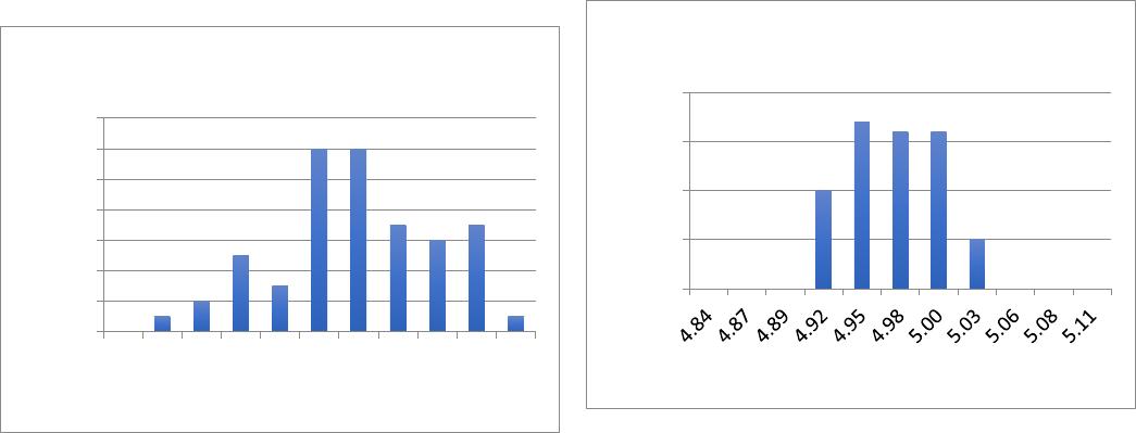
Some of the analysis was counterintuitive. It might be thought that the wear of circulated coins
would influence the average weight and the capability indexes, specifically for the older coins.
The data showed that the older coins were closer to the nominal weight than the newer coins
Cp
Cpl
Cpu
Cpk
Chapter 8 – Measuring and Controlling Quality
(4.988 g.-older vs. 4.957 g.-newer coins). However, their standard deviations were in the
expected direction, with the older coins showing more variation than the newer ones (0.056 g.
older vs. 0.031 g. – newer). The process capability indexes of older coins were lower than those
of the more recent ones, although both were in the acceptable capability ranges, in relation to the
standards. Side-by-side comparison of the histograms for the older and newer coins provide
striking evidence of the capability of the newer coins’ production process to adhere to standards.
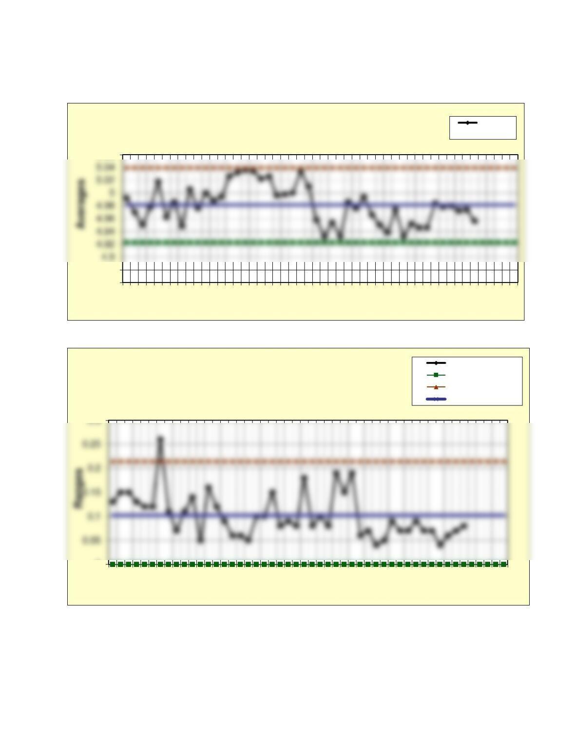
3. The worksheet Data Set 2 provides an additional sample of five nickels from 1964
through 2013 (insufficient data were available for the year 2009 and for the years 1967 to
1969, which were grouped). Construct x-bar and R-charts using these samples. What can
you conclude?
0
2
4
6
8
10
12
14
4.844.874.894.924.954.985.005.035.065.085.11
Frequency
Cell Upper Limit
Histogram – Older Coins
0
5
10
15
20
Frequency
Cell Upper Limit
Histogram – Newer Coins
Chapter 8 – Measuring and Controlling Quality
4.86
4.88
5.06
1357911 13 15 17 19 21 23 25 27 29 31 33 35 37 39 41 43 45 47 49
Sample number
Nickel Experiment Samples by Year X-bar Chart Averages
0
1357911 13 15 17 19 21 23 25 27 29 31 33 35 37 39 41 43 45 47 49
Sample number
Nickel Experiment Samples by Year R-Chart
Ranges
Lower control limit
Upper control limit
Center line
Chapter 8 – Measuring and Controlling Quality Quality 13
MONTVALLEY SHORT-HAUL LINES, INC.
See the Excel files in the Ch 08 – Case Solution Files folder
The Billing Study – Part I
1. At this point, MSL is unsure of how to interpret these results. You have been hired as a
consultant by the executive committee to analyze these data and provide additional
recommendations for integrating SPC concepts into MSL’ s quality system. Using the results
from the base case data, determine the performance, that is, the process capability, in a
qualitative and quantitative sense, of the billing input. What is the average rate of defective
bills? Is the process in control? What error rates might the company expect in the future? What
general conclusions do you reach?
The first assignment requires the construction of a p-chart, since we are interested in the proportion
of nonconforming bills.
1.00
Sample number
Attribute (p) Chart p Values
Lower Control Limit
Center Line
Upper Control Limit
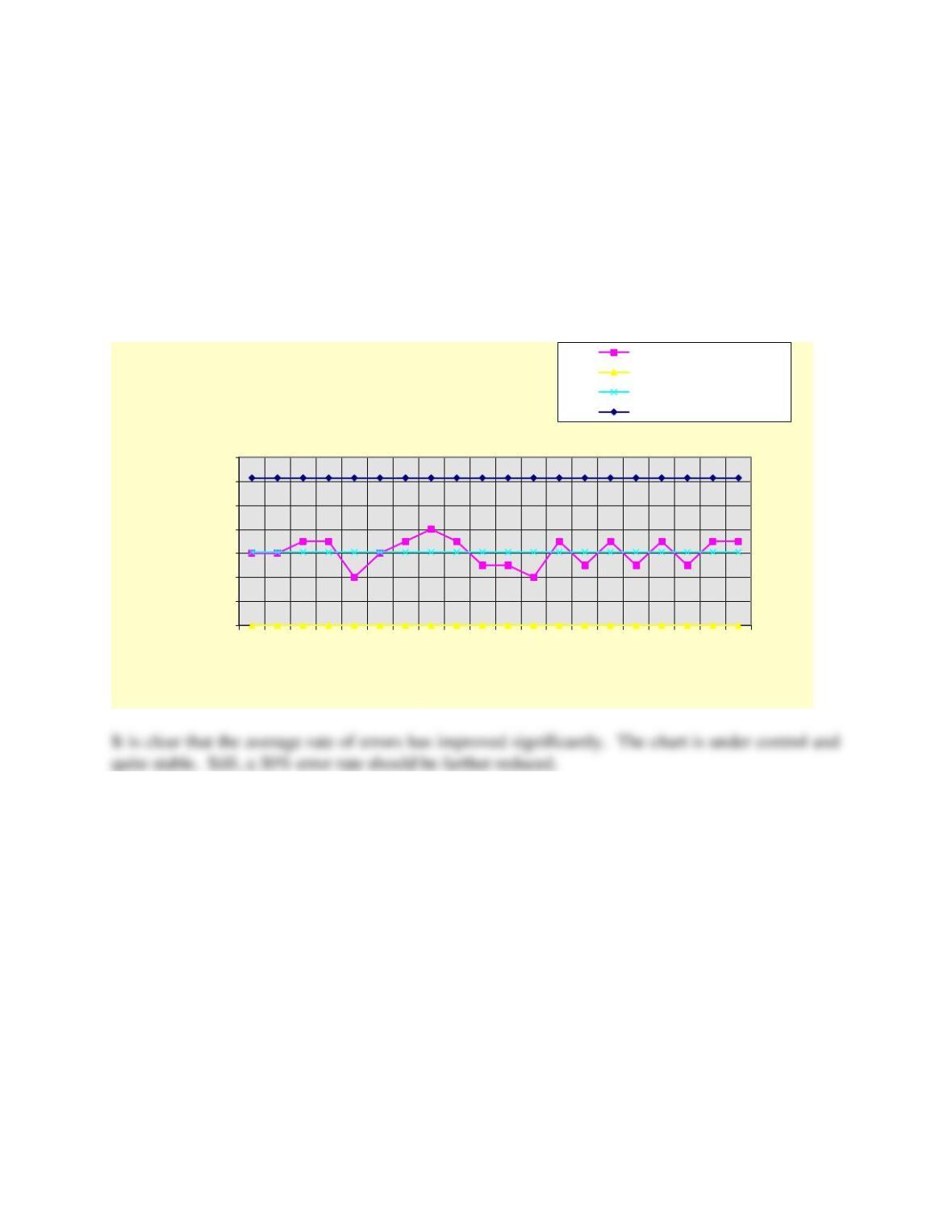
The process appears to be under control, despite the high rate of errors. An error rate of 63 percent is
clearly unacceptable. The capability of the process is specified by the control limits, since they are 3
Chapter 8 – Measuring and Controlling Quality
standard deviations on either side of the average. This can be interpreted to mean that error rates only
as low as 31 percent and as high as 95 percent might be reasonably expected.
The Billing Study – Part I After Process Improvement
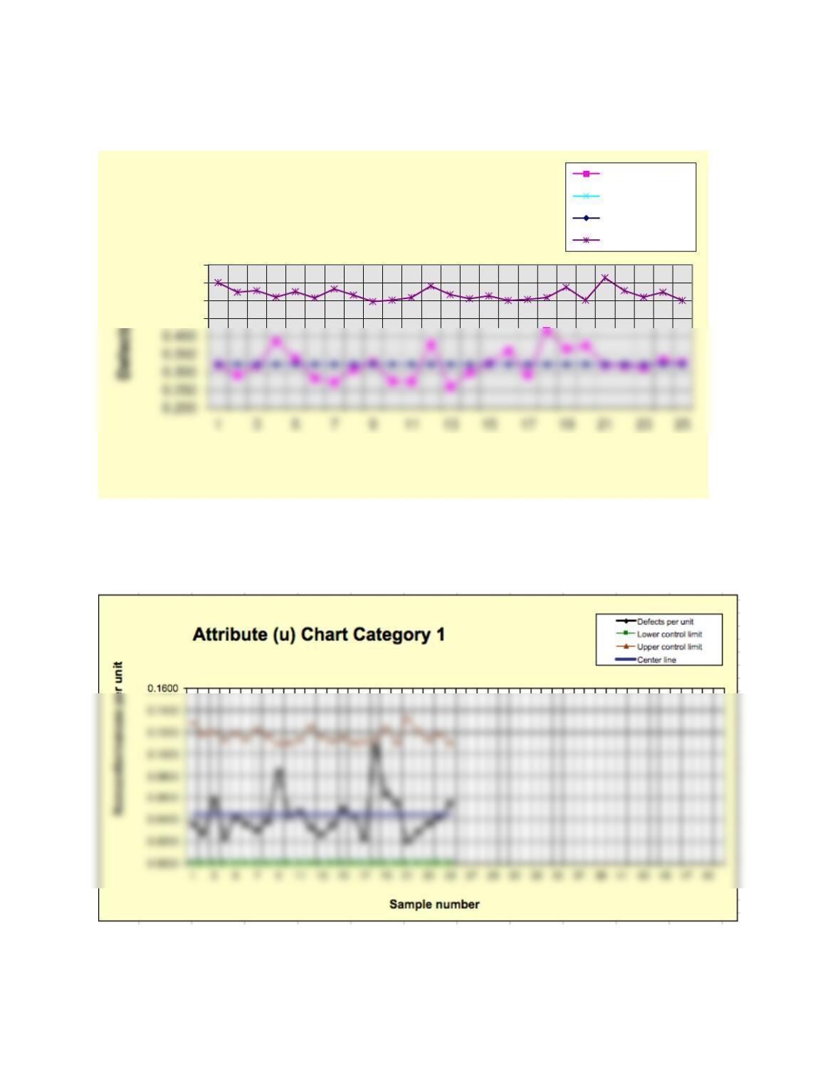
2. Perform the same statistical analysis with the revised data after improvements were made.
How do the results differ?
The Billing Study – Part II
3. Construct u-charts for the number of total errors/bill and for the number of errors/bill for
each error category. What conclusions can you reach? What are the next steps that
management should take?
0.00
0.100
0.200
0.300
0.400
0.500
0.600
0.700
12345678910 11 12 13 14 15 16 17 18 19 20
% Non – conforming
Sample number
Attribute (p) Chart
p Values
Lower Control Limit
Center Line
Upper Control Limit
Chapter 8 – Measuring and Controlling Quality
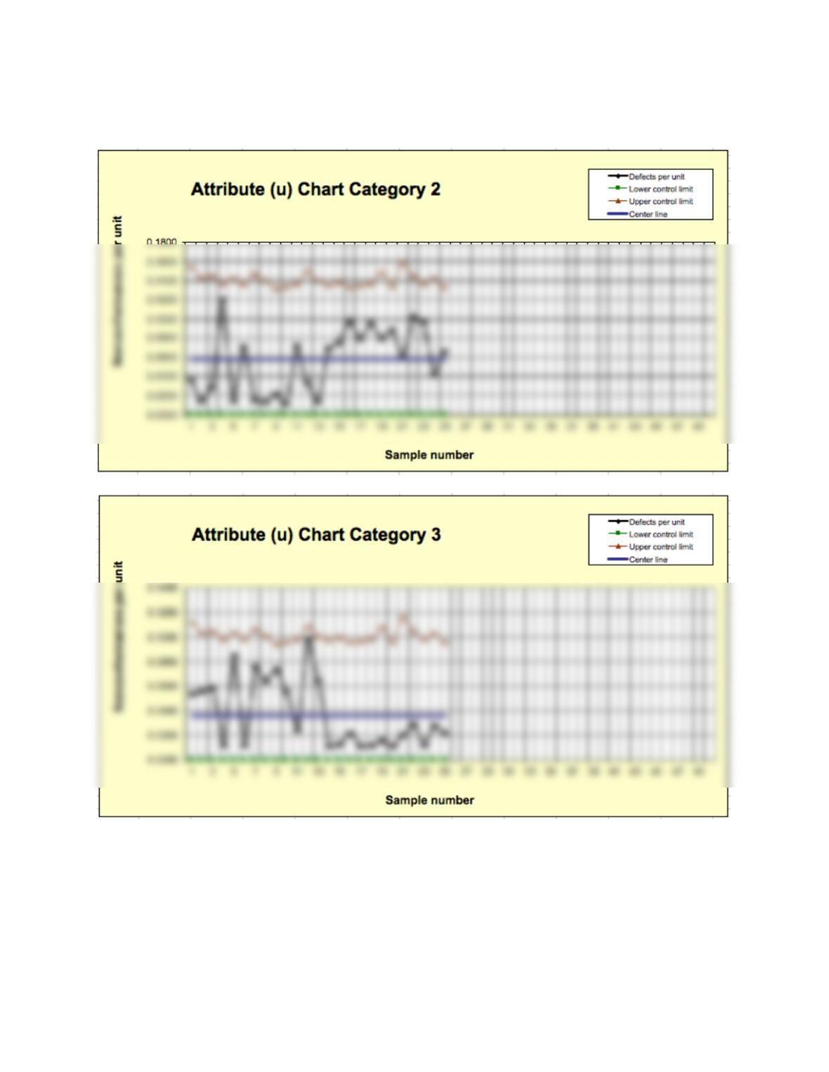
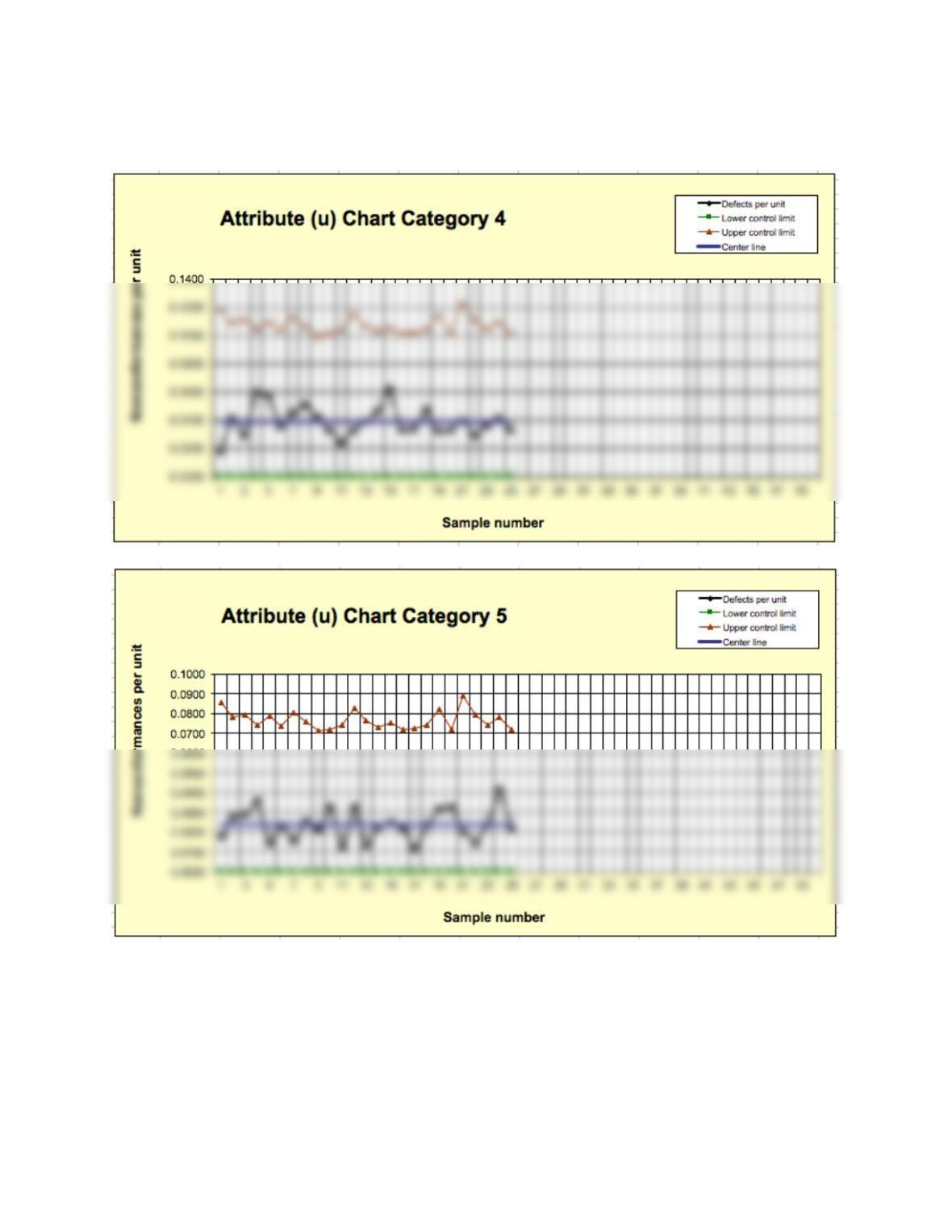
The u-chart is in control but the total number of errors/bill is still quite high. Charts for each error
category are shown next.
0.450
0.500
0.550
0.600
Sample number
Attribute (u) Chart -Total
U Values
Lower Control Limit
Center Line
Upper Control Limit
Chapter 8 – Measuring and Controlling Quality
Chapter 8 – Measuring and Controlling Quality
Chapter 8 – Measuring and Controlling Quality
Chapter 8 – Measuring and Controlling Quality
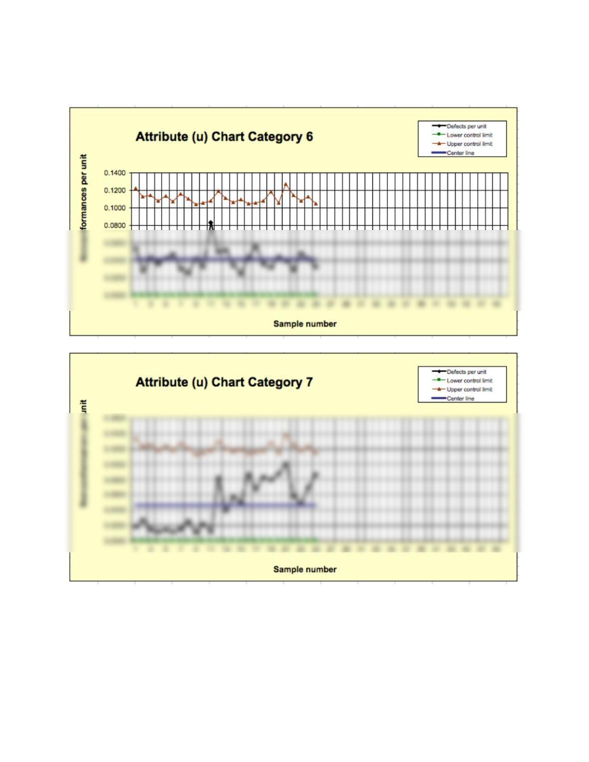
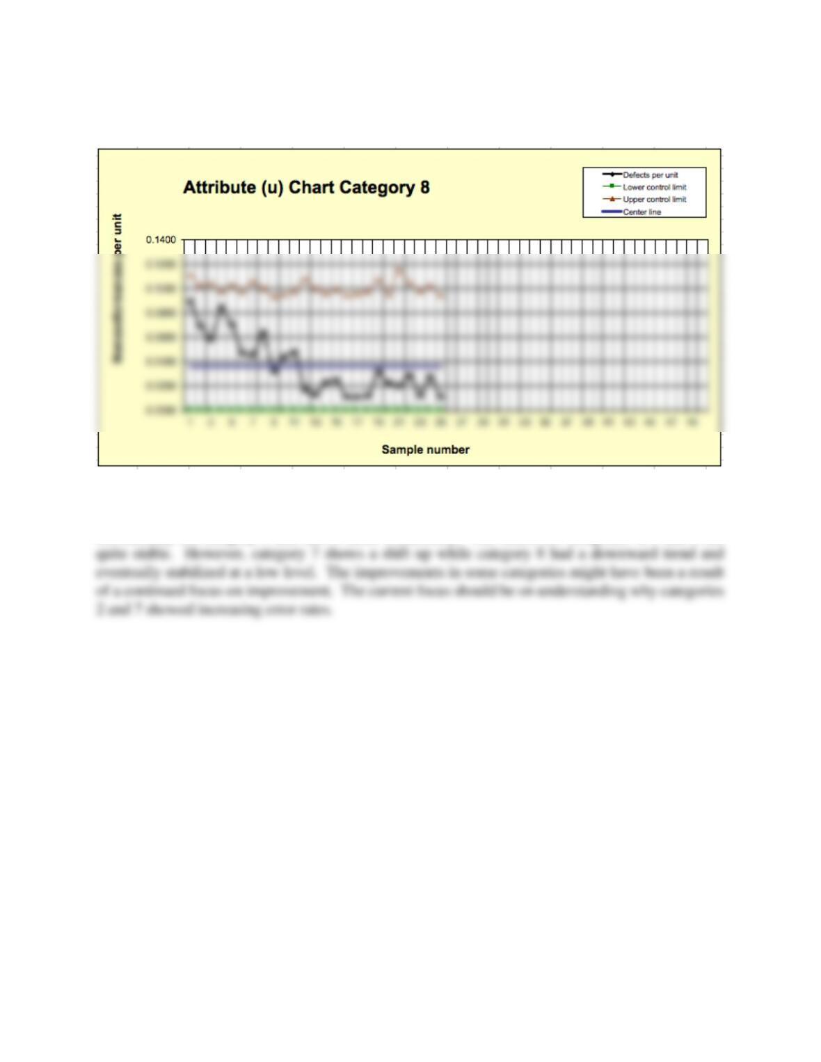
From the center lines, we see that category 2 has the highest rate or errors. The error rate dropped
substantially for category 3 and shows more consistency. The charts for categories 4, 5 and 6 are