Statistical Methods in Quality Management 32
Value for price paid
3.92
1.19
Overall satisfaction
3.80
0.87
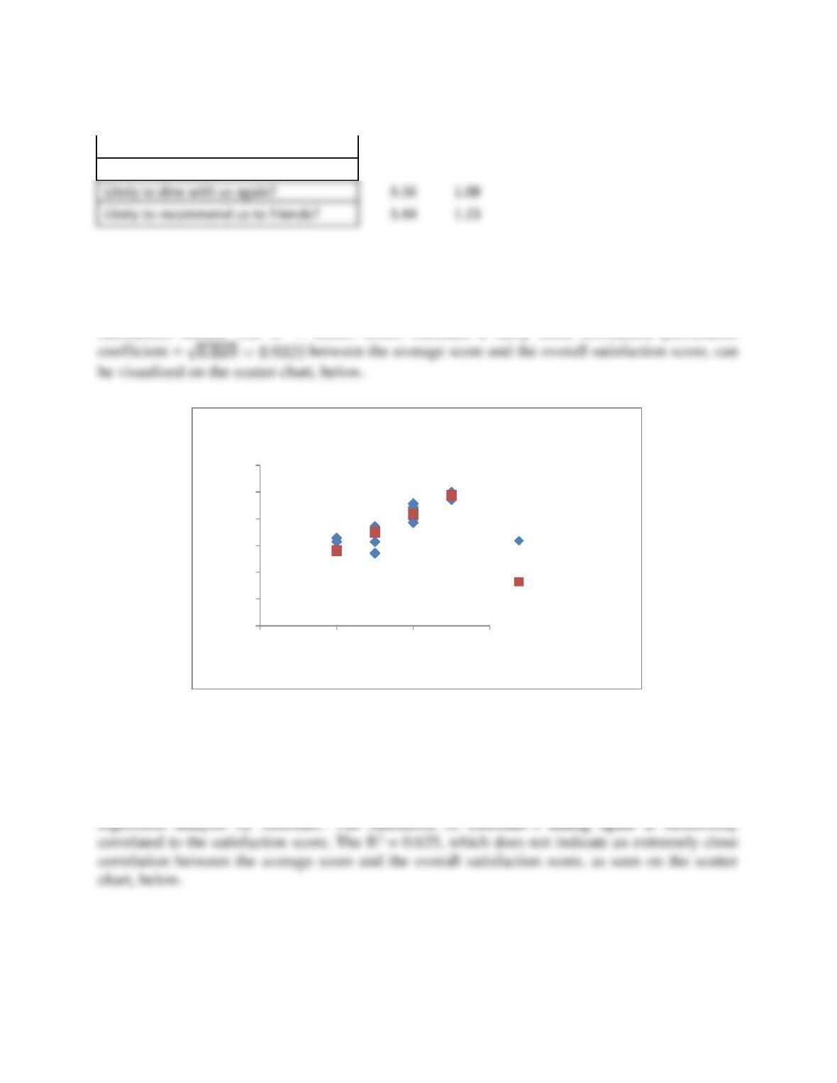
2. If you average the responses to the first seven questions by customer, how closely are
those averages correlated to the satisfaction score? Include a scatter chart in your analysis.
The average responses to the first seven questions by customers, are well correlated with their
satisfaction scores. The R2 = 0.869, which indicates a fairly close correlation [correlation
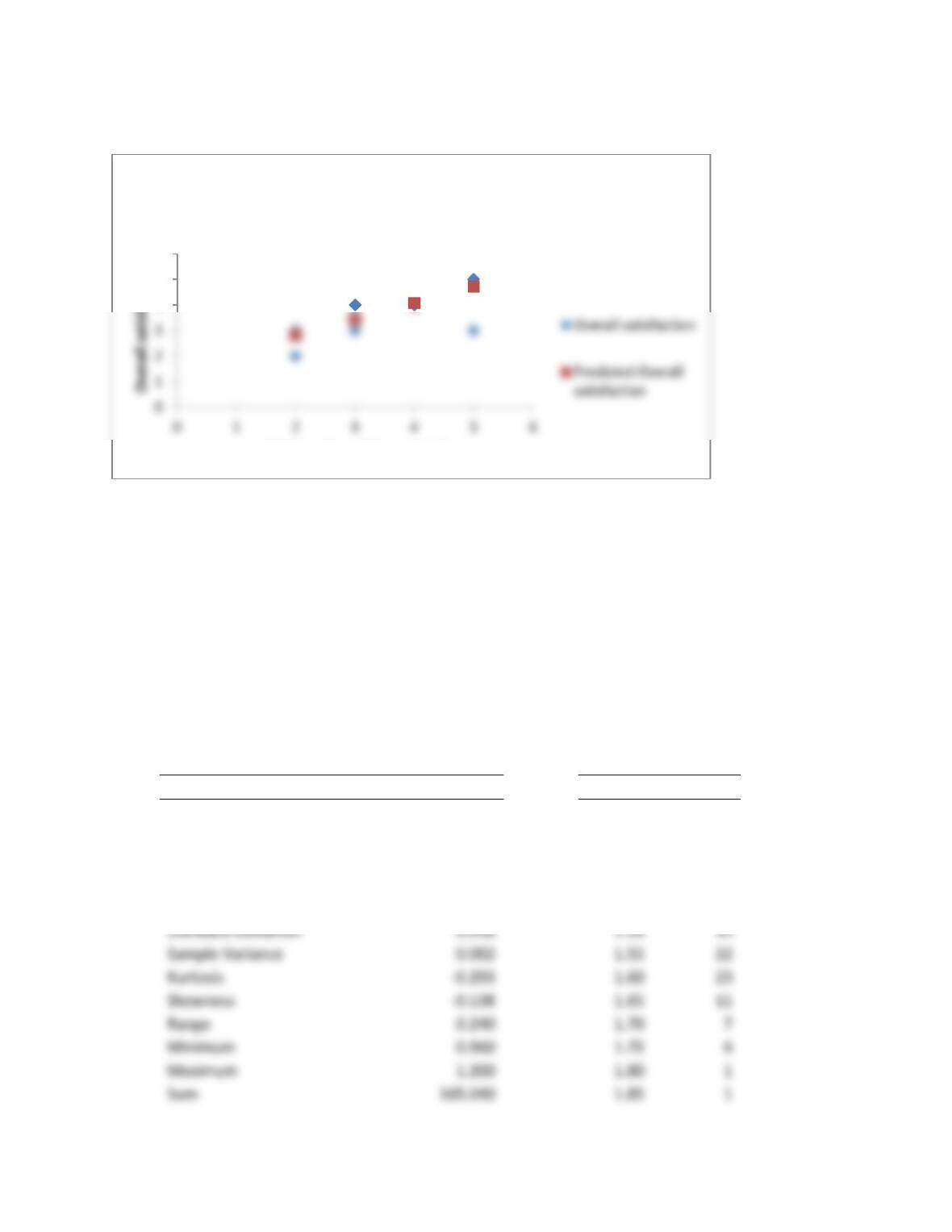
3. Can the likelihood of the customer dining again at Burrito Brothers be predicted by
using the satisfaction score and regression analysis? How good is that prediction likely to
be, based on the R2 value?
The likelihood of the customer dining again can be predicted by using the satisfaction score and
0.0
1.0
2.0
3.0
4.0
5.0
6.0
0 2 4 6
Average score
Overall satisfaction
Overall satisfaction Line Fit Plot
Average score
Predicted Average
score
Statistical Methods in Quality Management 33
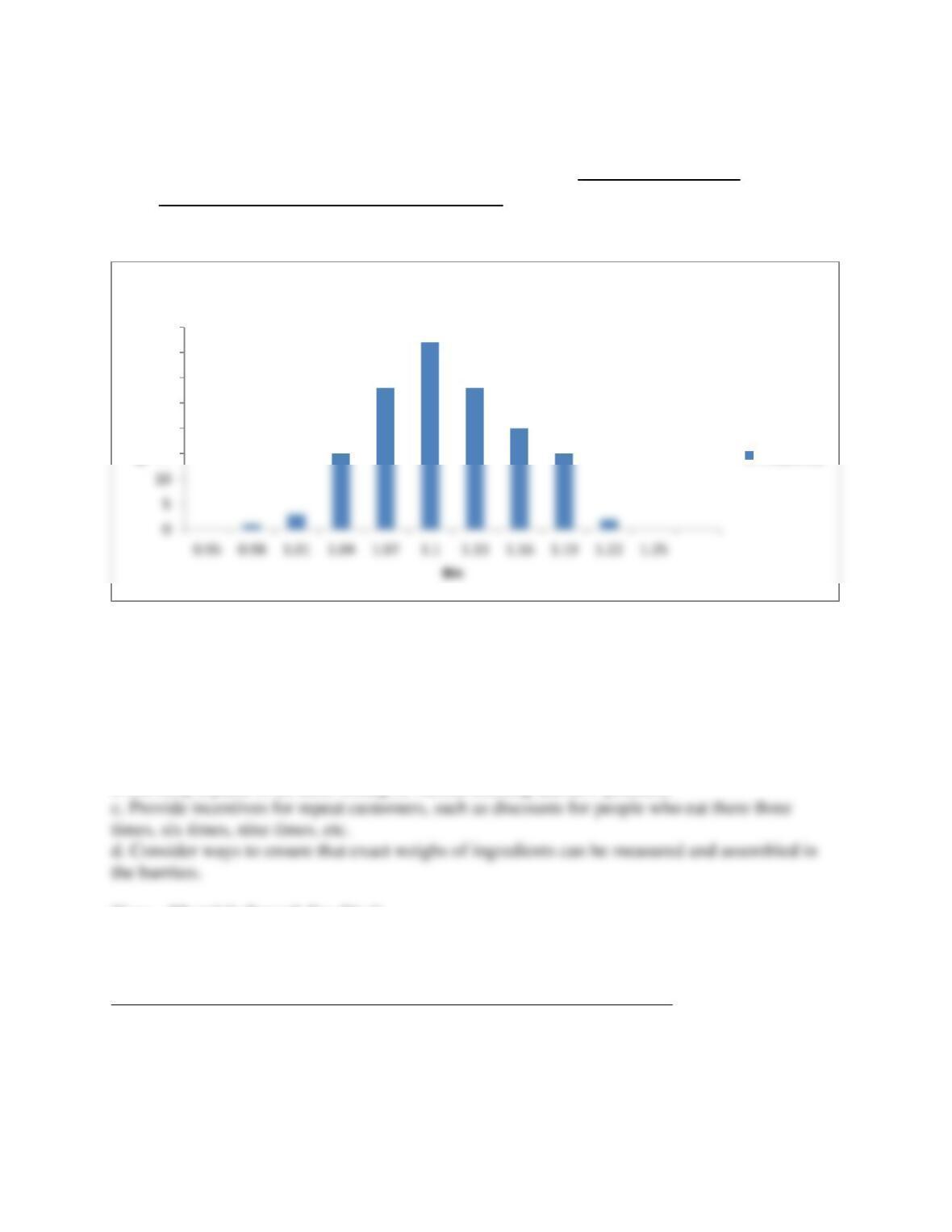
4. Analyze the data on burrito weights using descriptive statistical measures such as the
mean and standard deviation, and tools such as a frequency distribution and histogram.
What do your results tell you about the consistency of the food servings?
The descriptive statistics for burrito weights show that the mean 𝑥̅ = 1.100 and standard
deviation, s = 0.048. The frequency distribution and histogram show that the sample is somewhat
normal in shape. The range and standard deviation show that the food servings are somewhat
variable. The range is 0.24, or ¼ pound difference between the lowest and highest values. This
could be due to the nature of the burrito product, where the customer specifies ingredients, which
add more or less weight to the burrito.
Descriptive Statistics
Bin
Frequency
1.25
0
Mean
1.100
1.30
3
Standard Error
0.004
1.35
9
Median
1.100
1.40
16
Mode
1.090
1.45
17
Standard Deviation
0.048
1.50
34
Sample Variance
0.002
1.55
22
Kurtosis
1.60
23
Skewness
1.65
11
Range
0.240
1.70
7
Minimum
0.960
1.75
6
4
5
6
Likely to dine with us again?
Likely to dine with us again? Line Fit
Plot
Statistical Methods in Quality Management 34
Count
150.000
More
0
Confidence Level (95.0 percent)
1.200
5. What recommendations for decision-making and improvement can you make to Juan
Niceley?
Recommendations for improvement to Hector Gustavo include:
a. Work to ensure that food is served hot.
b. Develop a panel to do taste-testing of various existing and new products.
Case – Maggie’s French Fry Study
Discussion Questions
See the instructor’s Excel solution file in the Ch 06 Case Excel Files folder
1. Use statistical tools discussed in this chapter to analyze the data. Consider the overall
distribution of lengths, statistical summary of the data, percentage of conforming fries, and
differences by location. You might also compute confidence intervals and conduct a
hypothesis test to determine if differences exist by location.
15
20
25
30
35
40
Frequency
Histogram
Frequency
Statistical Methods in Quality Management 35
2. Summarize your results in a well-written report.
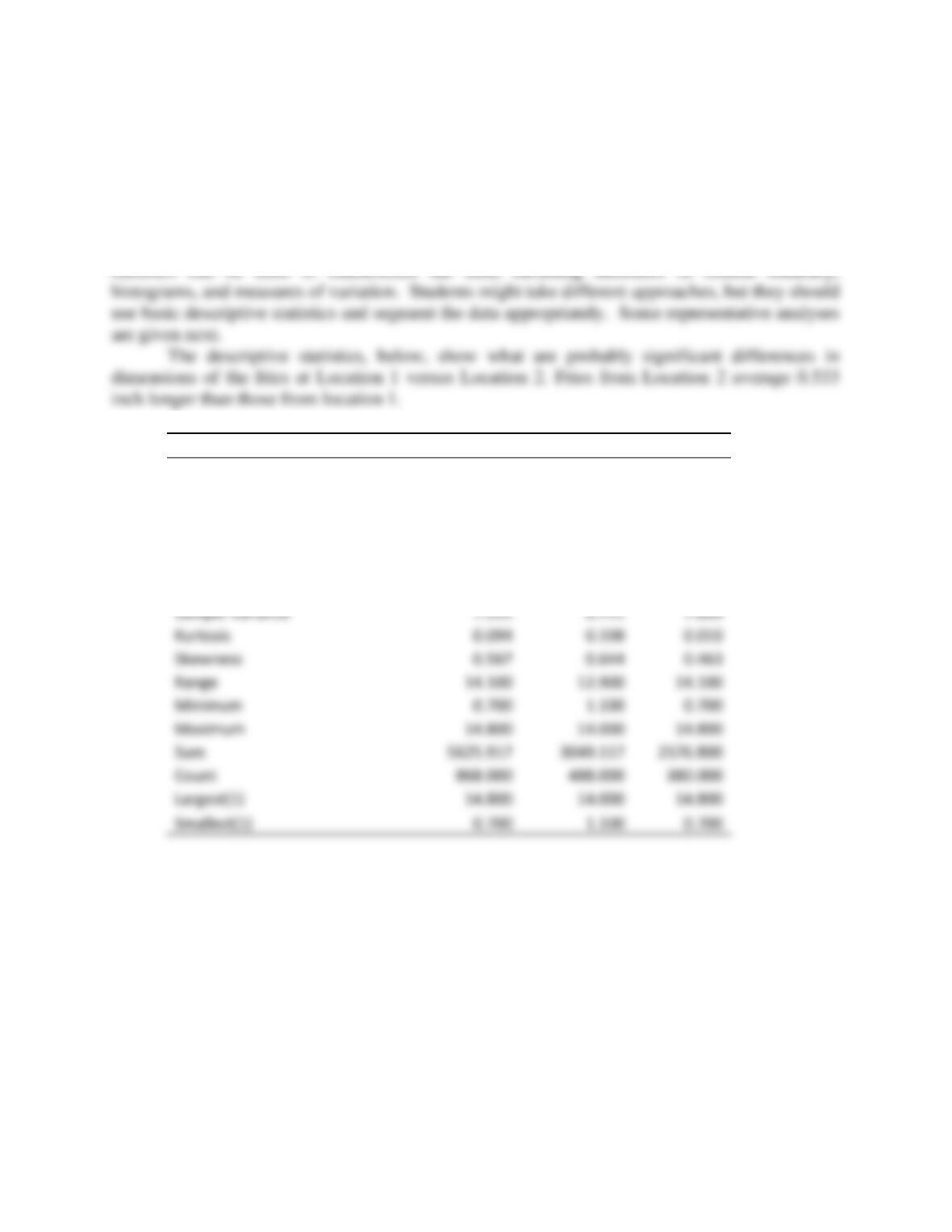
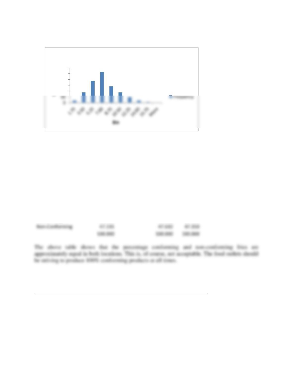
This is a fairly large database that can provide a number of possible ways to use statistical
techniques. The data may be analyzed as one large sample, or may be broken into its subsamples
by location, container, order size, inspection results, or conforming/non-conforming. Descriptive
Lengths
Total Sample
Location 1
Location 2
Mean
6.481
6.248
6.781
Standard Error
0.091
0.118
0.142
Median
6.100
5.800
6.500
Mode
5.000
5.000
6.000
Standard Deviation
2.687
2.596
2.775
Sample Variance
7.222
6.741
7.699
Kurtosis
0.094
0.198
0.010
Skewness
0.567
0.644
0.463
Range
Minimum
0.700
1.100
0.700
Maximum
Count
Largest(1)
Smallest(1)
0.700
1.100
0.700
Statistical Methods in Quality Management 36
Conforming vs. Non-Conforming Fries
Location 1
Location 2
Total
Conforming
258
199
457
Non-Conforming
230
181
411
488
380
868
Percentage of Totals by Location
Conforming
52.869
52.368
52.650
Case – Berton Card Company
See the instructor’s Excel solution file in the Ch 06 Case Excel Files folder
Using whatever statistical calculations and methods that you feel are appropriate, analyze
these data and prepare a report summarizing your conclusions along with a
recommendation for controlling the line speed and pressure of the roller. Be sure to include
appropriate charts that help explain your findings.
100
150
200
250
300
Histogram
Non-Conforming
47.131
47.632
47.350
100.000
Statistical Methods in Quality Management 37
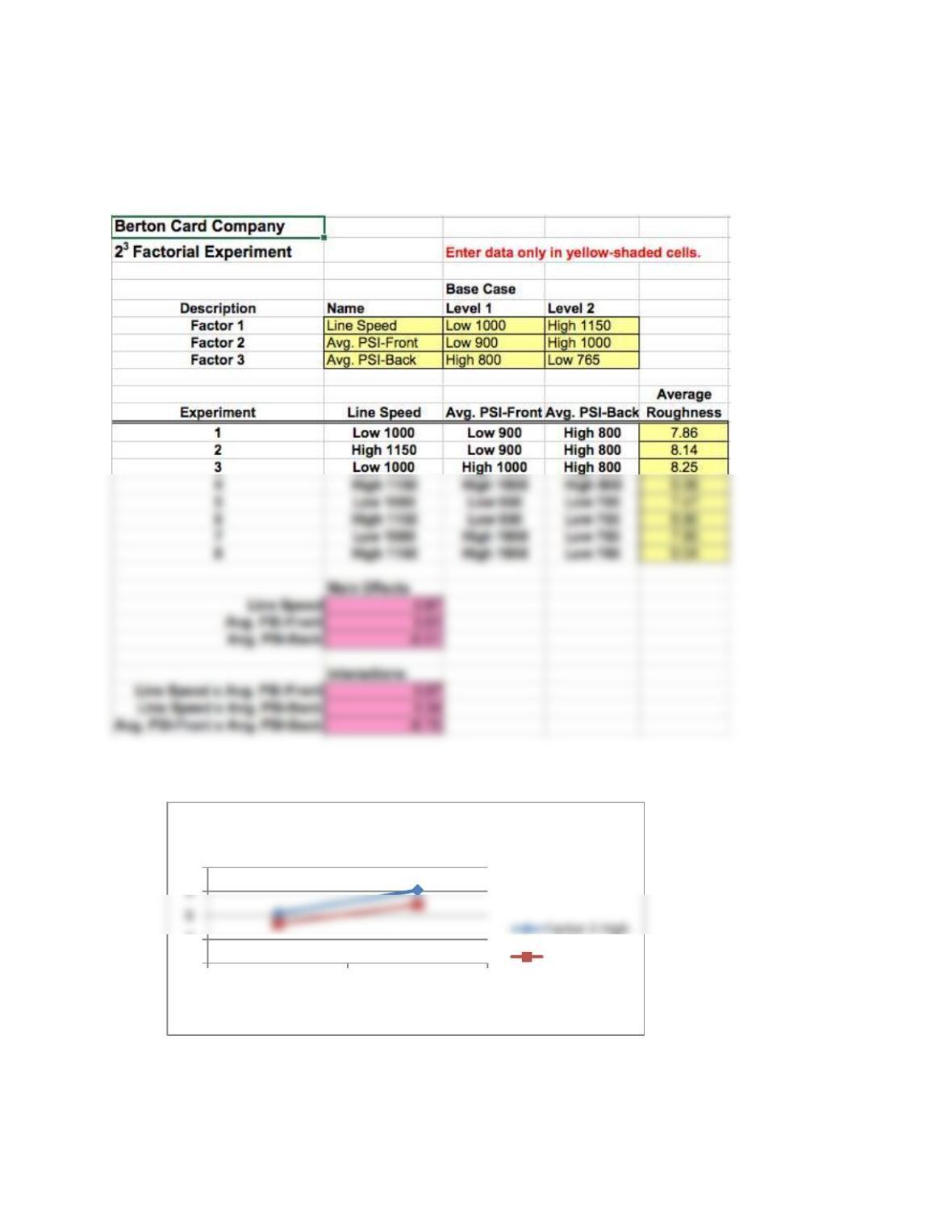
Students should recognize that they need to use the 23 Factorial Experiment template. The main
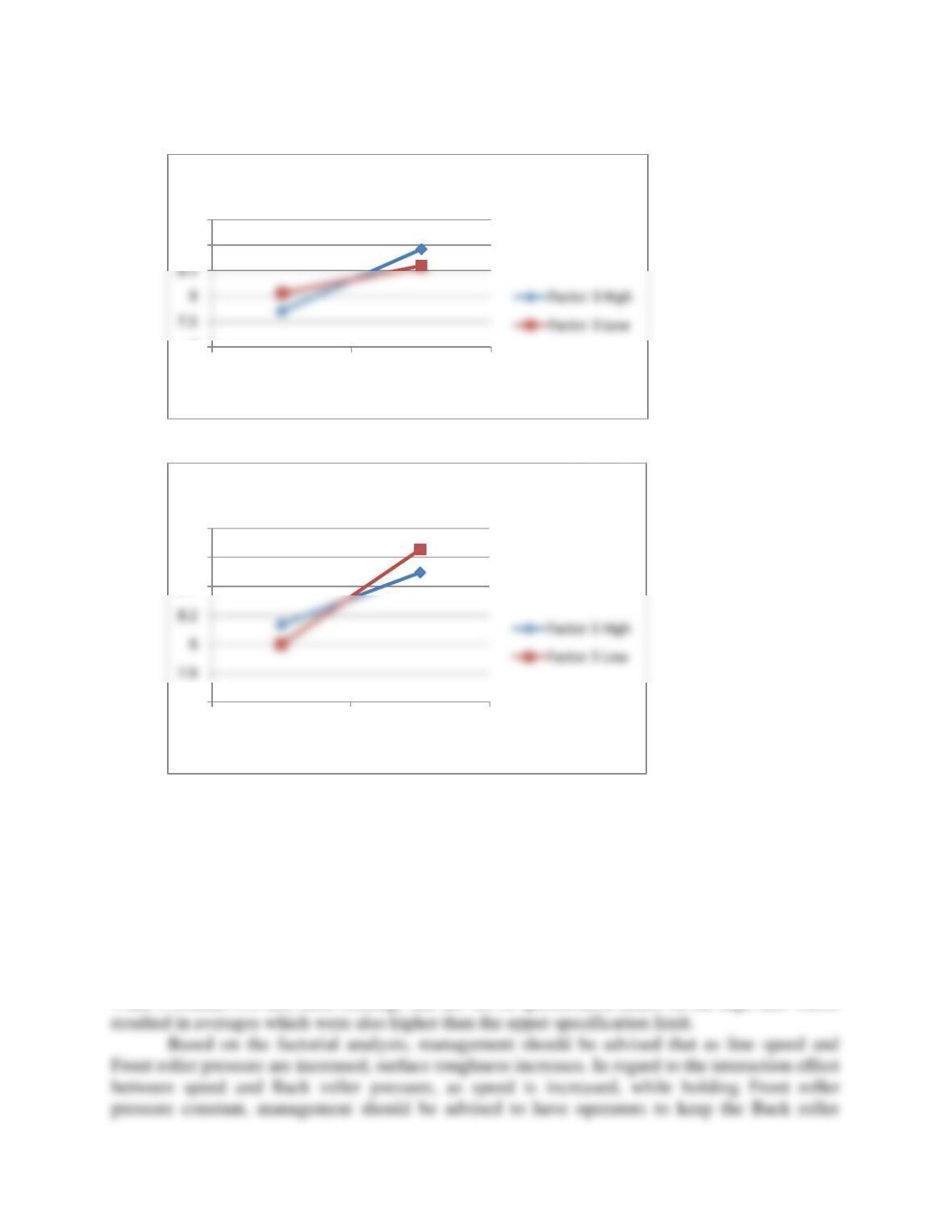
effects, interactions and interaction charts for the 8 experiments are summarized below.
Interaction Charts
6
7
10
Low 1000 High 1150
Factor 1
Factor 1 x Factor 2
Factor 2 Low
Statistical Methods in Quality Management 38
Conclusions
The line speeds [Factor 1] and Front (Face) roller pressure [Factor 2] appear to be the significant
variables affecting roughness. There is negligible interaction between those two variables. The
other interactions appear to be relatively small but significant. Thus, the main effects can be
used to predict results. For example, when all factors are low, the average roughness is 7.47.
Increasing the line speed and front roller pressure to high levels would increase roughness by
0.87 + 0.51 = 1.38 to 8.85. From the results, the actual averages are a bit higher. Experiments
4 and 8 contain two and three readings that are out of specification limits on the high end. These
7
9
9.5
Low 1000 High 1150
Factor 1
Factor 1 x Factor 3
7.6
8.4
8.6
8.8
Low 1000 High 1150
Factor 2
Factor 2 x Factor 3
Statistical Methods in Quality Management 39
pressure low, in order to have a smaller effect on roughness. In regard to the interaction effect
between the Front and Back roller pressures, it would be wise for management to instruct
machine operators to hold the high pressure setting on the Back roller, as front roller pressure is
increased, and line speed is kept constant.
Case – The Battery Experiment
Discussion Questions
See the instructor’s Excel solution file in the Ch 06 Case Excel Files folder
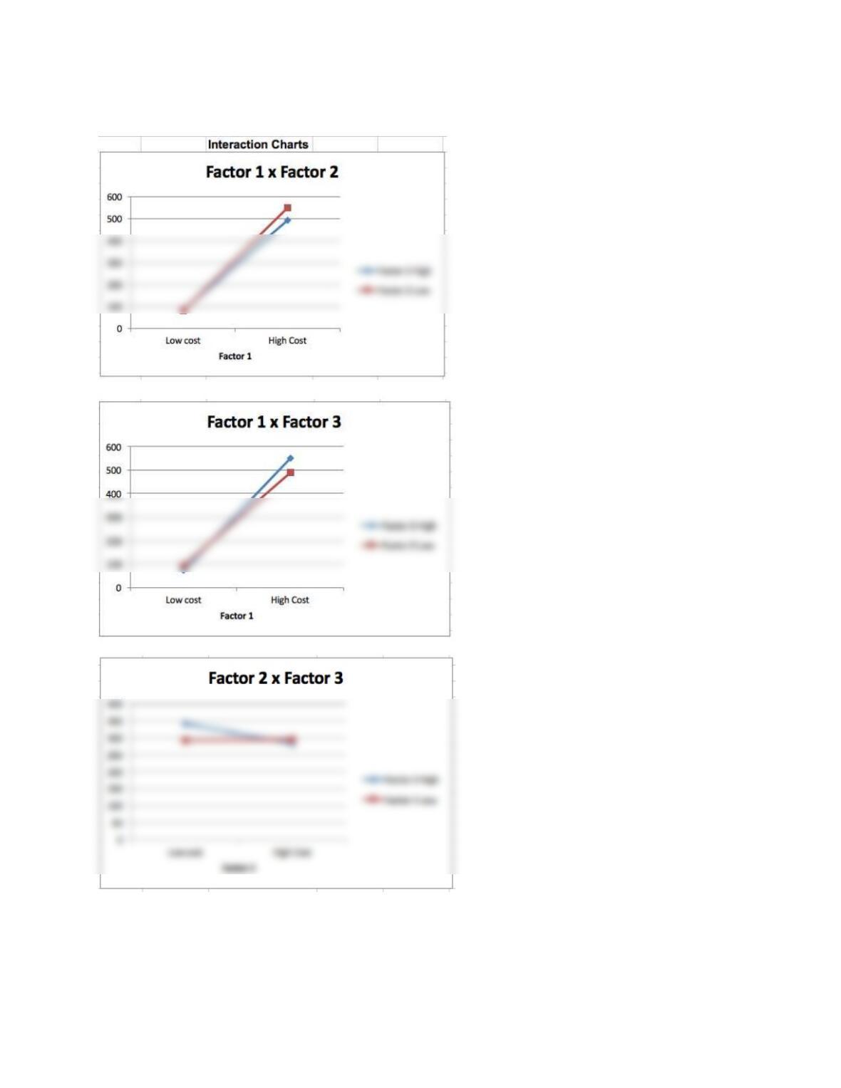
1. Use the data in Table 6.5 to find the main effects, interactions, and interaction plots for
the three factors (use the Excel template 2×3 Factorial Experiment on the Student
Companion Site). Thoroughly explain your results.
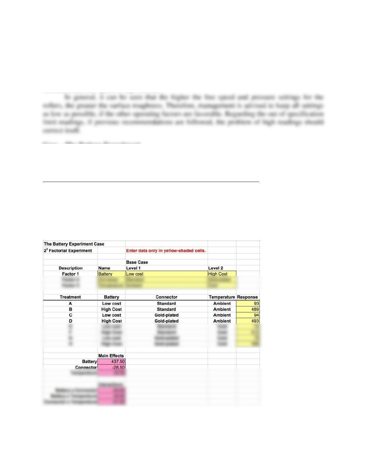
Results using the spreadsheet template are shown below.
Statistical Methods in Quality Management 40
The interaction charts show relatively minor interactions. From the main effects, we see
that high cost batteries, standard connectors, and cold temperatures have the longest life.

Statistical Methods in Quality Management 41
2. Use the data in Table 6.6 and the Excel Data Analysis tool to conduct an ANOVA to
determine whether a significant difference exists between battery types. Explain the
ANOVA output and your conclusions.
An examination of the SUMMARY and ANOVA parts of the table, below, shows that the mean
𝑥̅ = 521 and the variance, s2 = 3683.333, which are considerably larger than the other two
groups. Also, in the ANOVA part of the table, the mean square between groups is also much
larger than the mean square within groups, resulting in an F statistic of 183.0412. When this
SUMMARY
Groups
Count
Sum
Average
Variance
A
4
2084
521
3683.333
B
4
100
212.6667
C
4
135
ANOVA
Source of Variation
SS
df
MS
F
P-value
F crit
Between Groups
491892.7
2
245946.3
183.0412
5.135E-08
4.256495
Within Groups
1343.667
Total
503985.7
Anova: Single Factor