by hand using the formulas in the chapter. If any special causes are identified, remove
them from the data and construct a revised control chart.
Use Equations 17.4 -= 17.6.
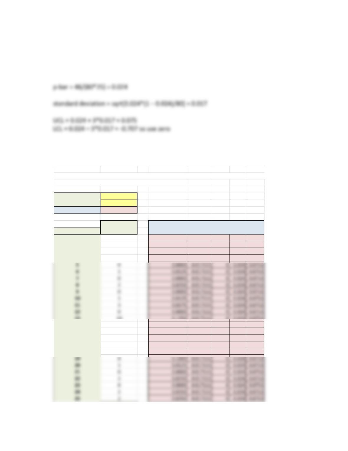
On average, this insurance claim process generates 2.4% errors. Portions of the Excel
template are shown below:
p-Chart Copyrigh
This spreadsheet is designed for up to 50 samples. Enter data only in yellow cells. Not for c
Some resizing or rescaling of the chart may be needed.
Sample size 80
Number of samples 25
Average (p-bar) 0.024
Number Fraction Standard
Sample Nonconforming Nonconforming Deviation LCLp CL UCLp
12 0.0250 0.017111 0 0.024 0.0753
21 0.0125 0.017111 0 0.024 0.0753
30 0.0000 0.017111 0 0.024 0.0753
43 0.0375 0.017111 0 0.024 0.0753
13 10 0.1250 0.017111 0 0.024 0.0753
14 2 0.0250 0.017111 0 0.024 0.0753
15 1 0.0125 0.017111 0 0.024 0.0753
16 4 0.0500 0.017111 0 0.024 0.0753
17 0 0.0000 0.017111 0 0.024 0.0753
18 3 0.0375 0.017111 0 0.024 0.0753
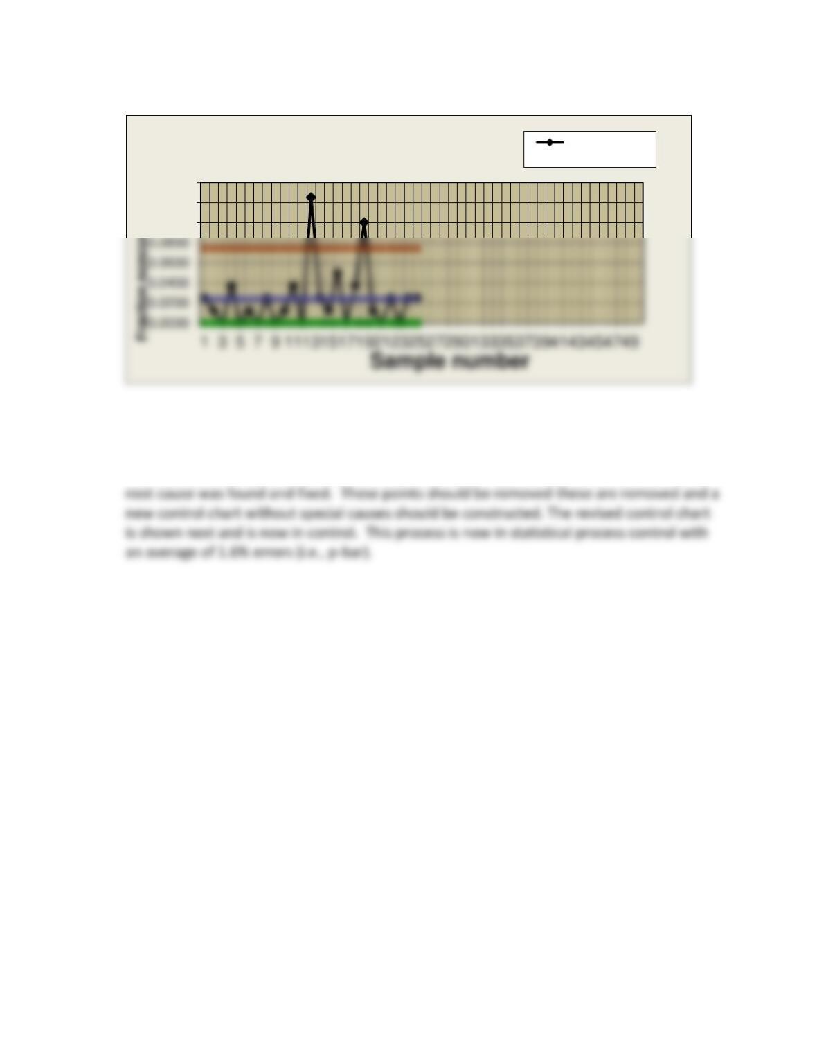
Based on the control limits, we would expect a maximum of about 7.5% errors. Samples
13 and 19 are outside of the control limits and are most likely due to a special cause. It is
assumed that an improvement team was set up to investigate samples 13 and 19 and a
0.1000
0.1200
0.1400
Attribute (p) Chart Fraction
nonconforming
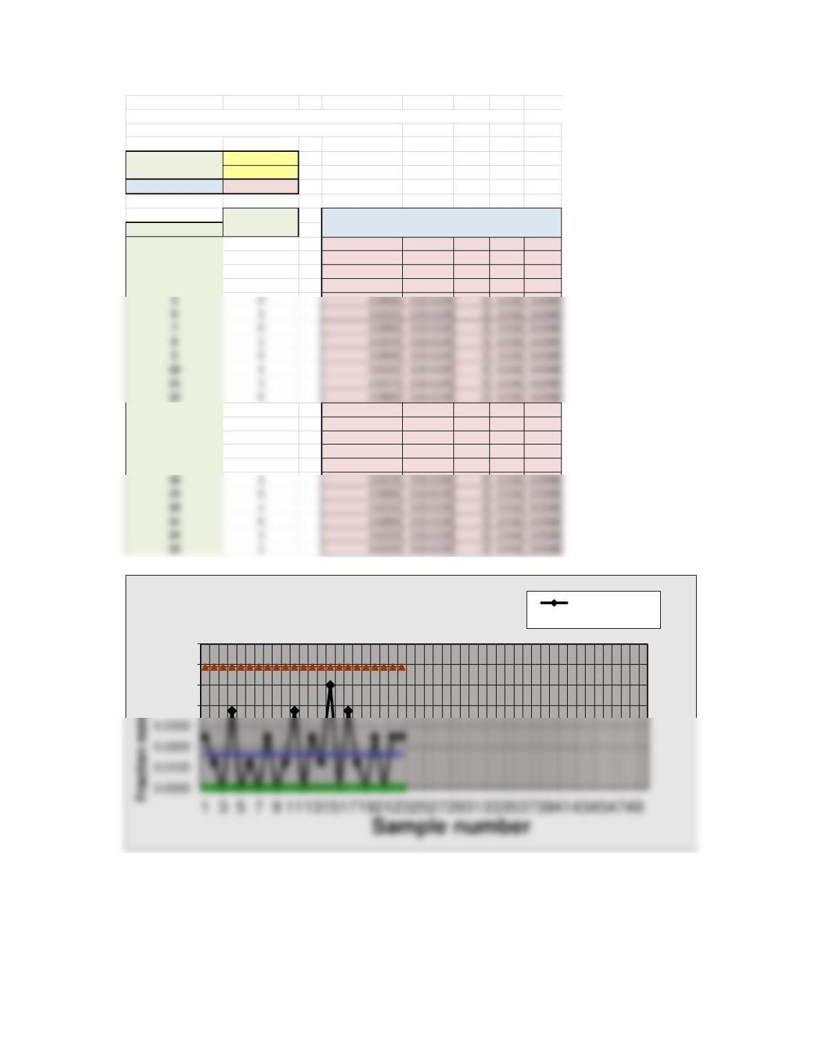
Instructors might also show students that they can simply delete the data for samples 13
and 19 in column B of the template) – and change the number of samples from 25 to 23 –
to display the revised chart, connecting samples 12 and 14, and 18 and 20 automatically in
the chart.
p-Chart Copyrigh
This spreadsheet is designed for up to 50 samples. Enter data only in yellow cells. Not for c
Some resizing or rescaling of the chart may be needed.
Sample size 80
Number of samples 23
Average (p-bar) 0.016304348
Number Fraction Standard
Sample Nonconforming Nonconforming Deviation LCLp CL UCLp
12 0.0250 0.014159 0 0.016 0.0588
21 0.0125 0.014159 0 0.016 0.0588
30 0.0000 0.014159 0 0.016 0.0588
43 0.0375 0.014159 0 0.016 0.0588
13 2 0.0250 0.014159 0 0.016 0.0588
14 1 0.0125 0.014159 0 0.016 0.0588
15 4 0.0500 0.014159 0 0.016 0.0588
16 0 0.0000 0.014159 0 0.016 0.0588
17 3 0.0375 0.014159 0 0.016 0.0588
0.0400
0.0500
0.0600
0.0700
Attribute (p) Chart Fraction
nonconforming
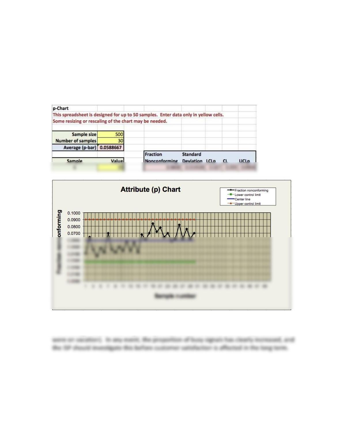
43. An Internet service provider (ISP) measures the proportion of peak period time when a
customer is likely to receive busy signals. Data on the number of busy signals received from
samples of 500 calls over a 30-day period can be found in the worksheet C17 Excel P43
Data in MindTap. Construct and interpret a p-chart for these data.
Portions of the Excel template are shown below:
The process appears to have shifted considerably around sample 16. This might represent
a technology issue or a staffing issue (perhaps several customer service representatives
44. Data showing the number of errors per thousand lines of code for a software development
project are given in the worksheet C17 Excel P44 Data in MindTap. Construct a c-chart and
interpret the results.
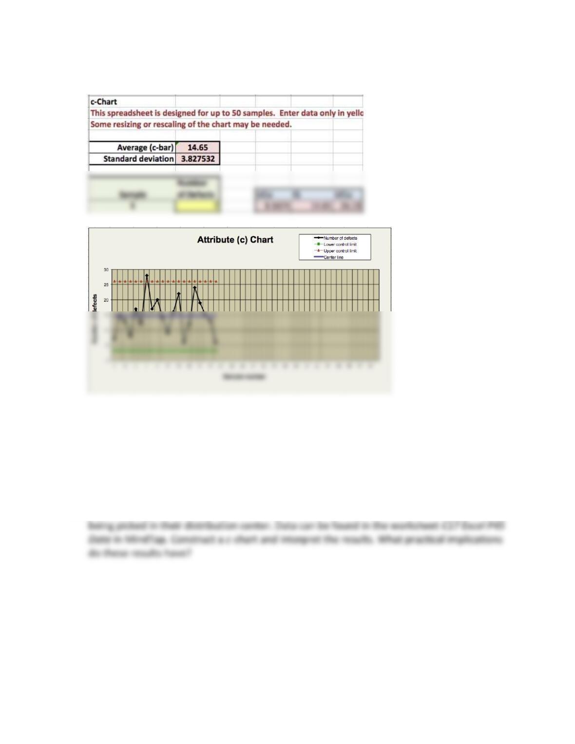
Portions of the Excel template c-Chart are shown next.
On average, the process generates c-bar = 14.65 errors per 1,000 lines of code.
Statistically, the number of errors should range from 3.1 to 26.13. Sample #7 exceeds the
upper control limit, so this process is not in statistical control. The reason for the high
value for sample #7 should be investigated. In any event, having this many errors in
software coding is probably not acceptable, and the project manager should take steps to
understand the root causes and reduce the incidence of errors.
45. A mail-order prescription drug vendor measured the number of errors per standard order
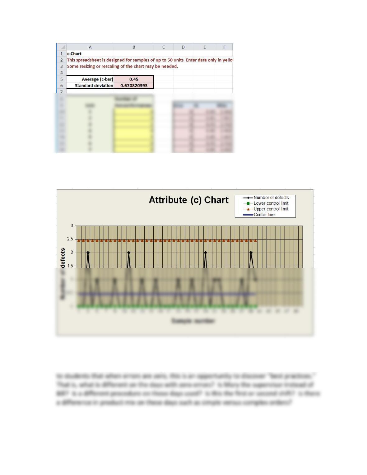
Note that in calculating the lower control limit using the formula in the book, the value
turns out negative, so 0 is used.
The process appears to be in control; however, an order with 3 errors or more should
trigger investigation. Nevertheless, every effort should be made to reduce the number of
errors to zero, especially considering that they may affect patient’s health. Also, point out
46. Use the data from the machining process in Excel problem 40 (worksheet C17 Excel P40
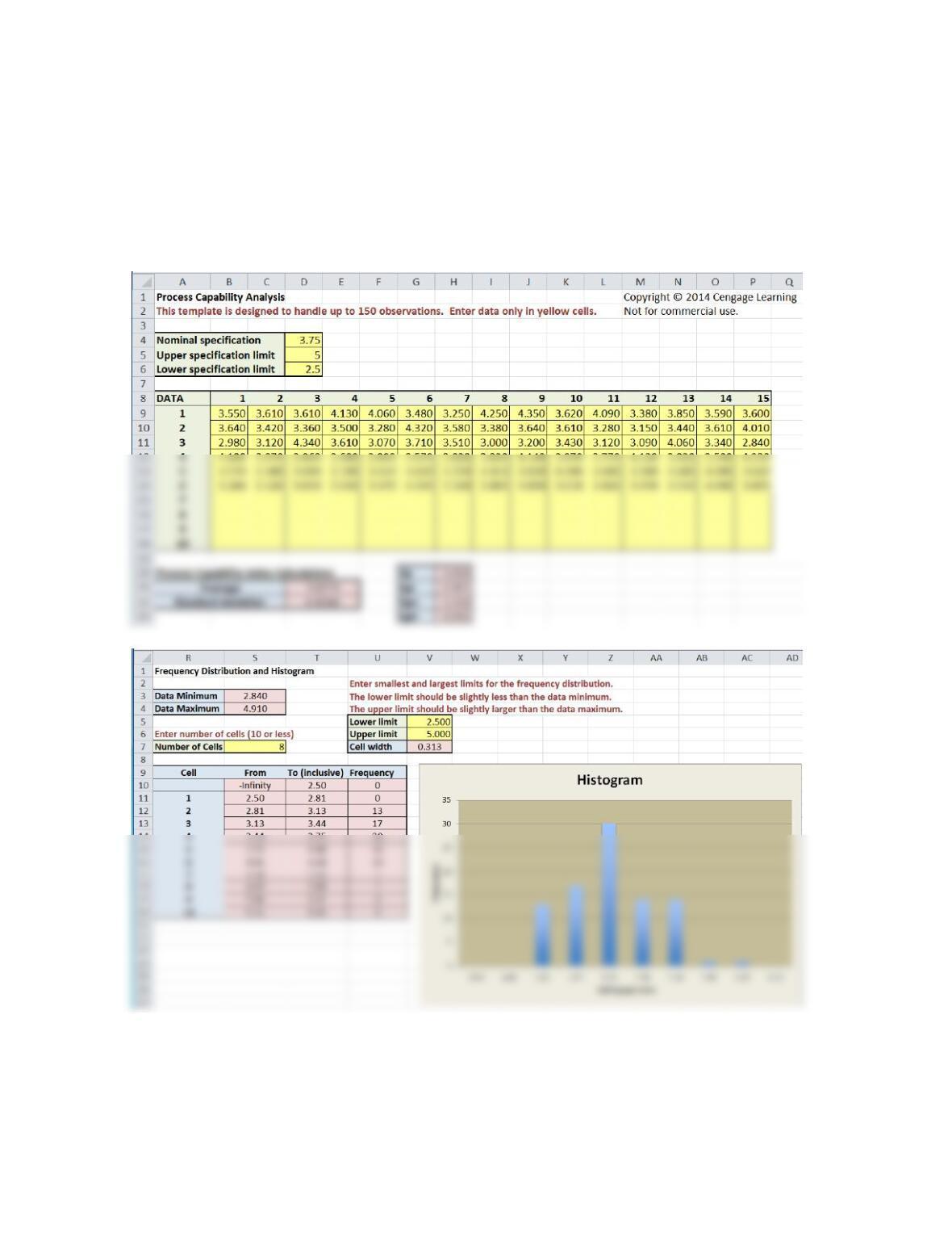
Data in MindTap) to calculate Cp , Cpl , Cpu, and Cpk , assuming that the specifications are
3.75 ± 1.25. Interpret the results for the manager of this process.
Using the Process Capability Excel template, we obtain the following:
The overall capability indexes is marginal, but the lower index suggests that there is a
problem meeting the lower specification.
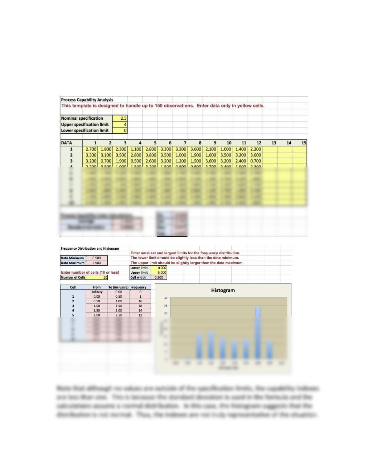
47. The worksheet C17 Excel P47 Data in MindTap provides sample times in hours for
processing and shipping orders from a web-based retailer. The retailer advertises that
orders are shipped within four hours of receipt. What is the capability of the process to
achieve this standard? Explain your conclusions.
Teaching Note: Eckhardt Hospital
Overview
The Joint Commission on Accreditation of Healthcare Organizations (JCAHO) monitors and
evaluates health care providers according to strict standards and guidelines. Improvement in
Case Questions for Discussion:
1. Using the data in Exhibit 17.8, what is the average percentage of infections?
The average percentage of infections is the total number of infections divided by the total
number of surgeries = 55/[(36)(200)] = 0.0076 or 0.76 percent. This is also calculated in the
template.
2. Construct an appropriate control chart, compute the upper and lower control limits, plot
the data on the control chart, and determine if the process is in statistical control. Based
on your analysis, what action, if any, should management take?
A p-chart is the correct chart to use.
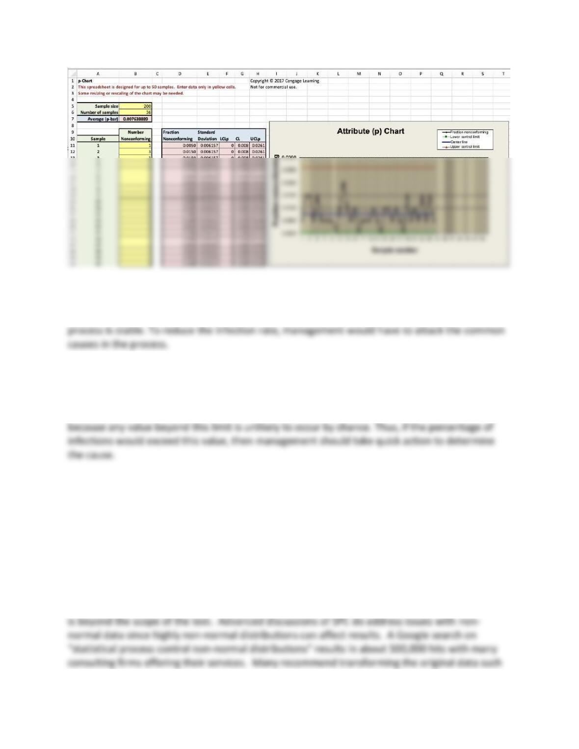
Although month 12 has a higher rate of infections, none of the data points fall above the upper
control limit, indicating that the variation each month is due purely to chance and that the
3. What threshold for evaluation should management use to monitor future samples as a
basis for taking action?
The upper control limit is 0.026 or 2.6%. The upper control limit would be a logical TFE to use,
Teaching Note: Goodman Tire and Rubber Company
Overview
The case describes an automobile tire manufacturer that uses statistical process control to
monitor the product quality of the tires the produce. The case data are available in MindTap.
The case asks students to examine the distribution of the data (for example, how does it
compare to the specification limit cited in the case?).
Some students might address normality of the data. The histogram is clearly not normal. This
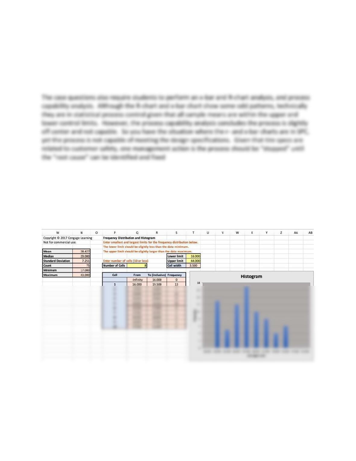
as a lognormal distribution, individual charts, chi-square goodness of fit tests, assume gamma
or Weibull distributions, and multivariate control charts. You might simply tell your students
that there are statistical process control methods for non-normal distributions but they require
advanced knowledge to understand them, and may or may not provide better insights than we
produce in this SPC analysis.
Case Questions for Discussion:
1. Draw a histogram of these data. What can you conclude (if anything) about the
distribution of the tread wear?
Using the Statistical Analysis template:
The distribution of the data does not appear to be normal; it is somewhat symmetric, but the
tails do not die off as a normal distribution would. However, normality is not a requisite for
using control charts, although it can improve the results. This, however, is beyond the scope of
the text.
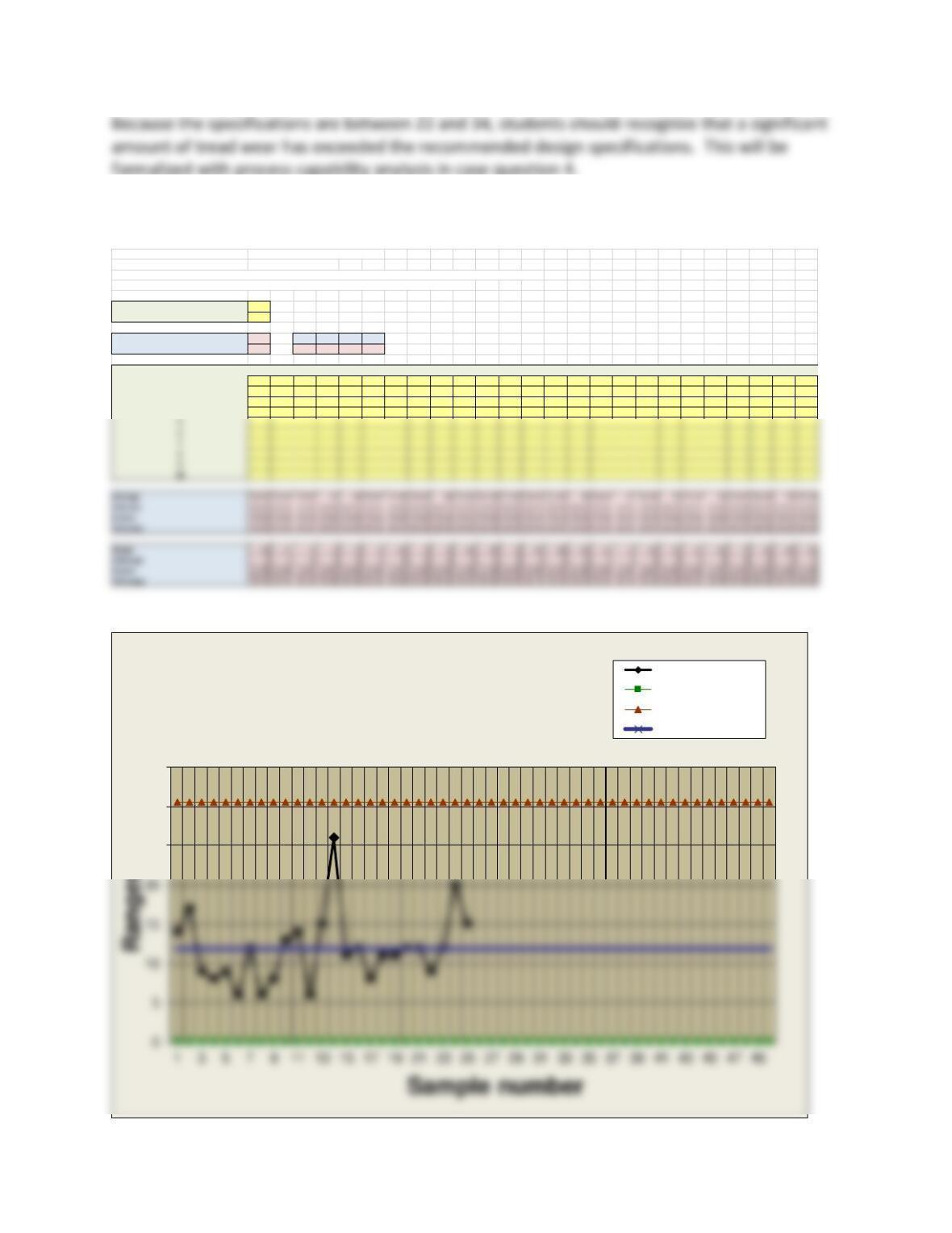
2. Construct x-bar and R-charts for these data. Is the production process in control?
X-bar and R-Chart Copyright © 2014 Cengage Learning
Not for commercial use.
This spreadsheet is designed for up to 50 samples, each of a constant sample size from 2 to 10. Enter data only in yellow cells
Charts are displayed below the calculations. Some resizing or rescaling of the charts may be required.
Number of samples (<= 50) 25
Sample size (2 – 10) 3
Grand Average 28.43 A2 D3 D4 d2
Average Range 11.84 1.023 0 2.574 1.693
DATA 1 2 3 4 5 6 7 8 9 10 11 12 13 14 15 16 17 18 19 20 21 22 23 24 25
131 26 25 17 38 41 21 32 41 29 26 23 17 43 18 30 28 40 18 22 18 24 27 39 17
242 18 30 25 29 42 17 26 34 17 31 19 24 35 25 42 36 29 29 34 24 28 32 26 32
328 35 34 21 35 36 29 28 33 30 40 25 32 17 29 31 32 31 28 26 30 19 20 19 27
25
30
35
R-Chart Ranges
Lower control limit
Upper control limit
Center line
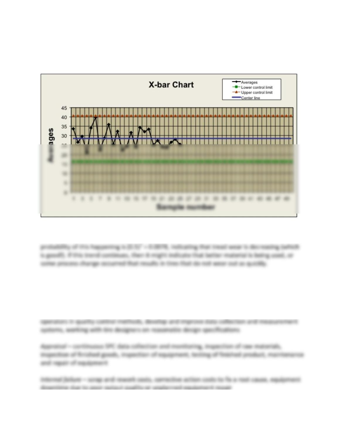
The R-chart is in statistical process control since all points fall within the control limits. There is
no discernable pattern in the plot of sample means for the R-chart.
The x-bar chart might appear to be in statistical process control. However, there appears to be
a downward shift since samples #19 to #25 are all below the centerline (x-bar) and the
3. Provide two examples of each of the four major categories of quality costs applicable to
this situation (i.e., prevention, appraisal, internal and external failure costs).
Prevention – frequent calibration of tire making equipment, checking raw material quality
levels, frequent training equipment operators, quality design planning, training equipment
4. What are the process capability indexes for this process to meet design specifications?
What do you recommend?
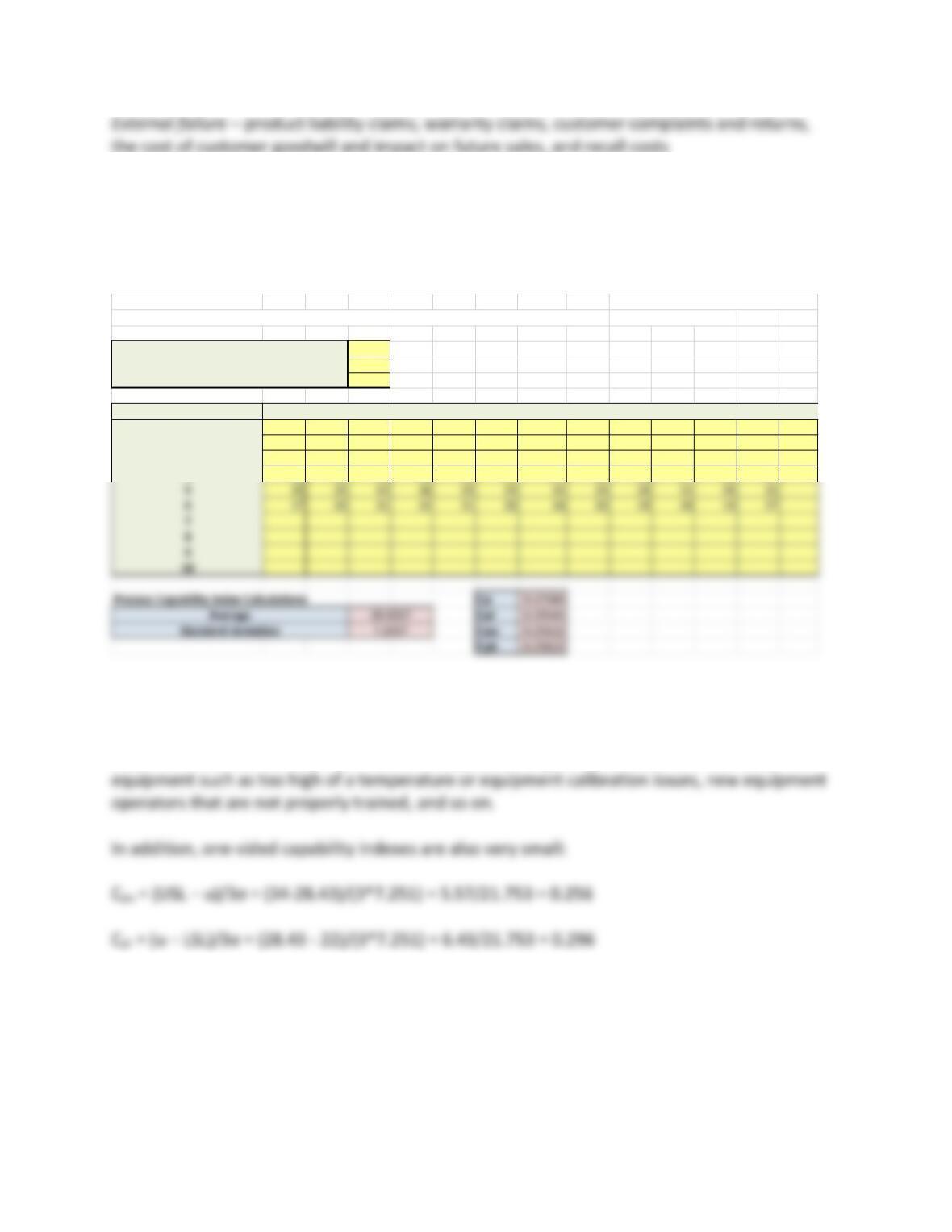
Using the Process Capability template, we have
Cp = (34-22)/43.51 = 0.276 which is much less than 1.0. That is, the process is not capable and
tires will not all meet the 60-month lifetime! This may result in excessive warranty (external
failure) costs. A Kaizen event should take place to identify the root cause and fix it. The root
cause could be the raw materials from the supplier, changes in production procedures or
Therefore, the process is slightly off center, closer to the USL, and not capable.
Process Capability Analysis Copyright © 2014 Cengage Learning
This template is designed to handle up to 150 observations. Enter data only in yellow cells.
Not for commercial use.
Nominal specification 28
Upper specification limit 34
Lower specification limit 22
DATA 1 2 3 4 5 6 7 8 9 10 11 12 13
131 26 25 17 38 41 21 32 41 29 26 23 17
242 18 30 25 29 42 17 26 34 17 31 19 24
328 35 34 21 35 36 29 28 33 30 40 25 32

Integrative Case – Hudson Jewelers
A complete teaching note for all chapters is available in the Instructor Resources online.
Instructors should read the entire case and most of the case assignments at the end of each
chapter. Then decide if you want to assign all or part of the case questions.
Chapter 17 Case Questions for Discussion:
1. Research and acquire the criteria for diamond appraisals and critique these criteria in
terms of objectivity, measurement, and overall accuracy. Are diamond quality criteria as
specific and measurable as for manufactured parts? Explain.
Criteria:
Color
Diamond color can range from steel gray, white, blue, orange, red, green, pink, purple, brown,
Carat
Each carat weight is subdivided into 100 points. For example, a diamond that is 0.75 carats is a
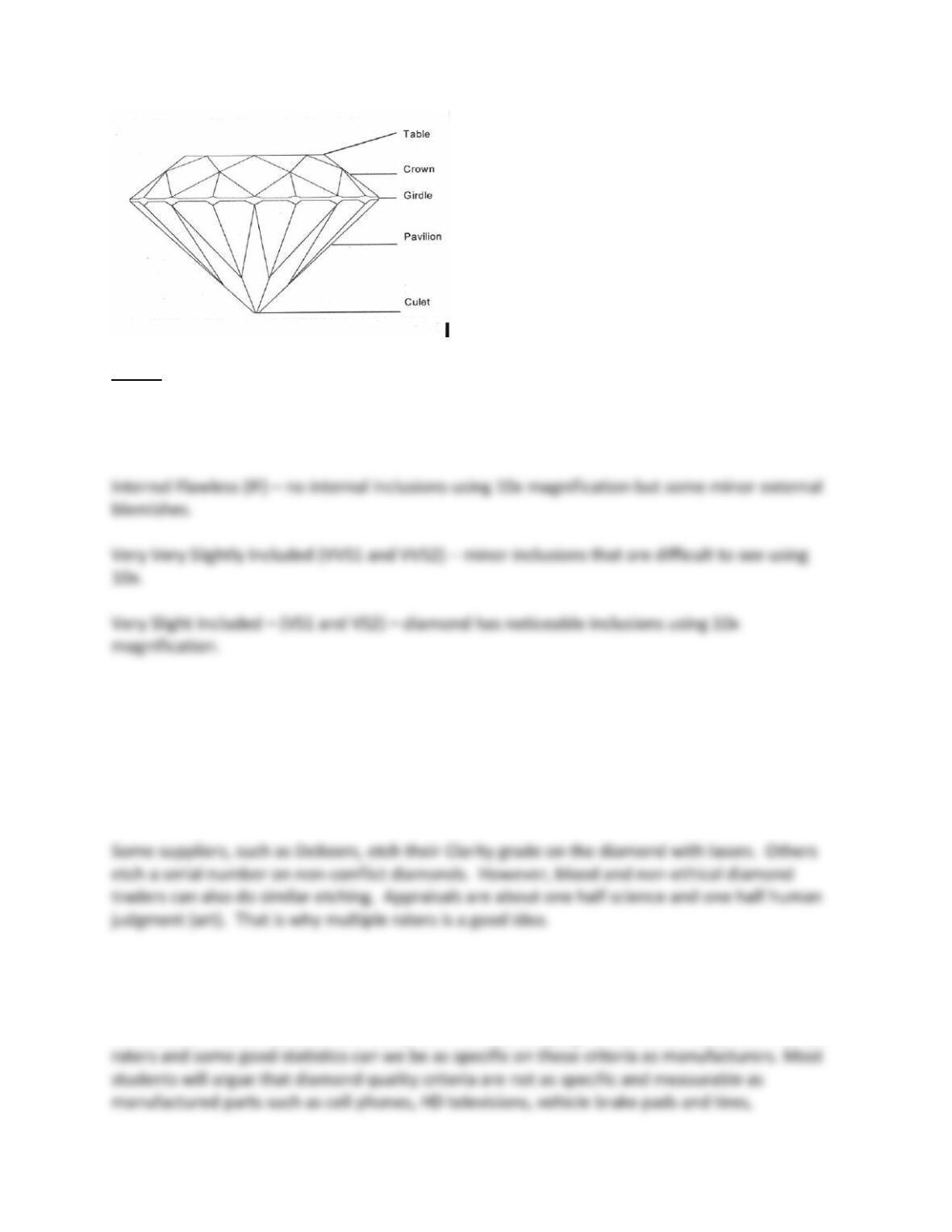
Cut
Possible diamond cuts or shapes include princess (square), cushion (oval), heart, pear, Radiant
and Asscher (hexagons), emerald (rectangle), and oval. In addition, each part of the diamond
Clarity
The grading system includes these clarity categories:
Flawless (FL) – no external blemishes or internal inclusions visible using a 10x magnification.
Slight Included – (SI1 and SI2) – diamond has noticeable inclusions that are easy to see using
10x magnification.
Included – (I1, I2, and I3) – diamond has obvious inclusions that are clearly visible using 10x or
visible without magnification or have inclusions that threaten the long term viability of the
stone such as possible fractures.
Measurability:
Diamond quality criteria are specific with criteria like cut and carat weight being very
measurable. However, color and clarity are more human judgment criteria. Only with multiple
2. Develop p-charts for the diamond blemish and inclusion data found in the worksheet
Hudson Jeweler Blemish and Inclusion Data in MindTap, which documents the quality of
the diamonds on “clarity and defects” coming from two different diamond mines
(suppliers) – one in Asia and one in Africa. What do you conclude?
You might want to go over the diamond criteria for “Clarity” defined in the previous question.
Assuming the same diamond experts did the clarity grading for these two different mines, the
conclusion is the Africa diamonds in this carat range are of higher quality.
For Asia Supplier:
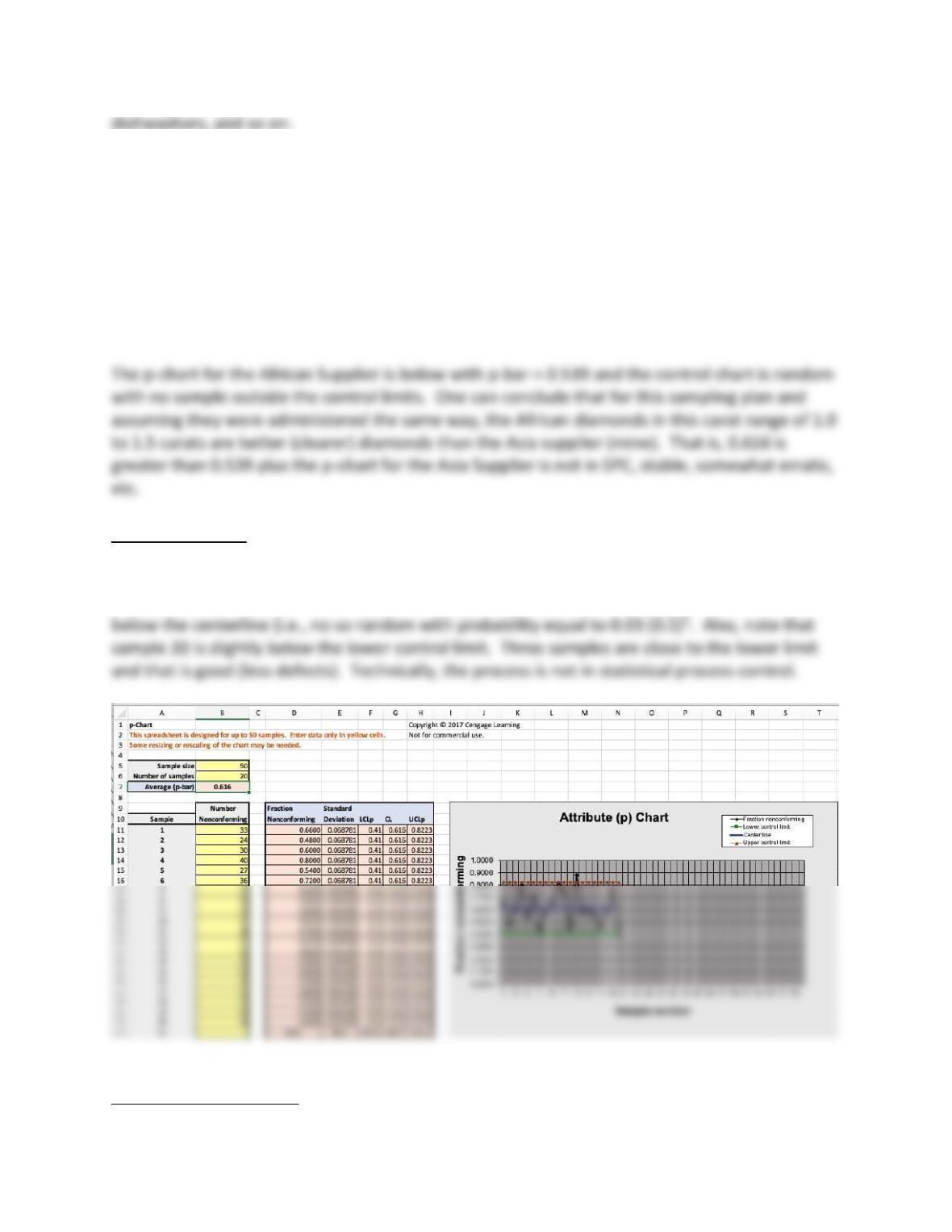
The p-chart for the Asia Supplier is below with p-bar = 0.616 and the control chart is fairly
random with samples 13 and 20 outside the upper control limit. And samples 14 to 18 are all
For the African supplier:
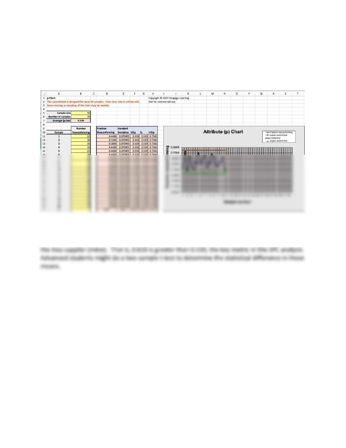
The p-chart for the African Supplier is with p-bar = 0.539 and the control chart is random with
no sample outside the control limits. Technically, this p-chart is in statistical process control.
One can conclude that for this sampling plan, assuming they were administered the same way,
the African diamonds in this carat range of 1.0 to 1.5 carats are better (clearer) diamonds than