CHAPTER 5
Statistics, Quality Tools and Troubleshooting Techniques
OBJECTIVES
• Describe key terms and definitions used in statistics.
• Use and describe Measures of Central Tendency
• Identify dependent and independent variables.
• Describe the steps used in the statistical approach.
• Describe probability.
• Describe the quality tools and techniques used by technicians.
• Explain how to use a Pareto diagram.
• Use a Cause-and-Effect diagram.
• Describe the purpose of a checklist.
• Design a Flow diagram.
• Design a Scatter diagram.
• Design a Histogram.
• Fill in data on a Run chart.
• Describe TPM and management tools.
REVIEW QUESTIONS
1. Describe the term “Measures of Central Tendency.
2. Define the term Mean.
3. Define the term Mode.
4. Define the term Median.
5. Define the term Range.
6. Define the term Measures of Variation.
Measures of Variation– descriptive measures that indicate the dispersion of a
set of values.
7. Describe standard deviation.
Standard Deviation– a measure of data variation; the square root of the variance.
8. Give an example of how statistics are used to operate a process unit.
9. Describe the measure distribution under a normal curve.
The interval from one standard deviation (SD) below the mean to one SD above the
10. What tools do you use to collect data?
11. What tools do you use to organize data?
12. What tools do you use to analyze data?
13. Describe the quality tools and techniques used by technicians.
Most quality experts separate quality tools into two categories; quantitative and non–
quantitative. Quantitative tools are described as; acceptance sampling, reliability,
14. Explain how to use a Pareto diagram.
Constructing a Pareto diagram requires six simple steps; (1) identify the method
15. Describe the purpose of a checklist.
16. Design a Flow diagram. See Figure 5-5 Flow Chart
18. Design a Histogram.
Histograms or frequency plots is a graphical tool used to understand
19. Fill in data on a Run chart.
One of the most common tools used in industry is a run chart. Run charts are
very powerful tools that show a graphical record of a process variable measured
over time. The following steps should be used when building a run chart:
1. estimate the expected range of data points

20. Explain how statistics can help in process troubleshooting.
Name:____________________________ TEST A
Date:____________________________
CHAPTER FIVE
STATISTICS, QUALITY TOOLS AND TROUBLESHOOTING TECHNIQUES
1. A dependent variable is best described as:
a. the sum of the measures in a distribution divided by the number of
measures.
b. a variable that causes, or influences, another variable.
c. descriptive measures that indicate the dispersion of a set of values.
d. a variable that is caused or influenced by another.
2. The mean is best described as:
a. a measure of data variation; the mean of the squared deviation scores
about the means of a distribution.
b. most frequent measure in a distribution.
c. a characteristic of a sample
d. the sum of the measures in a distribution divided by the number of
measures.
3. The independent variable is most closely defined as:
a. a variable that is caused or influenced by another.
b. the sum of the measures in a distribution divided by the number of
measures.
c. a variable that causes, or influences, another variable.
d. a measure of data variation; the mean of the squared deviation scores
about the means of a distribution.
4. Measures of Central Tendency is most closely described as:
a. most frequent measure in a distribution.
b. a characteristic of a sample
c. descriptive measures that indicate the dispersion of a set of values.
d. a quantitative measure of the chances for a particular outcome or
outcomes.
5. Measures of Variation are:
a. a quantitative measure of the chances for a particular outcome or
outcomes.
b. descriptive measures that indicate the dispersion of a set of values.
c. a picture of the activities that take place in a process.
d. a characteristic of a sample
6. Three measures of central tendency are:
a.
b.
c.
7. Scatter plots are:
a. used to indicate relationships between two variables or pairs of data.
b. a picture of the activities that take place in a process
c. a measure of data variation; the mean of the squared deviation scores
about the means of a distribution.
d. a quantitative measure of the chances for a particular outcome or
outcomes.
8. Statistical process control is best described as:
a. a quality system based on the principles of statistical mathematics.
b. a quantitative measure of the chances for a particular outcome or
outcomes.
c. a measure of data variation; the mean of the squared deviation scores
about the means of a distribution.
d. a picture of the activities that take place in a process
9. The improvement cycle has four parts:
a. (1) plot, (2)observe and analyze, (3) learn and (4) act
b. (1) identify, (2)review, (3) plan and (4) act
c. (1) collect, (2)organize, (3) analyze (4) implement
d. (1) plan, (2)observe and analyze, (3) learn and (4) act.
10. Histograms or frequency plots are best described as:
a. a graphical tool used to understand variability.
b. constructed with a block of data separated into five to twelve bars or
sections from low number to high number.
c. will resemble a bell if the data is in control
d. all the above
11. Planned experimentation is:
a. a tool used to test and implement changes to a process (aimed at
reducing variation)
b. constructed with a block of data separated into five to twelve bars or
sections from low number to high number.
c. understand the causes of variation (process problems)
d. a & c
12. A control chart is best described as:
a. a statistical tool used to determine and control process variations.
b. a graphical record of a process variable measured over time.
c. a picture of the activities that take place in a process.
d. a simple bar graph with classifications along the horizontal and vertical
axis. The vertical axis is usually the number of occurrences, cost or time.
The horizontal axis orders the bars from the most frequent to the least
frequent.
13. A run chart is best described as:
a. a simple bar graph with classifications along the horizontal and vertical
axis. The vertical axis is usually the number of occurrences, cost or time.
The horizontal axis orders the bars from the most frequent to the least
frequent.
b. a statistical tool used to determine and control process variations.
c. a picture of the activities that take place in a process.
d. a graphical record of a process variable measured over time.
14. A Pareto chart is best described as:
a. a graphical record of a process variable measured over time.
b. a statistical tool used to determine and control process variations.
c. a simple bar graph with classifications along the horizontal and vertical
axis. The vertical axis is usually the number of occurrences, cost or time.
The horizontal axis orders the bars from the most frequent to the least
frequent.
d. a picture of the activities that take place in a process.
15. A flow chart is:
a. a statistical tool used to determine and control process variations.
b. a picture of the activities that take place in a process.
c. a graphical record of a process variable measured over time
d. a simple bar graph with classifications along the horizontal and vertical
axis.
16. Variance is:
a. an observable characteristic of a phenomenon that can be measured or
classified
b. a graphical record of a process variable measured over time
c. a picture of the activities that take place in a process
d. a measure of data variation; the mean of the squared deviation scores
about the means of a distribution.
17. A process variable is best described as:
a. a picture of the activities that take place in a process
b. a graphical record of a process variable measured over time
c. an observable characteristic of a phenomenon that can be measured or
classified.
d. a characteristic of a sample
18. A process statistic is:
a. a characteristic of a sample
b. a branch of mathematics designed to draw conclusions from data.
c. a smaller group selected to represent a larger population
d. the mean of the squared deviation scores about the means of a
distribution.
19. Statistics are :
a. a measure of data variation; the mean of the squared deviation scores
about the means of a distribution.
b. a branch of mathematics designed to draw conclusions from data that has
been collected, organized, and subjected to analysis.
c. a group of members of a population selected to represent that population
d. a characteristic of a sample
20. A statistical sample is:
a. a group of members of a population selected to represent that population.
b. a characteristic of a sample
c. a branch of mathematics designed to draw conclusions from data that has
been collected, organized, and subjected to analysis.
d. an observable characteristic of a phenomenon that can be measured or
classified.
Answer Key CHAPTER 5 TEST A
STATISTICS, QUALITY TOOLS AND TROUBLESHOOTING TECHNIQUES
Name:____________________________ TEST B
Date:____________________________
CHAPTER FIVE
STATISTICS, QUALITY TOOLS AND TROUBLESHOOTING TECHNIQUES
1. A pareto chart is
a. used to indicate relationships between two variables or pairs of data.
b. a French quality system.
c. a herring bone diagram.
d. a simple bar graph with classifications along the horizontal and vertical
axis.
2. A flow chart is
a. a picture of the activities that take place in a process.
b. a tool used to test and implement changes in a process.
c. a statistical tool used to determine and control process variations.
d. used to indicate relationships between two variables or pairs of data.
3. True or False
In today’s global economy a new relationship exists between suppliers,
companies and customers. Each is dependent upon the other for financial
success.
4. Define the term “measures of central tendency”.
5. True or False
Customers identify the key target set points for the products they require. The
other process variables are identified in-house that support the ability of the
process to produce the desired products; temperatures, flows, level, and
pressure.
6. Control Charts are used to
a. plot quality parameter points from samples taken at different times during
a run.
b. clearly display data.
c. identify upset or out–of-control situations.
d. identify process adjustments and responses.
e. all the above
7. The principles of continuous quality improvement include all of the following
except:
a. innovation and improvement of services and products.
b. innovation and improvement of processes.
c. commitment to quality.
d. integration of suppliers and customers into the quality process.
e. use of quality tools
f. innovative marketing
8. True or False
Statistical process control is a quality tool , based upon the principles of statistical
mathematics and applied to a process to control product quality.
9. What quality tool can vary from notes jotted down on a napkin to complex forms?
a. run chart
b. control chart
c. forms for collecting data
d. pareto
10. What is statistical control methodology applied to a process?
a. statistical process control (SPC)
b. run chart
c. flow chart
d. fishbone
11. The planning phase of the improvement cycle should address all of the following
except:
a. specific objectives and questions.
b. audit and evaluation.
c. predictions .
d. plan for test.
12. A run chart is
a. used to indicate relationships between two variables or pairs of data.
b. a tool used to test and implement changes in a process.
c. a statistical tool used to determine and control process variations.
d. a graphical record of a process variable measured over time.
13. True or False
The results from phase three are used to decide whether or not a change to the
process is required. If a change is required a modified brainstorming session
should be conducted to determine what changes to the process would result in
improvement. These changes should be clearly stated.
14. A cause and effect diagram is
a. is a simple bar graph with classifications along the horizontal and vertical
axis.
b. is used to indicate relationships between two variables or pairs of data.
c. is a method for summarizing available knowledge about the causes of
process variation.
d. can vary from notes jotted down on a napkin to complex forms.
15. A cause and effect diagram is sometimes referred to as a
a. fishbone diagram.
b. herring bone diagram.
c. pareto.
d. run chart.
16. Define the term “deviation.”
17. Define the term “variance.”
18. What is a statistical tool used to determine and control process variations?
a. control chart
b. run chart
c. flow chart
d. pareto
19. Planned experimentation is
a. a tool used to test and implement changes to a process.
b. aimed at reducing variation.
c. used to understand the causes of variation (process problems).
d. all the above
20. A process technician uses three simple steps with statistics:
a.
b.
c.
21. Define the term “mean.”
22. Quality tools include all of the following except:
a. statistical process control.
b. flowcharts.
c. cause and effect diagrams, fishbone.
d. pareto charts.
e. run charts.
f. control charts.
g. planned experimentation.
h. audit and evaluation.
i. histograms or frequency plots.
j. forms for collecting data.
k. scatter plots.
23. The first step in the improvement cycle is to
a. increase current knowledge of the process.
b. identify the problem.
c. identify symptoms.
d. select possible solutions to problem.
24. True or False
Before SPC operators would adjust their equipment based upon current
readings. If the reading is taken when the processes normal variation is in a low
cycle the operators adjustment will swing the process variable high. Adjustments
made without SPC methodology tend to make the process swing high and low.
25. Define the term “mode.” The value that occurs most often in a set of numbers.
26. Histograms or frequency plots
a. are graphical tools used to understand variability.
b. are constructed with a block of data separated into five to twelve bars or
sections from low number to high number.
c. have a vertical axis that is the frequency and the horizontal axis is the
scale of characteristics.
d. are finished charts that resemble a bell if the data is in control.
e. all the above
27. Phase two ________________ & ______________ implements the data
collection process. The data collected will be used to address the questions from
phase one.
a. observe and analyze
b. plan and learn
c. learn and act
d. none of the above
28. True or False
In any process a certain amount of variability can be found. Variability is defined
as the tendency to vary. SPC identifies this variability and enhances an
operators ability to control the process.
29. True or False
SPC allows the normal fluctuations on the equipment to be considered over a
longer period of time. Sample results must demonstrate a downward or upward
trend above the key target set points.
30. A histogram or frequency plots is a
a. graphical tool used to understand variability.
b. finished chart which will resemble a bell if the data is in control
c. a chart in which the vertical axis is the frequency and the horizontal axis is
the scale of characteristics.
d. chart constructed with a block of data separated into five to twelve bars or
sections from low number to high number.
e. all the above
31. What quality tool is used to indicate relationships between two variables or pairs
of data?
a. histogram
b. scatter plots
c. pareto
d. SPC chart
32. Define the term “median.”
33. Define the term “range.”
34. Define the term “standard deviation.”
35. The interval from one standard deviation below the mean to one standard
deviation above the mean contains approximately ______% of the
measurements.
36. The interval from two standard deviations below the mean to two standard
deviations above the mean contains approximately ______% of the
measurements.
37. The interval from three standard deviations below the mean to three standard
deviations above the mean contains approximately ______% of the
measurements.
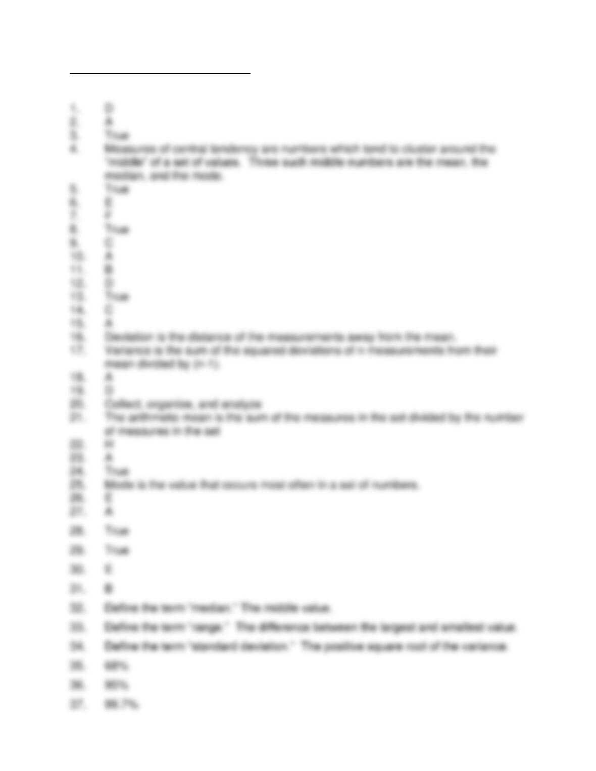
Answer Key CHAPTER 5 TEST B
STATISTICS, QUALITY TOOLS AND TROUBLESHOOTING TECHNIQUES