QUESTIONS 18, PART A
1. Study Figure 18.1a, the oxygen isotope record for the Quelccaya Ice Cap in Peru. This ice cap is fed by
moisture from the Amazon Basin.
a. Were temperatures warmer or colder than the mean for the record during the period from A.D. 1550 to
1900?
b. How could the record of the Huaynaputina volcanic eruption be used to date this ice core (Figure
18.1b)?
2. During this period, would you expect mountain glaciers in the region to have advanced (due to less
summer melting) or retreated (due to more summer melting)? Explain.
3. From the record in 18.1a, has the last century at Quelccaya been warmer or cooler than the three
centuries before 1900?
4. Between 1963 and 1991, significant retreat and lowering of an outlet glacier of the Quelccaya Ice Cap
was observed. Although glaciers may not respond immediately to climate change, if increased
temperature was the cause of this retreat, is this explanation consistent with temperature data in Figure 18.1
a? Why or why not?
Yes.
5. In 1600 the Rhone Glacier in Switzerland was in an advanced position. A four-story building, erected
about 1950, now covers the glacier’s former terminal position. Does this evidence agree or disagree with
the ice core record in Figure 18.1a?
6. In parts of Glacier Bay, near Juneau, Alaska, glacier ice was near its maximum in 1820. Since that time,
the ice has retreated more than 45 miles in this fiord. Does this Little Ice Age (about 1450 to 1850)
advance of ice in Glacier Bay, and the retreat that followed, agree with the ice-core record from Peru
(18.1)? Explain.
7. Study Figure 18.2a–e. This figure presents the oxygen isotope profiles for the tropical Quelccaya Ice Cap
drilled in 1991 on the summit dome (A), cores drilled in 1976 on the summit dome (B), the middle dome
(C), and the south dome (D). The north-to-south cross section of the Quelccaya Ice Cap (E) illustrates the
locations from which the oxygen isotope records in A through D were drilled and the position of the
percolation line in 1976 and 1991. The percolation line is the altitude on the glacier below which melting of
snow and subsequent percolation of water through the snow and firn occurs.
a. How do the mean isotopic values at the summit core drilled in 1991 compare with those drilled in
1976? (See mean values at bottom of each record.)
b. What does the change in mean isotopic value between 1976 and 1991 at Summit Dome suggest about
atmospheric temperatures in this part of the World?
c. Why are the distinctive annual spikes seen in the 1976 summit core missing or subdued in the 1991
summit core? (Hint: Compare 1991 summit record with the record from South Dome.) The d1 8O
8. In 1991 the percolation line was above the Summit Dome (Figure 18.2D). How many meters has the
percolation line risen between 1976 and 1991?
140 meters. The dome elevations were 5670 and 5540 with a difference of 130 m. The percolation line
9. Melting now occurs at Summit Dome that did not occur there in 1976, indicating that the air temperature
has warmed. We know that the temperature of the atmosphere changes by 0.7 °C for each rise in elevation of
10. Study the photos (Figure 18.3) of the Qori Kalis Glacier, the largest outlet glacier from the Quelccaya
Ice Cap. What has happened to this glacier between 1983 and 1991?
11. a. Study the map (A) in Figure 18.4, which illustrates positions of the Quori Kalis glacier terminus
mapped from aerial photos taken in 1963 and terrestrial photos taken in 1978, and later. What is the
approximate straight-line distance between the maximum position in 1963 (near the 1 in the date 1963 in
the figure) and the center of the average position of the terminus in 1991?
Approximately 320–325 meters
b. From your measurement, what is the average annual rate of change for this period (1963–1991) in
m/yr?
c. Study the inset graph in Figure 18.4. Has the rate of retreat of the glacier increased or decreased since
1991?
12. a. Determine the rate of retreat from 1991 to the most recent position of the end of the glacier as
shown in Figure 18.5.
b. Has the rate increased from that during the 1963–1991 period?
4.5 times faster.
13. To help understand the impact of even small changes in temperature, we now look at “the year without
a summer.” Volcanic events are recorded in ice cores as seen in Figure 18.1b where the eruption of Mt.
_________ is shown by an ash layer. On April 5, 1815, Mount Tambora in Indonesia began erupting and
injected ash and gases (e.g., H2O, HCl, CO2, SO2, N2) into the stratosphere. Some of these gases (for
instance, HCl) have the potential to affect the ozone (O3) layer; most act to enhance the greenhouse effect,
but sulfate (SO4) droplets in the stratosphere can increase cooling. In 1816 temperatures declined by 1 °C
in the northern hemisphere (Bryant, 1991). The following description, modified from the Berlin, Ohio,
Sesquicentennial History (1966) captures the conditions in this area of the Midwest in the “year without a
summer.”
In each of the 12 months of 1816, ice and frost were experienced in Ohio, the Midwest, and New
England. The month of January was very mild, and only a few cold days in February. March was
moderately cold; April came in warm, but changed to snow and cold by the end of the month.
May was so cold that all buds and fruits were frozen and ice formed an inch thick. Corn that came up was
Frost was common in July. A half-inch of ice was recorded in August; the stunted corn was fed to cattle as
fodder. September began cold with snow in New York on September 11. New Berlin was mild in mid-
September, then cold, frost and 1/4 inch of ice. Frost and ice were common in October; November was
stormy with much snow. December was mild and comfortable.
Switzerland was also experiencing unusual weather in the summer of 1816. The rainy and overcast weather
was a factor in Mary Shelley’s writing a novel about Frankenstein (Shelley, 1965). Consider the
introduction for this question and:
a. Describe the cause of this cooler weather in many places in the world in 1816.
b. Speculate on the impact on society of a larger eruption.
Many events, changes, and losses could be listed as possible impacts. Some guidance can be obtained from
literature about the 1815 eruption of Tambora or the 1991 and later eruptions of Pinatubo. Or students
could simply scale up the processes described in books and movies on volcanism, the relevant hazards that
were studied earlier in this book, and the events that follow any major natural disaster (e.g. Hurricane
QUESTIONS 18, PART B
1. In Figure 18.6, identify the following in the space below or by marking on the diagram: CFC, ozone,
and diatomic oxygen molecules and chlorine and oxygen atoms.
Students can circle and label parts on Figure 18.6 or sketch parts of Figure 18.6 below with correct names.
2. In step 5 to step 6 of Figure 18.6, what causes the chlorine atom to separate from the chlorine-oxygen
molecule?
3. a. Why does one chlorine atom destroy many O3 molecules?
Chlorine atoms remain in the atmosphere for one to two years and each one has the potential to destroy
b. Where and when in the year are the lowest values for stratospheric ozone?
c. Why is the ozone “hole” over Antarctica?
The stratosphere over Antarctica develops very low temperatures during the darkness of winter (July-
4. The concentration of ozone is measured in “Dobson units.” From Figure 18.6 one Dobson unit is equal to
______
1 ppb (part per billion) of ozone
5. What is the average value for the October concentration of ozone in the stratosphere over Halley
Station, Antarctica, in 1956? in 1972? in 1993?
6. On Figure 18.7 sketch a smooth best-fit curve through the data. About when did the rate of decline
change significantly?
..
7. What was the average annual decrease or rate of change (ppb/year) from 1972 to 1993?
8. Draw a straight trend line through the 1972 and 1994 data points to the bottom axis. What might you
conclude about the ozone problem from data available at the end of 1994?
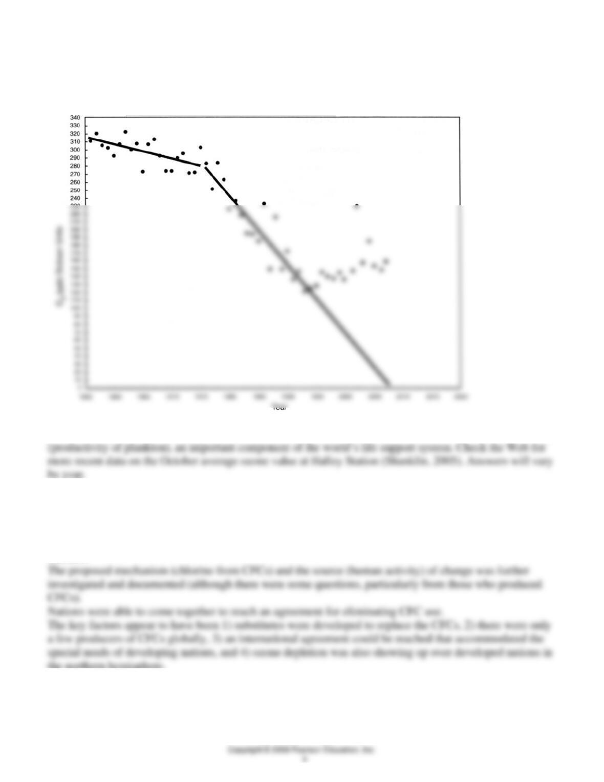
See Figure 18.7 below for the approximate straight line. From the 1994 and earlier data, the downward
trend was continuing and suggested an approach to zero about 2008.
9. From data up to 2004, what might you conclude about society’s response to the ozone problem?
It is beginning to show results with October ozone levels rising, after reaching a low of ~120ppb in 1993.
10. In addition to the October decrease in ozone, there has been a corresponding increase in the area of the
ozone hole. Fortunately few people live in Antarctica (mainly scientists), but ozone could impact marine life
11. Why were nations able to reach agreement on CFC reduction? (Give several factors.) Once the
change in October ozone levels in Antarctica were recognized and analyzed, the data were found to be
compelling.
The potential impact of declining ozone was determined to very serious for the biosphere, including
humans.
the northern hemisphere.
QUESTIONS 18, PART C
Study Figure 18.8 and then answer the following questions.
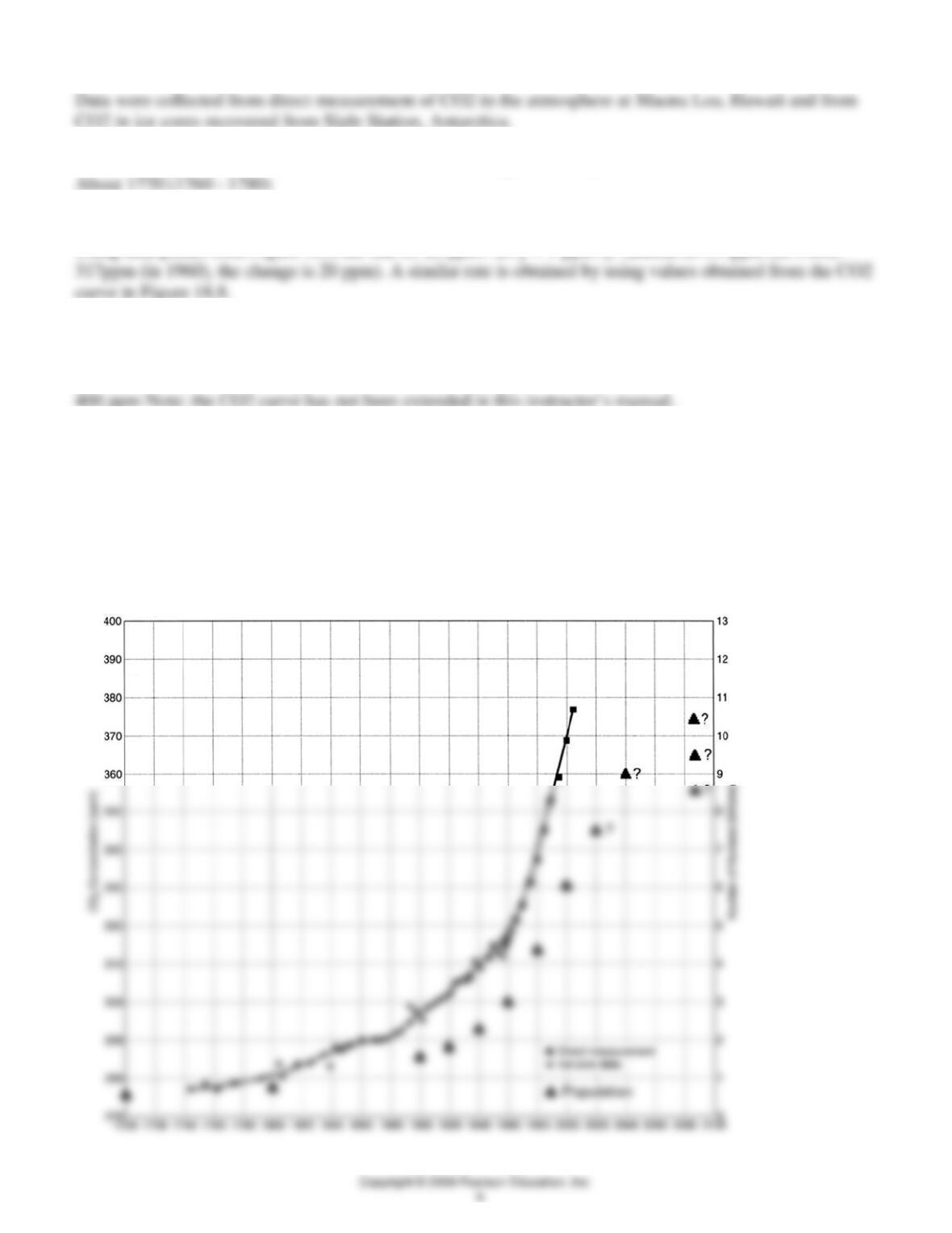
1. Where were the data collected that are shown in the graph?
2. According to Figure 18.8, when did CO2 levels first begin to increase?
3. Calculate the average annual rate of CO2 increase (in ppm/yr) between 1960 and 1980.
Using data points from Figure 18.8 the rate is: 20 ppm / 20 y = 1 ppm /y. (Based on 337ppm (in 1980) –
4. Using Figure 18.8, estimate the CO2 concentration in the year 2020 by linear projection. Extend the
CO2 line by placing a ruler on the line joining 1980 and the last point (2004). Draw this line through the
year 2020. The CO2 value expected at that time is ____ ppm.
5. Using the data in Table 18.1, plot the change in world population between 1700 and 2005 on the same
figure as CO2 increase (Figure 18.8). Use the right axis for the population scale. Write a revised caption
for Figure 18.8 here.
Caption: CO2 concentration in the atmosphere from direct measurement at Mauna Loa (squares) and from
Siple Station ice cores (dots). Global human population from 1700 to 2000 from Table 18.1 (triangles) with
possible future population numbers indicated by triangle with adjacent “?”. (Reader is invited to use
additional population data in Table 18.1 to support drawing the population curve in Figure 18.8).
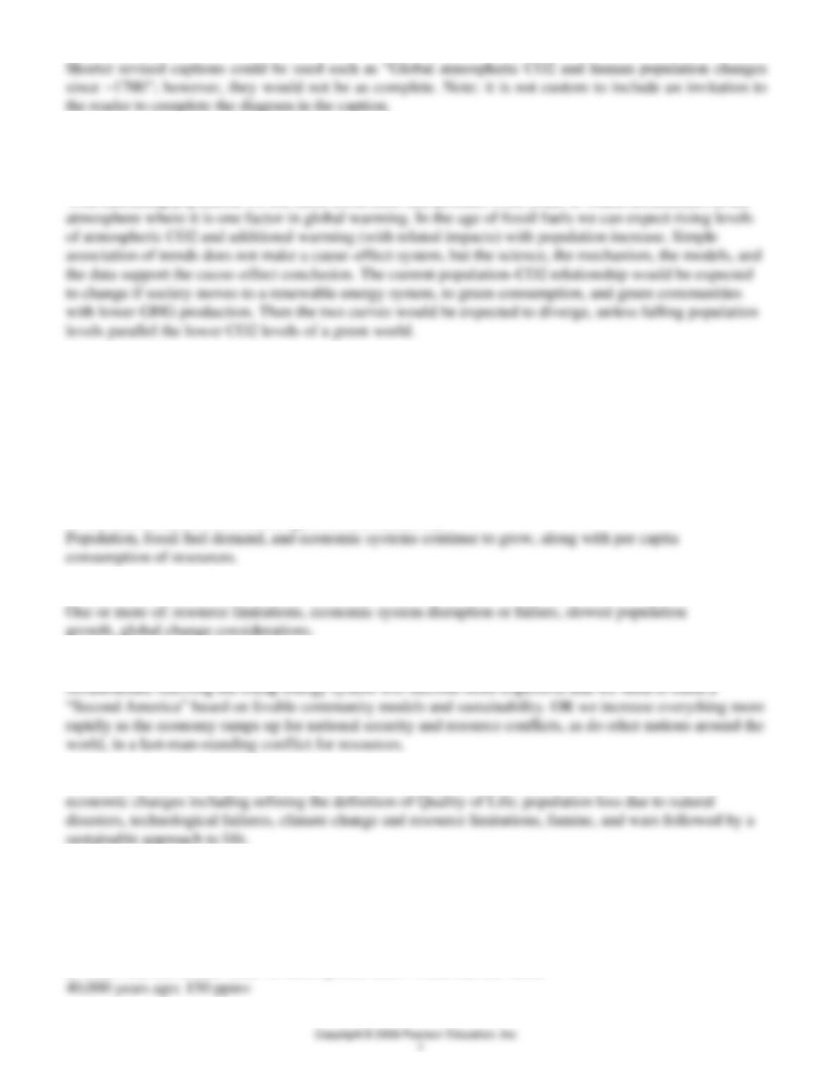
6. Note the shape of the two curves in Figure 18.8. What is the apparent cause–effect relationship between
the two?
With increasing population we use more fossil fuels that produce CO2, some of which accumulates in the
7. Given that the world’s energy use and population continue to increase, over the next 10 years will the
CO2 content of the atmosphere (check one):
____ increase at its current rate;
____ increase at a slower rate;
____ increase at a more rapid rate;
____ decrease?
Why?
Variety of answers possible, depending on the emphasis and systems considered by the student.
1) Increase in CO2 at current rate (give current date); why?
2) Increase in CO2 at slower rate (give current date); why?
3) Increase in CO2 at faster rate (give current date): Why? We seek to build infrastructure, and build green
4) Decrease in CO2 for any combination of reasons from lower trade and consumption, cultural and
8. In 1997, the complex diagram (Figure 18.9), provided a comprehensive summary of changes in past
temperatures and atmospheric CO2. The records extended from the present, through the last ice age
(Wisconsinan) and though the last interglacial to 150,000 years before the present. These data from the
Vostolc, Antarctica, ice-core extend well beyond the directly measured and earlier ice-core derived
temperatures of Figure 18.8. Use the information in Figure 18.9 to help answer the following questions.
a. When was the lowest value for atmospheric CO2? What was the value?
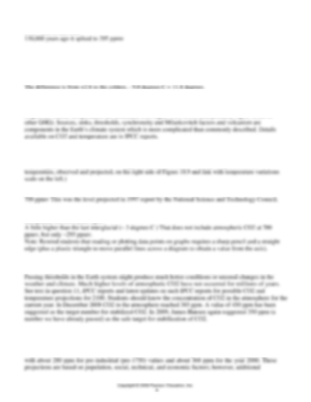
b. In the 150,000 years prior to 1850, about when did the highest atmospheric CO2 occur? What was the
CO2 value at that time?
c. What was the maximum temperature variation after that peak in CO2?
It rose to about +2.8 degrees
d. About how much colder was the temperature during the coldest parts of the glacial periods than during
the warmest part of the last interglacial?
9. What might you infer (Figure 18.9) about the general relationship between CO2 and temperature of Earth
in the past?
In general, warmer temperatures are associated with higher CO2 levels (and probably higher levels of
10. From Figure 18.9
a. What is the projected temperature variation in 2100?
Plus 3 degrees C. (Variation is from “0”, approximately from the 20th century temperatures; see
b. What is the projected CO2 level with no controls in 2100?
c. How does the projected temperature for 2100 compare with the temperature during the height of the last
interglacial (125,000 years ago)?
d. If CO2 levels go beyond 700 ppm, what change, if any, would you expect in temperature?
It should go higher, however, the temperature–CO2 correlation may vary with higher CO2 levels.
11. The Third Assessment Report (TAR) in 2001 of the Intergovernmental Panel on Climate Change
(IPCC, 2001) provides an update on values in Figure 18.9. Highlights from the Summary for Policy
Makers include the following.
Projected concentrations of atmospheric CO2 for the year 2100 range from 540 to 970 ppm compared

a. Given the above summary, what action should the world take now (or in the future) in the way of long-
the current number to focus the responses of students.
b. Your instructor may assign specific topics in the TAR for you or your group to research before next
class. Topics might include expected temperature increase over 1,100 years (beginning in the year 1000),
c. Additionally, answer the question, What action should the world take now (or in the future) to address
these projected climate changes?
Work to minimize and reverse climate change, and then to adapt. Consider all the options discussed in
The TAR Summary for Policy Makers is online with other IPCC Reports at: http://www.ipcc.ch/
12. The IPCC Fourth Assessment Report (AR4) further refines the certainty of human activity as a major
factor in global warming and the possible range in temperature to be expected in 2100. Consult IPCC
(2007) online and prepare a paragraph on one of the following:
Answers will vary depending on depth of investigation of the issue. See IPCC reports and other sources
QUESTIONS 18, PART D
1. Using at least one of the references in the Introduction to Part D, prepare a one-page scenario
describing the next 50 years. Write it as if the next 50 years have already passed. Consider starting your
scenario with, “The last 50 years have produced a few surprises,” or “The year is 20XX and it is a fine day
in,” or as a letter to a former classmate, “I am now _____________ years old and things have changed
since we were in class 50 years ago.” You should focus on changes in energy and mineral resources,
pollution, and quality of life, plus any unusual natural disaster events. You might want to include a few
related social, economic, and political events. Unless your instructor suggests otherwise, you may take
any viewpoint, optimistic/pessimistic, sustainable/unsustainable, etc.
Answers will vary. For the most part those students who are well aware of current events, the topics of
2. Using the doubling time equation, the population growth rate of 1% (expected in 2015), and your ideas of
how the world is progressing, answer the following.
a. Considering the trends in population and the availability of resources (including fossil fuels), what is
your best guess for the maximum human population on Earth?
Answer depends on realistic rates of change in the population–resource relationship, with the understanding
b. This maximum human population will occur in the year ____ .
2020, 2050? ????
c. The major factor(s) that will end population growth will be… (consider the Introduction to Section IV and
any changes that you expect in population, resources, biodiversity, and global climate).

d. How will we achieve sustainability for humans on Earth?
Develop a sense of community, understand how the Earth works, and balance natural and human resources