58 CHAPTER 3 | Where Prices Come From: The Interaction of Demand and Supply
d. The information on nutrition may well cause at least some consumers to decide to eat
1.10 The demand for UGG boots decreased from 2016 to 2017, which could be caused by a decrease
in the price of leather boots, which are a substitute good (UGG boots are sheepskin boots), by a
decrease in national income, assuming UGG boots are normal goods, by a decrease in the taste
(preference) for UGG boots as a result of a campaign by animal rights activists against using
sheepskin to make boots, or by any other factors that decrease demand.
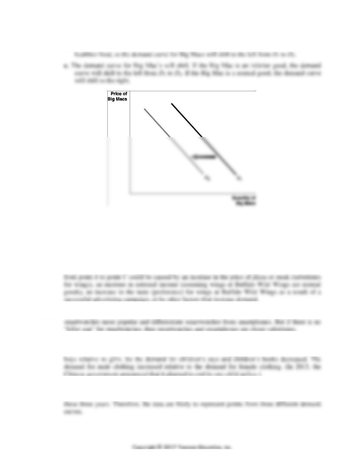
1.11 A movement along the demand curve from point A to point B would be caused by a decrease in
the price of traditional wings at Buffalo Wild Wings. A shift to the right of the demand curve
1.12 A “killer app” for smartwatches (the app would be a complement for smartwatches) should make
1.13 China’s one-child policy increased the relative demand for goods and services consumed by the
population over age 14 and increased the relative demand for goods and services consumed by
1.14 The data do not indicate that the demand curve for Priuses is upward sloping. It is likely that
factors such as income, fuel prices, and the prices of other hybrid vehicles have changed during
CHAPTER 3 | Where Prices Come From: The Interaction of Demand and Supply 59
1.16 You should disagree. The journalist made a common error. A decrease in the price of gasoline
1.17 a. Although per capita incomes may be lower in China than in some high-income countries,
China’s large population and the rapid economic growth China has experienced in recent
years means there are many potential buyers of iPhones in China. In addition, many Chinese
consumers may not currently own a smartphone, which means Apple might have an easier
3.2
The Supply Side of the Market
Learning Objective: Discuss the variables that influence supply.
Review Questions
2.1 A supply schedule is a table that shows the relationship between the price of a product and the
2.2. A “change in supply” refers to a shift of the supply curve, while a “change in quantity supplied”
refers to a movement along the supply curve as a result of a change in the product’s price.
2.3 The law of supply states that, holding everything else constant, an increase in price causes an
increase in the quantity supplied (and a decrease in price causes a decrease in the quantity
supplied). The main variables that will cause a supply curve to shift include: (1) changes in the
prices of inputs used to make the product, (2) technological change, (3) changes in the prices of
60 CHAPTER 3 | Where Prices Come From: The Interaction of Demand and Supply
Problems and Applications
2.4 a. Change in quantity supplied: A movement up the supply curve.
2.6 A movement along the supply curve from point A to point B would be caused by an increase in
the price of traditional wings at Buffalo Wild Wings. A shift to the right of the supply curve from
2.7 The supply of UGG boots decreased from 2016 to 2017. The decrease in supply could be caused
2.8 One of the variables that shifts a market supply curve is a change in the price of a substitute in
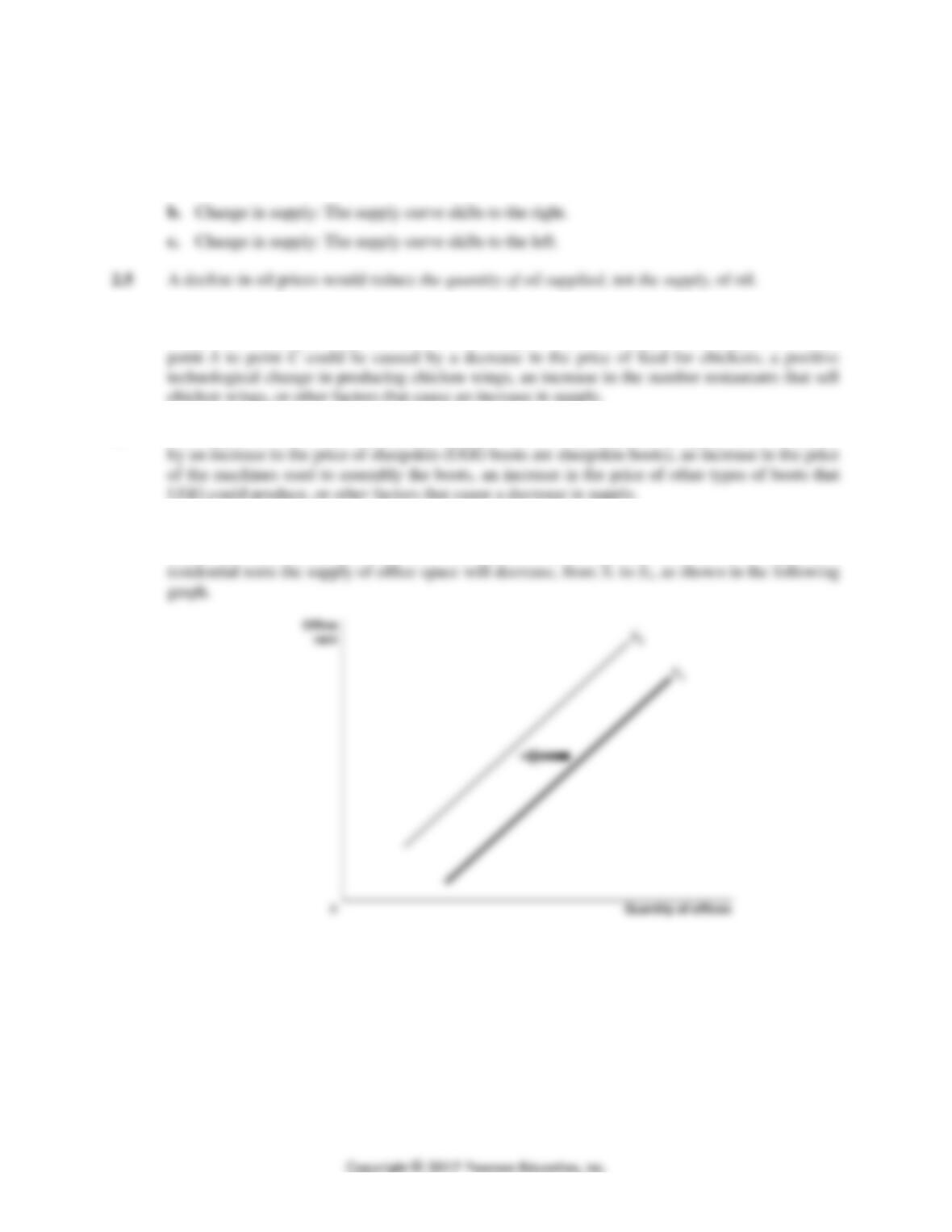
production. Residential apartments are a substitute for office space. In response to an increase in
CHAPTER 3 | Where Prices Come From: The Interaction of Demand and Supply 61
2.9 One of the variables that will shift a market supply curve is a change in the expected future price
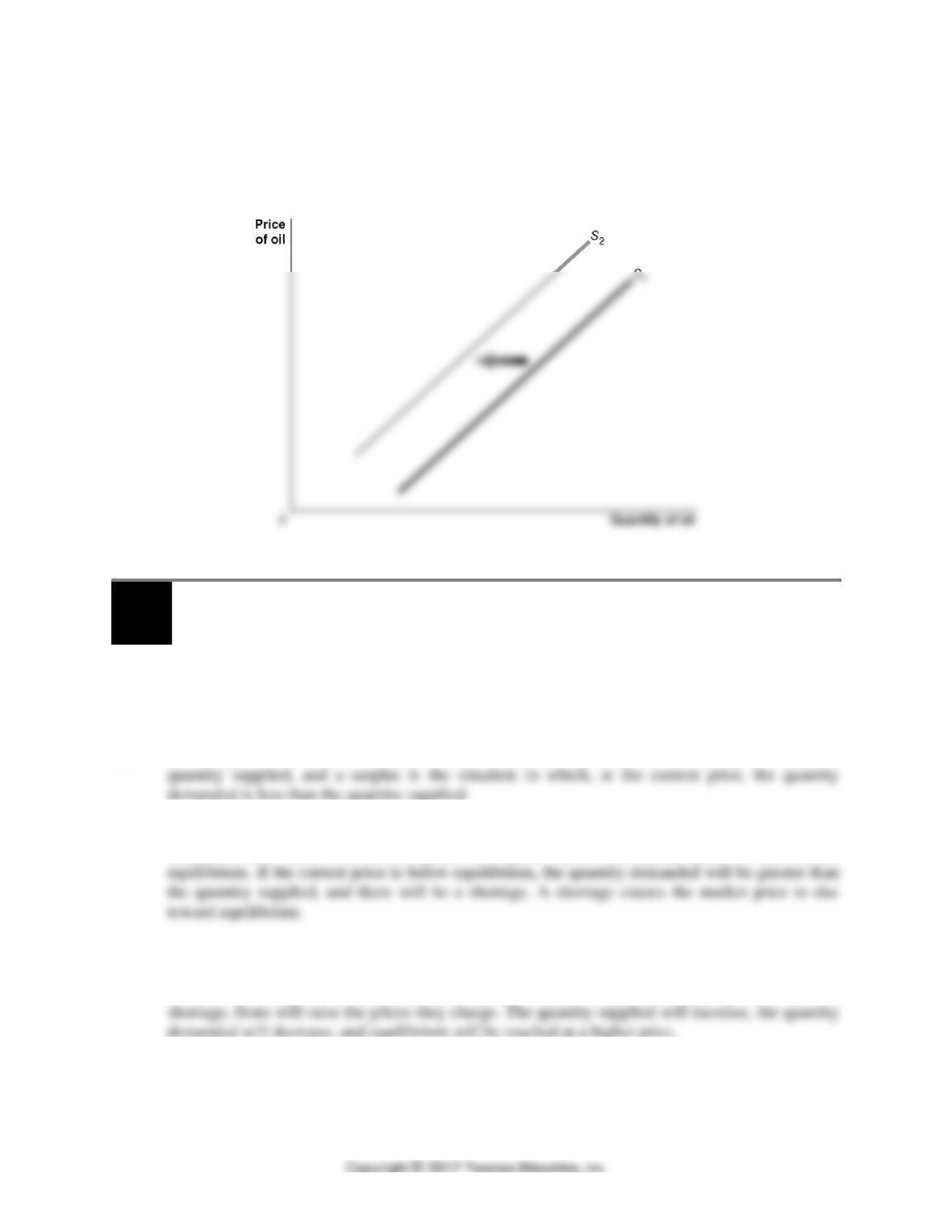
of the good or service. Holding some oil in storage rather than selling it would mean less oil
would be supplied at every price. As a result, the supply of oil will shift to the left from S1 to S2 in
the following graph.
3.3
Market Equilibrium: Putting Demand and Supply Together
Learning Objective: Use a graph to illustrate market equilibrium.
Review Questions
3.1 Market equilibrium is the situation in which the quantity demanded equals the quantity supplied.
3.2 A shortage is a situation in which, at the current price, the quantity demanded is greater than the
3.3 If the current price is above equilibrium, the quantity supplied will be greater than the quantity
demanded, and there will be a surplus. A surplus causes the market price to fall toward
Problems and Applications
3.4 You should disagree. The demand curve will not shift as a result of a shortage. If there is a
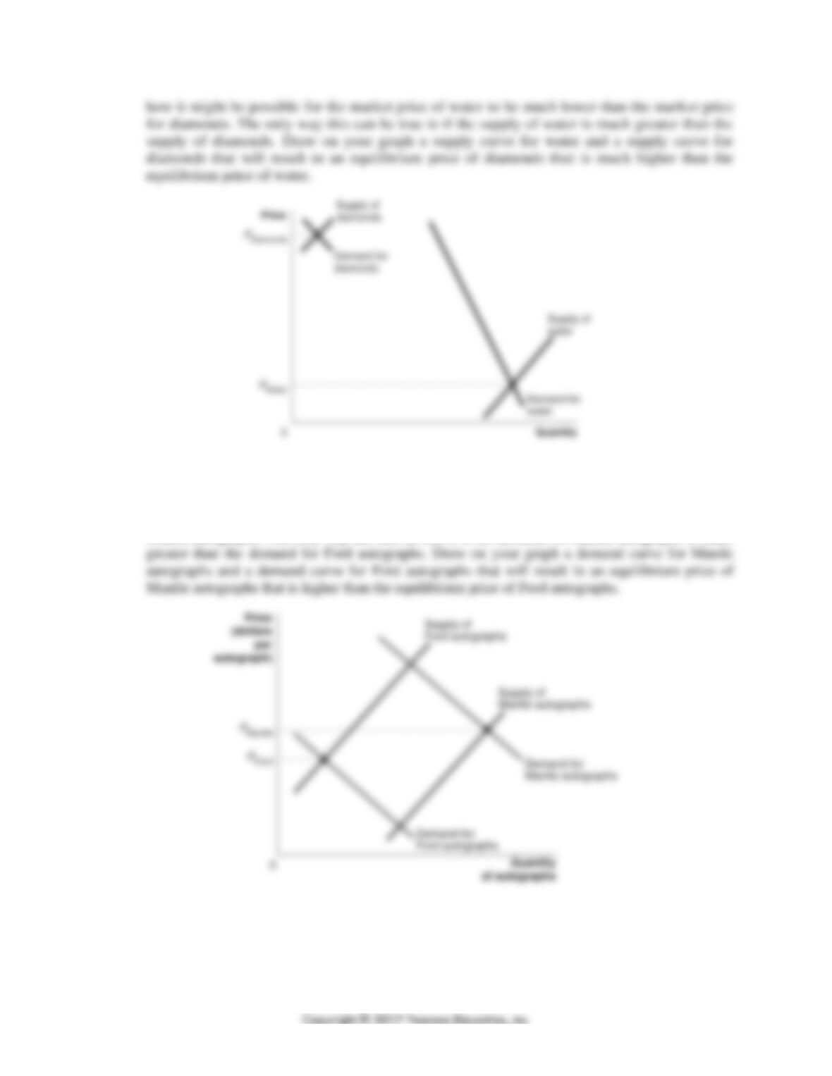
3.5 Begin by drawing two demand curves. Label one “Demand for diamonds” and the other
“Demand for water.” Make sure that the water demand curve is much farther to the right than
the diamond demand curve. Based on the demand curves you have just drawn, think about
62 CHAPTER 3 | Where Prices Come From: The Interaction of Demand and Supply
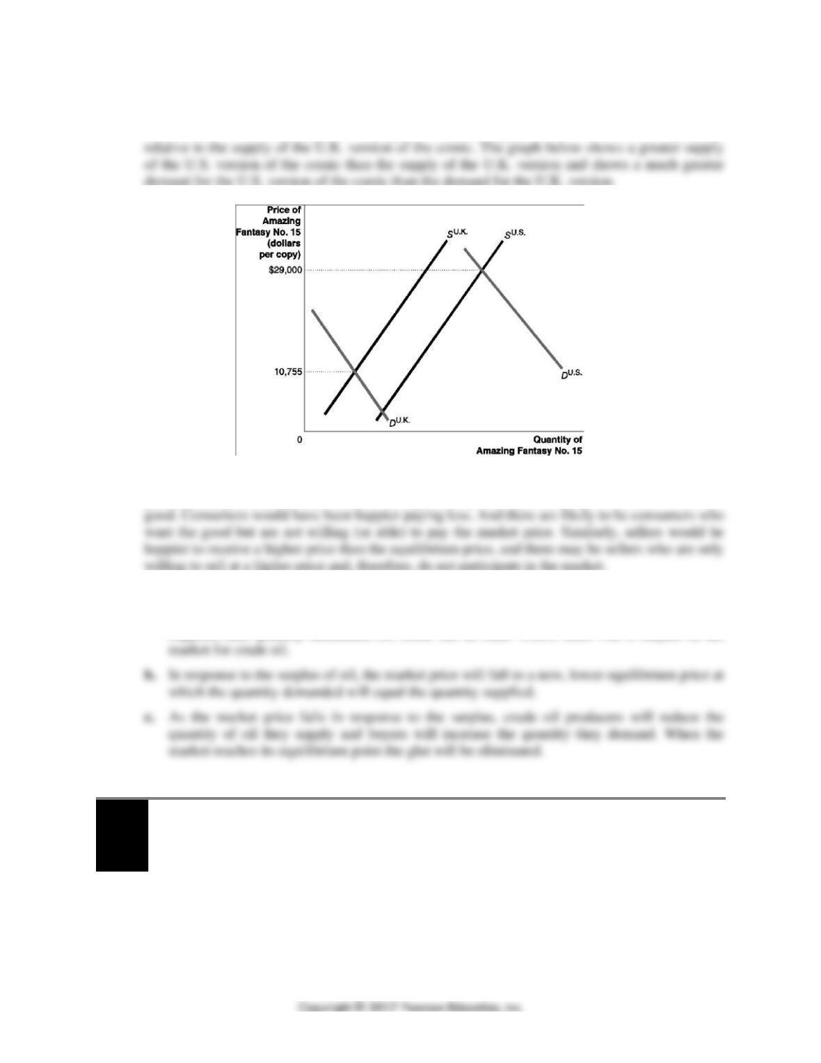
3.6 Begin by drawing two supply curves. Label one “Supply of Mantle autographs” and the other
“Supply of Ford autographs.” Make sure that the Mantle supply curve is much farther to the right
than the Ford supply curve. Based on the supply curves you have just drawn, think about how it
might be possible for the market price of Ford autographs to be lower than the market price for
Mantle autographs. The only way this can be true is if the demand for Mantle autographs is much
CHAPTER 3 | Where Prices Come From: The Interaction of Demand and Supply 63
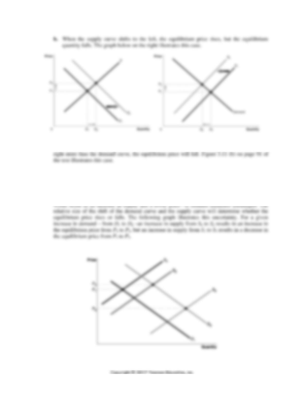
3.7 The demand for the U.S. version of Amazing Fantasy No. 15 comic relative to the demand for the
U.K. version of the comic must be even greater than the supply of the U.S. version of the comic
3.8 No. It only means that consumers who are willing to pay the equilibrium price are able to
purchase the good, and sellers who are willing to accept the equilibrium price are able to sell the
3.9 a. In referring to a “global glut of crude” the article describes the result of a significant increase
in supply relative to the demand for crude oil. This change resulted in a greater quantity
supplied than quantity demanded for crude oil; in other words, there was a surplus in the
3.4
The Effect of Demand and Supply Shifts on Equilibrium
Learning Objective: Use demand and supply graphs to predict changes in prices and
quantities.
Review Questions
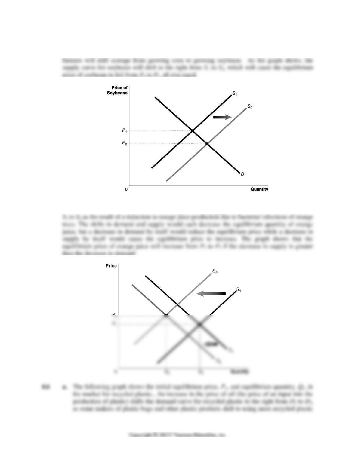
4.1 a. When the demand curve shifts to the right, the equilibrium price and equilibrium quantity
both rise. The graph below on the left illustrates this case.
64 CHAPTER 3 | Where Prices Come From: The Interaction of Demand and Supply
4.2 If the demand curve shifts to the right more than the supply curve does, the equilibrium price will
rise. Figure 3.11 (a) on page 91 of the text illustrates this case. If the supply curve shifts to the
Problems and Applications
4.3 You should agree. By itself, the increase in demand for smartwatches would cause the demand
curve to shift to the right along an unchanged supply curve. This shift would result in an increase
in the price of smartwatches. But an increase in the number of firms producing smartwatches
CHAPTER 3 | Where Prices Come From: The Interaction of Demand and Supply 65
4.4 The problem assumes that the soybeans and corn are substitutes in production. In response to a
decline in the demand for corn, the equilibrium price of corn will decrease. As a result, some
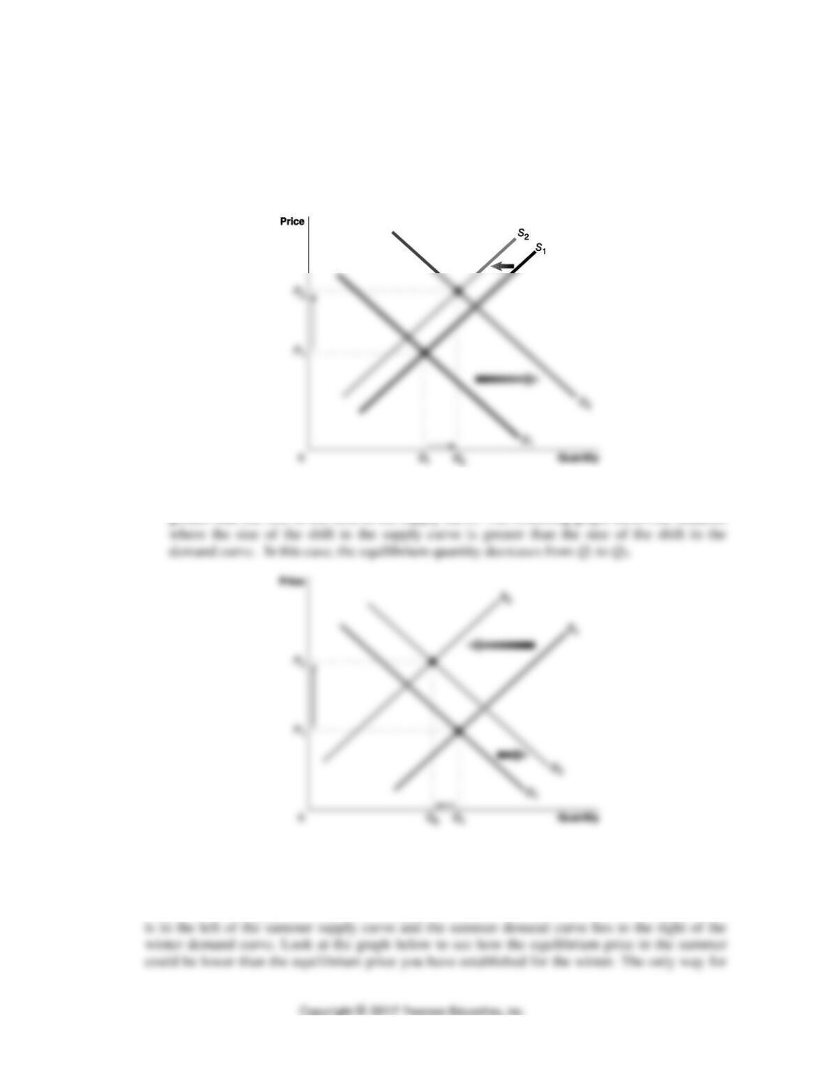
4.5 The following graph illustrates a decline in the demand for orange juice from D1 to D2 as a result
of the shift in consumer preferences to other juices. The supply curve also shifts to the left from
66 CHAPTER 3 | Where Prices Come From: The Interaction of Demand and Supply
as the cost of newly produced plastic increases. The ban on the use of plastic bags would
decrease the supply of recycled plastic by eliminating one source of plastic for recycling, so
the supply curve shifts to the left from S1 to S2. As the graph shows, both the shift in the
demand curve and the shift in the supply curve will cause the equilibrium price to rise. So we
can conclude that the new equilibrium price, P2, will be greater than the initial equilibrium
price, P1
b. The graph in part a. shows the equilibrium quantity increasing from Q1 to Q2. But that
increase occurs only because we show the size of the shift in the demand curve as being
greater than the size of the shift in the supply curve. The following graph shows the situation
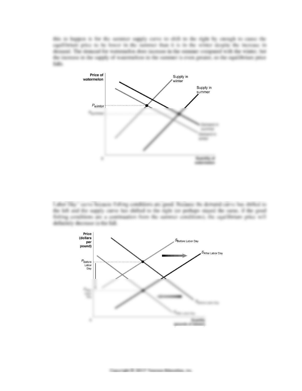
4.7 Draw a demand and supply graph for watermelon with two demand curves and two supply
curves. Label the demand curves “Demand in winter” and “Demand in summer.” Label the
supply curves “Supply in winter” and “Supply in summer.” Be sure that the winter supply curve
CHAPTER 3 | Where Prices Come From: The Interaction of Demand and Supply 67
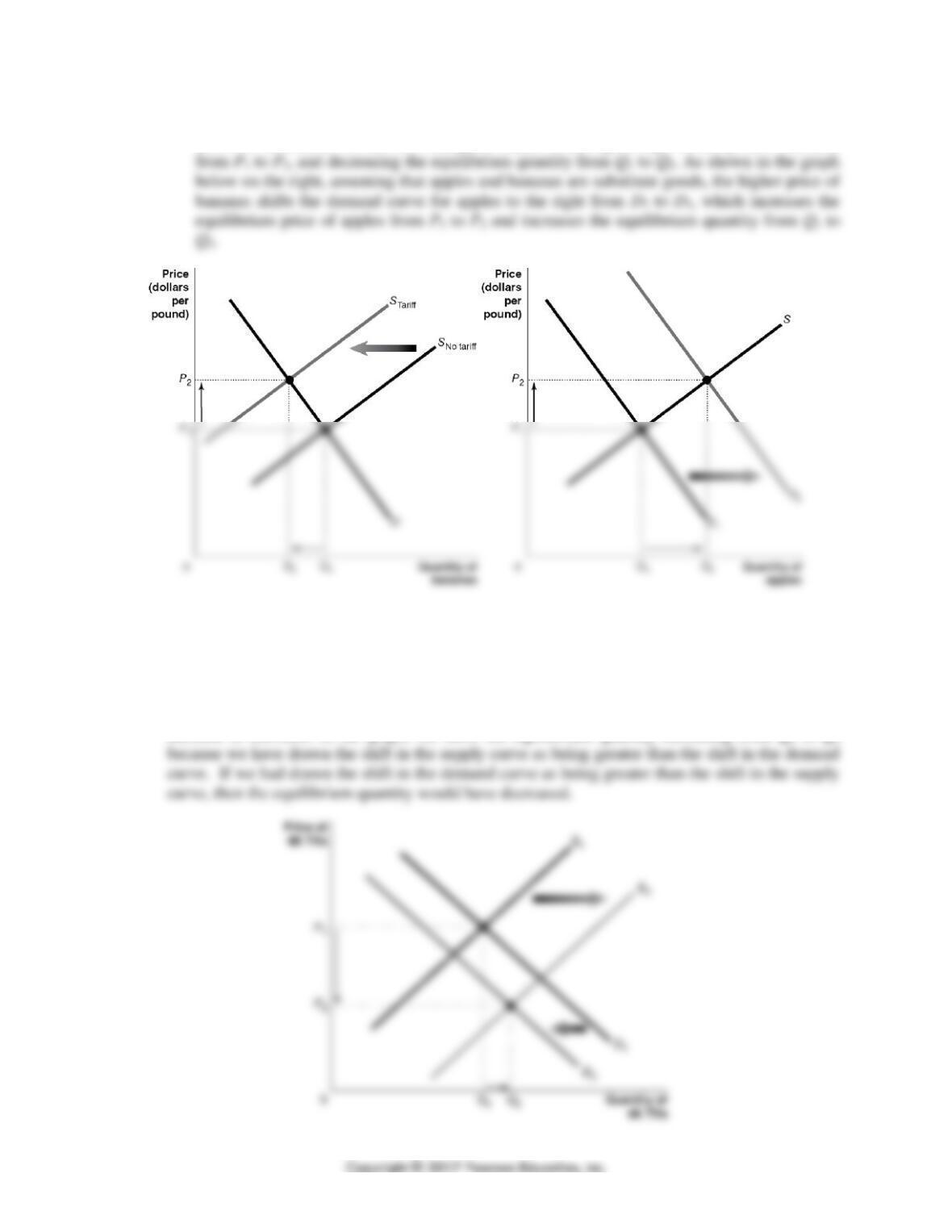
4.8 Draw a demand and supply graph showing the market equilibrium before Labor Day. Label both
the demand and supply curves “Before Labor Day,” and label the resulting equilibrium price
PBefore Labor Day. Add to your graph the demand curve for “After Labor Day,” making sure it is to
the left of the “Before Labor Day” demand curve, as the vacationers have gone home. Add to
your graph the supply curve for “After Labor Day,” making sure it is to the right of the “Before
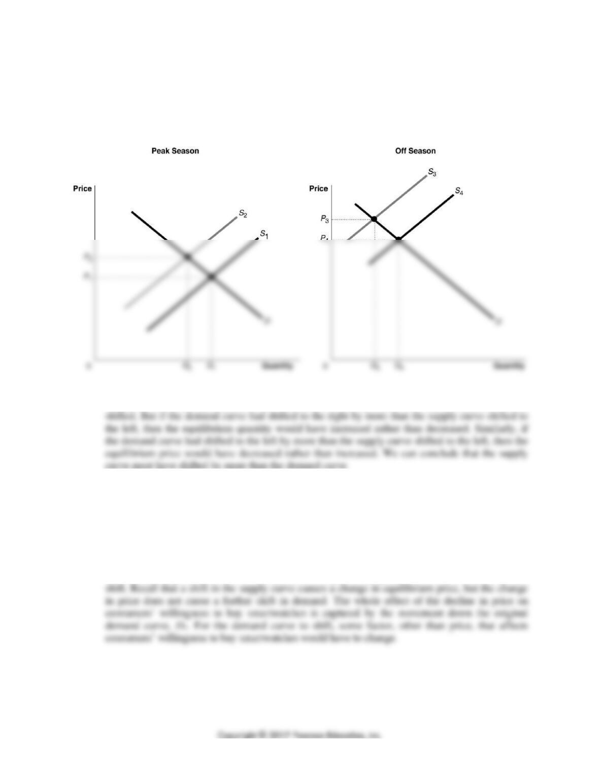
4.9 a. The apple producer was assuming that apples and bananas are substitutes. The lower priced
bananas lead people to substitute away from buying apples and toward buying bananas.
68 CHAPTER 3 | Where Prices Come From: The Interaction of Demand and Supply
b. The tariff on imported bananas, as shown in the graph below on the left, shifts the supply
curve for bananas to the left from SNo tariff to STariff, increasing the equilibrium price of bananas
4.10 The student’s reasoning is correct. The following graph represents the market for 4K televisions
with: (a) a decrease in demand from D1 to D2, and (b) and an increase in supply from S1 to S2.
Each change will decrease the equilibrium price of TV sets; however, by itself the decrease in
demand will decrease the equilibrium quantity while, by itself, the increase in supply will
increase the equilibrium quantity. Therefore, we can be certain that the equilibrium price will
decrease from P1 to P2, but we can’t know with certainty whether the equilibrium quantity will
increase or decrease. In the graph, we show the equilibrium quantity increasing from Q1 to Q2
CHAPTER 3 | Where Prices Come From: The Interaction of Demand and Supply 69
4.11 Refrigeration allowed for the storage of perishable products. In the graph on the left below,
storage removes some of the supply during the peak season, shifting the supply curve to the left
from S1 to S2 and driving the equilibrium price up from P1 to P2. During the off-season, the
refrigerated supply could be offered for sale, shifting right the relatively small supply from S3 to
S4 and causing the equilibrium price to fall from P3 to P4, as shown in the graph on the right.
4.12 With the equilibrium price increasing and the equilibrium quantity decreasing, we know that the
supply curve definitely shifted to the left in 2016. It is possible that the demand curve also
4.13 The student’s reasoning is incorrect. He should have said: “Increased production shifts the supply
curve to the right and leads to a lower equilibrium price, but a higher equilibrium quantity, and
therefore a larger quantity demanded. The increase in quantity demanded is a result of a supply
curve shifting to the right and a movement along the demand curve, but the demand curve does
not shift.
4.14 The student’s analysis is incorrect—the shift from D1 to D2 will not happen. There will be a
movement along the demand curve, D1, due to the price change, but the demand curve will not
70 CHAPTER 3 | Where Prices Come From: The Interaction of Demand and Supply
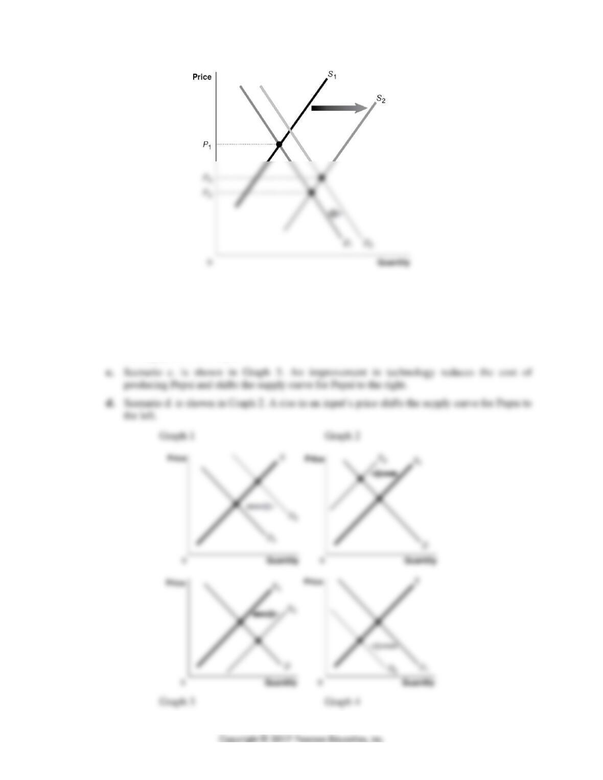
4.15 a. Scenario a. is shown in Graph 1. The demand for Pepsi rises because a decrease in the supply
of Coke will increase the price of Coke, which is a substitute for Pepsi. The shift in the
demand curve for Pepsi results in a movement along the supply curve for Pepsi.
b. Scenario b. is shown in Graph 4. The demand for Pepsi falls when incomes fall assuming
Pepsi is a normal good. The shift in the demand curve for Pepsi results in a movement along
the supply curve for Pepsi.
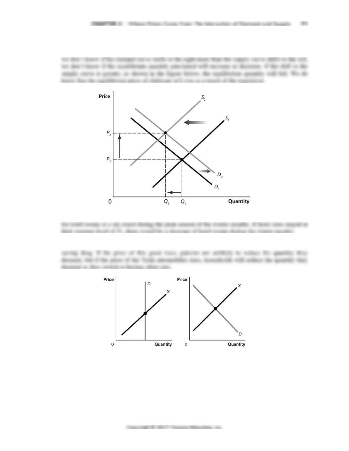
4.16 The rising costs will cause the supply curve to shift to the left, from S1 to S2, while the
improvement in quality will cause the demand curve to shift to the right from D1 to D2. Because
4.17 The graph with the demand curve shifting to the right from D1 to D2 best represents the market
4.18 The graph with the vertical demand curve is more likely to represent the market for the life-