A n s w e r s t o t h e R e v i e w Q u i z
Page 28
1. Explain how we “read” the three graphs in Figs. A1.1 and A1.2.
The points in the graphs relate the quantity of the variable measured on the one axis to the quantity of
2. Explain what scatter diagrams show and why we use them.
Scatter diagrams plot the value of one economic variable against the value of another variable for a
3. Explain how we “read” the three scatter diagrams in Figs. A1.3 and A1.4.
The scatter diagram in Figure A1.3 shows the relationship between box office ticket sales and DVDs
sold for 9 popular movies. The figure shows that higher box office sales are associated with a higher
number of DVDs sold. But the figure shows that the relationship is weak.
1
GRAPHS IN
ECONOMICS
A p p e n d i x
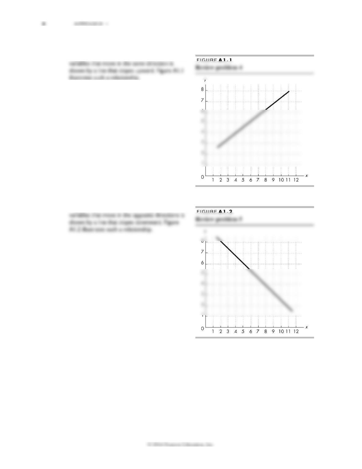
4. Draw a graph to show the relationship between two variables that move in the same direction.
A graph that shows the relationship between two
5. Draw a graph to show the relationship between two variables that move in opposite directions.
A graph that shows the relationship between two
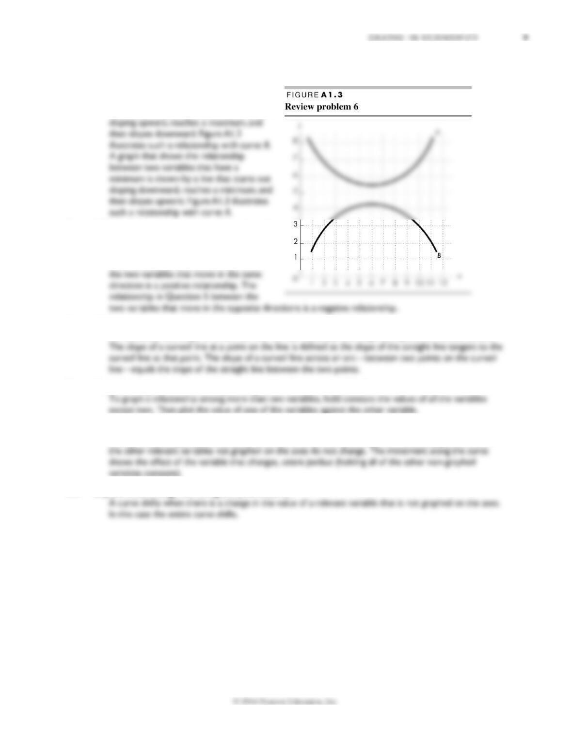
6. Draw a graph of two variables whose relationship shows (i) a maximum and (ii) a minimum.
A graph that shows the relationship
between two variables that have a
maximum is shown by a line that starts out
7. Which of the relationships in Questions 4
and 5 is a positive relationship and which is
a negative relationship?
The relationship in Question 4 between
8. What are the two ways of calculating the slope of a curved line?
To calculate the slope of a curved line we can calculate the slope at a point or across an arc.
9. How do we graph a relationship among more than two variables?
10. Explain what change will bring a movement along a curve.
A movement along a curve occurs when the value of a variable on one of the axes changes while all of
11. Explain what change will bring a shift of a curve.
10 A P P E N D I X 1
1.4
3.2
4.5
0.2
0.1
0.1
A n s w e r s t o t h e S t u d y P l a n P r o b l ems a n d Appl i c a t i o n s
Use the spreadsheet to work Problems 1 to 3.
The spreadsheet provides data on the U.S.
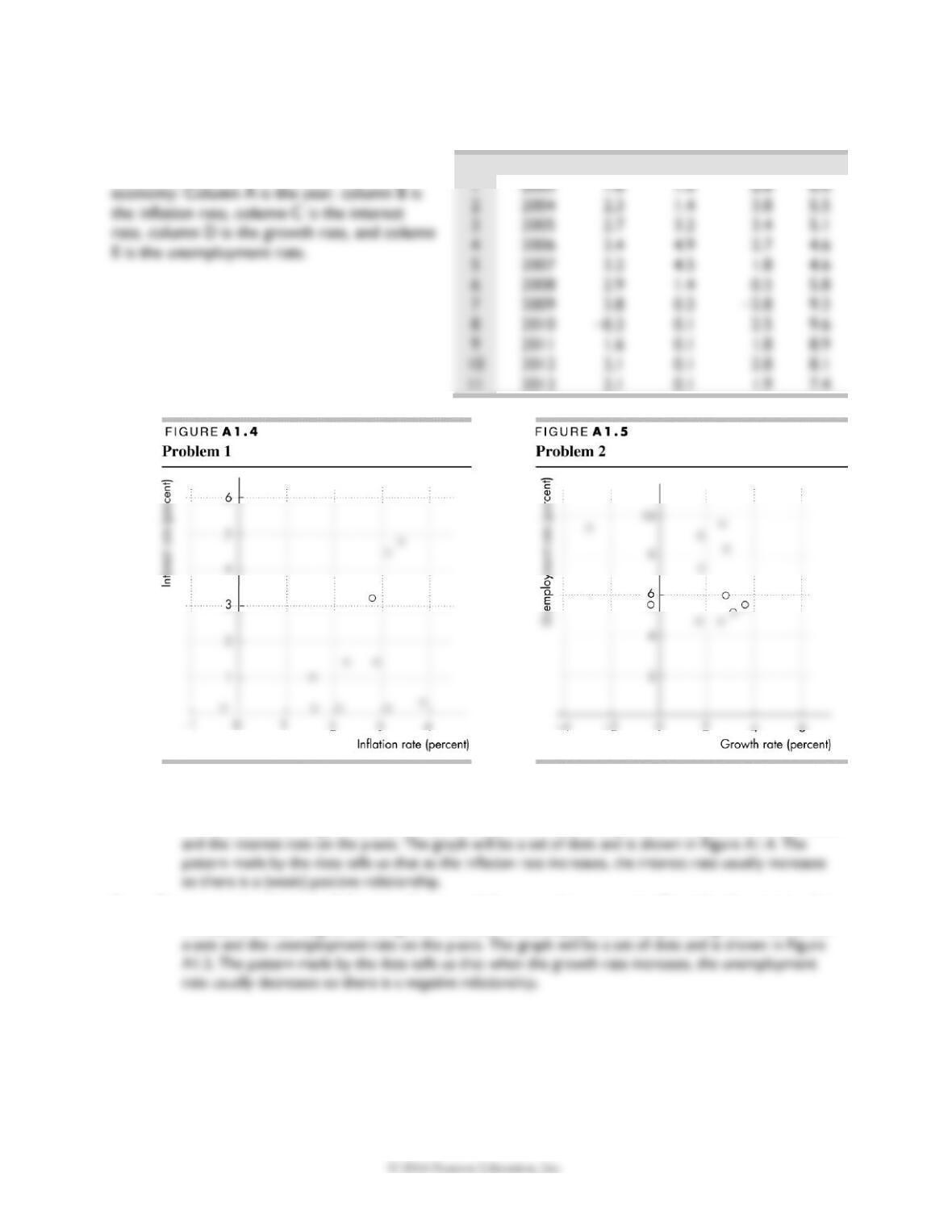
1. Draw a scatter diagram of the inflation rate and the interest rate. Describe the relationship.
To make a scatter diagram of the inflation rate and the interest rate, plot the inflation rate on the x-axis
2. Draw a scatter diagram of the growth rate and the unemployment rate. Describe the relationship.
To make a scatter diagram of the growth rate and the unemployment rate, plot the growth rate on the
A
B
C
D
E
$12,356
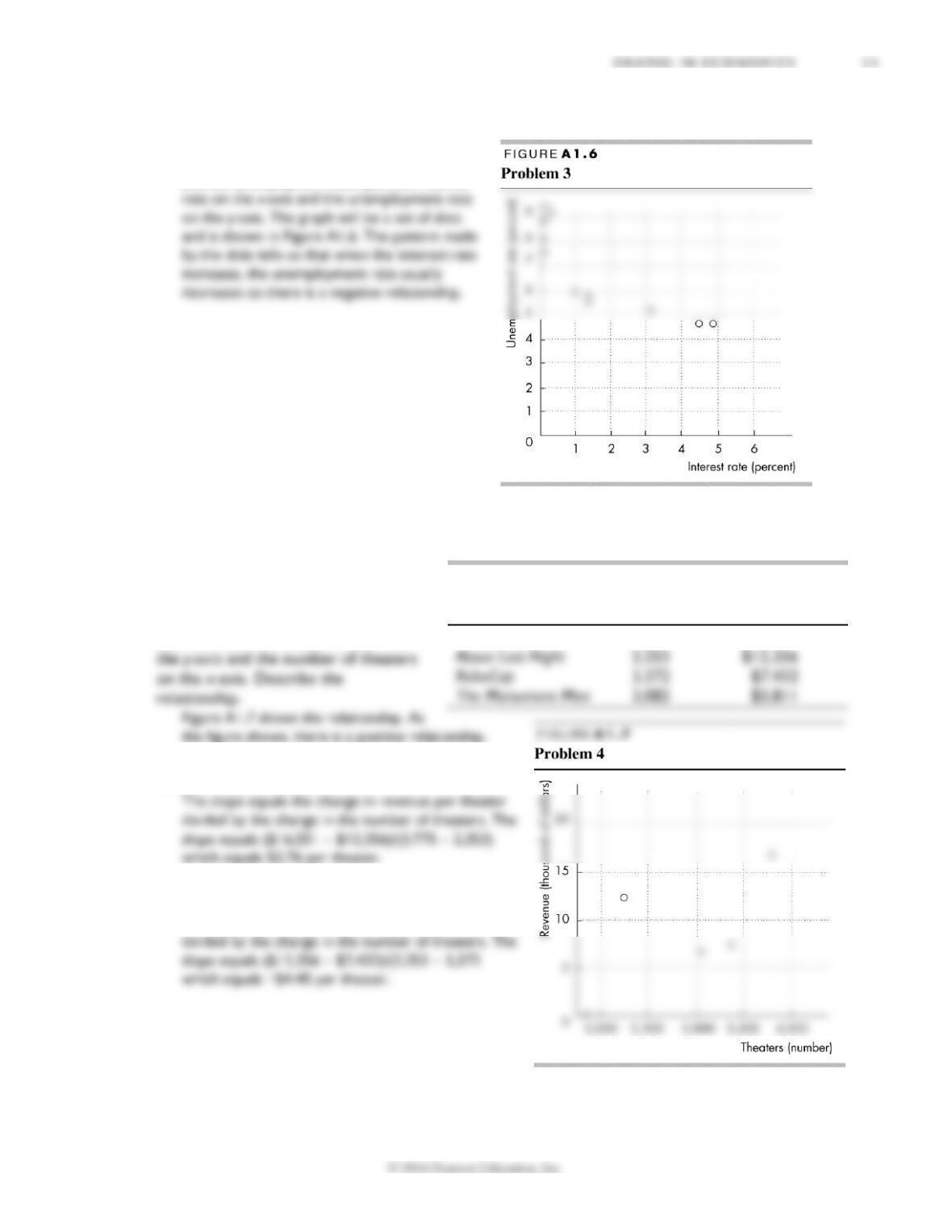
3. Draw a scatter diagram of the interest rate and the unemployment rate. Describe the
relationship.
To make a scatter diagram of the interest rate
and the unemployment rate, plot the interest
Use the following news clip to work Problems 4 to 6.
Lego Shatters More Records:
Source: Boxofficemojo.com,
Data for weekend of February 14-17, 2014
4. Draw a graph of the relationship
between the revenue per theater on
5. Calculate the slope of the relationship between
3,775 and 2,253 theaters.
6. Calculate the slope of the relationship in Problem 4
between 2,253 and 3,372 theaters.
The slope equals the change in revenue per theater
Movie
Theaters
(number
)
Revenue
(dollars per
theater)
The LEGO Movie
3,775
$16,551
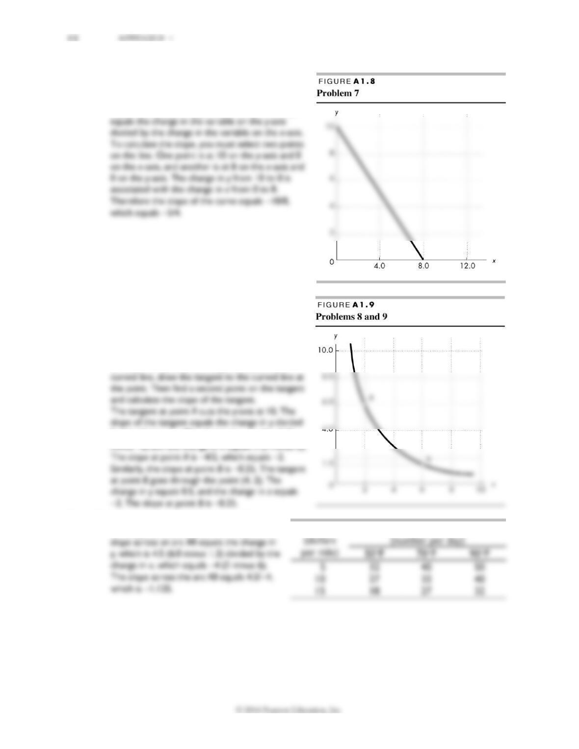
7. Calculate the slope of the relationship shown in
Figure A1.8.
The slope is −5/4. The curve is a straight line, so its
slope is the same at all points on the curve. Slope
Use the relationship shown in Figure A1.9 to work
Problems 8 and 9.
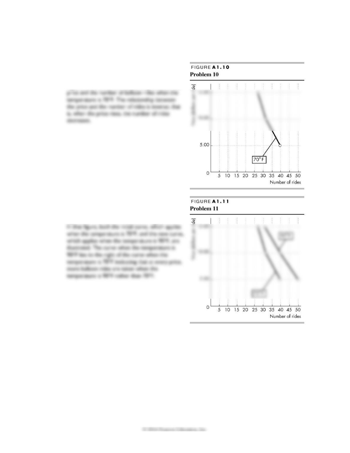
8. Calculate the slope of the relationship at point A
and at point B.
The slope at point A is −2, and the slope at point B
is −0.25. To calculate the slope at a point on a
by the change in x. The change in y equals −4 (6
minus 10) and the change in x equals 2 (2 minus 0).
9. Calculate the slope across the arc AB.
The slope across the arc AB is −1.125. The
Price
Balloon rides
G R A P H S I N E C O N O M I C S 13
Use the table to work Problems 10 and 11. The table gives the price of a balloon ride, the temperature,
and the number of rides a day.
10. Draw a graph to show the relationship between
the price and the number of rides, when
temperature is 70°F. Describe this relationship.
Figure A1.10 shows the relationship between the
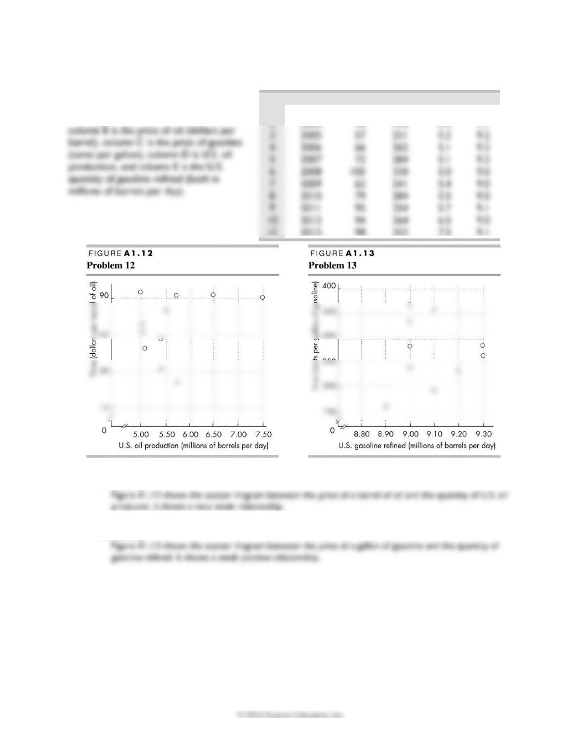
11. What happens in the graph in Problem 10 if the
temperature rises to 90°F?
If the temperature rises to 90F, the curve shifts
rightward. This shift is illustrated in Figure A1.11.
14 A P P E N D I X 1
3
2005
57
231
5.2
9.2
4
2006
66
262
5.1
9.3
5
2007
72
284
5.1
9.3
7
2009
62
241
5.4
9.0
8
2010
79
284
5.5
9.0
10
2012
94
364
6.5
9.0
Answers to Additional Problems and Applications
Use the spreadsheet to work Problems 12
to 14. The spreadsheet provides data on
oil and gasoline: Column A is the year,
12. Draw a scatter diagram of the price of oil and the quantity of U.S. oil produced. Describe the
relationship.
13. Draw a scatter diagram of the price of gasoline and the quantity of gasoline refined. Describe the
relationship.
A
B
C
D
E
1
2003
31
160
5.7
8.9
11
2013
98
353
7.5
9.1
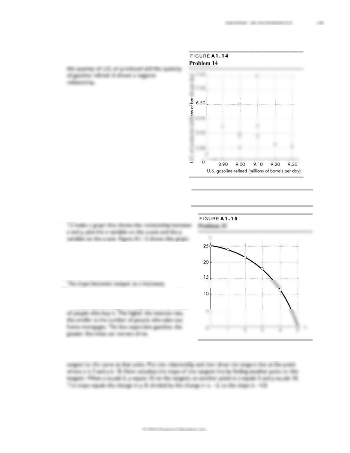
14. Draw a scatter diagram of the quantity of U.S. oil produced and the quantity of gasoline refined.
Describe the relationship.
Figure A1.14 shows the scatter diagram between
Use the following data to work Problems 15 to
17.
Draw a graph that shows the relationship
between the two variables x and y in the table to
the right.
15. a. Is the relationship positive or negative?
The relationship is negative because x and y move in
opposite directions: As x increases, y decreases.
b. Does the slope of the relationship become steeper
or flatter as the value of x increases?
c. Think of some economic relationships that might
be similar to this one.
The less expensive a good, the greater is the number
16. Calculate the slope of the relationship between x
and y when x equals 3.
The slope equals −4.0. The slope of the curve at the point where x is 3 is equal to the slope of the
x
0
1
2
3
4
5
y
25
24
22
18
12
0
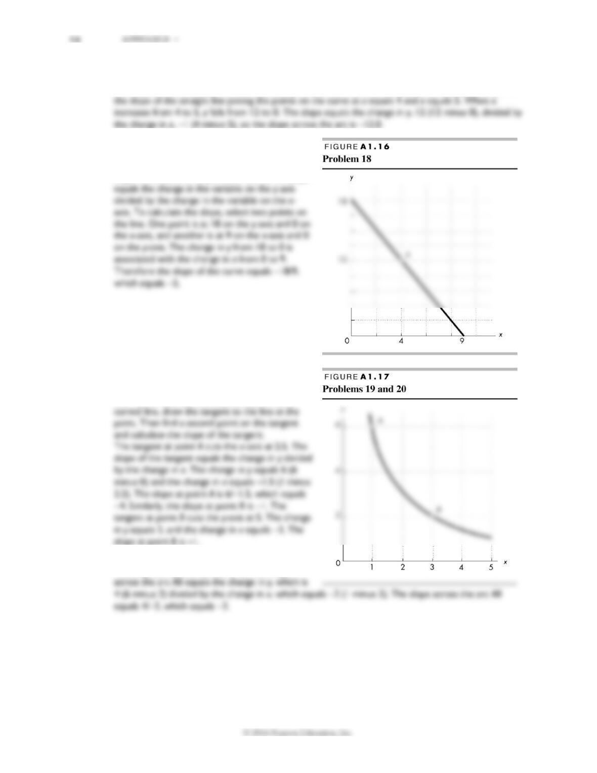
17. Calculate the slope of the relationship across the arc as x increases from 4 to 5.
The slope is –12. The slope of the relationship across the arc when x increases from 4 to 5 is equal to
18. Calculate the slope of the curve in Figure A1.16
at point A.
The slope is −2. The curve is a straight line, so its
slope is the same at all points on the curve. Slope
Use Figure A1.17to work Problems 19 and 20.
19. Calculate the slope at point A and at point B.
The slope at point A is −4, and the slope at point
B is −1. To calculate the slope at a point on a
slope at point B is −1.
20. Calculate the slope across the arc AB.
The slope across the arc AB is −2. The slope
G R A P H S I N E C O N O M I C S 17
Use the following table to work Problems 21 to 23.
The table gives information about umbrellas: price,
the number purchased, and rainfall in inches.
21. Draw a graph to show the relationship
between the price and the number of
umbrellas purchased, holding the amount of
rainfall constant at 1 inch. Describe this
relationship.
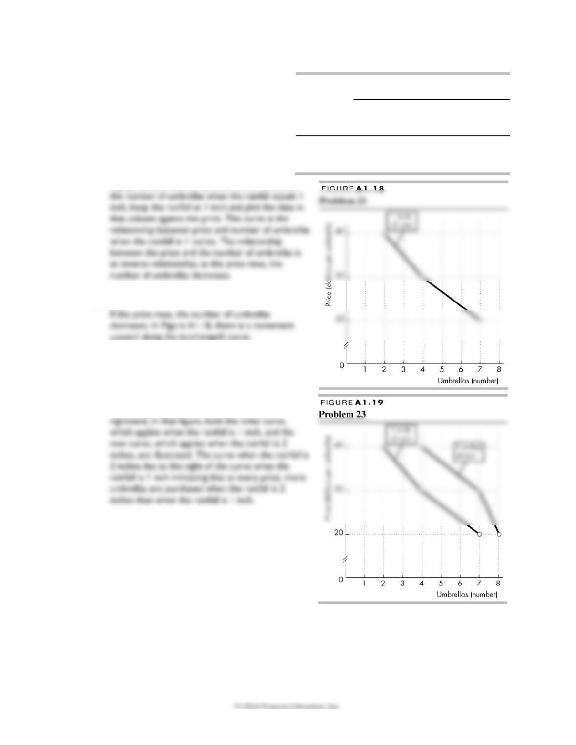
Figure A1.18 shows the relationship. To draw
a graph of the relationship between the price and
22. What happens in the graph in Problem 21 if the
price rises and rainfall is constant?
23. What happens in the graph in Problem 21 if the
rainfall increases from 1 inch to 2 inches?
As shown in Figure A1.19, the curve shifts
Price
(dollars
per
umbrella)
Umbrellas
(numbers per day)
0
1
2
(inches of rainfall)
20
4
7
8
30
2
4
7
40
1
2
4