2-1
CHAPTER 2. DATA DESCRIPTION AND TREATMENT
CHAPTER 2. DATA DESCRIPTION AND TREATMENT ……………………………………………………1
2.2. Classification of Data …………………………………………………………………………………………………1
2.3. Graphical Description of Data ……………………………………………………………………………….…….2
2.4. Histograms and Frequency Diagrams …………………………………………………………………………15
2.6. Descriptive Measures ……………………………………………………………………………………….………24
The following table provides a summary of the problems with their appropriate sections:
Section Problems
2.2 1 to 3
2.2. Classification of Data
Problem 2-1.
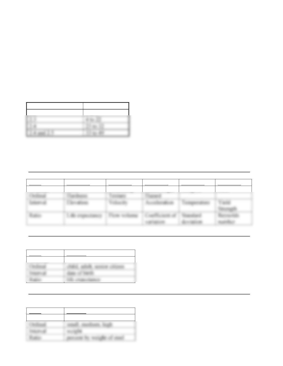
Scale Variable 1 Variable 2 Variable 3 Variable 4 Variable 5
Nominal Color Citizenship Ethnic origin Religion Race
Problem 2-2.
Age is a variable of interest.
Scale Function
Nominal
Problem 2-3.
Copper content of steel is a variable of interest.
Scale Function
Nominal presence of copper
2-2
2.3. Graphical Description of Data
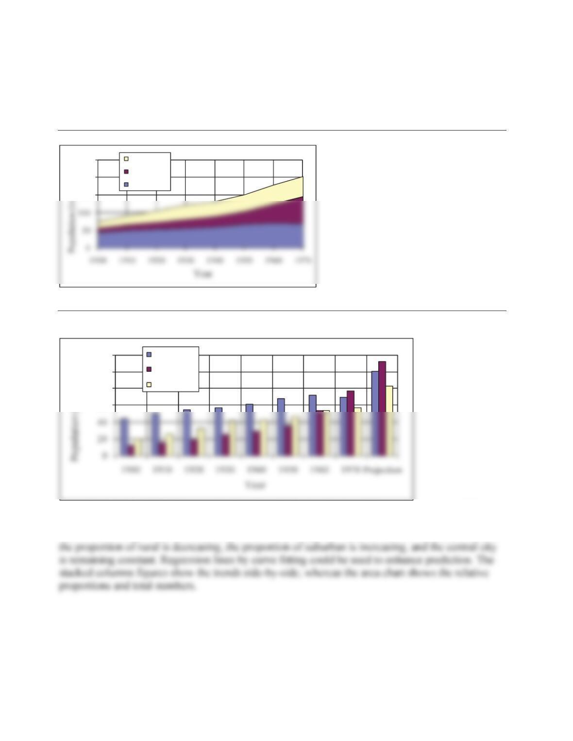
Problem 2-4.
150
200
250
Central City
Suburban
Rural
Problem 2-5.
See Problem 2-4 for the area chart. The column chart is as follows:
60
80
100
120
Rural
Suburban
Central City
Assuming that the 295 is future projection, then the best estimates of the proportions would be
those from the last year of record, 1970, which are 34, 38, and 28. This would lead to 100.3,
112.1, and 82.6 for rural, suburban, and central city. It appears from the data of Problem 2-18 that
Problem 2-6.
Municipal Trash
and Garbage
Industrial
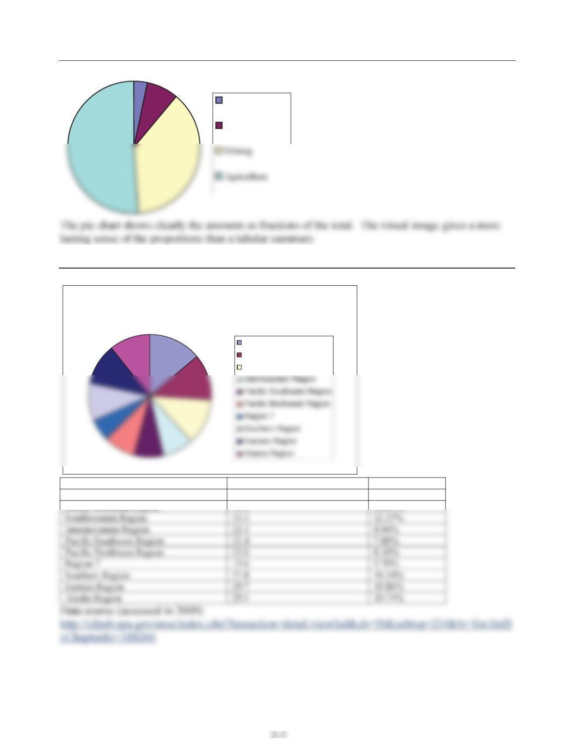
Problem 2-7.
Percent of Core Forested Area of the U.S. by
Region
Northern Region
Rocky Mountain Region
Southwestern Region
Region Percent Core Forested of Region Percent of all US
Northern Region 38.0 13.89%
2-4
Problem 2-8.
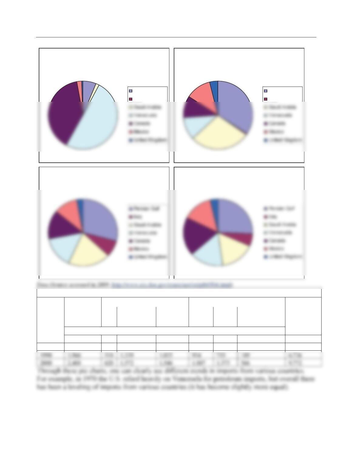
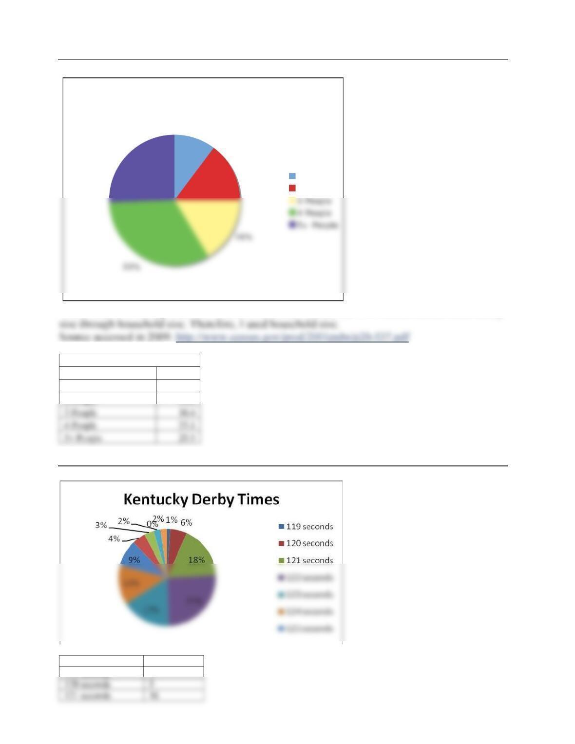
Petroleum Imports by Selected Countries
of Origin, 1970
Persian Gulf
Ir aq
Petroleum Imports by Selected Countries
of Origin, 1980
Persian Gulf
Ir aq
Petroleum Imports by Selected Countries
of Origin, 1990
Petroleum Imports by Selected Countries
of Origin, 2000
Petroleum Imports by Country of Origin, 1970-2000
Year
Persian Gulf
Selected OPEC Countries Selected Non-OPEC Countries
Total
Imports
Iraq Saudi Arabia Venezuela Canada Mexico United Kingdom
Thousand Barrels per Day
1970 121 0 30 989 766 42 11 1,959
1980 1,519 28 1,261 481 455 533 176 4,453
2-5
Problem 2-9.
Household Size in 2000
10%
15%
26%
1 Person
2 People
*Note: The U.S. Family Size was unable to be found because the U.S. Census Bureau finds family
Excel Table Used for Pie Chart:
Household Size in 2000
Size %
1 Person 10.4
2 People 14.6
Problem 2-10.
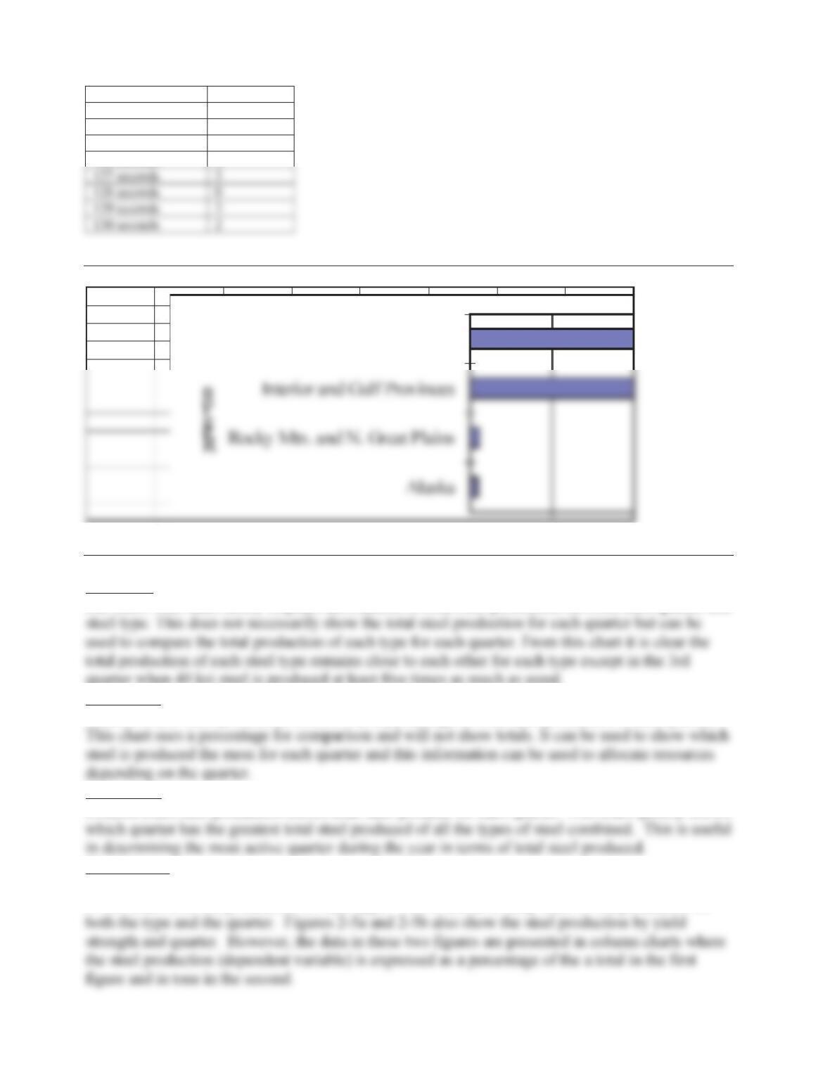
Frequency of Kentucky Derby times from 1919 to present:
Time Frequency
119 seconds 1
2-6
122 seconds 23
123 seconds 15
124 seconds 12
125 seconds 8
126 seconds 4
Problem 2-11.
Eastern Province
Problem 2-12.
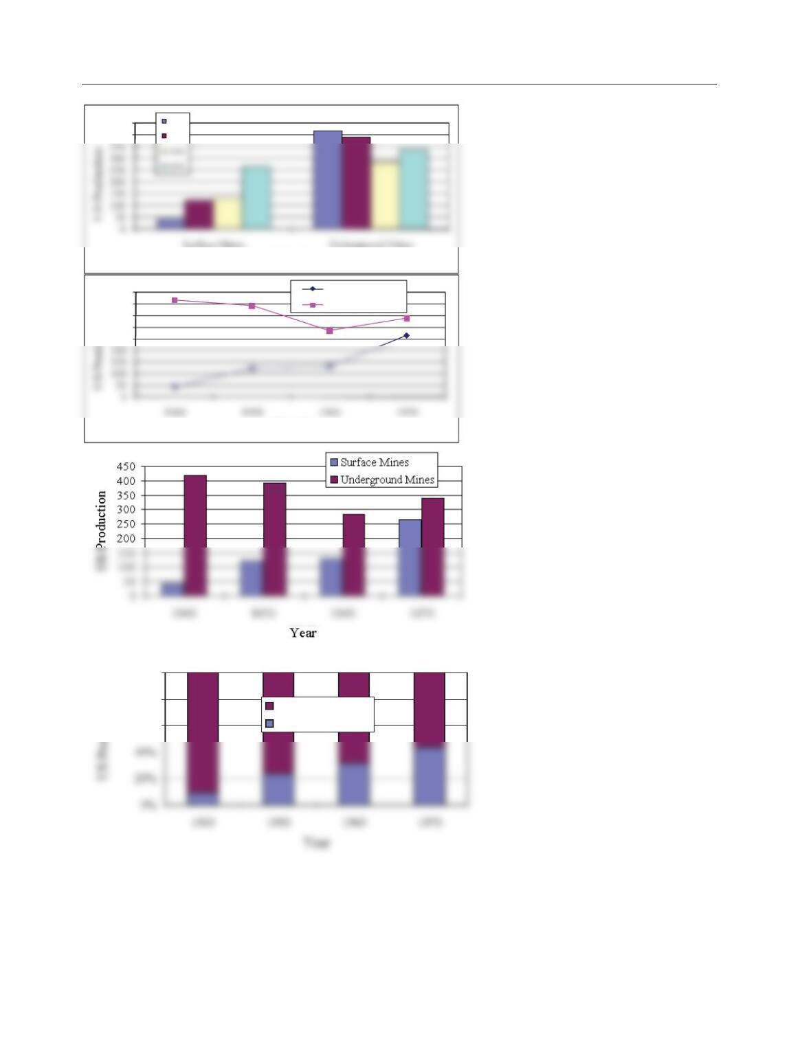
Figure 2-3
Bar chart: This chart nicely displays information of total steel production between each quarter and
quarter when 40 ksi steel is produced at least five times as much as usual.
Figure 2-5a
Column chart: Steel production is shown as a percentage of total steel produced for each quarter.
Figure 2-5b
Column chart steel production shows total steel produce for each quarter. This chart quickly shows
Comparison:
Figure 2-3 is a bar chart showing the steel production by yield strength and quarter. The emphasis
in this chart is on the production for steel type. This is useful to keep track of the production for
2-7
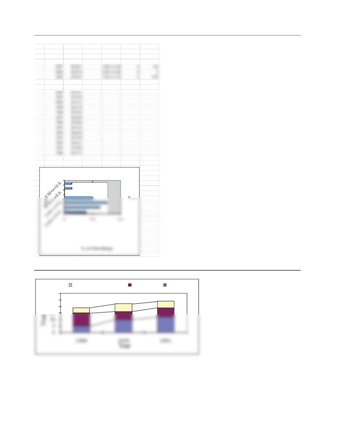
Problem 2-13.
400
450
Mine Type
1940
1950
250
300
350
400
450
Mine Type
Surface Mines
Underground Mines
60%
80%
100%
Underground Mines
Surface Mines
2-8
Problem 2-14.
Data: % in Range
Year Time Time Rang
e
# in Range 0.15
2009 02:27.5 2:26<x<2:2
6
30.25
2008 02:29.7 2:27<x<2:27 5 0.3
2004 02:27.5 2:31<x<2:31 1 0.05
2003 02:28.3 2:32<x<2:3
2
1
Column Chart:
Be lm on t St ak es W in ne rs 1 99 0 –2 0 0 9
Problem 2-15.
20
25
30
Prestressed Concrete Concrete Steel
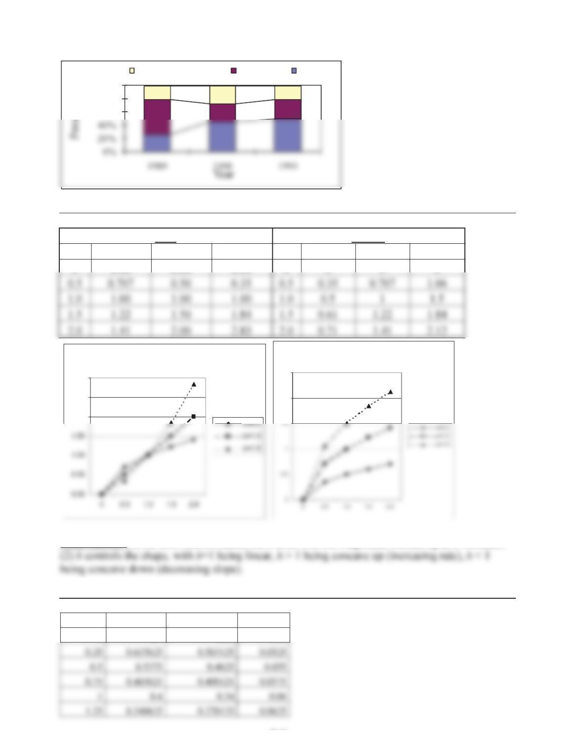
9
0
2-9
60%
80%
100%
Prestressed Concrete Concrete Steel
Problem 2-16.
y=xb y=ax0.5
X b=0.5 b=1.0 b=1.5 X a=0.5 a=1.0 a=1.5
0 0.00 0.00 0.00 0 0 0 0
y=xb
2.00
2.50
3.00
y=ax0.5
2
2.5
Observations: (1) the coefficient a scales the y-axis, with the magnitude increasing as a increases.
Problem 2-17.
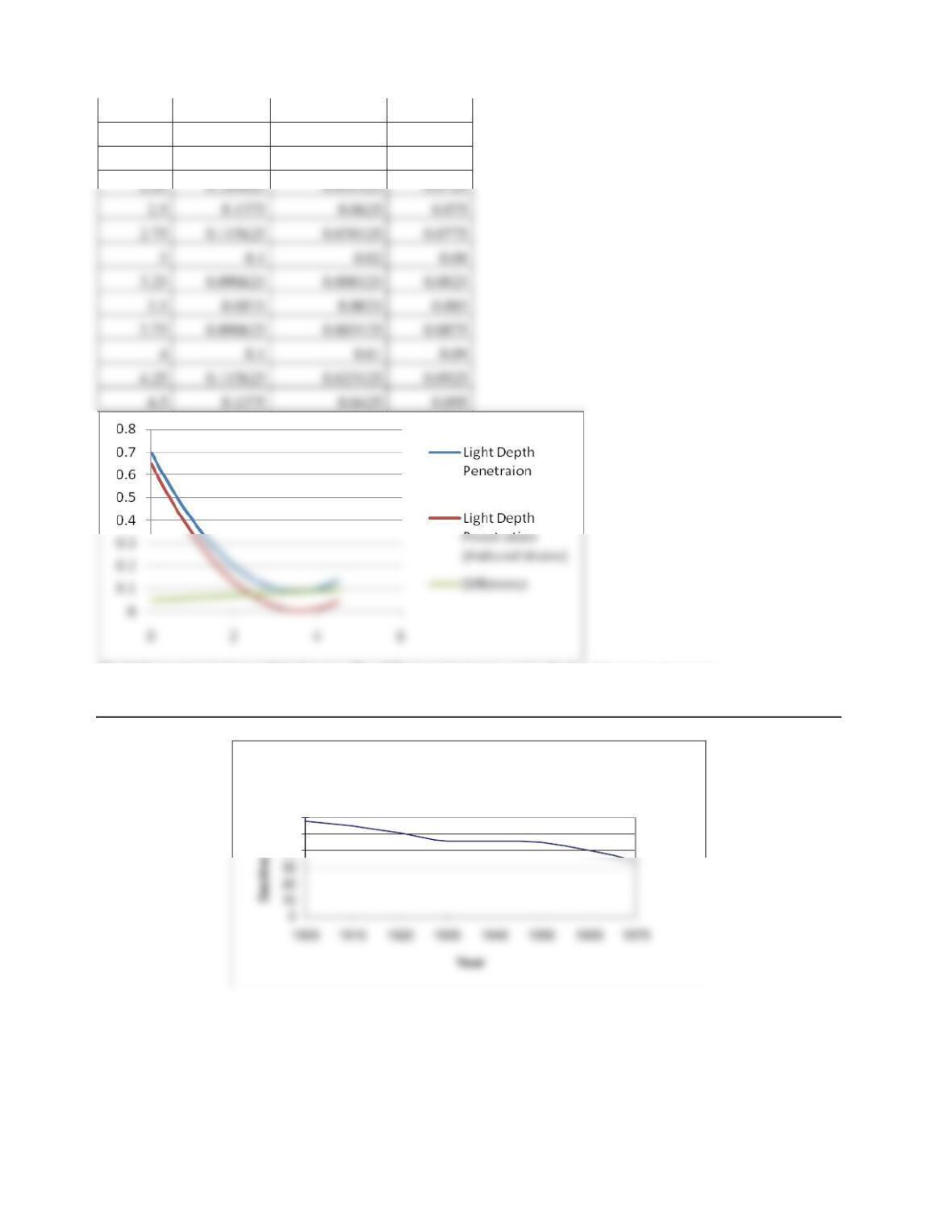
Depth Clean Water Polluted Water Difference
0 0.7 0.65 0.05
2-10
1.5 0.2875 0.2225 0.065
1.75 0.240625 0.173125 0.0675
2 0.2 0.13 0.07
The light penetrates less polluted water. The difference increases as the depth of the water increases.
Problem 2-18.
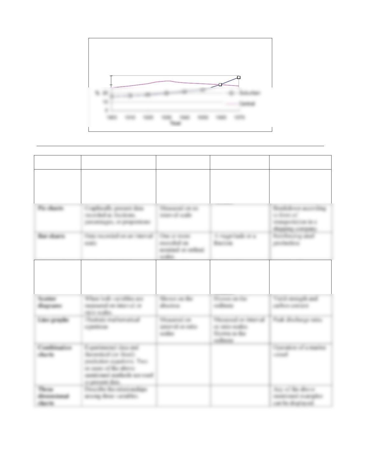
Decline in The Proportion of The Population
Living in Rural Areas
40
50
60
2-11
Association Between The Change in Central City
Population And The Increase In Proportion Living
in Suburban Areas
30
40
Problem 2-19.
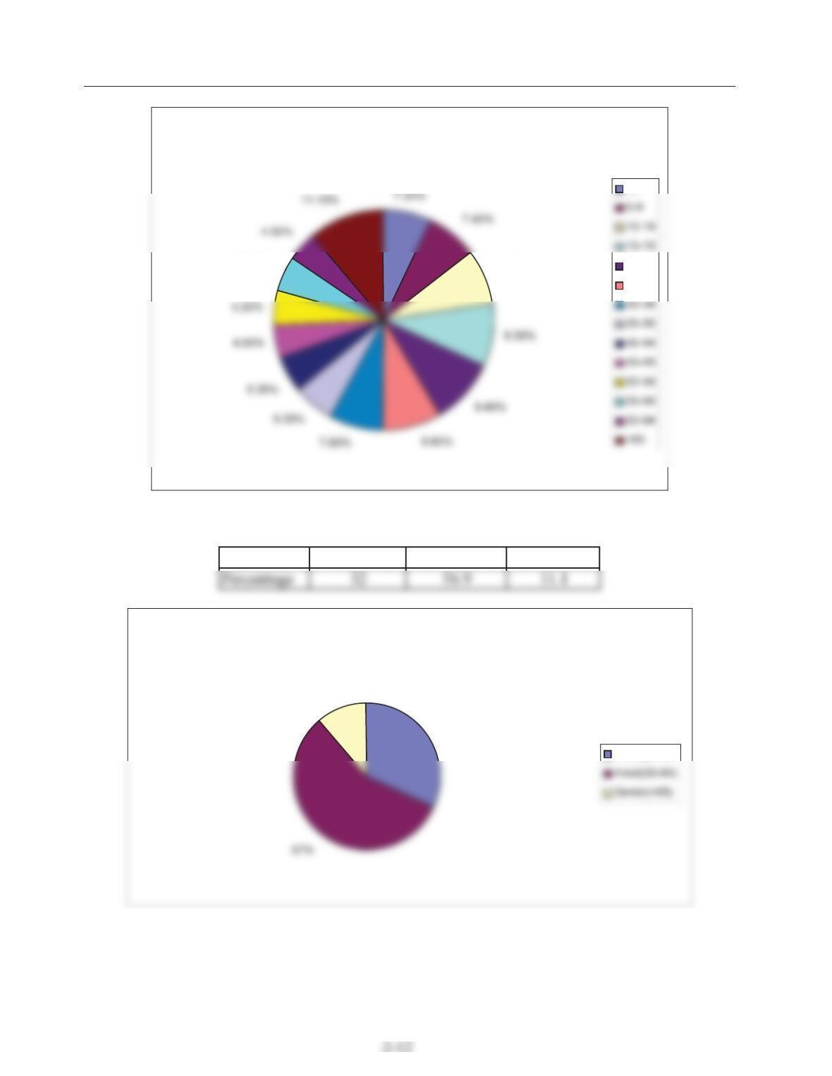
Type Use Independent
Variable
Dependent Variable Example
Area charts Three-dimensional data that
include both nominal and
interval-independent
variables.
Measured on an
interval scale and
shown on the
abscissa
Measured on the
interval scale and
cumulated over all
values of the nominal
variable
Analyzing the traffic
at an intersection
Column charts Similar to bar charts Used for the
abscissa.
Expressed as a
percentage (or
fraction) of a total. It
is shown as the
ordinate.
Capacity of
desalination plants
Problem 2-20.
U.S. Citizens As a Function of Age Group
8.10%
5.10%
<5
20-24
25-29
The pie chart shows the percentage of the U.S. citizens with respect to their age group. It would be
also meaningful to classify the citizens as young, adult, and senior. The following table shows the
distribution of the citizens as a function of the new classification:
Age group Young(<20) Adult(20-64) Senior(>65)
Percentage of U.S. Citizens as A function Of New Age Group
32%
11%
Young(<20)
2-13
Problem 2-21.
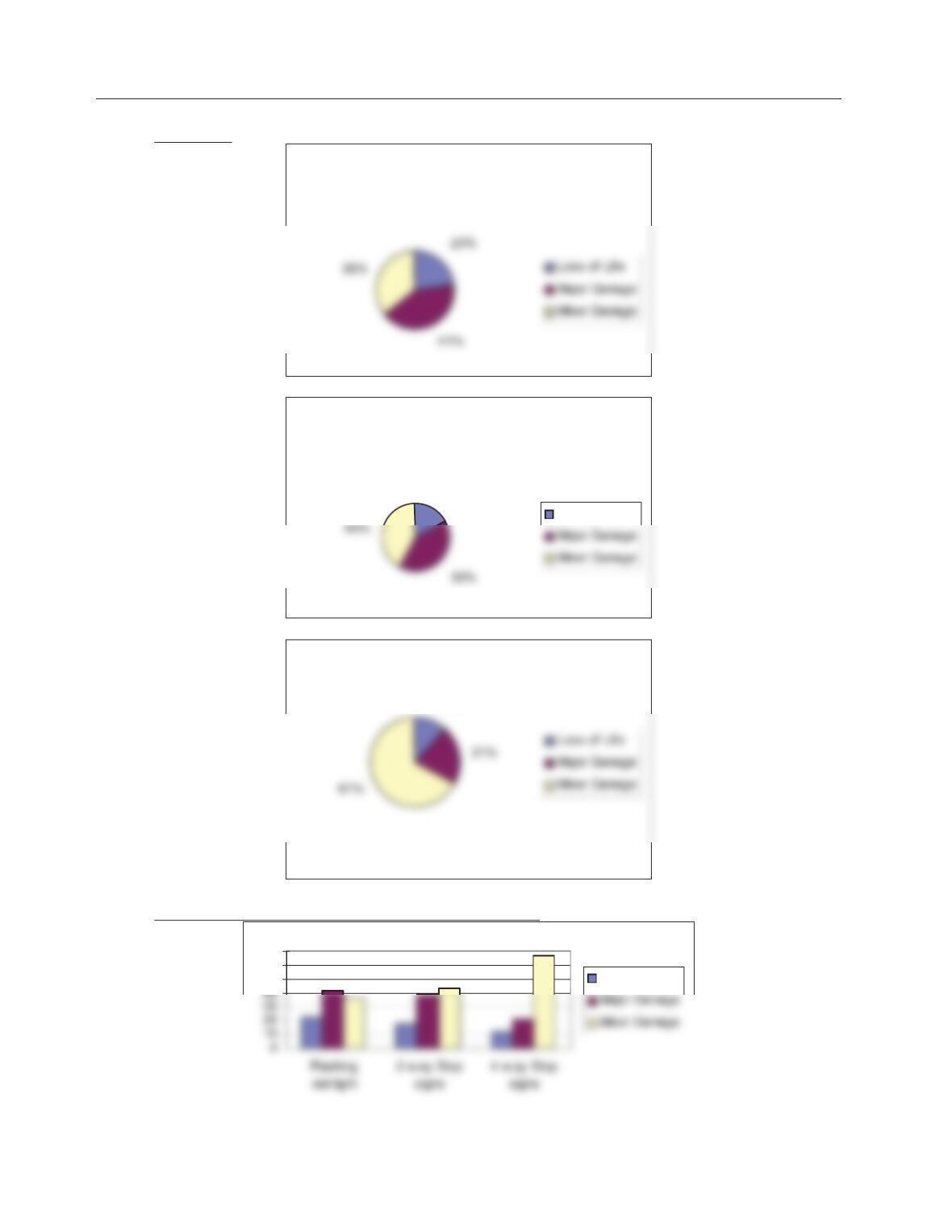
(a). Pie charts:
Traffic Control Method: flashing red
light
Traffic Control Method: 2-way stop
signs
18%
Loss of Life
Traffic Control Method: 4–way stop
signs
12%
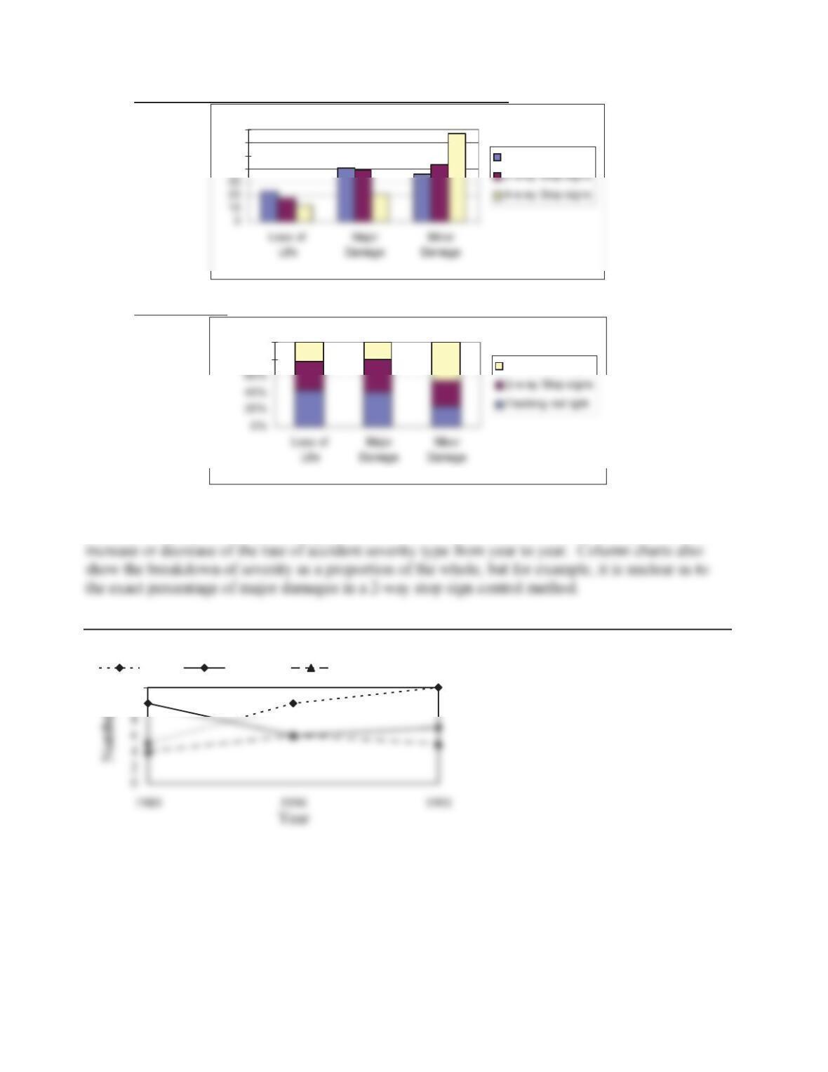
(b). Emphasis on differences between accident severity:
50
60
70
Loss of Life
2-14
(c). Emphasis on differences between traffic control methods:
40
50
60
70
Flashing red light
(d). Column chart:
80%
100%
4-w ay Stop signs
(e). The advantage of pie charts over bar charts is that they show the breakdown of accident
severity as a proportion or percentage of 100%. On the other hand, bar charts clearly illustrate the
Problem 2-22.
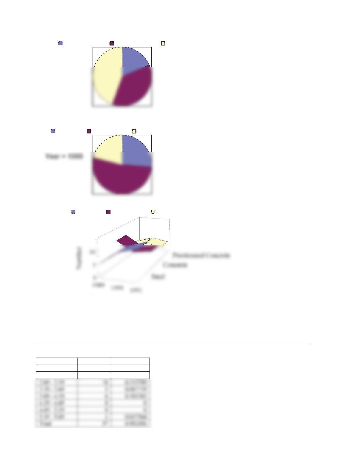
10
12
Steel Concrete Prestressed Concrete
2-15
1989 1990 1991
For an example year,
Steel Concrete Prestressed Concrete
15
Year
Steel Concrete Prestressed Concrete
2.4. Histograms and Frequency Diagrams
Problem 2-23.
0.5m intervals
Interval Frequency Rel. Freq.
1.69 – 2.19 10 0.175439
2.19 – 2.69 17 0.298246
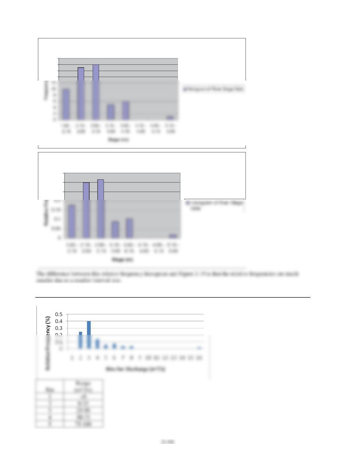
Histogram of River Stage Data
14
16
18
20
Histogram of River Stage Data
0.25
0.3
0.35
y
Problem 2-24.