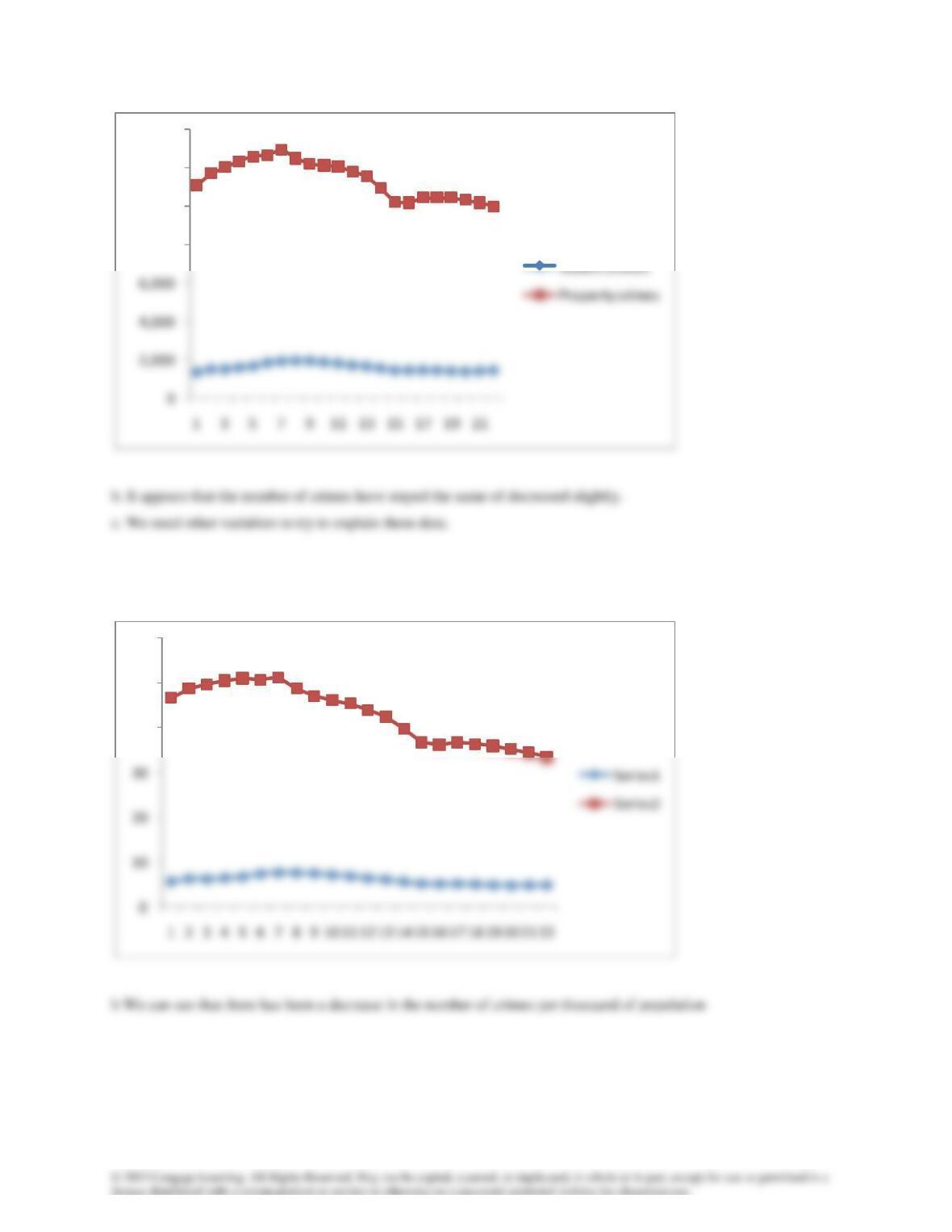
3.74 We divided the number of crimes by the population and multiplied by 1,000. The result is the number of crimes
per thousand of population.
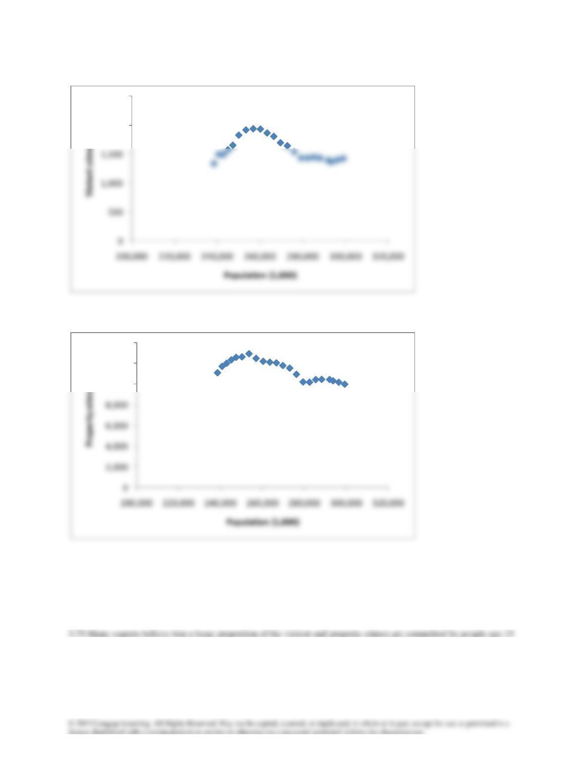
c Another possible chart is a scatter diagram of the number of crimes and population.
8,000
10,000
12,000
14,000
40
50
60
Violent crimes
Property crimes
The unusual shapes of the scatter diagram are difficult to explain. Both charts are quadratic rather than linear. They
suggest that when the population was less than 255 million the population and the number of crimes were positively
linear related, whereas when the population was more than 255 million the relationship was negative.
to 24.
2,000
2,500
10,000
12,000
14,000
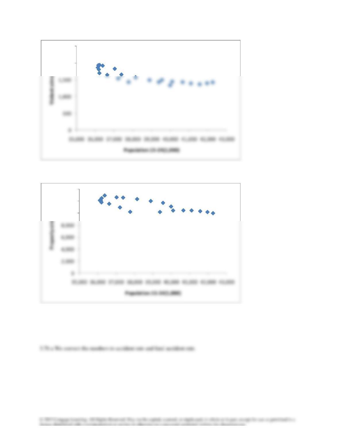
Scatter diagram of number of property crimes and population 15 to 24
The scatter diagrams indicate that there is a negative linear relationship between the number of crimes and the
population aged 15 to 24, refuting the experts.
2,000
2,500
10,000
12,000
14,000
b
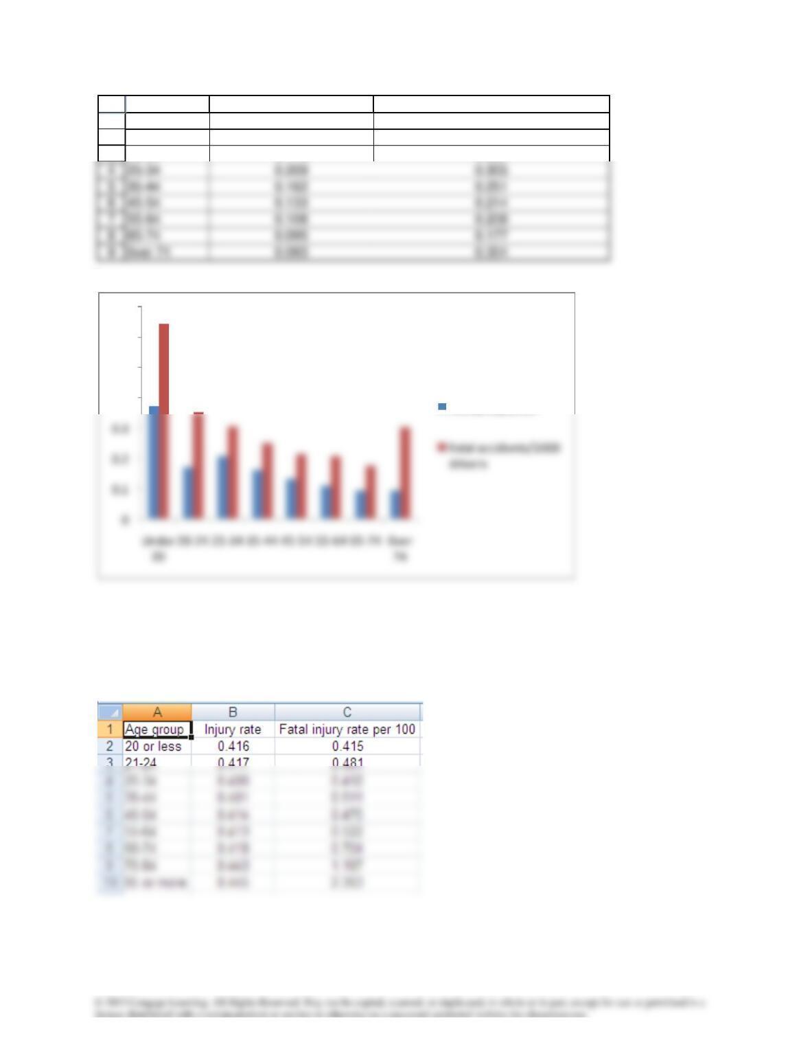
c. The accident rate generally decreases as the ages increase. The fatal accident rate decreases until the over 64 age
category where there is an increase.
3.77
1
2
3
A B C
Age group Accident rate per driver Fatal accidient rate (per 1,000 drivers)
Under 20 0.373 0.643
20-24 0.173 0.352
0.4
0.5
0.6
0.7
Accidents/driver
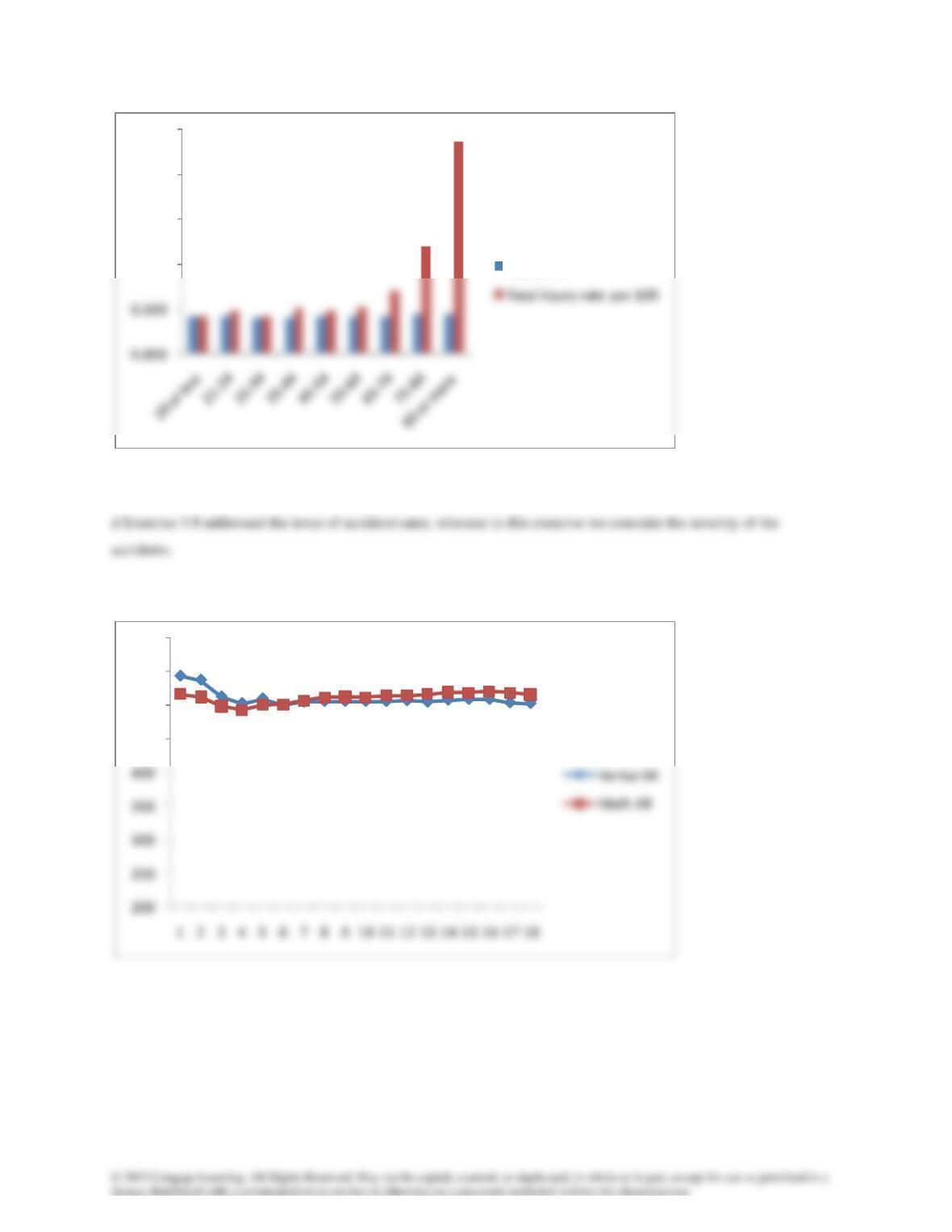
c Older drivers who are in accidents are more likely to be killed or injured.
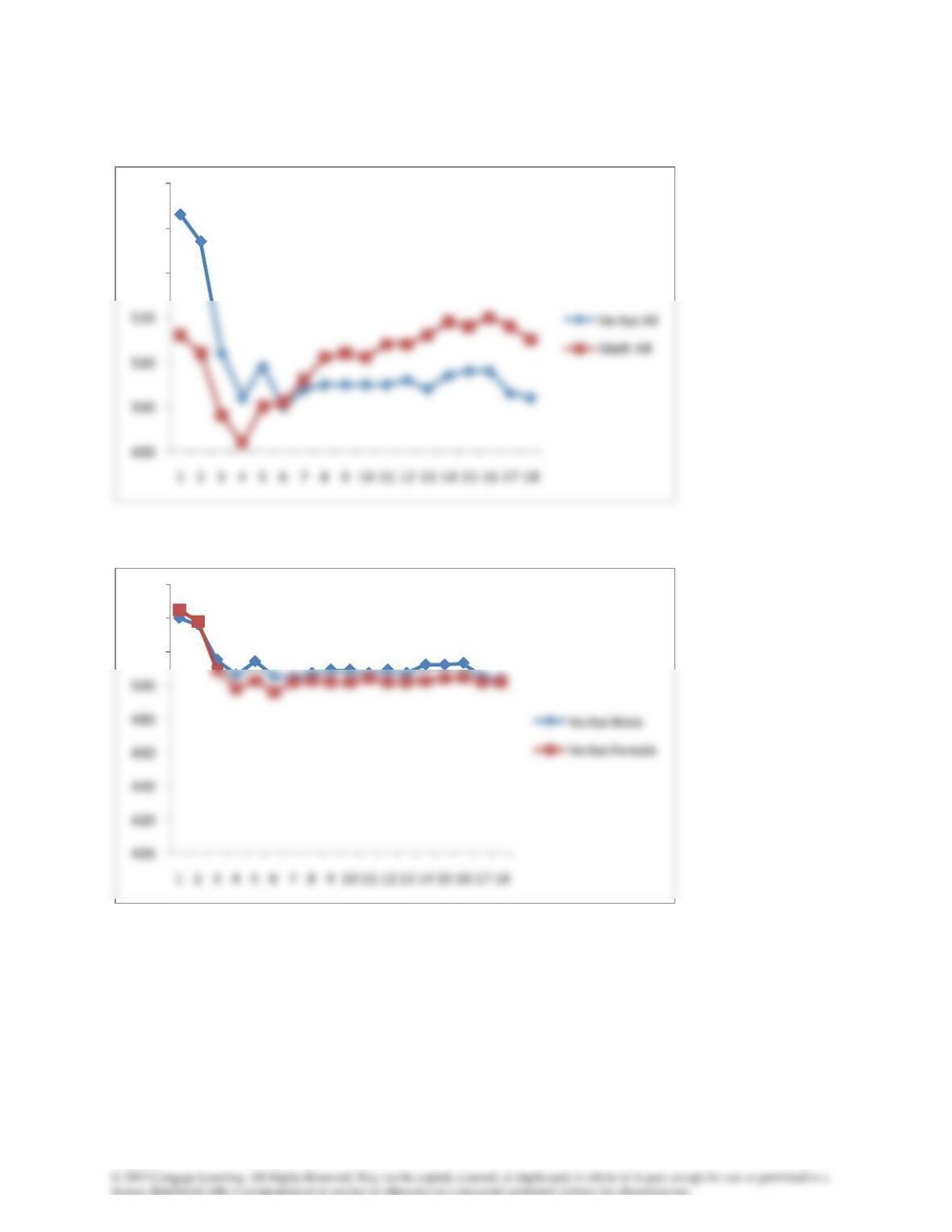
3.78aNEW DATA
Verbal All
1.000
1.500
2.000
2.500
Injury rate
450
500
550
600
b
c
530
540
550
520
540
560
d
400
500
600
530
540
550
3.79a
b
520
530
540
550
7.0
7.2
7.4
7.6
7.8
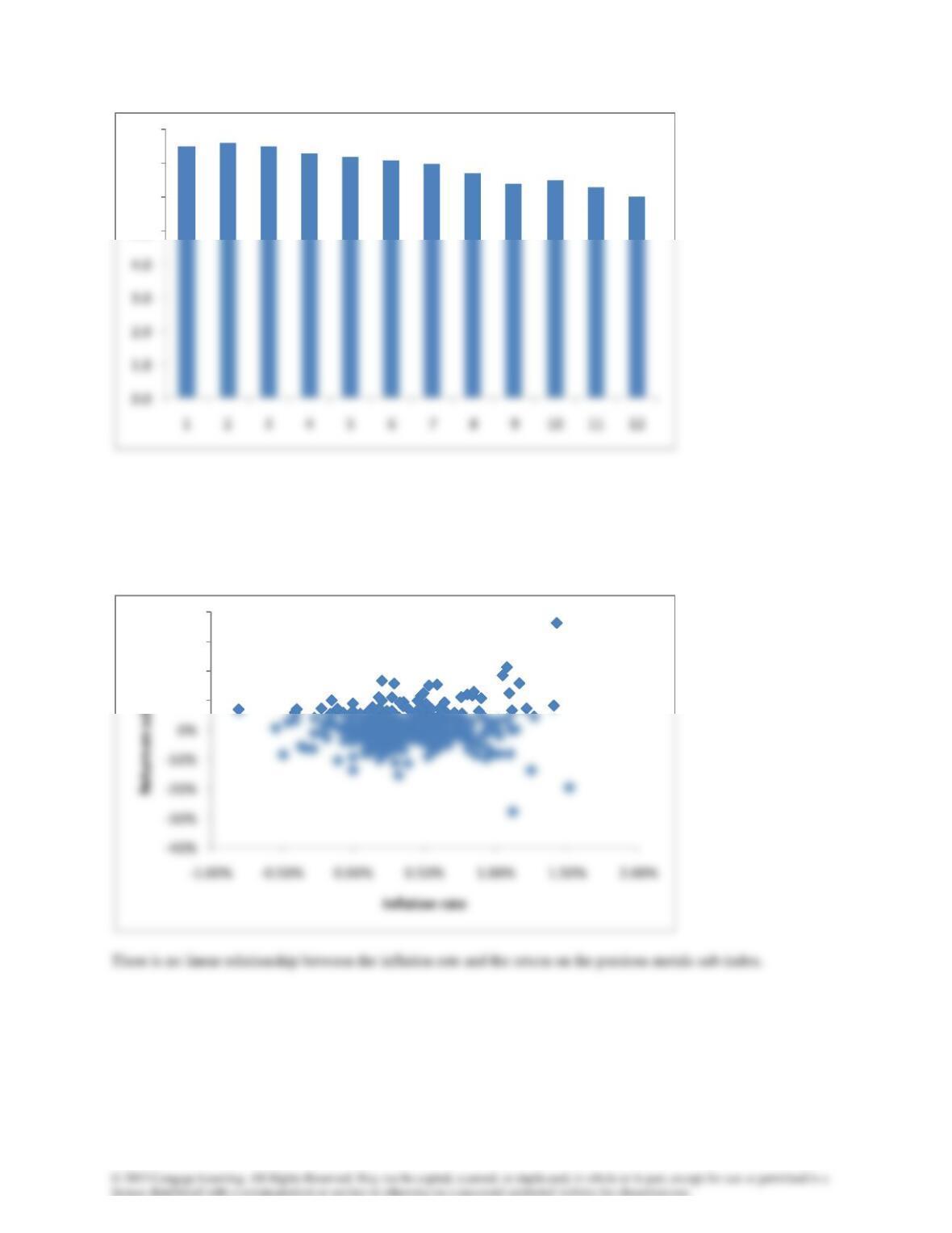
c Caption a: Unemployment rate falling rapidly. Caption b: Unemployment rate virtually unchanged.
d The chart in (a) is more honest.
3.80
5.0
6.0
7.0
8.0
10%
20%
30%
40%
3.81
3.82
1
1.2
1.4
1.6
100
120
140
160
3.83
3.84
100
120
140
160
180
20
30
3.85a
3.86
70
72
74
6
8
10
12