Solution
S-219
1. In the economy of Scottopia, policy makers want to lower the unemployment rate and
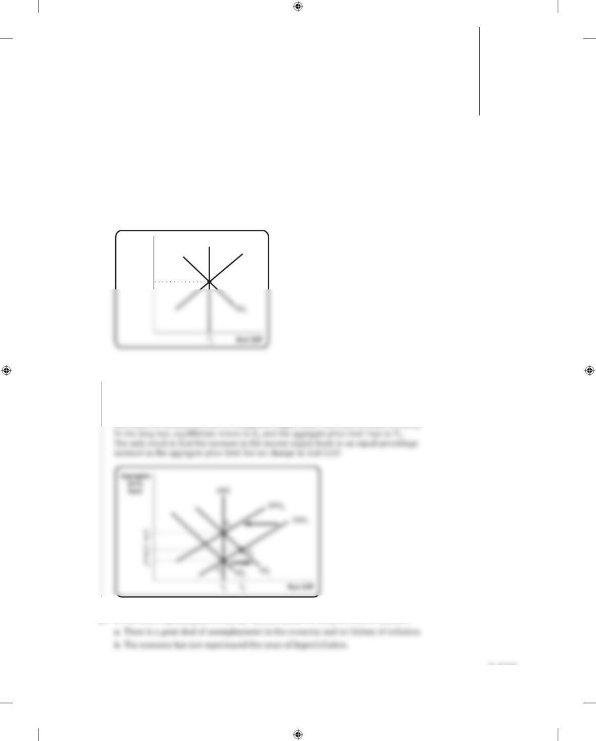
raise real GDP by using monetary policy. Using the accompanying diagram, show why
this policy will ultimately result in a higher aggregate price level but no change in real
GDP.
Aggregate
price
level
LRAS
SRAS1
P1
E1
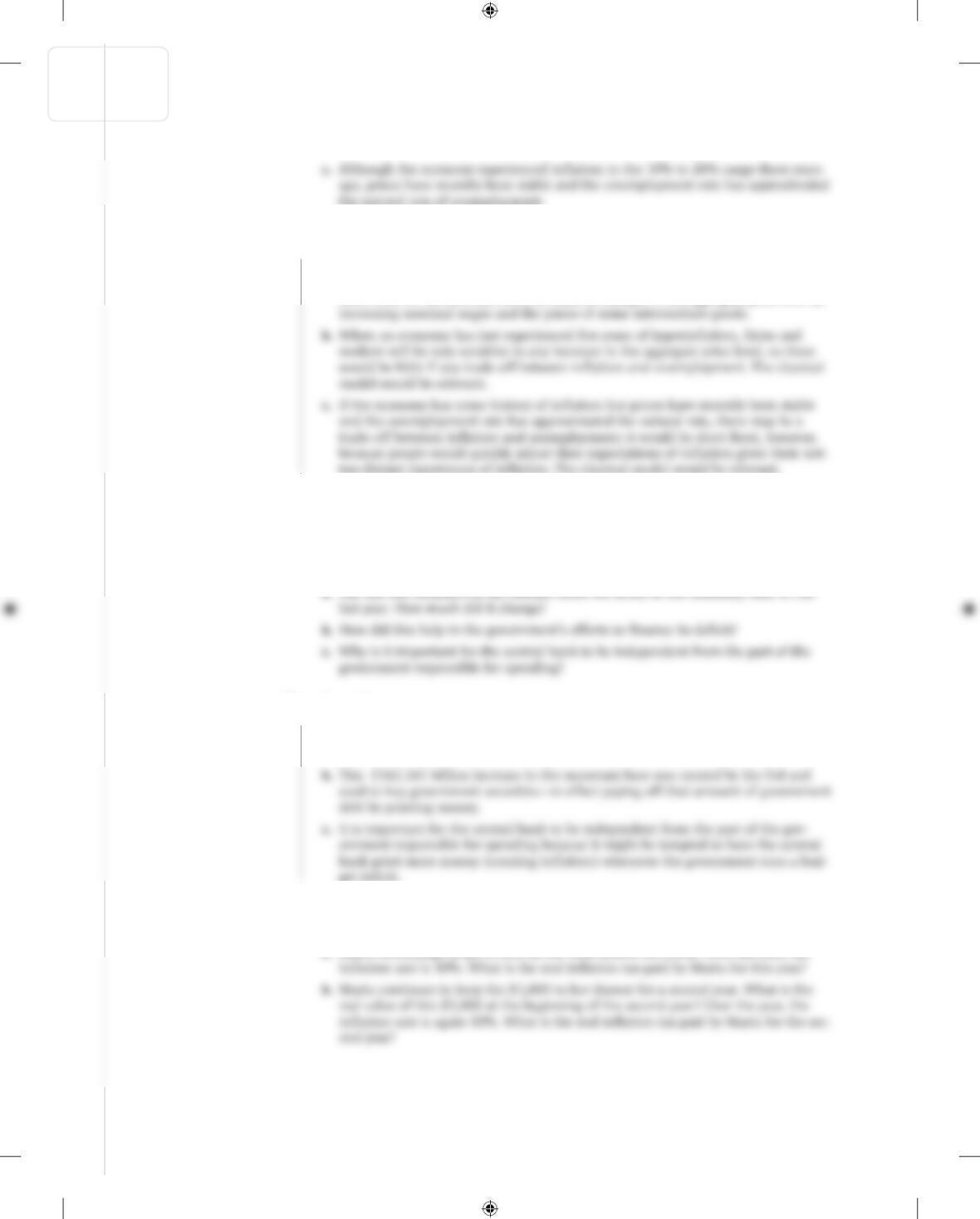
1. In the accompanying diagram, the economy of Scottopia is in long- run macro-
economic equilibrium at E1. If policy makers want to lower the unemployment rate
and raise real GDP, they will engage in expansionary monetary policy, which will
shift AD1 rightward to AD2. In the short run, equilibrium moves to E2; real GDP is
higher and unemployment is lower. However, the aggregate price level has risen and
over time, as workers are able to renegotiate wages, SRAS1 will shift leftward to SRAS2.
2. In the following examples, would the classical model of the price level be relevant?
Inflation, Disinflation, and Deflation 16
CHAPTER
KrugWellsECPS4e_Macro_CH16.indd S-219KrugWellsECPS4e_Macro_CH16.indd S-219 2/9/15 10:00 AM2/9/15 10:00 AM
Solution
Solution
2. a. The classical model of the price level is not well suited to an economy with a great
deal of unemployment and no history of inflation. Increases in aggregate output
can occur without an immediate change in the aggregate price level because it takes
some time for workers and firms to react to changes in the aggregate price level by
3. The Federal Reserve regularly releases data on the U.S. monetary base. You can access
that data at various websites, including the website for the Federal Reserve Bank of
St. Louis. Go to http://research.stlouisfed.org/fred2/ and click on “Categories,” then on
“Money, Banking, & Finance,” then on “Monetary Data,” then on “Monetary Base,”
and then on “Monetary Base; Total” for the latest report. Then click on “View Data.”
3. Answers will vary depending on when you look up the information.
a. From September 2013 to September 2014, the monetary base grew from
$3,486.920 billion to $4,049.181 billion, an increase of $562.261 billion.
4. Answer the following questions about the (real) inflation tax, assuming that the price
level starts at 1.
a. Maria Moneybags keeps $1,000 in her sock drawer for a year. Over the year, the
S-220 CHAPTER 16 INFLATION, DISINFLATION, AND DEFLATION
KrugWellsECPS4e_Macro_CH16.indd S-220KrugWellsECPS4e_Macro_CH16.indd S-220 2/9/15 10:00 AM2/9/15 10:00 AM
Solution
Solution
c. For a third year, Maria keeps the $1,000 in the drawer. What is the real value of
4. a. The real inflation tax paid is $100 ($1,000 × 0.10).
b. The price level at the end of the first year will be 1 × 1.10 = 1.10. The real value of
$1,000 at the beginning of the second year is $1,000/1.10 = $909.09. So the real
inflation tax paid for the second year is $90.91 ($909.09 × 0.10).
c. The price level at the end of the second year will be 1.10 × 1.10 = 1.21. The real
5. The inflation tax is often used as a significant source of revenue in developing coun-
tries where the tax collection and reporting system is not well developed and tax eva-
sion may be high.
a. Use the numbers in the accompanying table to calculate the inflation tax in the
United States and India (Rp = rupees).
5. a. The inflation tax is equal to: Inflation rate × Money supply. For India, this is
Money supply Central government
Inflation in 2013 receipts in 2013
in 2013 (billions) (billions)
CHAPTER 16 INFLATION, DISINFLATION, AND DEFLATION S-221
KrugWellsECPS4e_Macro_CH16.indd S-221KrugWellsECPS4e_Macro_CH16.indd S-221 2/9/15 10:00 AM2/9/15 10:00 AM
Solution
b. The inflation tax as a percentage of government receipts is 16.9% in
6. The main advantage to printing money to cover the deficit is to avoid the crowding –
out effects—the reduction in private investment spending that occurs due to higher
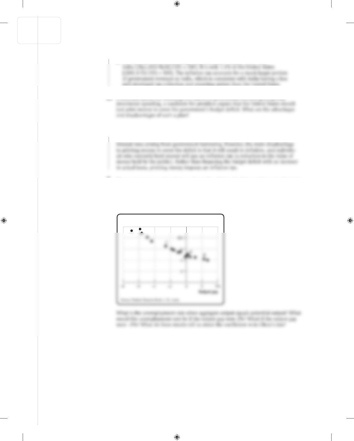
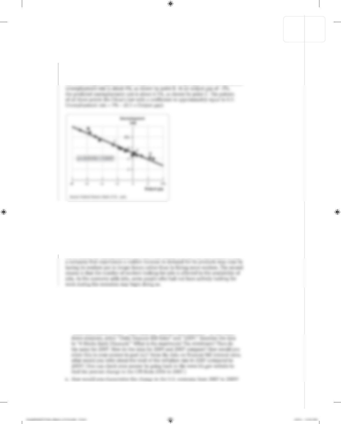
7. The accompanying scatter diagram shows the relationship between the unemployment
rate and the output gap in the United States from 1996 to 2013. Draw a straight line
through the scatter of dots in the figure. Assume that this line represents Okun’s law:
Unemployment rate = b − (m × Output gap)
where b is the vertical intercept and −m is the slope
Unemployment
rate
S-222 CHAPTER 16 INFLATION, DISINFLATION, AND DEFLATION
KrugWellsECPS4e_Macro_CH16.indd S-222KrugWellsECPS4e_Macro_CH16.indd S-222 2/9/15 10:00 AM2/9/15 10:00 AM
Solution
Solution
7. The accompanying figure shows a line drawn through the dots relating the unemploy-
ment rate and the output gap for the United States from 1996 to 2013. Your line may
be slightly different from the one drawn here. The line passes through the vertical axis
at an unemployment rate of about 5%, as indicated by point A. So the unemployment
rate when output equals potential output is 5%. At an output gap of 2%, the predicted
8. After experiencing a recession for the past two years, the residents of Albernia were
looking forward to a decrease in the unemployment rate. Yet after six months of strong
positive economic growth, the unemployment rate has fallen only slightly below what it
was at the end of the recession. How can you explain why the unemployment rate did
not fall as much although the economy was experiencing strong economic growth?
8. There are two primary reasons why Albernia is experiencing a jobless recovery, a recov-
ery in which the unemployment rate falls only slowly, if at all. The first reason is that
9. a. Go to www.bls.gov. Click on link “Subjects”; on the left, under “Inflation &
Prices,” click on the link “Consumer Price Index.” Scroll down to the section “CPI
Tables,” and find the link “Consumer Price Index Detailed Report, Tables Annual
Averages 2009 (PDF).” What is the value of the percent change in the CPI from
2008 to 2009?
b. Now go to www.treasury.gov and click on “Resource Center.” From there, click on
“Data and Charts Center.” Then click on “Interest Rate Statistics.” In the scroll-
CHAPTER 16 INFLATION, DISINFLATION, AND DEFLATION S-223
Solution
Solution
9. a. The percent change in the CPI from 2008 to 2009 was −0.4%.
b. In 2009, the Treasury bill 4-week bank discount was very low, with a maximum of
0.26% and a low of 0.01%—virtually zero. In 2007, the equivalent rate was much
higher, with a high of 5.15% and a low of 2.34%. The very low Treasury bill rates in
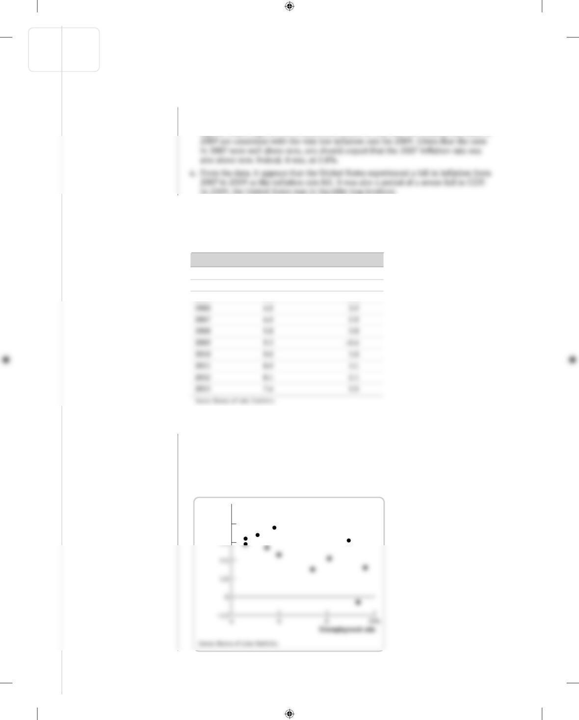
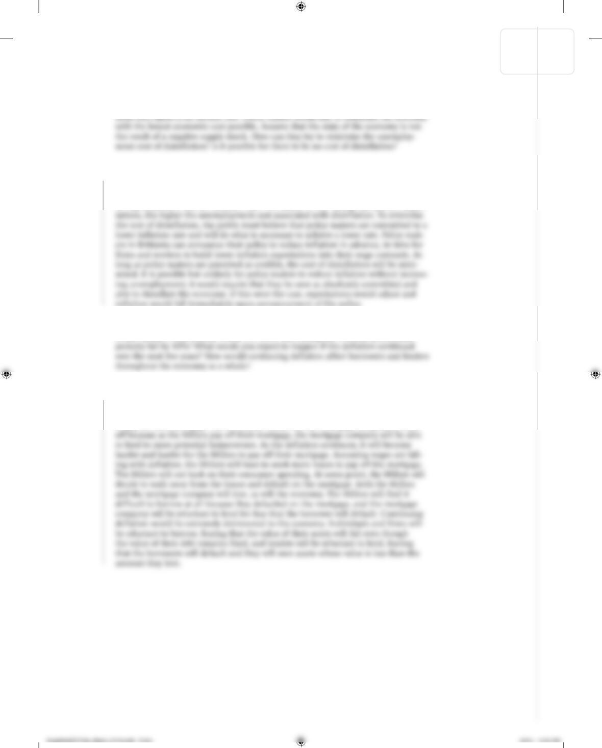
10. The accompanying table provides data from the United States on the average annual
rates of unemployment and inflation. Use the numbers to construct a scatter plot
similar to Figure 16-5. Discuss why, in the short run, the unemployment rate rises
when inflation falls.
Year Unemployment rate Inflation rate
2003 6.0% 2.3%
2004 5.5 2.7
2005 5.1 3.4
10. The accompanying figure shows a negative relationship between the unemployment rate
and the inflation rate: when the unemployment rate rises, the inflation rate falls. This
should come as no surprise: the short-run aggregate supply curve says that as the aggregate
price level rises (that is, as there is inflation), aggregate output rises. And from Okun’s law
we know that as aggregate output rises above potential output (that is, as the output gap
increases), unemployment falls. In other words, as inflation rises, unemployment falls. So
there is a negative relationship between the inflation rate and the unemployment rate.
Inflation
rate
4.0%
3.0
S-224 CHAPTER 16 INFLATION, DISINFLATION, AND DEFLATION
KrugWellsECPS4e_Macro_CH16.indd S-224KrugWellsECPS4e_Macro_CH16.indd S-224 2/9/15 10:00 AM2/9/15 10:00 AM
Solution
Solution
11. The economy of Brittania has been suffering from high inflation with an unemploy-
11. A major obstacle to achieving disinflation is that the public has come to expect con-
tinuing inflation. To reduce inflation, it is often necessary to keep the unemployment
rate above the natural rate for an extended period of time so that the public can adjust
its expectations to a lower inflation rate. The harder it is to change the public’s expec-
12. Who are the winners and losers when a mortgage company lends $100,000 to the
Miller family to buy a house worth $105,000 and during the first year prices unex-
12. Over the first year, as prices fall 10%, the value of the Millers’ house will fall from
$105,000 to $94,500. Since they borrowed $100,000 to buy it, the value of the house
is now less than the amount they owe. If they sold the house, they would not be able
to pay off their mortgage. The Millers are worse off. The mortgage company is better
CHAPTER 16 INFLATION, DISINFLATION, AND DEFLATION S-225
Solution
13. Due to historical differences, countries often differ in how quickly a change in actual
inflation is incorporated into a change in expected inflation. In a country such as
Japan, which has had very little inflation in recent memory, it will take longer for
13. Countries such as Japan will find that they can sustain an unemployment rate lower
than the NAIRU for longer periods of time before the expected rate of inflation
increases than can countries such as Zimbabwe. So Japanese monetary and fiscal
S-226 CHAPTER 16 INFLATION, DISINFLATION, AND DEFLATION
KrugWellsECPS4e_Macro_CH16.indd S-226 2/9/15 10:00 AM