
9: Visual Media 9-1
Chapter 9: Visual Media
This chapter introduces students to visual communication, including the principles of visual design, the
full range of charts and graphs, tips for integrated visuals with text, and the production of business video.
CHAPTER OUTLINE
Understanding Visual Communication
The Power of Images
The Visual Evolution in Business Communication
Visual Design Principles
The Ethics of Visual Communication
Identifying Points to Illustrate
Selecting Visuals for Presenting Data
Tables
Line and Surface Charts
Bar Charts, Pictograms, and Gantt Charts
Scatter and Bubble Diagrams
Pie Charts
Data Visualization
Selecting Visuals for Presenting Information, Concepts, and Ideas
Flowcharts and Organization Charts
Maps
Illustrations, Diagrams, Photographs
Infographics
Producing and Integrating Visuals
Creating Visuals
Integrating Visuals with Text
Maintaining a Balance Between Illustrations and Words
Referencing Visuals
Placing Visuals
Writing Titles, Captions, and Legends
Verifying the Quality of Your Visuals
Visual Media on Mobile Devices
Producing Business Videos
Step 1: Preproduction
Step 2: Production
Step 3: Postproduction
Learning Catalytics is a “bring your own device” student engagement, assessment, and classroom
intelligence system. It allows instructors to engage students in class with real-time diagnostics. Students
can use any modern, web-enabled device (smartphone, tablet, or laptop) to access it. For more
information on using Learning Catalytics in your course, contact your Pearson Representative.

9: Visual Media 9-2
LECTURE NOTES
Section 1: Understanding Visual Communication
Learning Objective 1: Explain the power of business images, discuss six principles of graphic design that
help ensure effective visuals, and explain how to avoid ethical lapses when using visuals.
Many businesses look for new ways to connect and explore business ideas through creative visuals,
helping clients see important concepts and relationships that aren’t obvious using text alone.
Visual communication has become an important skill for today’s business professionals and managers.
The Power of Images
Well-designed visual elements can enhance the communication power of textual messages or even
replace textual messages:
• Visuals can often convey some message points more effectively and efficiently than words.
Many colors, shapes, and other design elements have visual symbolism:
• Their symbolic, connotative meaning can mean different things in different cultures.
Because they have so much power to communicate, visuals must be carefully planned, competently
created, and seamlessly integrated with text.
The Visual Evolution in Business Communication
Thanks to advances in technology and changing audience expectations, business communication is
becoming much more visual.
Design and production tasks that used to take days can now be completed in hours or even minutes.
Two changes in the business environment continue to increase the importance of quality visuals:

9: Visual Media 9-3
Visual Design Principles
Just as creating effective sentences and paragraphs requires working knowledge of the principles of
good writing, creating effective visuals requires some knowledge of the principles of good design.
By thinking about your own reactions to visual designs, you can become a more effective designer
yourself.
Six fundamental principles help distinguish ineffective and effective designs:
• Consistency. Audiences assume that design elements will be consistent from one page to the
next.
• Contrast. To emphasize differences, depict items in contrasting colors, shapes, or sizes.
• Balance. Balance can be either formal, in which the elements in the images are arranged
symmetrically around a central point or axis, or informal, in which stronger and weaker
elements are arranged in a way that achieves an overall effect of balance.
The Ethics of Visual Communication
The potential power of visuals places an ethical burden on every business communicator.
Avoid ethical lapses by following these guidelines:
• Consider all possible interpretations—and misinterpretations. View your visuals from the
audience members’ perspective, considering their biases, beliefs, or backgrounds.
• Provide enough context and background information to help audiences interpret the visual
information correctly.
• Don’t hide or minimize negative information that runs counter to your argument.
• Don’t exaggerate information that supports your argument.

9: Visual Media 9-4
Section 2: Identifying Points to Illustrate
Learning Objective 2: Explain how to choose which points in your message to illustrate.
To help identify which parts of your message can benefit from visuals, consider the flow of your message
from the audience’s point of view.
When you’re deciding which points to present visually, think of the five Cs:
• Clear. If you’re having difficultly conveying an idea in words, consider whether a visual element
will do the job instead.
• Complete. Visuals, particularly tables, often serve to provide the supporting details for a main
idea or recommendation. A table or another visual can provide these details without getting in the
way of your main message.
Make sure that each visual you decide on has a clear purpose.
Section 3: Selecting Visuals for Presenting Data
Learning Objective 3: Describe the most common options for presenting data in a visual format.
Once you have identified which points would benefit most from visual presentation, it’s time to choose
the visual for each message point.
There are many choices for business graphics, which can be roughly divided into those for presenting data
and those for presenting information, concepts, and ideas.
Tables
When you need to present detailed, specific information, a table is often the best choice.
Tables are ideal when your audience needs information that would be difficult to handle in the text.
Follow these guidelines to make your tables easy to read:

9: Visual Media 9-5
• Provide totals or averages of columns or rows when relevant.
• Document the source of the data, using the same format as a text.
Line and Surface Charts
A line chart illustrates trends over time or plots the relationship of two or more variables.
In line charts showing trends, the vertical, or y, axis shows the amount, and the horizontal, or x, axis
shows the time or other quantity against which the amount is being measured.
Because they often show trends based on historical data, line charts often prompt questions about
what comes next:
A surface chart, also called an area chart, is a form of line chart with a cumulative effect:
Bar Charts, Pictograms, and Gantt Charts
A bar chart portrays numbers by the height or length of its rectangular bars, making a series of
numbers easy to read or understand.
Vertical bar charts are sometimes called column charts.
Bar charts are particularly valuable when you want to:

9: Visual Media 9-6
Bar charts can appear in various forms:
• Grouped bar charts compare more than one set of data, using a different color or pattern for
each set.
• Deviation bar charts identify positive and negative values, or winners and losers.
A chart that portrays data as symbols instead of words or numbers is known as a pictogram.
Scatter and Bubble Diagrams
Scatter or XY diagrams compare entities against two variables.
Pie Charts
A pie chart is a commonly used tool for showing how the parts of a whole are distributed.
Data Visualization
Conventional charts and graphs are limited in several ways:
• Most types can show only a limited number of data points before becoming too cluttered to
A diverse class of display capabilities known as data visualization work to overcome all these
drawbacks.
Unlike charts and graphs, data visualization is less about clarifying individual data points and more
about extracting broad meaning from giant masses of data or putting the data in context.
Data visualization has become an important tool for companies working with big data.

9: Visual Media 9-7
Copyright © 2018 Bovée and Thill LLC
In addition to displaying large data sets and linkages within data sets, other kinds of visualization
tools combine data with textual information to communicate complex or dynamic data much faster
than conventional presentations can.
Section 4: Selecting Visuals for Presenting Information, Concepts, and Ideas
Learning Objective 4: Describe the most common options for presenting information, concepts, and
ideas.
In addition to facts and figures, you’ll need to present other types of information, from spatial
relationships to abstract ideas.
Flowcharts and Organization Charts
Flowcharts illustrate a sequence of events from start to finish.
Maps
Use maps for such tasks as representing statistics by geographic area or showing spatial relationships.
Illustrations, Diagrams, and Photographs
Use illustrations and diagrams to show how something works or how it is made or used.
Illustrations are sometimes better than photographs because they let you focus on the most important
details.
To use photographs successfully, consider these guidelines:
• Consider whether a diagram would be more effective than a photograph; sometimes
photographs communicate too much information.

9: Visual Media 9-8
At a more sophisticated level, software enables the creation of multimedia files that include computer
animation, digital video, and other elements.
Classroom discussion question: With image manipulation tools such as Photoshop so prevalent today,
do you trust photographs you see in news media, product advertising, real estate listings, and other
places? Where would you draw the line in terms of how much manipulation is ethical? For example,
would it be ethical to subtly improve the look of a real estate listing by using camera lens filters or digital
postprocessing to make the sky bluer or the landscape colors more intense?
Infographics
Infographics are a special class of diagrams that can convey data as well as concepts or ideas.
Section 5: Producing and Integrating Visuals
Learning Objective 5: Explain how to integrate visuals with text, and list three criteria to review in order
to verify the quality of your visuals.
Creating Visuals
Computers make it easy to create visuals, but they also make it easy to create ineffective, distracting,
and even downright ugly visuals.
By following the basic design principles, you can create visuals that are both attractive and effective.
In addition to helping ensure an effective design, using templates saves you the time of making
numerous design decisions every time you create a chart or graphic.
Learn how to use your tools to help save time and produce better results.
Take care to match the style and quality of your visuals with the subject matter and the situation at
hand.

9: Visual Media 9-9
Integrating Visuals with Text
For maximum effectiveness and minimum disruption for the reader, integrate visuals carefully.
Successful integration involves four decisions:
• Maintaining a balance between visuals and text
• Referring to visuals in the text
Maintaining a Balance Between Illustrations and Words
Maintain a balance between text and visuals, and place visuals so that they help emphasize the
key points.
Take into account the audience’s specific needs:
Referencing Visuals
Unless a visual element clearly stands on its own, it should be referred to by number in the text of
your report.
Whatever scheme you use, make sure the scheme for numbering is clear and easy to follow.
Placing Visuals
Place each visual as close as possible to its in-text reference to help readers understand the
illustration’s relevance and to minimize the effort of reading.
• Place each visual within, beside, or immediately after the paragraph it illustrates so that
readers can consult the explanation and the visual at the same time.

9: Visual Media 9-10
Writing Titles, Captions, and Legends
Titles, captions, and legends help connect your visual and textual messages and ensure a seamless
reading experience.
A title identifies the content and purpose of the visual, along with whatever label and number
you’re using to refer to the visual:
A caption usually offers additional discussion of the visual’s content and can be up to several
sentences long.
Captions can also alert readers that additional discussion is available in the accompanying text.
Verifying the Quality of Your Visuals
Visuals have a particularly strong impact on your readers and on their perceptions of you and your
work, so verifying the quality of your visuals is an essential step.
Ask yourself three questions about every visual element:
• Is the visual accurate? Check for typographical errors, inconsistent color treatment, confusing
or undocumented symbols, and misaligned elements. Also verify that visuals and text match
and that formulas used are correct.
• Is the visual properly documented? Visuals based on other people’s research, information,
and ideas require full citation.
• Is the visual honest? Step back and verify that your visuals communicate truthful messages.
Make sure they don’t hide information the audience needs, imply conclusions that your
information doesn’t support, or play on audience emotions in manipulative or coercive ways.
Visual Media on Mobile Devices
More and more employees need to consume visual media on smartphones and tablets.

9: Visual Media 9-11
Section 6: Producing Business Videos
Learning Objective 6: Identify the most important considerations in the preproduction, production, and
postproduction stages of producing basic business videos.
Step 1: Preproduction
For any video, be sure to think through the following seven elements:
• Purpose and scope
• Scene composition
Step 2: Production
These four tips will help you collect great footage:
• Frame each shot carefully to direct the viewer’s eye where you want and create the desired
emotional impact.
• Keep the camera still unless you absolutely need to move it in order to get the footage you
need.
Step 3: Postproduction
Postproduction is where you assemble your video by combining and arranging sections of video,
audio tracks, titles, and other elements.
Here is a general overview of the postproduction process:


9: Visual Media 9-13
Team Challenge
Students should have some fun with this challenge, but they might be surprised at how much planning
and work is involved in creating even a short and informal video. Remind them that the emphasis is on
effective communication, so they’ll need to think through the scope of their video carefully so they don’t
get bogged down in details of the phone’s operation.
TEST YOUR KNOWLEDGE
9.1. Simplicity in visuals is important because it can help enhance the reception and understanding of
9.3. To illustrate trends over time, use a line chart or a bar chart. [LO-3] AACSB: Written and oral
communication
9.4. A bubble diagram is useful when you need to show a third variable (represented by the relative
9.6. Titles identify the overall content of a visual and in some instances highlight a specific message
9.7. To check a visual for quality, first make sure it’s accurate and contains no typographical errors,
inconsistent color treatment, confusing or undocumented symbols, or misaligned elements. Next,
9.8. Videographers recommend against using the microphone built into a video camera for two
9.9. B-roll footage can be edited in during postproduction to add visual interest, smooth over
transitions, and otherwise improve the flow of the finished product. [LO-6] AACSB: Written

9: Visual Media 9-14
APPLY YOUR KNOWLEDGE
9.10. Like nonverbal communication, visual aids convey meaning independently of words and are
therefore not hindered by differences between the sender’s and the receiver’s interpretation of
9.11. It is acceptable to add interactivity to a website to increase its persuasiveness as long as it’s done
in an ethical manner. In fact, one of the reasons interactivity is effective is that it allows each
9.12. The best choice for depicting changes over time would be a line chart, using a separate line for
each department. The vertical axis would indicate the absenteeism rate, and the horizontal axis
would indicate the passage of months. However, for more than three departments, a single line
9.13. In-text references to illustrations help readers understand the relationship between the textual
9.14. A typical classroom lecture is going to have at least three views of primary interest: the instructor,
the students in the class (particularly those who are interacting with the instructor), and whatever
display system the instructor might be using (whiteboard, etc.). Therefore, one camera should be
positioned on the instructor and fairly close to get maximum visual impact of his or her facial

Copyright © 2018 Bovée and Thill LLC
9.15. Message 9.A
This bar chart has several problems:
• The bar colors are too similar to clearly differentiate years.
9.16. Message 9.B
This line chart is almost unreadable:
• The use of a three-dimensional graph—particularly given the skewed viewing angle—makes it
9.17. In explaining why a visual worked better to achieve a particular purpose, students should consider
the amount of text that would’ve been required to convey the same information and the burden
that a text-only treatment would’ve placed on the reader (e.g., to visualize the “big picture” or to
Copyright © 2018 Bovée and Thill LLC
9.20. This exercise offers several opportunities to discuss the effectiveness and ethics of data
presentations. For example, does a pictogram (perhaps using partially filled/emptied wallets to
represent taxation percentages) really communicate the ideas better than a simple bar chart, or is
it simply more interesting to look at? Regarding ethics, the scales chosen for the bar charts could
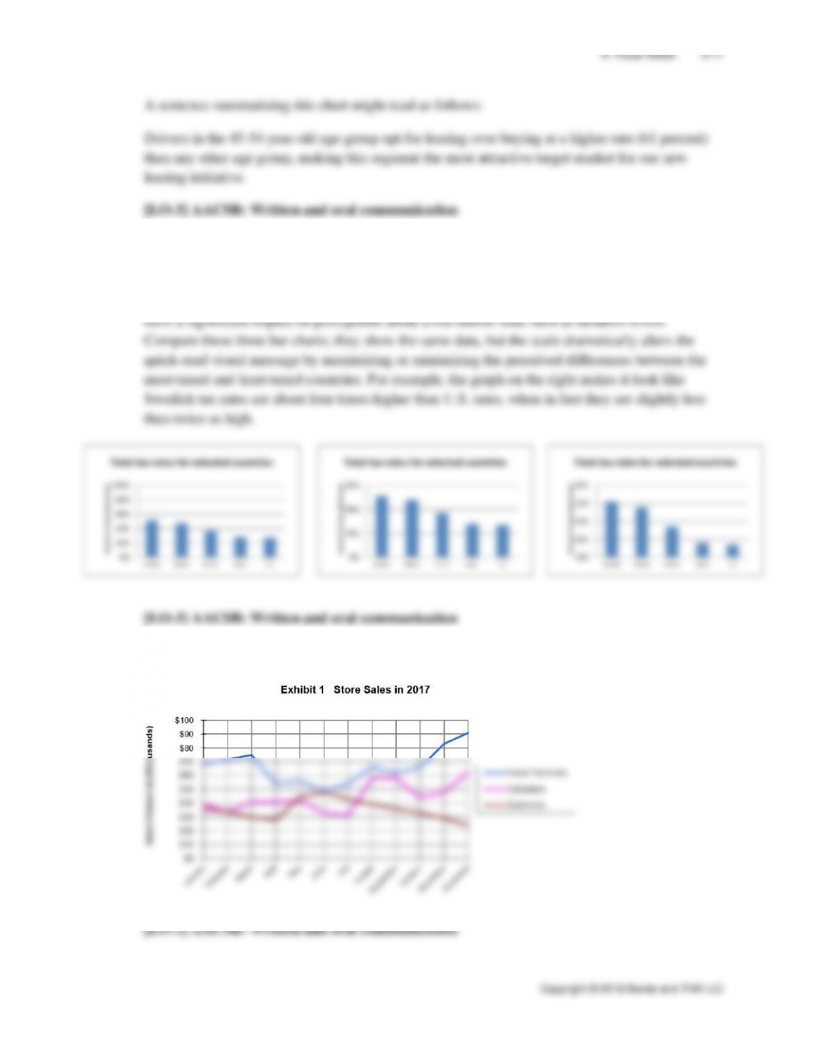
9.21. This information would probably be most useful presented in a line chart similar to the following: