10 Managing Data and Using Graphics
IN THIS CHAPTER YOU WILL FIND:
LEARNING OBJECTIVES
KEY CONCEPTS
KEY TERMS
CHAPTER OUTLINE
TEACHING SUGGESTIONS
CLASSROOM ACTIVITIES
REVIEW QUESTIONS & SUGGESTED ANSWERS
FEATURED ASSIGNMENTS
ADDITIONAL ASSIGNMENTS
CASE ASSIGHMENT
LEARNING OBJECTIVES
1 Communicate quantitative information effectively.
2 Apply principles of effectiveness and ethical responsibilities in the construction of graphic
aids.
3 Select and design appropriate and meaningful graphics.
4 Integrate graphics within documents.
KEY CONCEPTS
To ensure that communication occurs, the elements of quantitative data must be classified,
summarized, and condensed into a manageable size, then interpreted and written in common
language. Readers remember information they gain from pictures or graphs longer than text they
read. In this chapter, you will find tips for creating effective and ethical charts, descriptions of
acceptable types of graphics, and methods for integrating graphics into text.
KEY TERMS
TERM
PAGE
TERM
PAGE
Area chart
175
Grouped bar chart
173
Bar chart
173
Line chart
175
Common language
169
Map
176
Flowchart
177
Pictogram
173
Gantt chart
173
Pie chart
175
Table
172
CHAPTER OUTLINE
10-1 Communicating Quantitative Information 169
10-2 Using Graphics 170
10-3 Types of Graphic Aids 171
10-3a Tables 172
10-3b Bar Charts 173
10-3d Pie Charts 175
10-3f Flowcharts 177
10-4 Including Graphics in Text 178
10-4a Positioning Graphics in Text 178
TEACHING SUGGESTIONS
LEARNING OBJECTIVE 1
Communicate quantitative information effectively.
Communicating Quantitative Information
• To gain students’ attention, use the statistics instructors’ technique of saying that at least two
people in a class of 35 will have the same birth month and day. Try it by starting with those
born in January and moving through the months. For each month ask those raising hands to
give the date. More often than not, two will have the same date of birth. This activity raises
student interest in quantitative management techniques.
• As an example of the value of data condensing and summarizing, refer to the results students
receive from standardized tests (ACT, SAT, etc.) The overall score is computed, expressed as
a percentile, and possibly expressed with some other normed set (students in their state, etc.).
What value does such information add to the student’s interpretation of results?
LEARNING OBJECTIVE 2
Apply principles of effectiveness and ethical responsibilities in the construction of graphic aids.
Effective and Ethical Use of Graphics
• Discuss guidelines for appropriate use of graphics.
LEARNING OBJECTIVE 3
Select and design appropriate and meaningful graphics.
Types of Graphic Aids
• Review not only how to prepare each of the graphics described in the chapter but also when
to use each of them.
• Discuss choosing the appropriate graphic to fit your objective.
• Make visuals of actual graphics taken from company documents, newspapers, magazines,
Tables
• Discuss the guidelines for constructing a table and to illustrate correct table design.
• Emphasize the importance of providing a title that is complete enough to clarify what is
included in the table.
• Discuss the idea of labeling tables and other graphics. Remind students that categories can
often be combined into “Other” for a pie chart, or that years can be combined for a table, bar
chart, or line chart.
Bar Charts
• Refer students to the examples in the text as you discuss the guidelines for constructing the
types of bar charts illustrated: (a) horizontal, (b) grouped bar, (c) segmented bar charts, (d)
Line Charts
• Refer students to the examples in the text as you discuss guidelines for constructing single
and multiple line charts.
• Discuss the guidelines for constructing a table and to illustrate correct table design.
Pie Charts
• Refer students to the examples in the text as you discuss guidelines for constructing pie
charts. Discuss other graphics that can be used to show how the parts of a whole are
Maps, Flowcharts and Other Graphics
• Refer students to the examples in the text as you discuss guidelines for constructing these
charts.
LEARNING OBJECTIVE 4
Integrate graphics within documents.
Including Graphics in Text
• Review how text supports the practice of labeling all tables, graphs, and other illustrations as
“figures” and numbering them consecutively. This practice simplifies the narrative and does
not confuse the reader with “Graph 1, Table 1, etc.,” which might lead to sentences such as
“…as shown in Table 8 and Graph 3.” Using consecutive numbering, the sentence would
read “…as shown in Figures 8 and 9.” Businesspeople seem to prefer this approach, and it is
CLASSROOM ACTIVITIES
1. Selecting Appropriate Graphics: Select the most effective graphic means of presenting the
following data. Justify your decision.
a. Data showing the growth in the number of students using Android devices during the past
three years.
b. Data showing the distribution of contributions to the company’s education matching gifts
program by functional unit.
i. Data showing the total number of calls to a company’s ethics hotline over the past two
years. The data should show changes in the classifications of reported issues (e.g.,
financial fraud, employment discrimination, etc.).
j. Data showing the number of people utilizing the portfolio option of a financial investment
firm’s website. The data should depict the number of portfolios opened by investors in
five age categories during each of the past four quarters.
k. Data showing percentage of organizational projects that are delayed, on time, or ahead
of schedule.
l. Figures showing the number of MBA or graduate business employees hired by Google
during the past five years.
m. Company capital investments in each of five countries during the last fiscal year.
n. Graphic tracking the progress of a product development team working on a new
refrigeration product for a 2011 launch date.
Answers:
a. line chart; shows changes in quantitative data over time and illustrates trends.
b. simple bar chart; effective for comparing quantities.
2. Improving Introductions to Graphics: Improve the following statements taken from reports:
a. As can be seen in Table 3, the correlation between interest rates and credit card sales
was .68.
b. Professional salaries in the Southeast have increased about 12 percent while the national
average has increased 3 percent. (See Figure 1).
c. Take a look at Figure 3, where a steady decline in the price of flash drives during the
year is shown.
d. The data reveal (Figure 4) that only 7 out of 10 customers are satisfied with our service
department.
e. Figure 1 summarizes data related to college students’ investment patterns. Of the college
students surveyed, 45 percent believe their companies’ pension plan will adequately fund
their retirement, 25 percent plan to begin investing for retirement after their children
complete college, 15 percent plan to begin investing in their 30s, 10 percent plan to begin
investing in their 20s, and 5 percent have already begun their retirement investment
plans.
Answers:
a. Move the reference to Table 3 to the end of the sentence. If readers study the table before
REVIEW QUESTIONS & SUGGESTED ANSWERS
1. In what ways does managing data help protect researchers and readers from being
overwhelmed by information?
2. What is meant by common language? Provide several examples.
3. What is meant by the term chartjunk? Provide suggestions for eliminating chartjunk.
4. Discuss the major principles involved in preparing effective tables.
5. When would a pictogram be preferred to a bar chart? Why?
6. Should every graphic be introduced before it appears in a report? Is interpreting a self-
explanatory graphic necessary? Explain.
7. Discuss the appropriate way to introduce and to interpret a graphic in a report.
8. “A picture is worth a thousand words.” Discuss the significance of this statement in
regard to business information.
9. How much is “too much” when considering the use of graphics in a business document?
FEATURED ASSIGNMENTS
1. Gantt Chart: Consider a project that you have completed this semester or will complete
before the term ends. Create a Gantt chart for one of those projects. Even if the project has
already been completed, you will able to retroactively analyze what would have worked
better for them and envision a better process for future project management.
Solutions will vary. Evaluate based on effective graphics found in example slides and in the
chapter.
2. Preparing a Table From Prepared Data: Prepare a table to show the total revenue Nashville
Sports Connection earned from membership fees for a fiscal period. Fees were collected by
type of membership: single, $25; double, $40; family (3+ members), $50; corporate, $22.50;
senior, $20. Nashville Sports Connection has 1,439 single memberships, 642 double, 543
family, 3,465 corporate, and 786 senior memberships.
NOTE: this exercise can be completed with any set of data that you can find. You can also
find a single set of data and have students present it in multiple graphic formats.
3. Analyzing Printed Graphics: Bring in a pictogram or other graphic illustration from a
business magazine or newspaper. Either in small groups or as an entire class, you will be
reviewing your examples and using them as the basis for discussing powerful and effective
graphical depictions of information.
4. Evaluating Graphics in Annual Reports: In a team of three students, obtain a copy of a
corporate annual report for a U.S.-based firm and one for a non-U.S.–based firm. Working
together, team members should prepare a one-page memo that evaluates the use of graphics
in each report, the graphics’ effectiveness in clarifying or reinforcing major points, and any
noted differences between the graphics presentation of each report. You will share your
analysis in a short report to the class.
Solutions will vary. Students should focus on the use of effective talking headers, how the
ADDITIONAL ASSIGNMENTS
1. Recognizing Common Language: Using an online database, select an article from a
business journal that presents the findings of a research study. Find examples of how
percentages and common language are used in the reporting of the data. Describe how
effective or ineffective the author(s) was/were in assuring that the data were understood by
the intended audience.
2. Drawing a Line Chart: Using appropriate presentation software, prepare a bar chart
showing the water consumption patterns in the United States for the last five years. Locate
the most current information by visiting the website of the International Bottled Water
Association (http://www.bottledwater.org) or other research sources. Write a talking title that
clearly identifies the data depicted in the chart; then write a sentence to introduce the
graphic and emphasize its most important idea(s).
3. Analyzing a Published Pictogram: Clip a pictogram from USA Today and share it with
groups in class. Discuss the effectiveness of the symbols used and the ethical presentation of
the data.
Selections will vary.
4. Selecting and Drawing an Appropriate Graphic: Create the graphic that would most
effectively aid a human resources manager in identifying potential areas for training and
development. Write a descriptive or a talking title that interprets the data depicted in the
chart and a sentence to introduce the graphic and emphasize its most important idea(s).
Interest in Computer Training by Department January 2008
Instant Video- Video
Dept. Security Messaging Conferencing Production
Acct./
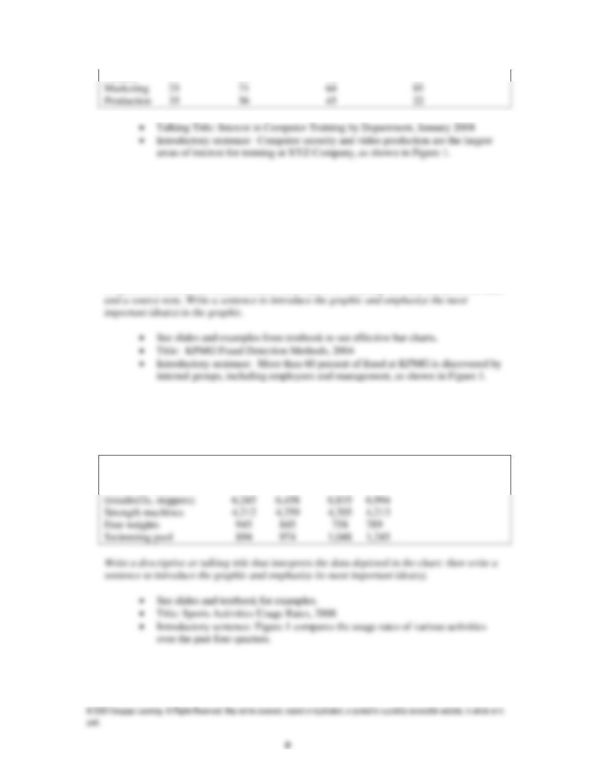
Finance 87 69 78 83
5. Drawing a Bar Chart: The 2004 KPMG Fraud Report gives a variety of ways fraud is
detected in organizations:
Notification by employee (19%), internal controls (19%), management
investigation (12%), employee investigation (11%), notification by customer
(9%), accident (7%), anonymous letter/call (6%), internal auditor review (5%),
third-party investigation (4%), notification by supplier (3%), notification by
band/credit (2%), and employee away on vacation (1%).
Prepare a horizontal bar chart; include a descriptive or a talking title that interprets the data
6. Drawing a Segmented Chart: The director of the Nashville Sports Connection wishes to
compare the usage rate of various activities offered to its members over the past four
quarters. Using the data provided in the following table, prepare a segmented chart that will
make comparison of these usage rates easier to understand.
Activity 1st Q 2nd Q 3rd Q 4th Q
Aerobics classes 2,451 2,315 2,248 2,258
Aerobics machines
7. Drawing a Line Chart: The information technology group of First National Bank has
prepared estimates on the number of its customers expected to actively use its Internet
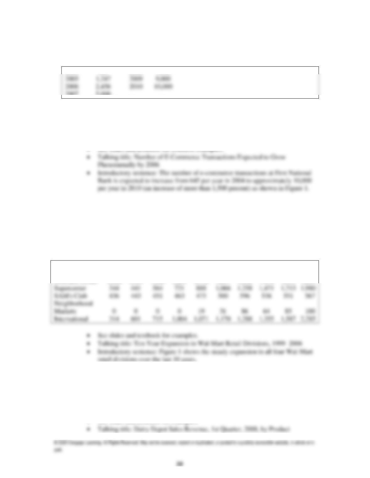
banking site. Prepare a line chart showing the actual number of customers for 2004–2007
with the estimates for 2008–2010:
2004 645 2008 7,500
2007 5,000
To distinguish projected data from actual data, create a dashed line or add an explanatory
note below the graph (e.g., Projected Data for ___). Write a descriptive or talking title that
clearly identifies the data depicted in the chart. Write a sentence to introduce the graphic and
emphasize its most important idea(s).
8. Drawing an Area Chart: Prepare an area chart showing how the Wal-Mart Stores’ retail
divisions contributed to the total number of stores over a ten-year period. Use the data
presented in the following table or obtain current data from Wal-Mart’s latest annual report
or web page. Include a source note below the chart.
Write a descriptive or talking title that clearly identifies the data depicted in the chart. Write
a sentence to introduce the graphic and emphasize its most important idea(s).
Area Chart Data
Division 1997 1998 1999 2000 2001 2002 2003 2004 2005 2006
Discount Center 1,960 1,921 1,869 1,801 1,736 1,647 1,568 1,478 1,353 1,209
9. Drawing a Pie Chart: Prepare a pie chart showing the percentage of revenue The Dairy
Depot generated from sales in the following categories during the first quarter of the current
year: ice cream (47%), beverages (24%), sandwiches (18%), novelty items (8%), and other
(3%). Write a descriptive or talking title that interprets the data depicted in the chart; then
write a sentence to introduce the graphic and emphasize its most important idea(s).
• See slides and textbook for examples.
10. Mastering Graphic Design: Tufte Style: Locate the following information related to Edward
Tufte’s principles of information design online or from another database available from your
campus library:
Rosen, S. (2000). The more words, the merrier. Communication World, 17(4),
64.
Conduct an online search to locate other articles that discuss and apply Tufte’s concepts or
obtain a copy of one of Tufte’s three books on information design: (a) Visual Explanations:
Student papers might include some of the following elements:
1. Tufte describes thin data as data obscured in clutter and confusion. Bad graphics fail
because they omit or manipulate context, deceive by discouraging comparison or
11. Evaluating Graphics in Annual Reports: Obtain a copy of a corporate annual report and
follow these three steps to critique a graphic in the report:
a. Identify one graphic that violates one or more of the principles presented in this chapter.
For example, the graphic may be an inappropriate type to present the data meaningfully,
be drawn incorrectly, distort the true meaning of the data, have too much clutter, contain
typographical or labeling errors, or contain other ineffective design elements.
b. Revise the graphic, incorporating your suggestions. Send your instructor an email
message outlining the major weaknesses in the graphic and your suggestions for
improving it. Attach the computer file containing your revised graphic.
c. Be prepared to present a report to the class. To support your report, prepare a slide or
transparency of the poor and revised graphic and a list of the weaknesses if your graphic
contained several errors.
12. Evaluating Graphics in Annual Reports: In teams of three, obtain a copy of a corporate
annual report for a U.S.-based firm and one for a non-U.S.–based firm. Prepare a one-page
memo to your instructor that evaluates the use of graphics in each report, the graphics’
effectiveness in clarifying or reinforcing major points, and any noted differences between the
graphics presentation of each report. Share your analysis in a short report to the class.
Papers will vary. Annual reports reflect both good and bad application of the use of graphics.
CASE ASSIGNMENT
LYING STATISTICS
Three kinds of lies are possible, according to Benjamin Disraeli, a British prime minister
in the nineteenth century: lies, damned lies, and statistics. A related notion exists that “you can
prove anything with statistics.” Such statements bolster the distrust that many people have for
statistical analysis. On the other hand, many non-mathematicians hold quantitative data in awe,
believing that numbers are, or at least should be, unquestionably correct. Consequently, it comes
as a shock that various research studies can produce very different, often contradictory results. To
solve this paradox, many naive observers conclude that statistics must not really provide reliable
rose 1.4 percent.
Distrust also arises concerning studies that link exercise to health. Numerous studies have
established statistically that people who exercise live longer. But the conclusion that exercise is
good for you may put the cart before the horse. Are people healthy because they exercise? Or do
they exercise because they are healthy? Correlation, once again, does not establish causation.
How do such incorrect and partial research findings become published and consequently
disseminated through the media? Some of the responsibility should probably be cast upon
researchers who may overstate the significance or the generalizability of their findings. The
media should also shoulder some blame, as preliminary findings of small or limited studies are
often reported as foregone conclusions. Consumers should also assume some responsibility in the
interpretation of reported research. Questions such as the following should be asked when
considering the value of reported findings.
• Is the study sample representative of the population involved?
• Were the statistical procedures used appropriate to the data?
• Has the research involved a sample of significant size and a sufficient time period of study?
Activities
1. Compile a list of behaviors or practices that can lead to the reporting of “lying statistics.”
For each item on your list, indicate whether the behavior or practice is likely an intentional
or unintentional attempt to distort.
Answers may include the following:
1. Biased sampling (may be intentional or unintentional)
2. Write a one- to two–page analysis of the researcher’s ethical responsibilities in reporting
statistical results of a study versus the consumer’s responsibilities in reading and interpreting
the results.
3. Prepare a short spoken report in which you describe some of the issues that arise when
reporting international economic statistics.
Reports may include the following issues related to reporting of international economic data:
• The economies of many countries are becoming service sector economies, but most of the