CHAPTER 11 MENDEL AND THE GENE IDEA
Scientific Skills Exercise
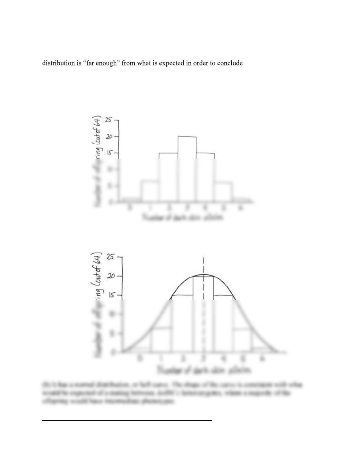
Teaching objective: Students will create a histogram showing the distribution of phenotype
frequencies in a population. The data are normally distributed in a typical bell curve.
Teaching tips: A histogram is related to a bar graph. A bar graph visually summarizes
categorical data, whereas a histogram is used to summarize numeric data. From a practical
perspective, a histogram is really a bar graph of numeric data that has been “binned” into
categories (numeric ranges; in this case the data themselves are integer values so each bin
represents the range from 0 to 0.99, 1.0 1.99, etc.). One visible difference between the two is
that one usually creates gaps between bars in a bar graph to make it easy to see the distinct
categories, while in a histogram, bars often touch to indicate the natural ordering and continuum
of the numeric values on the x-axis.
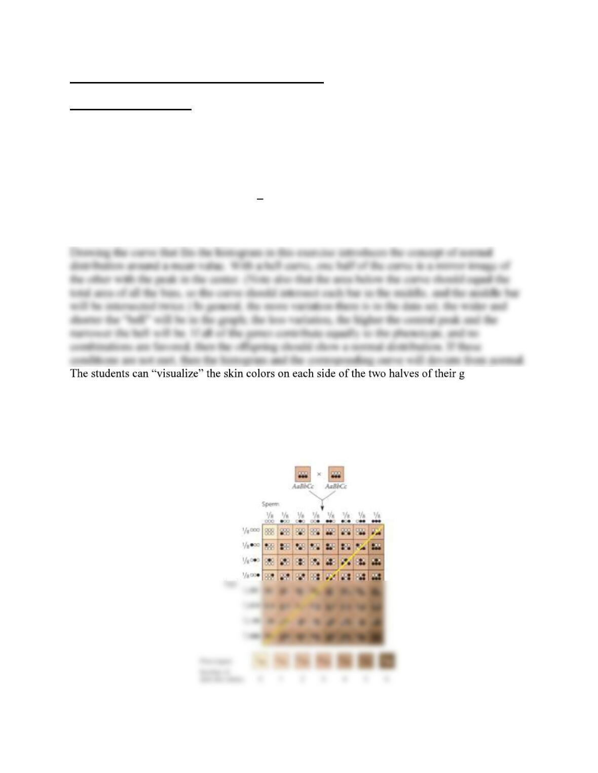
raph by
drawing a diagonal line from the upper right corner to the lower left corner of the Punnett square.
Most of the offspring have skin color that is close to those on the line; the corners farthest from
the diagonal line show the colors with lowest frequency. Note that this method works for this
particular example because of the order that the parental alleles are placed along the top and side,
and entered into the Punnett square cells, situating the triply homozygous individuals at opposite
corners.
When the lethal bb genotypes are removed from the population in question 3 (a purely
hypothetical exercise), the resulting distribution deviates from normal. (Determining whether the
that the distribution is not
normal requires statistical analysis, which is not covered in this exercise.) The skew of the
distribution in this hypothetical exercise is visually evident because more genotypes were
removed from one side of the diagonal line across the Punnett square than from the other; see the
answer to question 3.
Answers:
1.
2. (a) The skin color that results from three dark-skin alleles is most common (has the highest
frequency), with 20 out of 64 offspring carrying this genotype.
Suggested Answers for End-of-Chapter Essay Questions
15. Focus on Evolution
It should reduce the frequency of the lethal dominant allele in the population because if waiting
16. Scientific Inquiry
(a) TTAA, TTAa, TtAA, TtAa
(b) Testcross the mystery plant with a homozygous recessive plant (ttaa, with dwarf stems and
terminal flowers), using the procedure shown in Figure 11.2. Plant the seeds, and when the
17. Focus on Information
Sample key points:
Genes are stretches of DNA encoding characters that are passed on from parent to offspring.
The behavior of genes during sexual reproduction accounts for both similarity and variation
among offspring.
Sample top-scoring answer:
The behavior of genes accounts for both similarity and variation in inheritance. Genes encoding
characters exist as stretches of DNA that behave
genotype of each diploid parent includes two alleles of each gene, each allele coding for a variant
18. Synthesize Your Knowledge

–H for horizontal and SV for vertical. Because both