Appendix B An Introduction to Data Analysis
and Graphing for a Mac
This appendix provides a quick introduction to the use of some of the data analysis and
graphing capabilities of one of the more commonly used computer programs, Excel. This
and other similar software systems make it much easier to graph and analyze large data sets.
1. TO SET UP EXCEL FOR DATA ANALYSIS AND GRAPHING
• Open Excel and activate the “Data Analysis” tool.
䊊Under the “Tools” pull-down menu, look for “Data Analysis.”
䊊If you don’t see “Data Analysis,” look for “Add-Ins.” Click on “Data
• Enter the data to be analyzed or graphed in columns on the Excel spreadsheet.
䊊If you want to graph height versus arm length, enter the data in two columns
with the data you want to appear on the y-axis (independent variable) of a
graph in the right-hand column.
䊊The data to appear on the x-axis (dependent variable) should be in the
adjacent left-hand column.
䊊For example:
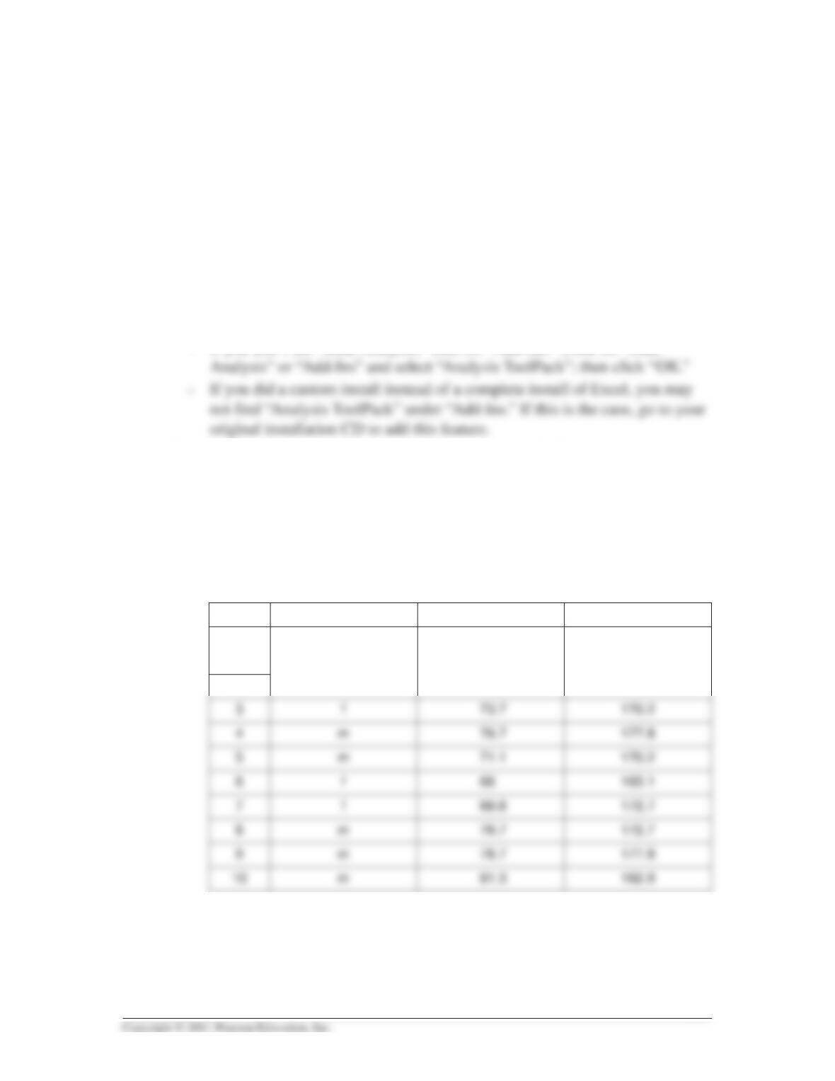
A B C
1
Gender Arm Length (cm) Height (cm)
2
Appendix B 387
2. TO SORT THE DATA
• In the upper left-hand corner of the Excel spreadsheet, click the box between Row
1 and Column A. The whole table should be highlighted when you do this.
3. TO GET DESCRIPTIVE/SUMMARY STATISTICS FOR THE DATA
a. Pull down the “Tools” menu at the top of the Excel spreadsheet and click on
“Data Analysis.”
b. Click on “Descriptive Statistics” and then “OK.”
• In the window that appears, for input range click on the icon to the right of the
Two data sets may have the same mean but very different amounts of variability. To
indicate the amount of variability that exists in a given set of data, the arithmetic mean for
4. TO GRAPH THE DATA
a. To make a linear graph of xvs. yvalues:
• Click on the “Chart Wizard” icon at the top of the Excel spreadsheet.
• Click on “XY (Scatter).”
• Click “Next.”
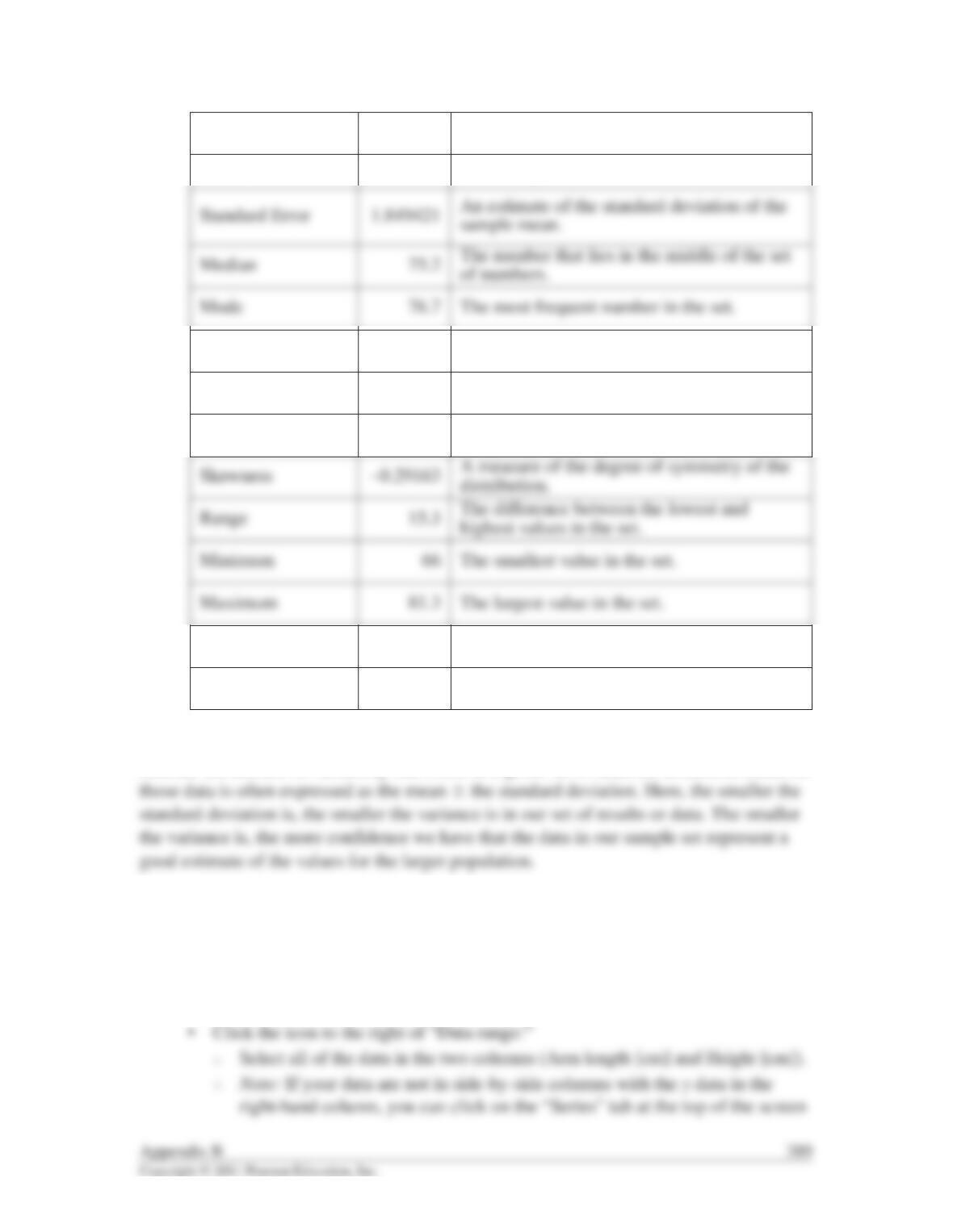
Arm Length Definitions:
Mean 74.1 The average of all the values.
Standard Deviation 5.230952 The square root of the variance.
Sample Variance 27.36286 A measure of how far from the average the
data points are.
Kurtosis –0.99518 A measure of how peaked or flat the
distribution is.
Sum 592.8 The total of all values in the set.
Count 8 The total number of values in the set.
that pops up (instead of the “Data range” tab). Click “Add” and then enter
the data separately for the x– and y-axes by highlighting the columns
separately here.
• Click “Next” and select the “Titles” tab to add titles for the chart and the x– and
y-axes.
• For the data in the previous table you should get the following graph.
The formula y⫽0.9409x⫹103.95 is in the format y⫽mx ⫹b. When the value of mis
positive it indicates that there is a direct relationship between xand y; in this case it
indicates that as xincreases, yincreases. (If mwere negative, it would indicate an inverse
relationship—as xincreases, ydecreases.)
For this specific graph, if it were reasonable to extrapolate the line to a point where x⫽0,
the line would intercept the y-axis at b, or 103.95 cm. With this as the zero point for xon the
line, the yvalues would increase from this point by m, or 0.9409 for every unit change in x.
185
Arm Length vs Height
180
y = 0.9409x 103.95
R2 = 0.7753
• Go to the “Tools” pull-down menu and click on “Data Analysis,” then on
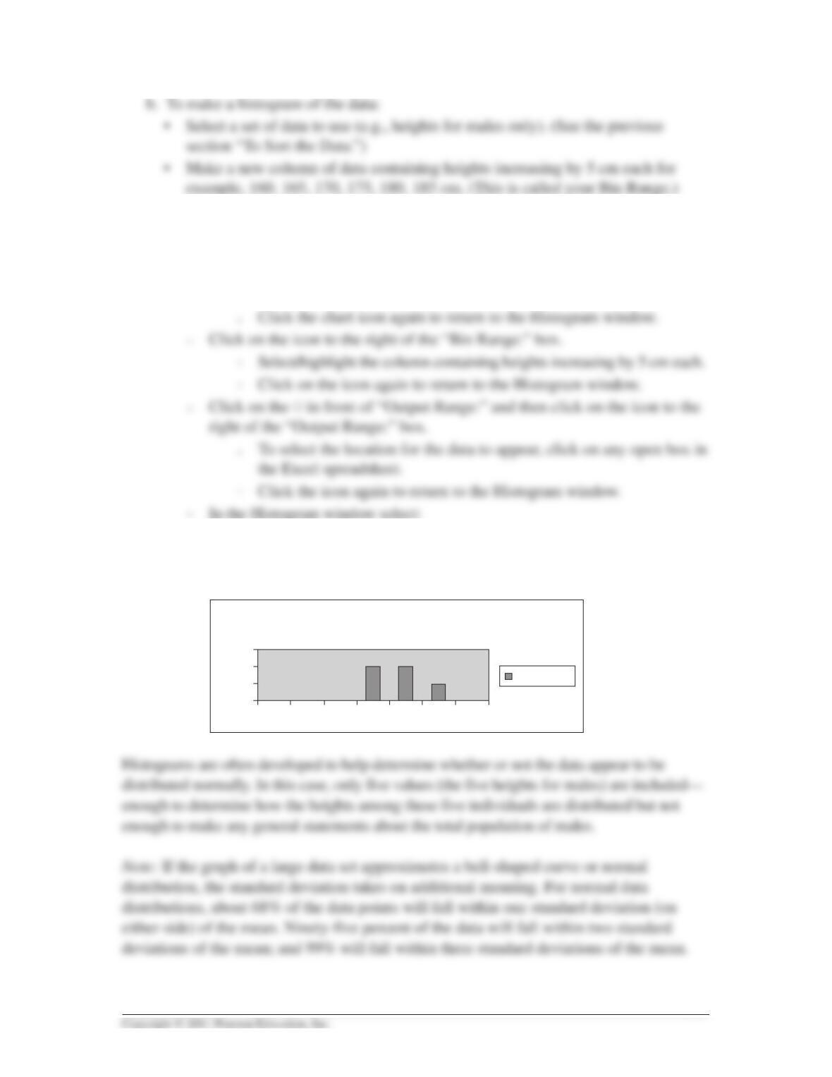
“Histogram.” Then click “OK.”
䊊Click on the icon to the right of the “Input Range:” box
䊐Select/highlight the height data for males only (include a column
heading).
䊐Chart Output
䊊Click “OK.” The frequency data and histogram should appear.
Appendix B 391
Histogram
0
160 165 170 175 180 185 More
1
2
3
Frequency
Frequency
5. TO DETERMINE STATISTICAL SIGNIFICANCE
The statistical significance of the difference in means can be determined by using a
statistical test. The null hypothesis (H0) is generally assumed for such tests. A simple null
hypothesis would state that there is no difference in x(some characteristic) between two
populations (e.g., there is no difference in arm length between males and females). This
null hypothesis further assumes that any differences observed between the two populations
are the result of chance variation or sampling error alone. An alternative hypothesis (Ha)
would be that there is a difference in arm length (or other characteristic) between the
populations. The alternative hypothesis is supported when the null hypothesis is rejected.
392 Appendix B