Appendix A An Introduction to Data Analysis
and Graphing for a PC
This appendix provides a quick introduction to the use of some of the data analysis and
graphing capabilities of one of the more commonly used computer programs, Excel.
This and other similar software systems make it much easier to graph and analyze large
data sets.
1. TO SET UP EXCEL FOR DATA ANALYSIS AND GRAPHING
• Open Excel and activate the “Data Analysis” tool.
䊊Under the “Tools” pull-down menu, look for “Data Analysis.”
䊊If you don’t see “Data Analysis,” look for “Add-Ins.” Click on “Data
Analysis” or “Add-Ins” and select “Analysis ToolPack”; then click “OK.”
Note: If you are using Excel 2007 to find and activate Add-ins:
• Click on the “Office” button in the upper left-hand corner.
• Then click on the “Excel options” button at the bottom of the pop-up window.
• Select “Add-ins” from the left-hand column.
• Select/highlight “Analysis ToolPak” in the list of Inactive Application Add-ins,
2. TO SORT THE DATA
• In the upper left-hand corner of the Excel spreadsheet, click the box between Row
1 and Column A. The whole table should be highlighted when you do this.
3. TO GET DESCRIPTIVE/SUMMARY STATISTICS FOR THE DATA
a. Pull down the “Tools” menu at the top of the Excel spreadsheet and click on “Data
Analysis.”
b. Click on “Descriptive Statistics” and then “OK.”
• In the window that appears, for input range click on the icon to the right of the
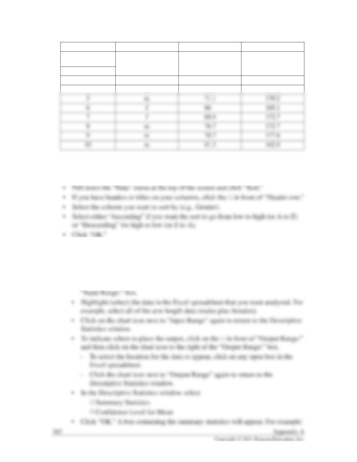
A B C
1Gender Arm Length (cm) Height (cm)
2
3 f 73.7 170.2
4 m 76.7 177.8
Two data sets may have the same mean but very different amounts of variability. To
indicate the amount of variability that exists in a given set of data, the arithmetic mean for
those data is often expressed as the mean ⫾the standard deviation. Here, the smaller the
4. TO GRAPH THE DATA
a. To make a linear graph of xvs. yvalues:
• Click on the “Chart Wizard” icon at the top of the Excel spreadsheet.
• Click on “XY (Scatter).”
• Click “Next.”
Arm Length Definitions:
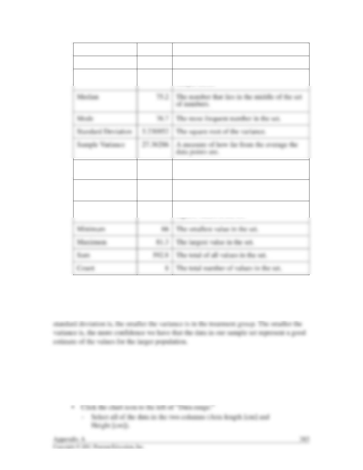
Mean 74.1 The average of all the values.
Standard Error 1.849421 An estimate of the standard deviation of the
sample mean.
Kurtosis –0.99518 A measure of how peaked or flat the
distribution is.
Skewness –0.29163 A measure of the degree of symmetry of the
distribution.
Range 15.3 The difference between the lowest and
highest values in the set.
䊊Note: If your data are not in side-by-side columns with the ydata in the
right-hand column, you can click on the “Series” tab instead of the “Data
range:” tab. Click “Add” and then enter the data separately for the x– and
y-axes by highlighting the columns separately here.
• On the graph that appears, click on one of the data points to highlight it, then
right click (on PC computers) and select “Add trendline.”
䊊Under the “Type” tab, select “Linear.”
䊊Under the “Options” tab, select:
䊐“Display equation on chart” and “Display R-squared value on chart.”
䊐Click “OK.”
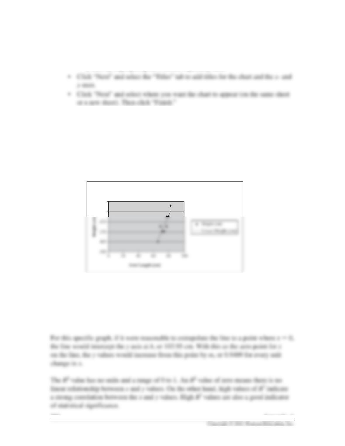
• For the data in the previous table you should get the following graph.
384 Appendix A
185
Arm Length vs Height
180
y = 0.9409x 103.95
R2 = 0.7753
The formula y⫽0.9409x⫹103.95 is in the format y⫽mx ⫹b. When the value of mis
positive it indicates that there is a direct relationship between xand y; in this case it
indicates that as xincreases, yincreases. (If mwere negative, it would indicate an inverse
relationship—as xincreases, ydecreases.)
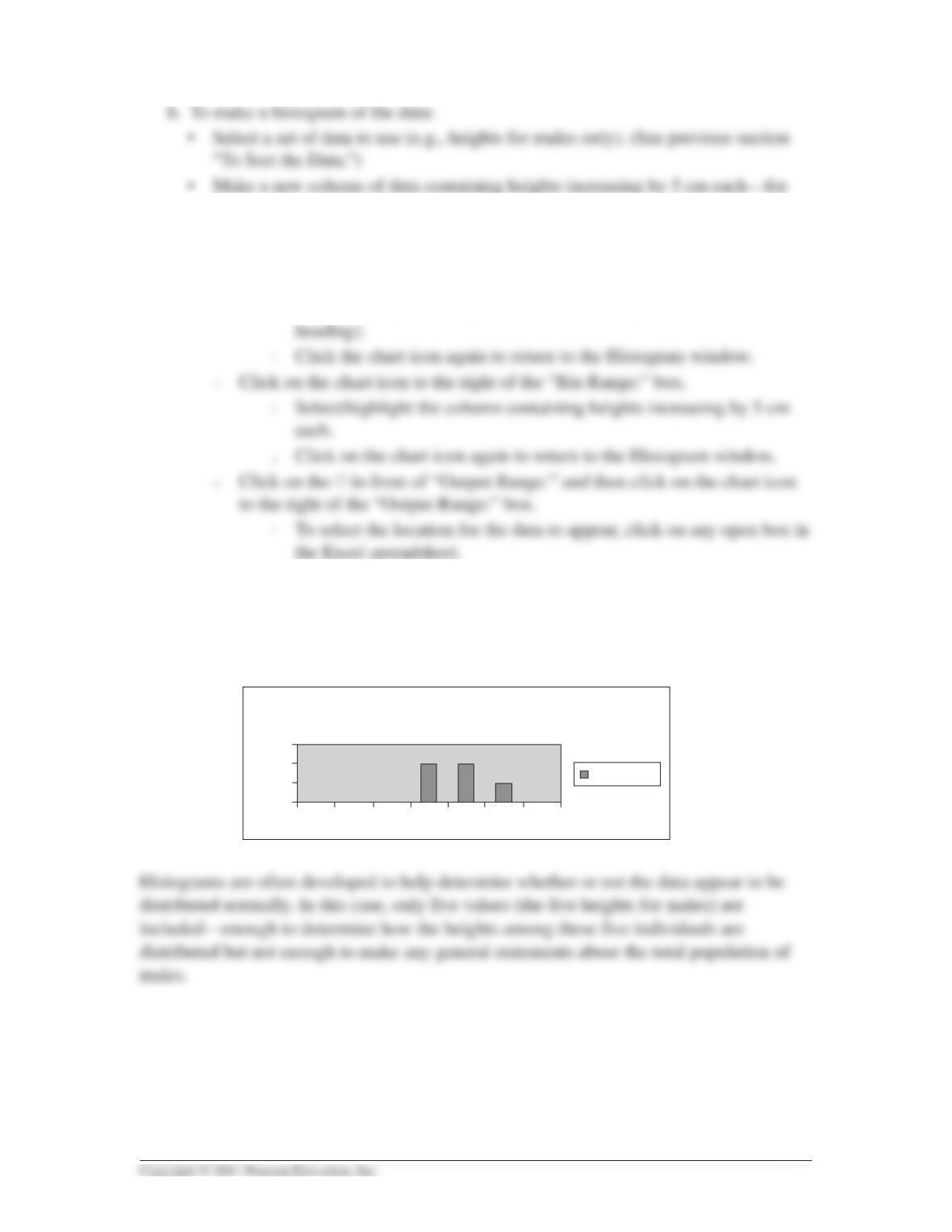
example, 160, 165, 170, 175, 180, 185 cm. (This is called your Bin Range.)
• Go to the “Tools” pull-down menu and click on “Data Analysis,” then on
“Histogram.” Then click “OK.”
䊊Click on the chart icon to the right of the “Input Range:” box.
䊐Select/highlight the height data for males only (include a column
䊐Click the chart icon again to return to the Histogram window.
䊊In the Histogram window select:
䊐Chart Output
䊊Click “OK.” The frequency data and histogram should appear.
Appendix A 385
Histogram
0
160 165 170 175 180 185 More
1
2
3
Frequency
Frequency
Note: If the graph of the data approximates a bell-shaped curve or normal distribution, the
standard deviation takes on additional meaning. For normal data distributions, about 68%
of the data points will fall within one standard deviation (on either side) of the mean.
Ninety-five percent of the data will fall within two standard deviations of the mean; and
99% will fall within three standard deviations of the mean.
5. TO DETERMINE STATISTICAL SIGNIFICANCE
The statistical significance of the difference in means can be determined by using a
statistical test. The null hypothesis (H0) is generally assumed for such tests. A simple null
hypothesis would state that there is no difference in x(some characteristic) between two
populations (e.g., there is no difference in arm length between males and females). This
null hypothesis further assumes that any differences observed between the two
populations are the result of chance variation or sampling error alone. An alternative
hypothesis (Ha) would be that there is a difference or relationship between the
populations. The alternative hypothesis is supported when the null hypothesis is rejected.
386 Appendix A