REVIEW QUESTIONS & SUGGESTED ANSWERS
1 In what ways does managing data help protect researchers and readers from being
overwhelmed by information?
1. What is meant by common language? Provide several examples.
2. What is meant by the term chartjunk? Provide suggestions for eliminating chartjunk.
3. Discuss the major principles involved in preparing effective tables.
4. When would a pictogram be preferred to a bar chart? Why?
5. Should every graphic be introduced before it appears in a report? Is interpreting a
self-explanatory graphic necessary? Explain.
6. Discuss the appropriate way to introduce and to interpret a graphic in a report.
7. “A picture is worth a thousand words.” Discuss the significance of this statement in
regard to business information.
© 2015 Cengage Learning. All Rights Reserved. May not be scanned, copied or duplicated, or posted to a
publicly accessible website, in whole or in part.
1
8. How much is “too much” when considering the use of graphics in a business document?
FEATURED ASSIGNMENTS
1Gantt Chart: Consider a project that you have completed this semester or will complete
before the term ends. Create a Gantt chart for one of those projects. Even if the project has
already been completed, you will able to retroactively analyze what would have worked
better for them and envision a better process for future project management.
9. Preparing a Table From Prepared Data: Prepare a table to show the total revenue
Nashville Sports Connection earned from membership fees for a fiscal period. Fees were
collected by type of membership: single, $25; double, $40; family (3+ members), $50;
corporate, $22.50; senior, $20. Nashville Sports Connection has 1,439 single memberships,
642 double, 543 family, 3,465 corporate, and 786 senior memberships.
NOTE: this exercise can be completed with any set of data that you can find. You can also
find a single set of data and have students present it in multiple graphic formats.
10. Analyzing Printed Graphics: Bring in a pictogram or other graphic illustration from a
business magazine or newspaper. Either in small groups or as an entire class, you’ll be
reviewing your examples and using them as the basis for discussing powerful and effective
graphical depictions of information.
11. Evaluating Graphics in Annual Reports: In a team of three students, obtain a copy of a
corporate annual report for a U.S.-based firm and one for a non-U.S.–based firm. Working
together, team members should prepare a one-page memo that evaluates the use of graphics
in each report, the graphics’ effectiveness in clarifying or reinforcing major points, and any
noted differences between the graphics presentation of each report. You will share your
analysis in a short report to the class.
© 2015 Cengage Learning. All Rights Reserved. May not be scanned, copied or duplicated, or posted to a
publicly accessible website, in whole or in part.
2
ADDITIONAL ASSIGNMENTS
1Recognizing Common Language: Using an online database, select an article from a
business journal that presents the findings of a research study. Find examples of how
percentages and common language are used in the reporting of the data. Describe how
effective or ineffective the author(s) was/were in assuring that the data were understood by
the intended audience.
12. Drawing a Line Chart: Using appropriate presentation software, prepare a bar chart
showing the water consumption patterns in the United States for the last five years. Locate
the most current information by visiting the website of the International Bottled Water
Association (http://www.bottledwater.org) or other research sources. Write a talking title that
clearly identifies the data depicted in the chart; then write a sentence to introduce the
graphic and emphasize its most important idea(s).
13. Analyzing a Published Pictogram: Clip a pictogram from USA Today and share it with
groups in class. Discuss the effectiveness of the symbols used and the ethical presentation of
the data.
14. Selecting and Drawing an Appropriate Graphic: Create the graphic that would most
effectively aid a human resources manager in identifying potential areas for training and
development. Write a descriptive or a talking title that interprets the data depicted in the
chart and a sentence to introduce the graphic and emphasize its most important idea(s).
Interest in Computer Training by Department January 2008
Instant Video- Video
Dept. Security Messaging Conferencing Production
Acct./
© 2015 Cengage Learning. All Rights Reserved. May not be scanned, copied or duplicated, or posted to a
publicly accessible website, in whole or in part.
3
15. Drawing a Bar Chart: The 2004 KPMG Fraud Report gives a variety of ways fraud is
detected in organizations:
Notification by employee (19%), internal controls (19%), management
investigation (12%), employee investigation (11%), notification by customer
(9%), accident (7%), anonymous letter/call (6%), internal auditor review (5%),
third-party investigation (4%), notification by supplier (3%), notification by
band/credit (2%), and employee away on vacation (1%).
16. Drawing a Segmented Chart: The director of the Nashville Sports Connection wishes to
compare the usage rate of various activities offered to its members over the past four
quarters. Using the data provided in the following table, prepare a segmented chart that will
make comparison of these usage rates easier to understand.
Activity 1st Q 2nd Q 3rd Q 4th Q
Write a descriptive or talking title that interprets the data depicted in the chart; then write a
sentence to introduce the graphic and emphasize its most important idea(s).
17. Drawing a Line Chart: The information technology group of First National Bank has
prepared estimates on the number of its customers expected to actively use its Internet
banking site. Prepare a line chart showing the actual number of customers for 2004–2007
with the estimates for 2008–2010:
© 2015 Cengage Learning. All Rights Reserved. May not be scanned, copied or duplicated, or posted to a
publicly accessible website, in whole or in part.
4
To distinguish projected data from actual data, create a dashed line or add an explanatory
note below the graph (e.g., Projected Data for ___). Write a descriptive or talking title that
clearly identifies the data depicted in the chart. Write a sentence to introduce the graphic and
emphasize its most important idea(s).
See slides and textbook for effective examples.
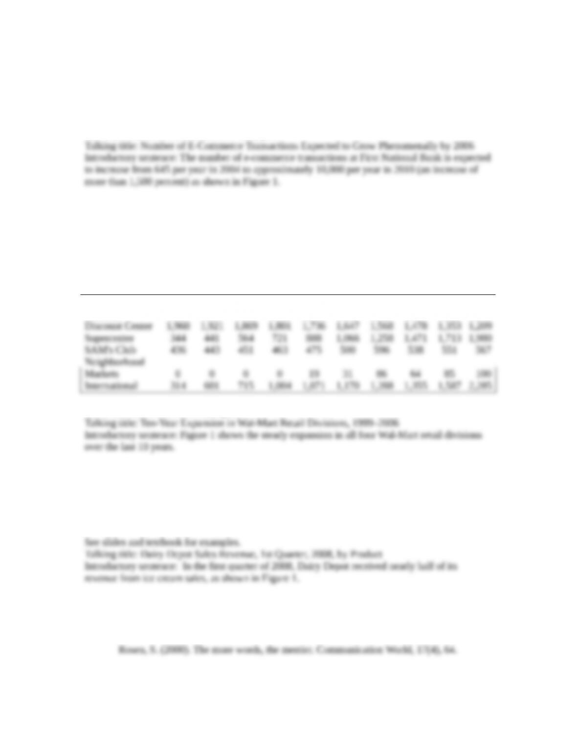
18. Drawing an Area Chart: Prepare an area chart showing how the Wal-Mart Stores’ retail
divisions contributed to the total number of stores over a ten-year period. Use the data
presented in the following table or obtain current data from Wal-Mart’s latest annual report
or web page. Include a source note below the chart.
Write a descriptive or talking title that clearly identifies the data depicted in the chart. Write
a sentence to introduce the graphic and emphasize its most important idea(s).
Area Chart Data
Division 1997 1998 1999 2000 2001 2002 2003 2004 2005 2006
See slides and textbook for examples.
19. Drawing a Pie Chart: Prepare a pie chart showing the percentage of revenue The Dairy
Depot generated from sales in the following categories during the first quarter of the current
year: ice cream (47%), beverages (24%), sandwiches (18%), novelty items (8%), and other
(3%). Write a descriptive or talking title that interprets the data depicted in the chart; then
write a sentence to introduce the graphic and emphasize its most important idea(s).
20. Mastering Graphic Design: Tufte Style: Locate the following information related to Edward
Tufte’s principles of information design online or from another database available from your
campus library:
© 2015 Cengage Learning. All Rights Reserved. May not be scanned, copied or duplicated, or posted to a
publicly accessible website, in whole or in part.
5
Student papers might include some of the following elements:
1) Tufte describes thin data as data obscured in clutter and confusion. Bad graphics fail because
2) Classic examples of poor data design include confusing hospital charts that lead to improper
3) Tufte’s principles for effective data presentation: (1) tell the truth, (2) show the data in its full
21. Evaluating Graphics in Annual Reports: Obtain a copy of a corporate annual report and
follow these three steps to critique a graphic in the report:
a. Identify one graphic that violates one or more of the principles presented in this chapter.
For example, the graphic may be an inappropriate type to present the data meaningfully,
be drawn incorrectly, distort the true meaning of the data, have too much clutter, contain
typographical or labeling errors, or contain other ineffective design elements.
b. Revise the graphic, incorporating your suggestions. Send your instructor an email
message outlining the major weaknesses in the graphic and your suggestions for
improving it. Attach the computer file containing your revised graphic.
c. Be prepared to present a report to the class. To support your report, prepare a slide or
transparency of the poor and revised graphic and a list of the weaknesses if your graphic
contained several errors.
22. Evaluating Graphics in Annual Reports: In teams of three, obtain a copy of a corporate
annual report for a U.S.-based firm and one for a non-U.S.–based firm. Prepare a one-page
memo to your instructor that evaluates the use of graphics in each report, the graphics’
effectiveness in clarifying or reinforcing major points, and any noted differences between the
graphics presentation of each report. Share your analysis in a short report to the class.
© 2015 Cengage Learning. All Rights Reserved. May not be scanned, copied or duplicated, or posted to a
publicly accessible website, in whole or in part.
6

CASE ASSIGNMENT
The case focuses on the power of statistics to influence and convince, but also to distort and
deceive. Consumer responsibility in interpreting reported findings is emphasized.
LYING STATISTICS
Three kinds of lies are possible, according to Benjamin Disraeli, a British prime minister in the
nineteenth century—lies, damned lies, and statistics. A related notion exists that “you can prove
anything with statistics.” Such statements bolster the distrust that many people have for statistical
analysis. On the other hand, many non-mathematicians hold quantitative data in awe, believing
that numbers are, or at least should be, unquestionably correct. Consequently, it comes as a shock
that various research studies can produce very different, often contradictory results. To solve this
paradox, many naive observers conclude that statistics must not really provide reliable indicators
of reality after all, and if statistics aren’t “right,” they must be “wrong.” It is easy to see how even
intelligent, well-educated people can become cynical if they don’t understand the concepts of
statistical reasoning and analysis.
Consider, for instance, the frequent reporting of a “scientific discovery” in the fields of
health and nutrition. The United States has become a nation of nervous people, ready to give up
eating pleasures at the drop of a medical report. Today’s “bad-for-you” food was probably once
good for you, and vice versa. Twenty years ago, many consumers were turned away from
consuming real butter to oily margarine, only recently to learn that the synthetically solidified oils
of margarine, trans-fatty acids, are worse for our arteries than any fat found in nature. In the year
following the publication of this finding, margarine sales dropped 8.2 percent and butter sales
rose 1.4 percent.
Distrust also arises concerning studies that link exercise to health. Numerous studies have
established statistically that people who exercise live longer. But the conclusion that exercise is
good for you may put the cart before the horse. Are people healthy because they exercise? Or do
they exercise because they are healthy? Correlation, once again, does not establish causation.
How do such incorrect and partial research findings become published and consequently
disseminated through the media? Some of the responsibility should probably be cast upon
researchers who may overstate the significance or the generalizability of their findings. The
media should also shoulder some blame, as preliminary findings of small or limited studies are
often reported as foregone conclusions. Consumers should also assume some responsibility in the
interpretation of reported research. Questions such as the following should be asked when
considering the value of reported findings.
Is the study sample representative of the population involved?
Were the statistical procedures used appropriate to the data?
Has the research involved a sample of significant size and a sufficient time period of study?
Were adequate controls applied to assure that outcomes are actually the result of the studied
variable?
Has the margin for error been taken into account in interpreting the results?
© 2015 Cengage Learning. All Rights Reserved. May not be scanned, copied or duplicated, or posted to a
publicly accessible website, in whole or in part.
7
Has any claim of causation been carefully examined using appropriate approaches?
The statement that “you can prove anything with statistics” is true only if statistics are
used incorrectly. Understanding the basics of statistics is becoming increasingly important. With
the prevalence of computers, vast amounts of data are available on every subject; and statistical
packages allow analysis of these data with the press of a button, regardless of whether the
analysis makes sense. Our professional and business lives thrive on numbers and our ability to
interpret them correctly.
Activities
1 Compile a list of behaviors or practices that can lead to the reporting of “lying statistics.”
For each item on your list, indicate whether the behavior or practice is likely an intentional
or unintentional attempt to distort.
Answers may include the following:
23. Write a one- to two-page analysis of the researcher’s ethical responsibilities in reporting
statistical results of a study versus the consumer’s responsibilities in reading and interpreting
the results.
24. Prepare a short spoken report in which you describe some of the issues that arise when
reporting international economic statistics.
Reports may include the following issues related to reporting of international economic data:
© 2015 Cengage Learning. All Rights Reserved. May not be scanned, copied or duplicated, or posted to a
publicly accessible website, in whole or in part.
8