
Chapter 4/Supply and Demand: An Initial Look
CHAPTER 4
SUPPLY AND DEMAND: AN INITIAL LOOK
TEST YOURSELF
1. What shapes would you expect for the following demand curves?
a. A medicine that means life or death for a patient
b. French fries in a food court with kiosks offering many types of food
(a) The demand curve for a medicine that means life or death for a patient will be
vertical. One would not expect a decline in quantity demanded as the price rises, if
2. The following are the assumed supply and demand schedules for hamburgers in
Collegetown:
Demand Schedule Supply Schedule
Price Quantity
Demanded
per Year
(thousands)
Price Quantity
Supplied
per Year
(thousands)
$2.75 14 $2.75 32
2.50 18 2.5 30
2.25 22 2.25 28
2 26 2 26
1.75 30 1.75 24
1.5 34 1.5 22
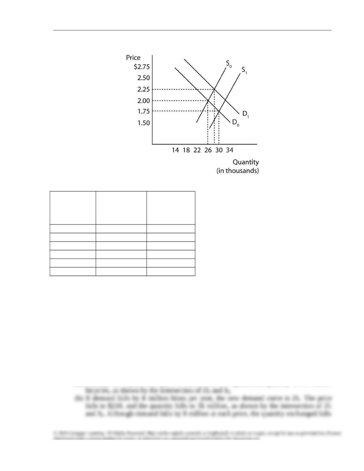
a. Plot the supply and demand curves and indicate the equilibrium price and quantity.
b. What effect would a decrease in the price of beef (a hamburger input) have on the
equilibrium price and quantity of hamburgers, assuming all other things remained
constant? Explain your answer with the help of a diagram.
c. What effect would an increase in the price of pizza (a substitute commodity) have on
the equilibrium price and quantity of hamburgers, assuming again that all other things
remain constant? Use a diagram in your answer.
The answers to all three parts are shown in Figure 1.
(a) Initially, the equilibrium price is $2.00, and the equilibrium quantity is 26,000
Chapter 4/Supply and Demand: An Initial Look
FIGURE 1
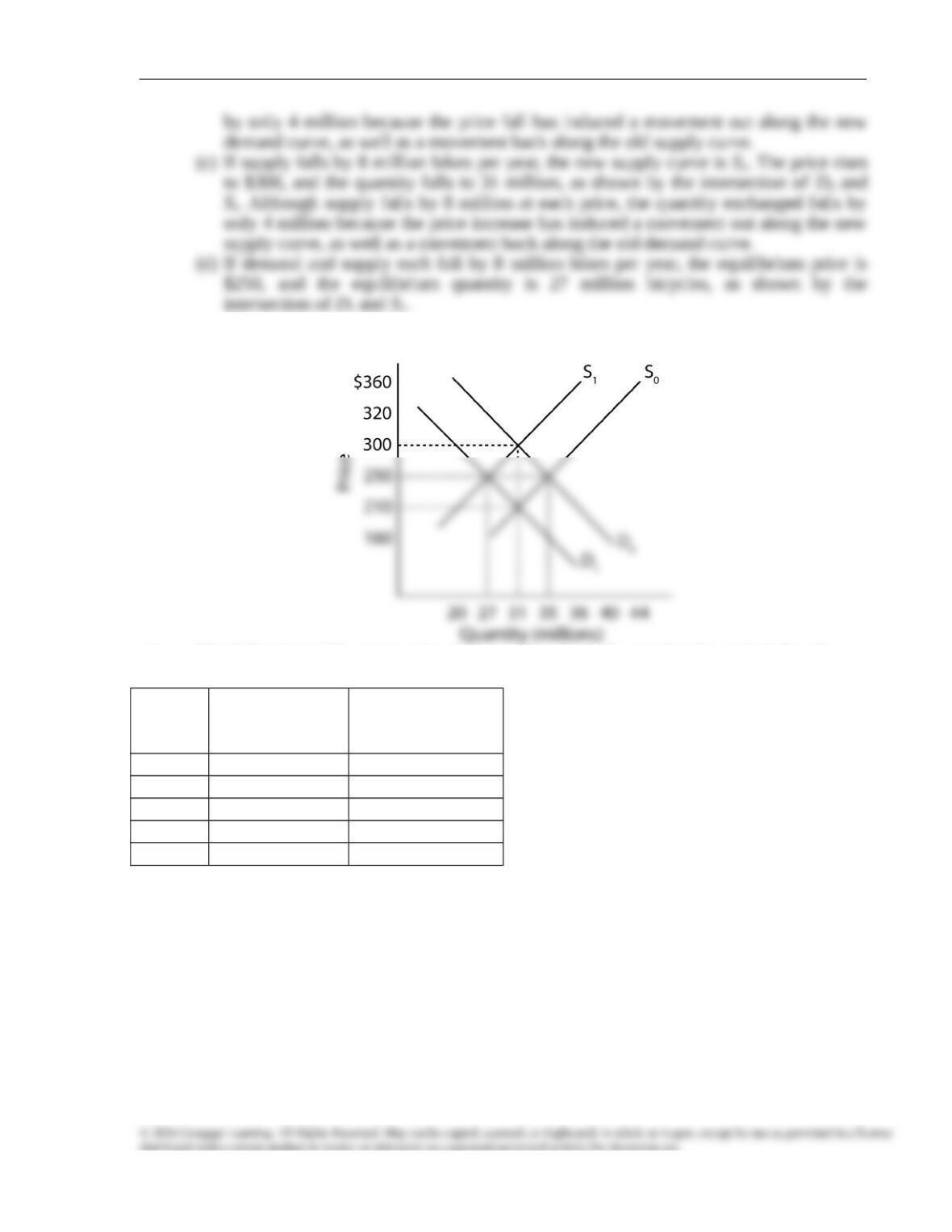
3. Suppose the supply and demand schedules for bicycles are as they appear in the
following table.
Price Quantity
Demanded
per Year
(millions)
Quantity
Supplied per
Year
(millions)
$170 43 27
210 39 31
250 35 35
300 31 39
330 27 43
370 23 47
a. Graph these curves and show the equilibrium price and quantity.
b. Now suppose that it becomes unfashionable to ride a bicycle, so that the quantity
demanded at each price falls by 8 million bikes per year. What is the new equilibrium
price and quantity? Show this solution graphically. Explain why the quantity falls by
less than 8 million bikes per year.
c. Suppose instead that several major bicycle producers go out of business, thereby
reducing the quantity supplied by 8 million bikes at every price. Find the new
equilibrium price and quantity, and show it graphically. Explain again why quantity
falls by less than 8 million.
d. What are the equilibrium price and quantity if the shifts described in Test Yourself
Questions 3(b) and 3(c) happen at the same time?
The answers to all three parts are shown in Figure 2.
(a) Initially, the equilibrium price is $250, and the equilibrium quantity is 35 million
Chapter 4/Supply and Demand: An Initial Look
FIGURE 2
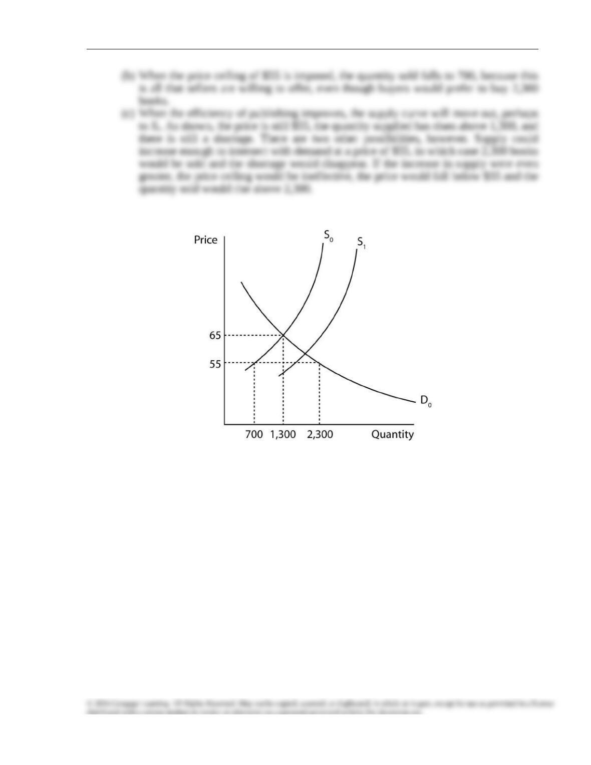
4. The following table summarizes information about the market for principles of
economics textbooks:
Price Quantity
Demanded per
Year
Quantity
Supplied per
Year
$45 4,300 300
55 2,300 700
65 1,300 1,300
75 800 2,100
85 650 3,100
a. What is the market equilibrium price and quantity of textbooks?
b. To quell outrage over tuition increases, the college places a $55 limit on the price of
textbooks. How many textbooks will be sold now?
c. While the price limit is still in effect, automated publishing increases the efficiency of
textbook production. Show graphically the likely effect of this innovation on the
market price and quantity.
The answers to all three parts are shown in Figure 3.
(a) In market equilibrium, the price is $65 and the quantity is 1,300, as shown by the
intersection of D0 and S0.
Chapter 4/Supply and Demand: An Initial Look
FIGURE 3
5. How are the following demand curves likely to shift in response to the indicated
changes?
a. The effect of a drought on the demand curve for umbrellas
b. The effect of higher popcorn prices on the demand curve for movie tickets
c. The effect on the demand curve for coffee of a decline in the price of Coca-Cola
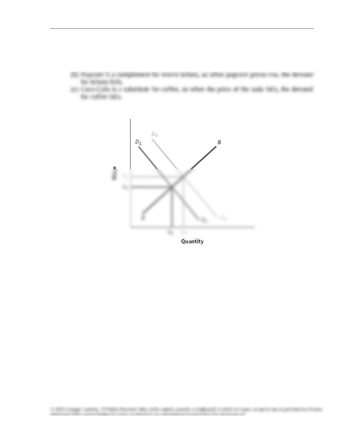
Chapter 4/Supply and Demand: An Initial Look
The same diagram, Figure 4, can be used for all three cases, because they all entail a
decline in demand, from D0 to D1. Price falls from P0 to P1, and quantity falls from Q0 to
Q1.
(a) In a drought, people have less need for umbrellas, so demand falls.
FIGURE 4
6. The two accompanying diagrams show supply and demand curves for two substitute
commodities: regular cell phones and smartphones.
a. On the right-hand diagram, show what happens when rising raw material
prices make it costlier to produce regular cell phones.
b. On the left-hand diagram, show what happens to the market for
smartphones.
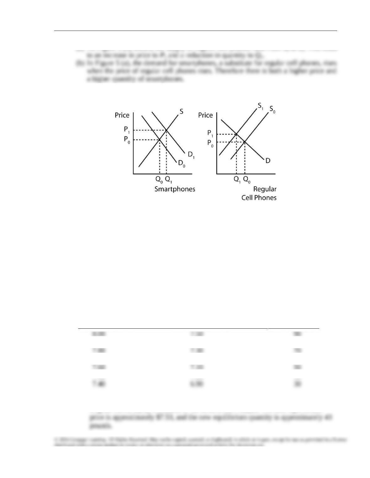
Chapter 4/Supply and Demand: An Initial Look
(a) As Figure 5 (b) shows, the supply of regular cell phones falls from S0 to S1. This leads
FIGURE 5
7. Consider the market for beef discussed in this chapter (Tables 1 through 3 and Figures
1 and 8). Suppose that the government decides to fight cholesterol by levying a tax of
50 cents per pound on sales of beef. Follow these steps to analyze the effects of the tax:
a. Construct the new supply schedule (to replace Table 2) that relates quantity
supplied to the price that consumers pay.
b. Graph the new supply curve constructed in Test Yourself Question 7(a) on the
supply-demand diagram depicted in Figure 7.
c. Does the tax succeed in its goal of reducing the consumption of beef?
d. Is the price rise greater than, equal to, or less than the 50-cent tax?
e. Who actually pays the tax, consumers or producers? (This may be a good question
to discuss in class.)
(a) With a 50-cent tax per pound of beef, Table 2 in the text must be adjusted:
Price Paid by Consumers Price Received by Farmers Quantity Supplied
(dollars per pound) (dollars per pound) (pounds per year)
7.90 7.40 80
7.70 7.20 60
7.50 7.00 40
(b) Using the new Table 4-2, Figure 6 shows that the new supply curve, S1 lies above the
original curve, S0, by a distance of 50 cents at each output. The new equilibrium
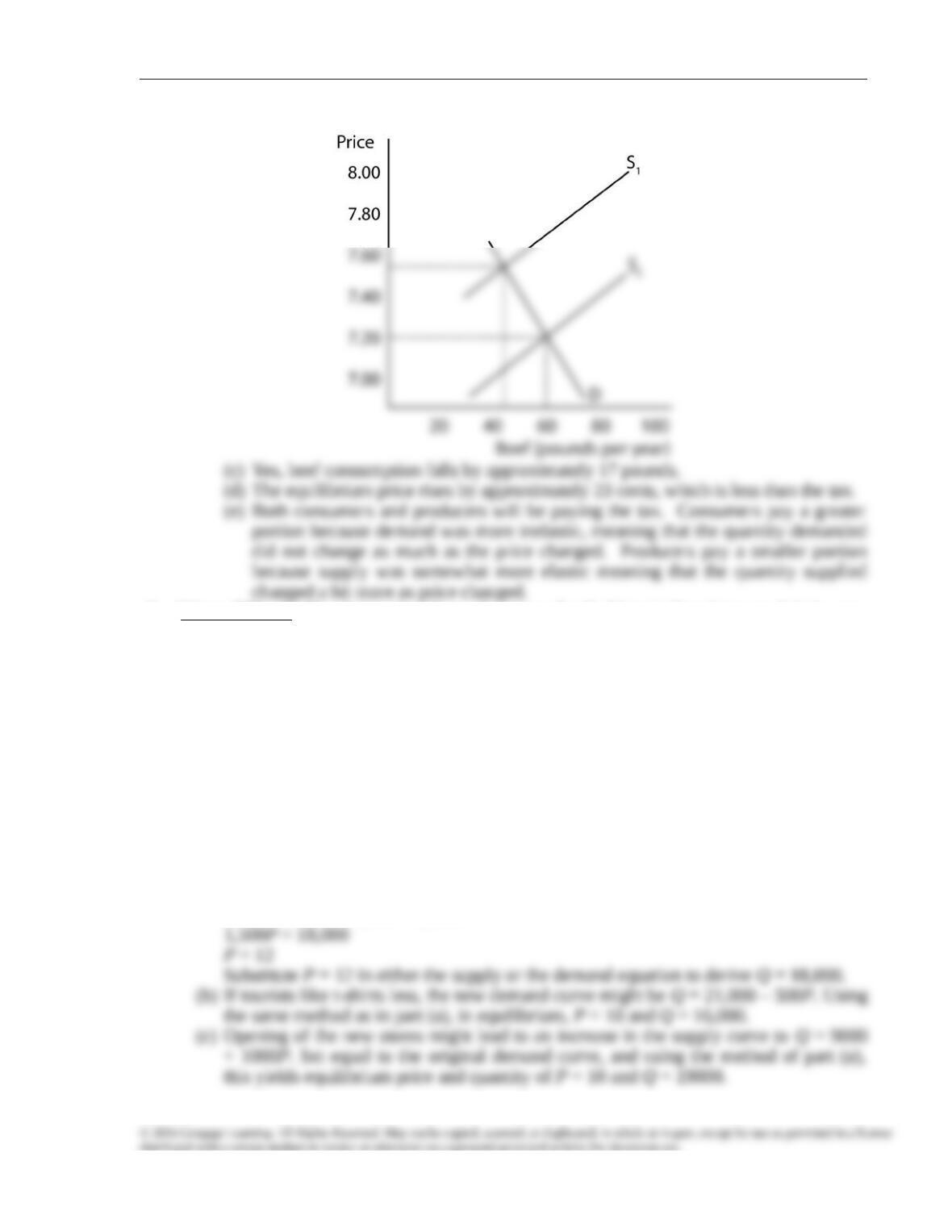
Chapter 4/Supply and Demand: An Initial Look
FIGURE 6
8. (More difficult) The demand and supply curves for T-shirts in Touristtown, U.S.A., are
given by the following equations:
Q = 24,000 − 500P Q = 6,000 + 1,000P
where P is measured in dollars and Q is the number of T-shirts sold per year.
a. Find the equilibrium price and quantity algebraically.
b. If tourists decide they do not really like T-shirts that much, which of the following
might be the new demand curve?
Q = 21,000 − 500P Q = 27,000 + 500P
Find the equilibrium price and quantity after the shift of the demand curve.
c. If, instead, two new stores that sell T-shirts open up in town, which of the
following might be the new supply curve?
Q = 4,000 + 1,000P Q = 9,000 + 1,000P
Find the equilibrium price and quantity after the shift of the supply curve.
(a) In equilibrium, quantity demanded equals quantity supplied:
24,000 – 500P = 6,000 + 1,000P
Chapter 4/Supply and Demand: An Initial Look
DISCUSSION QUESTIONS
1. How often do you rent videos? Would you do so more often if a rental cost half as
much? Distinguish between your demand curve for home videos and your “quantity
demanded” at the current price.
This question is intended to help students develop an intuitive sense of the origins of the
demand curve. If you deal with this question in class or discussion section, it will be
2. Discuss the likely effects of the following:
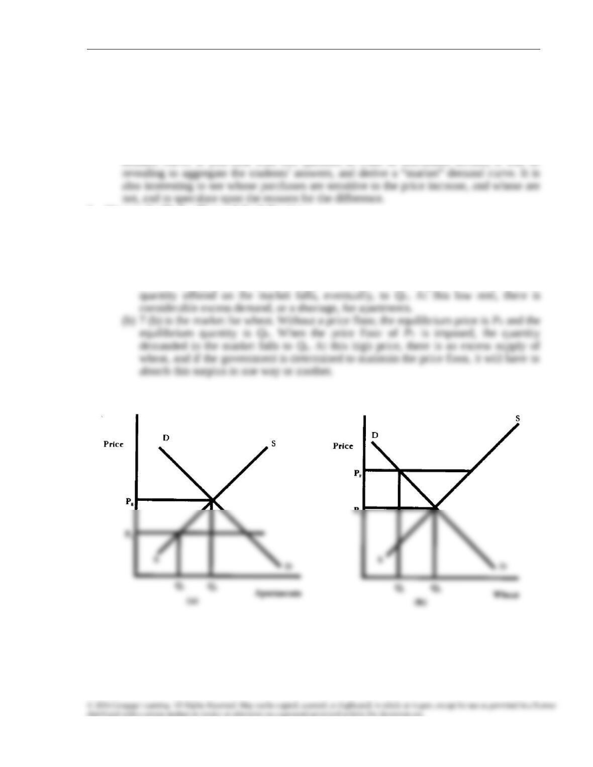
a. Rent ceilings on the market for apartments
b. A price floor in the market for wheat
Use supply-demand diagrams to show what may happen in each case.
(a) Figure 7 (a) is the market for apartments. Without rent control, the equilibrium rent is
PE and the equilibrium quantity is QE. When the rent ceiling of PC is imposed, the
FIGURE 7
3. U.S. government price supports for milk led to an unceasing surplus of milk. In an
effort to reduce the surplus about a decade ago, Congress offered to pay dairy farmers
to slaughter cows. Use two diagrams, one for the milk market and one for the meat
market, to illustrate how this policy should have affected the price of meat. (Assume
that meat is sold in an unregulated market.)
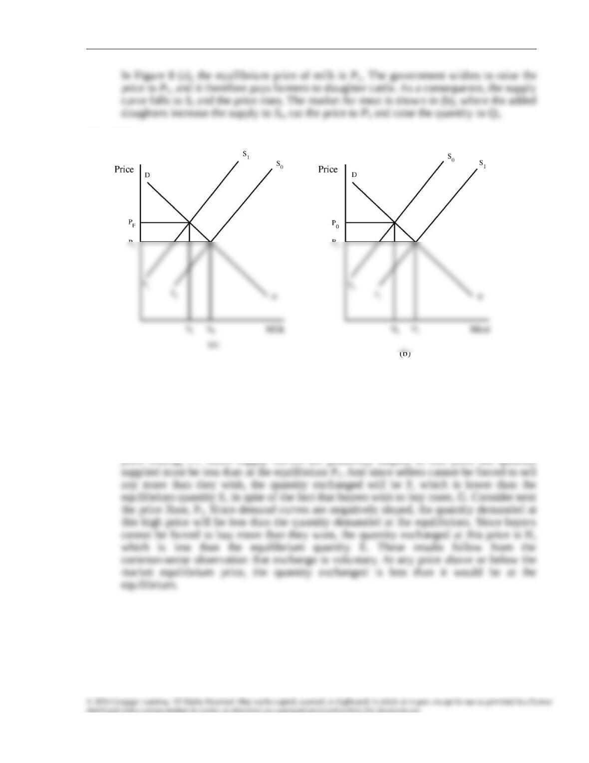
Chapter 4/Supply and Demand: An Initial Look
FIGURE 8
4. It is claimed in this chapter that either price floors or price ceilings reduce the actual
quantity exchanged in a market. Use a diagram or diagrams to test this conclusion, and
explain the common sense behind it.
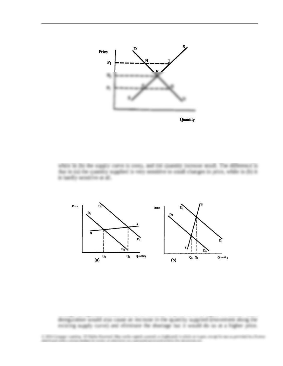
Figure 9 shows three different prices. P1 is an effective price ceiling, at which the quantity
demanded, G, exceeds the quantity supplied, F. P2 is the equilibrium price, at which the
quantity supplied and the quantity demanded are equal, at E. P3 is an effective price floor,
at which the quantity supplied, I, exceeds the quantity demanded, H. Consider first the
Chapter 4/Supply and Demand: An Initial Look
FIGURE 9
5. The same rightward shift of the demand curve may produce a very small or a very
large increase in quantity, depending on the slope of the supply curve. Explain this
conclusion with diagrams.
Figures 10 (a) and (b) show the same increase in the demand curve, from D0 to D1. In (a)
the supply curve is quite flat, and the resulting quantity increase, from Q0 to Q1, is large,
FIGURE 10
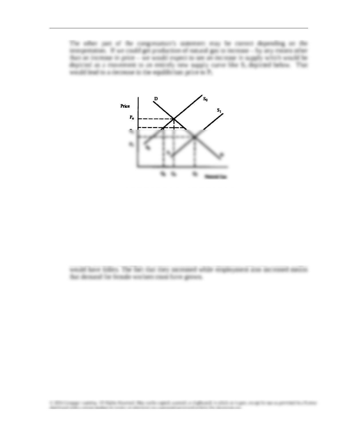
6. In 1981, when regulations were holding the price of natural gas below its free-market
level, then-Congressman Jack Kemp of New York said the following in an interview
with The New York Times: “We need to decontrol natural gas, and get production of
natural gas up to a higher level so we can bring down the price.” Evaluate the
congressman’s statement.
One part of the congressman’s statement was incorrect. Removing the price controls
through deregulation would lead to an increase in price to Pe in figure 11 below. Such
Chapter 4/Supply and Demand: An Initial Look
FIGURE 11
7. From 2000 to 2010 in the United States, the number of working men fell by 0.6 percent,
while the number of working women grew by almost 4 percent. During this time,
average wages for men grew by roughly 3 percent, whereas average wages for women
grew by slightly more than 6 percent. Which of the following two explanations seems
more consistent with the data?
a. Women decided to work more, raising their relative supply (relative to men).
b. Discrimination against women declined, raising the relative (to men) demand for
female workers.
Explanation (b) is more consistent with the data. If the principal change in the market had
been an increase in supply of female workers, i.e., explanation (a), then female wages