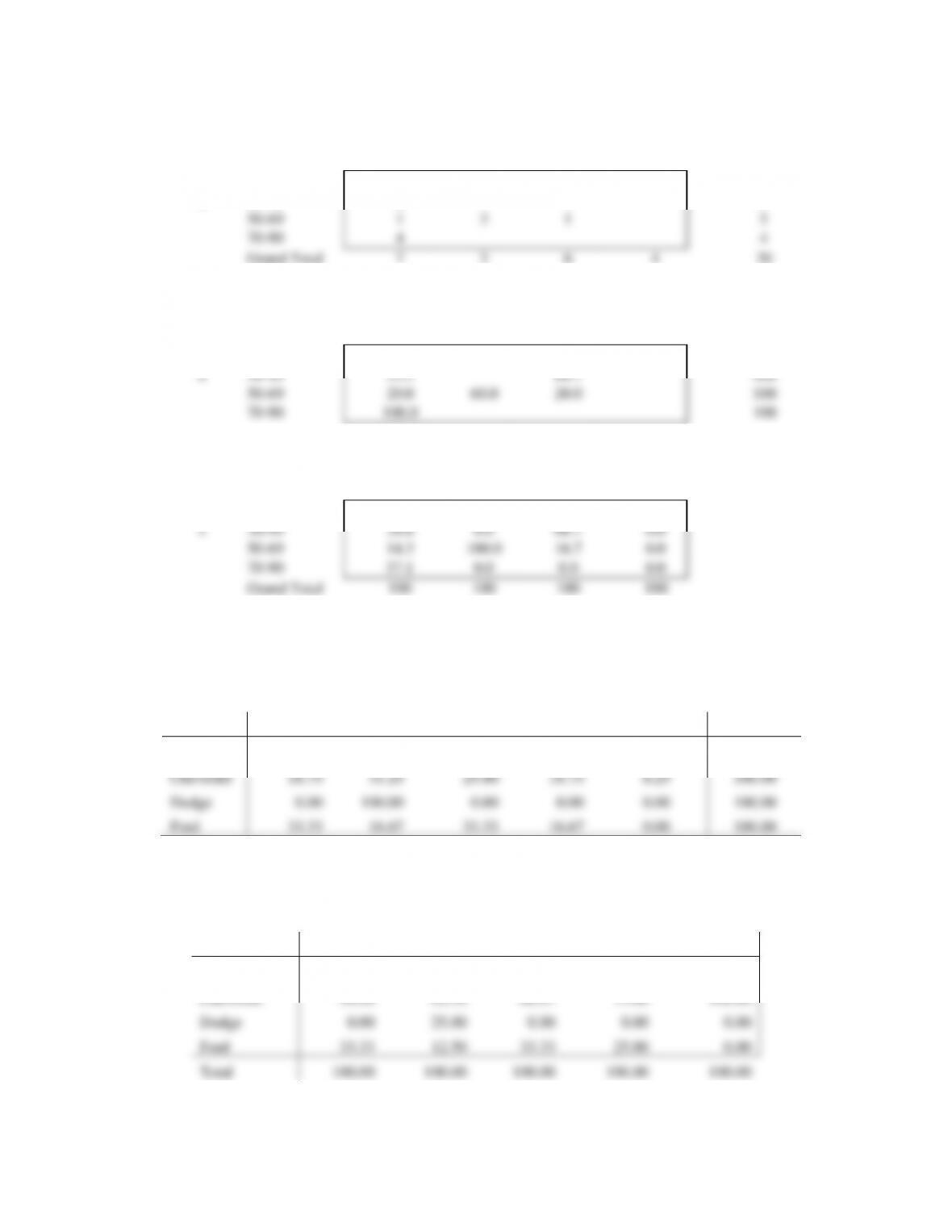
28. a.
y
20–39
40–59
60–79
80-100
Grand Total
10–29
1
4
5
x
30–49
2
4
6
50–69
1
3
1
5
70–90
4
4
Grand Total
7
3
6
4
20
b.
y
20–39
40–59
60–79
80-100
Grand Total
10–29
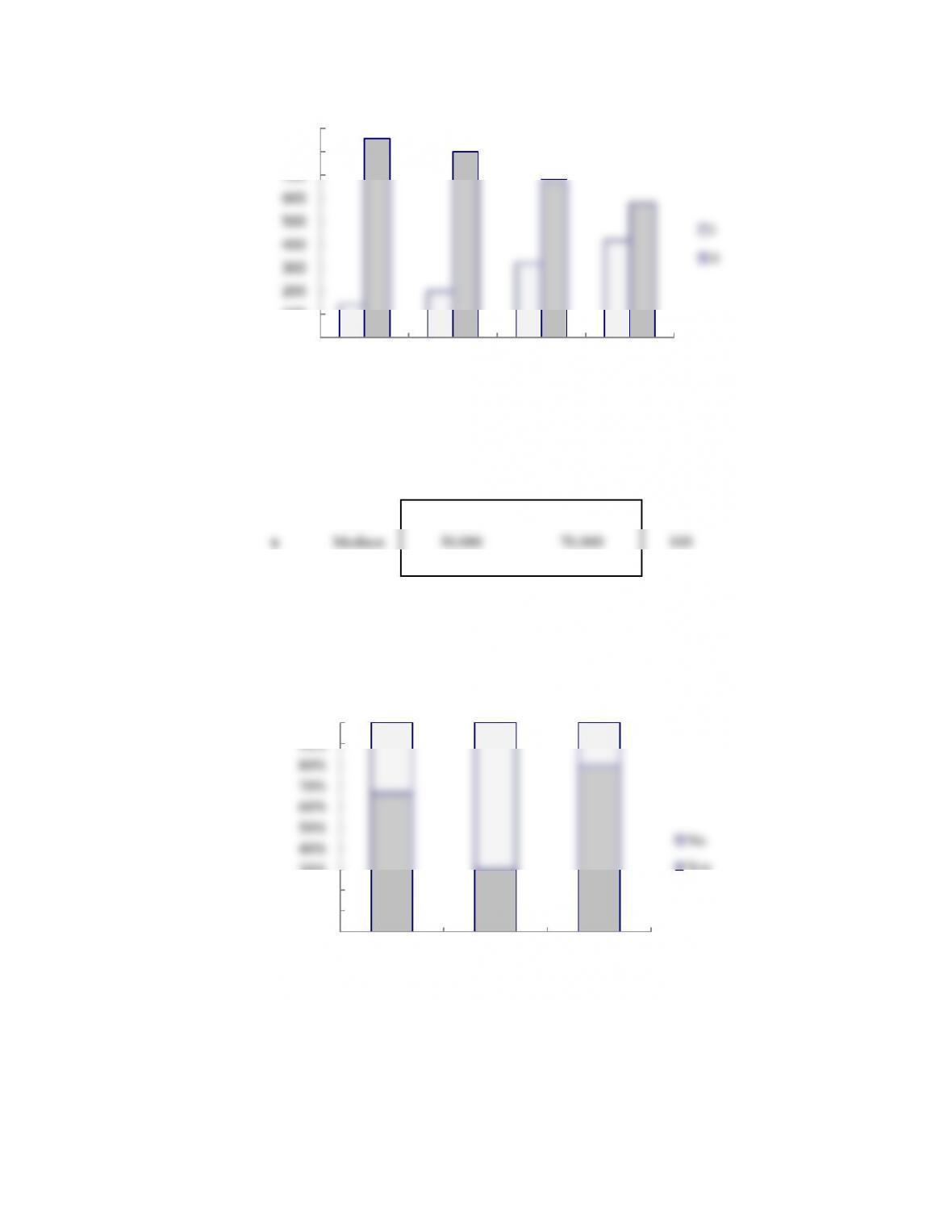
20.0
80.0
100
x
30–49
33.3
66.7
100
50–69
20.0
60.0
20.0
100
70–90
100.0
100
c.
y
20–39
40–59
60–79
80-100
10–29
0.0
0.0
16.7
100.0
x
30–49
28.6
0.0
66.7
0.0
50–69
14.3
100.0
16.7
0.0
70–90
57.1
0.0
0.0
0.0
Grand Total
100
100
100
100
d. Higher values of x are associated with lower values of y and vice versa
29. a.
Average Miles per Hour
Make
130-139.9
140-149.9
150-159.9
160-169.9
170-179.9
Total
Buick
100.00
0.00
0.00
0.00
0.00
100.00
Chevrolet
18.75
31.25
25.00
18.75
6.25
100.00
Dodge
0.00
100.00
0.00
0.00
0.00
100.00
Ford
33.33
16.67
33.33
16.67
0.00
100.00
b. 25.00 + 18.75 + 6.25 = 50 percent
c.
Average Miles per Hour
Make
130-139.9
140-149.9
150-159.9
160-169.9
170-179.9
Buick
16.67
0.00
0.00
0.00
0.00
Chevrolet
50.00
62.50
66.67
75.00
100.00
Dodge
0.00
25.00
0.00
0.00
0.00
Ford
33.33
12.50
33.33
25.00
0.00
Total
100.00
100.00
100.00
100.00
100.00
d. 75%
30. a.
Year
Average Speed
1988-1992
1993-1997
1998-2002
2003-2007
2008-2012
Total
130-139.9
16.7
0.0
0.0
33.3
50.0
100
140-149.9
25.0
25.0
12.5
25.0
12.5
100
150-159.9
0.0
50.0
16.7
16.7
16.7
100
160-169.9
50.0
0.0
50.0
0.0
0.0
100
170-179.9
0.0
0.0
100.0
0.0
0.0
100
b. It appears that most of the faster average winning times occur before 2003. This could be due to new
31. a. The crosstabulation of condition of the greens by gender is below.
Green Condition
Gender
Too Fast
Fine
Total
Male
35
65
100
Female
40
60
100
Total
75
125
200
b. Among low handicap golfers, 1/10 = 10% of the women think the greens are too fast and 10/50 =
c. Among the higher handicap golfers, 39/51 = 43% of the woman think the greens are too fast and
25/50 = 50% of the men think the greens are too fast. So, for the higher handicap golfers, the men
show a higher percentage who think the greens are too fast.
d. This is an example of Simpson’s Paradox. At each handicap level a smaller percentage of the women
think the greens are too fast. But, when the crosstabulations are aggregated, the result is reversed and
Region
Under
$15,000
$15,000
to
$24,999
$25,000
to
$34,999
$35,000
to
$49,999
$50,000
to
$74,999
$75,000
to
$99,999
$100,000
and over
Total
Northeast
12.72
10.45
10.54
13.07
17.22
11.57
24.42
100.00
Midwest
12.40
12.60
11.58
14.27
19.11
12.06
17.97
100.00
South
14.30
12.97
11.55
14.85
17.73
11.04
17.57
100.00
West
11.84
10.73
10.15
13.65
18.44
11.77
23.43
100.00
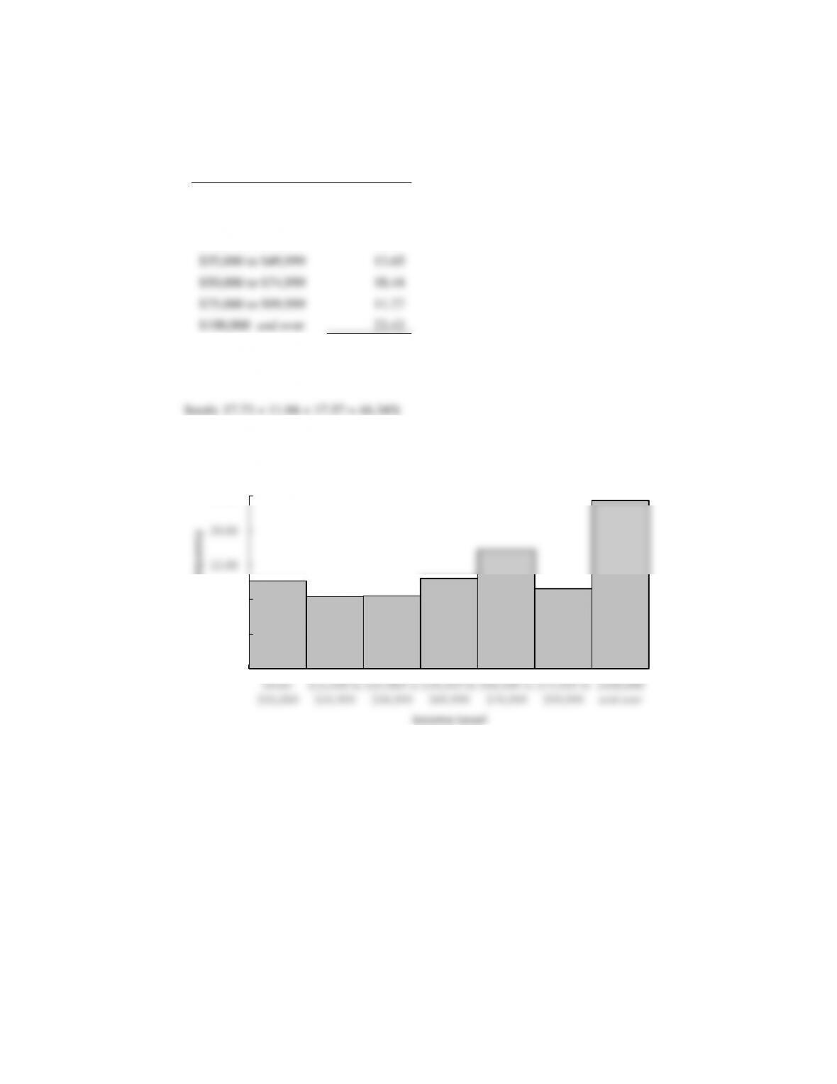
The percent frequency distributions for each region now appear in each row of the table. For
example, the percent frequency distribution of the West region is as follows:
Income Level
Percent
Frequency
Under $15,000
11.84
$15,000 to $24,999
10.73
$25,000 to $34,999
10.15
$35,000 to $49,999
13.65
$50,000 to $74,999
18.44
$75,000 to $99,999
11.77
$100,000 and over
23.43
Total
100.00
b. West: 18.44 + 11.77 + 23.43 = 53.64%
c.
0.00
5.00
10.00
15.00
20.00
25.00
Under
$15,000
$15,000 to
$24,999
$25,000 to
$34,999
$35,000 to
$49,999
$50,000 to
$74,999
$75,000 to
$99,999
$100,000
and over
Percent Frequency
Income Level
Northeast
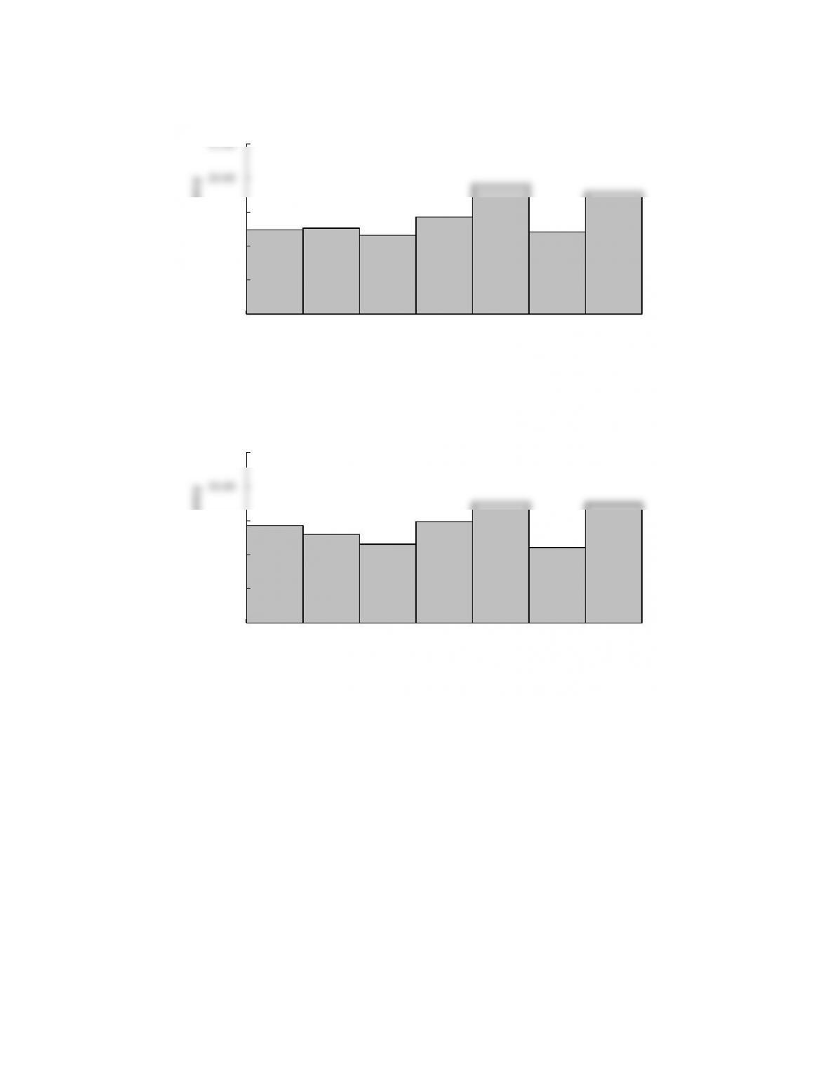
0.00
5.00
10.00
15.00
20.00
25.00
Under
$15,000
$15,000 to
$24,999
$25,000 to
$34,999
$35,000 to
$49,999
$50,000 to
$74,999
$75,000 to
$99,999
$100,000
and over
Percent Frequency
Income Level
Midwest
0.00
5.00
10.00
15.00
20.00
25.00
Under
$15,000
$15,000 to
$24,999
$25,000 to
$34,999
$35,000 to
$49,999
$50,000 to
$74,999
$75,000 to
$99,999
$100,000
and over
Percent Frequency
Income Level
South
The largest difference appears to be a higher percentage of household incomes of $100,000 and over
for the Northeast and West regions.
d. Column percentages are shown below.
Region
Under
$15,000
$15,000
to
$24,999
$25,000
to
$34,999
$35,000
to
$49,999
$50,000
to
$74,999
$75,000
to
$99,999
$100,000
and over
Northeast
17.83
16.00
17.41
16.90
17.38
18.35
22.09
Midwest
21.35
23.72
23.50
22.68
23.71
23.49
19.96
South
40.68
40.34
38.75
39.00
36.33
35.53
32.25
West
20.13
19.94
20.34
21.42
22.58
22.63
25.70
Total
100.00
100.00
100.00
100.00
100.00
100.00
100.00
Each column is a percent frequency distribution of the region variable for one of the household
income categories. For example, for an income level of $35,000 to $49,999 the percent frequency
distribution for the region variable is as follows:
Region
Percent
Frequency
Northeast
16.90
Midwest
22.68
South
39.00
West
21.42
Total
100.00
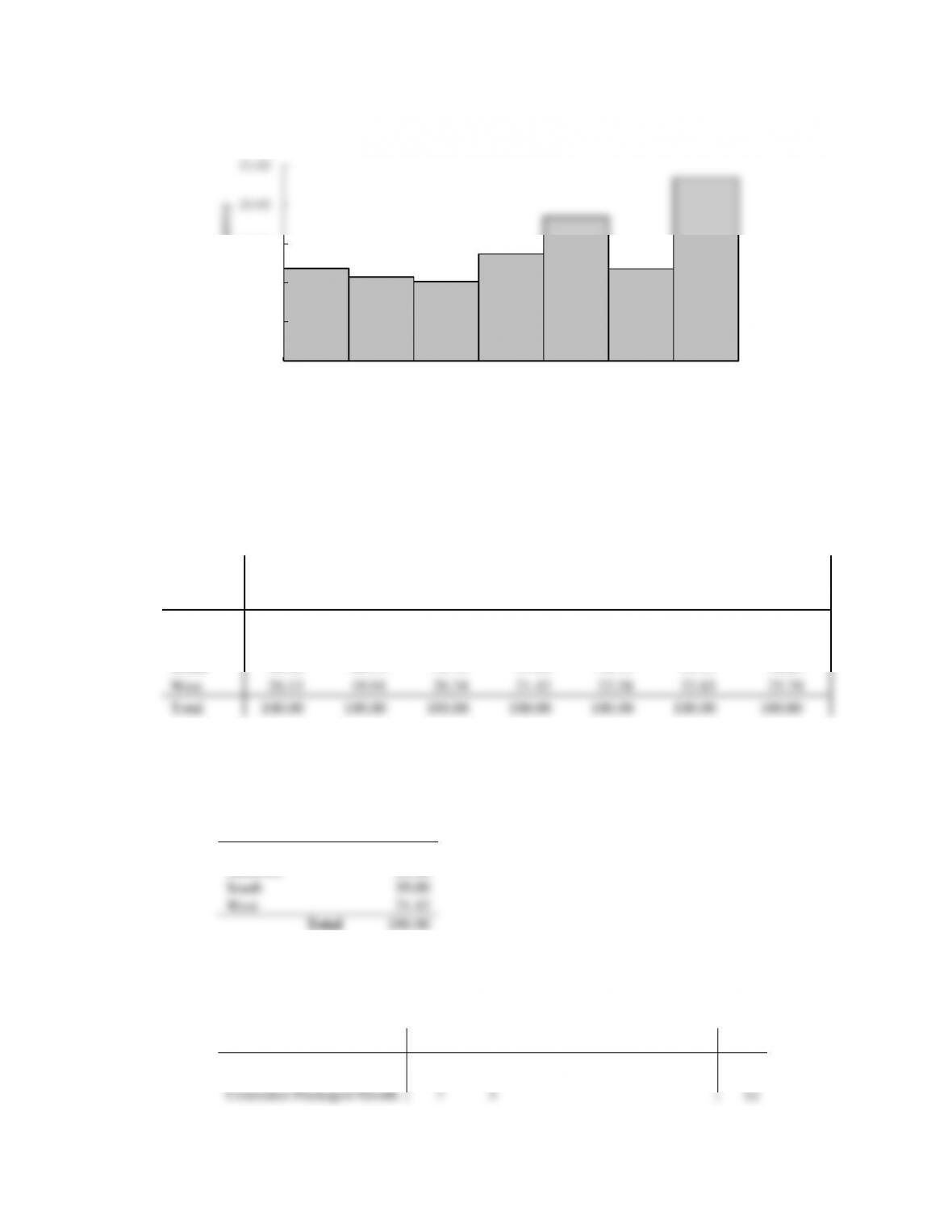
33. a.
Brand Value ($ billions)
Industry
0-10
10–20
20–30
30–40
40–50
50–60
Total
Automotive & Luxury
10
4
1
15
Consumer Packaged Goods
7
5
12
0.00
5.00
10.00
15.00
20.00
25.00
Under
$15,000
$15,000 to
$24,999
$25,000 to
$34,999
$35,000 to
$49,999
$50,000 to
$74,999
$75,000 to
$99,999
$100,000
and over
Percent Frequency
Income Level
West
Financial Services
11
3
14
Other
14
10
2
26
Technology
7
4
1
1
2
15
Total
49
26
1
3
1
2
82
b.
Industry
Total
Automotive & Luxury
15
Consumer Packaged Goods
12
Financial Services
14
Other
26
Technology
15
Total
82
c.
Brand Value ($ billions)
Frequency
0-10
49
10–20
26
20–30
1
30–40
3
40–50
1
50–60
2
Total
82
d. The right margin shows the frequency distribution for the fund type variable and the bottom margin
shows the frequency distribution for the brand value.
34. a.
Brand Revenue ($ billions)
Industry
0-25
25-50
50-75
75–100
100-125
125–150
Total
Automotive & Luxury
10
1
1
1
2
15
Consumer Packaged Goods
12
12
Financial Services
2
4
2
2
2
2
14
Other
13
5
3
2
2
1
26
Technology
4
4
4
1
2
15
Total
41
14
10
5
7
5
82
b.
Brand Revenue ($ billions)
Frequency
0-25
41
25-50
14
50-75
10
75–100
5
100-125
7
125–150
5
Total
82
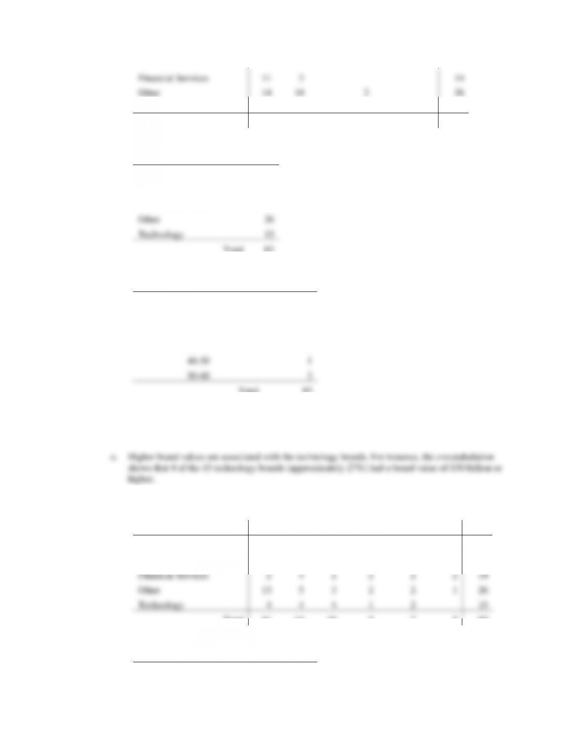
c. Consumer packaged goods have the lowest brand revenues; each of the 12 consumer packaged
goods brands in the sample data had a brand revenue of less than $25 billion. Approximately 57% of
d.
1-Yr Value Change (%)
Industry
–60—41
–40—21
–20—1
0-19
20–39
40–60
Total
Automotive & Luxury
11
4
15
Consumer Packaged Goods
2
10
12
Financial Services
1
6
7
14
Other
2
20
4
26
Technology
1
3
4
4
2
1
15
Total
1
4
14
52
10
1
82
e.
1-Yr Value Change (%)
Frequency
–60—41
1
–40—21
4
–20—1
14
0-19
52
20–39
10
40–60
1
Total
82
f. The automotive & luxury brands all had a positive 1-year value change (%). The technology brands
had the greatest variability.
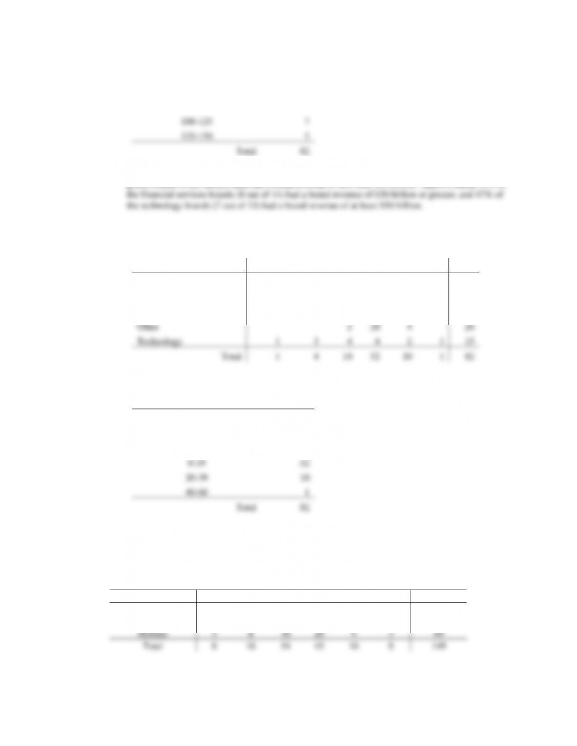
35. a.
Hwy MPG
Size
15–19
20–24
25–29
30–34
35–39
40–44
Total
Compact
3
4
17
22
5
5
56
Large
2
10
7
3
2
24
Midsize
3
4
30
20
9
3
69
Total
8
18
54
45
16
8
149
b. Midsize and Compact seem to be more fuel efficient than Large.
c.
City MPG
Drive
10–14
15–19
20–24
25–29
30–34
40–44
Total
A
7
18
3
28
F
17
49
19
2
3
90
R
10
20
1
31
Total
17
55
52
20
2
3
149
d. Higher fuel efficiencies are associated with front wheel drive cars.
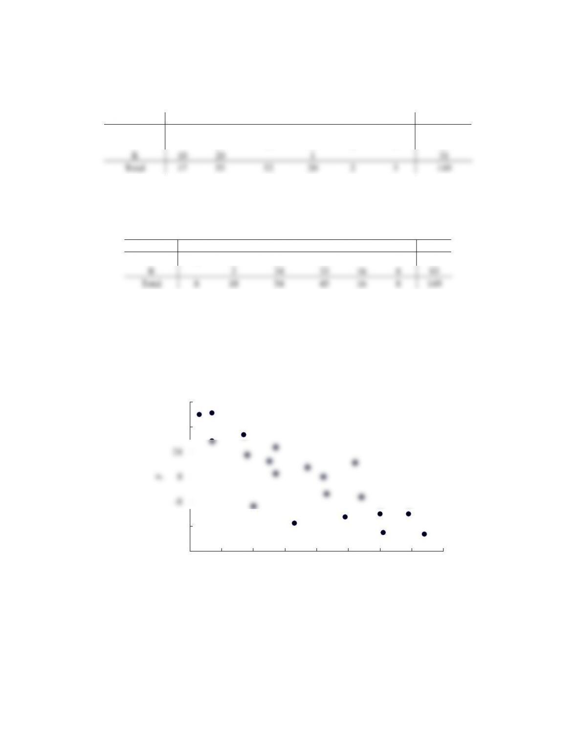
e.
City MPG
Fuel Type
15–19
20–24
25–29
30–34
35–39
40–44
Total
P
8
16
20
12
56
R
2
34
33
16
8
93
Total
8
18
54
45
16
8
149
f. Higher fuel efficiencies are associated with cars that use regular gas.
36. a.
b. There is a negative relationship between x and y; y decreases as x increases.
37. a.
-40
-24
-8
8
24
40
56
-40 -30 -20 -10 0 10 20 30 40
y
x
b. As X goes from A to D the frequency for I increases and the frequency of II decreases.
38. a.
y
Yes
No
Low
66.667
33.333
100
x
Medium
30.000
70.000
100
High
80.000
20.000
100
b.
0
100
200
300
400
500
600
700
800
900
A B C D
I
II
0%
10%
20%
30%
40%
50%
60%
70%
80%
90%
100%
Low Medium High
x
No
Yes