Appendix A – Math Essentials: Understanding Graphs and Slope
APPENDIX A
MATH ESSENTIALS:
UNDERSTANDING
GRAPHS AND SLOPE
Learning Objectives
LO A.1: Create four quadrants using x- and y-axes and plot points on graph.
LO A.2: Use data to calculate slope.
LO A.3: Interpret what direction and steepness of slope indicate about a line.
Appendix Outline
Creating a Graph (LO A.1)
Graphs of one variable
Graphs of two variables
Slope
Calculating slope (LO A.2)
The direction of a slope (LO A.3)
The steepness of a slope
Problems and Applications
Review Questions
1. Create four quadrants using x– and y-axes. Use your graph to plot the
following points. [LO A.1]
a. (1,4)
b. (-2,1)
c. (-3, -3)
d. (3, -2)
Answer: Each point is an (x,y) coordinate. For example, for point a, we
A-1
Copyright © 2018 McGraw-Hill Education. All rights reserved. No reproduction or distribution without the prior written consent of McGraw-Hill
Education.
Appendix A – Math Essentials: Understanding Graphs and Slope
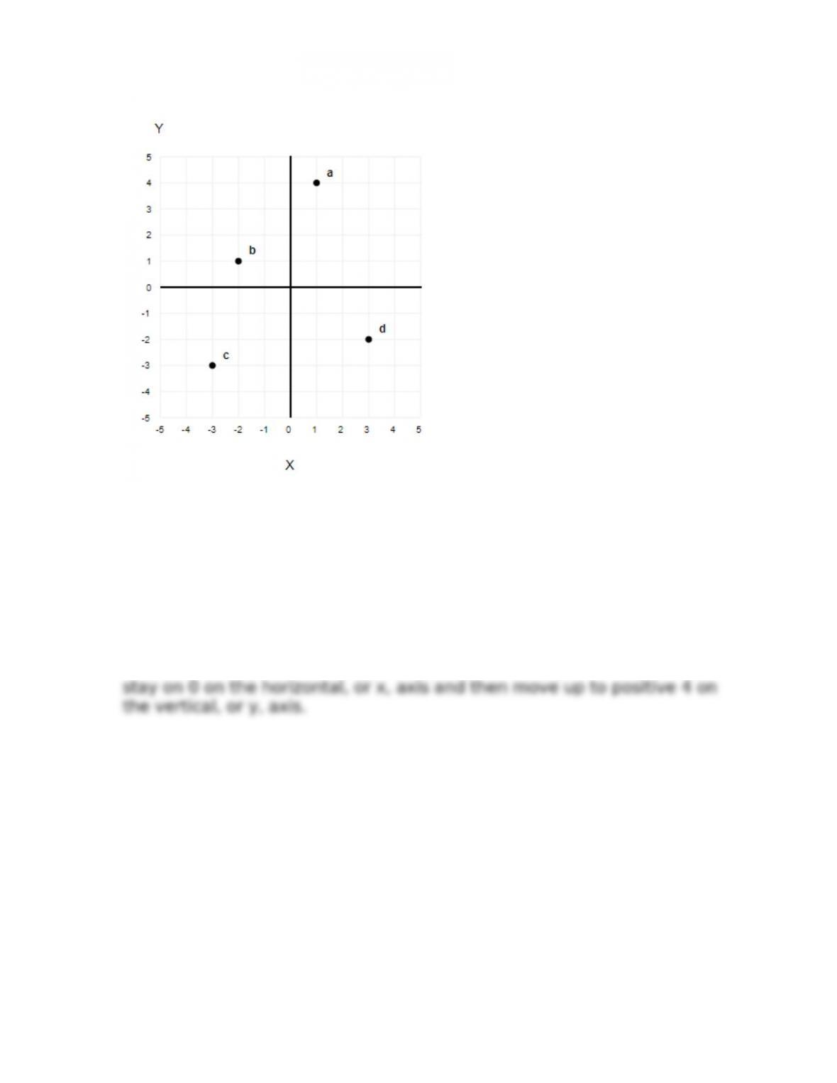
2. Create four quadrants using x– and y–axes. Use your graph to plot the
following points. [LO A.1]
a. (0,4)
b. (0, -2)
c. (1,0)
d. (-3, 0)
Answer: Each point is an (x,y) coordinate. For example, for point a, we
A-2
Copyright © 2018 McGraw-Hill Education. All rights reserved. No reproduction or distribution without the prior written consent of McGraw-Hill
Education.
Appendix A – Math Essentials: Understanding Graphs and Slope
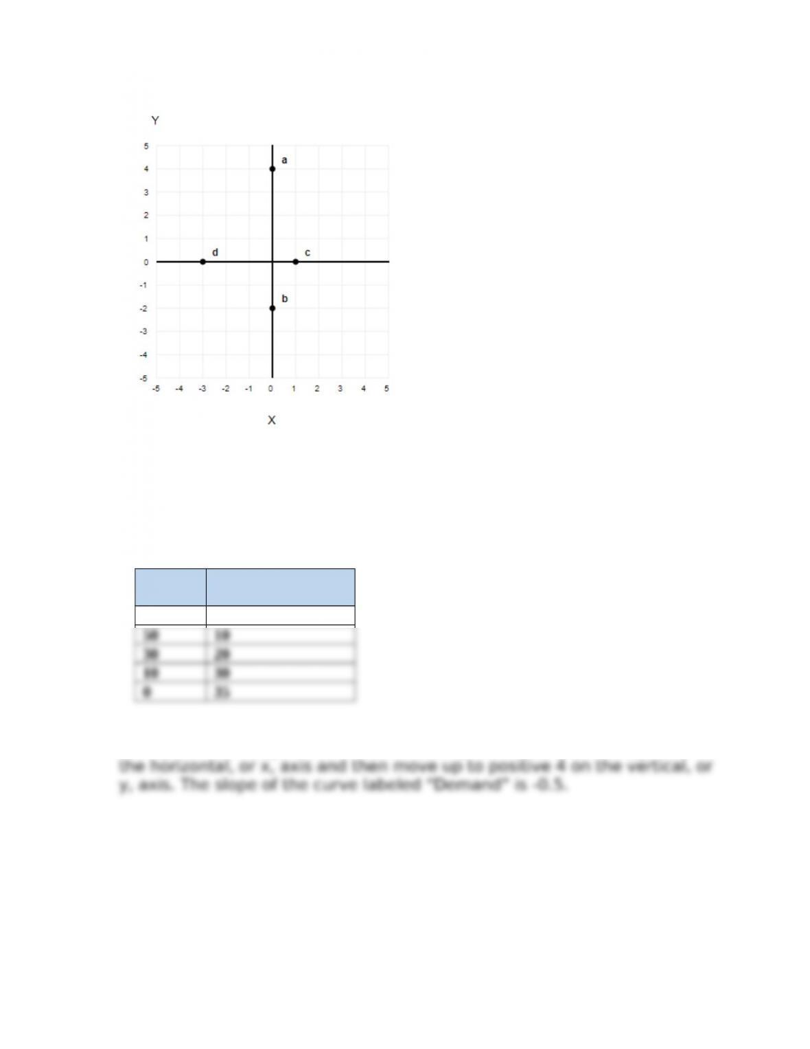
3. Use the curve labeled “Demand” in Figure AP-1 to create a table
(schedule) that shows Price in one column and Quantity in another. What is
the slope of the curve labeled “Demand”? [LO A.2]
Answer:
Price Quantity
Demanded
70 0
Each point is an (x,y) coordinate. For example, for point a, we stay on 0 on
4. Use the curve labeled “Demand” in Figure AP-2 to create a table
(schedule) that shows Price in one column and Quantity in another. What is
the slope of the curve labeled “Demand”? [LO A.2]
A-3
Copyright © 2018 McGraw-Hill Education. All rights reserved. No reproduction or distribution without the prior written consent of McGraw-Hill
Education.
Appendix A – Math Essentials: Understanding Graphs and Slope
Answer:
Price Quantity
Demanded
70 0
5. Use the information about price and quantity in Table AP-1 to create a
graph, with Price on the y–axis and Quantity on the x-axis. Label the resulting
curve “Demand”. What is the slope of that curve? [LO A.2]
Answer: The slope of the line is the rise over the run, or the change in
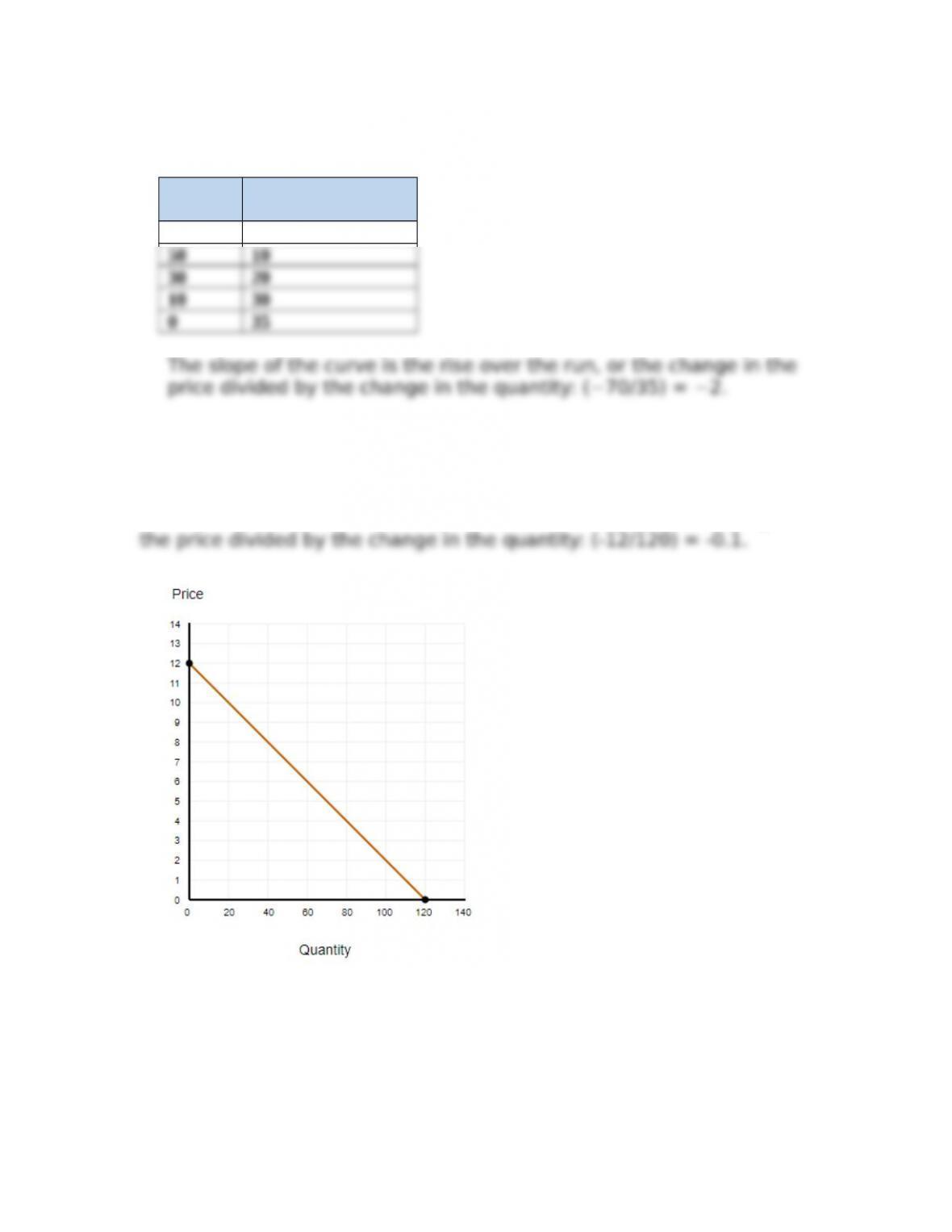
6. Use the information about price and quantity in Table AP-2 to create a
graph, with Price on the y-axis and Quantity on the x-axis. Label the resulting
curve “Demand”. What is the slope of that curve? [LO A.2]
A-4
Copyright © 2018 McGraw-Hill Education. All rights reserved. No reproduction or distribution without the prior written consent of McGraw-Hill
Education.
Appendix A – Math Essentials: Understanding Graphs and Slope
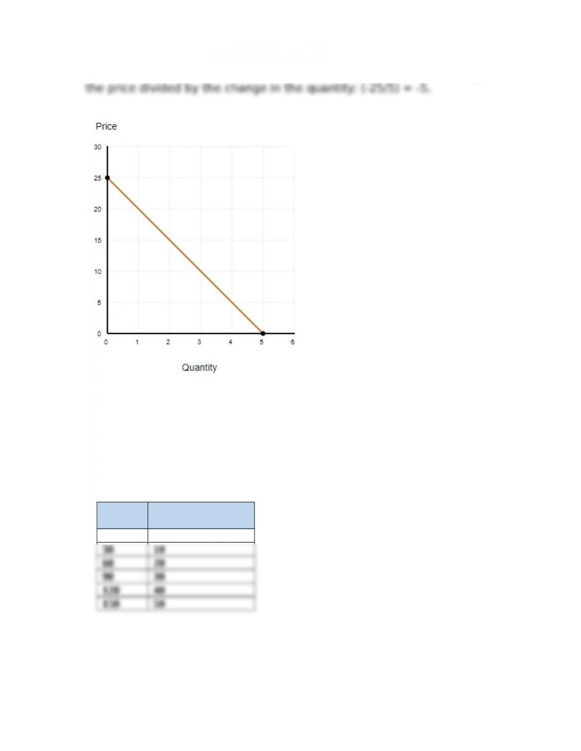
Answer: The slope of the curve is the rise over the run, or the change in
7. Use the curve labeled “Supply” in >gure Ap-3 to create a table
(schedule) that shows Price in one column and Quantity in another. What is
the slope of the curve labeled “Supply”? [LO A.2]
Answer: The slope of the curve labeled “Supply” is the rise over the run,
or the change in the price divided by the change in the quantity: (30/10)
= 3.
Price Quantity
Demanded
0 0
8. Use the curve labeled “Supply” in >gure Ap-4 to create a table
(schedule) that shows Price in one column and Quantity in another. What is
the slope of the curve labeled “Supply”? [LO A.2]
A-5
Copyright © 2018 McGraw-Hill Education. All rights reserved. No reproduction or distribution without the prior written consent of McGraw-Hill
Education.
Appendix A – Math Essentials: Understanding Graphs and Slope
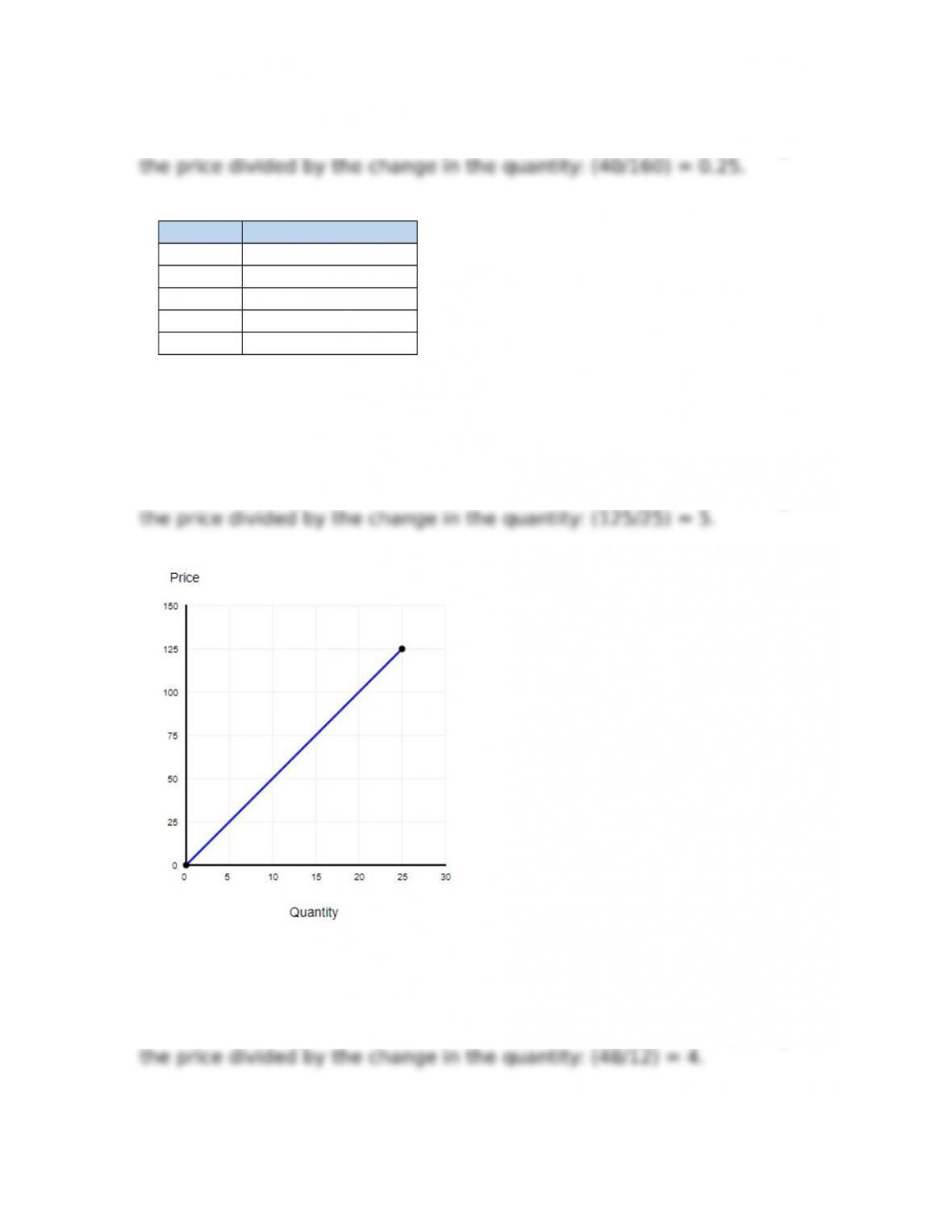
Answer: The slope of the curve is the rise over the run, or the change in
Price Quantity Supplied
0 0
10 40
20 80
30 120
40 160
9. Use the information about price and quantity in Table AP-3 to create a
graph, with Price on the y-axis and Quantity on the x-axis. Label the resulting
curve “Supply”. What is the slope of that curve? [LO A.2]
Answer: The slope of the curve is the rise over the run, or the change in
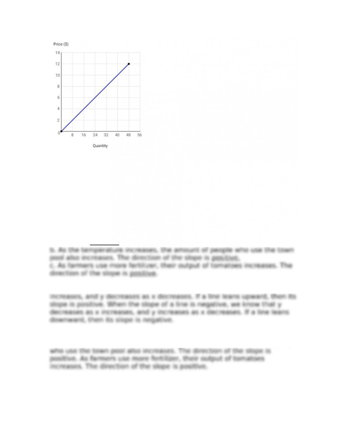
10. Use the information about price and quantity in Table AP-4 to create a
graph, with Price on the y-axis and Quantity on the x-axis. Label the resulting
curve “Supply”. What is the slope of that curve? [LO A.2]
Answer: The slope of the curve is the rise over the run, or the change in
A-6
Copyright © 2018 McGraw-Hill Education. All rights reserved. No reproduction or distribution without the prior written consent of McGraw-Hill
Education.
Appendix A – Math Essentials: Understanding Graphs and Slope
11. What is the direction of slope indicated by the following examples? [LO
A.3]
a. As price of rice increases, consumers want less of it.
b. As the temperature increases, the amount of people who use the
town pool also increases.
c. As farmers use more fertilizer, their output of tomatoes increases.
Answer:
a. As price of rice increases, consumers want less of it. The direction of
the slope is negative.
When the slope of a line is positive, we know that y increases as x
As the price of rice increases, consumers want less of it. The direction of
the slope is negative. As the temperature increases, the amount of people
12. Rank the following equations by the steepness of their slope from
lowest to highest. [LO A.3]
A-7
Copyright © 2018 McGraw-Hill Education. All rights reserved. No reproduction or distribution without the prior written consent of McGraw-Hill
Education.
Appendix A – Math Essentials: Understanding Graphs and Slope
a. y = -3x + 9
b. y = 4x + 2
c. y = -0.5x + 4
Answer: The slope of the curve is the rise over the run or the change in
a. Slope is -3 Rank is 2.
A-8
Copyright © 2018 McGraw-Hill Education. All rights reserved. No reproduction or distribution without the prior written consent of McGraw-Hill
Education.