
Chapter 17
DESIGNING VISUAL AIDS
Chapter overview
This chapter gives detailed, practical advice for choosing and — especially — designing visual
aids.
Brief outline of the chapter
I. Design your body slides using Master Slides. That way, the design will be consistent
throughout. Students not familiar with master slides often find the concept confusing and
need a lot of help.
II. Make your blueprint slide distinguishable. You want your viewers to immediately
recognize the blueprint slide from its design.
III. Prefer a sans serif typeface. A sans serif font—like Arial—projects better.
IV. Place your content toward the top. Sometimes members of the audience can’t see the
bottom of the slide.
V. Don’t use too many words. There’s no good way to present a slide that has too many words
on it.
VI. Prefer images instead of words. The slides we remember usually communicated via an
image, but avoid meaningless decoration.
VII. Exercises.
General comments
This is also a key chapter. Just as good layout is important to writing, so good design for visual
aids is important to presentations. More so, in fact. A good design for visual aids can make a
presentation easy to give; a bad design.…
I find that students are eager for the kind of concrete, detailed information in this chapter. Here
are a few comments:
•Moving blueprint slides. Students need to make these distinguishable from the standard
•Type size. Students rarely use a type size big enough. Partly that’s because they’re not
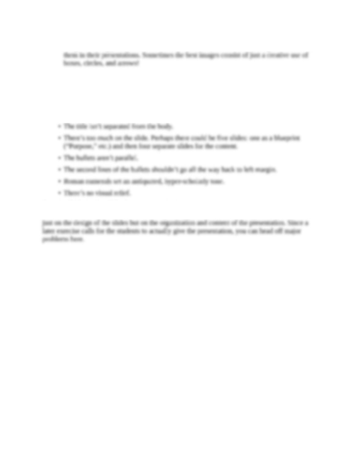
•Images. I strongly emphasize the use of purposeful (not decorative) images and insist on
Notes on the exercises
Exercise A (pointing out what’s wrong with a sample slide)
Almost everything is wrong:
• It shouldn’t use all caps.
Exercise B (designing slides for a presentation)
This is the most important exercise in the speaking part of the book. It’s a great way to check not