
9: Visual Media 9-1
TEST YOUR KNOWLEDGE
9.1. Simplicity in visuals is important because it can help enhance the reception and understanding of
9.2. The “five Cs” to consider when deciding which points to illustrate are clear, complete, concise,
communication
9.4. A bubble diagram is useful when you need to show a third variable (represented by the relative
[LO-3] AACSB: Written and oral communication
9.5. Gantt charts are a kind of timeline chart used to track progress toward an end result, such as
9.6. Titles identify the overall content of a visual and in some instances highlight a specific message
9.7. To check a visual for quality, first make sure it’s accurate and contains no typographical errors,
inconsistent color treatment, confusing or undocumented symbols, or misaligned elements. Next,
oral communication (See MyBCommLab for additional insights)
9.8. Videographers recommend against using the microphone built into a video camera for two
AACSB: Information technology
9.9. B-roll footage can be edited in during postproduction to add visual interest, smooth over
and oral communication
APPLY YOUR KNOWLEDGE
9.10. Like nonverbal communication, visual aids convey meaning independently of words and are
therefore not hindered by differences between the sender’s and the receiver’s interpretation of
Copyright © 2018 Bovée and Thill LLC

9: Visual Media 9-2
data. [LO-1] AACSB: Written and oral communication (See MyBCommLab for additional
insights)
9.11. It is acceptable to add interactivity to a website to increase its persuasiveness as long as it’s done
in an ethical manner. In fact, one of the reasons interactivity is effective is that it allows each
and reasoning
9.12. The best choice for depicting changes over time would be a line chart, using a separate line for
each department. The vertical axis would indicate the absenteeism rate, and the horizontal axis
would indicate the passage of months. However, for more than three departments, a single line
Careful attention must be paid to the vertical scale for either type of chart to make sure the charts
communicate clearly without over- or under-emphasizing variations in the data. Scaling the axis
differences. [LO-1] AACSB: Ethical understanding and reasoning
9.13. In-text references to illustrations help readers understand the relationship between the textual
[LO-5] AACSB: Written and oral communication
9.14. A typical classroom lecture is going to have at least three views of primary interest: the instructor,
the students in the class (particularly those who are interacting with the instructor), and whatever
display system the instructor might be using (whiteboard, etc.). Therefore, one camera should be
positioned on the instructor and fairly close to get maximum visual impact of his or her facial
expressions, gestures, and body language—without relying too heavily on zoom. (You wouldn’t
technology (See MyBCommLab for additional insights)
PRACTICE YOUR SKILLS
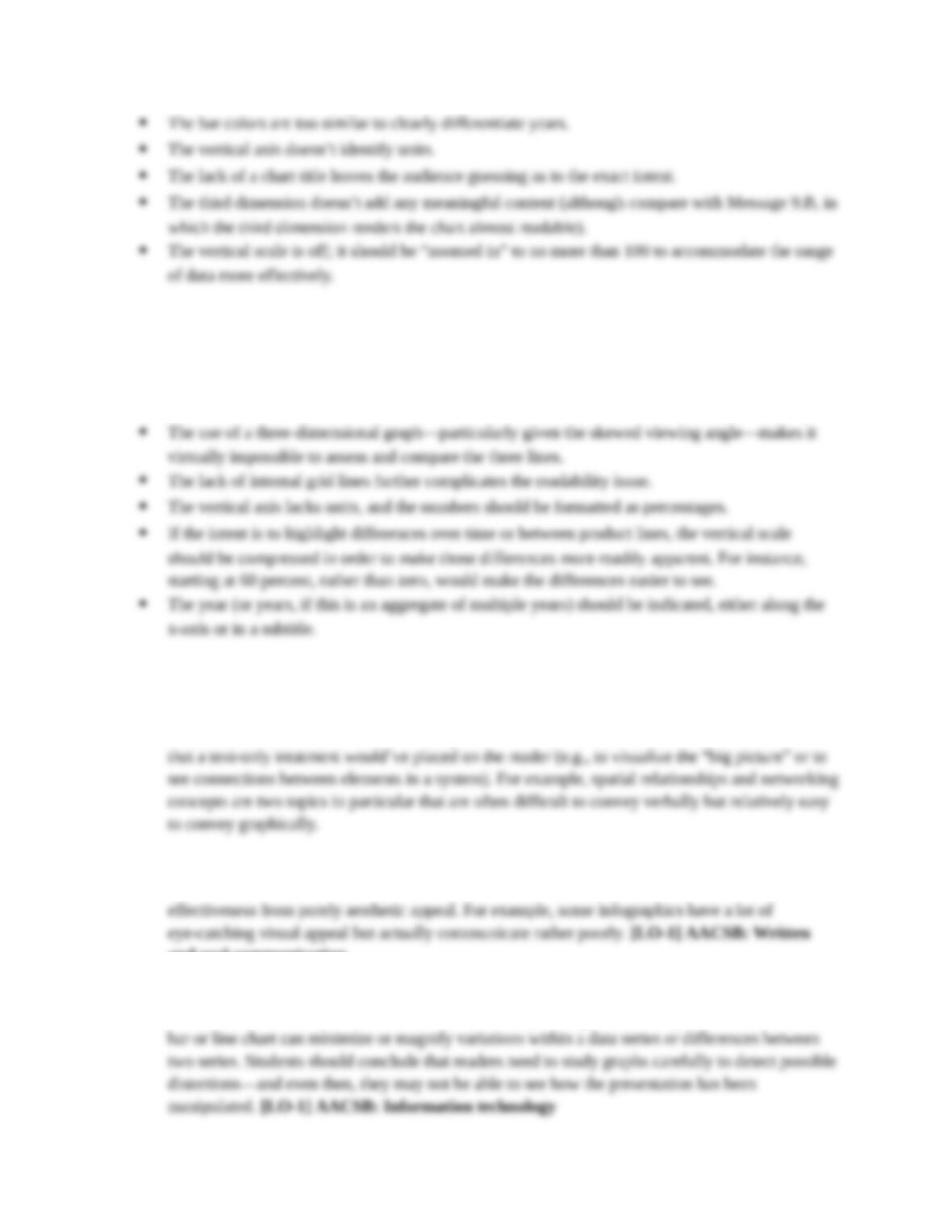
9.15. Message 9.A
This bar chart has several problems:
Copyright © 2018 Bovée and Thill LLC
9: Visual Media 9-3
[LO-1] [LO-3] AACSB: Written and oral communication
9.16. Message 9.B
This line chart is almost unreadable:
[LO-1] [LO-3] AACSB: Written and oral communication
9.17. In explaining why a visual worked better to achieve a particular purpose, students should consider
the amount of text that would’ve been required to convey the same information and the burden
Students can use the design principles discussed in the chapter to evaluate each of the three
visuals. A critical distinction to be made with each visual is to separate communication
and oral communication
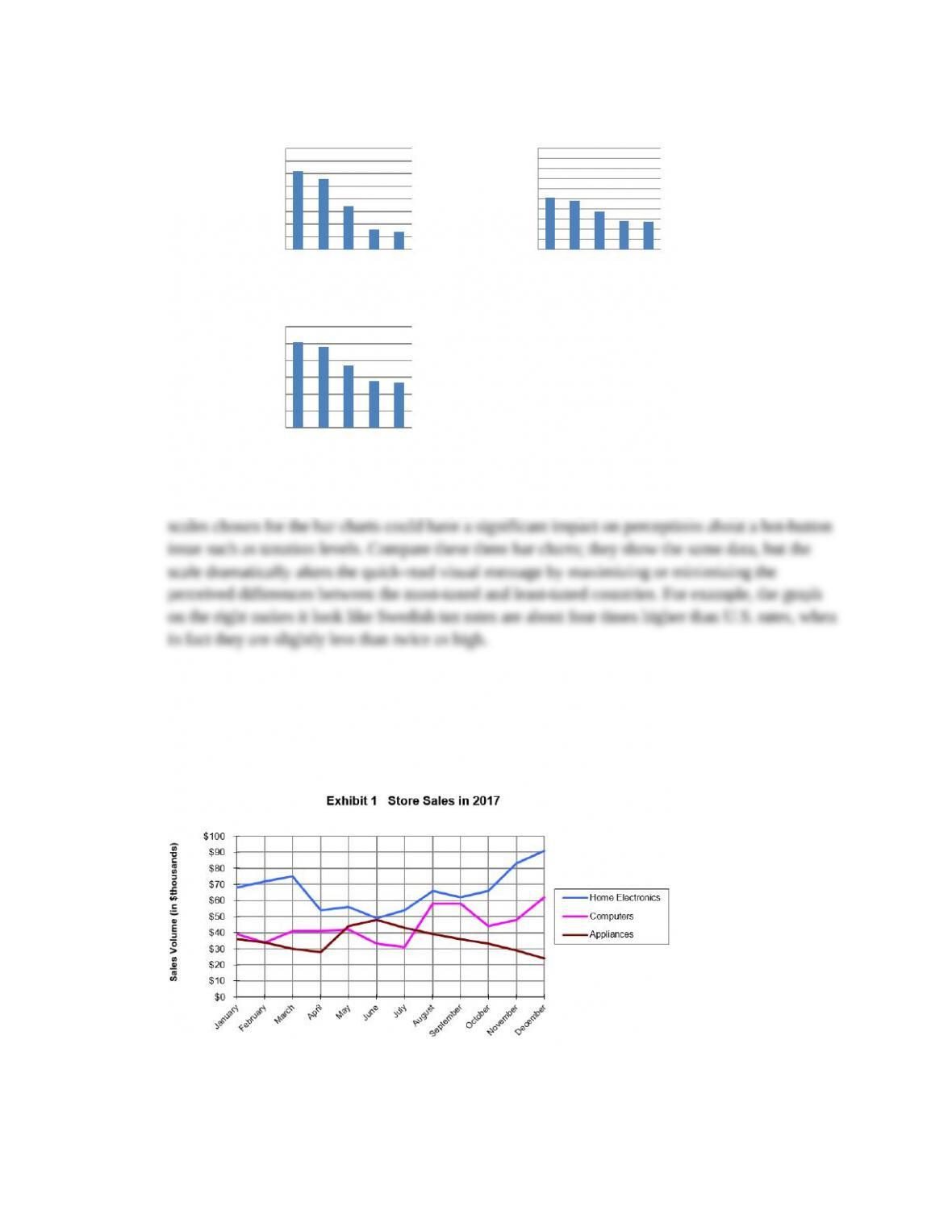
9.18. This exercise should give students a hands-on demonstration of how easily graphic design
choices can influence perceptions. For example, compressing or expanding the vertical axis on a
Copyright © 2018 Bovée and Thill LLC
9: Visual Media 9-4
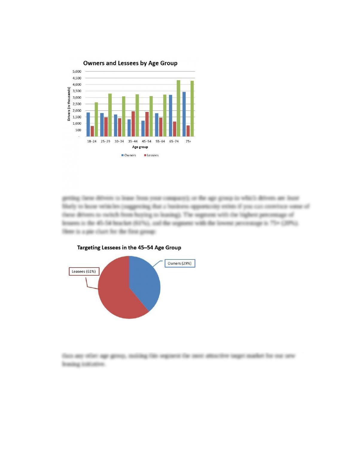
9.19. Student bar charts may look something like this:
To select an age group that holds the most promise for leasing a new vehicle, students can
approach the challenge from two directions: the age group in which drivers are most likely to
lease vehicles (suggesting that the consumer behavior is already established, and it’s a question of
A sentence summarizing this chart might read as follows:
Drivers in the 45-54 year-old age group opt for leasing over buying at a higher rate (61 percent)
[LO-3] AACSB: Written and oral communication
Copyright © 2018 Bovée and Thill LLC
9: Visual Media 9-5
9.20.
Sweden Britain France Japan U.S.
20%
25%
30%
35%
40%
45%
50%
55%
6 0%
To tal tax rate s fo r se le cte d co untrie s
Pe rcent of income paid on taxes
Sweden Britain France Japan U.S.
0%
10%
20%
30%
40%
50%
6 0%
70%
8 0%
90%
100%
To tal tax rate s fo r se le cte d countrie s
Pe rcent of income paid on taxes
Sweden Britain France Japan U.S.
0%
10%
20%
30%
40%
50%
6 0%
To tal tax rate s fo r se le cte d co untrie s
Pe rcent of income paid on taxes
This exercise offers several opportunities to discuss the
effectiveness and ethics of data presentations. For example, does a pictogram (perhaps using
partially filled/emptied wallets to represent taxation percentages) really communicate the ideas
better than a simple bar chart, or is it simply more interesting to look at? Regarding ethics, the
[LO-3] AACSB: Written and oral communication
9.21. This information would probably be most useful presented in a line chart similar to the following:
[LO-3] AACSB: Written and oral communication
Copyright © 2018 Bovée and Thill LLC

9: Visual Media 9-6
9.22. Students will probably find that both line and bar charts convey the information, but in this case
9.23. This exploration should help students realize that data visualization tools vary widely in their
9.24. Use students’ photos to initiate a discussion of ethical issues associated with using visuals to
persuade audiences. The discussion points in “The Ethics of Visual Communication” can serve as
Ethical understanding and reasoning
9.25. Students can overlay concentric rings on a map image to show the population percentages moving
9.26. You may wish to identify sources of information in advance or provide students with a list of
offices and departments that are to be included in the chart. This will save time for the students
and ensure that the school administration isn’t asked for the same information repeatedly.
and oral communication
9.27. The first question student teams must answer is whether they plan to show exact numbers for all
50 states (implying the need to distinguish 50 separate numbers) or to show ranges (with perhaps
five or ten population brackets). It would be practical to color-code five ranges, for instance, but
9.28. Students should have some fun with this exercise, identifying six scenes around campus that
would be appealing to potential applicants. Their choices should reflect the diverse nature of the
oral communication
ASSISTED GRADING QUESTIONS (ACCESSED ON MYBCOMMLAB)
9.29. A simplified line illustration could be more effective than a full-color digital photography if you
want to focus the reader’s attention on important or specific details within a scene. Illustrations
Copyright © 2018 Bovée and Thill LLC

9: Visual Media 9-7
9.30. To work around a video subject who isn’t comfortable speaking on camera, a videographer could
ask the person to provide voiceover narration for a sequence of video clips and still images.
Someone who isn’t comfortable talking into the camera might be more at ease speaking “out of
view.” Plus, it’s easier to edit together voiceover narration and visuals if the person speaking isn’t
oral communication
Copyright © 2018 Bovée and Thill LLC