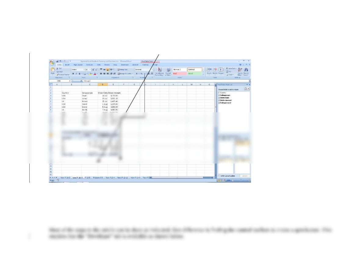
Step 3: You can collapse and display the groups by clicking on the button to the left of each group name. The preceding screen
shot showed all members of each group (note the minus signs to the left of the labels “Group1” and “Group2”). Clicking those to
change to a plus sign produces the following:
16.10 Excel Problem Objective: How to do what-if analysis with graphs.
a. Read the article “Tweaking the Numbers,” by Theo Callahan in the June 2001 issue of the Journal of Accountancy
(either the print edition, likely available at your school’s library, or access the Journal of Accountancy archives at
www.aicpa.org). Follow the instructions in the article to create a spreadsheet with graphs that do what-if analysis.
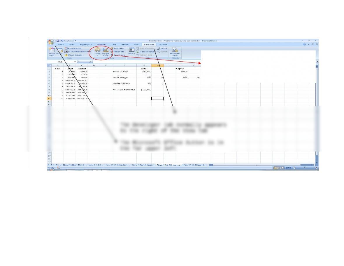
Click on “Design Mode” to toggle
Click on Insert to add spin
buttons and other Active X
controls
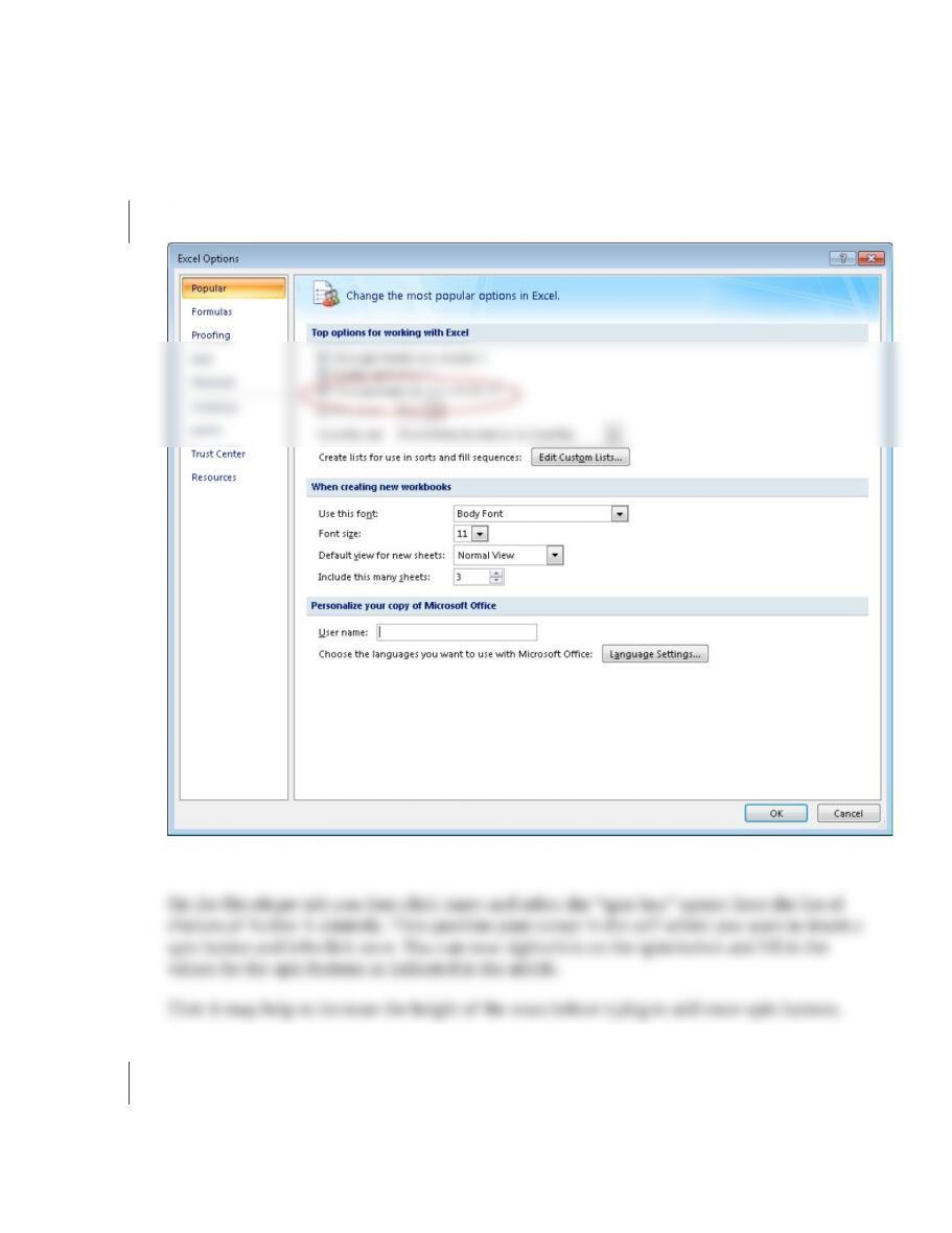
If the developer tab is not available, follow these steps (for Excel 2007):
1. Click the Microsoft Office Button (in far upper left corner – see prior
screenshot)
2. Click Excel Options
3. In the “Popular” category, under “Top options for working with Excel” select
the “Show Developer tab in the Ribbon” check box and click OK
The rest of the article steps work as described.
Now create a spreadsheet to do graphical what-if analysis for the “cash gap.” Cash gap
represents the number of days between when a company has to pay its suppliers and when
it gets paid by its customers. Thus, Cash gap = Inventory days on hand + Receivables
collection period – Accounts payable period.
The purpose of your spreadsheet is to display visually what happens to cash gap
when you “tweak” policies concerning inventory, receivables, and payables.
Thus, you will create a spreadsheet that looks like Figure 16-11
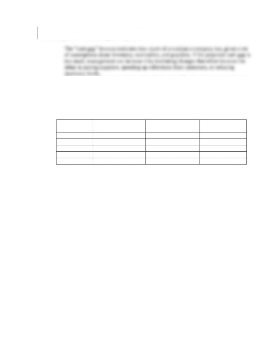
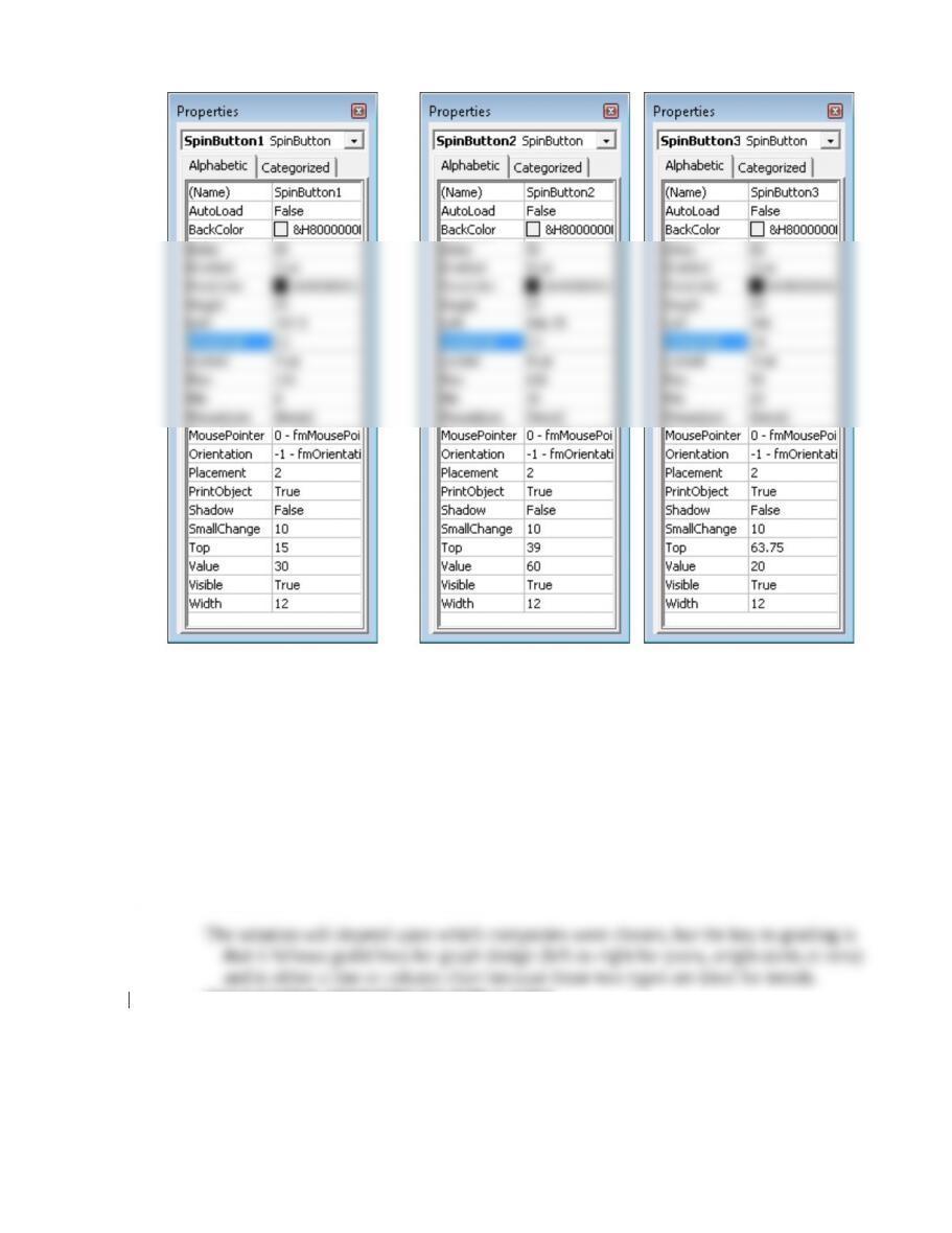
b. Set the three spin buttons to have the following values:
Spin button for
Inventory
Spin button for
Receivables
Spin button for
Payables
Linked cell C2 C3 C4
Maximum 120 120 90
Minimum 0 30 20
Value 30 60 20
Small change 10 10 10
The article “Analyzing Liquidity: Using the Cash Conversion Cycle” by C. S. Cagle, S.
N. Campbell, and K. T. Jones in the Journal of Accountancy (May 2013), pp. 44-48
calls the “Cash Gap” the “Currency Conversion Cycle” and explains that bigger
values are bad because they indicate less liquidity (because cash needed to pay
suppliers is tied up in receivables and inventory). Indeed, the “cash gap” can even
be negative for companies, like Dell, that collect payment from customers in
advance and stretch out payments to suppliers as long as possible. Given that
background, collect the information from annual reports needed to calculate the
“cash gap” for at least 3 years for Dell and 3 or more other companies. Enter that
data in a spreadsheet and create a graph that you think best highlights the trend in
cash gap across the different companies.
SUGGESTED ANSWERS TO THE CASES
Case 16-1 Exploring XBRL Tools
Each year companies release new software tools designed to simplify the process of
interacting with XBRL. Obtain a free trial (demo) version of two of the following tools and
write a brief report comparing them:
Potential tools (your professor may suggest others):
Xinba—available at http://www.hitachiconsulting.com/xbrl/products.cfm
MapForce—available at http://www.altova.com/xml_tools.html
CrossFire—available at http://rivetsoftware.com/solutions/crossfire/
CalcBench spreadsheet tool—available at http://www.calcbench.com
Case 16-3 Visualization tools for Big Data
Traditional graphs (bar charts, line graphs, pie charts) help decision makers see patterns
and relationships in data contained in typical spreadsheets. However, more advanced
virtualization techniques are required to understand Big Data. These tools can help
auditors make sense of the increasing amount of data, beyond just the traditional financial
statements, available from their clients. Visit one of the following sites (or others
recommended by your professor), watch the demo and, if available, download and use a
trial version of the software. Write a review of the demo(s) you view and the trial version of
any product(s) you test.
Virtualization tools:

Tableau—available from www.tableausoftware.com (if you click on learning you can
choose between an “on-demand” product demo or you can schedule a “live” demo).
Spotfire—available from www.spotfire.tibco.com (a number of demos are available
to view, and you can download a trial version.