Module 05 – Designing Documents, Slides, and Screens
Module 5
Designing Documents, Slides, and Screens
LO 5-1 Apply strategies for paper page design.
LO 5-2 Apply strategies for presentation slide design.
LO 5-3 Apply strategies for web page design.
LO 5-4 Apply strategies for design tests.
LO 5-5 Apply strategies for computer use in design.
LO 5-6 Recognize questions about design while writing.
Module Overview
Creating effective documents goes beyond simply choosing the right words. In this age of video,
multimedia, and the Internet, the visual appeal of a document is also critical.
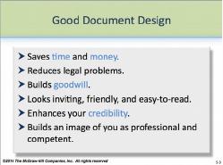
As shown on PP 5-3, good document design saves time and money,
reduces legal problems, and builds goodwill. A well-designed document
looks inviting, friendly, and easy to read. The benefits of document design
go beyond aesthetics—research shows that easy-to-read documents also
enhance your credibility and build an image of you as a professional,
competent person.
The aesthetics of good design are, to some degree, up to the individual. Therefore, some
students may still disagree that the principles and examples in this module demonstrate good
design.
Yet, these principles have grown from research conducted throughout the years that show not
only the qualities of good design, but also its importance. Establish these principles as course
standards, with the knowledge that standards can and will change depending on the organization,
discourse community, and fashion of the day.
Teaching Tip: Bring in “real world” examples of well-designed pages. Contrast
these with ones that are not so well designed. Ask the students which they prefer.
What do students expect in a document’s design? How does this compare to the
principles in this module? If there are differences, have the students explain why.
After sharing with them the principles in this module, see if the students still feel the
same.
© 2014 by McGraw-Hill Education. This is proprietary material solely for authorized instructor use. Not authorized for sale or distribution in any
manner. This document may not be copied, scanned, duplicated, forwarded, distributed, or posted on a website, in whole or part.
5-1
Module 05 – Designing Documents, Slides, and Screens
Teaching Tip: Follow the guidelines in this book for all class documents you submit
to your students and expect students to do the same for documents they submit to
you.
Teaching Tip: For students who might say, “That’s not how we design documents at
my company,” use the opportunity to address the effects of organizational culture
and discourse community on document design. A good pedagogical question to offer
is if it works in one company but is not typically used by others, is the design
practice necessarily “good?” Should more companies be following it? Why or why
not? Connect the discussion to the issue of standards. Why do we have them if not
everyone follows them?
What’s in This Supplement
This supplement is organized around the major questions posed in Module 5. It covers
Part 1: Key Lecture Points, Teaching Tips, and In-Class Exercises Page 73
Part 2: Answers to Textbook Assignments Page 81
Part 3: Appendixes of Handouts/Transparency Masters Page 88
PowerPoint presentations can be found at our Web page at www.mhhe.com/bcs6e.
Questions (with answers) suitable for quizzes are in the Instructor’s Test Bank. For student
practice quizzes with answers, see our Web page.
Part 1: Key Lecture Points, Teaching Tips, and In-Class Exercises
How should I design paper pages? LO 5-1
Follow these five guidelines.
The following design guidelines, as illustrated on PP 5-4 through PP 5-10,
are applicable for standard business correspondence: letters, memos,
reports, and so forth. Highly specialized documents, such as advertising
circulars with a colorful, multi-font “circus layout,” may violate these
principles and still be acceptable. However, those documents are beyond
the scope of this book.
Students should follow these five guidelines when creating business documents
© 2014 by McGraw-Hill Education. This is proprietary material solely for authorized instructor use. Not authorized for sale or distribution in any
manner. This document may not be copied, scanned, duplicated, forwarded, distributed, or posted on a website, in whole or part.
5-2
Module 05 – Designing Documents, Slides, and Screens
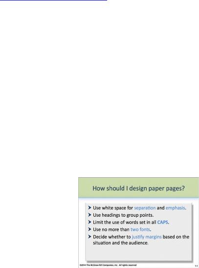
Use white space to separate and emphasize points (PP 5-5).
Use headings to group points (PP 5-6 & 5-7).
Limit the use of words set in all capital letters.
Use no more than two typefaces in a single document.
Decide whether to justify margins based on the situation and the audience (PP 5-9 &
5-10).
Appendix 5-A shows different typefaces and sizes for comparison. Given the multitude of fonts
available with computer programs today, students should understand that their choices of
typeface for business communication should reflect the nature of the document they wish to
compose. In general, fonts should be readable and professional.
Headings also help readers to locate information quickly and efficiently. Use PP 5-6 and PP 5-7
to discuss principles of effective headings.
Teaching Tip: Use Appendix 5-B through Appendix 5-D to show students the
contrast between a page that is well designed and the same page with a flawed
design, including the use of white space and margins. Show students how effectively
applied principles make the page more readable and attractive.
How should I design presentation slides? LO 5-2
Keep slides simple, relevant, and interesting.
When using a presentation software program like PowerPoint, students need to apply different
design principles than when creating paper documents. As presentation software continues to
evolve, principles will also evolveCfor instance, animation is becoming more complex and
available, and its use in PowerPoint slides may increase.
For now, students should follow these five guidelines, as illustrated on PP
5-11:
© 2014 by McGraw-Hill Education. This is proprietary material solely for authorized instructor use. Not authorized for sale or distribution in any
manner. This document may not be copied, scanned, duplicated, forwarded, distributed, or posted on a website, in whole or part.
5-3
Module 05 – Designing Documents, Slides, and Screens
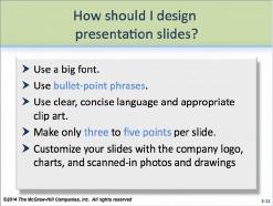
Use a big font: 44- or 50-point for titles, 32-point for subheads, and 28-point for
examples.
Use bullet-point phrases rather than complete sentences.
Use clear, concise language.
Make only three to five points on each slide. If you have more, consider using two slides.
Customize your slides with the company logo, charts, and scanned-in photos and
drawings.
Teaching Tip: Have students share experiences when they thought a PowerPoint
presentation was ineffective. Did the design of the slides affect their impression of
the speaker? How? If the design was poor, what might the students have wanted
instead? How did the students feel about the overall presentation?
In-Class Exercise: If you are in a computer-equipped room, let groups of 3-5 students
each dabble in creating a poor PowerPoint presentation. Tell them to use
inappropriate colors, sound, typefaces, type sizes, and clip art or animation. Enter
each group’s effort in a “poor design” contest and let the class vote. After crowning
the winner, discuss for 10-15 minutes why the design and others don’t work.
Compare and contrast it with the design principles discussed in this module. If you
are not in a computer-equipped room, assign this task as homework, letting students
use home computers or other facilities.
How should I design web pages? LO 5-3
Pay attention to content, navigation, and the first screen.
Good web pages have both good content and interesting design.
The most critical page for a website is the opening screen. Therefore, students should invest
more into designing that page to help ensure that visitors, as with up to 90%, don’t simply leave.
In addition to qualities that all web screens should have, as described on
PP 5-13 and PP 5-14, the opening page should
© 2014 by McGraw-Hill Education. This is proprietary material solely for authorized instructor use. Not authorized for sale or distribution in any
manner. This document may not be copied, scanned, duplicated, forwarded, distributed, or posted on a website, in whole or part.
5-4
Module 05 – Designing Documents, Slides, and Screens
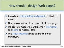
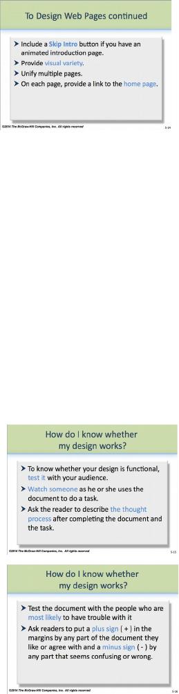
Provide an introductory statement on the first screen. Offer an
overview of the content of your page.
Put interesting and useful information up front.
Minimize large graphics and animation.
Include an “off” button for animation and music on introduction
pages.
Provide visual variety.
Unify multiple pages.
On each page, provide a link to the home page.
In-Class Exercise: If you are in a computer-equipped room, let students surf to find
pages that are attractive, as well as those that aren’t. (Chances are, they already have
favorites.) Let them analyze the pages to see if they follow these guidelines. Share
results with the class, perhaps projecting an image of the screen using LCD
projection equipment. If your classroom is not computer equipped, have students
print out copies of both strong and weak web pages and bring them to class. Make
an overhead of each to share with the class.
How do I know whether my design works? LO 5-4
Test it.
Good design is both visually attractive and functional. Just as an essay
that features accurate typing, crisp margins, and strong white space but has
weak content or expression fails, so does an “empty” business document.
As PP 5-15 and PP 5-16 show, testing is the best way to help ensure the
document will work:
Watch someone to see how he or she uses the document.
Ask the reader to “think aloud” while completing the task.
Test the document with people who are most likely to use the
document.
In-Class Exercise: Have students take bring a copy of an
instruction manual they may have received with a camera, VCR, or computer
program. Let them partner up and take turns “thinking aloud” for 10 minutes while
reading the instructions. What points are clear? Unclear? After they have recorded
their findings, the partners should spend 10-15 minutes rewriting the document or a
section to try to make it more understandable and user-friendly. Let the students
share with the class their experience with this exercise. What was helpful?
Enlightening?
© 2014 by McGraw-Hill Education. This is proprietary material solely for authorized instructor use. Not authorized for sale or distribution in any
manner. This document may not be copied, scanned, duplicated, forwarded, distributed, or posted on a website, in whole or part.
5-5
Module 05 – Designing Documents, Slides, and Screens
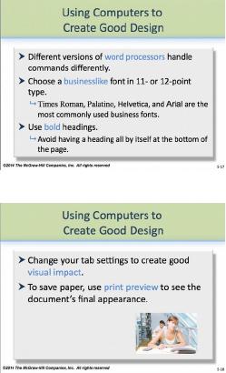
Using computers to create good design LO 5-5
Computer programs provide a great deal of choices and sophistication for users for document
design. In some cases, the choices may be overwhelming. For the most part, document design
in business writing hasn’t changed substantially in decades. Letters and memos look essentially
the same. Paper resume layouts and various kinds of reports allow for a great deal of
individuality but still rely on many of the same tried-and-true concepts. So, writers should take
care when employing computer technology. The wealth of fonts available, for instance, may
encourage them to “go crazy,” when standards like Helvetica or Times Roman work best.
As PP 5-17 and PP 5-18 suggest,
Different versions of word processors handle commands
differently.
Choose a businesslike font in 11- or 12-point type.
Times Roman, Palatino, Helvetica, and Arial are the most
commonly used business fonts.
Use bold headings.
Avoid having a heading all by itself at the bottom of the
page.
Change your tab settings to create good visual impact.
A setting at .6″ works well for the To/From/Subject line
section of memos.
Use .4″ for paragraphs and .6″ for the start of bulleted lists.
For lists with 10 or more items, the setting will need to be a
bit further to the right—about .65″.
To save paper, use print preview to see the document’s final
appearance.
Teaching Tip: While many instructors, as well as students, are quite capable with
computer technology, others may not be. Either way, a good idea is to find an expert
on your campus for a tutorial, especially if you are teaching in a computer
classroom. One significant challenge with technology, of course, is how quickly it
changes. Another is that the version of a popular program students are using at
campus could differ from the version they are using at home. To help minimize the
time you spend navigating computer challenges and maximize the time you spend
with business communication, finding an expert “point person” may be the best
move.
© 2014 by McGraw-Hill Education. This is proprietary material solely for authorized instructor use. Not authorized for sale or distribution in any
manner. This document may not be copied, scanned, duplicated, forwarded, distributed, or posted on a website, in whole or part.
5-6
Module 05 – Designing Documents, Slides, and Screens
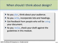
When should I think about design? LO 5-6
At each stage of the writing process.
Students should understand that design is not an afterthought. By considering how design affects
a document both before and during the composing process, students are more likely to produce
better and more user-friendly documents.
PP 5-19 illustrates the following steps that they can use:
As you plan, think about your audience.
As you write, incorporate lists and headings.
Get feedback from people who will be using your document.
As you revise, check your draft against the guidelines in this
module.
In-Class Exercise: Use Appendix 5-F through Appendix 5-G to let students apply
what they have learned in this module. In groups of 3-5, have them spend 10-15
minutes reviewing the document for flaws. Then have them spend 20-25 minutes
revising the document, paying particular attention to designing a document that is
both readable and user-friendly. Have groups make copies for the entire class.
Spend 10-15 minutes critiquing each group’s solution.
Last Word: Help students to see that design is a critical component in the document
composing process. Yet, good design will never compensate for poor content or
ineffective expression. Good design enhances a document. It doesn’t compensate
for an empty message.
© 2014 by McGraw-Hill Education. This is proprietary material solely for authorized instructor use. Not authorized for sale or distribution in any
manner. This document may not be copied, scanned, duplicated, forwarded, distributed, or posted on a website, in whole or part.
5-7