Exam
Name___________________________________
MULTIPLE CHOICE. Choose the one alternative that best completes the statement or answers the question.
Given the following “data scenario,” decide which type of grouping (single–value, limit, or cutpoint) is probably the best.
1)
Wingspan of Cardinal: The wingspan lengths, to the nearest hundredth of a millimeter, of a sample
of 35 cardinals.
1)
A)
Limit grouping
B)
Single–value grouping
C)
None of these
D)
Cutpoint grouping
2)
Number of Pets: The number of pets per family.
2)
A)
Limit grouping
B)
Single–value grouping
C)
Cutpoint grouping
D)
None of these
3)
Exam Scores: The exam scores, rounded to the nearest whole number, of all students in a given
math course.
3)
A)
None of these
B)
Single–value grouping
C)
Limit grouping
D)
Cutpoint grouping
SHORT ANSWER. Write the word or phrase that best completes each statement or answers the question.
Use cutpoint grouping to organize these data into a frequency distribution.
4)
The table shows the closing share price, in dollars, for each of the 32 stock holdings of a
mutual fund.
18 1
16 24 5
856 3
448 14 9
16 53 3
8 25 1
420 1
4
20 27 11
16 67 3
16 30 1
2 18 1
8 62 31 9
16 47 3
8
52 15
16 29 5
826 13 15
16 11 11
16 24 7
8 49 3
470
45 1
16 54 1
256 3
16 60 58 15
16 37 5
8 59 3
451
Construct a frequency distribution for these share prices. Use 10 as the first cutpoint and
classes of equal width 10.
Share price
4)
Provide an appropriate response.
5)
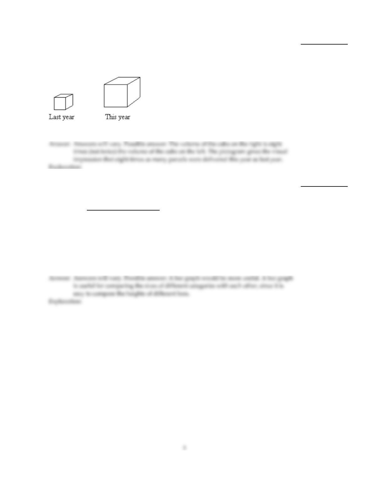
A parcel delivery service lowered its prices and finds that it has delivered twice as many
parcels this year as it did last year. To illustrate this fact, the manager draws a pictogram
as shown below. Each cube depicts a parcel. The side length of the “parcel” on the right is
twice the side length of the “parcel” on the left.
Why is this pictogram misleading? What visual impression is portrayed by the pictogram?
5)
6)
Shortly before a mayoral election, a market research firm took a poll to find out which
candidate people were planning to vote for. The results are shown below.
Candidate Frequency
Li Fong 2120
Bob Green 2329
Sue Moore 1042
Jose Alvarez 399
You wish to construct a graph to represent the data. It should be easy to see from your
graph which candidate is in the lead. Which graph would be more useful, a bar graph or a
pie chart? Explain your thinking.
6)
7)
Construct a stem–and–leaf diagram for the data set below. Round each number to the
nearest whole number before constructing the diagram. Why is it necessary to first round
the numbers?
192.3 213.2 235.1 216.7 187.9 231.7 238.1 188.9 209.3
219.4 190.2 191.1 212.7 224.7 195.6 187.0 220.6 207.1
7)
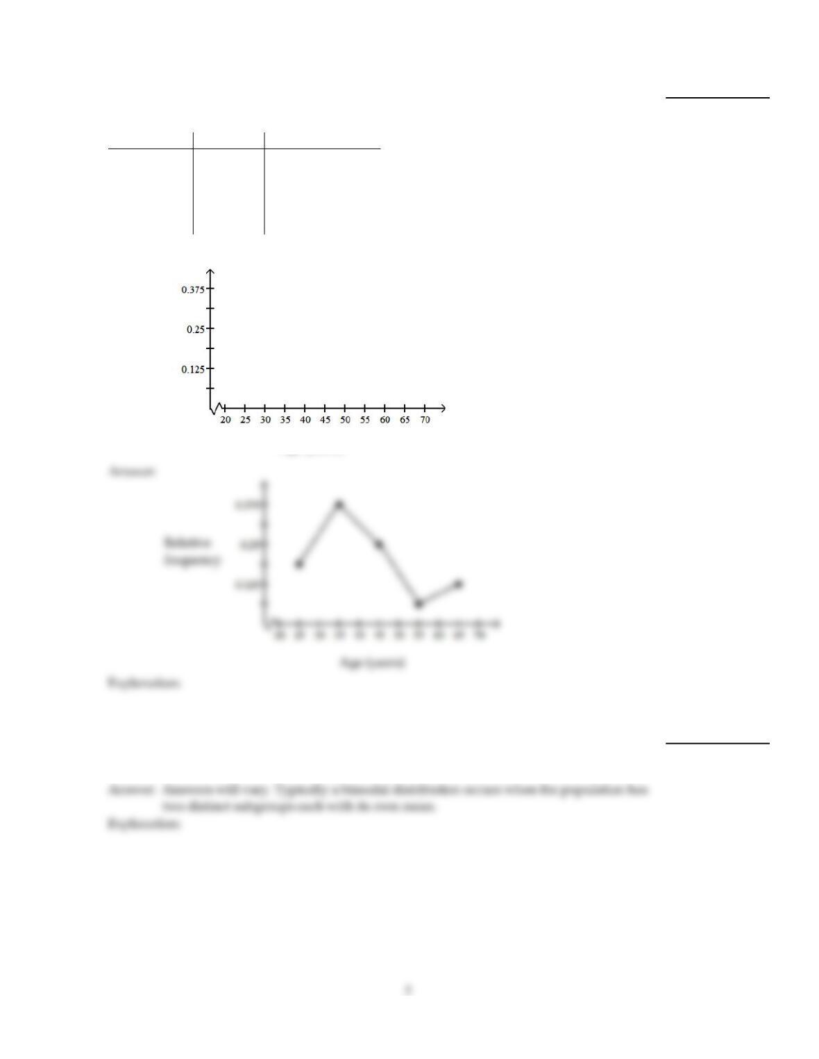
Construct a relative–frequency polygon for the given data.
8)
The table contains the frequency and relative–frequency distributions for the ages of the
employees in a particular company department.
Age (years) Frequency Relative frequency
20–under 30 3 0.1875
30–under 40 6 0.375
40–under 50 4 0.25
50–under 60 1 0.0625
60–under 70 2 0.125
Relative
frequency
Age (years)
8)
Provide an appropriate response.
9)
Give an example of a data set whose distribution is likely to be bimodal. Describe the
population from which the sample is selected and the variable that is measured for each
person. Explain why you think the distribution will be bimodal.
9)
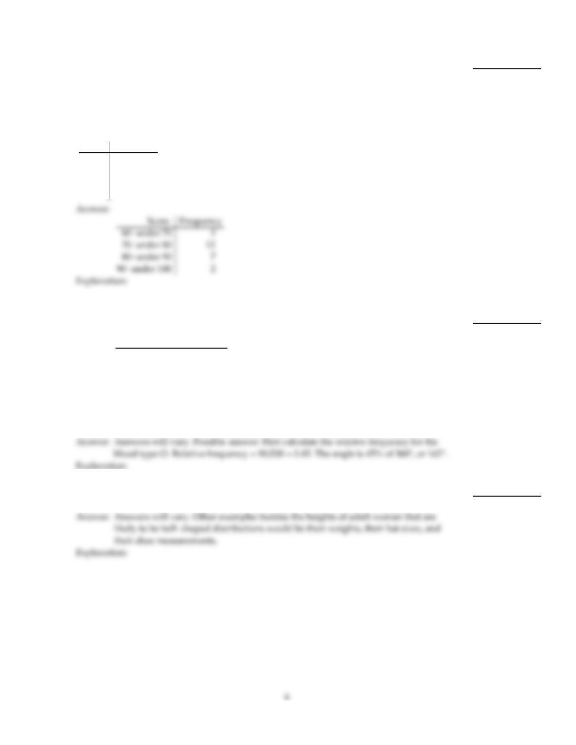
Use cutpoint grouping to organize these data into a frequency distribution.
10)
On a math test, the scores of 24 students were
92 75 75 67 75 75 92 83 75 65 83 75
75 83 75 75 83 75 75 83 75 83 83 67
Construct a frequency distribution. Use 4 classes beginning with a lower class limit of 60.
Score Frequency
10)
Provide an appropriate response.
11)
Suppose that you want to construct a pie chart to represent the following data.
Blood Type Frequency
O90
A84
B18
AB 8
Explain how you would calculate the angle for the pie–shaped piece corresponding to the
blood type O.
11)
12)
The heights of adult women have a bell–shaped distribution. Give examples of three other
data sets whose distributions are likely to be bell–shaped.
12)
13)
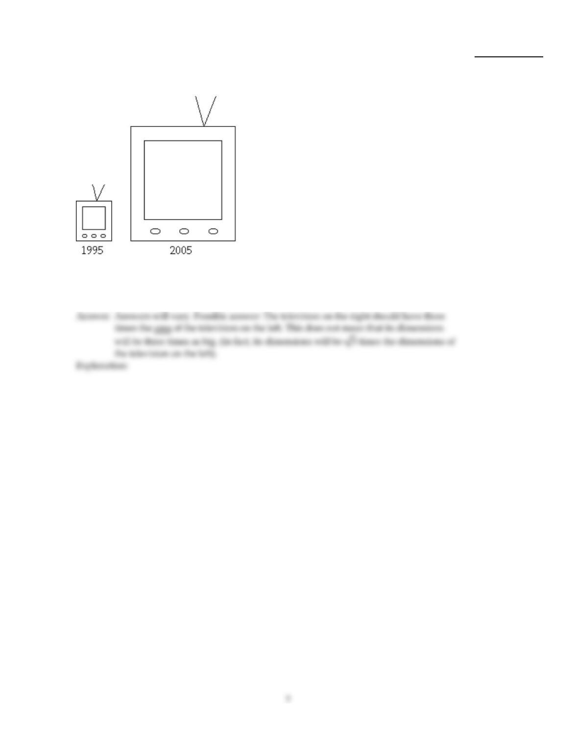
A television manufacturer sold three times as many televisions in 1995 as it did in 1985. To
illustrate this fact, the manufacturer draws a pictogram as shown below. The television on
the right is three times as tall and three times as wide as the television on the left.
This pictogram is misleading because it actually gives the visual impression that nine
times as many televisions were sold in 2005 as in 1995. How can the manufacturer
correctly illustrate the fact that sales in 2005 were three times sales in 1995?
13)
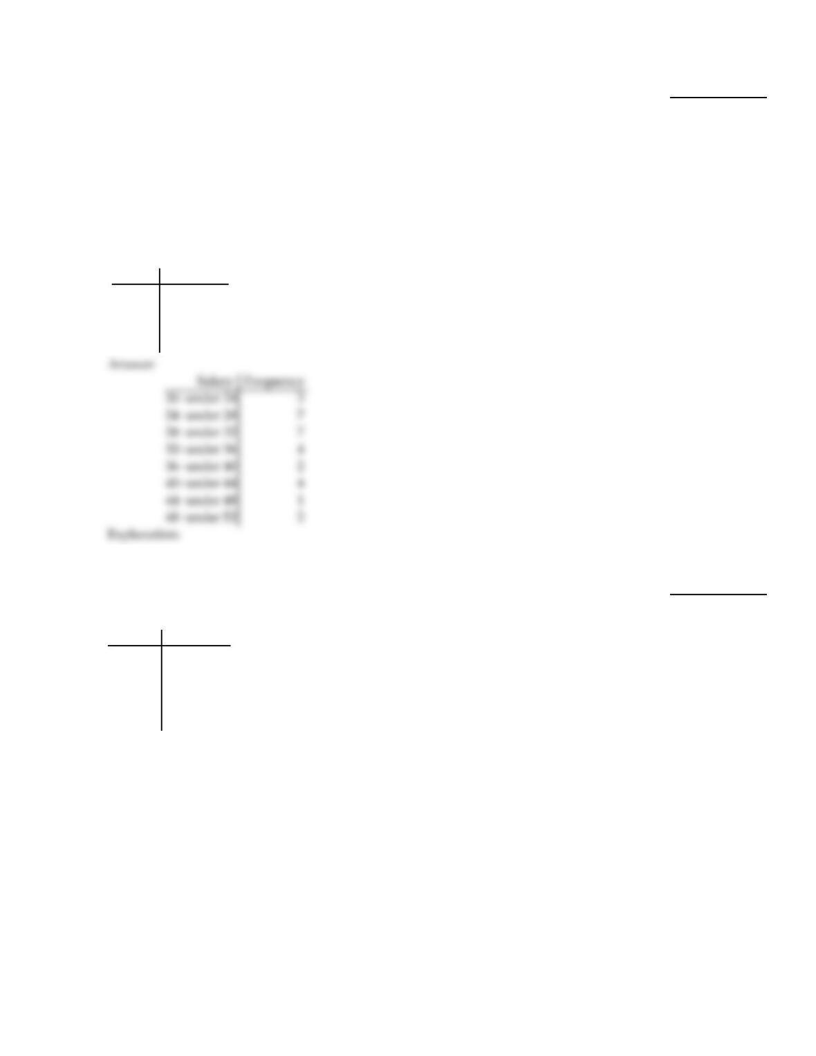
Use cutpoint grouping to organize these data into a frequency distribution.
14)
A government researcher was interested in the starting salaries of humanities graduates. A
random sample of 30 humanities graduates yielded the following annual salaries. Data are
in thousands of dollars, rounded to the nearest hundred dollars.
23.1 24.0 33.7 28.4 36.0 41.0 22.2 21.8 30.5 49.2
30.1 25.2 38.3 46.1 40.0 27.5 24.9 28.0 31.8 29.9
25.7 32.5 48.6 27.4 41.4 35.9 31.9 42.4 26.3 33.0
Construct a frequency distribution for these annual starting salaries. Use 20 as the first
cutpoint and classes of equal width 4.
Salary Frequency
14)
Construct the requested histogram.
15)
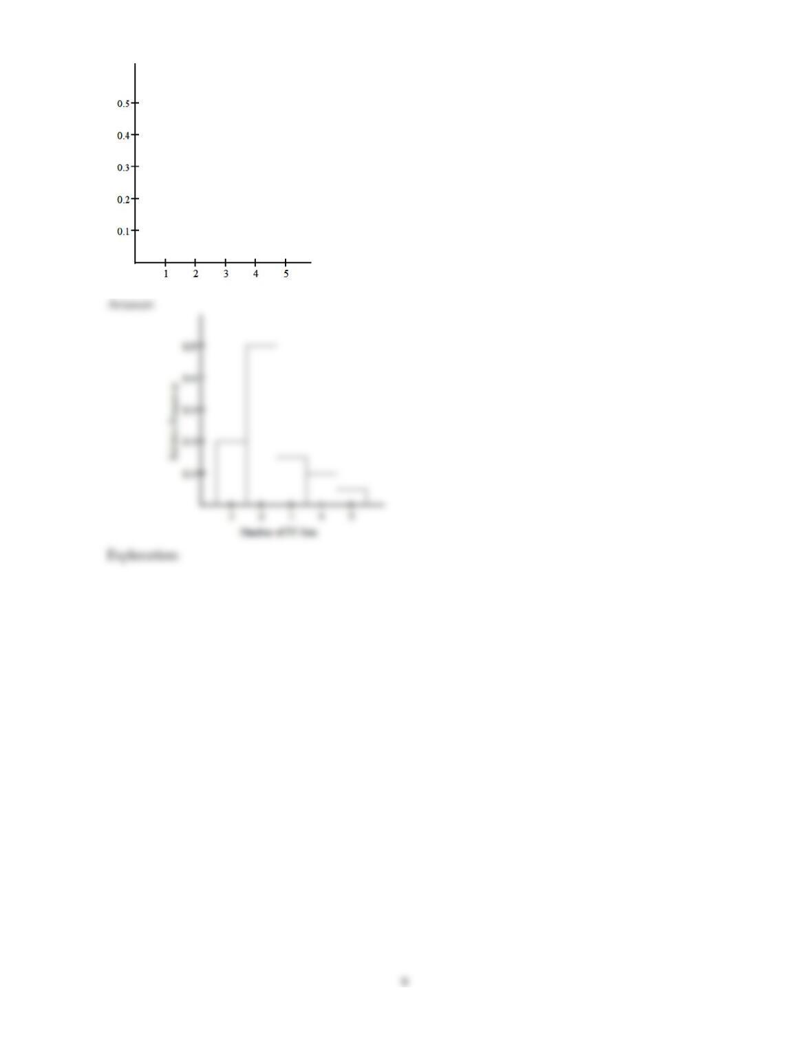
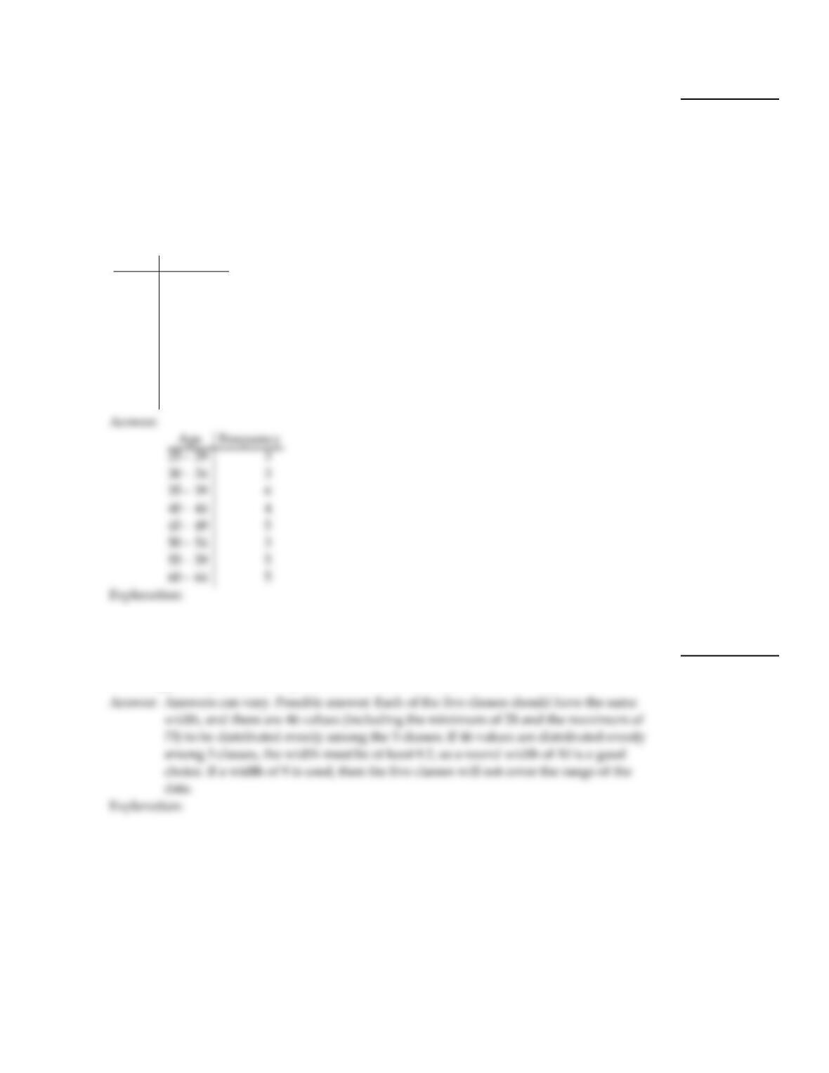
The table gives the frequency distribution for the data involving the number of television
sets per household for a sample of 100 U.S. households.
# of TVs Frequency
1 20
2 50
3 15
4 10
5 5
Construct a relative frequency histogram.
15)
8
Use limit grouping to organize these data into a frequency distribution.
16)
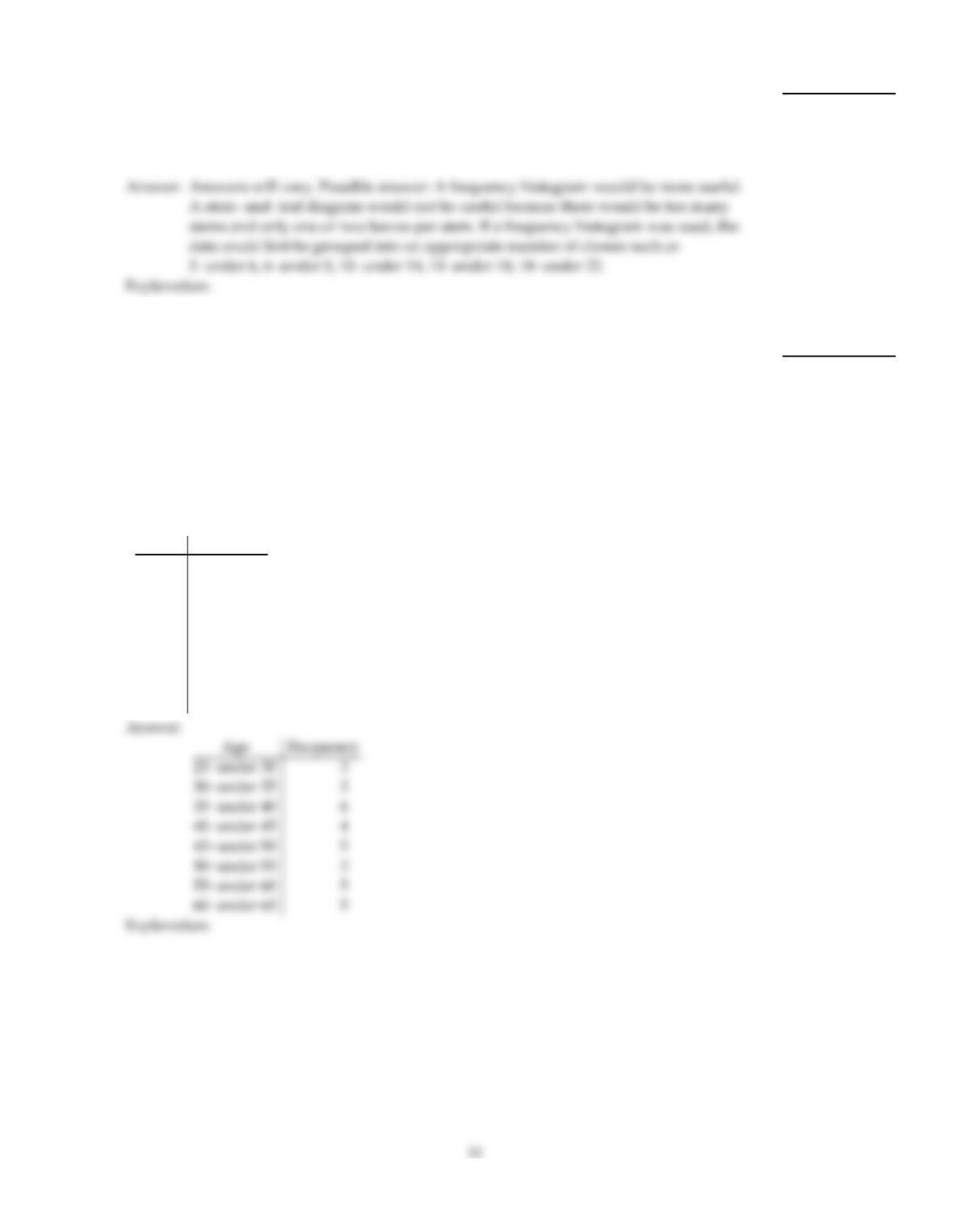
A medical research team studied the ages of patients who had strokes caused by stress. The
ages of 34 patients who suffered stress strokes were as follows.
29 30 36 41 45 50 57 61 28 50 36 58
60 38 36 47 40 32 58 46 61 40 55 32
61 56 45 46 62 36 38 40 50 27
Construct a frequency distribution for these ages. Use 8 classes beginning with a lower class
limit of 25 and class width of 5.
Age Frequency
16)
Provide an appropriate response.
17)
Suppose that a data set has a minimum value of 28 and a maximum value of 73 and that
you want 5 classes. Explain how to find the class width for this frequency distribution.
What happens if you mistakenly use a class width of 9 instead of 10?
17)
10
18)
Which type of graph, a stem–and–leaf diagram or a frequency histogram, would be more
useful for the data set below? Explain your thinking.
2.3 3.2 5.1 6.3 7.3 7.7 8.1 8.9 9.3
9.5 10.2 11.1 12.7 14.7 15.6 16.4 18.6 19.1
18)
Use cutpoint grouping to organize these data into a frequency distribution.
19)
A medical research team studied the ages of patients who had strokes caused by stress. The
ages of 34 patients who suffered stress strokes were as follows.
29 30 36 41 45 50 57 61 28 50 36 58
60 38 36 47 40 32 58 46 61 40 55 32
61 56 45 46 62 36 38 40 50 27
Construct a frequency distribution for these ages. Use 8 classes beginning with a lower class
limit of 25.
Age Frequency
19)
Provide an appropriate response.
20)
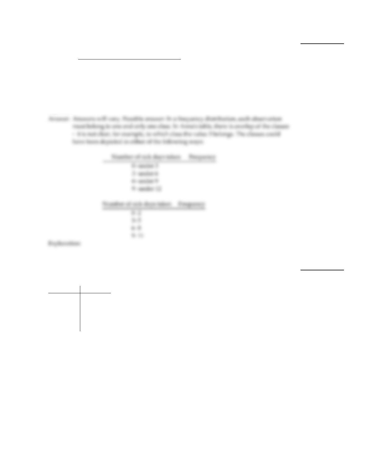
Anna set up a frequency distribution with the following classes:
Number of sick days taken Frequency
0–3
3–6
6–9
9–12
What is wrong with these classes? Describe two ways the classes could have been correctly
depicted.
20)
Construct the requested histogram.
21)
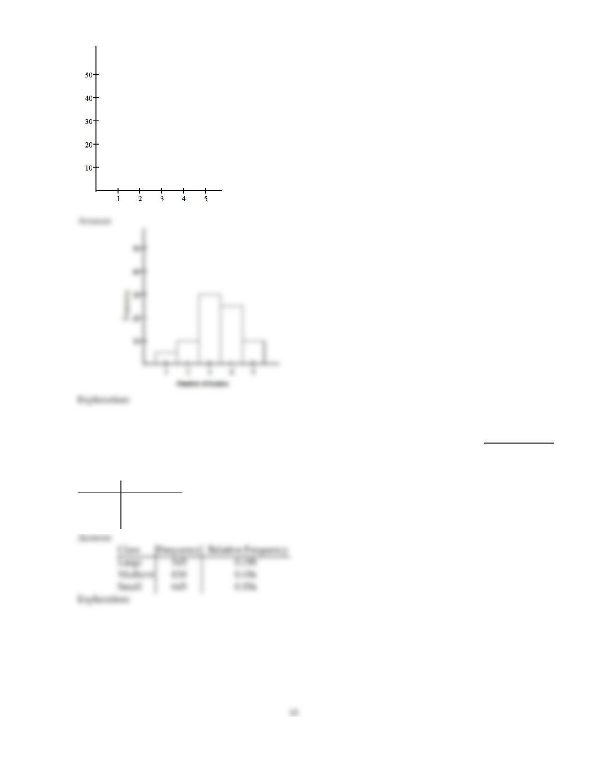
The table gives the frequency distribution for the data involving the number of radios per
household for a sample of 80 U.S. households.
# of Radios Frequency
1 5
2 10
3 30
4 25
5 10
Construct a frequency histogram.
21)
12
Provide an appropriate response.
22)
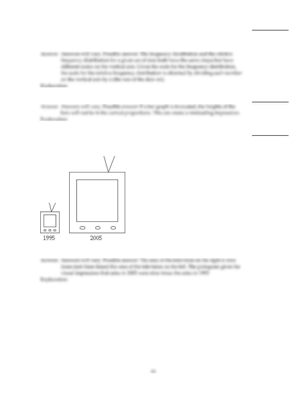
Scott Tarnowski owns a pet grooming shop. His prices for grooming dogs are based on the
size of the dog. His records from last year are summarized below. Construct a relative
frequency distribution.
Class Frequency
Large 345
Medium 830
Small 645
22)
23)
Explain the difference between a frequency distribution and a relative frequency
distribution. Comment on the differences on the vertical axis scale. Given the same data set
and the same classes, will the shapes of the frequency distribution and the relative
frequency distribution be the same? You may draw a diagram to support your answer.
23)
24)
Explain in your own words why a truncated bar graph can be misleading.
24)
25)
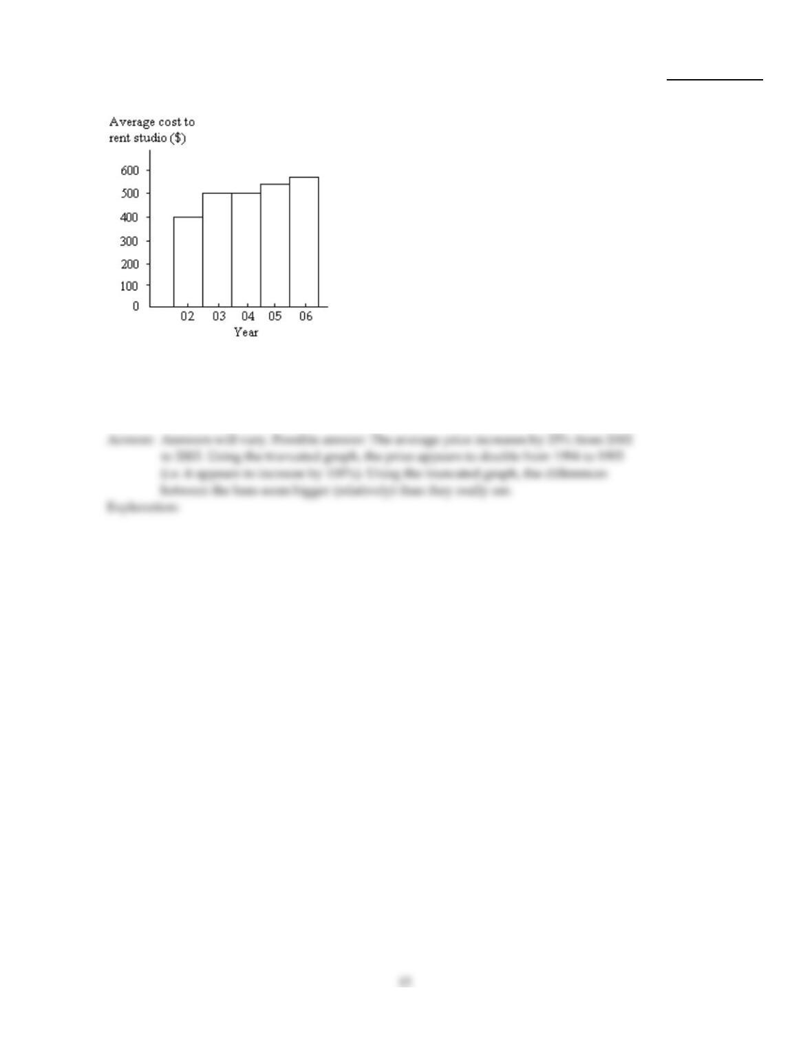
A television manufacturer sold three times as many televisions in 2005 as it did in 1995. To
illustrate this fact, the manufacturer draws a pictogram as shown below. The television on
the right is three times as tall and three times as wide as the television on the left.
Why is this pictogram misleading? What visual impression is portrayed by the pictogram?
25)
26)
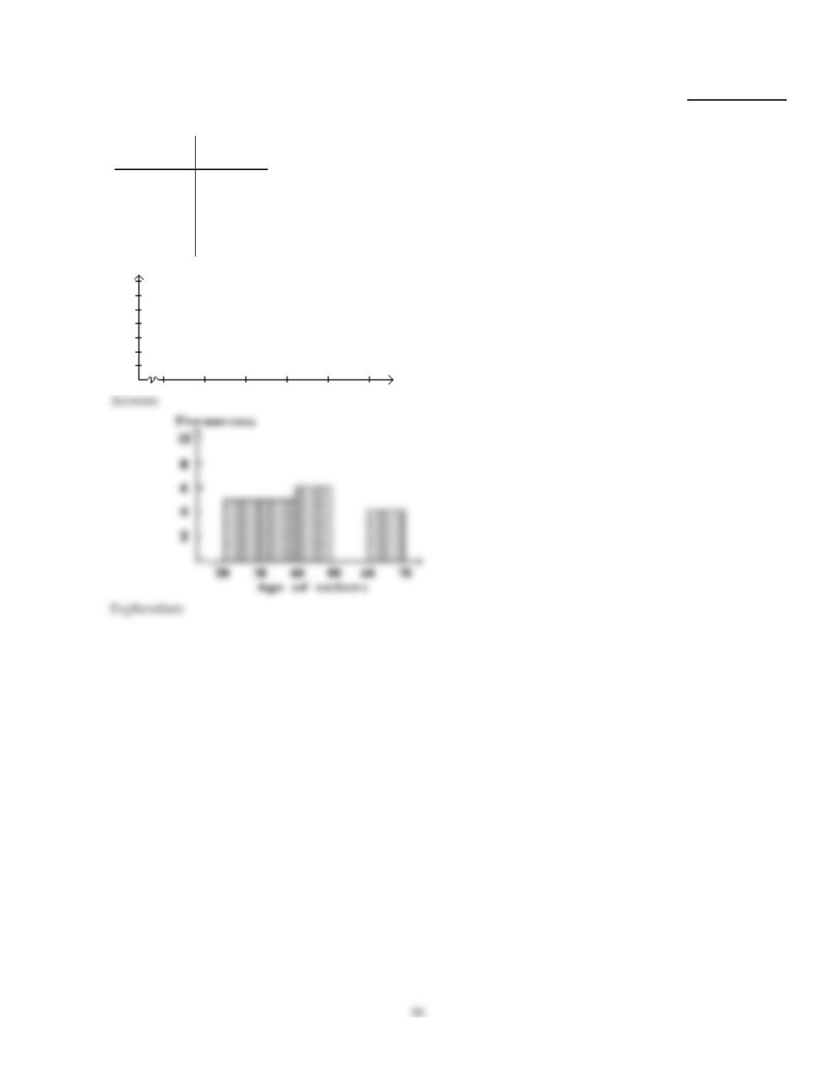
The bar graph below shows the average cost of renting a studio in one city in each of the
years 2002 through 2006.
By what percentage does the average price increase from 2002 to 2003? Obtain a truncated
version of the graph by sliding a piece of paper over the bottom of the graph so that the
bars start at 300. In the truncated graph, by what percentage does the price appear to
increase from 2002 to 2003? Why is the truncated graph misleading?
26)
Construct the requested histogram.
27)
In a survey, 20 voters were asked their age. The results are summarized in the table below.
Construct a frequency histogram corresponding to data below.
Age of
voters
Number of
voters
20–under 30 5
30–under 40 5
40–under 50 6
50–under 60 0
60–under 70 4
27)
Use cutpoint grouping to organize these data into a frequency distribution.
28)
Lori asked 24 students how many hours they had spent doing homework during the
previous week. The results are shown below.
11 10 11 811 11 15 13 11 813 10
10 13 11 10 13 11 10 13 10 13 13 8
Construct a frequency distribution. Use 4 classes, a class width of 2 hours, and a lower limit
of 8 for the first class.
Hours Frequency
28)
Provide an appropriate response.
29)
Suppose you wanted to construct a stem–and–leaf diagram for the data set below. What
leaf unit would you use? What numbers would the stems represent and how many stems
would there be?
3.13 3.24 3.37 3.28 3.16 3.42 3.44 3.39
3.24 3.14 3.35 3.21 3.45 3.37 3.10 3.40
29)
30)
Raul set up a frequency distribution with the following classes:
Weight (lb) Frequency
20–under 25
25–under 30
30–under 35
Give an alternate way of depicting these classes if the original data are given:
a. To the nearest whole number
b. To one decimal place
c. To two decimal places
30)
31)
Explain in your own words the difference between a bar graph and a histogram. Give an
example of data for which you might use a histogram and an example of data for which
you might use a bar graph.
31)
32)
Suppose you are comparing frequency data for two different groups, 25 managers and 150
blue collar workers. Why would a relative frequency distribution be better than a
frequency distribution?
32)
33)
When organizing data into tables, what is the disadvantage of having too many classes?
What is the disadvantage of having too few classes?
33)
34)
A high school teacher keeps a record of the number of days that each student attended
school last year and then she constructs a relative frequency histogram. What do you think
the shape of the distribution will be? Why?
34)
Use cutpoint grouping to organize these data into a frequency distribution.
35)
Kevin asked some of his friends how many hours they had worked during the previous
week at their after–school jobs. The results are shown below.
6 5 6 3 6 6 9 8 6 3 8 5
5 8 6 5 8 6 5 8 5 8 8 3
Construct a frequency distribution. Use 4 classes, a class width of 2 hours, and a lower limit
of 3 for the first class.
Hours Frequency
35)
Provide an appropriate response.
36)
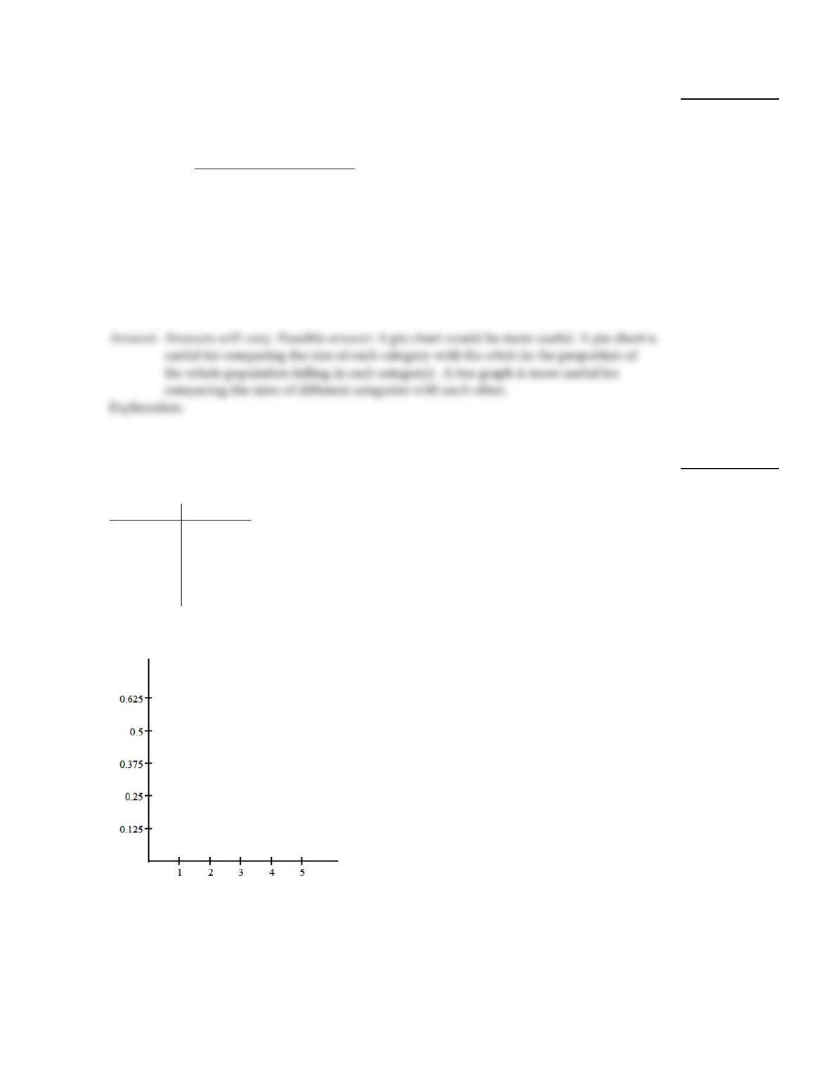
Shortly before an election, a market research firm took a poll to find out whether people
were planning to vote for or against a particular ballot measure. The results are shown
below.
Position Frequency
Against 3087
In favor 3691
Undecided 910
The ballot measure will pass if a simple majority (more than 50%) vote in favor of the
measure. You wish to construct a graph to represent the data. It should be easy to see from
your graph whether more than 50% of the people are planning to vote in favor of the
measure. Which graph would be more useful, a bar graph or a pie chart? Explain your
thinking.
36)
Construct the requested histogram.
37)
The table gives the frequency distribution for the data involving the number of radios per
household for a sample of 80 U.S. households.
# of Radios Frequency
1 5
2 10
3 30
4 25
5 10
Construct a relative frequency histogram.
37)
20