80. An economics professor wants to study the relationship between income and education. A sample of
10 individuals is selected at random, and their income (in thousands of dollars) and education (in
years) are shown below:
Education
12
14
10
11
13
8
10
15
13
12
Income
25
31
20
24
28
15
21
35
29
27
a.
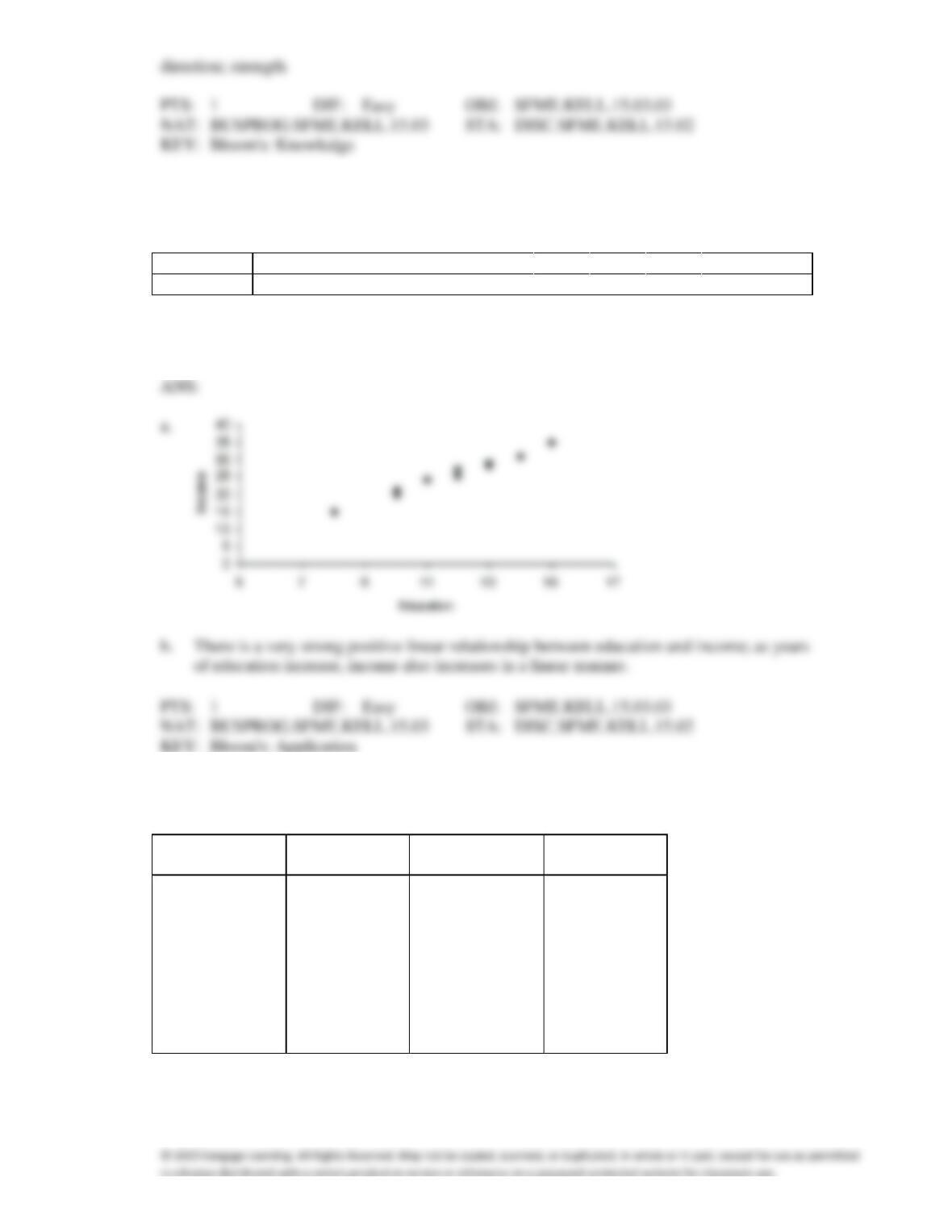
Draw a scatter diagram for these data with the income on the vertical axis.
b.
Describe the relationship between income and education.
of education increase, income also increases in a linear manner.
81. The number of houses sold in Miami Springs and the average monthly mortgage rates for 18 months
randomly selected between January 2011 and April 2013 are shown in the following table.
Mortgage rate
Number of
Mortgage rate
Number of
(%)
houses sold
(%)
houses sold
7.5
90
9.5
68
9.0
72
6.5
97
7.0
89
8.0
79
10.5
62
9.0
75
10.0
58
10.5
53
9.5
70
9.5
73
8.5
74
11.0
50
10.0
65
7.5
82
11.0
51
8.5
70
a.
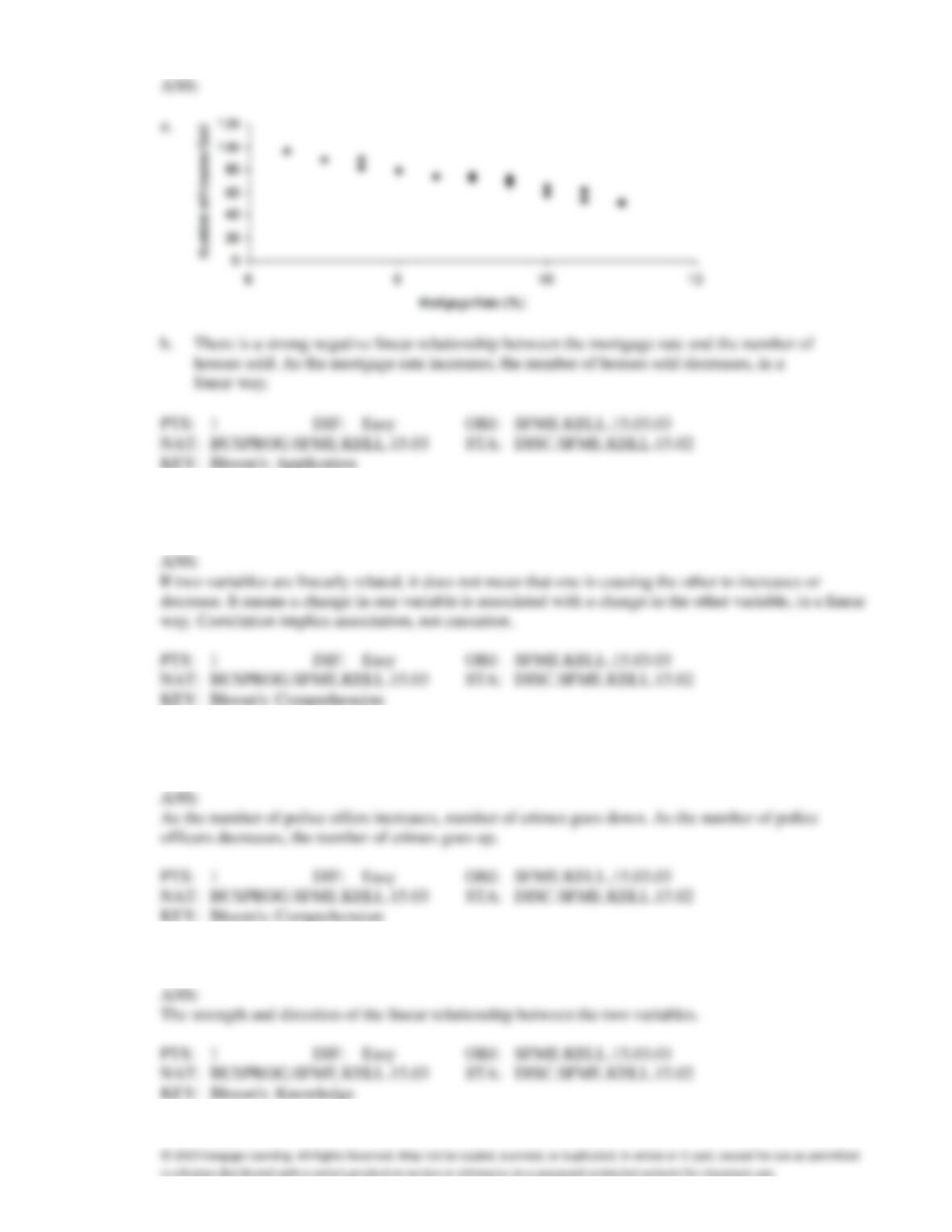
Draw a scatter diagram with the number of houses sold on the vertical axis.
b.
Describe the relationship between mortgage rate and number of houses sold.
82. Briefly explain the difference between correlation and causation in terms of a relationship between X
and Y.
83. It is speculated that the number of police officers has a negative linear relationship with number of
crimes. Explain why this might be so.
84. What are the two most important characteristics to look for in a scatter diagram?
85. Can a scatter diagram be used to explore the relationship between two nominal variables? Explain why
or why not.
86. Graphical techniques should not be used to present data if accurate tabular forms for the same data are
available.
87. Graphical excellence gives the greatest number of ideas in the shortest time with the least ink in the
smallest space.
88. Graphical excellence is nearly always univariate.
89. The techniques of shrinking the horizontal axis or stretching the vertical axis have the effect of making
the slope of the graph visually (but not numerically) steeper.
90. Graphical excellence is a term usually applied to techniques that are informative and concise and that
impart information clearly to their viewers.
91. A popular method of creating distorted impressions with bar charts is to construct the bars so that their
widths are proportional to their heights.
92. If the form of the graph replaces the substance of the data, the graph is performing to function and
graphical excellence is achieved.
93. A pie chart uses relative frequencies to summarize the data so including the sample size is not
important.
94. The scale used on a bar chart does not affect the way the bar chart looks.
95. A line chart showing the number of crimes in Las Vegas from 2000 to 2005 may exhibit a totally
different trend than a line chart showing the crime rate in Las Vegas from 2000 to 2005. (Crime rate is
defined as number of crimes per 100,000 people.)
96. A pie chart showing 80% yes and 20% no would look the same whether it was based on 10,000
observations or 10 observations. This is one way that pie charts can be deceptive.
97. A bar chart can be made to look deceptive if the Y-axis starts at a number other than zero.
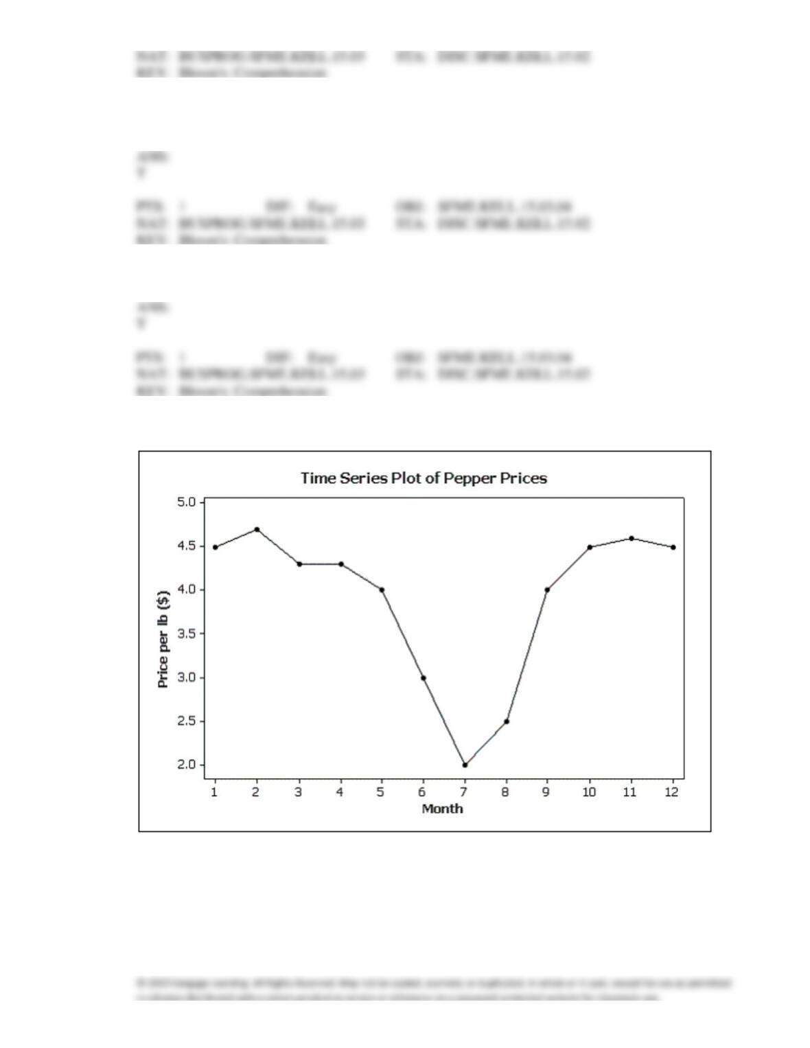
98. The following graph shows pepper prices throughout a 12-month period.
Suppose you made a new graph of the same data, where the maximum value on the Y-axis was
changed from 5.0 to 10.0. (Assume everything else stays the same.)
Your new graph would appear to have ____ variability in pepper prices compared to the original
graph shown above.
a.
more
b.
less
c.
the same
d.
unknown
99. The effect of making the slope of a line chart appear steeper can be created by:
a.
Stretching the vertical axis.
b.
Shrinking the horizontal axis.
c.
Stretching the horizontal axis.
d.
Both a and b
100. Which of the following is a characteristic of graphical excellence?
a.
Data sets are summarized in tables wherever possible.
b.
The graph includes no more than one variable, to stress clarity.
c.
The substance of the data, and not the form of the graph, is stressed.
d.
All of these choices are true.
101. Possible methods of graphical deception include:
a.
A graph without a scale on one axis.
b.
A graph’s caption that influences the impression of the viewer.
c.
A graph where absolute changes, rather than percentage changes, are reported.
d.
All of these choices are true.
102. Possible methods of creating distorted impressions with bar charts include:
a.
Stretching the vertical axis.
b.
Shrinking the horizontal axis.
c.
Constructing the bars so that their widths are proportional to their heights.
d.
All of these choices are true.
103. Which of the following statements is true?
a.
Graphical techniques should only be used where there is a small amount of data.
b.
Large data sets are best presented in tabular form.
c.
Graphical techniques create a visual impression, which is easy to distort.
d.
All of these choices are true.
104. Which of the following characteristics apply to achieve graphical excellence?
a.
The graph encourages the viewer to compare two or more variables.
b.
The display induces the viewer to address the substance of the data and not the form of the
graph.
c.
There is no distortion of what the data reveal.
d.
All of these choices are true.
105. Which of the following statements illustrates graphical deception?
a.
Absolute changes, rather than percentage changes are reported.
b.
To reduce clutter, the scales of the axes are not shown.
c.
The Y-axis is stretched or shrunk to show the data in their best possible light.
d.
All of these choices are true.
106. You are less likely to be misled by a graph if you:
a.
Concentrate on the numbers rather than the form of the graph.
b.
Pay more attention to the graph’s caption than to the graph itself.
c.
Ignore the scales used on the axes.
d.
None of these choices.
107. Is it fair to depict Texas as most tornado prone area of the U.S. by showing it has the highest number
of tornados of all states in the U.S.?
a.
Yes, because number of tornadoes is the appropriate measure in this situation.
b.
Yes, because Texas is one of the largest states.
c.
No, because Texas is larger than almost every other state. Number of square miles should
also be taken into account.
d.
No, because Texas has a very high population, and you need to report tornados per capita.
108. A(n) ____________________ is best defined as a set of symbols (such as people or animals) used to
depict data. It often distorts the actual sizes of the items being portrayed.
109. Differences in the frequencies of a histogram appear to be less dramatic if you
____________________ the vertical axis.
110. Differences in the frequencies of a histogram appear to be more dramatic if you
____________________ the vertical axis.
111. The number of crimes per capita is known as the crime ____________________. It is a fairer way to
represent and compare crimes from year to year or place to place.
112. Pie charts only show ____________________, not ____________________. This means you don’t
know what the sample size is unless it is stated on the pie chart.
113. Slopes and trends in a line chart appear to be less steep if you ____________________ the horizontal
(time) axis.
114. Slopes and trends in a line chart appear to be steeper if you ____________________ the horizontal
(time) axis.
115. A graph showing trends over time is called a(n) ____________________ chart.
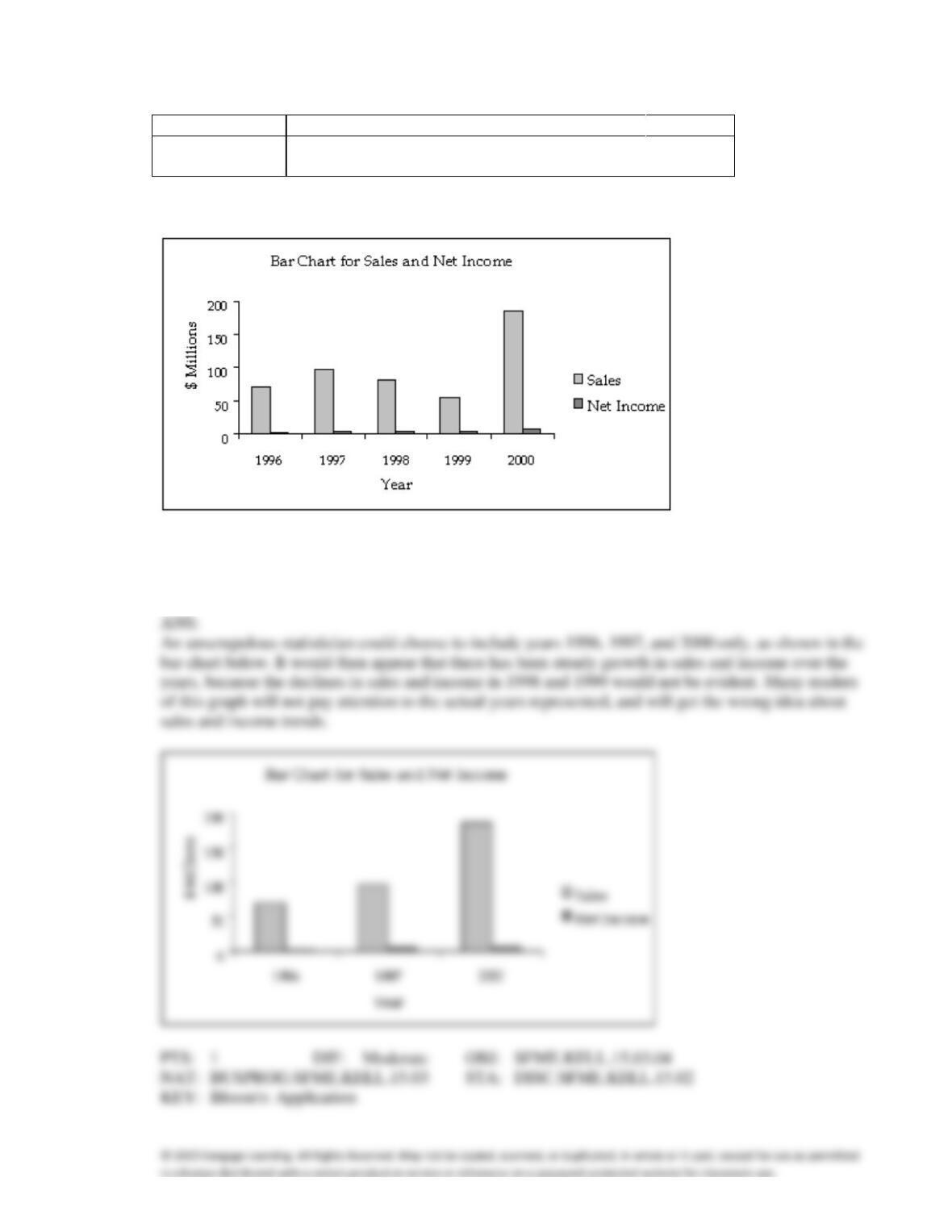
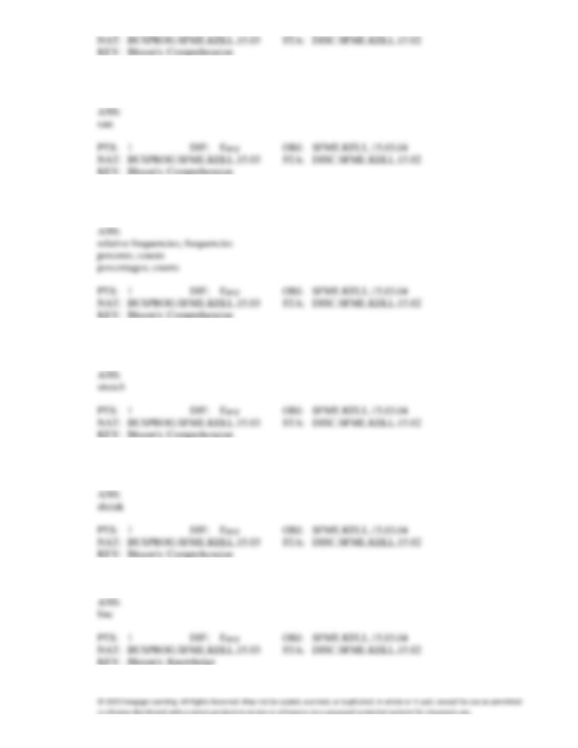
116. In its 2000 report, a company presented the following data regarding its sales (in millions of dollars),
and net income (in millions of dollars).
Year
1996
1997
1998
1999
2000
Sales
70
97
80
55
185
Net Income
1.6
5.2
4.1
2.4
7.1
The bar chart below was used to present these data.
Assume that you are an unscrupulous statistician and want to make the data appear more positive than
they really are. Redraw the graph by being selective about which years to include, getting the desired
effect.
Admission to ER
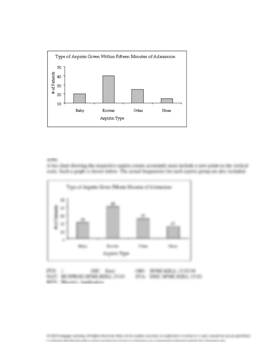
The following bar chart shows the type of aspirin (if any) given to 100 cardiac patients within 15
minutes of their admission to the emergency room.
117. {Admission to ER Narrative} Notice that the Y-axis of the bar chart does not start at a frequency of
zero. Create a new bar chart of the displayed data that accurately displays the frequency for each
aspirin type.
118. {Admission to ER Narrative} In what way does the original bar chart distort the data as compared to a
bar chart that starts at zero on the Y–axis (frequency axis)?
ANS:
Credit Hours
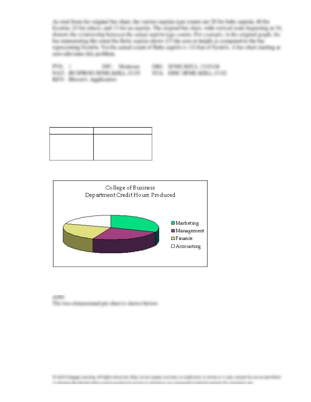
The College of Business at The State University of California produced 3,400 credit hours during
Spring Semester, 2011he number and percentage of credit hours produced by each of the four
departments in the College of Business is shown below.
Department
Percent
Count
Marketing
35.3
1,200
Management
23.5
800
Finance
23.5
800
Accounting
17.6
600
The following three-dimensional pie chart was constructed from the table above.
119. {Credit Hours Narrative} Construct a two-dimensional pie chart showing the percentages of credit
hours produced by the four departments.
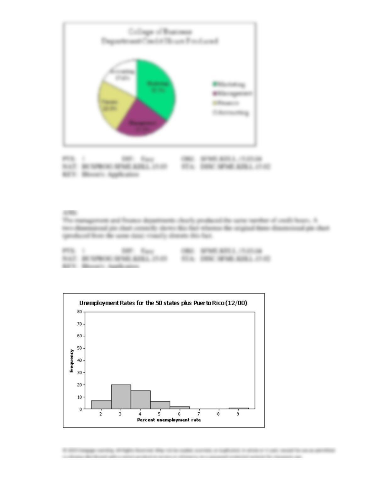
120. {Credit Hours Narrative} In what way does the original three-dimensional pie chart distort the data,
compared to a two-dimensional pie chart?
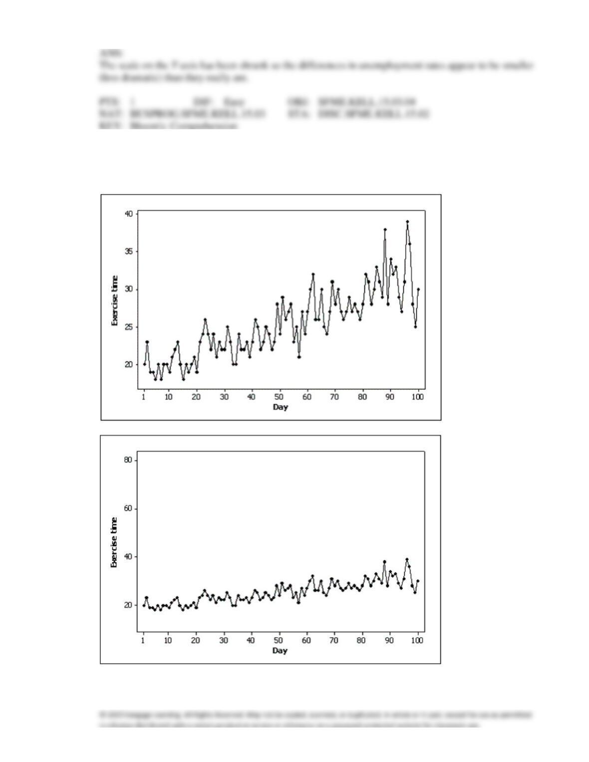
121. Briefly explain why the histogram below is misleading.
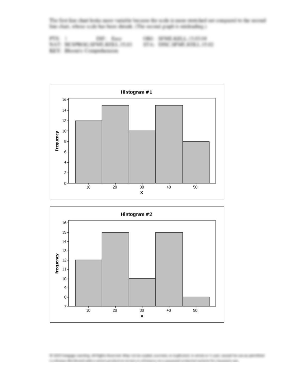
122. Samantha recorded her amount of exercise time (in minutes) for 100 days. Both of the line charts
below were created based on her same data set. Which line chart makes her exercise times look more
variable and why?
ANS:
Home Care
Data are collected on the number of house calls (x) made in a given week by each of 60 nurses in a
certain hospital. The same data set is displayed in each of the three histograms below.
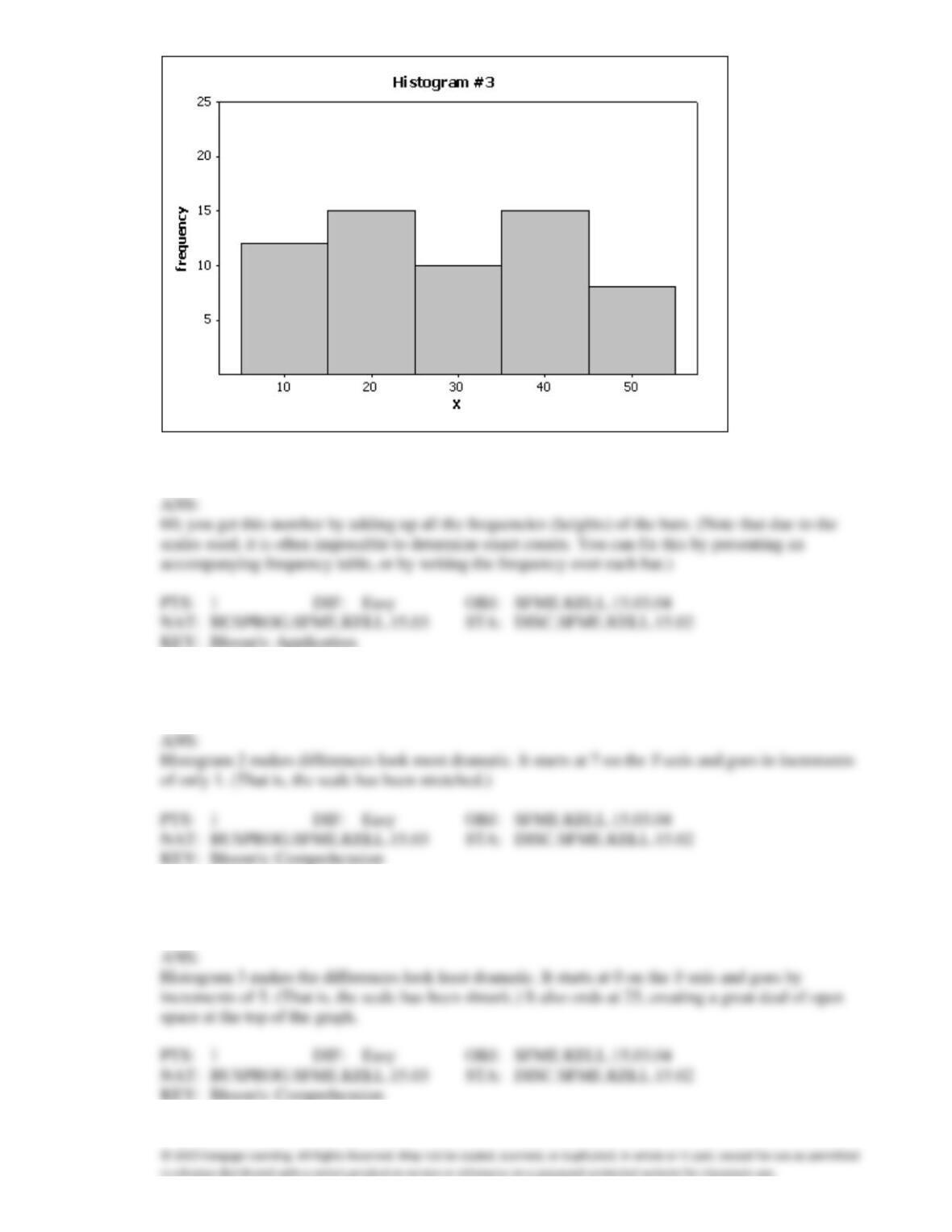
123. {Home Care Narrative} How many nurses are there in this hospital?
124. {Home Care Narrative} Which histogram makes the differences in the house calls appear to be the
most dramatic?
125. {Home Care Narrative} Which histogram makes the differences in the house calls appear to be the
least dramatic?
126. {Home Care Narrative}Which graph do you think is the most appropriate display? Justify your
answer.
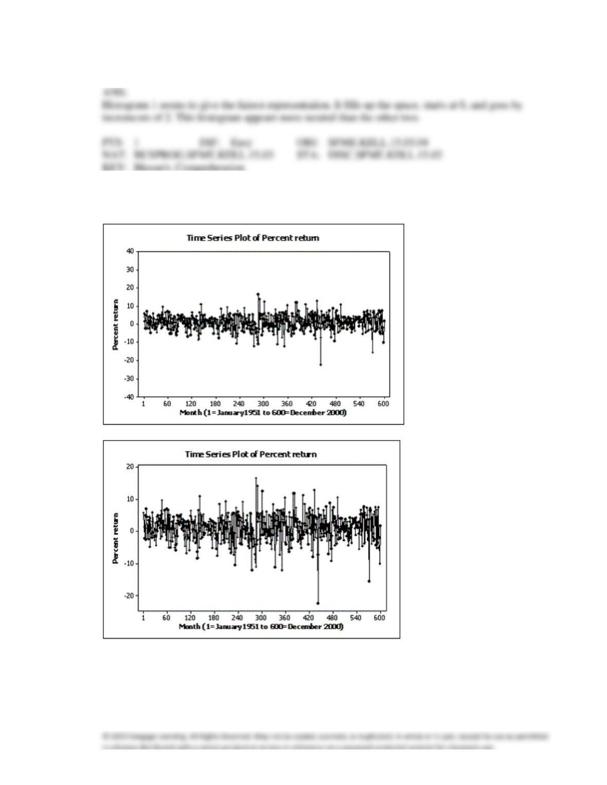
127. Below are two line charts where the percentage return for a stock is shown over time. The two graphs
are made from the same data set.
Explain why these two line charts look different.
ANS:
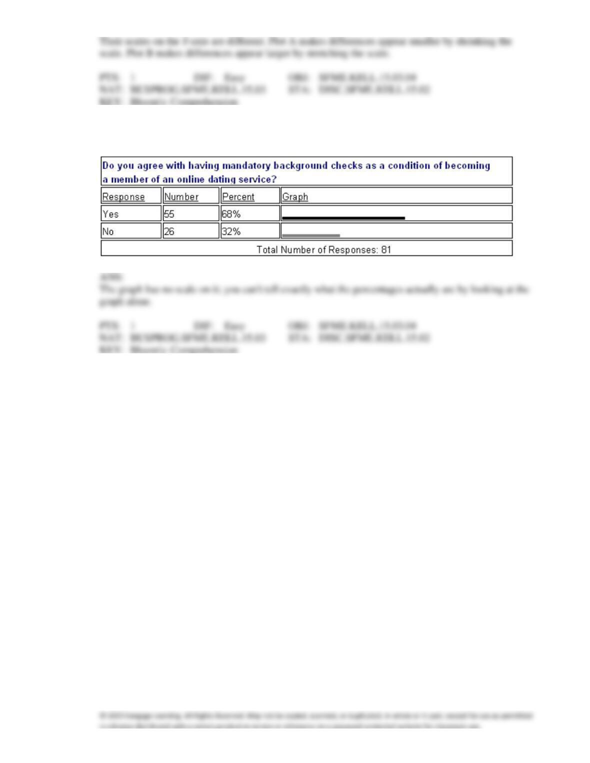
128. An online dating service has a quick poll on its website showing the following results. Critique the
graph portion of the table. How can it be improved?