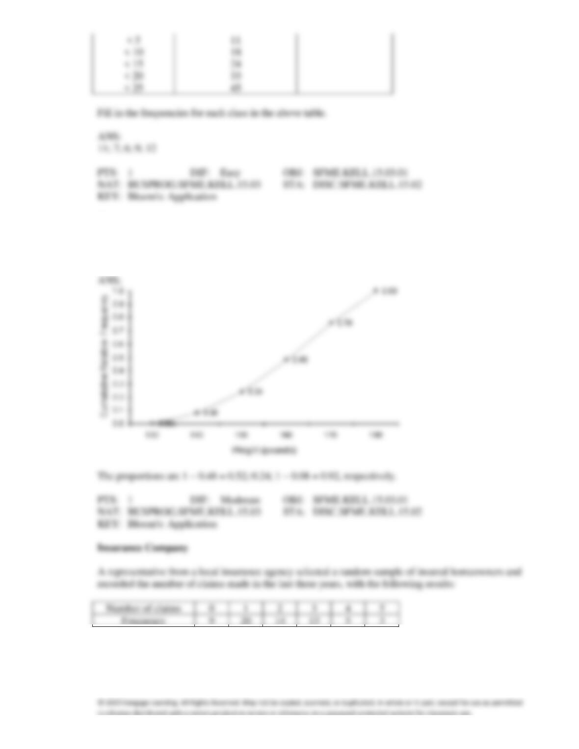
16. The weights of a sample of 25 workers are given (in pounds): 164, 148, 137, 157, 173, 156, 177, 172,
169, 165, 145, 168, 163, 162, 174, 152, 156, 168, 154, 151, 174, 146, 134, 140, and 171. Construct an
ogive for the data. What proportion of the worker’s weights are between 160 and 180 pounds; below
150 pounds; and at or above 140 pounds, respectively?
17. {Insurance Company Narrative} How many homeowners are represented in the sample?
ANS:
18. {Insurance Company Narrative} How many total claims are represented in the sample?
19. {Insurance Company Narrative} What proportion of homeowners had no claims in the last three
years?
20. {Insurance Company Narrative} What number of claims was made by the highest proportion of
homeowners?
Electronics Company
At a meeting of regional offices managers of a national electronics company, a survey was taken to
determine the number of employees the regional managers supervise in the operation of their
departments. The results of the survey are shown below.
Number of employees supervised
1
2
3
4
5
Frequency
7
11
14
8
10
21. {Electronics Company Narrative} How many regional offices are represented in the survey results?
22. {Electronics Company Narrative} Across all of the regional offices, how many total employees were
supervised by those surveyed?
23. {Electronics Company Narrative} What proportion of managers supervise 3 employees?
24. {Electronics Company Narrative} What is the cumulative relative frequency corresponding to 4
employees?
Internet Classes
A survey of 25 students was conducted to determine how they rate the quality of Internet classes.
Students were asked to rate the overall quality from 0 (no quality at all) to 100 (extremely good
quality). The stem-and-leaf display of the data is shown below.
Stem
Leaves
3
15
4
01457889
5
0134677
6
24568
7
29
8
9
5
25. {Internet Classes Narrative} What percentage of the students rated the overall quality of Internet
classes as being 70 or above?
26. {Internet Classes Narrative} What percentage of the students rated the overall quality of Internet
classes as being 60 or below?
27. {Internet Classes Narrative} What percentage of the students rated the overall quality of on-line
classes as being between 50 and 75, inclusive?
28. {Internet Classes Narrative} What percentage of the students rated the overall quality of on-line
classes as being below 40?
29. A line chart is created by plotting the values of the variable on the vertical axis and the time periods on
the horizontal axis.
30. Time series data are often graphically depicted on a line chart, which is a plot of the variable of interest
over time.
31. A line chart that is flat shows no fluctuation in the variable being presented.
ANS:
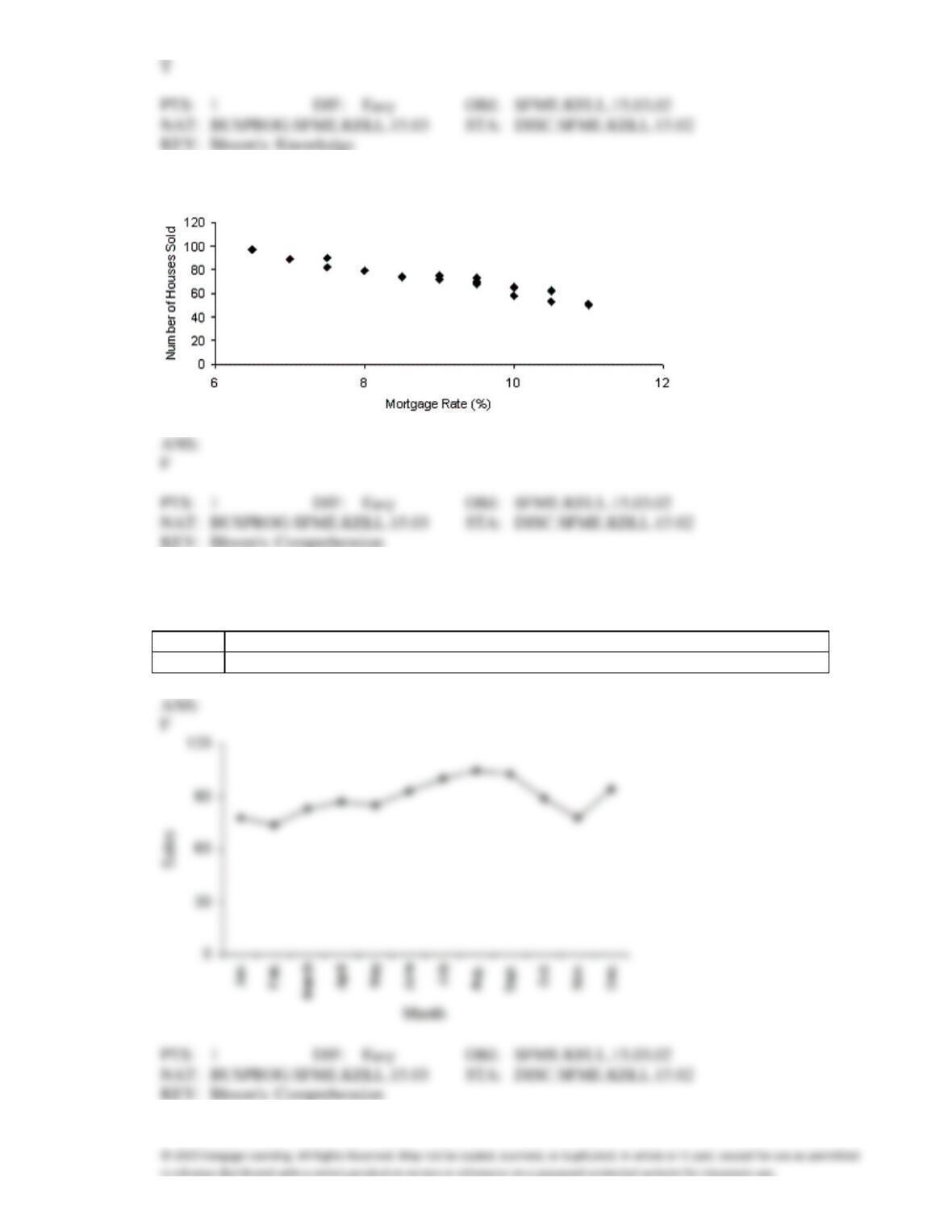
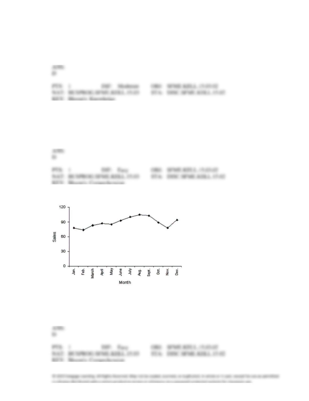
32. The graph below represents a line graph.
33. A department store’s monthly sales (in thousands of dollars) for the last year were as follows. A
histogram should be used to present these data.
Month
1
2
3
4
5
6
7
8
9
10
11
12
Sales
78
74
83
87
85
93
100
105
103
89
78
94
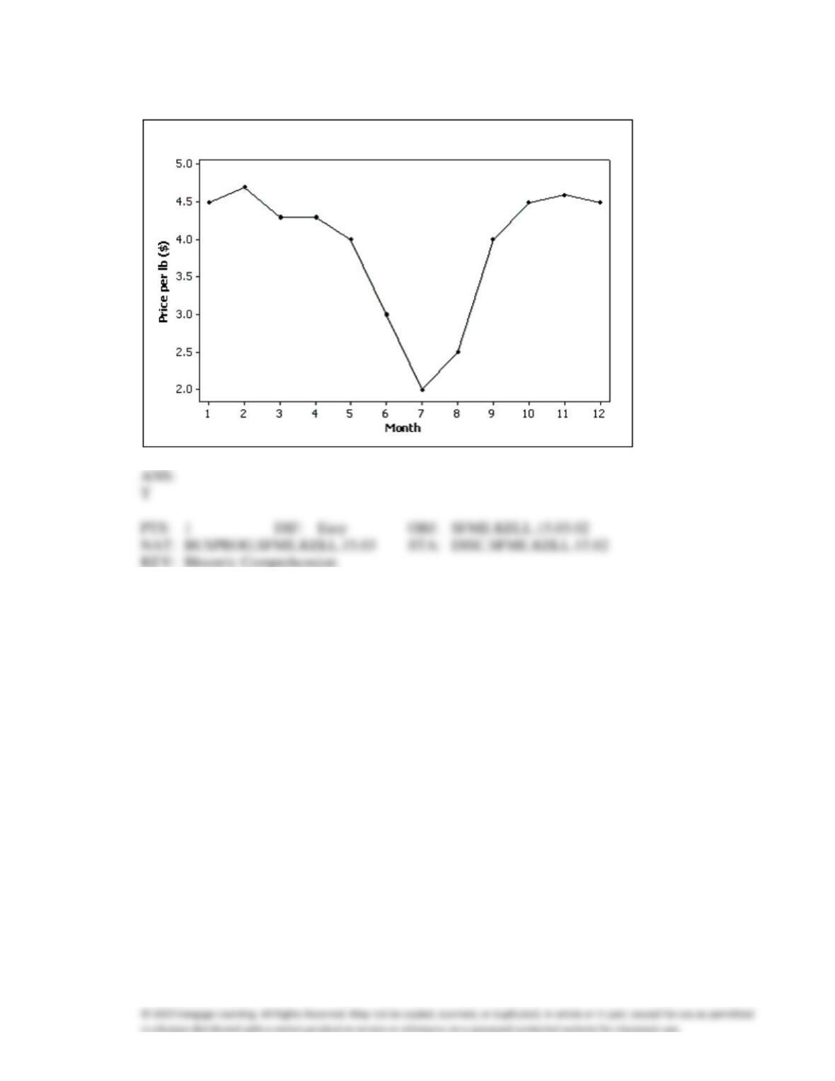
34. The line chart below shows tomato prices each month from January (month 1) to December last year
($ per pound). By looking at this chart you can see the lowest tomato prices occurred in July.
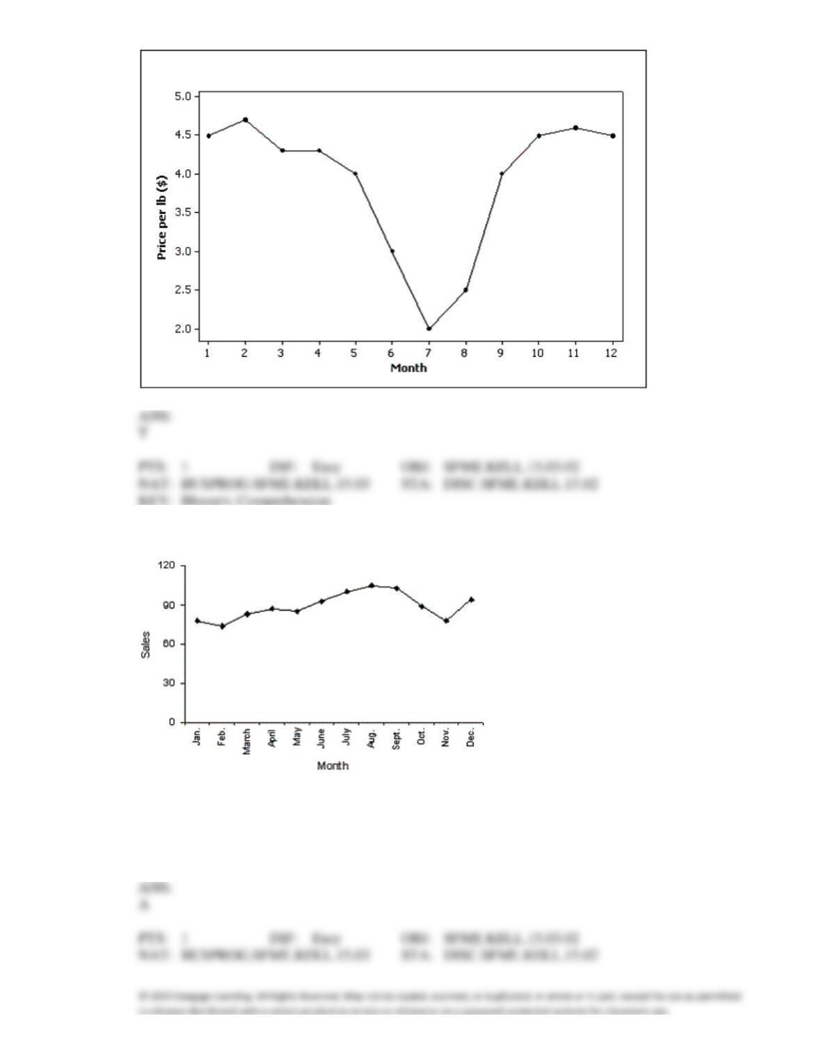
35. The line chart below shows cucumber prices fluctuated from $2.00 per pound to over $4.50 per pound
during the year.
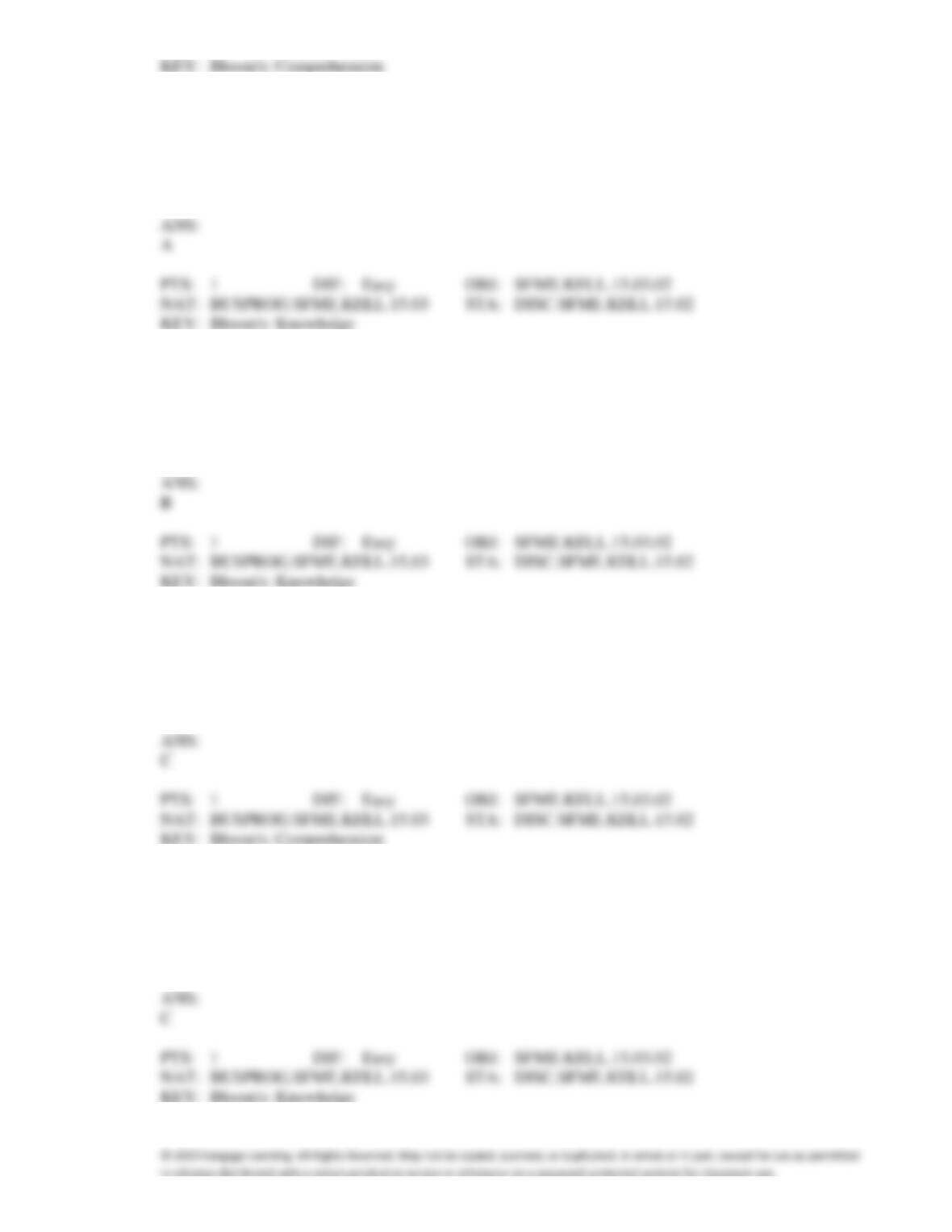
36. What type of graph depicts the data below?
a.
A line chart
b.
A histogram
c.
A dot plot
d.
A bar chart
37. Observations that are measured at successive points in time is what type of data?
a.
Time-series data
b.
Cross-sectional data
c.
Successive data
d.
None of these choices.
38. Observations that are measured at the same time represent what type of data?
a.
Time-series data
b.
Cross-sectional data
c.
Synchronous data
d.
None of these choices.
39. Which of the following represents time-series data?
a.
The length of time each of the top 100 stocks have been available on the NYSE.
b.
The most popular time of year that people purchase the top 100 stocks on the NYSE.
c.
The value of the #1 stock on the NYSE each month over a one-year period.
d.
All of these choices are true.
40. Time-series data are often graphically depicted how?
a.
Bar chart
b.
Histogram
c.
Line chart
d.
All of these choices are true.
41. Which of the following statements describes a line chart?
a.
A line chart is a graph of time-series data.
b.
A line chart is a plot of a variable over time.
c.
The horizontal axis of a line chart contains time periods.
d.
All of these choices are true.
42. What kind(s) of data can be depicted by a line chart?
a.
Frequencies of an interval over time.
b.
Frequencies of a nominal variable over time.
c.
Relative frequencies of a nominal variable over time.
d.
All of these choices are true.
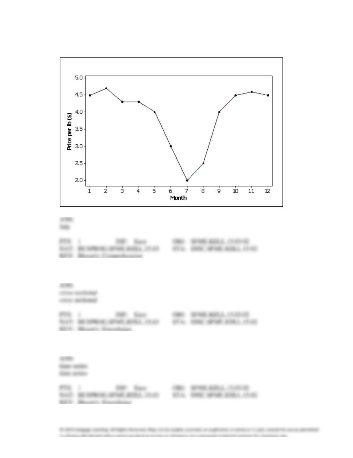
43. Which of the following statements describe(s) the line chart below?
a.
November experienced the lowest sales throughout the year.
b.
August experienced the highest sales throughout the year.
c.
Sales did not fluctuate more than 30 units on either side of 90.
d.
All of these choices are true.
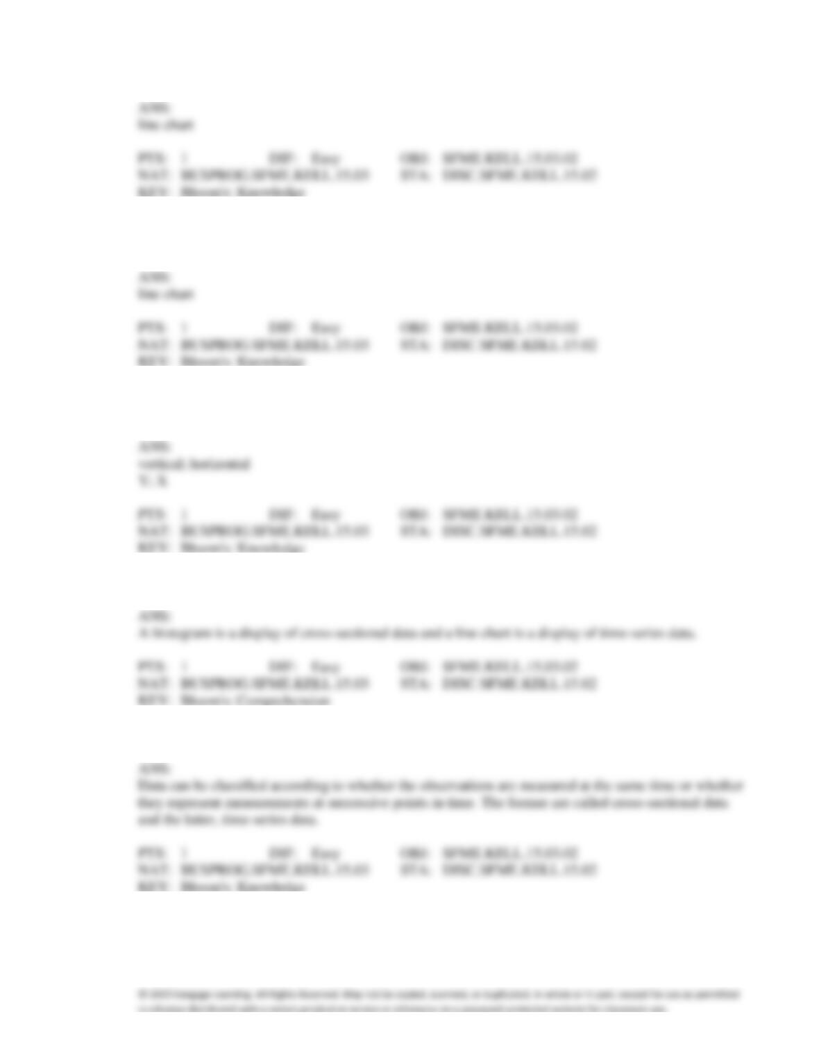
44. The line chart below shows potato prices per pound for each month from January (month 1) to
December last year. By looking at this chart you can see the lowest potato prices occurred in
____________________.
45. Observations that are measured at the same time are called ____________________ data.
46. Observations that are taken during successive points in time are called ____________________ data.
47. Time series data are often graphically depicted on a(n) ____________________, which is a plot of the
variable of interest over time.
48. A(n) ____________________ is created by plotting the value of the variable on the vertical axis and
the time periods on the horizontal axis.
49. A line chart is created by plotting the value of the variable on the ____________________ axis and the
time periods on the ____________________ axis.
50. Explain the difference between a histogram and a line chart.
51. Briefly discuss the difference between cross-sectional data and time-series data.
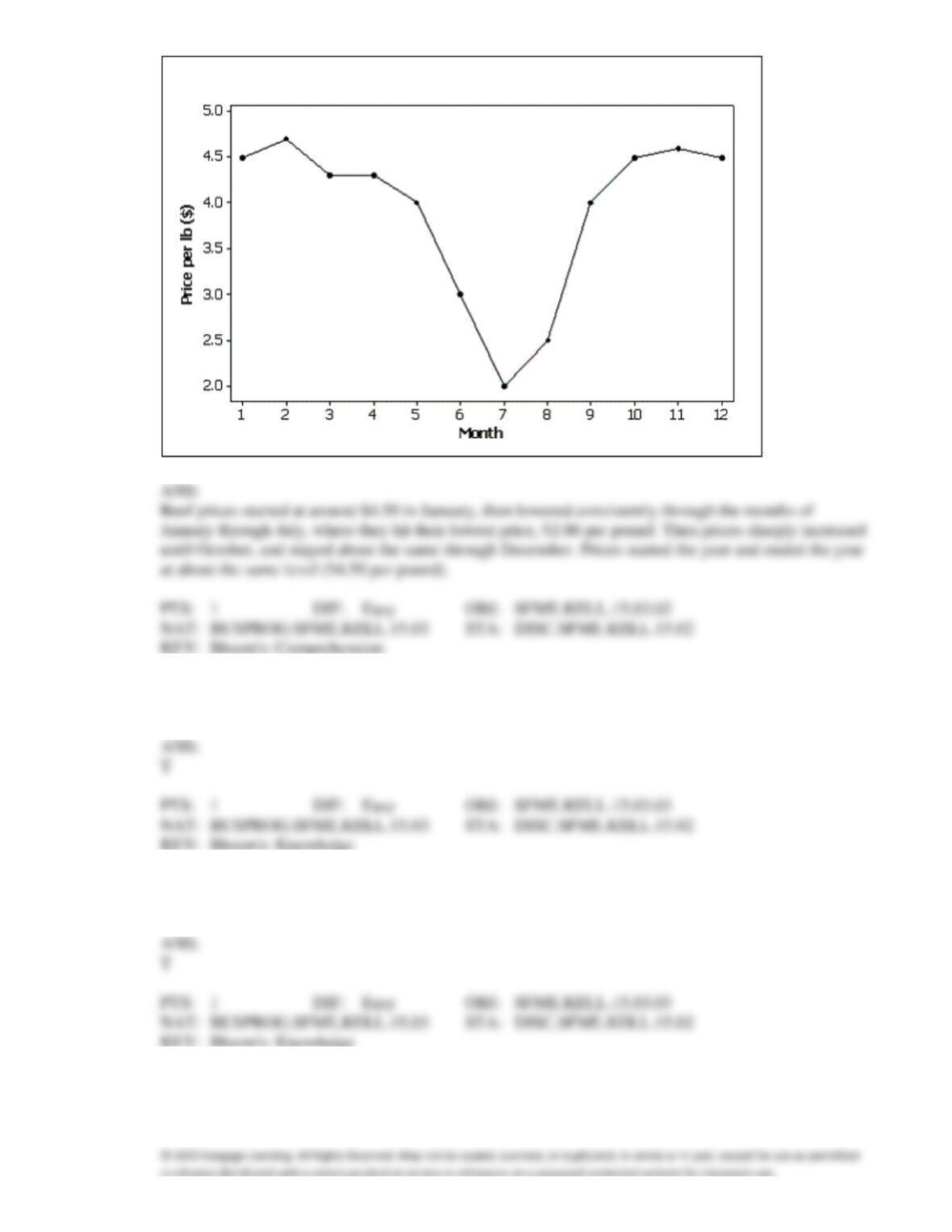
52. Beef prices throughout the year (month 1 = January) are shown in the line chart below (per pound).
Describe beef prices for this given year using this line chart.
53. The graphical technique used to describe the relationship between two interval variables is the scatter
diagram.
54. The two most important characteristics revealed by the scatter diagram are the strength and direction
of the linear relationship.
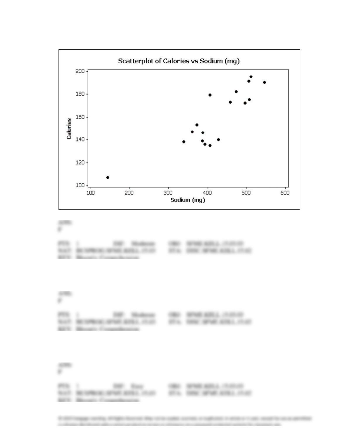
55. Data for calories and salt content (milligrams of sodium) in 17 brands of meat hot dogs are shown in
the scatter diagram below. According to this diagram, it appears that hot dogs that are high in sodium
are generally low in calories, and hot dogs with low sodium are generally high in calories.
56. If we draw a straight line through the points in a scatter diagram and most of the points fall close to the
line, there must be a positive relationship between the two variables.
57. The two most important characteristics to examine in a scatter diagram are the number of possible
categories for X and Y and the number of observations in each category.
58. When two variables are linearly related, and tend to move in opposite directions, we describe the
nature of their association as a negative linear relationship.
59. Correlation implies causation.
60. If two variables have a strong linear relationship, that means one variable is causing the other variable
to go up or down.
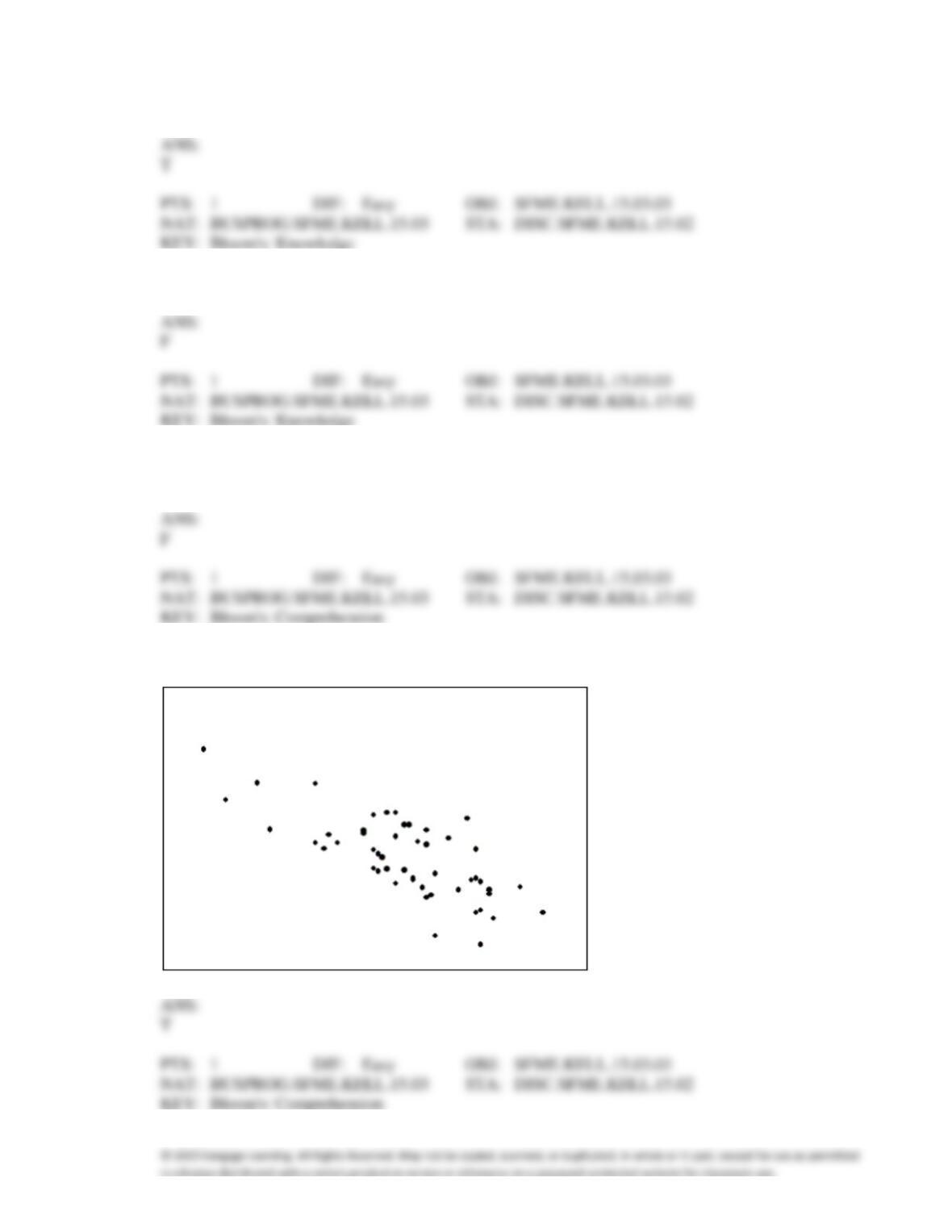
61. The scatter diagram below depicts data with a negative linear relationship.
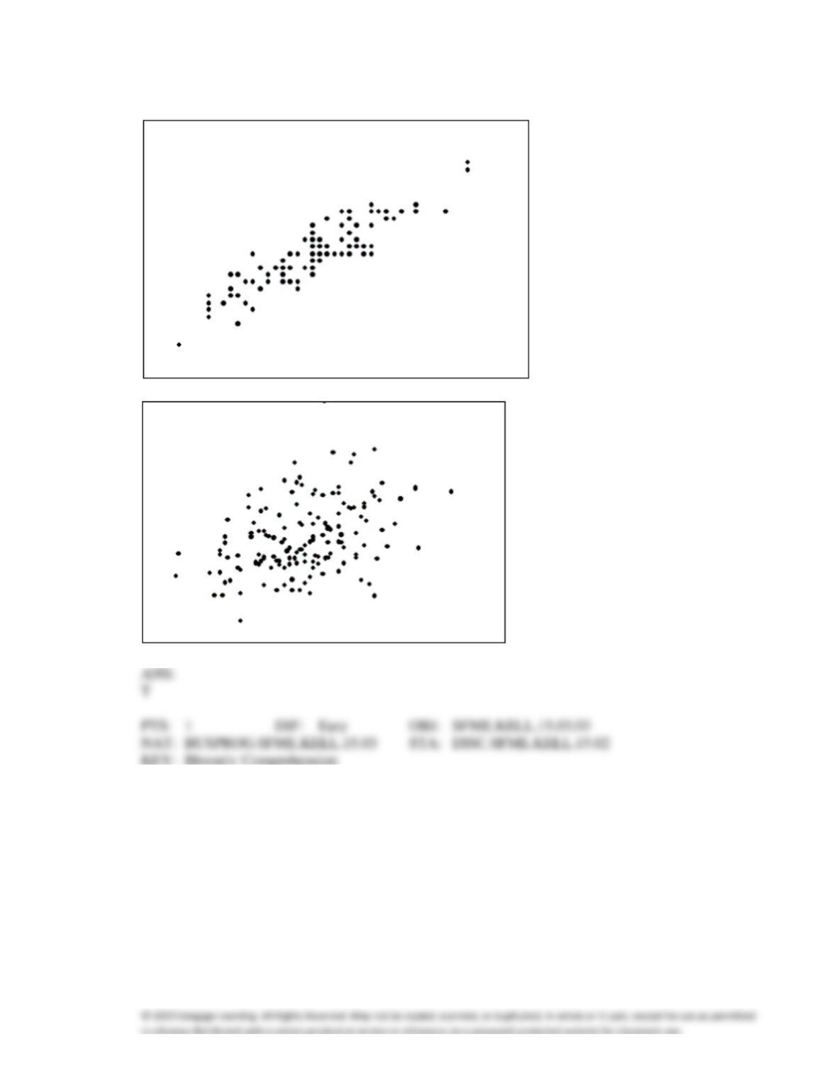
62. The first scatter diagram below shows a stronger linear relationship than the second scatter diagram.
(Assume the scales on both scatter diagrams are the same.)
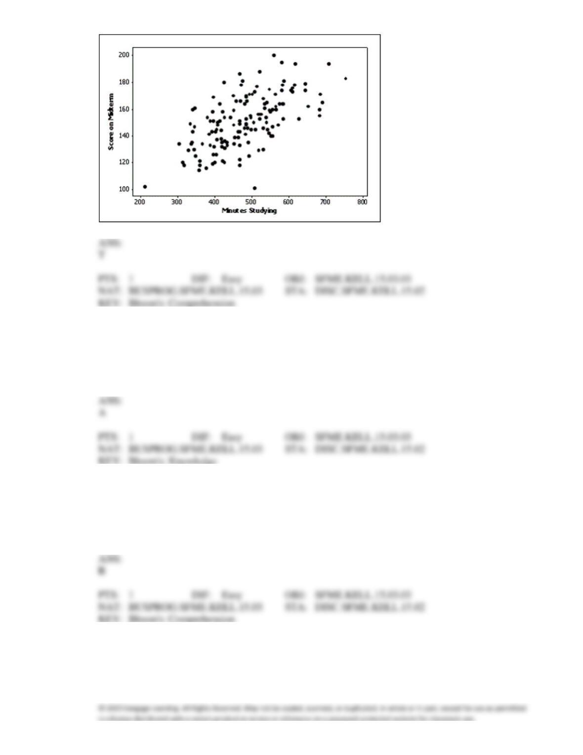
63. A professor examines the relationship between minutes studying and exam score (out of 200 points)
for a random sample of his students. The scatter diagram is shown below. It appears that study time
has somewhat of a positive linear relationship with exam score.
64. The relationship between two interval variables is graphically displayed by a
a.
scatter diagram
b.
histogram
c.
bar chart
d.
pie chart
65. In order to draw a scatter diagram, we need interval data for
a.
one variable
b.
two variables
c.
three variables
d.
four variables
66. Which of the following statements is false?
a.
You can examine the relationship between two nominal variables using a
cross-classification table.
b.
You can only apply statistical techniques to one variable at a time.
c.
You can examine the relationship between two interval variables using a scatter diagram.
d.
None of these choices.
67. How do you determine whether two interval variables have a positive linear relationship?
a.
Most of the points fall close to a straight line with positive slope.
b.
As the X variable increases, the Y variable increases in a linear way.
c.
The scatter diagram shows a linear pattern that is going uphill.
d.
All of these choices are true.
68. If the data in a scatter diagram is scattered completely at random, what do you conclude?
a.
There is no linear relationship between X and Y.
b.
There is a strong linear relationship between X and Y.
c.
There is a strong linear relationship between X and Y that is described by a horizontal (flat)
line.
d.
None of these choices.
69. Which of the following is the method statisticians use to draw the best fitting straight line through the
data on a scatter diagram?
a.
The fit best method.
b.
The least squares method.
c.
The point-intercept method.
d.
None of these choices.
70. Which of the following describes a positive linear relationship between X and Y?
a.
As the X values increase, the Y values increase in a linear manner.
b.
As the X values decrease, the Y values decrease in a linear manner.
c.
The X and Y values move uphill together in a linear manner.
d.
All of these choices are true.
71. When two variables tend to move in opposite directions, yet still form a linear pattern, how do you
describe their relationship?
a.
A positive linear relationship.
b.
A negative linear relationship.
c.
A proportional inverse relationship.
d.
None of these choices.
72. In applications involving two variables, X and Y, where one variable depends to some degree on the
other, we call Y the ____________________ variable.
73. In applications involving two variables, X and Y, where one variable depends to some degree on the
other, we call X the ____________________ variable.
74. A(n) ____________________ is a graphical display consisting of a set of points, each point
representing one variable measured along the horizontal axis, and another variable measured along the
vertical axis.
75. If when one variable increases the other one also increases, we say that there is a(n)
____________________ relationship between these two variables.
76. When one variable increases and the other decreases, we say that there is a(n) ____________________
relationship between these two variables.
77. An individual’s income depends somewhat on their number of years of education. Accordingly, we
identify income as the ____________________ variable, and years of education as the
____________________ variable.
78. One of the variables used to help predict unemployment rates is the rate of inflation. Accordingly, we
identify rate of inflation as the ____________________ variable, and unemployment rate as the
____________________ variable.
79. The two most important characteristics to look for in a scatter diagram are the
____________________ and ____________________ of the linear relationship.