41. When estimating the population standard deviation, you typically use the sample standard deviations.
However, for a variety of reasons, statistical process control frequently uses the
____________________ instead of the standard deviation.
42. To construct a chart, estimate the mean of the process distribution using the mean of the sample
means, denoted by: ____________________.
43. To estimate the standard deviation of a process distribution, we calculate the sample variance for each
sample collected. Then we compute the ____________________ standard deviation, denoted by S.
44. Statistical process control allows us to detect ____________________ variation only.
45. Chance variation ____________________ product quality and ____________________ costs.
46. If a control chart finds fourteen points in a row that are alternating up and down, this is an example of
assignable variation called a(n) ____________________.
47. If a control chart finds six increasing or six decreasing points in a row, this is an example of assignable
cause variation called a(n) ____________________.
48. If a control chart finds the standard deviation in the means is increasing, this could be an indicator of
assignable variation called ____________________.
49. If your control chart found a series of points all lying within 3 standard errors above the center line,
and none lying below the centerline, this could be an indication of assignable variation due to a(n)
____________________.
40 Samples Production
The mean of the sample means and the pooled standard deviation of 40 samples of size 8 taken from a
production process under control are , and S = 14.5, respectively.
50. {40 Samples Production Narrative} Calculate the centerline and control limits for the chart.
ANS:
51. {40 Samples Production Narrative} Compute the zone boundaries for the chart.
ANS:
—————————
B
C
————————–
C
B
————————–
————————–
25 Samples Production
25 samples of size 4 were taken from a manufacturing process. The mean of the sample means and the
pooled standard deviation are , and S = 3.5, respectively. The sample means are listed below.
Sample
1
2
3
4
5
6
7
8
9
10
11
12
13
15.1
10.9
17.6
10.0
13.8
9.9
17.7
6.1
5.9
16.9
11.1
12.1
9.4
Sample
14
15
16
17
18
19
20
21
22
23
24
25
13.2
11.1
16.9
9.3
10.0
12.0
18.2
21.1
21.7
16.9
19.1
21.5
52. {25 Samples Production Narrative} Find the centerline and control limits for the chart.
53. {25 Samples Production Narrative} Plot the sample means on the chart.
54. {25 Samples Production Narrative} Is the process under control? Discuss.
30 Samples Production
Thirty samples of size 4 were drawn from a production process. The data are shown below.
Sample
Production Process Data
1
52.80
43.32
56.48
54.85
2
44.10
54.18
52.08
45.84
3
45.22
52.70
54.89
55.99
4
55.14
54.82
46.91
53.91
5
43.35
55.94
63.21
53.75
6
51.87
50.27
55.51
53.98
7
51.70
50.47
48.02
51.43
8
49.56
49.57
53.75
46.44
9
49.25
57.05
41.33
53.11
10
55.43
52.29
49.95
54.36
11
48.12
52.75
57.07
50.33
12
60.76
52.92
49.42
54.92
13
54.82
51.41
44.64
45.20
14
49.49
46.08
47.67
49.00
15
43.92
53.69
44.99
51.19
16
44.13
48.27
53.41
43.57
17
58.26
55.78
50.93
51.37
18
44.24
62.19
47.20
50.80
19
54.74
51.22
54.31
53.86
20
51.99
57.71
54.75
57.28
21
45.63
51.50
51.68
43.21
22
49.02
44.98
41.27
47.75
23
49.00
49.43
41.66
50.27
24
41.15
57.19
49.27
44.97
25
51.49
53.54
49.49
44.89
26
45.47
43.93
53.93
41.29
27
35.72
53.38
41.01
44.62
28
40.61
51.22
51.11
45.03
29
54.51
46.22
45.98
43.28
30
45.49
51.37
44.17
37.68
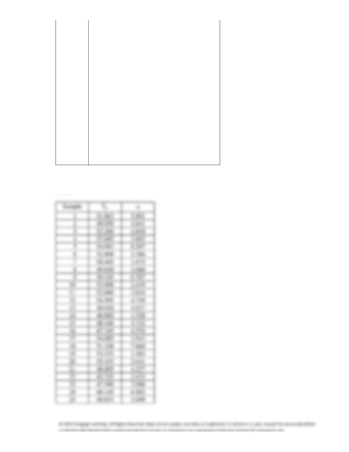
55. {30 Samples Production Narrative} Calculate the mean and standard deviation of each sample.
ANS:
5.891
4.841
4.850
3.892
8.207
2.306
1.675
3.000
6.707
10
2.419
11
3.834
12
4.749
13
4.937
14
1.528
15
4.742
16
4.554
17
3.542
18
7.860
19
1.583
20
2.641
21
4.257
22
3.433
23
3.988
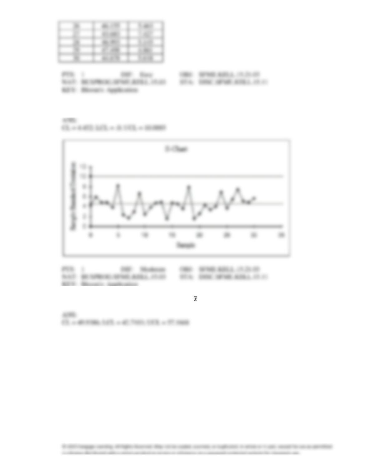
56. {30 Samples Production Narrative} Construct an S chart.
57. {30 Samples Production Narrative} Construct an chart.
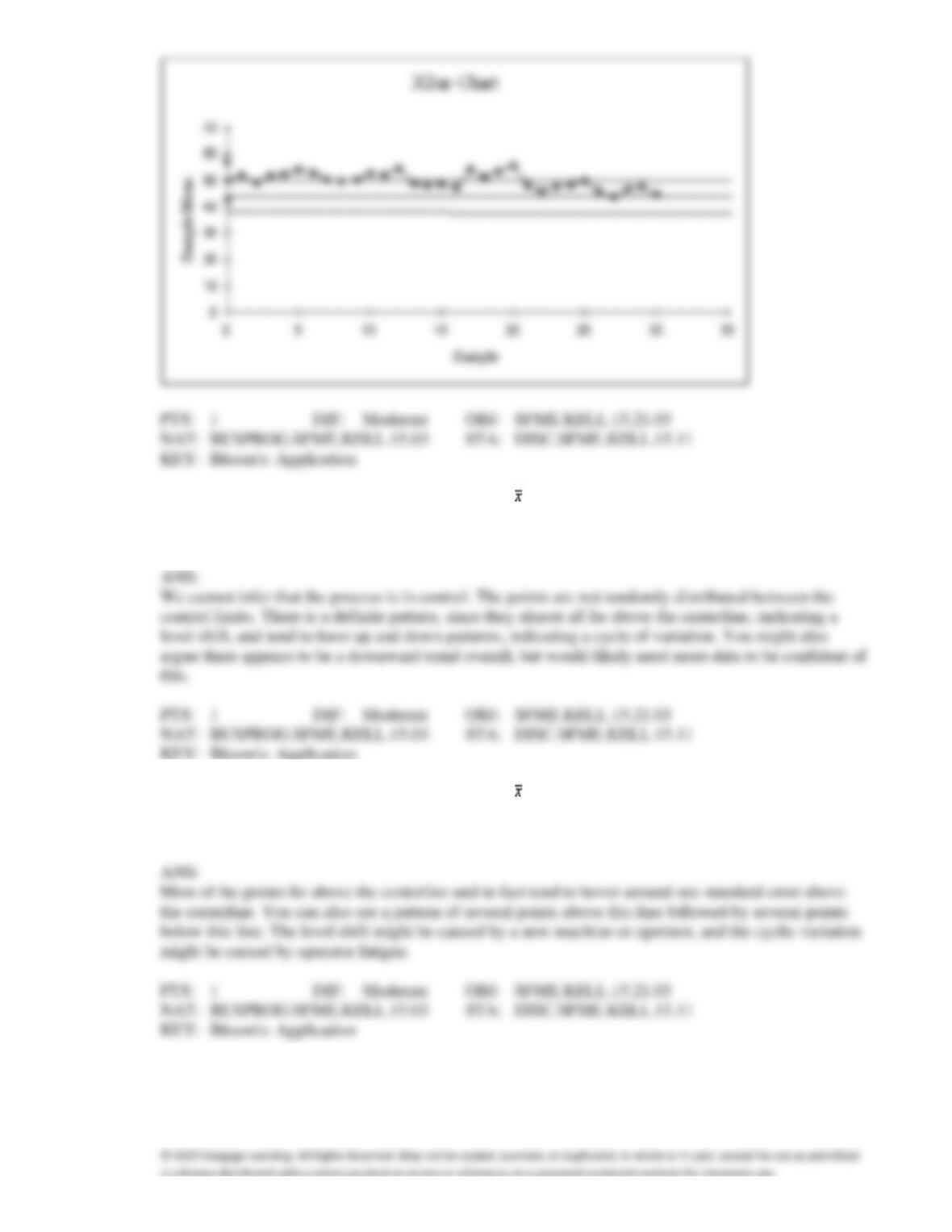
58. {30 Samples Production Narrative} Looking at the and S charts developed in a previous question,
can you infer that the process is under control? If so, explain why. If not, explain what the problems
are.
59. {30 Samples Production Narrative} Looking at the chart developed in a previous question, you see
indications of a possible level shift as well as cyclic variation. Explain how the chart shows this, and
give a possible explanation.
40 Samples Manufacturing
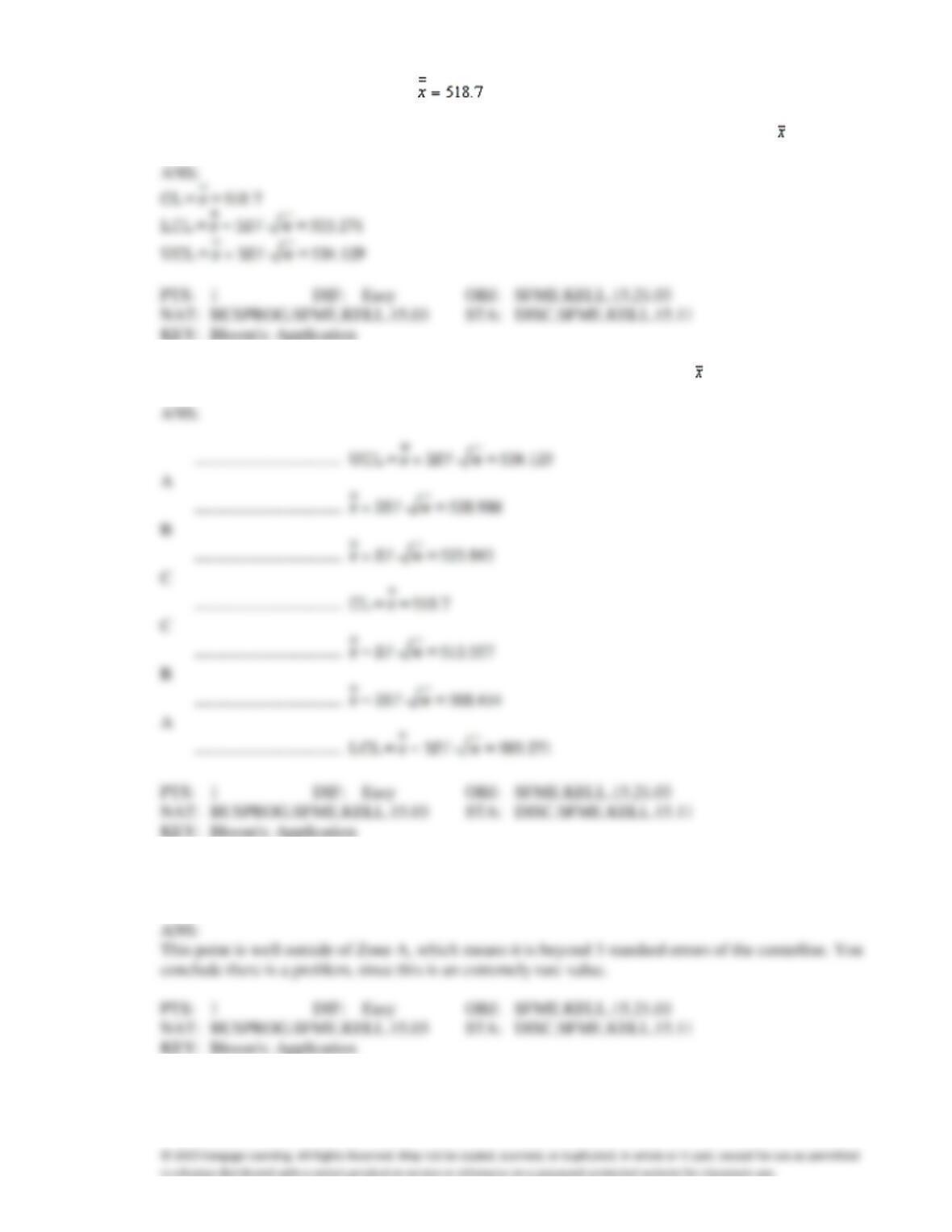
The mean of the sample means and the pooled standard deviation of 40 samples of size 5 taken from a
production process under control are , and S = 11.5, respectively.
60. {40 Samples Manufacturing Narrative} Calculate the centerline and control limits for the chart.
61. {40 Samples Manufacturing Narrative} Compute the zone boundaries for the chart.
62. {40 Samples Manufacturing Narrative} Suppose you take a sample of size 5 and find the mean to be
502.80. What do you conclude?
63. The p chart is an example of control charts for attributes.
64. Control limits for the p chart are typically placed so that they are 3 standard errors above and below
the centerline.
65. When the purpose of sampling is to detect when a process becomes too variable, the chart of choice
will be a p chart.
66. 40 samples of size 2,500 were taken from a production process that is under control. The mean of the
sample proportions of defectives was .05. The lower control limit for the 3-sigma p chart is .0369.
67. The lower control limit for the , p, and R charts must be zero or above.
68. Control charts that are used to monitor a process whose results are categorized as either defective or
non-defective are called p charts.
69. The lower and upper control limits for the p chart are based on the standard deviation of the process.
70. Sample proportions that are less than the lower control limit indicate a change in the process that we
would like to make permanent.
71. Fifty samples of size 1,000 were drawn from a manufacturing process and the number of defectives in
each sample was counted. The mean sample proportion was .05. The centerline for the p chart is 50.
72. To ensure that a manufacturing process is under control, 40 samples of size 900 were drawn, and the
number of defectives in each sample was counted. The mean of the sample proportion was .025. Then,
the lower and upper control limits for the p chart are .0094 and .0406, respectively.
73. If the lower control limit for the p chart is negative, we set it equal to
a.
2
b.
1
c.
0
d.
None of these choices.
74. Control charts that are used to monitor a process whose results are categorized as either defective or
nondefective are called:
a.
p chart
b.
S chart
c.
chart
d.
None of these choices.
75. 20 samples of size 1,500 were drawn from a manufacturing process and the number of defectives in
each sample was counted. The mean sample proportion was .020. The upper control limit for the p
chart is:
a.
0.0200
b.
0.0236
c.
0.0199
d.
0.0308
76. 40 samples of size 800 were drawn from a manufacturing process and the number of defectives in each
sample was counted. The mean sample proportion was .035. The lower control limit for the p chart is:
a.
0.0350
b.
0.0155
c.
0.0505
d.
0.0545
77. A control chart used to monitor a process whose results are categorized as either defective or
nondefective is called a(n) ____________________.
78. To construct a p chart, draw samples of size n, and for each sample calculate the sample
____________________ of defective units.
79. If the lower control limit of a p chart is negative, set it equal to ____________________.
80. Sample proportions that are ____________________ than the lower control limit of a p chart indicate
a change in the process that we would like to keep.
81. We construct a p chart to track the proportion of ____________________ units in a series of samples.
82. We construct a p chart to track the ____________________ of defective units in a series of samples.
83. If a p control chart finds six increasing or six decreasing sample proportions in a row, this could be an
example of assignable cause variation called a(n) ____________________.
84. If a p chart finds fourteen sample proportions in a row that alternate up and down, this could be an
example of assignable cause variation called a(n) ____________________.
85. The letter p in p chart stands for ____________________.
86. If your control chart found a series of points all lying within 3 standard errors above the center line,
and none lying below the centerline, this could be an indication of assignable variation due to a(n)
____________________.
Assembly Line
Random samples of 200 parts were taken on an assembly line every hour for the past 25 hours. The
number of defective parts is shown in the accompanying table.
Sample
1
2
3
4
5
6
7
8
9
10
11
12
13
Number of
Defectives
5
2
4
10
2
6
8
2
0
5
12
11
8
Sample
14
15
16
17
18
19
20
21
22
23
24
25
Number of
Defectives
10
5
13
7
5
7
11
3
16
3
2
10
87. {Assembly Line Narrative} Calculate the centerline and control limits for the p chart.
88. {Assembly Line Narrative} Construct the p chart.
89. {Assembly Line Narrative} Apply the pattern tests to determine if the production process is under
control.
Diaper Delivery
Wrap-M-Up, a Ft. Lauderdale diaper Service, has 10 delivery men who each deliver diapers to 50
customers every day. Wrap-M-Up decides to record the proportion of diapers delivered on time for a
10-day period and construct a p chart to see whether the proportion is too erratic. The data are shown
below:
Day
1
2
3
4
5
6
7
8
9
10
Proportion of Diapers
Delivered on Time
.916
.894
.928
.900
.864
.968
.914
.988
.952
.936
90. {Diaper Delivery Narrative} Find the numerical value of the center line for the p chart.
91. {Diaper Delivery Narrative} Find the numerical value of the lower control limit for the p chart.
92. {Diaper Delivery Narrative} Find the numerical value of the upper control limit for the p chart.
93. {Diaper Delivery Narrative} At which days is the process out of control?
94. 50 samples of size 2,000 were taken from a production process that is under control. The mean of the
sample proportions of defectives was .041. Calculate the centerline and control limits for the p chart.
95. In order to ensure that a manufacturing process is under control, 50 samples of size 1,000 were drawn
and the number of defectives in each sample was counted. The mean sample proportion was .0234.
Compute the centerline and control limits for the p chart.
96. In order to test if a production process is under control, 30 samples of 1,000 units were drawn and the
number of defectives in each sample was determined. The mean sample proportion was found to be
.0615. Compute the centerline and control limits for the p chart.