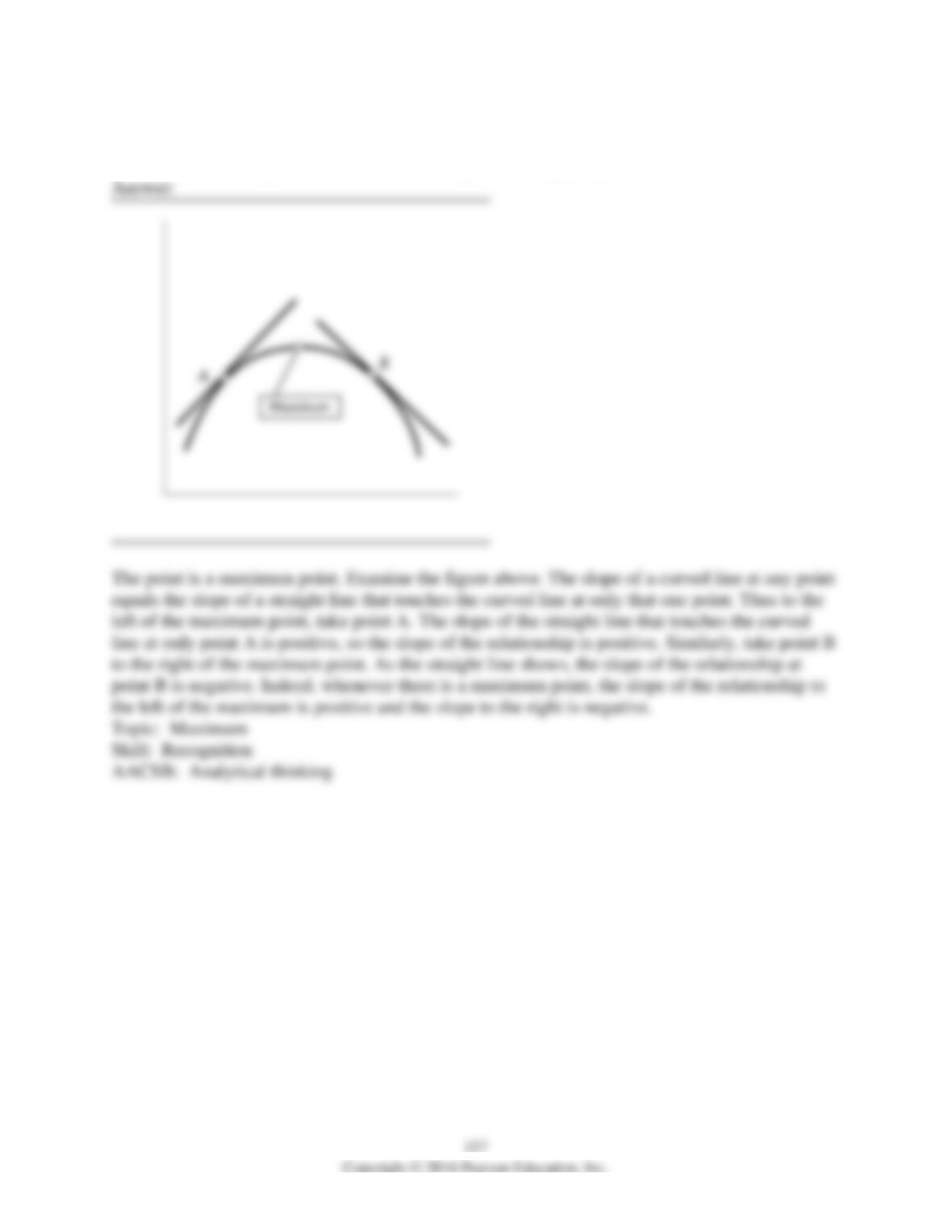
3) A graph has a point that is either a maximum or a minimum. To the left of the point, the slope
of relationship is positive. To the right of the point, the slope is negative. Is the point a maximum
point or a minimum point? Be sure to draw a figure that supports your answer.
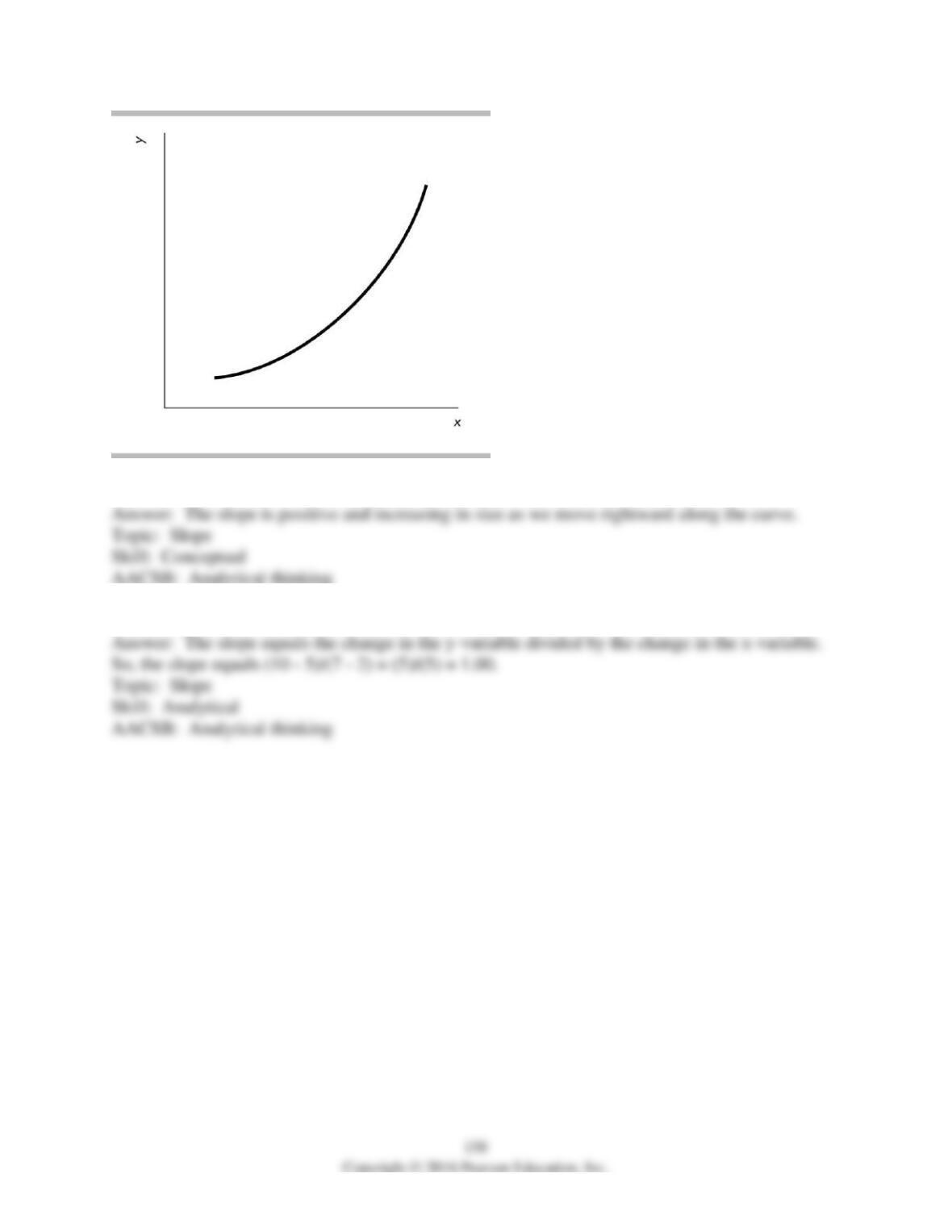
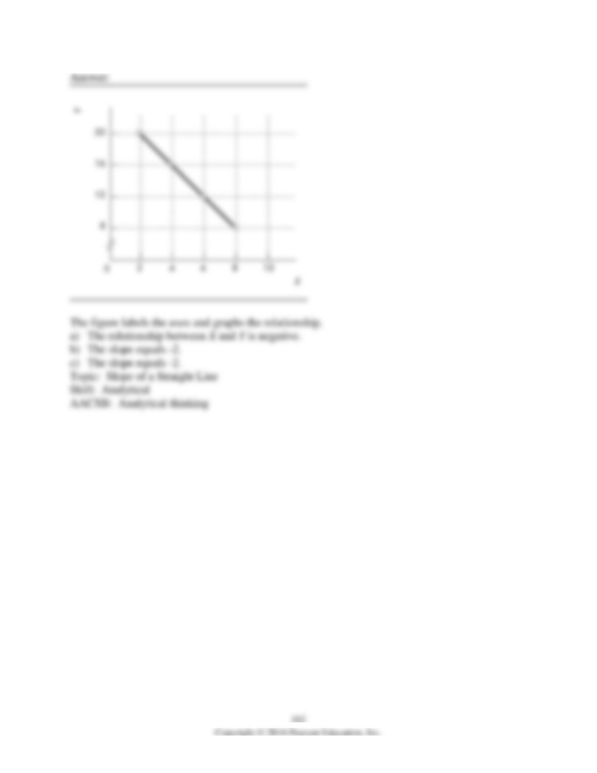
4) In the figure above, what can you deduce about the slope of the curve?
5) If two points on a line are x = 2, y = 5 and x = 7, y = 10, what is the slope of this line?
159
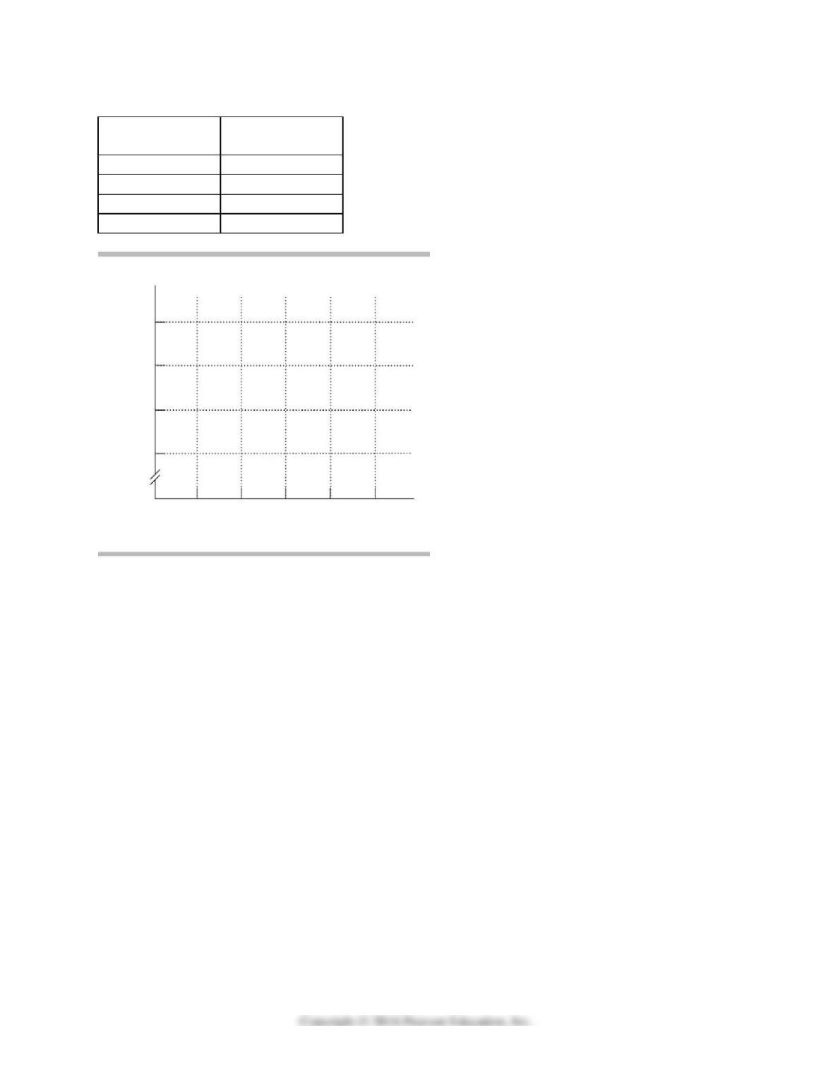
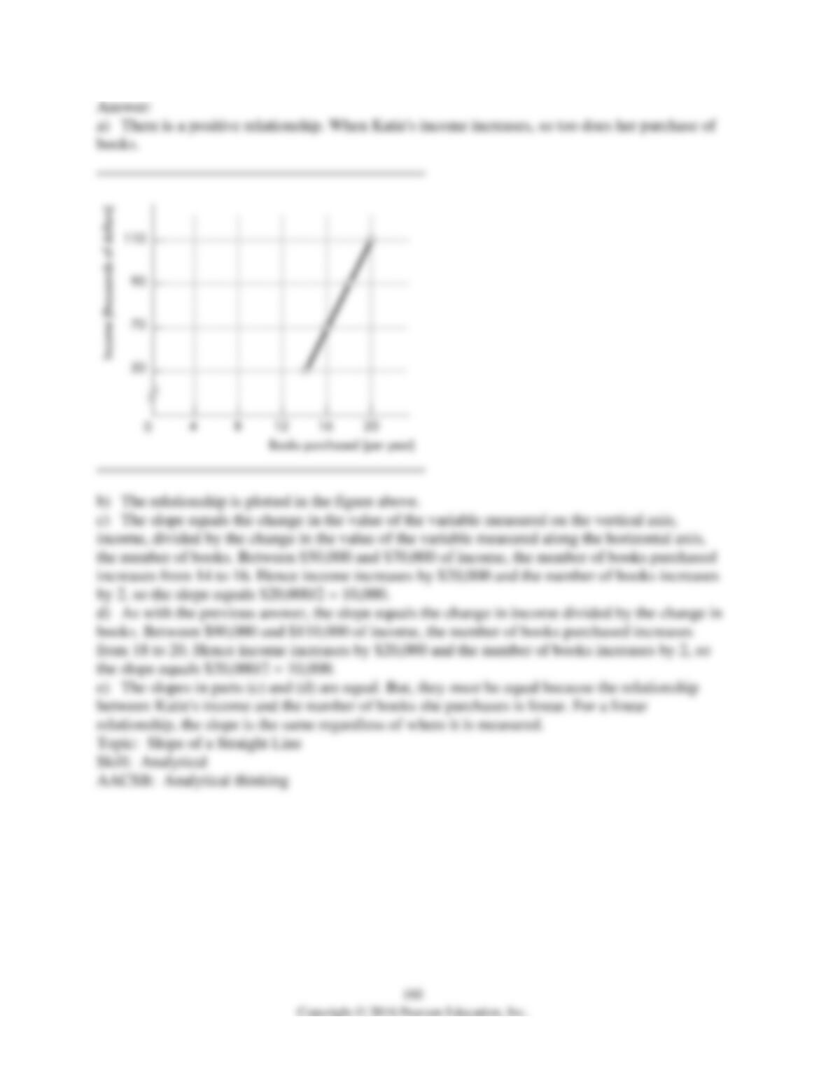
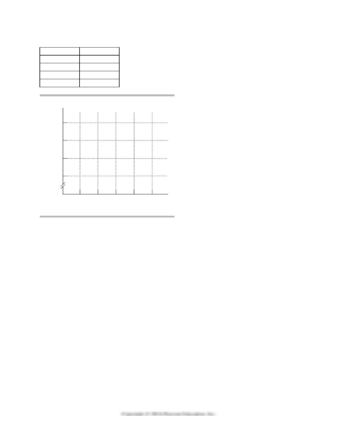
Katie’s income
(dollars per year)
Katie’s purchases
(books per year)
50,000
14
70,000
16
90,000
18
110,000
20
6) The table above shows how the number of books Katie buys each year depends on her
income.
a) What kind of relationship exists between Katie’s income and the number of books she
purchases?
b) Plot the relationship between Katie’s income and the number of books she purchases in the
above figure. Measure income along the vertical axis and the number of books along the
horizontal axis. Be sure to label the axes.
c) What is the slope of the relationship between $50,000 and $70,000 of income?
d) What is the slope of the relationship between $90,000 and $110,000 of income?
e) Comment on the similarity or dissimilarity of your answers to parts (c) and (d).
161
X
Y
2
20
4
16
6
12
8
8
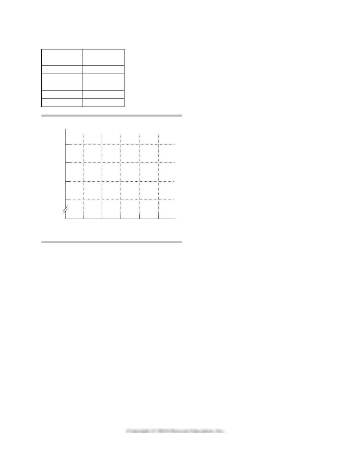
7) Graph the data in the table above in the figure. Label the axes.
a) Is the relationship between X and Y positive or negative?
b) What is the slope when X = 4?
c) What is the slope when X = 8?
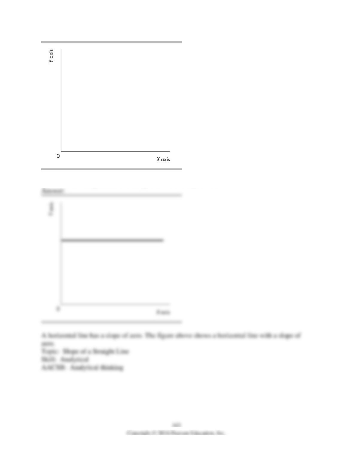
8) In the above diagram, draw a straight line with a slope of zero.
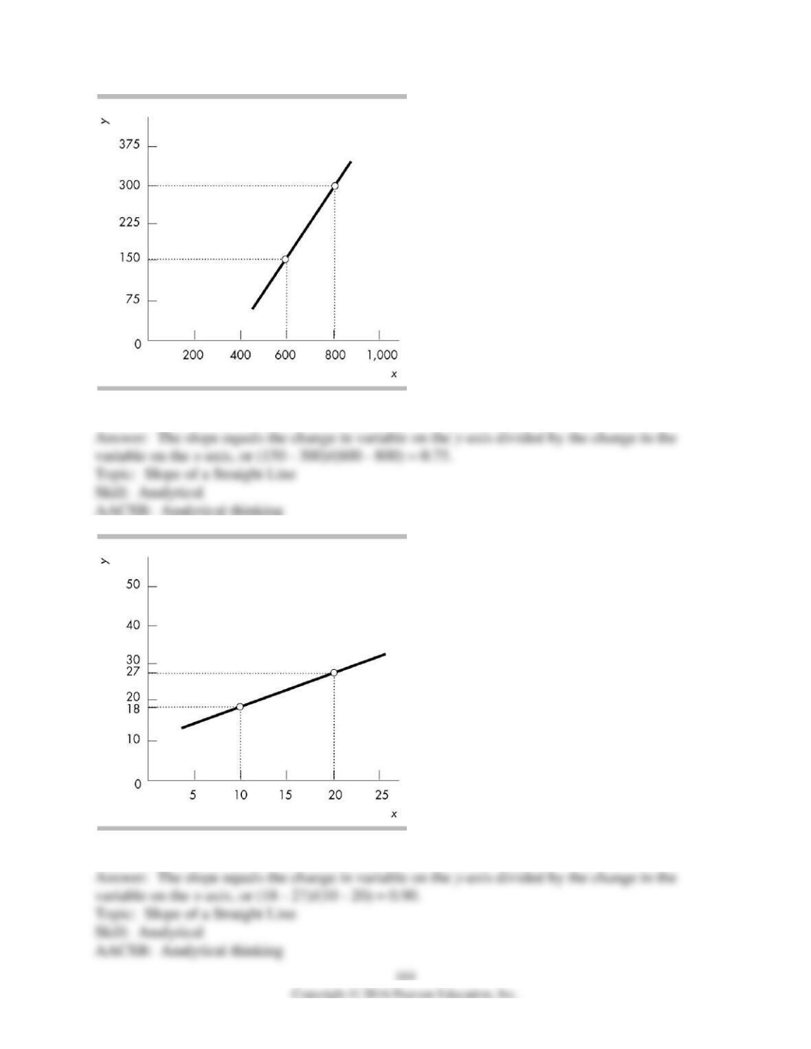
9) What does the slope of the line shown in the above figure equal?
10) What does the slope of the line shown in the above figure equal?
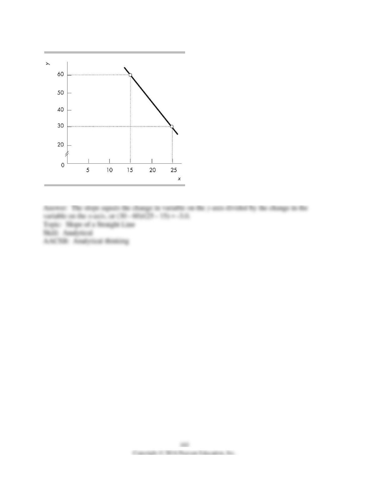
11) What does the slope of the line shown in the above figure equal?
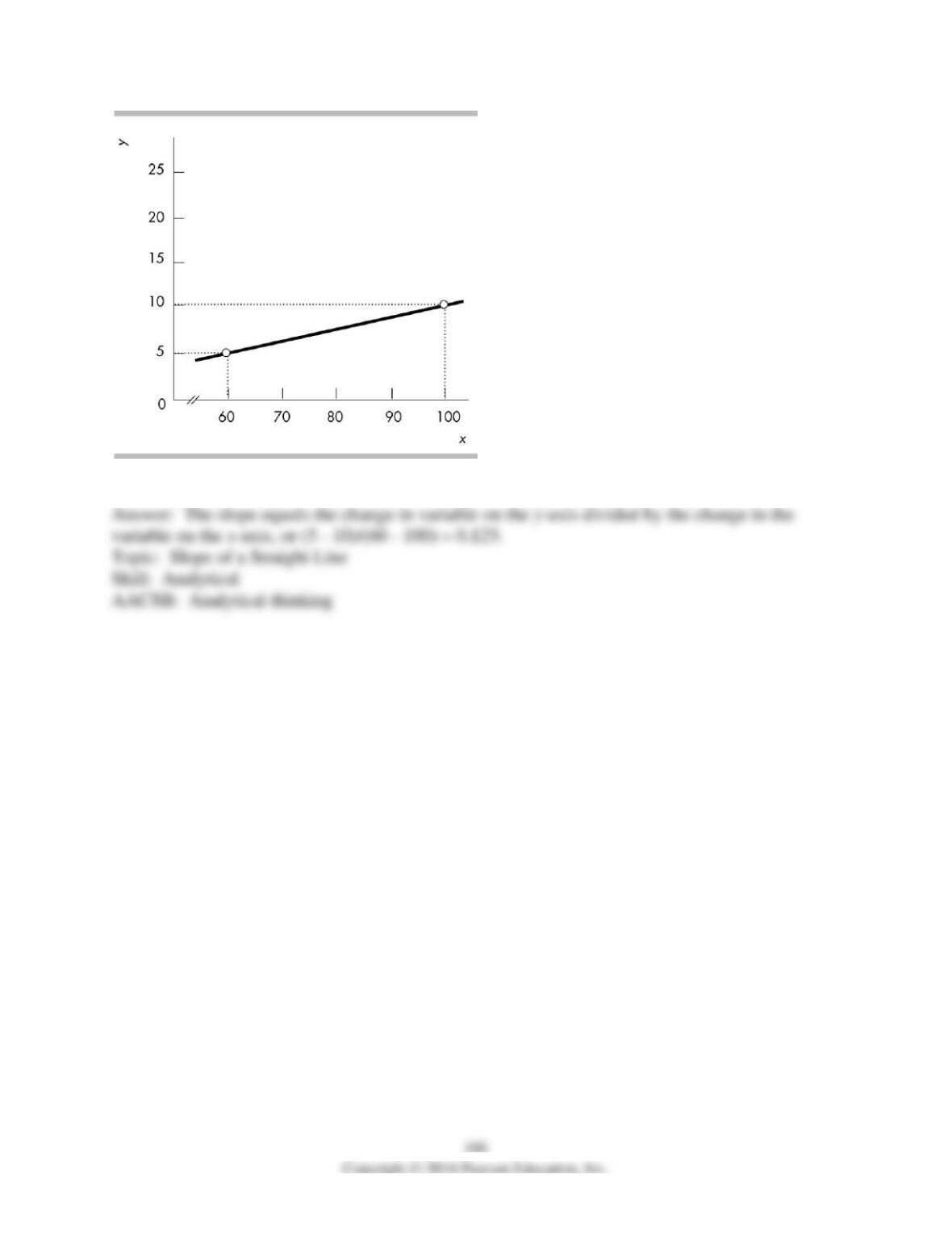
12) What does the slope of the line shown in the above figure equal?
167
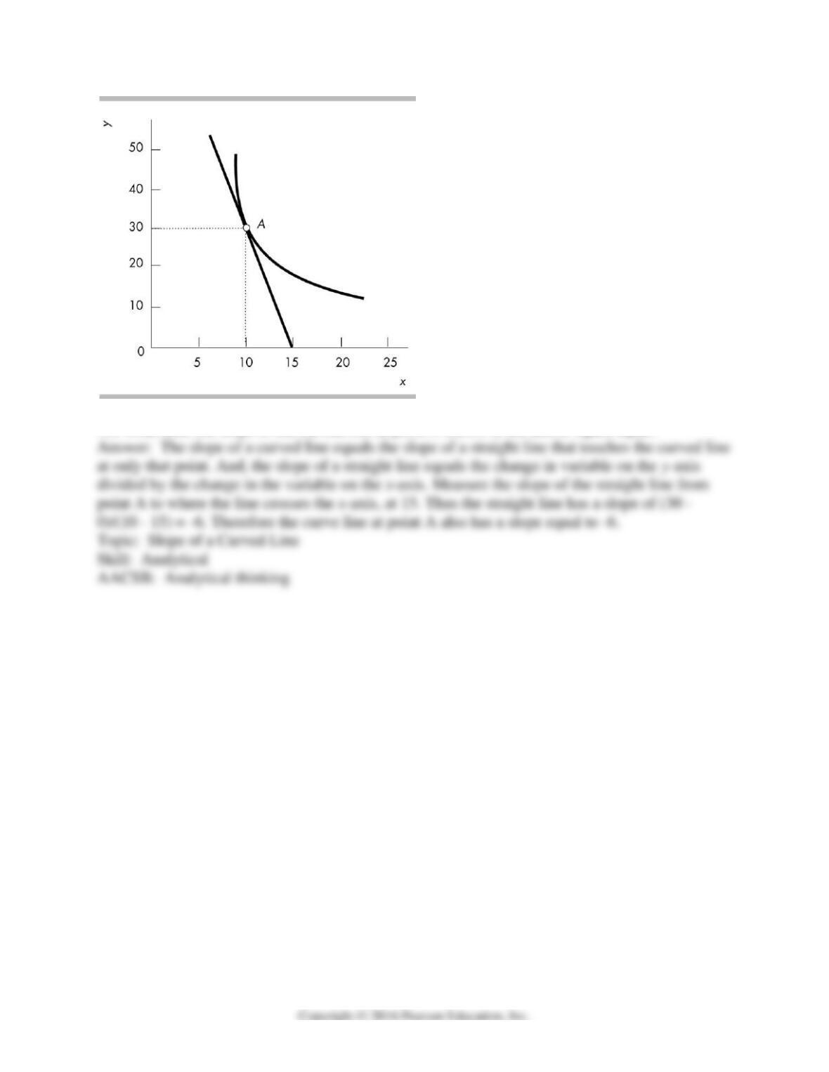
13) What does the slope of the curved line at point A shown in the above figure equal?
168
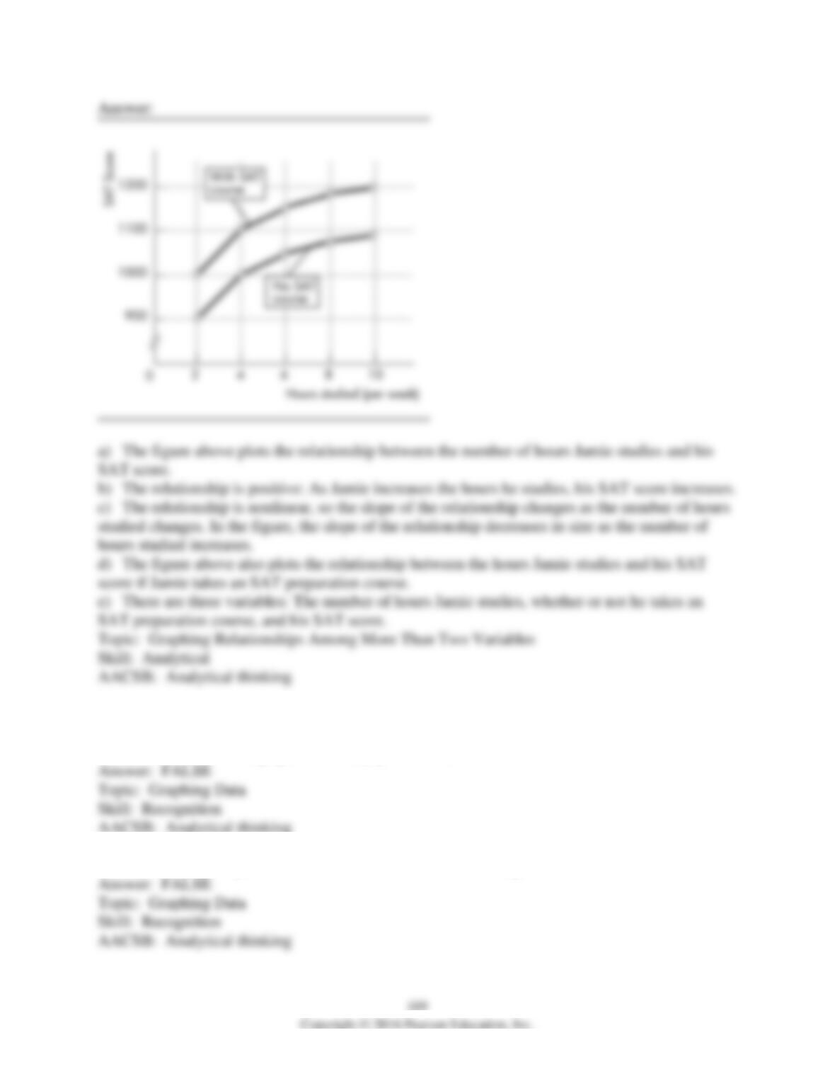
Hours studies
(per week)
SAT scores
2
900
4
1000
6
1050
8
1075
10
1090
14) Jamie is preparing to take his SAT tests. The table above shows how Jamie’s score depends
on the number of hours a week Jamie studies.
a) Plot the relationship in the figure, putting the hours studied on the horizontal axis.
b) Is the relationship you plotted positive or negative?
c) What happens to the slope of the relationship as hours studied increase?
d) Suppose Jamie can enroll in an SAT prep course and, by so doing, for every possible number
of hours he studies, his score will be 100 points higher. Plot the new relationship between the
number of hours studied and Jamie’s SAT score in the figure.
e) How many variables are involved in the figure you just completed?
16 Appendix: True or False
1) The vertical axis of a graph shows only positive values.
2) A scatter diagram plots the value of one economic variable against time.
3) A cross-section graph can show how economic variables for different groups of people vary
over time.
4) If the x-axis variable increases while the y-axis variable decreases, the variables x and y are
negatively related.
5) A graph cannot be used to show that two variables are unrelated.
6) When graphed, variables that are unrelated are shown by either a horizontal or a vertical line.
7) The slope of a line is the change in the y-axis variable divided by the change in the x-axis
variable.
8) The slope of a straight line increases as the numbers on the x-axis become larger.
9) To calculate the slope of a curved line, you can calculate the slope at a point on the curve or
across an arc of the curve.
10) If the change in the y-axis variable is 4 and the change in the x-axis variable is 2, the slope of
this line is 1/2.
11) If the change in the y-axis variable is 6 and the change in the x-axis variable is 5, the slope of
this line is 6/5.
12) To graph a relationship that involves more than two variables, we use the “ceteris paribus”
assumption.
13) “Ceteris paribus” refers to the idea that if more than two variables are graphed, only one
variable must be held constant.