Reference: Ref 2-10
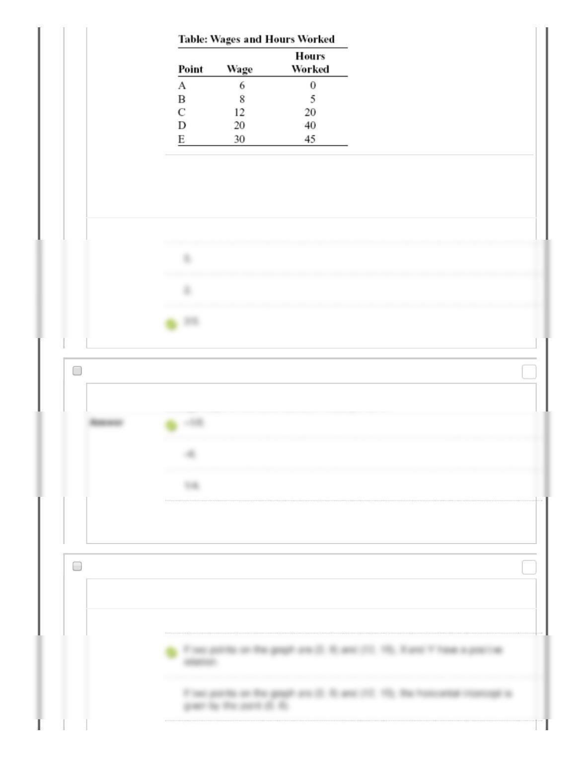
(Table: Wages and Hours Worked) Look at the table Wages and Hours Worked.
Graphing the relation with wages on the vertical axis and hours worked on the
horizontal axis, the slope between point A and point B is:
Answer 2.5.
36. Multiple Choice: Two points on a nonlinear curve have …
Question Two points on a nonlinear curve have coordinates given by (5, 15) and (17, 13). The
average slope of the curve between these points is:
2.5.
37. Multiple Choice: Which of the following statements abo...
Question Which of the following statements about a graph drawn with X on the horizontal
axis and Y on the vertical axis is correct?
Answer If two points on the graph are (0,8) and (12,15), X is 0 when Y is 12.
Points: 0
Points: 0
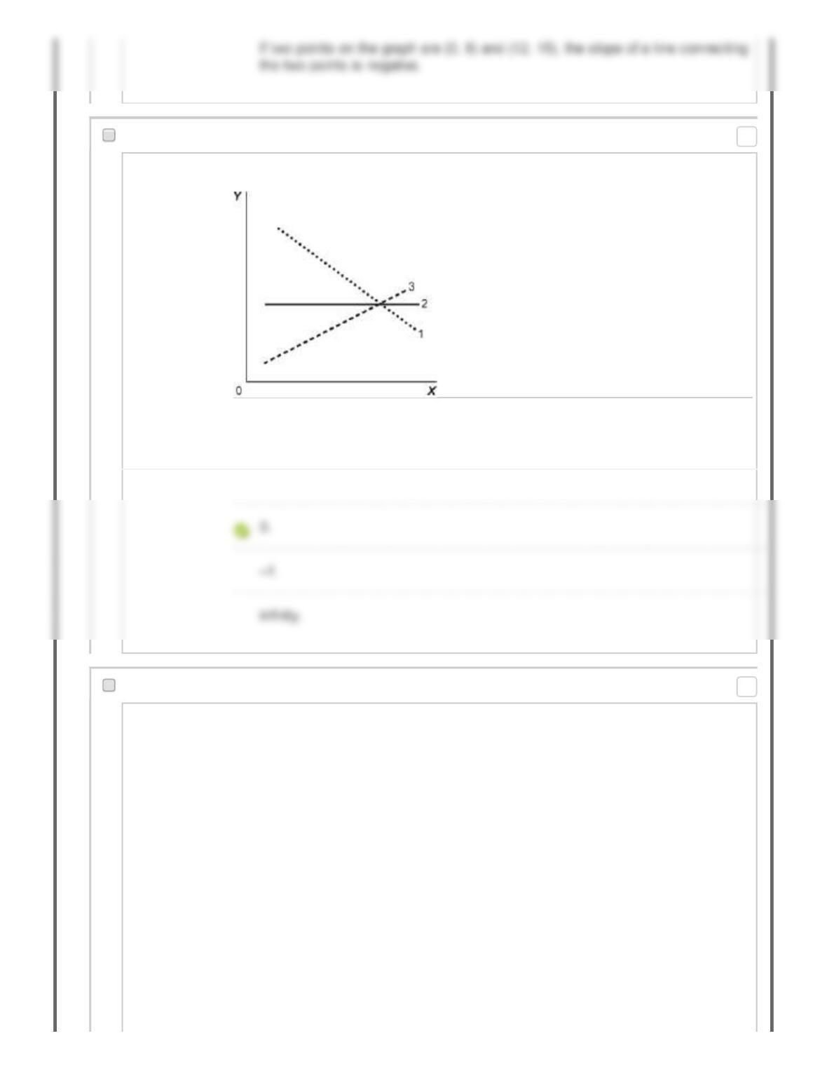
38. Multiple Choice: Figure: Illustrating Slope Reference:...
Question Figure: Illustrating Slope
Reference: Ref 2-11
(Figure: Illustrating Slope) Look at the figure Illustrating Slope. In the graph, line 2
has a slope of:
Answer +1.
39. Multiple Choice: Figure: Demand and Supply Reference: …
Question
Points: 0
Points: 0
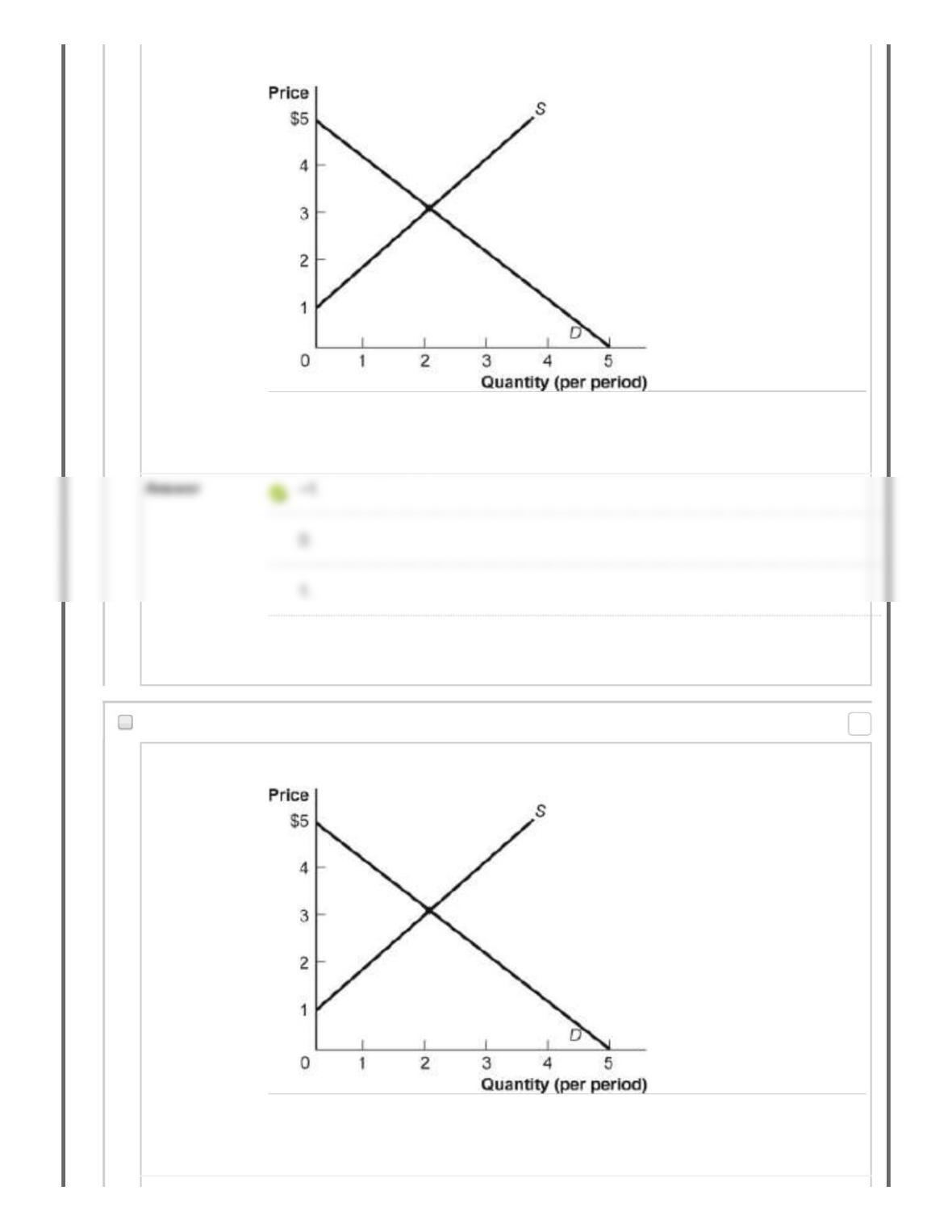
Figure: Demand and Supply
Reference: Ref 2-12
(Figure: Demand and Supply) Look at the figure Demand and Supply. The slope of
the curve labeled D is:
3.
40. Multiple Choice: Figure: Demand and Supply Reference: …
Question Figure: Demand and Supply
Reference: Ref 2-12
(Figure: Demand and Supply) Look at the figure Demand and Supply. The slope of
the curve labeled S is:
Points: 0
Answer –1.
41. Multiple Choice: The slope of a straight line is the r…
Question The slope of a straight line is the ratio of the:
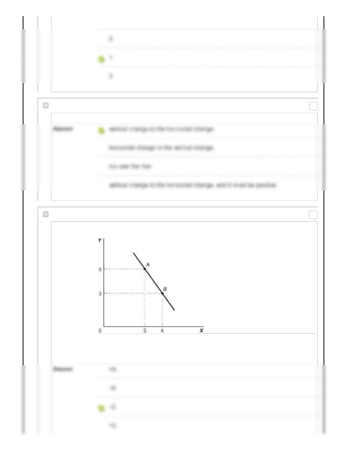
42. Multiple Choice: Figure: Slope Reference: Ref 2-13 (Fi...
Question Figure: Slope
Reference: Ref 2-13
(Figure: Slope) Look at the figure Slope. In the graph, the slope of the line between
points A and B is:
Points: 0
Points: 0
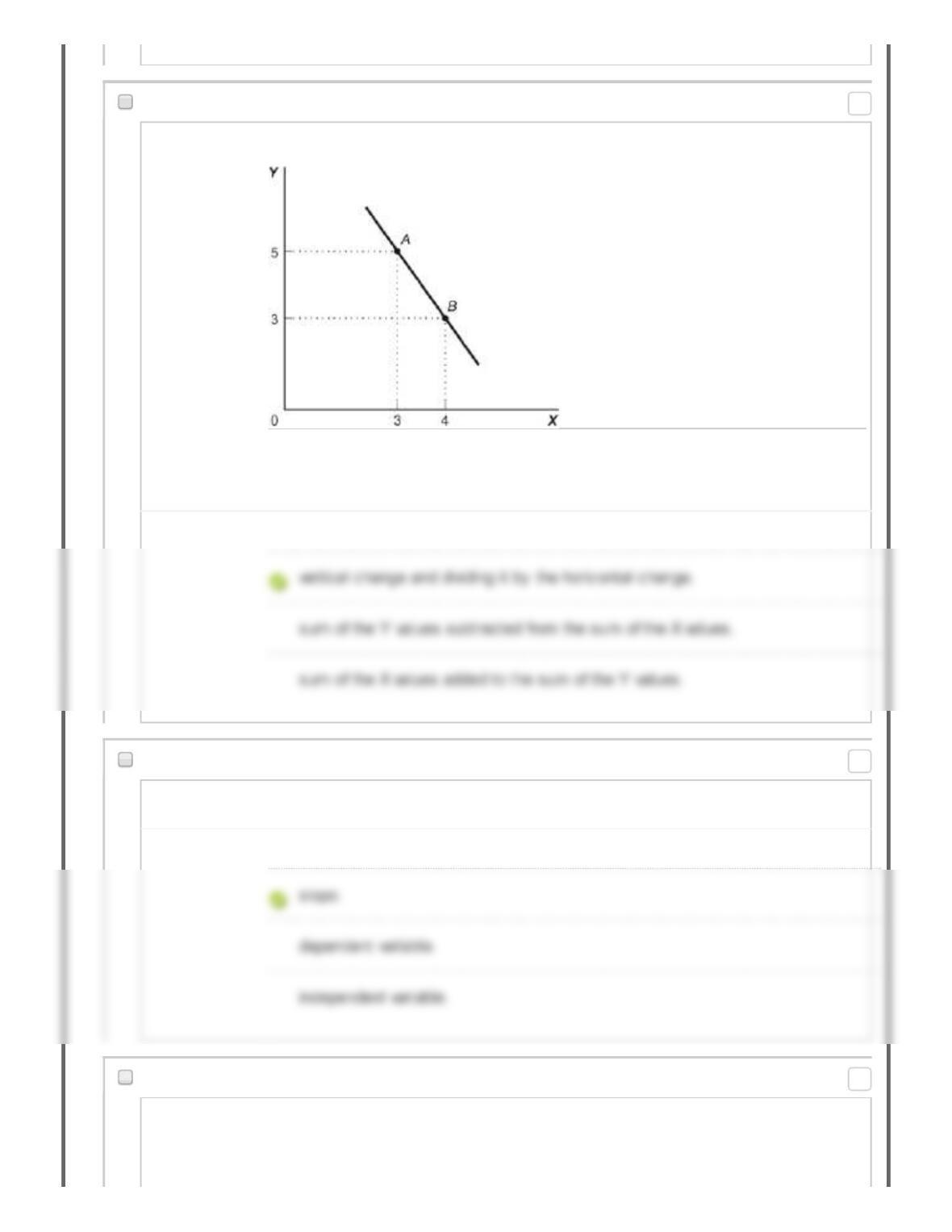
43. Multiple Choice: Figure: Slope Reference: Ref 2-13 (Fi...
Question Figure: Slope
Reference: Ref 2-13
(Figure: Slope) Look at the figure Slope. The slope of the line in the graph can be
calculated by taking the:
Answer horizontal change and dividing it by the vertical change.
44. Multiple Choice: The ratio of the change in the variab...
Question The ratio of the change in the variable on the vertical axis to the change in the
variable on the horizontal axis, measured between two points on the curve, is the:
Answer axis.
45. Multiple Choice: Reference: Ref 2-14 (Table: Price, Q…
Question
Points: 0
Points: 0
Points: 0
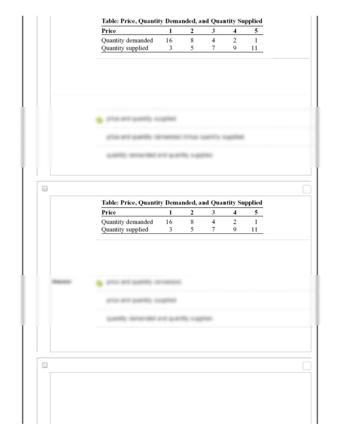
Reference: Ref 2-14
(Table: Price, Quantity Demanded, and Quantity Supplied) Look at the table Price,
Quantity Demanded, and Quantity Supplied. A straight line represents the relation
between:
Answer price and quantity demanded.
46. Multiple Choice: Reference: Ref 2-14 (Table: Price, Q…
Question
Reference: Ref 2-14
(Table: Price, Quantity Demanded, and Quantity Supplied) Look at the table Price,
Quantity Demanded, and Quantity Supplied. The data in the figure suggest a
nonlinear relation between:
A nonlinear relationship does not exist.
47. Multiple Choice: Reference: Ref 2-14 (Table: Price, Q…
Question
Points: 0
Points: 0
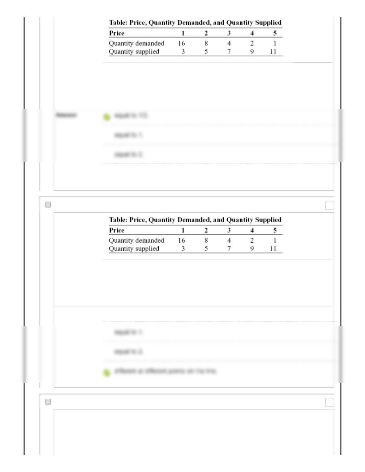
Reference: Ref 2-14
(Table: Price, Quantity Demanded, and Quantity Supplied) Look at the table Price,
Quantity Demanded, and Quantity Supplied. The slope of the line representing the
relation between price on the vertical axis and quantity supplied on the horizontal
axis is:
different at different points on the line.
48. Multiple Choice: Reference: Ref 2-14 (Table: Price, Q…
Question
Reference: Ref 2-14
(Table: Price, Quantity Demanded, and Quantity Supplied) Look at the table Price,
Quantity Demanded, and Quantity Supplied. The slope of the line representing the
relationship between price on the vertical axis and quantity demanded on the
horizontal axis is:
Answer equal to 1/2.
49. Multiple Choice: Figure: Y = f(X) Reference: Ref 2-15 ...
Question
Points: 0
Points: 0
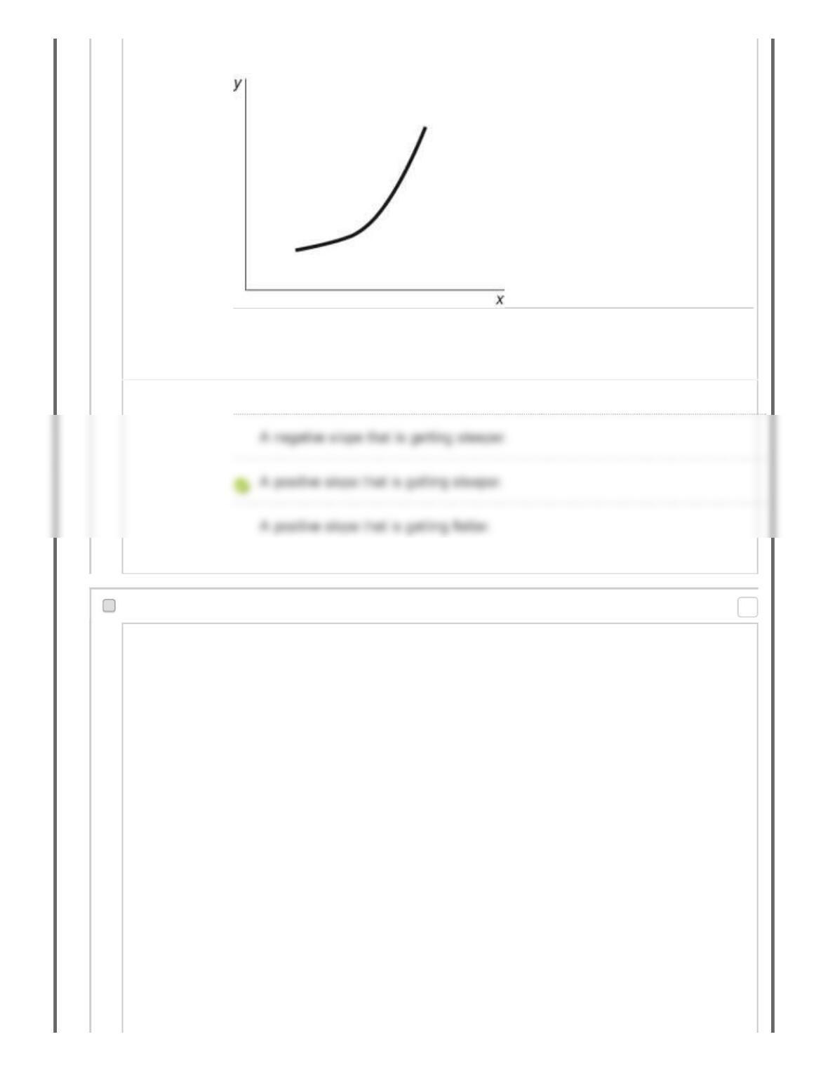
Figure: Y = f(X)
Reference: Ref 2-15
(Figure: Y = f(X) Look at the figure Y = f(X). In the figure, what best describes the
slope of the relation between x and y?
Answer A positive and constant slope.
50. Multiple Choice: Figure: Seasonally Adjusted Unemploym…
Question
Points: 0
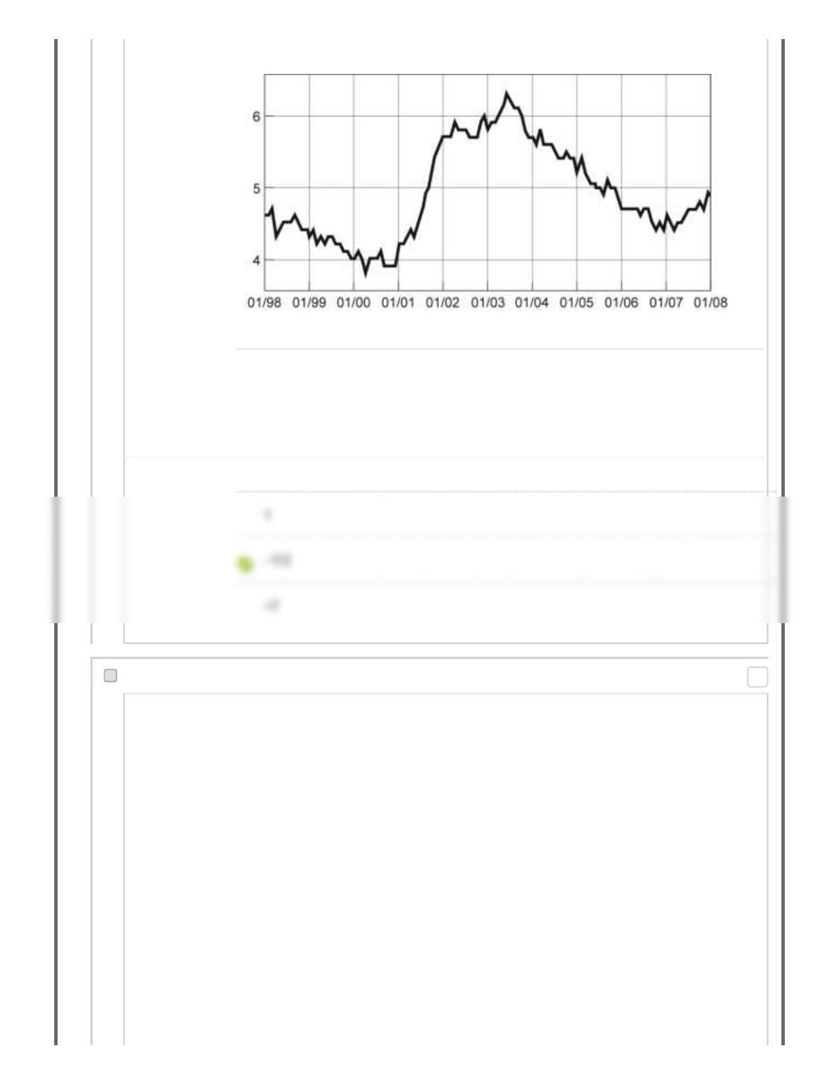
Figure: Seasonally Adjusted Unemployment Rate
Source: Bureau of Labor Statistics, 2008.
Reference: Ref 2-16
(Figure: Seasonally Adjusted Unemployment Rate) Look at the figure Seasonally
Adjusted Unemployment Rate. The distance between each labeled point on the
horizontal axis is one year. What is the approximate slope of the graph between
1/2004 and 1/2006?
Answer 1/2
51. Multiple Choice: Figure: Seasonally Adjusted Unemploym…
Question
Points: 0
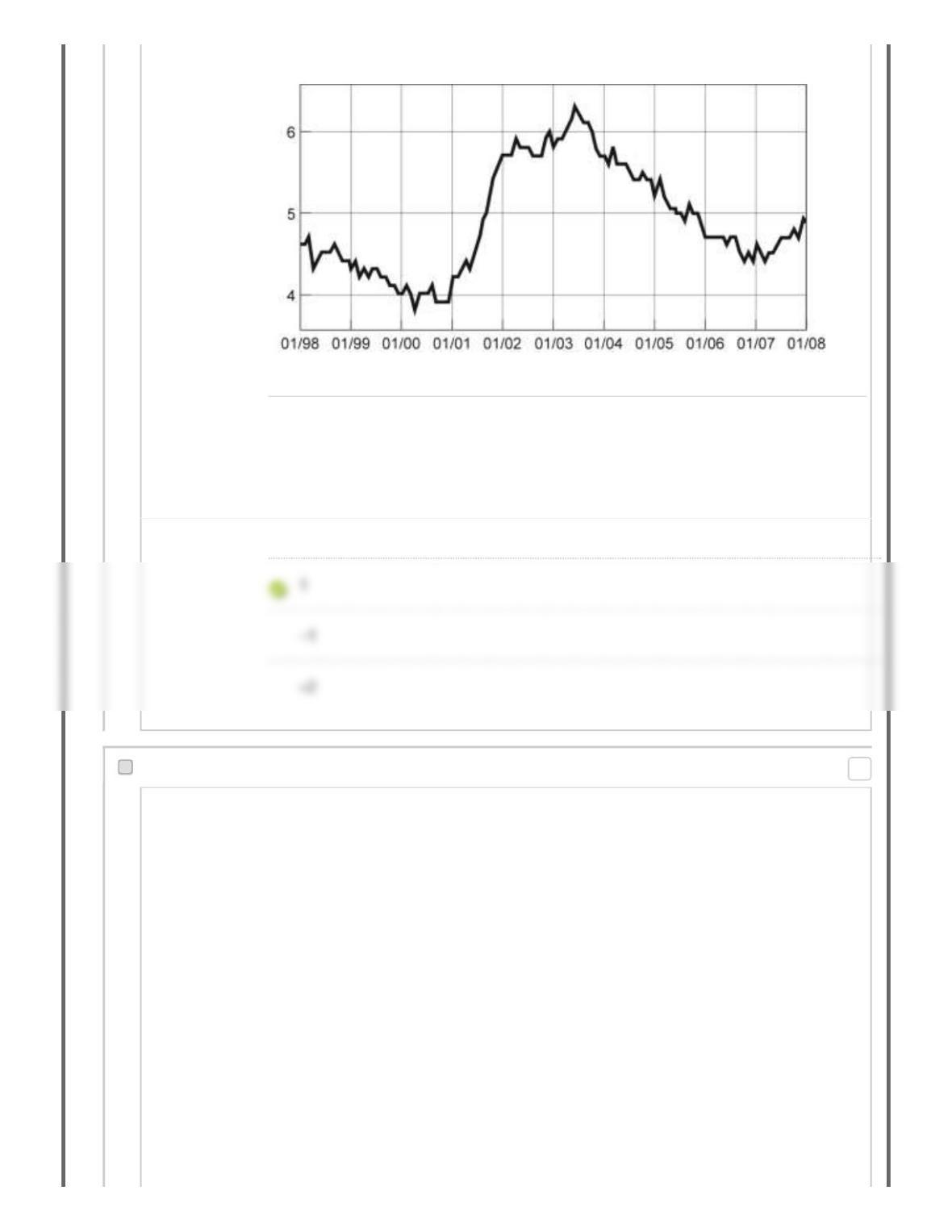
Figure: Seasonally Adjusted Unemployment Rate
Source: Bureau of Labor Statistics, 2008.
Reference: Ref 2-16
(Figure: Seasonally Adjusted Unemployment Rate) Look again at the figure
Seasonally Adjusted Unemployment Rate. The distance between each labeled
point on the horizontal axis is one year. What is the approximate slope of the
graph between 1/2001 and 1/2003?
Answer 2
52. Multiple Choice: Figure: Seasonally Adjusted Unemploym…
Question
Points: 0
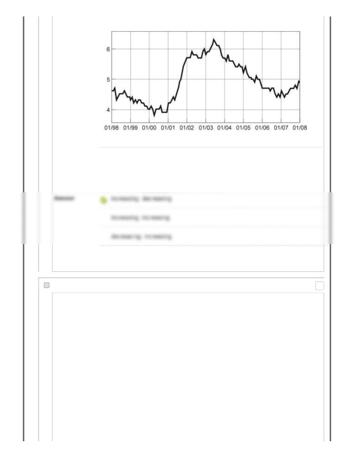
Figure: Seasonally Adjusted Unemployment Rate
Source: Bureau of Labor Statistics, 2008.
Reference: Ref 2-16
(Figure: Seasonally Adjusted Unemployment Rate) Look again at the figure
Seasonally Adjusted Unemployment Rate. The distance between each labeled
point on the horizontal axis is one year. Unemployment was ________ between
2001–2002 and ________ between 1999–2000.
decreasing; decreasing
53. Multiple Choice: Figure: Seasonally Adjusted Unemploym…
Question
Points: 0
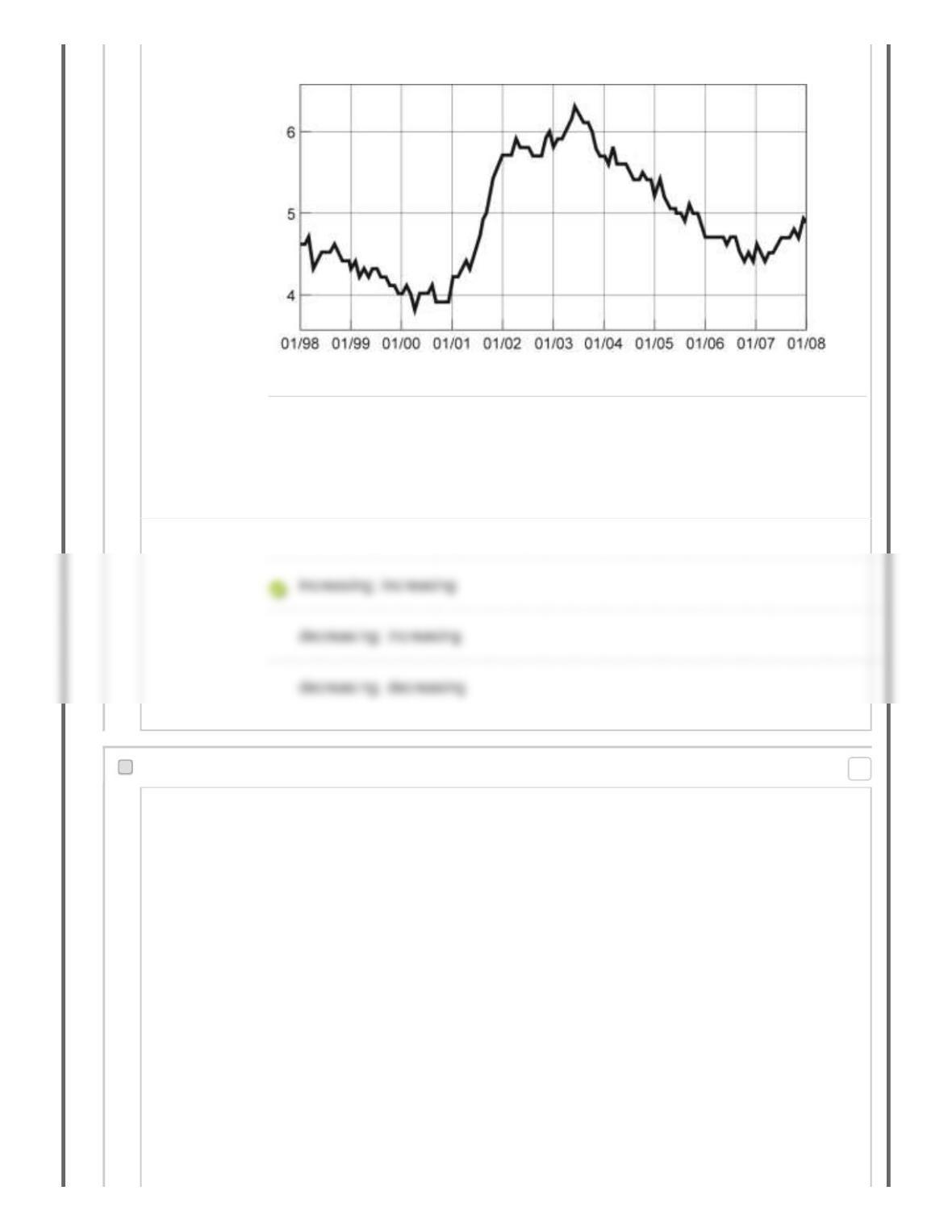
Figure: Seasonally Adjusted Unemployment Rate
Source: Bureau of Labor Statistics, 2008.
Reference: Ref 2-16
(Figure: Seasonally Adjusted Unemployment Rate) Look again at the figure
Seasonally Adjusted Unemployment Rate. The distance between each labeled
point on the horizontal axis is one year. Unemployment was ________ between
2001–2003 and ________ between 2007–2008.
Answer increasing; decreasing
54. Multiple Choice: Figure: Seasonally Adjusted Unemploym…
Question
Points: 0