
Name:
Class:
Date:
chapter 3
Indicate whether the statement is true or false.
1. The correlation between two variables is a unitless and is always between –1 and +1.
a.
True
b.
False
2. Problems in data analysis where we want to compare a numerical variable across two or more subpopulations are
called comparison problems.
a.
True
b.
False
3. An example of a joint category of two variables is the count of all non-drinkers who are also nonsmokers.
a.
True
b.
False
4. We must specify appropriate bins for side-by-side histograms in order to make fair comparisons of distributions by
category.
a.
True
b.
False
5. Statisticians often refer to the pivot tables that display counts as contingency tables or crosstabs.
a.
True
b.
False
6. If the standard deviations of X and Y are 15.5 and 10.8, respectively, and the covariance of X and Y is 128.8, then the
coefficient of correlation r is approximately 0.77.
a.
True
b.
False
7. We do not even try to interpret correlations numerically except possibly to check whether they are positive or negative.
a.
True
b.
False
8. The advantage that the coefficient of correlation has over the covariance is that the former has a set lower and upper
limit.
a.
True
b.
False
9. Relationships between two variables are less evident when counts are expressed as percentages of row totals or
column totals.
a.
True
b.
False
10. The Filters field of a pivot table contains the data you want summarize.
a.
True
b.
False
11. Side-by-side box plots allow you to quickly see how two or more categories of a numerical variable compare.

Name:
Class:
Date:
chapter 3
a.
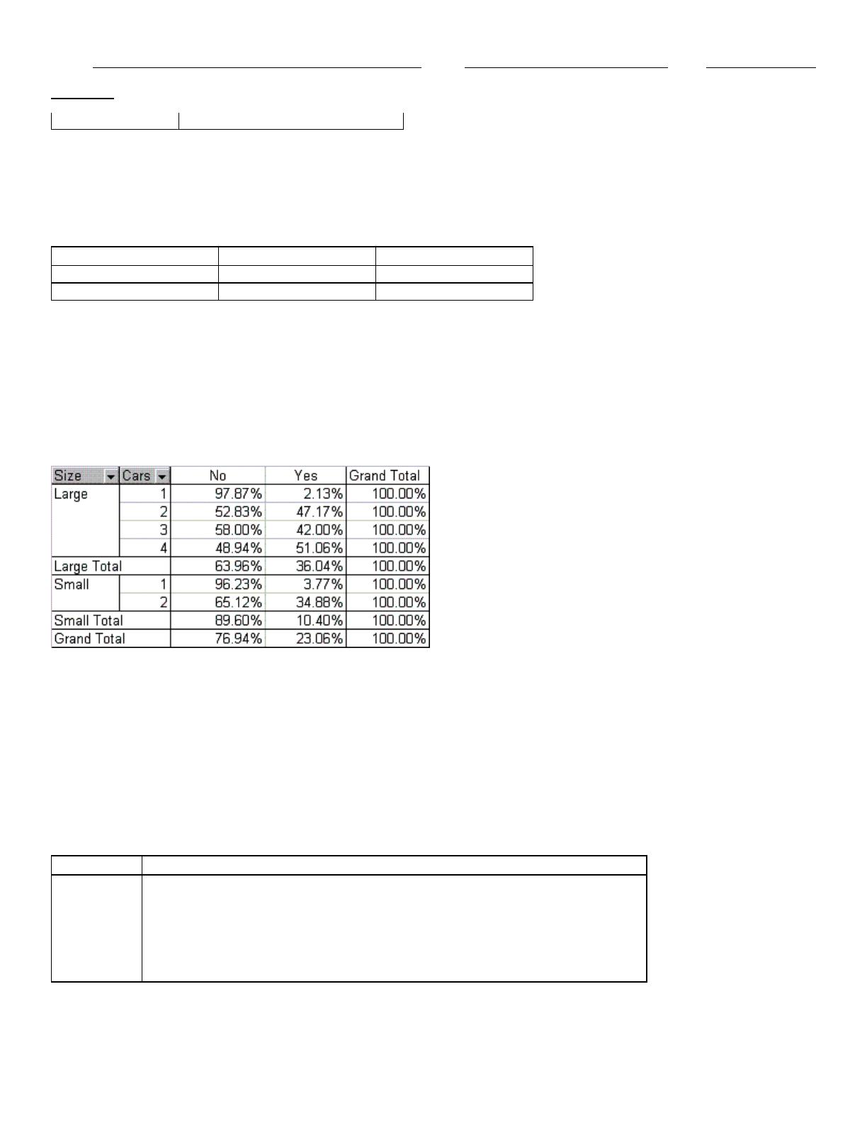
True
b.
False
12. If the coefficient of correlation r = 0 .80, the standard deviations of X and Y are 20 and 25, respectively, then Cov(X, Y)
must be 400.
a.
True
b.
False
13. The cutoff for defining a large correlation is
a.
True
b.
False
14. To form a scatterplot of X versus Y, X and Y must be paired variables.
a.
True
b.
False
15. Correlation can be affected by the measurement scales applied to X and Y variables.
a.
True
b.
False
16. A trend line on a scatterplot is a line or a curve that “fits” the scatter as well as possible.
a.
True
b.
False
17. Correlation is a single-number summary of a scatterplot.
a.
True
b.
False
18. It is possible that the data points are close to a curve and have a correlation close to 0, because correlation is relevant
only for measuring linear relationships.
a.
True
b.
False
19. Strongly related variables have a relationship close to zero if the relationship is nonlinear.
a.
True
b.
False
20. If the standard deviation of X is 15, the covariance of X and Y is 94.5, the coefficient of correlation r = 0.90, then the
variance of Y is 7.0.
a.
True
b.
False
21. The scatterplot is a graphical technique used to make apparent the relationship between two numerical variables.
a.
True
b.
False

Name:
Class:
Date:
chapter 3
22. Counts for categorical variable are often expressed as percentages of the total.
a.
True
b.
False
23. Correlation and covariance can be used to examine relationships between numerical variables as well as for
categorical variables that have been coded numerically.
a.
True
b.
False
Indicate the answer choice that best completes the statement or answers the question.
24. The tool that provides useful information about a data set by breaking it down into categories is the
a.
histogram
b.
scatterplot
c.
pivot table
d.
spreadsheet
25. We study relationships among numerical variables using
a.
correlation
b.
covariance
c.
scatterplot charts
d.
all of these options
e.
none of these options
26. The limitation of covariance as a descriptive measure of association is that it
a.
only captures positive relationships
b.
does not capture the units of the variables
c.
is very sensitive to the units of the variables
d.
is invalid if one of the variables is categorical
e.
none of these options
27. Scatterplots are also referred to as
a.
crosstabs
b.
contingency charts
c.
X-Y charts
d.
all of these options
e.
none of these options
28. Displaying all correlations between 0.6 and 0.999 on a scatterplot as green and all correlations between –1.0 and -0.6
as red is known as
a.
rank-order formatting
b.
categorical formatting
c.
coded formatting
d.
numerical formatting
e.
conditional formatting
29. Correlation is useful only for
a.
assessing the weakness of a linear relationship

Name:
Class:
Date:
chapter 3
b.
conveying the same information in a simpler format than a scatterplot
c.
measuring the strength of a linear relationship
d.
automatically calculating covariances
e.
measuring the strength of a nonlinear relationship
30. If the correlation of variables is close to 0, then we expect to see
a.
an upward sloping cluster of points on the scatterplot
b.
a downward sloping cluster of points on the scatterplot
c.
a cluster of points around a trendline on the scatterplot
d.
a cluster of points with no apparent relationship on the scatterplot
e.
no explanation of what the scatterplot should look like based on the correlation
31. We can infer that there is a strong relationship between two numerical variables when
a.
the points on a scatterplot cluster tightly around an upward sloping straight line
b.
the points on a scatterplot cluster tightly around a downward sloping straight line
c.
either of these options
d.
neither of these options
32. We are usually on the lookout for large correlations near
a.
+1
b.
-1
c.
Either of these options
d.
Neither of these options
33. The most common data format is
a.
long
b.
short
c.
stacked
d.
unstacked
34. A useful way of comparing the distribution of a numerical variable across categories of some categorical variable is
a.
side-by-side box plot
b.
side-by-side pivot table
c.
both of these options
d.
neither of these options
35. A line or curve superimposed on a scatterplot to quantify an apparent relationship is known as a(n)
a.
average
b.
trend line
c.
data point
d.
positive variable
e.
slope
36. The Excel function that allows you to count using more than one criterion is
a.
COUNTIF
b.
COUNTIFS
c.
SUMPRODUCT
d.
VLOOKUP
e.
HLOOKUP
37. Correlation and covariance measure

Name:
Class:
Date:
chapter 3
a.
the strength of a linear relationship between two numerical variables
b.
the direction of a linear relationship between two numerical variables
c.
the strength and direction of a linear relationship between two numerical variables
d.
the strength and direction of a linear relationship between two categorical variables
e.
none of these options
38. Tables used to display counts of a categorical variable are called
a.
crosstabs
b.
contingency tables
c.
both of these options
d.
neither of these options
39. To examine relationships between two categorical variables, we can use
a.
counts and corresponding charts of the counts
b.
scatterplots
c.
histograms
d.
none of these options
40. Example of comparison problems include
a.
salary broken down by male and female subpopulations
b.
cost of living broken down by region of a country
c.
recovery rate for a disease broken down by patients who have taken a drug and patients who have taken a
placebo
d.
Starting salary of recent graduates broken down by academic major
e.
all of these options
41. The tables of counts that result from pivot tables are often called
a.
samples
b.
sub-tables
c.
specimens
d.
crosstabs
42. The four areas of a pivot table are
a.
Crosstabs, Fields, Rows, Columns
b.
Data, Count, Contingency, Percentage
c.
Filters, Rows, Columns, Values
d.
Sort, Rows, Columns, Count
43. Changing the location of fields in a pivot table is known as
a.
slicing
b.
dicing
c.
sorting
d.
pivoting
44. Which of the following are considered numerical summary measures?
a.
mean and variance
b.
variance and correlation
c.
correlation and covariance
d.
covariance and variance
Name:
Class:
Date:
chapter 3
e.
first quartile and third quartile
45. One characteristic of “paired variables” is
a.
one is a negative value and the other is a positive value
b.
both are positive values
c.
they have the same number of observations
d.
they have a variable number of observations
46. A scatterplot allows one to see
a.
whether there is any relationship between two variables
b.
what type of relationship there is between two variables
c.
Both options are correct.
d.
Neither option is correct.
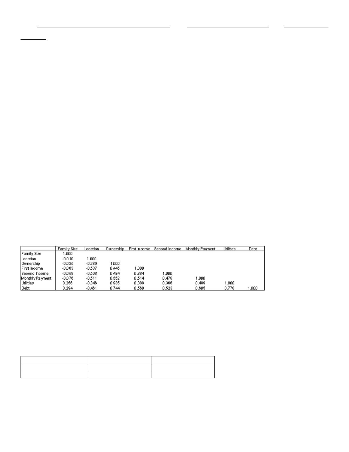
An economic development researcher wants to understand the relationship between the average monthly expenditure on
utilities for households in a particular middle-class neighborhood and each of the following household variables: family
size, approximate location of the household within the neighborhood, and indication of whether those surveyed owned or
rented their home, gross annual income of the first household wage earner, gross annual income of the second household
wage earner (if applicable), size of the monthly home mortgage or rent payment, and the total indebtedness (excluding
the value of a home mortgage) of the household.
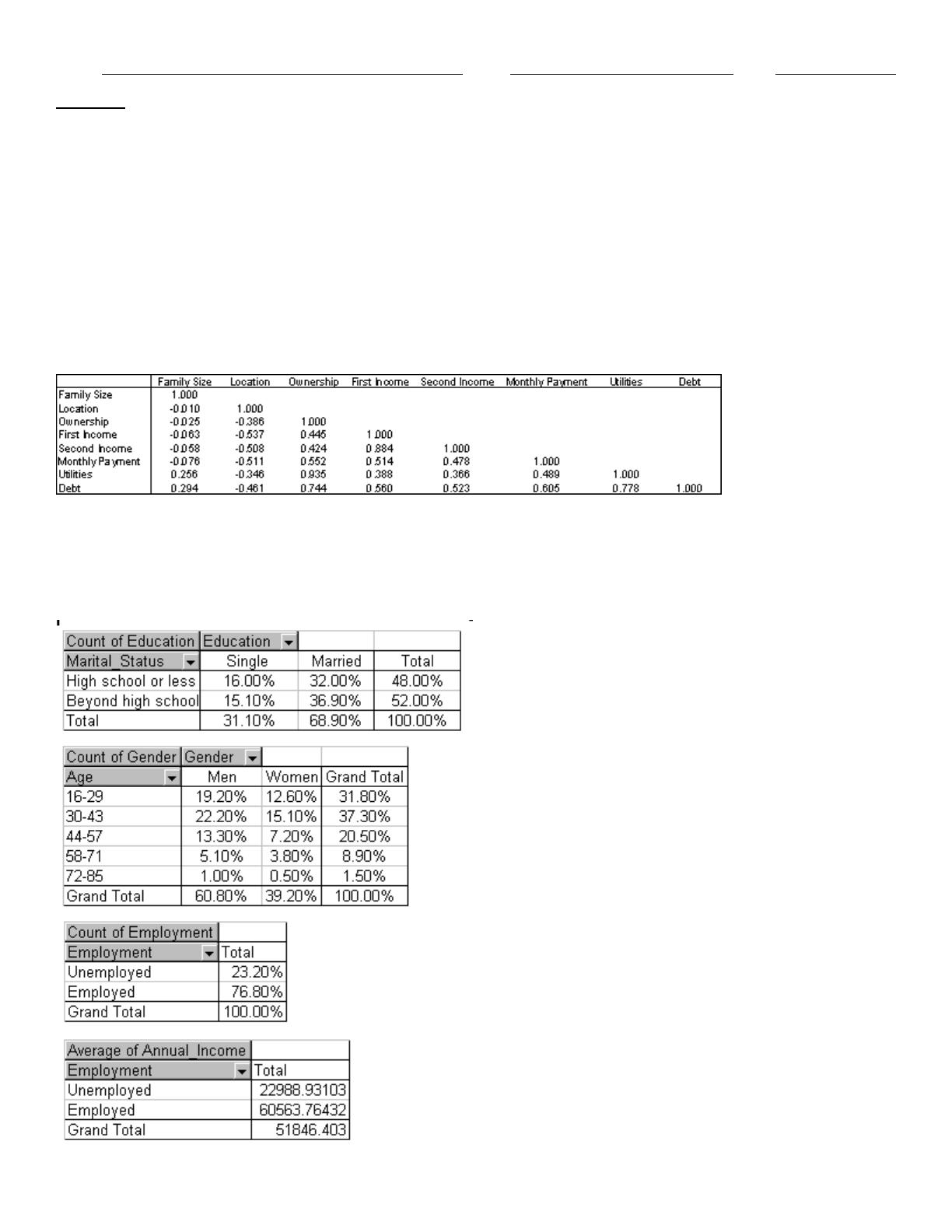
The correlation for each pairing of variables are shown in the table below:
Table of correlations
47. Which of the variables have essentially no linear relationship with the household’s average monthly expenditure on
utilities?
A sample of 150 students at a State University was taken after the final business statistics exam to ask them whether they
went partying the weekend before the final or spent the weekend studying, and whether they did well or poorly on the
final. The following table contains the result.
Did Well in Exam
Did Poorly in Exam
Studying for Exam
60
15
Went Partying
22
53
48. What percentage of the students in the sample spent the weekend studying and did well in the final exam?
An economic development researcher wants to understand the relationship between the average monthly expenditure on
utilities for households in a particular middle-class neighborhood and each of the following household variables: family
size, approximate location of the household within the neighborhood, and indication of whether those surveyed owned or
Name:
Class:
Date:
chapter 3
rented their home, gross annual income of the first household wage earner, gross annual income of the second household
wage earner (if applicable), size of the monthly home mortgage or rent payment, and the total indebtedness (excluding
the value of a home mortgage) of the household.
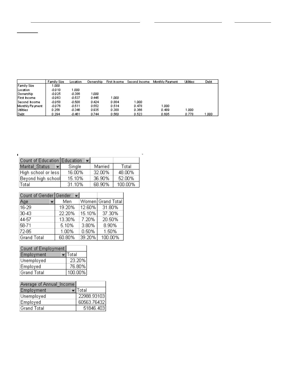
The correlation for each pairing of variables are shown in the table below:
Table of correlations
49. Which of the variables have a negative linear relationship with the household’s average monthly expenditure on
utilities?
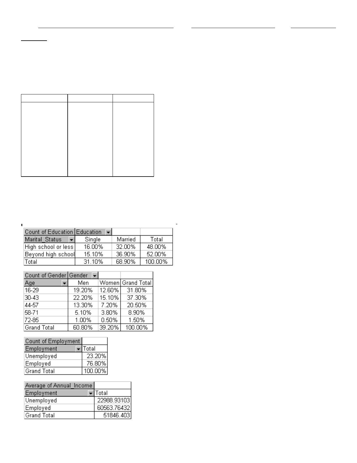
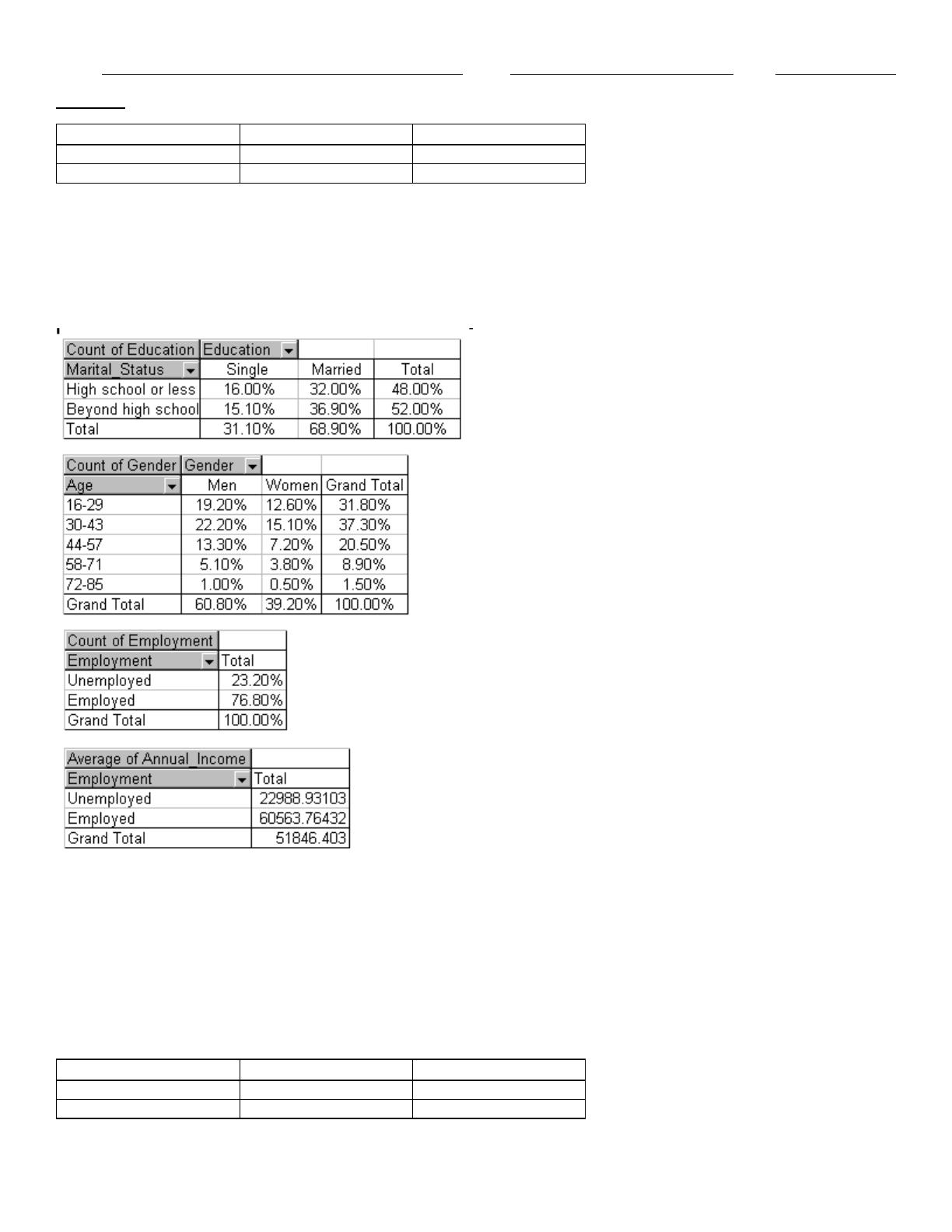
A recent survey collected data from 1000 randomly selected Internet users. The characteristics of the users include their
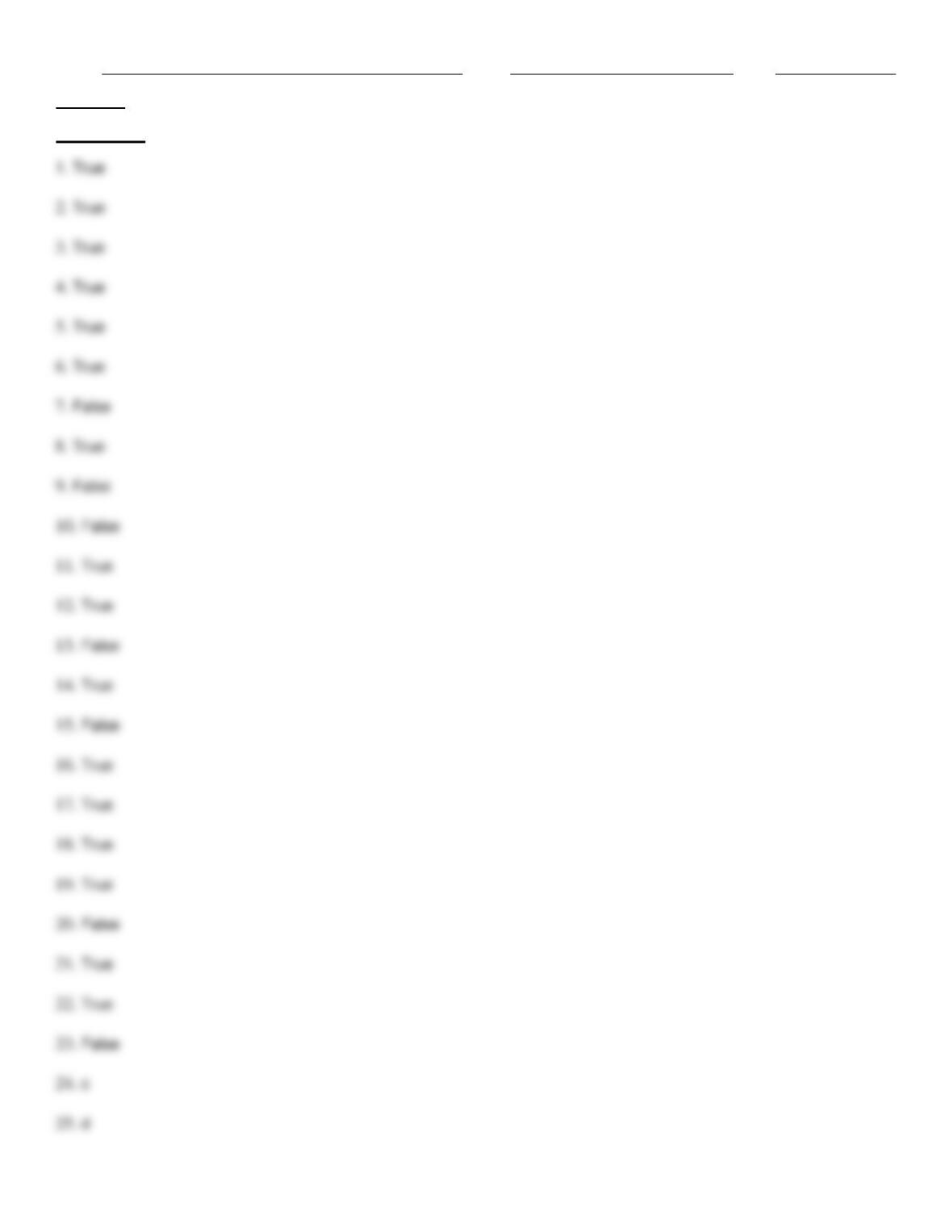
gender, age, education, marital status, and annual income. Using Excel, the following pivot tables were produced.
50. Approximate the percentage of these Internet users who are men under the age of 30.
51. Approximate the percentage of these Internet users who are single with no formal education beyond high school.
Economists believe that countries with more income inequality have lower unemployment rates. An economist in 1996
Name:
Class:
Date:
chapter 3
developed the table below containing the following information for 10 countries during the 1980-1995 time period:
· The change from 1980 to 1995 in ratio of the average wage of the top 10% of all wage earners to the median wage
· The change from 1980 to 1995 in unemployment rate.
Income inequality vs. Unemployment rate
Country
WIR Change
UR Change
Germany
–6.0%
6.0%
France
–3.5%
5.6%
Italy
1.0%
5.2%
Japan
0.0%
0.6%
Australia
5.0%
2.4%
Sweden
4.0%
5.9%
Canada
5.5%
2.0%
New Zealand
9.5%
4.0%
Britain
15.6%
2.5%
U.S.
15.8%
–1.8%
52. Explain why the ratio of the average wage of the top 10% of all wage earners to the median measures income
inequality.
A recent survey collected data from 1000 randomly selected Internet users. The characteristics of the users include their
gender, age, education, marital status, and annual income. Using Excel, the following pivot tables were produced.
53. What is the average annual salary of the employed Internet users in this sample?
Name:
Class:
Date:
chapter 3
Economists believe that countries with more income inequality have lower unemployment rates. An economist in 1996
developed the table below containing the following information for 10 countries during the 1980-1995 time period:
· The change from 1980 to 1995 in ratio of the average wage of the top 10% of all wage earners to the median wage
· The change from 1980 to 1995 in unemployment rate.
Income inequality vs. Unemployment rate
Country
WIR Change
UR Change
Germany
–6.0%
6.0%
France
–3.5%
5.6%
Italy
1.0%
5.2%
Japan
0.0%
0.6%
Australia
5.0%
2.4%
Sweden
4.0%
5.9%
Canada
5.5%
2.0%
New Zealand
9.5%
4.0%
Britain
15.6%
2.5%
U.S.
15.8%
–1.8%
54. Do these data help to confirm or contradict the hypothesis that increased wage inequality leads to lower
unemployment levels? [Hint: construct a scatterplot]
A sample of 150 students at a State University was taken after the final business statistics exam to ask them whether they
went partying the weekend before the final or spent the weekend studying, and whether they did well or poorly on the
final. The following table contains the result.
Did Well in Exam
Did Poorly in Exam
Studying for Exam
60
15
Went Partying
22
53
55. Of those in the sample who did well on the final exam, what percentage of them went partying the weekend before the
exam?
56. The percentage of the US population without health insurance coverage for samples from the 50 states and District of
Columbia for both 2003 and 2004 produced the following table of correlations.
Table of Correlations: Percent 2003 Percent 2004
Percent 2003
1.000
Percent 2004
0.903
1.000
What does the table for the two given sets of percentages tell you in this case?
A sample of 150 students at a State University was taken after the final business statistics exam to ask them whether they
went partying the weekend before the final or spent the weekend studying, and whether they did well or poorly on the
final. The following table contains the result.
Name:
Class:
Date:
chapter 3
Did Well in Exam
Did Poorly in Exam
Studying for Exam
60
15
Went Partying
22
53
57. Of those in the sample who went partying the weekend before the final exam, what percentage of them did poorly in
the exam?
A recent survey collected data from 1000 randomly selected Internet users. The characteristics of the users include their
gender, age, education, marital status, and annual income. Using Excel, the following pivot tables were produced.
58. Approximate the percentage of these internet users who are women in the 30–43 age group.
59. Approximate the percentage of these Internet users who are currently employed.
A sample of 150 students at a State University was taken after the final business statistics exam to ask them whether they
went partying the weekend before the final or spent the weekend studying, and whether they did well or poorly on the
final. The following table contains the result.
Did Well in Exam
Did Poorly in Exam
Studying for Exam
60
15
Went Partying
22
53

Name:
Class:
Date:
chapter 3
60. Of those in the sample who did well in the final exam, what percentage of them spent the weekend before the exam
studying?
61. If the sample is a good representation of the population, what percentage of the students in the population should we
expect to spend the weekend studying and do poorly on the final exam?
62. If the sample is a good representation of the population, what percentage of those who spent the weekend studying
should we expect to do poorly on the final exam?
Below you will find current annual salary data and related information for 30 employees at Gamma Technologies, Inc.
These data include each selected employees gender (1 for female; 0 for male), age, number of years of relevant work
experience prior to employment at Gamma, number of years of employment at Gamma, the number of years of post-
secondary education, and annual salary. The tables of correlations and covariances are presented below.
Table of Correlations
Gender
Age
Prior Exp
Gamma Exp
Education
Salary
Gender
1.000
Age
–0.111
1.000
Prior Exp
0.054
0.800
1.000
Gamma Exp
–0.203
0.916
0.587
1.000
Education
–0.039
0.518
0.434
0.342
1.000
Salary
–0.154
0.923
0.723
0.870
0.617
1.000
Table of Covariances (variances on the diagonal)
Gender
Age
Prior Exp
Gamma Exp
Education
Salary
Gender
0.259
Age
–0.633
134.051
Prior Exp
0.117
39.060
19.045
Gamma Exp
–0.700
72.047
17.413
49.421
Education
–0.033
9.951
3.140
3.987
2.947
Salary
-1825.97
249702.35
73699.75
143033.29
24747.68
584640062
63. For which of the two variables, number of years of prior work experience or number of years of post-secondary
education, is the relationship with salary stronger? Justify your answer.
64. The table shown below contains information technology (IT) investment as a percentage of total investment for eight
countries during the 1990s. It also contains the average annual percentage change in employment during the 1990s.
Explain how these data shed light on the question of whether IT investment creates or costs jobs. (Hint: Use the data to
construct a scatterplot)
Country
% IT
% Change
Netherlands
2.5%
1.6%
Italy
4.1%
2.2%
Germany
4.5%
2.0%
France
5.5%
1.8%
Canada
8.3%
2.7%
Japan
8.3%
2.7%
Britain
8.3%
3.3%
Name:
Class:
Date:
chapter 3
U.S.
12.4%
3.7%
A sample of 150 students at a State University was taken after the final business statistics exam to ask them whether they
went partying the weekend before the final or spent the weekend studying, and whether they did well or poorly on the
final. The following table contains the result.
Did Well in Exam
Did Poorly in Exam
Studying for Exam
60
15
Went Partying
22
53
65. What percentage of the students in the sample went partying the weekend before the final exam and did well in the
exam?
66. A data set from a sample of 399 Michigan families was collected. The characteristics of the data include family size
(large or small), number of cars owned by family (1, 2, 3, or 4), and whether family owns a foreign car. Excel produced the
pivot table shown below.
Use this pivot table to determine how family size and number of cars owned influence the likelihood that a family owns a
foreign car.
Below you will find current annual salary data and related information for 30 employees at Gamma Technologies, Inc.
These data include each selected employees gender (1 for female; 0 for male), age, number of years of relevant work
experience prior to employment at Gamma, number of years of employment at Gamma, the number of years of post-
secondary education, and annual salary. The tables of correlations and covariances are presented below.
Table of Correlations
Gender
Age
Prior Exp
Gamma Exp
Education
Salary
Gender
1.000
Age
–0.111
1.000
Prior Exp
0.054
0.800
1.000
Gamma Exp
–0.203
0.916
0.587
1.000
Education
–0.039
0.518
0.434
0.342
1.000
Salary
–0.154
0.923
0.723
0.870
0.617
1.000
Table of Covariances (variances on the diagonal)
Name:
Class:
Date:
chapter 3
Gender
Age
Prior Exp
Gamma Exp
Education
Salary
Gender
0.259
Age
–0.633
134.051
Prior Exp
0.117
39.060
19.045
Gamma Exp
–0.700
72.047
17.413
49.421
Education
–0.033
9.951
3.140
3.987
2.947
Salary
-1825.97
249702.35
73699.75
143033.29
24747.68
584640062
67. Which two variables have the strongest linear relationship with annual salary?
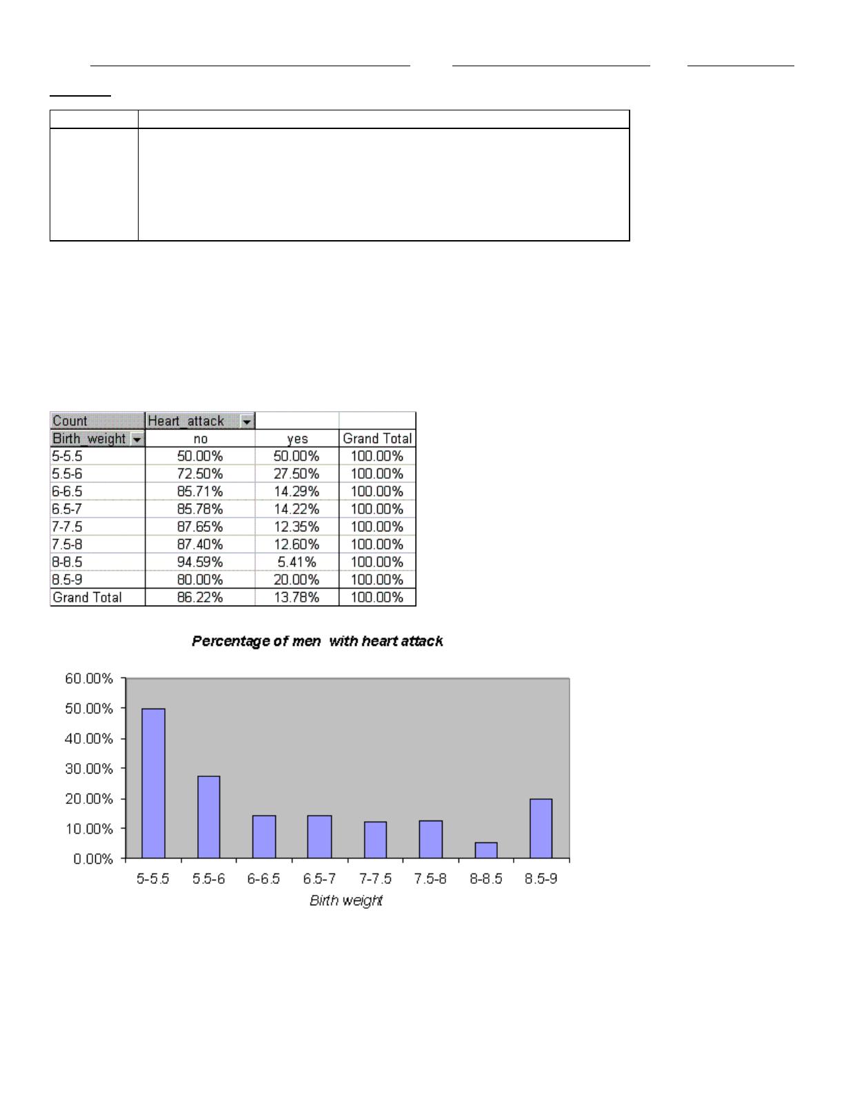
68. A health magazine reported that a man’s weight at birth has a significant impact on the chance that the man will suffer
a heart attack during his life. A statistician analyzed a data set for a sample of 798 men, and produced the pivot table and
histogram shown below. Determine how birth weight influences the chances that a man will have a heart attack.
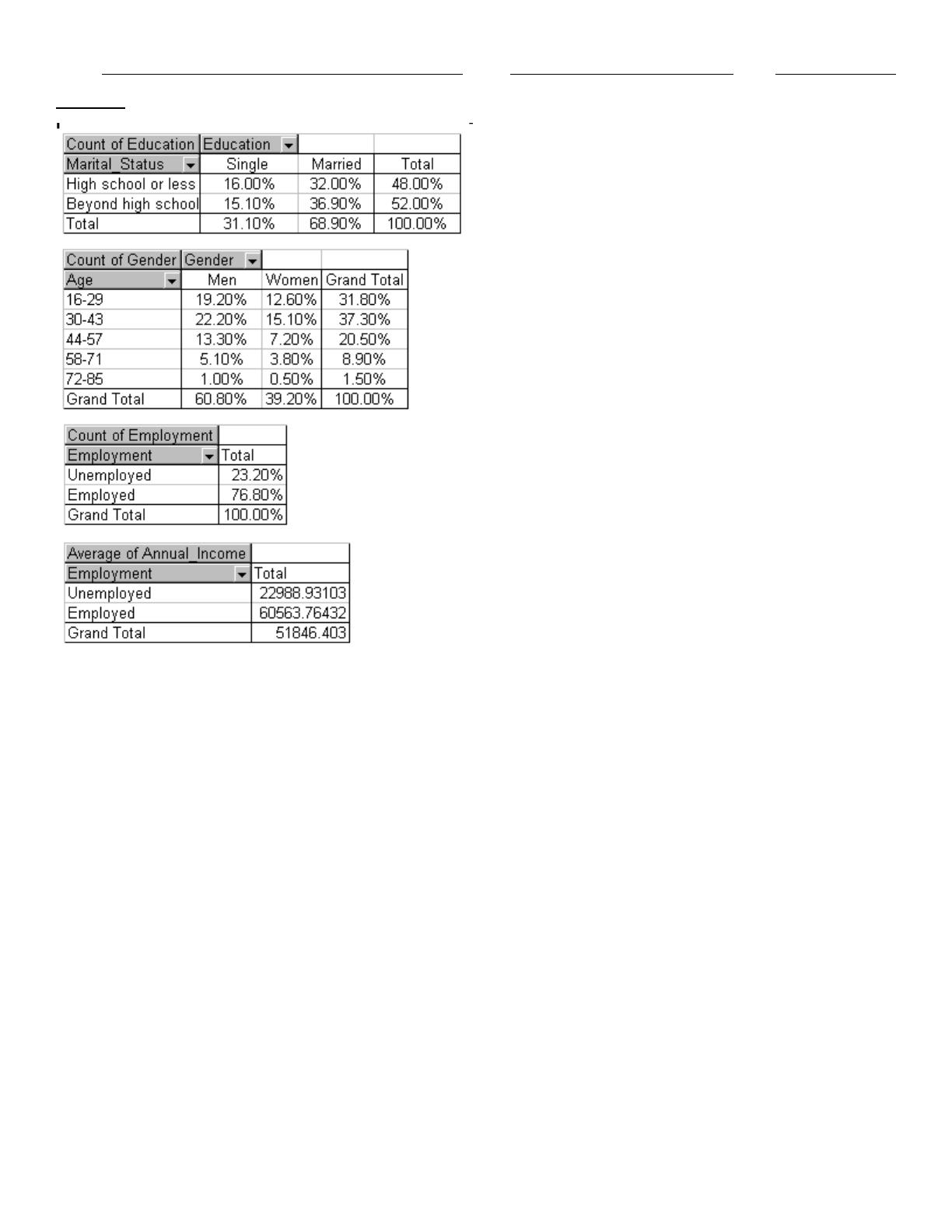
A recent survey collected data from 1000 randomly selected Internet users. The characteristics of the users include their
gender, age, education, marital status, and annual income. Using Excel, the following pivot tables were produced.
Name:
Class:
Date:
chapter 3
69. Approximate the percentage of these Internet users who are married.
70. What percentage of these internet users has formal education beyond high school?
71. Approximate the percentage of these Internet users who are married with formal education beyond high school.
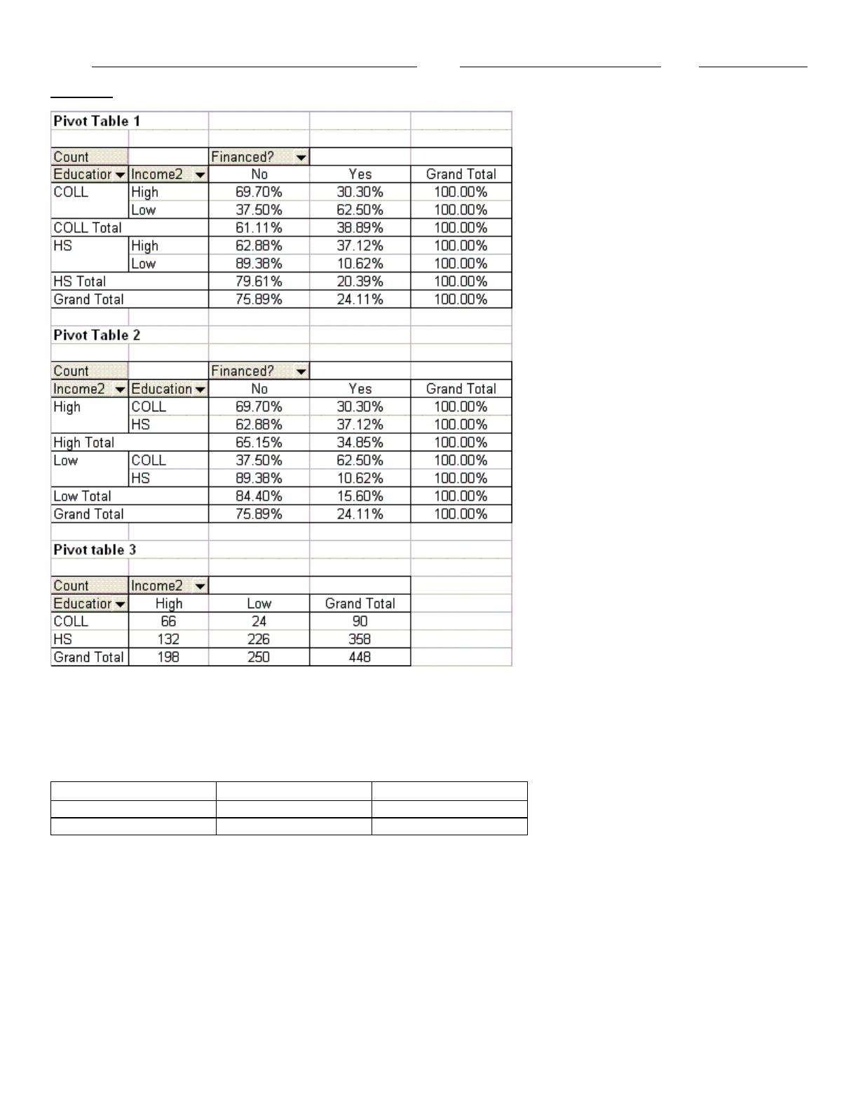
72. A car dealer collected the following information about a sample of 448 Grand Rapids residents:
· Exact salaries of these Grand Rapids residents
· Education level (completed high school only or completed college)
· Income level (low or high)
· Car finance (whether or not the last purchased car was financed)
Using the education level, income level, and car finance data, he created the three pivot tables shown below. Based on
these tables, determine how education and income influence the likelihood that a family finances a car.
Name:
Class:
Date:
chapter 3
A sample of 150 students at a State University was taken after the final business statistics exam to ask them whether they
went partying the weekend before the final or spent the weekend studying, and whether they did well or poorly on the
final. The following table contains the result.
Did Well in Exam
Did Poorly in Exam
Studying for Exam
60
15
Went Partying
22
53
73. If the sample is a good representation of the population, what percentage of those who did poorly on the final exam
should we expect to have spent the weekend studying?
74. Of those in the sample who went partying the weekend before the final exam, what percentage of them did well in the
exam?
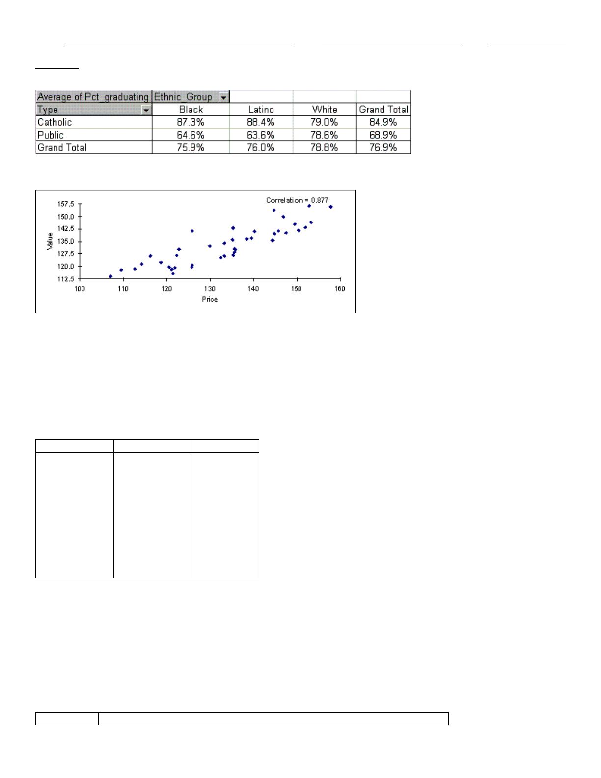
75. A sample of 30 schools produced the pivot table shown below for the average percentage of students graduating from
high school. Use this table to determine how the type of school (public or Catholic) that students attend affects their
chance of graduating from high school.
Name:
Class:
Date:
chapter 3
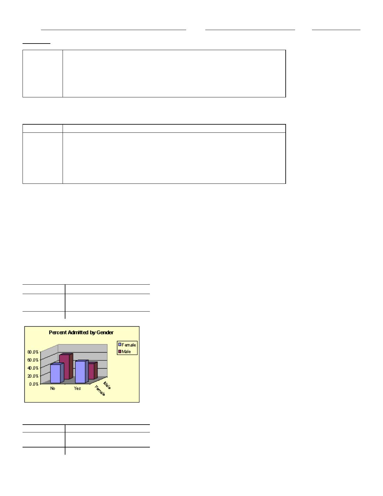
76. The following scatterplot compares the selling price and the appraised value.
Is there a linear relationship between these two variables? If so, how would you characterize the relationship?
Economists believe that countries with more income inequality have lower unemployment rates. An economist in 1996
developed the table below containing the following information for 10 countries during the 1980-1995 time period:
· The change from 1980 to 1995 in ratio of the average wage of the top 10% of all wage earners to the median wage
· The change from 1980 to 1995 in unemployment rate.
Income inequality vs. Unemployment rate
Country
WIR Change
UR Change
Germany
–6.0%
6.0%
France
–3.5%
5.6%
Italy
1.0%
5.2%
Japan
0.0%
0.6%
Australia
5.0%
2.4%
Sweden
4.0%
5.9%
Canada
5.5%
2.0%
New Zealand
9.5%
4.0%
Britain
15.6%
2.5%
U.S.
15.8%
–1.8%
77. What other data would you need to be more confident that increased income inequality leads to lower unemployment?
Below you will find current annual salary data and related information for 30 employees at Gamma Technologies, Inc.
These data include each selected employees gender (1 for female; 0 for male), age, number of years of relevant work
experience prior to employment at Gamma, number of years of employment at Gamma, the number of years of post-
secondary education, and annual salary. The tables of correlations and covariances are presented below.
Table of Correlations
Gender
Age
Prior Exp
Gamma Exp
Education
Salary
Name:
Class:
Date:
chapter 3
Gender
1.000
Age
–0.111
1.000
Prior Exp
0.054
0.800
1.000
Gamma Exp
–0.203
0.916
0.587
1.000
Education
–0.039
0.518
0.434
0.342
1.000
Salary
–0.154
0.923
0.723
0.870
0.617
1.000
Table of Covariances (variances on the diagonal)
Gender
Age
Prior Exp
Gamma Exp
Education
Salary
Gender
0.259
Age
–0.633
134.051
Prior Exp
0.117
39.060
19.045
Gamma Exp
–0.700
72.047
17.413
49.421
Education
–0.033
9.951
3.140
3.987
2.947
Salary
-1825.97
249702.35
73699.75
143033.29
24747.68
584640062
78. How would you characterize the relationship between gender and annual salary?
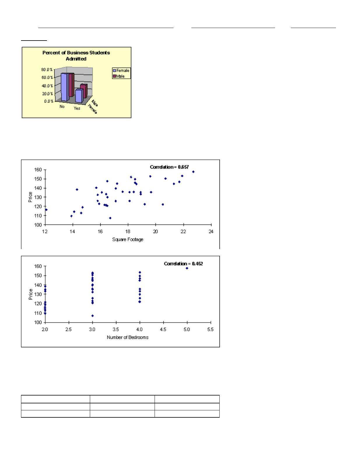
79. The students at small community college in Iowa apply to study either English or Business. Some administrators at the
college are concerned that women are being discriminated against in being allowed admittance, particularly in the
business program. Below, you will find two pivot tables that show the percentage of students admitted by gender to the
English program and the Business school. The data has also been presented graphically. What do the data and graphs
indicate?
English program
Gender
No
Yes
Total
Female
46.0%
54.0%
100%
Male
60.8%
39.2%
100%
Total
53.5%
46.5%
100%
Business school
Gender
No
Yes
Total
Female
69.2%
30.8%
100%
Male
64.1%
35.9%
100%
Total
65.4%
34.6%
100%
Name:
Class:
Date:
chapter 3
80. There are two scatterplots shown below. The first chart shows the relationship between the size of the home and the
selling price. The second chart examines the relationship between the number of bedrooms in the home and its selling
price. Which of these two variables (the size of the home or the number of bedrooms) seems to have the stronger
relationship with the home’s selling price? Justify your answer.
A sample of 150 students at a State University was taken after the final business statistics exam to ask them whether they
went partying the weekend before the final or spent the weekend studying, and whether they did well or poorly on the
final. The following table contains the result.
Did Well in Exam
Did Poorly in Exam
Studying for Exam
60
15
Went Partying
22
53
Name:
Class:
Date:
chapter 3
81. What percentage of the students in the sample went partying the weekend before the final exam and did poorly on the
exam?
An economic development researcher wants to understand the relationship between the average monthly expenditure on
utilities for households in a particular middle-class neighborhood and each of the following household variables: family
size, approximate location of the household within the neighborhood, and indication of whether those surveyed owned or
rented their home, gross annual income of the first household wage earner, gross annual income of the second household
wage earner (if applicable), size of the monthly home mortgage or rent payment, and the total indebtedness (excluding
the value of a home mortgage) of the household.
The correlation for each pairing of variables are shown in the table below:
Table of correlations
82. Which of the variables have a positive linear relationship with the household’s average monthly expenditure on
utilities?
A recent survey collected data from 1000 randomly selected Internet users. The characteristics of the users include their
gender, age, education, marital status, and annual income. Using Excel, the following pivot tables were produced.

Name:
Class:
Date:
chapter 3
83. Approximate the percentage of these Internet users who are in the 58–71 age group.
84. Approximate the percentage of these internet users who are women.
85. Three samples, regarding the ages of teachers, are selected randomly as shown below:
Sample A: 17 22 20 18 23
Sample B: 30 28 35 40 25
Sample C: 44 39 54 21 52
How is the value of the correlation coefficient r affected in each of the following cases?
a) Each X value is multiplied by 4.
b) Each X value is switched with the corresponding Y value.
c) Each X value is increased by 2.
Name:
Class:
Date:
chapter 3
Answer Key
Name:
Class:
Date:
chapter 3
Name:
Class:
Date:
chapter 3
more.)
Name:
Class:
Date:
chapter 3
(36.0% versus 10.4%).
Name:
Class:
Date:
chapter 3
purchase, there aren’t many low-income people with a college education.
Catholic and public schools that are white.
from the scatterplot, that there is a positive relationship between the selling price and the appraisal value.
gender value increases. This indicates that the salaries are lower for females (1) than for males (0).
program.
variable.
expenditure on utilities.