Page 1
1.
Given the data below concerning oil prices, which point would best pair with point D to
make a case for a drastic increase in the price of oil?
Point
Year
Oil Price
($ per barrel)
A
1994
17
B
2002
19
C
2005
59
D
2007
63
A)
A
B)
B
C)
C
2.
Given the data below concerning oil prices, which point would best pair with point D to
make a case for a slow increase in the price of oil?
Point
Year
Oil Price
($ per barrel)
A
1994
16
B
2002
20
C
2005
60
D
2007
64
A)
A
B)
B
C)
C
Page 2
3.
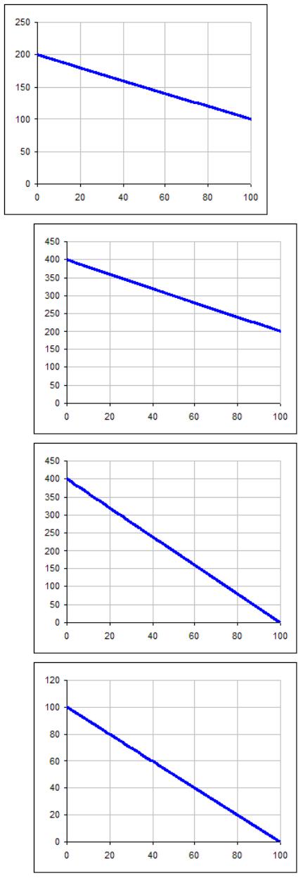
Which graph has the same slope as the graph below.
A)
B)
C)
Page 3
4.
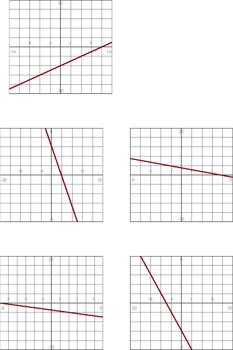
Use the intercepts to calculate the slope of this line. (Give the answer in fraction form.)
5.
Which line appears to have the steeper slope?
A: B:
6.
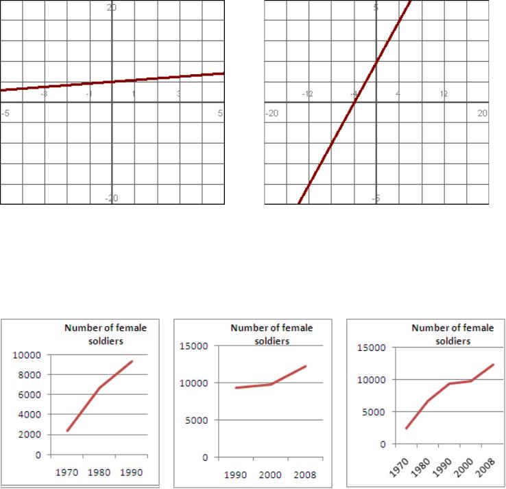
Which line has the steeper slope? (Answer “A”, “B“, or “Same”.)
A: B:
Page 4
7.
Which line has the steeper slope? (Answer “A”, “B“, or “Same”.)
A: B:
8.
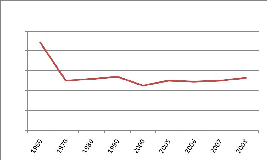
Which of these two graphs makes the best case for the rapid increase of the number of
female soldiers in the U.S. marine corps?
A: B:
C:
Page 5
Use the following to answer questions 9-12:
The following graph shows the percent of families in the U.S. living below the poverty level by
year.
9.
Which slope is larger and why: From B to C, or from G to H?
A)
B to C. From B to C goes up by 0.4 while G to H only goes up by 0.2.
B)
B to C. There are 10 years between B and C while there is only 1 year between G
and H.
C)
G to H. There are 10 years between B and C while there is only 1 year between G
and H.
D)
G to H. The graph continues to rise from H to I.
10.
Which pair of points would be used to show the most rapid increase in the number of
families living in poverty?
A)
B to D
B)
C to D
C)
E to F
D)
H to I
22.2
12.6
13.0
13.5
11.3
12.6
12.3
12.5
13.2
0.0
5.0
10.0
15.0
20.0
25.0
% of U.S. Population in Poverty
A
B
C
D
E
F
G
H
I
Page 6
11.
Which pair of points would be used to show the most rapid decrease in the number of
families living in poverty?
A)
A to B
B)
D to E
C)
G to I
D)
F to G
12.
What is the rate of change in families living in poverty from B to I? (Round the answer
to 3 decimal places.)
13.
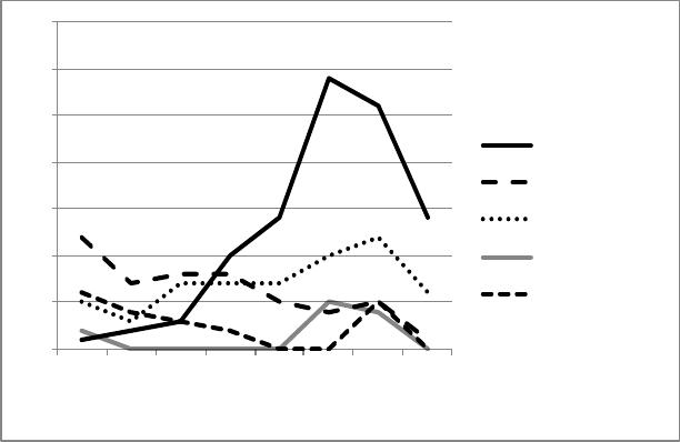
The following graphs shows the number of Nobel Prizes awarded in science for selected
countries.
Number of Nobel Prizes in Science Awarded for Selected Countries
It appears as though the number of prize winners drastically declined in the 1970s (The
number actually stayed the same.). What flaw in the construction of the graph leads to
this impression?
A)
There are only 5 selected countries shown on the graph. Nobel prizes may have
been awarded to other countries during this time.
B)
There was less scientific research being down in the 1970s due to budget cuts.
C)
The final catagory (1971 – 1974) covers a period of only 4 years while the other
entries cover 10-year periods.
D)
Both A and C.
0
5
10
15
20
25
30
35
1901 –
1910
1911 –
1920
1921 –
1930
1931 –
1940
1941 –
1950
1951 –
1960
1961 –
1970
1971 –
1974
United States
Germany
United Kingdom
U.S.S.R
France
Page 7
14.
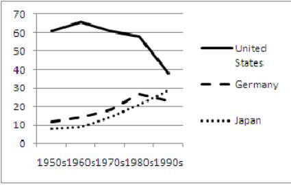
The following graph shows the percentage of cars produced each decade by country.
The graph gives the impression that production drastically decreased in the 1990s while
this is not really true. What flaw in the construction of the graph leads to this
impression?
Page 8
Answer Key