
Organizing and Visualizing Variables 2-1
CHAPTER 2: ORGANIZING AND VISUALIZING
VARIABLES
SCENARIO 2-1
An insurance company evaluates many numerical variables about a person before deciding on an
appropriate rate for automobile insurance. A representative from a local insurance agency selected a
random sample of insured drivers and recorded, X, the number of claims each made in the last 3
years, with the following results.
X f
1 14
2 18
3 12
4 5
5 1
1. Referring to Scenario 2-1, how many drivers are represented in the sample?
a) 5
b) 15
c) 18
d) 50
2. Referring to Scenario 2-1, how many total claims are represented in the sample?
a) 15
b) 50
c) 111
d) 250
3. A type of vertical bar chart in which the categories are plotted in the descending rank order of the
magnitude of their frequencies is called a
a) contingency table.
b) Pareto chart.
c) stem-and-leaf display.
d) pie chart.

2-2 Organizing and Visualizing Variables
SCENARIO 2-2
At a meeting of information systems officers for regional offices of a national company, a survey was
taken to determine the number of employees the officers supervise in the operation of their
departments, where X is the number of employees overseen by each information systems officer.
X f_
1 7
2 5
3 11
4 8
5 9
4. Referring to Scenario 2-2, how many regional offices are represented in the survey results?
a) 5
b) 11
c) 15
d) 40
5. Referring to Scenario 2-2, across all of the regional offices, how many total employees were
supervised by those surveyed?
a) 15
b) 40
c) 127
d) 200
6. The width of each bar in a histogram corresponds to the
a) differences between the boundaries of the class.
b) number of observations in each class.
c) midpoint of each class.
d) percentage of observations in each class.
ANSWER:
Organizing and Visualizing Variables 2-3
SCENARIO 2-3
Every spring semester, the School of Business coordinates a luncheon with local business leaders for
graduating seniors, their families, and friends. Corporate sponsorship pays for the lunches of each of
the seniors, but students have to purchase tickets to cover the cost of lunches served to guests they
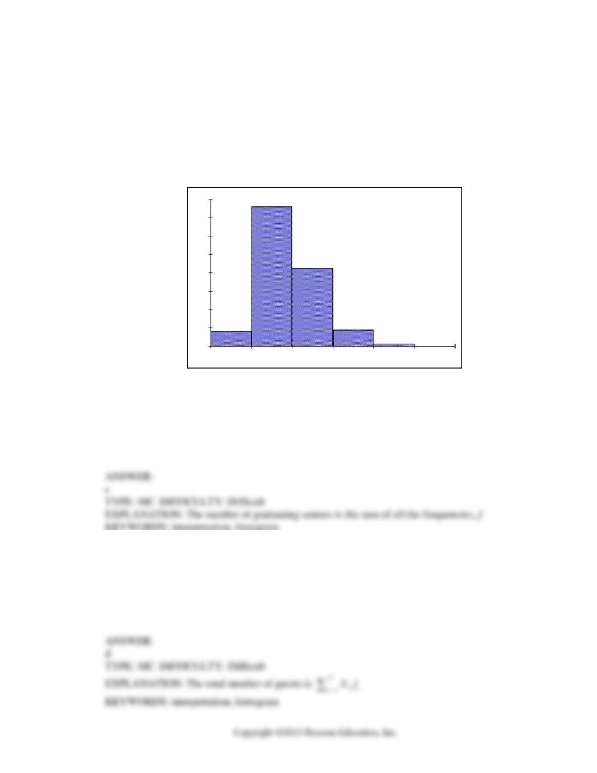
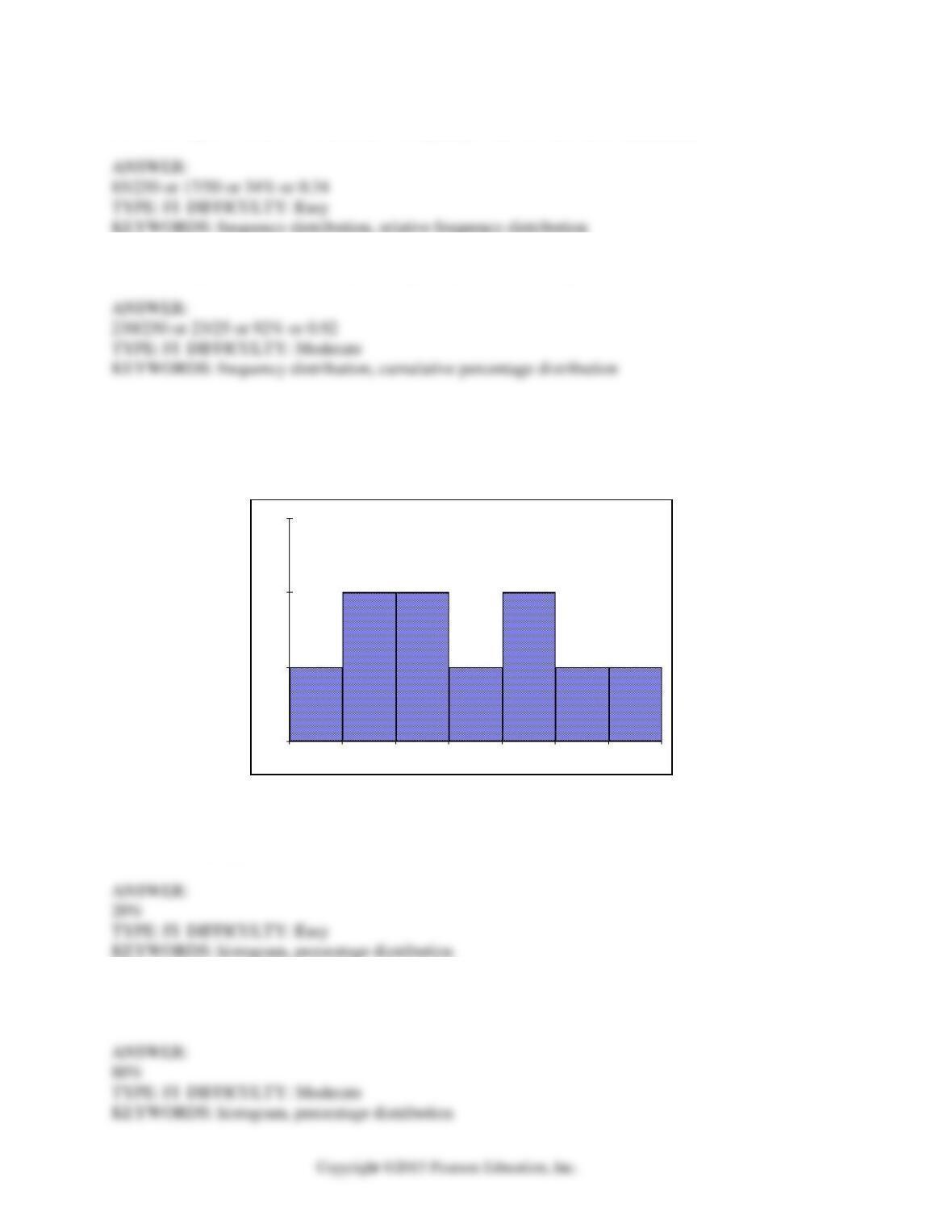
bring with them. The following histogram represents the attendance at the senior luncheon, where X
is the number of guests each graduating senior invited to the luncheon and f is the number of
graduating seniors in each category.
17
152
85
18
3
0
0
20
40
60
80
100
120
140
160
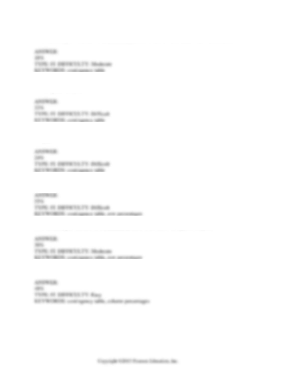
0 1 2 3 4 5
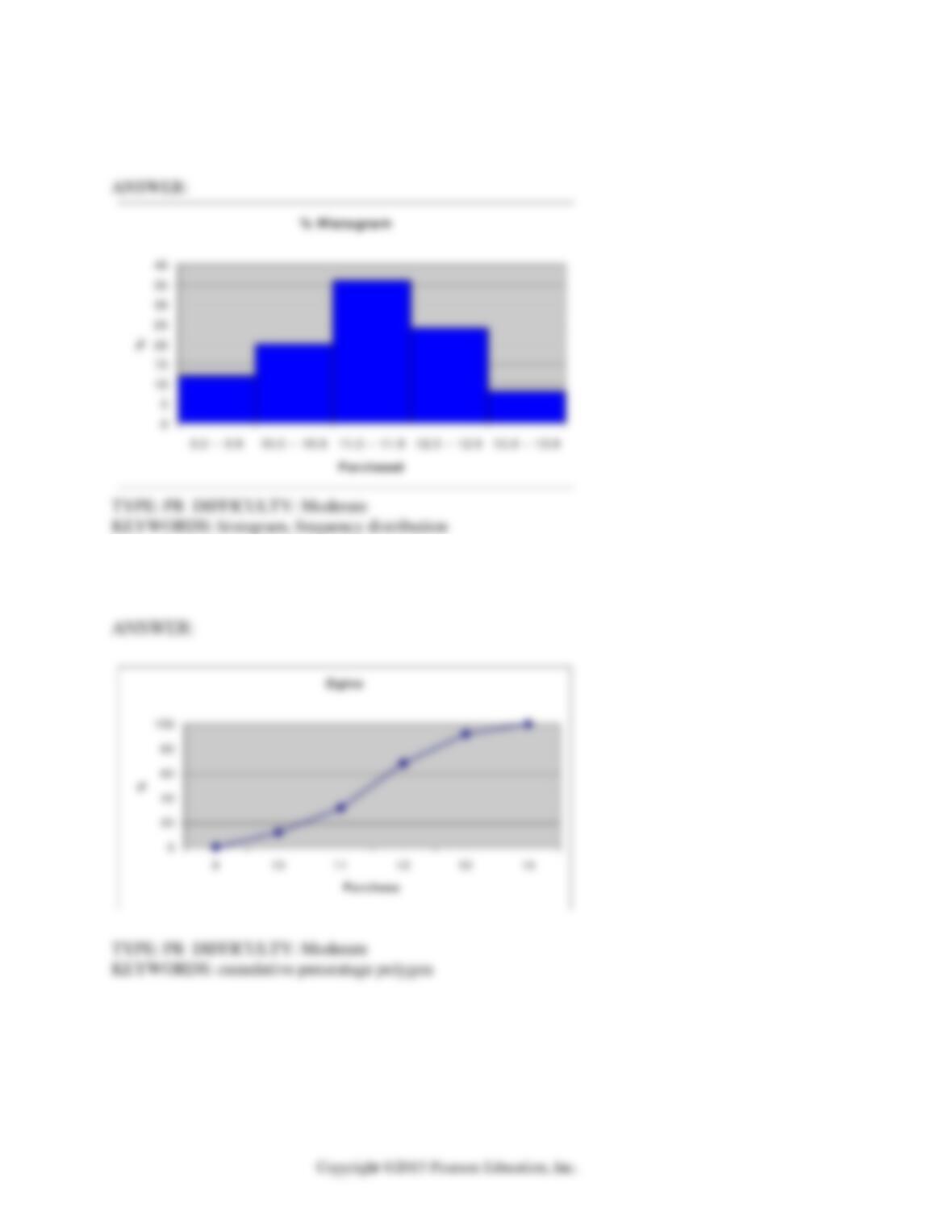
Guests per Student
Fre quency
7. Referring to the histogram from Scenario 2-3, how many graduating seniors attended the
luncheon?
a) 4
b) 152
c) 275
d) 388
8. Referring to the histogram from Scenario 2-3, if all the tickets purchased were used, how many
guests attended the luncheon?
a) 4
b) 152
c) 275
d) 388
2-4 Organizing and Visualizing Variables
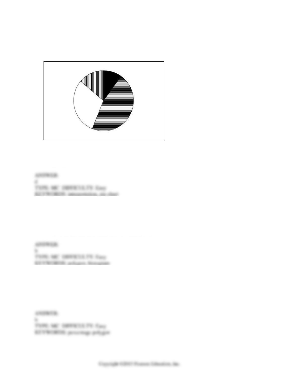
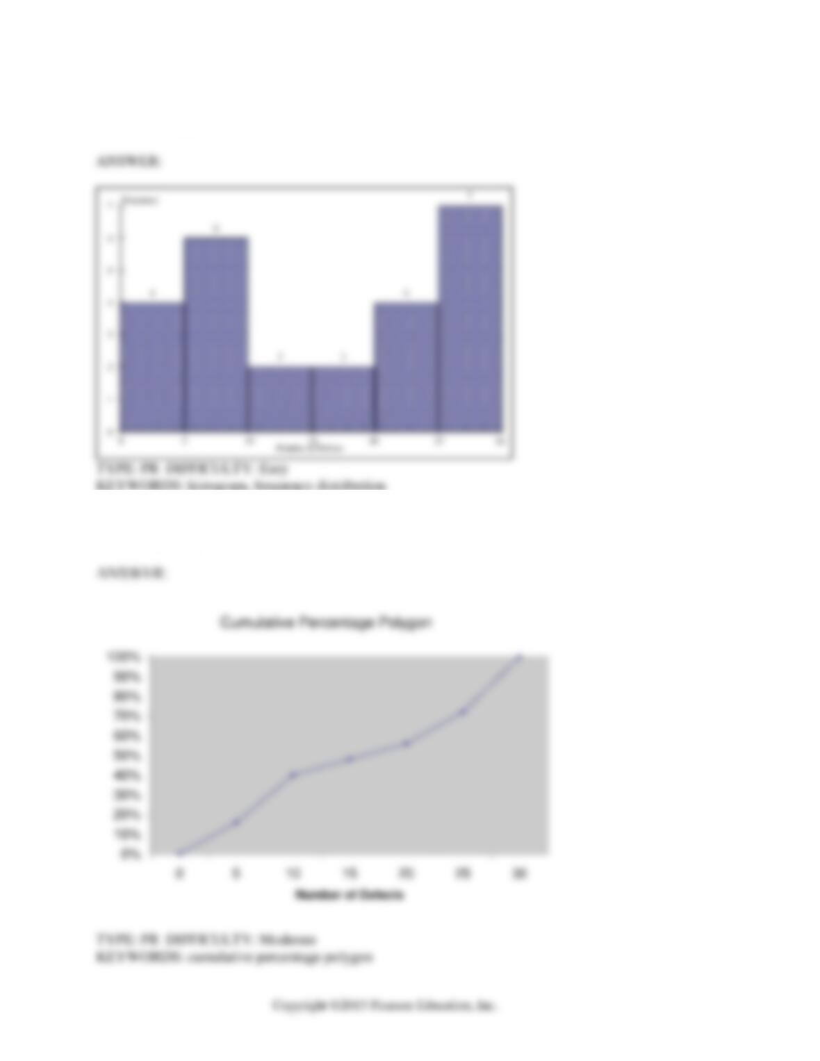
9. A professor of economics at a small Texas university wanted to determine what year in school
students were taking his tough economics course. Shown below is a pie chart of the results. What
percentage of the class took the course prior to reaching their senior year?
Juniors
30%
Seniors
14%
Sophomores
46%
Freshmen
10%
a) 14%
b) 44%
c) 54%
d) 86%
10. When polygons or histograms are constructed, which axis must show the true zero or “origin”?
a) The horizontal axis.
b) The vertical axis.
c) Both the horizontal and vertical axes.
d) Neither the horizontal nor the vertical axis.
11. When constructing charts, the following is plotted at the class midpoints:
a) frequency histograms.
b) percentage polygons.
c) cumulative percentage polygon (ogives).
d) All of the above.

Organizing and Visualizing Variables 2-5
SCENARIO 2-4
A survey was conducted to determine how people rated the quality of programming available on
television. Respondents were asked to rate the overall quality from 0 (no quality at all) to 100
(extremely good quality). The stem-and-leaf display of the data is shown below.
Stem Leaves
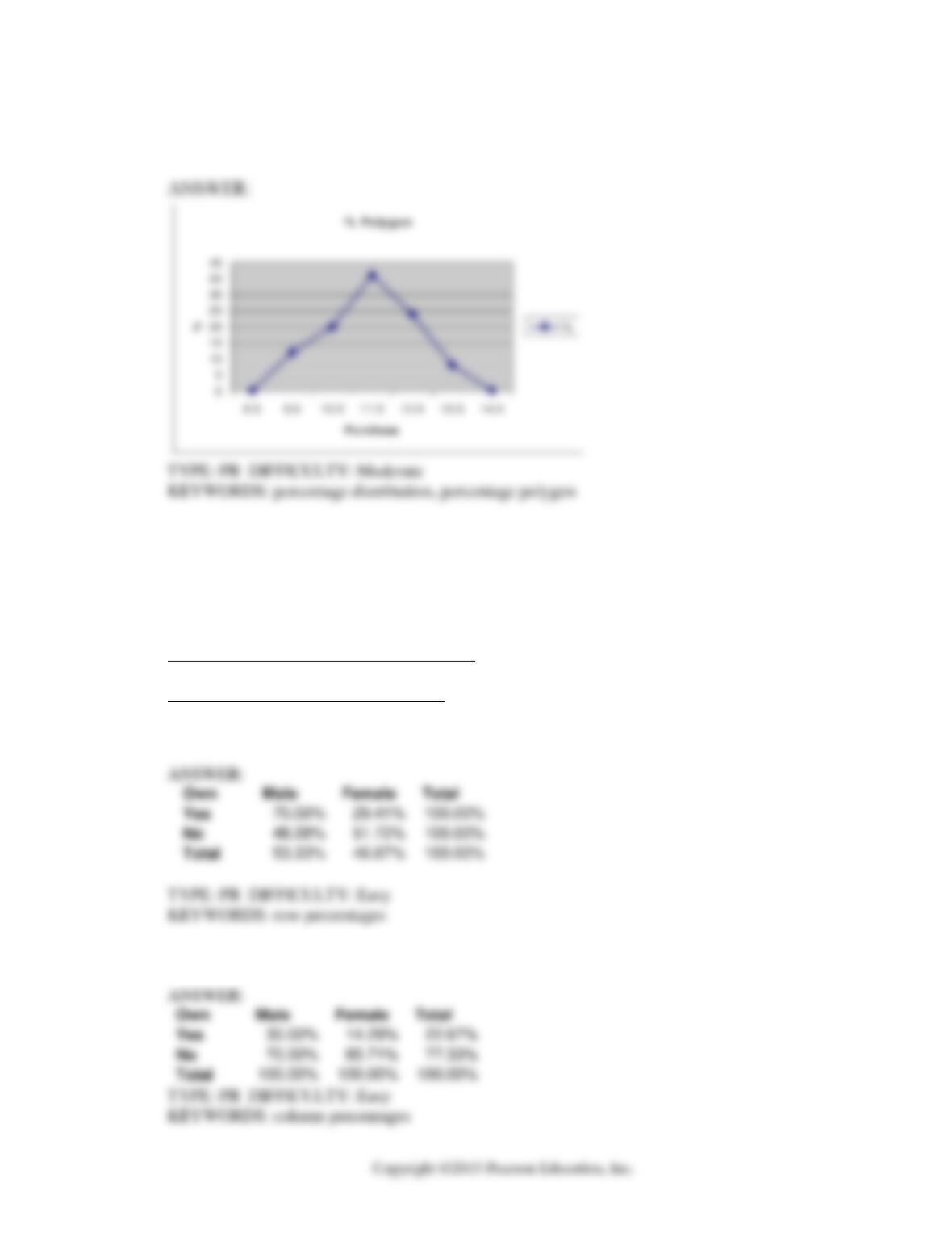
3 24
4 03478999
5 0112345
6 12566
7 01
8
9 2
12. Referring to Scenario 2-4, what percentage of the respondents rated overall television quality
with a rating of 80 or above?
a) 0
b) 4
c) 96
d) 100
13. Referring to Scenario 2-4, what percentage of the respondents rated overall television quality
with a rating of 50 or below?
a) 11
b) 40
c) 44
d) 56
14. Referring to Scenario 2-4, what percentage of the respondents rated overall television quality
with a rating from 50 through 75?
a) 11
b) 40
c) 44
d) 56

2-6 Organizing and Visualizing Variables
SCENARIO 2-5
The following are the duration in minutes of a sample of long-distance phone calls made within the
continental United States reported by one long-distance carrier.
Relative
Time (in Minutes) Frequency
0 but less than 5 0.37
5 but less than 10 0.22
10 but less than 15 0.15
15 but less than 20 0.10
20 but less than 25 0.07
25 but less than 30 0.07
30 or more 0.02
15. Referring to Scenario 2-5, what is the width of each class?
a) 1 minute
b) 5 minutes
c) 2%
d) 100%
16. Referring to Scenario 2-5, if 1,000 calls were randomly sampled, how many calls lasted under 10
minutes?
a. 220
b. 370
c. 410
d. 590
17. Referring to Scenario 2-5, if 100 calls were randomly sampled, how many calls lasted 15 minutes
or longer?
a. 10
b. 14
c. 26
d. 74

Organizing and Visualizing Variables 2-7
18. Referring to Scenario 2-5, if 10 calls lasted 30 minutes or more, how many calls lasted less than
5 minutes?
a) 10
b) 185
c) 295
d) 500
19. Referring to Scenario 2-5, what is the cumulative relative frequency for the percentage of calls
that lasted under 20 minutes?
a) 0.10
b) 0.59
c) 0.76
d) 0.84
20. Referring to Scenario 2-5, what is the cumulative relative frequency for the percentage of calls
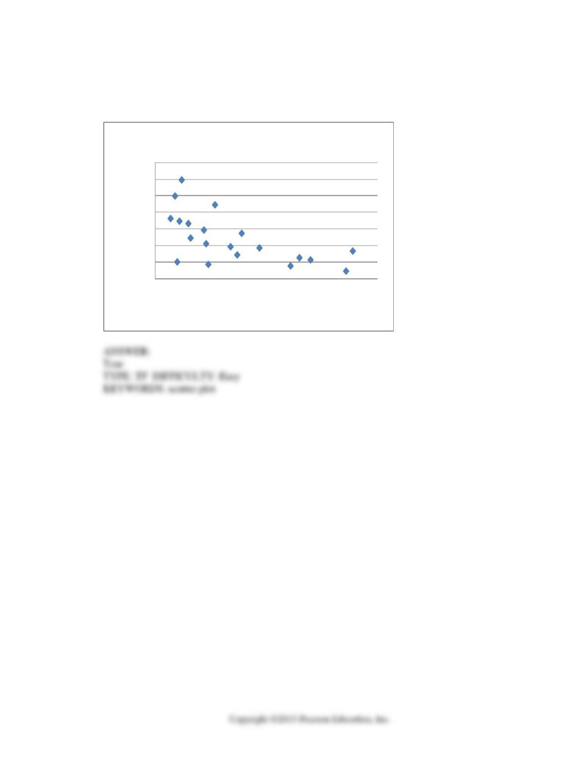
that lasted 10 minutes or more?
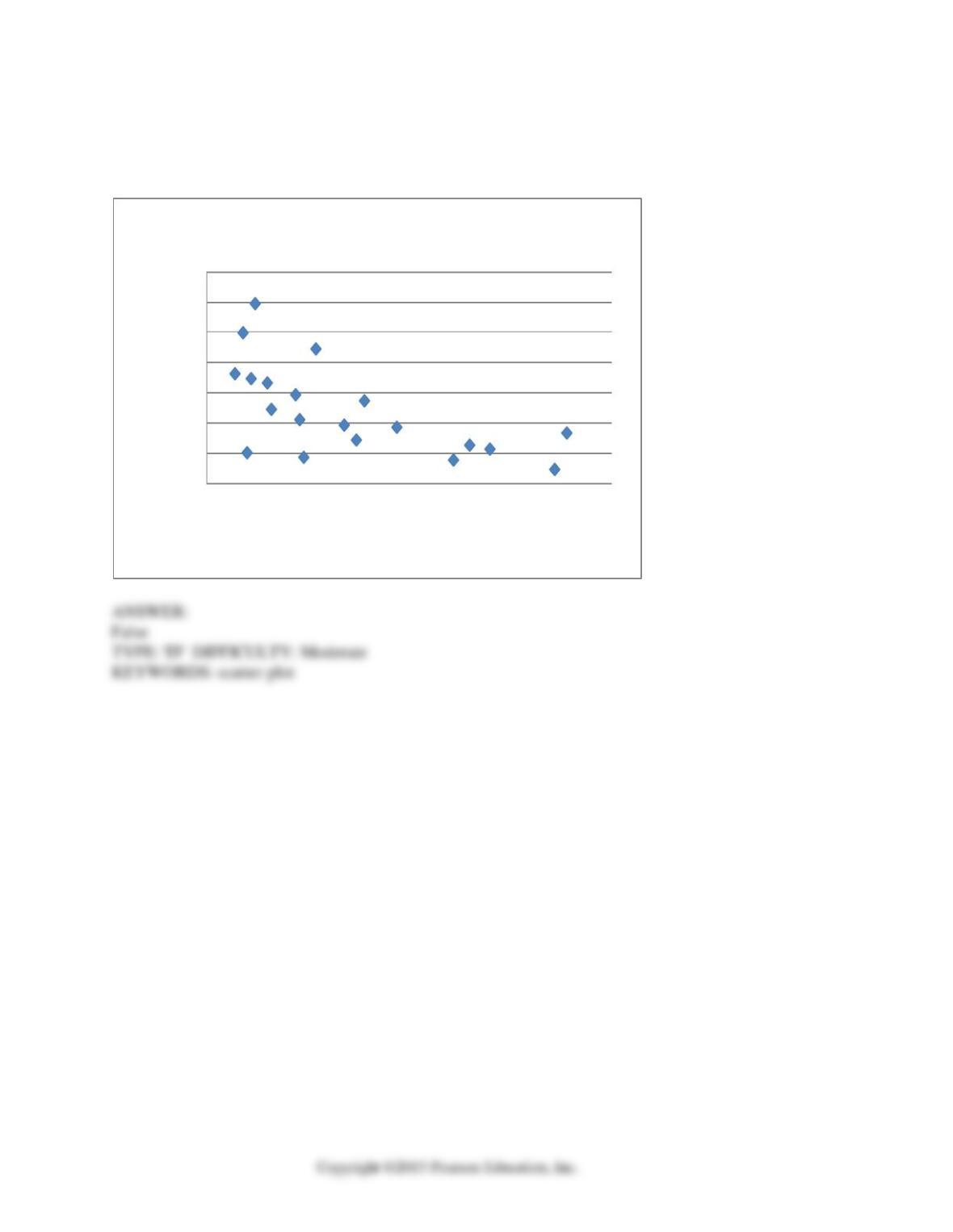
a) 0.16
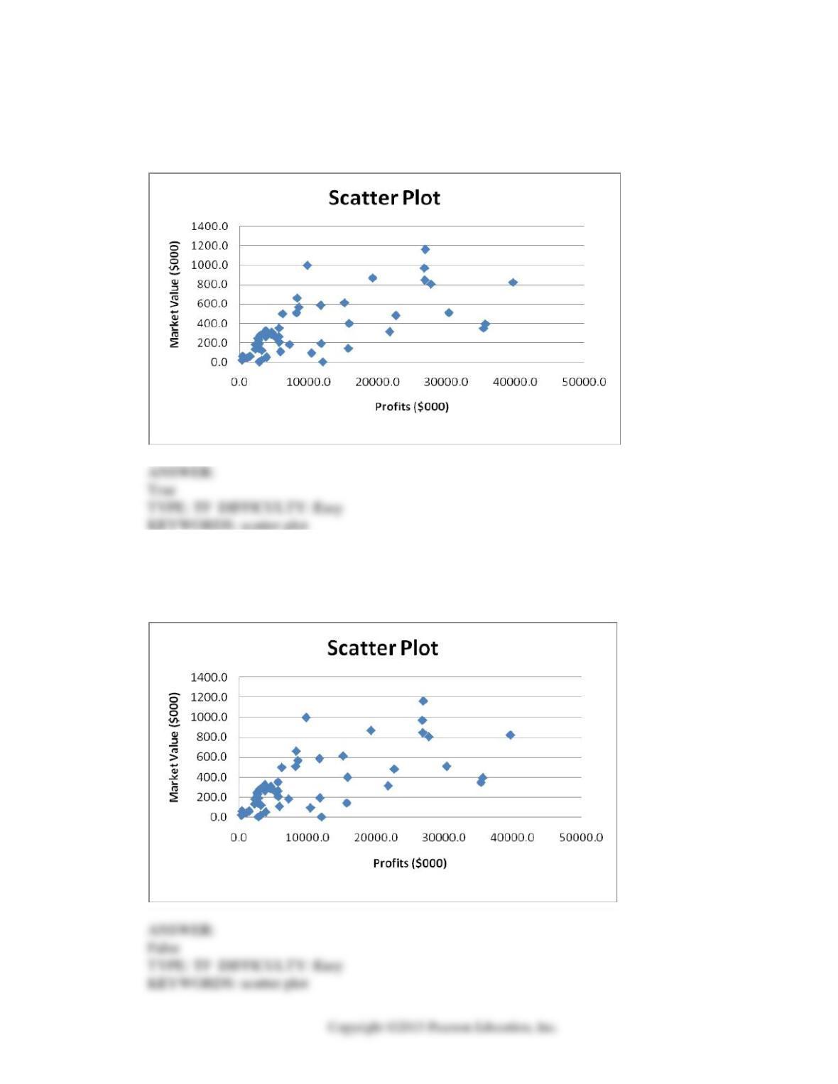
b) 0.24
c) 0.41
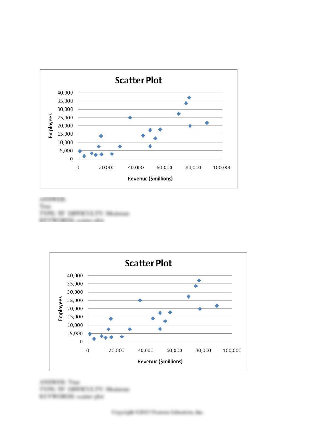
d) 0.90
21. Referring to Scenario 2-5, if 100 calls were randomly sampled, _______ of them would have
lasted at least 15 minutes but less than 20 minutes
a) 6
b) 8
c) 10
d) 16

2-8 Organizing and Visualizing Variables
22. Referring to Scenario 2-5, if 100 calls were sampled, _______ of them would have lasted less
than 15 minutes.
a) 26
b) 74
c) 10
d) None of the above.
23. Referring to Scenario 2-5, if 100 calls were sampled, _______of them would have lasted 20
minutes or more.
a) 26
b) 16
c) 74
d) None of the above.
24. Referring to Scenario 2-5, if 100 calls were sampled, _______ of them would have lasted less
than 5 minutes or at least 30 minutes or more.
a) 35
b) 37
c) 39
d) None of the above.
25. Which of the following is appropriate for displaying data collected on the different brands of cars
students at a major university drive?
a) A Pareto chart
b) A two-way classification table
c) A histogram
d) A scatter plot
Organizing and Visualizing Variables 2-9
26. One of the developing countries is experiencing a baby boom, with the number of births rising
for the fifth year in a row, according to a BBC News report. Which of the following is best for
displaying this data?
a) A Pareto chart
b) A two-way classification table
c) A histogram
d) A time-series plot
27. When studying the simultaneous responses to two categorical questions, you should set up a
a) contingency table.
b) frequency distribution table.
c) cumulative percentage distribution table.
d) histogram.
28. Data on 1,500 students’ height were collected at a larger university in the East Coast. Which of
the following is the best chart for presenting the information?
a) A pie chart.
b) A Pareto chart.
c) A side-by-side bar chart.
d) A histogram.
29. Data on the number of part-time hours students at a public university worked in a week were
collected. Which of the following is the best chart for presenting the information?
a) A pie chart.
b) A Pareto chart.
c) A percentage table.
d) A percentage polygon.
2-10 Organizing and Visualizing Variables
30. Data on the number of credit hours of 20,000 students at a public university enrolled in a Spring
semester were collected. Which of the following is the best for presenting the information?
a) A pie chart.
b) A Pareto chart.
c) A stem-and-leaf display.
d) A contingency table.
31. A survey of 150 executives were asked what they think is the most common mistake
candidates make during job interviews. Six different mistakes were given. Which of the
following is the best for presenting the information?
a) A bar chart.
b) A histogram
c) A stem-and-leaf display.
d) A contingency table.
32. You have collected information on the market share of 5 different search engines used by U.S.
Internet users in a particular quarter. Which of the following is the best for presenting the
information?
a) A pie chart.
b) A histogram
c) A stem-and-leaf display.
d) A contingency table.
ANSWER:
Organizing and Visualizing Variables 2-11
33. You have collected information on the consumption by the 15 largest coffee-consuming nations.
Which of the following is the best for presenting the shares of the consumption?
a) A pie chart.
b) A Pareto chart
c) A side-by-side bar chart.
d) A contingency table.
34. You have collected data on the approximate retail price (in $) and the energy cost per year (in $)
of 15 refrigerators. Which of the following is the best for presenting the data?
a) A pie chart.
b) A scatter plot
c) A side-by-side bar chart.
d) A contingency table.
35. You have collected data on the number of U.S. households actively using online banking and/or
online bill payment over a 10-year period. Which of the following is the best for presenting the
data?
a) A pie chart.
b) A stem-and-leaf display
c) A side-by-side bar chart.
d) A time-series plot.
36. You have collected data on the monthly seasonally adjusted civilian unemployment rate for the
United States over a 10-year period. Which of the following is the best for presenting the data?
a) A contingency table.
b) A stem-and-leaf display
c) A time-series plot.
d) A side-by-side bar chart.
2-12 Organizing and Visualizing Variables
37. You have collected data on the number of complaints for 6 different brands of automobiles sold
in the US over a 10-year period. Which of the following is the best for presenting the data?
a) A contingency table.
b) A stem-and-leaf display
c) A time-series plot.
d) A side-by-side bar chart.
38. You have collected data on the responses to two questions asked in a survey of 40 college
students majoring in business—What is your gender (Male = M; Female = F) and What is your
major (Accountancy = A; Computer Information Systems = C; Marketing = M). Which of the
following is the best for presenting the data?
a) A contingency table.
b) A stem-and-leaf display
c) A time-series plot.
d) A Pareto chart.
ANSWER:
SCENARIO 2-6
A sample of 200 students at a Big-Ten university was taken after the midterm to ask them whether
they went bar hopping the weekend before the midterm or spent the weekend studying, and whether
they did well or poorly on the midterm. The following table contains the result.
Did Well in Midterm
Did Poorly in Midterm
Studying for Exam
80
20
Went Bar Hopping
30
70
39. Referring to Scenario 2-6, of those who went bar hopping the weekend before the midterm in the
sample, _______ percent of them did well on the midterm.
a) 15
b) 27.27
c) 30
d) 55
Organizing and Visualizing Variables 2-13
40. Referring to Scenario 2-6, of those who did well on the midterm in the sample, _______ percent
of them went bar hopping the weekend before the midterm.
a) 15
b) 27.27
c) 30
d) 50
41. Referring to Scenario 2-6, _______ percent of the students in the sample went bar hopping the
weekend before the midterm and did well on the midterm.
a) 15
b) 27.27
c) 30
d) 50
42. Referring to Scenario 2-6, _______ percent of the students in the sample spent the weekend
studying and did well on the midterm.
a) 40
b) 50
c) 72.72
d) 80
43. Referring to Scenario 2-6, if the sample is a good representation of the population, we can expect
_______ percent of the students in the population to spend the weekend studying and do poorly
on the midterm.
a) 10
b) 20
c) 45
d) 50

2-14 Organizing and Visualizing Variables
44. Referring to Scenario 2-6, if the sample is a good representation of the population, we can expect
_______ percent of those who spent the weekend studying to do poorly on the midterm.
a) 10
b) 20
c) 45
d) 50
45. Referring to Scenario 2-6, if the sample is a good representation of the population, we can expect
_______ percent of those who did poorly on the midterm to have spent the weekend studying.
a) 10
b) 22.22
c) 45
d) 50
46. In a contingency table, the number of rows and columns
a) must always be the same.
b) must always be 2.
c) must add to 100%.
d) None of the above.
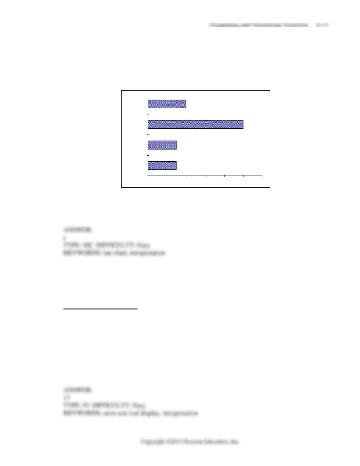
47. Retailers are always interested in determining why a customer selected their store to make a
purchase. A sporting goods retailer conducted a customer survey to determine why its customers
shopped at the store. The results are shown in the bar chart below. What proportion of the
customers responded that they shopped at the store because of the merchandise or the
convenience?
15%
15%
50%
20%
0% 10% 20% 30% 40% 50% 60%
Other
Convenience
Merchandise
Prices
Responses
a) 35%
b) 50%
c) 65%
d) 85%
SCENARIO 2-7
The Stem-and-Leaf display below contains data on the number of months between the date a civil
suit is filed and when the case is actually adjudicated for 50 cases heard in superior court.
Stem Leaves
1 2 3 4 4 4 7 8 9 9
2 2 2 2 2 3 4 5 5 6 7 8 8 8 9
3 0 0 1 1 1 3 5 7 7 8
4 0 2 3 4 5 5 7 9
5 1 1 2 4 6 6
6 1 5 8
48. Referring to Scenario 2-7, locate the first leaf, i.e., the lowest valued leaf with the lowest valued
stem. This represents a wait of ________ months.

2-16 Organizing and Visualizing Variables
49. Referring to Scenario 2-7, the civil suit with the longest wait between when the suit was filed and
when it was adjudicated had a wait of ________ months.
50. Referring to Scenario 2-7, the civil suit with the fourth shortest waiting time between when the
suit was filed and when it was adjudicated had a wait of ________ months.
51. Referring to Scenario 2-7, ________ percent of the cases were adjudicated within the first 2
years.
52. Referring to Scenario 2-7, ________ percent of the cases were not adjudicated within the first 4
years.
53. Referring to Scenario 2-7, if a frequency distribution with equal sized classes was made from this
data, and the first class was “10 but less than 20,” the frequency of that class would be ________.
54. Referring to Scenario 2-7, if a frequency distribution with equal sized classes was made from
this data, and the first class was “10 but less than 20,” the relative frequency of the third class
would be ________.
ANSWER:

Organizing and Visualizing Variables 2-17
55. Referring to Scenario 2-7, if a frequency distribution with equal sized classes was made from this
data, and the first class was “10 but less than 20,” the cumulative percentage of the second class
would be ________.
SCENARIO 2-8
The Stem-and-Leaf display represents the number of times in a year that a random sample of 100
“lifetime” members of a health club actually visited the facility.
Stem Leaves
0 012222233333344566666667789999
1 1111222234444455669999
2 00011223455556889
3 0000446799
4 011345567
5 0077
6 8
7 67
8 3
9 0247
56. Referring to Scenario 2-8, the person who has the largest leaf associated with the smallest stem
visited the facility ________ times.
57. Referring to Scenario 2-8, the person who visited the health club less than anyone else in the
sample visited the facility ________ times.
58. Referring to Scenario 2-8, the person who visited the health club more than anyone else in the
sample visited the facility ________ times.

2-18 Organizing and Visualizing Variables
59. Referring to Scenario 2-8, ________ of the 100 members visited the health club at least 52 times
in a year.
60. Referring to Scenario 2-8, ________ of the 100 members visited the health club no more than 12
times in a year.
61. Referring to Scenario 2-8, if a frequency distribution with equal sized classes was made from this
data, and the first class was “0 but less than 10,” the frequency of the fifth class would be
________.
62. Referring to Scenario 2-8, if a frequency distribution with equal sized classes was made from this
data, and the first class was “0 but less than 10,” the relative frequency of the last class would be
________.
63. Referring to Scenario 2-8, if a frequency distribution with equal sized classes was made from this
data, and the first class was “0 but less than 10,” the cumulative percentage of the next–to–last
class would be ________.
Organizing and Visualizing Variables 2-19
64. Referring to Scenario 2-8, if a frequency distribution with equal sized classes was made from this
data, and the first class was “0 but less than 10,” the class midpoint of the third class would be
________.
SCENARIO 2-9
The frequency distribution below represents the rents of 250 randomly selected federally subsidized
apartments in a small town.
Rent in $ Frequency
1,100 but less than 1,200 113
1,200 but less than 1,300 85
1,300 but less than 1,400 32
1,400 but less than 1,500 16
1,500 but less than 1,600 4
65. Referring to Scenario 2-9, ________ apartments rented for at least $1,200 but less than $1,400.
66. Referring to Scenario 2-9, ________ percent of the apartments rented for $1,400 or more.
67. Referring to Scenario 2-9, ________ percent of the apartments rented for at least $1,300.
68. Referring to Scenario 2-9, the class midpoint of the second class is ________.
2-20 Organizing and Visualizing Variables
69. Referring to Scenario 2-9, the relative frequency of the second class is ________.
70. Referring to Scenario 2-9, the percentage of apartments renting for less than $1,400 is ________.
SCENARIO 2-10
The histogram below represents scores achieved by 200 job applicants on a personality profile.
0.10
0.20
0.20
0.10
0.20
0.10
0.10
0.00
0.10
0.20
0.30
0
10
20
30
40
50
60
70
Rel.Freq.
71. Referring to the histogram from Scenario 2-10, ________ percent of the job applicants scored
between 10 and 20.
72. Referring to the histogram from Scenario 2-10, ________ percent of the job applicants scored
below 50.

Organizing and Visualizing Variables 2-21
73. Referring to the histogram from Scenario 2-10, the number of job applicants who scored between
30 and below 60 is _______.
74. Referring to the histogram from Scenario 2-10, the number of job applicants who scored 50 or
above is _______.
75. Referring to the histogram from Scenario 2-10, 90% of the job applicants scored above or equal
to ________.
76. Referring to the histogram from Scenario 2-10, half of the job applicants scored below
________.
77. Referring to the histogram from Scenario 2-10, _______ percent of the applicants scored below
20 or at least 50.
78. Referring to the histogram from Scenario 2-10, _______ percent of the applicants scored
between 20 and below 50.
2-22 Organizing and Visualizing Variables
SCENARIO 2-11
The ordered array below resulted from selecting a sample of 25 batches of 500 computer chips and
determining how many in each batch were defective.
Defects
1 2 4 4 5 5 6 7 9 9 12 12 15
17 20 21 23 23 25 26 27 27 28 29 29
79. Referring to Scenario 2-11, if a frequency distribution for the defects data is constructed, using
“0 but less than 5″ as the first class, the frequency of the “20 but less than 25” class would be
________.
80. Referring to Scenario 2-11, if a frequency distribution for the defects data is constructed, using
“0 but less than 5” as the first class, the relative frequency of the “15 but less than 20” class
would be ________.
81. Referring to Scenario 2-11, construct a frequency distribution for the defects data, using “0 but
less than 5″ as the first class.
Organizing and Visualizing Variables 2-23
82. Referring to Scenario 2-11, construct a relative frequency or percentage distribution for the
defects data, using “0 but less than 5” as the first class.
83. Referring to Scenario 2-11, construct a cumulative percentage distribution for the defects data if
the corresponding frequency distribution uses “0 but less than 5″ as the first class.
2-24 Organizing and Visualizing Variables
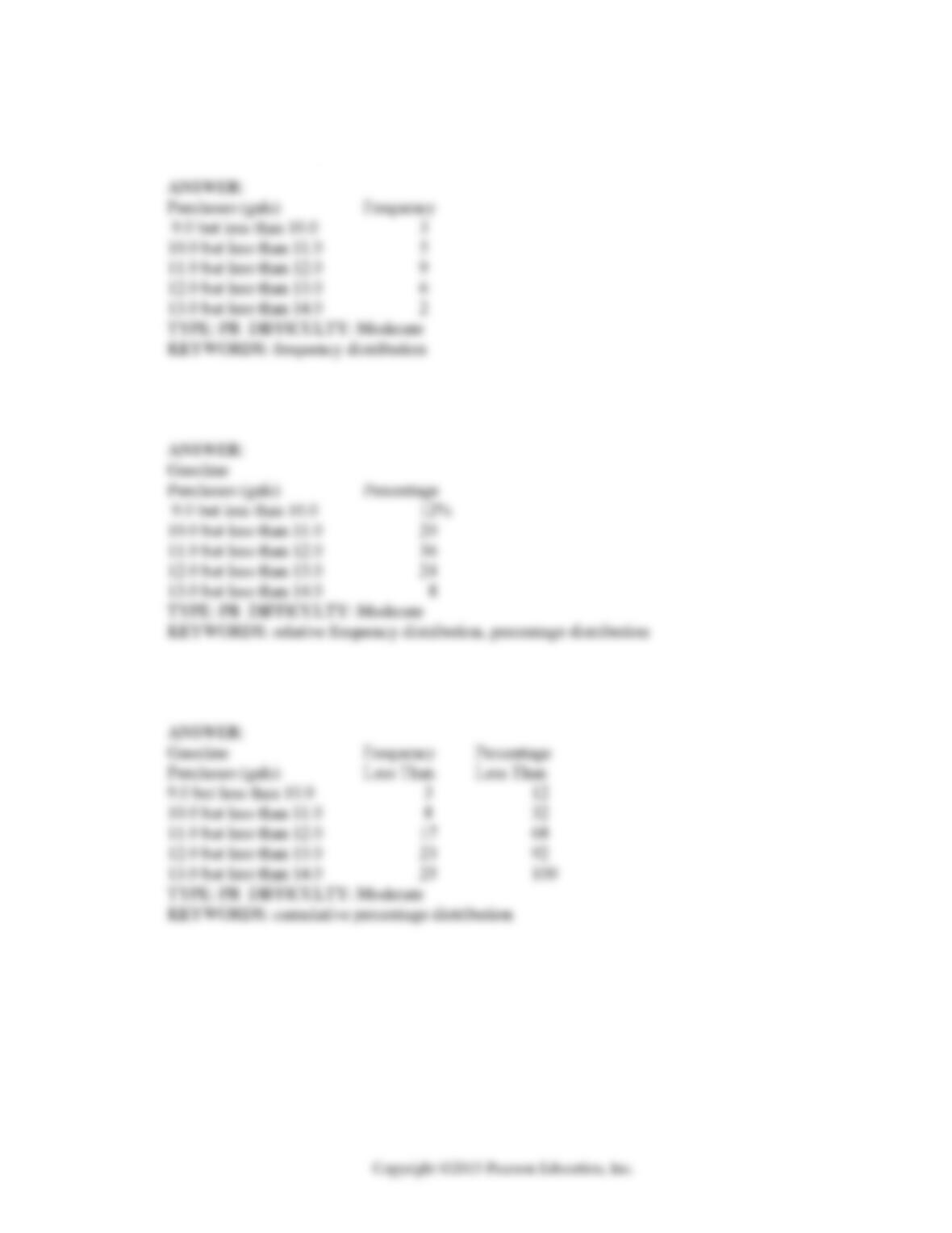
84. Referring to Scenario 2-11, construct a histogram for the defects data, using “0 but less than 5″ as
the first class.
85. Referring to Scenario 2-11, construct a cumulative percentage polygon for the defects data if the
corresponding frequency distribution uses “0 but less than 5″ as the first class.

Organizing and Visualizing Variables 2-25
86. The point halfway between the boundaries of each class interval in a grouped frequency
distribution is called the _______.
87. A _______ is a vertical bar chart in which the rectangular bars are constructed at the boundaries
of each class interval.
88. It is essential that each class grouping or interval in a frequency distribution be ________ and
________.
89. In order to compare one large set of numerical data to another, a ________ distribution must be
developed from the frequency distribution.
90. When comparing two or more large sets of numerical data, the distributions being developed
should use the same ________.
91. The width of each class grouping or interval in a frequency distribution should be ________.

2-26 Organizing and Visualizing Variables
92. In constructing a polygon, each class grouping is represented by its _______ and then these are
consecutively connected to one another.
93. A _______ is a summary table in which numerical data are tallied into class intervals or
categories.
94. True or False: In general, grouped frequency distributions should have between 5 and 15 class
intervals.
95. True or False: The sum of relative frequencies in a distribution always equals 1.
96. True or False: The sum of cumulative frequencies in a distribution always equals 1.
97. True or False: In graphing two categorical data, the side-by-side bar chart is best suited when
comparing joint responses.

Organizing and Visualizing Variables 2-27
98. True or False: When constructing a frequency distribution, classes should be selected so that they
are of equal width.
99. True or False: A research analyst was directed to arrange raw data collected on the yield of
wheat, ranging from 40 to 93 bushels per acre, in a frequency distribution. He should choose 30
as the class interval width.
100. True or False: If the values of the seventh and eighth class in a cumulative percentage
distribution are the same, we know that there are no observations in the eighth class.
101. True or False: One of the advantages of a pie chart is that it clearly shows that the total of all
the categories of the pie adds to 100%.
102. True or False: The larger the number of observations in a numerical data set, the larger the
number of class intervals needed for a grouped frequency distribution.
103. True or False: Determining the class boundaries of a frequency distribution is highly
subjective.

2-28 Organizing and Visualizing Variables
104. True or False: The original data values cannot be determined once they are grouped into a
frequency distribution table.
105. True or False: The percentage distribution cannot be constructed from the frequency
distribution directly.
106. True or False: The stem-and-leaf display is often superior to the frequency distribution in that
it maintains the original values for further analysis.
107. True or False: The relative frequency is the frequency in each class divided by the total number
of observations.
108. True or False: Ogives are plotted at the midpoints of the class groupings.
109. True or False: Percentage polygons are plotted at the boundaries of the class groupings.
Organizing and Visualizing Variables 2-29
110. True or False: The main principle behind the Pareto chart is the ability to separate the “vital
few” from the “trivial many.”
111. True or False: A histogram can have gaps between the bars, whereas bar charts cannot have
gaps.
112. True or False: Histograms are used for numerical data while bar charts are suitable for
categorical data.
113. True or False: A Walmart store in a small town monitors customer complaints and organizes
these complaints into six distinct categories. Over the past year, suppose the company has
received 534 complaints. One possible graphical method for representing these data would be a
Pareto chart.
114. True or False: Apple Computer, Inc. collected information on the age of their customers.
Suppose the youngest customer was 12 and the oldest was 72. To study the distribution of the
age among its customers, it can use a Pareto chart.

2-30 Organizing and Visualizing Variables
115. True or False: Apple Computer, Inc. collected information on the age of their customers.
Suppose the youngest customer was 12 and the oldest was 72. To study the distribution of the
age among its customers, it is best to use a pie chart.
116. True or False: Apple Computer, Inc. collected information on the age of their customers.
Suppose the youngest customer was 12 and the oldest was 72. To study the distribution of the
age among its customers, it can use a percentage polygon.
117. True or False: Apple Computer, Inc. collected information on the age of their customers.
Suppose the youngest customer was 12 and the oldest was 72. To study the percentage of their
customers who are below a certain age, it can use an ogive.
118. True or False: If you wish to construct a graph of a relative frequency distribution, you would
most likely construct an ogive first.
119. True or False: An ogive is a cumulative percentage polygon.
120. True or False: A side-by-side bar chart is two histograms plotted side-by-side.
Organizing and Visualizing Variables 2-31
121. True or False: A good choice for the number of class groups to use in constructing frequency
distribution is to have at least 5 but no more than 15 class groups.
122. True or False: In general, a frequency distribution should have at least 8 class groups but no
more than 20.
123. True of False: To determine the width of class interval, divide the number of class groups by
the range of the data.
124. True or False: The percentage polygon is formed by having the lower boundary of each class
represent the data in that class and then connecting the sequence of lower boundaries at their
respective class percentages.
125. True or False: A polygon can be constructed from a bar chart.
126. To evaluate two categorical variables at the same time, a _______ could be developed.
2-32 Organizing and Visualizing Variables
127. Relationships in a contingency table can be examined more fully if the frequencies are
converted into _______ .
SCENARIO 2-12
The table below contains the opinions of a sample of 200 people broken down by gender about the
latest congressional plan to eliminate anti-trust exemptions for professional baseball.
For Neutral Against Totals
Female 38 54 12 104
Male 12 36 48 96
Totals 50 90 60 200
128. Referring to Scenario 2-12, construct a table of row percentages.
129. Referring to Scenario 2-12, construct a table of column percentages.
130. Referring to Scenario 2-12, construct a table of total percentages.

Organizing and Visualizing Variables 2-33
131. Referring to Scenario 2-12, of those for the plan in the sample, ________ percent were
females.
132. Referring to Scenario 2-12, of those neutral in the sample, ________ percent were males.
133. Referring to Scenario 2-12, of the males in the sample, ________ percent were for the plan.
134. Referring to Scenario 2-12, of the females in the sample, ________ percent were against the
plan.
135. Referring to Scenario 2-12, of the females in the sample, ________ percent were either neutral
or against the plan.
136. Referring to Scenario 2-12, ________ percent of the 200 were females who were against the
plan.
2-34 Organizing and Visualizing Variables
137. Referring to Scenario 2-12, ________ percent of the 200 were males who were neutral.
138. Referring to Scenario 2-12, ________ percent of the 200 were females who were either neutral
or against the plan.
139. Referring to Scenario 2-12, _______ percent of the 200 were males who were not against the
plan.
140. Referring to Scenario 2-12, _______ percent of the 200 were not neutral.
141. Referring to Scenario 2-12, _______ percent of the 200 were against the plan.
142. Referring to Scenario 2-12, ________ percent of the 200 were males.

Organizing and Visualizing Variables 2-35
143. Referring to Scenario 2-12, if the sample is a good representation of the population, we can
expect _______ percent of the population will be for the plan.
144. Referring to Scenario 2-12, if the sample is a good representation of the population, we can
expect _______ percent of the population will be males.
145. Referring to Scenario 2-12, if the sample is a good representation of the population, we can
expect _______ percent of those for the plan in the population will be males.
146. Referring to Scenario 2-12, if the sample is a good representation of the population, we can
expect _______ percent of the males in the population will be against the plan.
147. Referring to Scenario 2-12, if the sample is a good representation of the population, we can
expect _______ percent of the females in the population will not be against the plan.
SCENARIO 2-13
Given below is the stem-and-leaf display representing the amount of detergent used in gallons (with
leaves in 10ths of gallons) in a day by 25 drive-through car wash operations in Phoenix.
9 | 147
10 | 02238
11 | 135566777
12 | 223489
13 | 02

2-36 Organizing and Visualizing Variables
148. Referring to Scenario 2-13, if a frequency distribution for the amount of detergent used is
constructed, using “9.0 but less than 10.0 gallons” as the first class, the frequency of the “11.0
but less than 12.0 gallons” class would be ________.
149. Referring to Scenario 2-13, if a percentage histogram for the detergent data is constructed,
using “9.0 but less than 10.0 gallons” as the first class, the percentage of drive-through car wash
operations that use “12.0 but less than 13.0 gallons” of detergent would be ________.
150. Referring to Scenario 2-13, if a percentage histogram for the detergent data is constructed,
using “9.0 but less than 10.0 gallons” as the first class, what percentage of drive-through car
wash operations use less than 12 gallons of detergent in a day?
151. Referring to Scenario 2-13, if a relative frequency or percentage distribution for the detergent
data is constructed, using “9.0 but less than 10.0 gallons” as the first class, what percentage of
drive-through car wash operations use at least 10 gallons of detergent in a day?
152. Referring to Scenario 2-13, if a relative frequency or percentage distribution for the detergent
data is constructed, using “9.0 but less than 10.0 gallons” as the first class, what percentage of
drive-through car wash operations use at least 10 gallons but less than 13 gallons of detergent in
a day?
Organizing and Visualizing Variables 2-37
153. Referring to Scenario 2-13, construct a frequency distribution for the detergent data, using “9.0
but less than 10.0 gallons” as the first class.
154. Referring to Scenario 2-13, construct a relative frequency or percentage distribution for the
detergent data, using “9.0 but less than 10.0″ as the first class.
155. Referring to Scenario 2-13, construct a cumulative percentage distribution for the detergent
data if the corresponding frequency distribution uses “9.0 but less than 10.0″ as the first class.
2-38 Organizing and Visualizing Variables
156. Referring to Scenario 2-13, construct a percentage histogram for the detergent data, using “9.0
but less than 10.0″ as the first class.
157. Referring to Scenario 2-13, construct a cumulative percentage polygon for the detergent data if
the corresponding frequency distribution uses “9.0 but less than 10.0″ as the first class.
Organizing and Visualizing Variables 2-39
158. Referring to Scenario 2-13, construct a percentage polygon for the detergent data if the
corresponding frequency distribution uses “9.0 but less than 10.0″ as the first class.
SCENARIO 2-14
The table below contains the number of people who own a portable Blu-ray player in a sample of 600
broken down by gender.
Own a Portable
Blu-ray player Male Female
Yes 96 40
No 224 240
159. Referring to Scenario 2-14, construct a table of row percentages.
160. Referring to Scenario 2-14, construct a table of column percentages.
ANSWER:
2-40 Organizing and Visualizing Variables
161. Referring to Scenario 2-14, construct a table of total percentages.
162. Referring to Scenario 2-14, of those who owned a portable Blu-ray player in the sample,
________ percent were females.
________ percent were males.
164. Referring to Scenario 2-14, of the males in the sample, ________ percent owned a portable
Blu-ray player.
165. Referring to Scenario 2-14, of the females in the sample, ________ percent did not own a
portable Blu-ray player.
166. Referring to Scenario 2-14 of the females in the sample, ________ percent owned a portable
Blu-ray player.
Organizing and Visualizing Variables 2-41
167. Referring to Scenario 2-14, ________ percent of the 600 were females who owned a portable
Blu-ray player.
ANSWER:
168. Referring to Scenario 2-14, ________ percent of the 600 were males who owned a portable
Blu-ray player.
169. Referring to Scenario 2-14, ________ percent of the 600 were females who either owned or did
not own a portable Blu-ray player.
170. Referring to Scenario 2-14, _______ percent of the 600 were males who did not own a portable
Blu-ray player.
171. Referring to Scenario 2-14, _______ percent of the 600 owned a portable Blu-ray player.
172. Referring to Scenario 2-14, _______ percent of the 600 did not own a portable Blu-ray player.
ANSWER:

2-42 Organizing and Visualizing Variables
173. Referring to Scenario 2-14, ________ percent of the 600 were females.
ANSWER:
174. Referring to Scenario 2-14, if the sample is a good representation of the population, we can
expect _______ percent of the population will own a portable Blu-ray player.
175. Referring to Scenario 2-14, if the sample is a good representation of the population, we can
expect _______ percent of the population will be males.
176. Referring to Scenario 2-14, if the sample is a good representation of the population, we can
expect _______ percent of those who own a portable Blu-ray player in the population will be
males.
177. Referring to Scenario 2-14, if the sample is a good representation of the population, we can
expect _______ percent of the males in the population will own a portable Blu-ray player.
178. Referring to Scenario 2-14, if the sample is a good representation of the population, we can
expect _______ percent of the females in the population will not own a portable Blu-ray player.
Organizing and Visualizing Variables 2-43
SCENARIO 2-15
The figure below is the ogive for the amount of fat (in grams) for a sample of 36 pizza products
where the upper boundaries of the intervals are: 5, 10, 15, 20, 25, and 30.
179. Referring to Scenario 2-15, roughly what percentage of pizza products contains less than 10
grams of fat?
a) 3%
b) 14%
c) 50%
d) 75%
180. Referring to Scenario 2-15, what percentage of pizza products contains at least 20 grams of fat?
a) 5%
b) 25%
c) 75%
d) 96%
Cumulative Percentage Polygon for Fat
0%
20%
%
40%
%
60%
%
80%
%
100%
-0.01
4.99
9.99
14.99
19.99
24.99
29.99
34.99
Fat (grams)
2-44 Organizing and Visualizing Variables
181. Referring to Scenario 2-15, what percentage of pizza products contains between 10 and 25
grams of fat?
a) 14%
b) 44%
c) 62%
d) 81%
SCENARIO 2-16
The figure below is the percentage polygon for the amount of calories for a sample of 36 pizzas
products where the upper limits of the intervals are: 310, 340, 370, 400 and 430.
Percentage Polygon for C alories
0%
5%
10%
15%
20%
25%
30%
264.99 294.99 324.99 354.99 384.99 414.99 444.99
Calories
182. Referring to Scenario 2-16, roughly what percentage of pizza products contains between 400
and 430 calories?
a) 0%
b) 11%
c) 89%
d) 100%
Organizing and Visualizing Variables 2-45
183. Referring to Scenario 2-16, roughly what percentage of pizza products contains between 340
and 400 calories?
a) 22%
b) 25%
c) 28%
d) 50%
184. Referring to Scenario 2-16, roughly what percentage of pizza products contains at least 340
calories?
a) 25%
b) 28%
c) 39%
d) 61%
SCENARIO 2-17
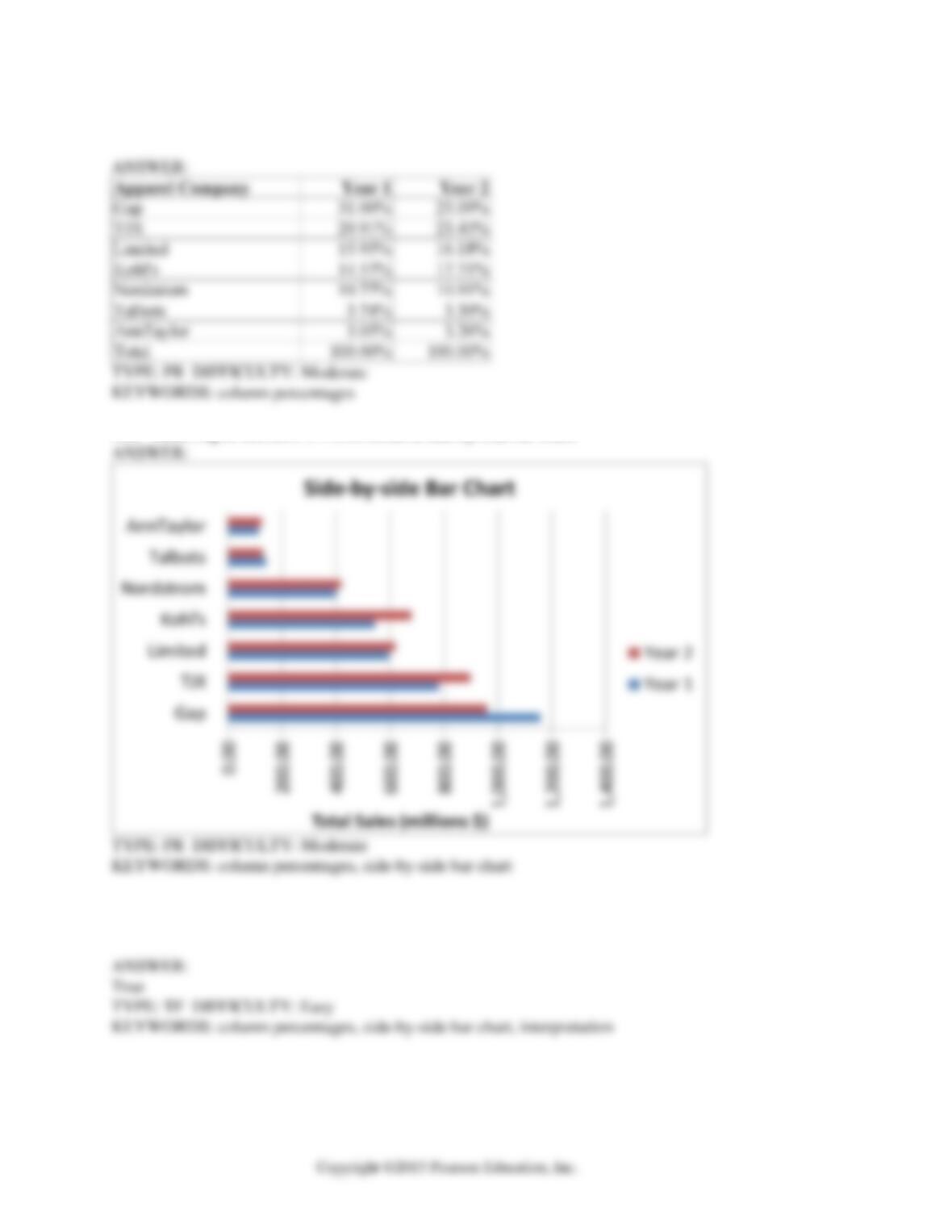
The following table presents total retail sales in millions of dollars for the leading apparel companies
over a two-year period in the past.
APPAREL COMPANY
Year 1
Year 2
Gap
1,159.0
962.0
TJX
781.7
899.0
Limited
596.5
620.4
Kohl’s
544.9
678.9
Nordstrom
402.6
418.3
Talbots
139.9
130.1
AnnTaylor
114.2
124.8
2-46 Organizing and Visualizing Variables
185. Referring to Scenario 2-17, construct a table of column percentages.
186. Referring to Scenario 2-17, construct a side-by-side bar chart.
187. True or False: Referring to Scenario 2-17, in general, retail sales for the apparel industry have
seen a modest growth between Year 1 and Year 2.
Organizing and Visualizing Variables 2-47
188. Referring to Scenario 2-17, among the 8 stores, _______ saw a sales decline.
SCENARIO 2-18
The stem-and-leaf display below shows the result of a survey on 50 students on their satisfaction
with their school with the higher scores represent higher level of satisfaction.
Stem-and–Leaf Display
Stem unit:
10
Statistics 4 1 3 6 6 7
Sample Size 50 5 0 0 3 8 9
Mean 71.06 6 0 1 1 4 4 5 7 7 9 9
Median 73.5 7 0 0 0 1 3 4 4 5 5 6 6 6 7 8 8
Std. Deviation 14.13695 8 0 1 1 3 4 4 5 7 7 8 9
Minimum 41 9 0 2 2 7
Maximum 97
189. Referring to Scenario 2-18, what was the highest level of satisfaction?
190. Referring to Scenario 2-18, what was the lowest level of satisfaction?
191. Referring to Scenario 2-18, how many students have a satisfaction level in the 50s?
192. Referring to Scenario 2-18, how many students have a satisfaction level below 60?
2-48 Organizing and Visualizing Variables
193. Referring to Scenario 2-18, how many students have a satisfaction level of at least 80?
194. True or False: Referring to Scenario 2-18, the level of satisfaction is concentrated around 75.
195. True or False: Referring to Scenario 2-18, if a student is randomly selected, his/her most likely
level of satisfaction will be in the 70s among the 40s, 50s, 60s, 70s, 80s and 90s.
196. True or False: Referring to Scenario 2-18, if a student is randomly selected, his/her most likely
level of satisfaction will be in the 60s among the 40s, 50s, 60s, 70s, 80s and 90s.
Organizing and Visualizing Variables 2-49
197. True or False: Given below is the scatter plot of the price/earnings ratio versus earnings per
share of 20 U.S. companies. There appears to be a negative relationship between price/earnings
ratio and earnings per share.
0.00
10.00
20.00
30.00
40.00
50.00
60.00
70.00
0.00 0.20 0.40 0.60 0.80 1.00
P/E Ratio
Earning Per Share
Scatter Plot
2-50 Organizing and Visualizing Variables
198. True or False: Given below is the scatter plot of the price/earnings ratio versus earnings per
share of 20 U.S. companies. There appear to be a positive relationship between price/earnings
ratio and earnings per share.
0.00
10.00
20.00
30.00
40.00
50.00
60.00
70.00
0.00 0.20 0.40 0.60 0.80 1.00
P/E Ratio
Earning Per Share
Scatter Plot
Organizing and Visualizing Variables 2-51
199. True or False: Given below is the scatter plot of the market value (thousands$) and profit
(thousands$) of 50 U.S. companies. Higher market values appear to be associated with higher
profits.
200. True or False: Given below is the scatter plot of the market value (thousands$) and profit
(thousands$) of 50 U.S. companies. There appears to be a negative relationship between market
value and profit.
2-52 Organizing and Visualizing Variables
201. True or False: Given below is the scatter plot of the number of employees and the total revenue
($millions) of 20 U.S. companies. There appears to be a positive relationship between total
revenue and the number of employees.
202. True or False: Given below is the scatter plot of the number of employees and the total revenue
($millions) of 20 U.S. companies. Companies that have higher numbers of employees appear to
also have higher total revenue.
Organizing and Visualizing Variables 2-53
203. The addition of visual elements that either fail to convey any useful information or that obscure
important points about the data in an attempt to enhance the visualization of data is called
_______.
204. True or False: The Guidelines for Developing Visualizations recommend avoiding uncommon
chart type such as doughnut, radar, cone and pyramid charts.
205. True or False: The Guidelines for Developing Visualizations recommend using the simplest
possible visualization.
206. True or False: The Guidelines for Developing Visualizations recommend labeling all axes only
when it is possible.
207. True or False: The Guidelines for Developing Visualizations recommend using varying scale to
conserve precious space whenever possible.
208. True or False: The Guidelines for Developing Visualizations recommend always starting the
scale for a vertical axis at zero.
2-54 Organizing and Visualizing Variables
209. True or False: The Guidelines for Developing Visualizations recommend always including a
scale for each axis if the chart contains axes.
210. True or False: When you work with many variables, you must be mindful of the limits of the
information technology as well as the limits of the ability of your readers to perceive and comprehend
your results.
211. True or False: A multidimensional contingency table allows you to tally the responses of more than
two continuous variables.
212. True or False: A multidimensional contingency table allows you to tally the responses of more than
two categorical variables.