Page 1
1.
Chapter 11 identifies five goals of document design. One goal is to make a good
impression on readers. What are two other goals mentioned in Chapter 11? (Select both
answers.)
A)
to help readers find the information they need
B)
to use several different colors
C)
to help readers remember the information
D)
to help readers get through the document quickly
E)
to prevent readers from becoming bored or distracted
2.
Chapter 11 discusses four basic principles for designing effective documents. One is
proximity. What are two other basic principles discussed in the chapter? (Select both
answers.)
A)
alignment
B)
consistency
C)
variety
D)
contrast
3.
What is the definition of queuing?
A)
Queuing is a page-design technique in which two or three columns are distributed
evenly across the page.
B)
Queuing is a page-design technique in which visual patterns show levels of
importance.
C)
Queuing is a page-design technique in which text and graphics are arranged in a
symmetrical pattern.
D)
Queuing is a page-design technique in which text and graphics are arranged in a
straight line, or queue.
4.
According to Chapter 11, what can you do to make a website easy to navigate?
A)
Use “Back to top” links on long pages.
B)
Include a site map.
C)
Use a table of contents at the top of long pages.
D)
All responses are correct.
E)
None of the responses are correct.
5.
Which design principle is especially important when creating accessing aids for your
document?
A)
repetition
B)
alignment
C)
proximity
D)
contraction
Page 2
6.
Which of the following is NOT a guideline for creating a readable website?
A)
Use thumbnail graphics.
B)
Use complex background images with fine details.
C)
Choose conservative colors for body text.
D)
Avoid clip-art graphics.
7.
Which of the following is a guideline for creating effective links in online documents?
A)
Trust readers to know what the linked page will contain.
B)
Structure your sentences as if there were no links in the text.
C)
Use custom colors for linked text.
D)
Make links bold, italic, and underlined for emphasis.
8.
Which of these is NOT a resource to consider when planning a document project?
A)
accessibility
B)
time
C)
equipment
D)
money
9.
A writer for a company headquartered in Texas is designing a 100-page report, the text
of which will be single-spaced to reduce printing costs. If she wants the report to be as
easy to read as possible, which of the following should the writer NOT do?
A)
Place the top-level headings along the left margin and indent each subsequent level
by several spaces.
B)
Use full justification.
C)
Use a heading at each significant change of topic.
D)
Use chunking to separate paragraphs.
Page 3
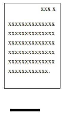
10.
The following graphic shows a page from a user’s manual. Which of the following
should the writer of this manual NOT consider doing?
A)
chunking
B)
using consistent page grids
C)
increasing negative space
D)
adding pull quotes
11.
A technical writer is designing a manual to be used by technicians repairing stereo
systems. Repair technicians will be seated at workbenches with bright lighting
overhead. They will need both hands to work on the equipment while reading manual
instructions. Which of the following design decisions is inappropriate?
A)
using perfect binding
B)
choosing a size of 6 x 9 inches for the manual
C)
printing on nonglare, tinted paper
D)
making the manual as concise as possible
12.
Which of these design features in a document does not primarily involve the principle of
contrast?
A)
a rule
B)
a pull quote
C)
a screen
D)
a marginal gloss
Page 4
13.
An inappropriate choice in which of following areas has the highest potential to confuse
an international audience?
A)
the thickness of the paper
B)
the type of binding used
C)
the pictures used as icons
D)
the typeface chosen for body text
14.
You are working on a brochure about your business. The type for the body text will be
black and that for the section headings will be blue. What document-design principles
are you implementing with these color choices?
A)
proximity and alignment
B)
alignment and repetition
C)
contrast and alignment
D)
contrast and repetition
15.
Which of the following is a potential drawback of using a multicolumn design?
A)
It shortens the length of lines of text, making them harder to read.
B)
It might increase the amount of space between a picture and the text describing it.
C)
It might lead to more words on a page than a single-column design.
D)
It might differ from the design the audience expects to see.
16.
Which aspects of typography affect the white space of a document?
A)
line length, sentence length, and word length
B)
leading, color, and sentence length
C)
line spacing, line length, and justification
D)
line spacing, headings, and footers
17.
Helvetica Regular, Helvetica Light, Helvetica Italic, and Helvetica Bold all belong to
what group?
A)
a typeface
B)
a type family
C)
a type case
D)
a type setting
18.
Which document-design practice will most effectively convey the hierarchy within a
document?
A)
queuing
B)
chunking
C)
underlining
D)
binding
Page 5
19.
You are writing a report using a template provided by your supervisor. If you increase
the margins around your pages by 30 percent and do not change anything else, which
aspect of the overall design will change the most?
A)
proximity
B)
alignment
C)
contrast
D)
repetition
20.
If you know the audience for your website is diverse, what should you do?
A)
Provide more than one way to find specific content.
B)
Avoid creating a list of frequently asked questions (FAQs).
C)
Incorporate graphics of sports and use sports-related metaphors.
D)
Use a high-tech, complex page design to impress site visitors.
21.
Chunking is the practice of using visual patterns to distinguish types of information so
that readers can decide what they want to read.
A)
True
B)
False
22.
Text printed in uppercase letters is easier to read than text set in a mix of uppercase and
lowercase letters.
A)
True
B)
False
23.
In designing an entire document as opposed to individual pages, you will need to
consider size, paper, bindings, and accessing aids.
A)
True
B)
False
24.
A page grid is a drawing, or map, in which areas of white space and text in a document
are arranged clearly and consistently.
A)
True
B)
False
25.
The most effective way to distinguish one level of heading from another is to use
different sizes of type.
A)
True
B)
False
Page 6
26.
One of the main challenges of document design is using as few pages as possible while
still making the document easy to read.
A)
True
B)
False
27.
An idiom is a phrase identified by linguists as universally understandable.
A)
True
B)
False
28.
An estimated 50 percent of Internet users are nonnative speakers of English.
A)
True
B)
False
29.
According to Chapter 11, margins serve four main purposes within a document. Identify
two.
30.
According to Chapter 11, online documents are easier to read than paper documents
because of differences in resolution.
A)
True
B)
False
31.
Chapter 11 identifies five goals of document design. One goal is to make a good
impression on readers. What are two other goals mentioned in the chapter?
32.
Chapter 11 discusses four basic principles for designing effective documents and
websites. One is contrast. What are the other three basic principles discussed in the
chapter?
33.
What is chunking?
34.
What is queuing?
35.
What is the difference between a serif typeface and a sans-serif typeface?
Page 7
36.
In typography, what is leading?
37.
Chapter 11 lists three kinds of physical impairments that may prevent someone from
fully using your site. One is hearing impairment. What is another?
38.
What is the design term for a straight line on a page or screen?
39.
Which principle states that the human eye is drawn to—and that the brain
interprets—differences in appearance between two items?
40.
You receive a progress report in which all of the first-level headings are in the same
typeface and type size and have the same spacing and color. Which design principle do
these characteristics reflect?
Page 8
Answer Key

Page 9