
Students who have completed a speed reading course have reading speeds that are
normally distributed with a mean of 950 words per minute and a standard deviation
equal to 220 words per minute. If two students were selected at random, what is the
probability that they would both read at less than 400 words per minute?
A) 0.4938
B) 0.0062
C) 0.00004
D) 0.2438
The makers of Mini-Oats Cereal have an automated packaging machine that can be set
at any targeted fill level between 12 and 32 ounces. Every box of cereal is not expected
to contain exactly the targeted weight, but the average of all boxes filled should. At the
end of every shift (eight hours), 16 boxes are selected at random and the mean and
standard deviation of the sample are computed. Based on these sample results, the
production control manager determines whether the filling machine needs to be
readjusted or whether it remains all right to operate. Use α = 0.05. Establish the
appropriate null and alternative hypotheses to be tested for boxes that are supposed to
have an average of 24 ounces.
A) H0 : μ = 32 ounces Ha: μ ≠ 32 ounces
B) H0: μ = 16 ounces Ha: μ ≠ 16 ounces
C) H0: μ = 22 ounces Ha: μ ≠ 22 ounces
D) H0: μ = 24 ounces Ha: μ ≠ 24 ounces

It is believed that number of people who attend a Mardi Gras parade each year depends
on the temperature that day. A regression has been conducted on a sample of years
where the temperature ranged from 28 to 64 degrees and the number of people
attending ranged from 8400 to 14,600. The regression equation was found to be =
2378 + 191x. Which of the following is true?
A) The average change in parade attendance is an additional 2378 people per
one-degree increase in temperature.
B) The average change in parade attendance is an additional 191 people per one-degree
increase in temperature.
C) If the temperature is 75 degrees, we can expect that 16,703 people will attend.
D) If the temperature is 0 degrees this year, then we should expect 2378 people to
attend.
A survey of 499 women for the American Orthopedic Foot and Ankle Society revealed
that 38% wear flats to work.
Use this sample information to develop a 99% confidence interval for the population
proportion of women who wear flats to work.
A) (0.324, 0.436)
B) (0.302, 0.458)
C) (0.368, 0.392)
D) 0.363, 0.397)
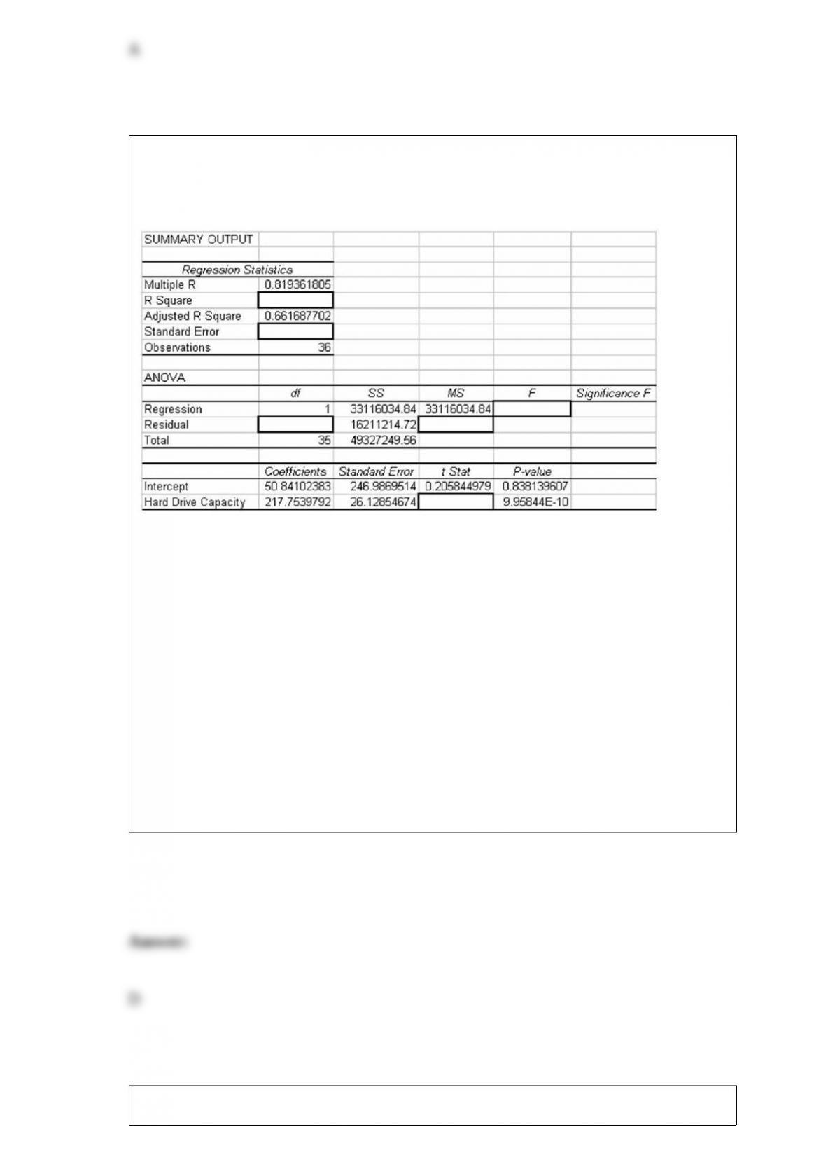
Consider the following partially completed computer printout for a regression analysis
where the dependent variable is the price of a personal computer and the independent
variable is the size of the hard drive.
Based on the information provided, which of the following statements is true if alpha
= .05?
A) The slope is not significantly different from 0 because p-value = 0.84 is greater than
0.05
B) The slope is significantly different from 0 because p-value = 9.95 is greater than
0.05
C) The slope is not significantly different from 0 because p-value = 9.95 is greater than
0.05
D) The slope is significantly different from 0 because p-value = 9.95En – 10 is less than
0.05
The Wilcoxon matched-pairs signed rank test assumes that the two samples are:

A) equal in size.
B) independent and random.
C) paired.
D) Both A and C
Which of the following probability distributions can be used to describe the distribution
for a continuous random variable?
A) Normal distribution
B) Binomial distribution
C) Poisson distribution
D) Hypergeometric
If a decision maker wishes to reduce the margin of error associated with a confidence
interval estimate for a population mean, she can:
A) decrease the sample size.
B) increase the confidence level.

C) increase the sample size.
D) use the t-distribution.
Which of the following statements is true?
A) When using a simple linear regression analysis model for prediction purposes, the
potential error in the forecast will be less when the value of x used to forecast y is closer
to .
B) The accuracy of the regression forecast is improved if the standard error for the
regression slope coefficient is reduced.
C) The use of regression analysis as a means of predicting the value for a dependent
variable is not impacted by sampling error since the regression model uses all sample
data to arrive at the regression model.
D) None of the above
If the sample value of the intercept turns out to be an illogical value, this is acceptable
as long as x = 0 is not within the range of the data.

Each evening, a nationwide retail chain randomly calls 100 of the customers who came
to their store that day to ask whether they were satisfied with the service they had
received. The customers respond yes or no. Suppose the company has found over time
that 8 percent of the customers are not satisfied (“no” answers). If they have established
a process control chart, what conclusion should be reached if the percentage of
customers surveyed tonight that say no is 14 percent?
A) This result indicates that a special cause situation exists.
B) Although this point is above the upper control limit, there is no cause for alarm if
this is the first time.
C) While this value is higher than “normal,” it is still within the range of common cause
variation and no action is needed.
D) This is outside the control limits and action should be taken
Arrivals to a bank automated teller machine (ATM) are distributed according to a
Poisson distribution with a mean equal to three per 15 minutes.
What is the probability that fewer than four customers will arrive in a 30-minute
segment?
A) 0.1512
B) 0.1889
C) 0.2515
D) 0.2576
For a standardized normal distribution, calculate P(z ≥ 0.85).
A) 0.8033
B) 0.1977
C) 0.2340
D) 0.7660
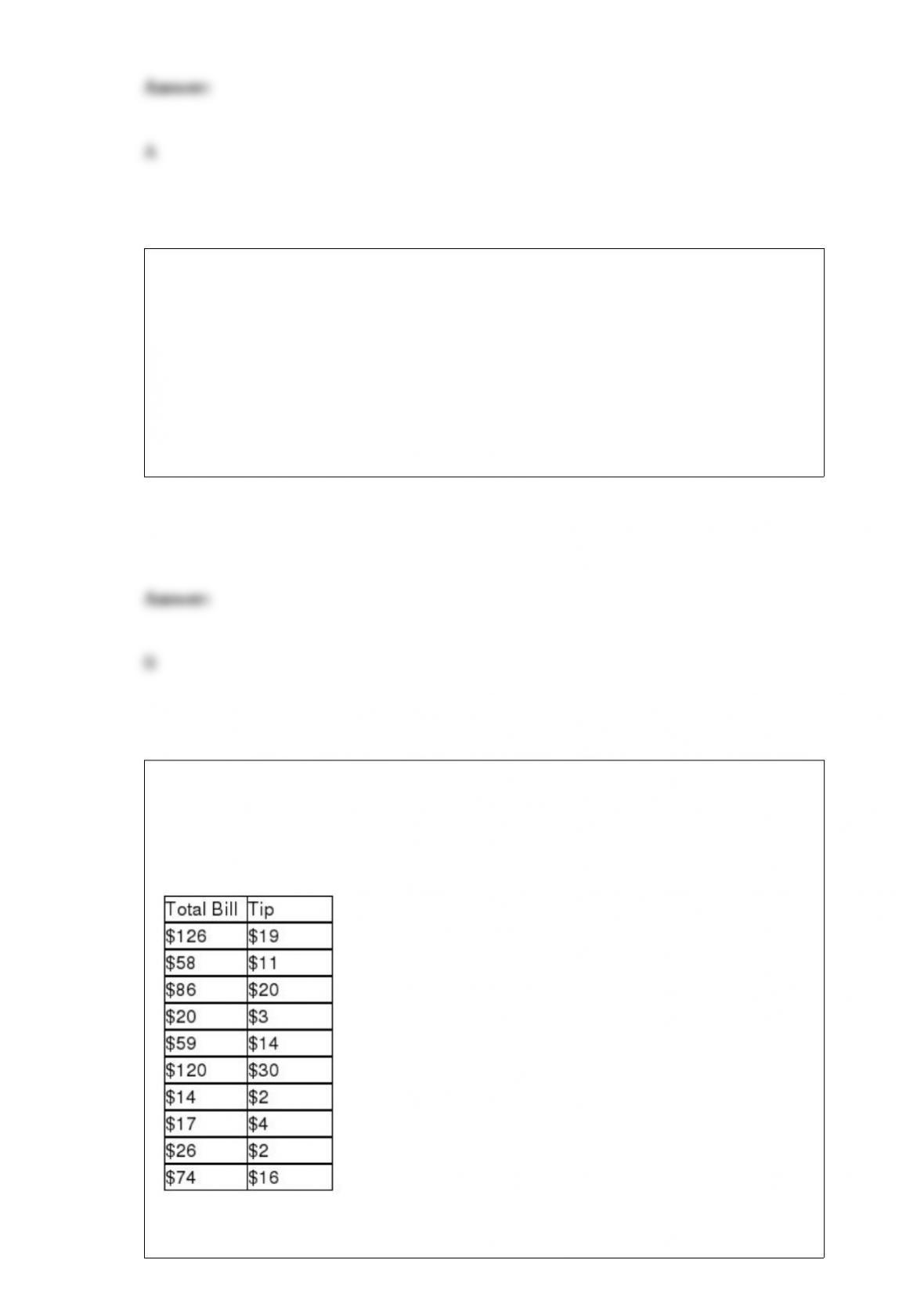
A study was recently performed by the Internal Revenue Service to determine how
much tip income waiters and waitresses should make based on the size of the bill at
each table. A random sample of bills and resulting tips were collected. These data are
shown as follows:
Based upon these data, what is the approximate predicted value for tips if the total bill

is $100?
A) $15.55
B) $20.61
C) $26.03
D) $12.88
A marketing firm is interested to know whether the median age of college students is 21
years. A sample of 80 college students is taken. Thirty of the students were under 21, 45
of the students were over 21, and 10 were 21 years old. The conclusion is that
A) the median age of college students is significantly different from 21.
B) the median age of college students is not significantly different from 21.
C) the median age of college students is significantly older than from 21.
D) the median age of college students is significantly younger than from 21.
Flavors of ice cream (chocolate, vanilla, strawberry, etc.) are an example of nominal
data.

The General Electric service department believes that the median time for a service call
should be 30 or fewer minutes. To test this, the following random sample of service
times was collected:
Given that the managers do not wish to make the assumption that the population is
normally distributed, the critical value for the test about median service times, using a .
05 level of significance, is:
A) 5
B) 40
C) 8
D) 37
Given a binomial distribution with n = 8 and p = 0.40, obtain the probability that the
number of successes is within 2 standard deviations of the mean.

A) 0.6887
B) 0.7334
C) 0.8665
D) 0.9334
A plywood manufacturer is interested in monitoring the thickness of the plywood.
Which of the following would be most useful for doing this?
A) p-charts
B) c-charts
C) -charts
D) Histograms
A tire manufacturing company is interested in obtaining data on stopping distances for
each of the three main tread types made by the company. The data collection method
that would be most likely used in this case would be:
A) telephone survey.
B) written questionnaire.

C) demographic surveying.
D) experiments.
A plywood manufacturer is interested in monitoring the thickness of the plywood.
Which of the following would be most useful for doing this?
A) p-charts
B) c-charts
C) -charts
D) Histograms
At a sawmill in Oregon, a process improvement team measured the diameters for a
sample of 1,500 logs. The following summary statistics were computed:
Given this information, the boundaries on the box in a box and whisker plot are:
A) 8.9 in and 15.6 in.
B) 13.5 in 1.5 (Q3-Q1).
C) 14.2 in 1.5 (Q3-Q1).

D) 8.9 in and 14.2 in.
Consider a goodness-of-fit test with a computed value of chi-square = 1.273 and a
critical value = 13.388, the appropriate conclusion would be to:
A) reject H0.
B) fail to reject H0.
C) take a larger sample.
D) take a smaller sample.
A study was done in which the high daily temperature and the number of traffic
accidents within the city were recorded. These sample data are shown as follows:

Given this data the sample correlation is:
A) -0.57
B) 0.64
C) 1.54
D) 0.57
The Lottaburger restaurant chain in central New Mexico is conducting an analysis of its
restaurants, which take pride in serving burgers and fries to go faster than the
competition. As a part of its analysis, Lottaburger wants to determine if its speed of
service is different across its four outlets. Orders at Lottaburger restaurants are tracked
electronically, and the chain is able to determine the speed with which every order is
filled. The chain decided to randomly sample 20 orders from each of the four
restaurants it operates. The speed of service for each randomly sampled order was noted
and is contained in the file Lottaburger.
At the alpha = 0.05 level of service, can Lottaburger conclude that the speed of service
is different across the four restaurants in the chain?
A) Since F = 18.418 > Fα=0.05 = 2.725, reject the null hypothesis. Based on these
sample data we can conclude that the average service time is different across the four
restaurants in the chain.
B) Since F = 22.666 > Fα=0.05 = 2.725, reject the null hypothesis. Based on these
sample data we can conclude that the average service time is different across the four
restaurants in the chain.
C) Since F = 22.666 > Fα=0.05 = 2.725, do not reject the null hypothesis. Based on these
sample data there is not sufficient evidence to conclude that the average service time is
different across the four restaurants in the chain.
D) Since F = 18.418 > Fα=0.05 = 2.725, do not reject the null hypothesis. Based on these
sample data there is not sufficient evidence to conclude that the average service time is
different across the four restaurants in the chain.
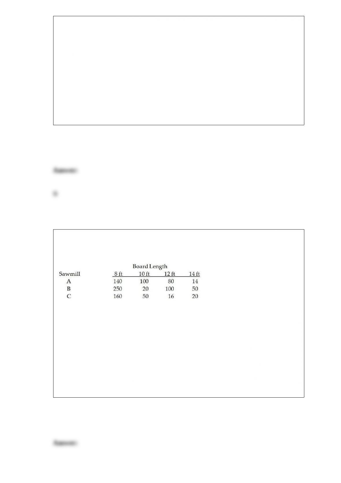
The Anderson Lumber Company has three sawmills that produce boards of different
lengths. The following table is a joint frequency distribution based on a random sample
of 1,000 boards selected from the lumber inventory.
Based on these data, the probability of selecting a board from inventory that is 10 feet
long is:
A) 0.196
B) 0.450
C) 0.084
D) 0.170

The sales manager at Western Furniture Company tracked data on the number of
customers who came into the store each day and the total dollar volume of sales at the
store during the same day. She is considering putting together a report for top
management and wishes to show the relationship between these two variables. Which
of the following graphs would likely be most useful? She has a sample of 36 days worth
of data.
A) Scatter diagram
B) Bar chart
C) Frequency histogram
D) Pie chart
Most major airlines allow passengers to carry two pieces of luggage (of a certain
maximum size) onto the plane. However, their studies show that the more carry-on
baggage passengers have, the longer it takes to unload and load passengers. One
regional airline is considering changing its policy to allow only one carry-on per
passenger. Before doing so, it decided to collect some data. Specifically, a random
sample of 1,000 passengers was selected. The passengers were observed, and the
number of bags carried on the plane was noted. Out of the 1,000 passengers, 345 had
more than one bag.
Suppose the airline also noted whether the passenger was male or female. Out of the
1,000 passengers observed, 690 were males. Of this group, 280 had more than one bag.
Using this data, obtain and interpret a 95% confidence interval estimate for the
proportion of male passengers in the population who would have been affected by the
one-bag limit.
A) (0.2815, 0.5124)
B) (0.3361, 0.4712)

C) (0.3692, 0.4424)
D) (0.3814, 0.4125)
A house cleaning service claims that it can clean a four bedroom house in less than 2
hours. A sample of n = 16 houses is taken and the sample mean is found to be 1.97
hours and the sample standard deviation is found to be 0.1 hours. Using a 0.05 level of
significance the correct conclusion is:
A) reject the null because the test statistic (-1.2) is < the critical value (1.7531).
B) do not reject the null because the test statistic (1.2) is > the critical value (-1.7531).
C) reject the null because the test statistic (-1.7531) is < the critical value (-1.2).
D) do not reject the null because the test statistic (-1.2) is > the critical value (-1.7531).
Damage to homes caused by burst piping can be expensive to repair. By the time the
leak is discovered, hundreds of gallons of water may have already flooded the home.
Automatic shutoff valves can prevent extensive water damage from plumbing failures.
The valves contain sensors that cut off water flow in the event of a leak, thereby
preventing flooding. One important characteristic is the time (in milliseconds) required
for the sensor to detect the water leak. Sample data obtained for four different shutoff
valves are contained in the file entitled Waterflow.
Use the Tukey-Kramer multiple comparison technique to discover any differences in
the average detection time. Use a significance level of 0.05.

A) The confidence intervals indicate that there is not sufficient evidence to conclude
that the average detection time for valve 1, 2, and 3 differ. There is, however, enough
evidence to indicate that the average detection time for valve 4 is larger than the other
three means.
B) The confidence intervals indicate that there is not sufficient evidence to conclude
that the average detection time for valve 1, 2, and 4 differ. There is, however, enough
evidence to indicate that the average detection time for valve 3 is larger than the other
three means.
C) The confidence intervals indicate that there is not sufficient evidence to conclude
that the average detection time for valve 2 and 4 differ. There is, however, enough
evidence to indicate that the average detection time for valve 1 and 3 are larger than the
other two means.
D) All mean detection times are equal.
A random variable is normally distributed with a mean of 25 and a standard deviation of
5. If an observation is randomly selected from the distribution, what value will be
exceeded 85% of the time?
A) 16.2
B) 17.9
C) 19.8
D) 14.2