SPC Solutions
1
1. The dairy takes random samples each day of the weight of outbound containers of milk
destined for restaurants. The daily averages and ranges are listed below. Data for the most
recent 10 days are posted below.
Create X-bar and R charts including control limits and interpret the results.
X-bars (averages) are already calculated. You can calculate ranges (R’s) as the maximum –
minimum for each sample. The next step is to calculate the average of these averages (X-bar-bar
and R-bar, respectively). X-bar-bar is 99.70, and R-bar is 11.00. You then use these values to
calculate the control limits for the X-bar and R charts. The sample size (n) repeated each day is
12, which is used to find A2, D3, and D4 from the chart in the PowerPoint slides.
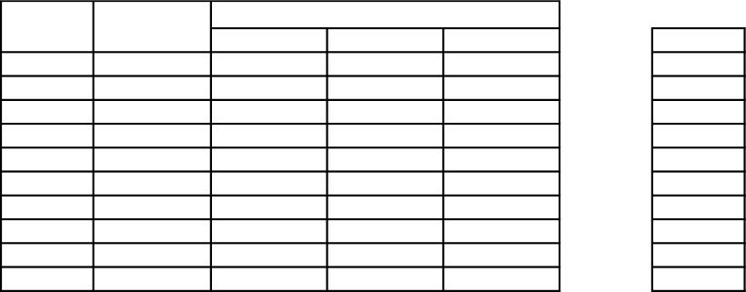
Average Maximum Minimum R
112 100 110 99 11
212 98 109 96 13
312 102 107 98 9
412 99 104 101 3
512 100 109 98 11
612 99 111 100 11
712 99 110 92 18
812 101 109 91 18
912 98 109 101 8
10 12 101 108 100 8
X-bar-bar = 99.70 11.00 = R-bar
X-Bar Chart
A2 (given n = 12)
UCL = 99.70 + 0.27 * 11.00 = 102.67
LCL = 99.70 – 0.27 * 11.00 = 96.73
R-Chart
UCL =
D4 (given n = 12) 1.72 * 11.00 = 18.92
LCL =
D3 (given n = 12) 0.28 * 11.00 = 3.08
Day
Weight
Sample Size
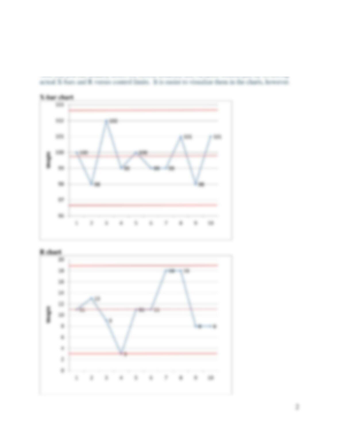
To create the X-bar chart, plot the X-bar values for each month versus the control limits (102.67
and 96.73) and centerline (X-bar-bar = 99.70) calculated above. The X-bar chart (next page)
does not indicate any problems with central tendency. Points are randomly distributed above
and below the centerline with no points exceeding control limits.
To create the R chart, plot the R values for each month versus the control limits (18.92 and 3.08)
and centerline (R-bar = 11.00) calculated above. This R chart indicates a few problems with
variation. First, the range for day 4 extends just beyond the lower control limit. Second, two
consecutive points approach the upper control limit (days 7 and 8). The extreme swing from day
4 (just below LCL) to day 7 (nearing UCL) might also be concerning to someone familiar with
the process.
SPC Solutions
So, the process is not in control (i.e., not stable). The process needs to be investigated for
variation problems. There might be issues with equipment, processes, training, and/or execution.
The company can conduct a kaizen blitz to brainstorm identify causes and potential fixes.