BM1708
09 Handout 1 *Property of STI
student.feedback@sti.edu Page 1 of 13
OVERVIEW OF TOTAL QUALITY TOOLS
Pareto Charts
• Pareto Charts refer to bar charts on which factors are plotted along the horizontal axis in decreasing
order of frequency.
• It is proposed by Vilfredo Pareto, a nineteenth–century Italian scientist whose statistical work focused
on inequalities of data.
Pareto Principle – states that eighty percent of the activity is caused by twenty percent of the factors. It is
also known as the “80–20 rule”. The principle suggests that managers must concentrate on the twenty
percent of the factors in order to eliminate the eighty percent of the organizational problems.
EXAMPLE: In a restaurant quality problem, the activity could be customer complaint (eighty percent)
and the factor could be an impolite server (twenty percent).
Sample Problem: Pareto Chart for a Restaurant
The manager of a neighborhood restaurant is concerned about the low number of customers patronizing
his eatery. Complaints have been rising, so he would like to find out the issues to address and present the
findings in a way his employees can understand.
SOLUTION: The manager surveyed his customers over several weeks and collected the following data:
Customer Complaints
Frequency
Impolite server
12
Slow service
42
Cold dinner
5
Cramped tables
20
Atmosphere
10
Table 1. Frequency of customer complaints
Source: Operations Management:
Process and Supply Chains, 2016, p. 91
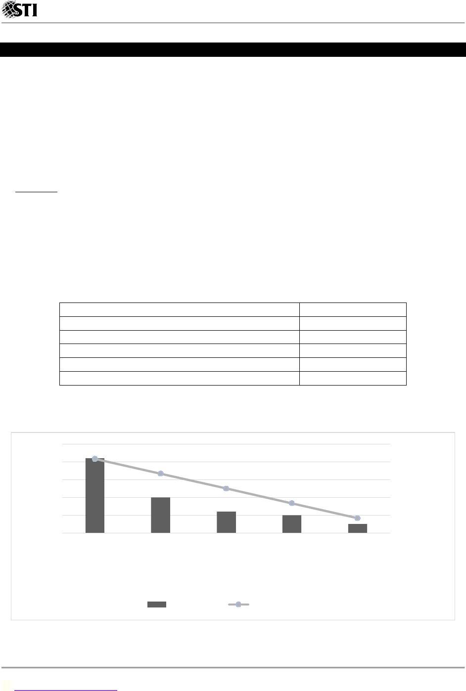
Figure 1. Pareto Chart for customer complaints
Source: Operations Management:
Process and Supply Chains, 2016, p. 91
0%
20%
40%
60%
80%
100%
120%
0
10
20
30
40
50
Slow service Cramped
tables
Impolite
server
Atmosphere Cold dinner
Percent of Tota l
Frequency
Customer Complaints
Frequency Percent of Total

BM1708
09 Handout 1 *Property of STI
student.feedback@sti.edu Page 2 of 13
Figure 1 presents the data in a way that shows which complaints are more prevalent. In order to solve for
the percentage of prevalent complaints, add and get the average of the two (2) most dominant complaints
and multiply it by 100%. Based on the given data, the two (2) most dominant complaint accounts under
slow service and cramped tables with data frequency of 42 and 20 respectively.
(42 +20)
89 × 100% =69.7%
DECISION POINT: It was clear to the manager which complaints, if rectified, would cover most of the
process failure problems in the restaurant. First, slow service will be addressed by training the existing
staff, adding another server, and improving the food preparation process. Removing some decorative
furniture from the dining area and spacing the tables better will solve the problem with cramped tables.
The Pareto Chart shows that these two (2) problems, if rectified, will account for almost 70% of the
complaints.
Cause–and–Effect Diagrams
• Cause–and–Effect Diagrams relate a key performance problem to its potential causes. It is used to
identify and isolate the causes of a problem. It is sometimes called the “fishbone diagram” because of
its structure.
• It is developed by Kaoru Ishikawa, a Japanese quality expert, so sometimes the diagram is also called
“Ishikawa Diagram”.
Sample Problem: Analysis of Inadequate Production of Headers
A process improvement team is working to improve the production output at the Johnson Manufacturing
Plant’s Header Cell that manufactures a key component, headers, used in commercial air conditioners. A
header is part of the circulatory system of a commercial air conditioner that moves coolant between
various components such as the evaporator coil and the condenser coil. Currently, the header production
cell is scheduled separately from the main work in the plant. Often, individual headers are not sequenced
according to their counterparts in the final assembly line in a timely manner, and so the product can sit in
queue waiting for a header.
SOLUTION: As a first step, the team conducted extensive on–site observations across the six (6) processing
steps within the cell, followed by the transport of the finished header to the air conditioner assembly area
for installation into an air conditioner unit. The six (6) processing steps include the following:
1. Cutting copper pipes to the appropriate length.
2. Punching vent and stubbing holes into the copper log.
3. Welding a steel supply valve onto the top of the copper log.
4. Brazing end caps and venting plugs to the copper log.
5. Brazing stub tubes into each stub hole in the copper log.
6. Adding plastic end caps to protect the newly created header.
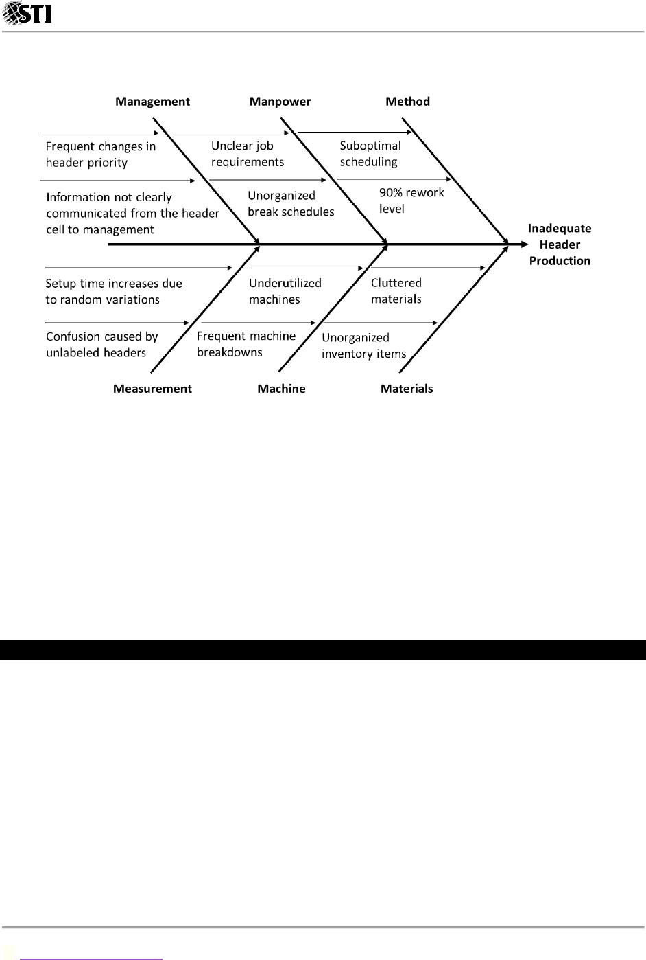
To analyze all the possible causes of the problem, the team constructed a cause–and–effect diagram,
shown in Figure 2. The main problem, inadequate header production, is the head of the diagram. The
team brainstormed all possible causes, and together they identified several major categories:
BM1708
09 Handout 1 *Property of STI
student.feedback@sti.edu Page 3 of 13
management, manpower, method, measurement, machine, and materials, or the six (6) M’s. Several
suspected causes were identified for each major category.
Figure 2. Cause–and–effect diagram for inadequate header production
Source: Operations Management:
Process and Supply Chains, 2016, p. 93
DECISION POINT: The improvement team noted several immediate issues that were slowing down the
production of headers. These issues included operators batching individual jobs (method branch) into
groups to save walking time, which was further exasperated by the availability of raw materials stocked
on the shop floor (materials branch) and the lack of specific job requirement (management branch).
Furthermore, there were many instances of individual tasks not being done correctly, and thus having to
be redone; such as the 90% rework rate at weld (method branch). The next step in this process
improvement was to eliminate the raw material on the floor, improve quality at the weld machine, and
move each header individually using a header–specific cart.
Check Sheets
A check sheet is a structured form for collecting and analyzing data. The purpose of the check sheet is to
make it easy to collect data for specific purposes and to present it in a way that facilitates conversion from
data to useful information.
Sample Problem: Imagine a book shop placed in the main street of a medium–large city. Regardless of
its convenient location, the sales of the shop are surprisingly lower than expected. The staff pointed
out that many customers are entering the shop but most of them are leaving without buying a single
item. To solve this problem, they organized a brainstorming session where the following causes came
into light:
o The customers did not find what they were looking for.
o The staff did not pay much attention to customers.
o The books were sold out.
o The books were not carried out by the shop.
BM1708
o The items are too expensive.
o Long queues at the counter
o Not all types of credit cards were accepted.
o Poor lightning
o Poor ventilation
o No places to sit and flick through books before making a decision.
SOLUTION: The staff found difficulties in identifying the main problem in order to implement a solution
so they decided to politely ask every customer pertaining to the reason why they leave the shop
without buying anything. The survey runs in a period of two (2) weeks and the answers were recorded
in the following check sheet:
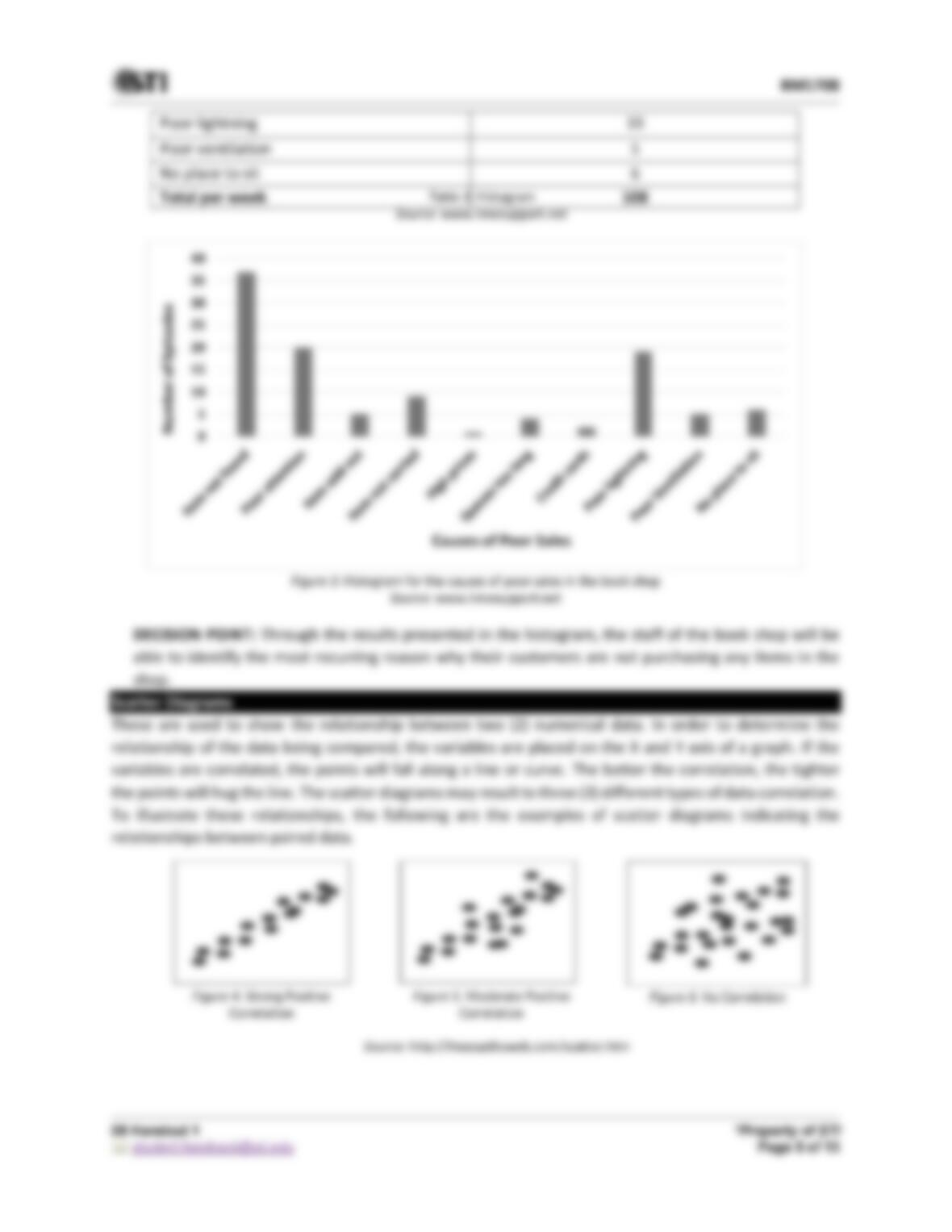
CAUSES OF POOR SALES
WEEK 1
WEEK 2
NUMBER OF EPISODES
Item not found
IIIII IIIII IIIII II
IIIII IIIII IIIII IIIII
37
Poor attention
IIIII IIIII IIII
IIIII I
20
Item sold out
II
III
5
Item not carried
III
IIIII I
9
High prices
I
1
Very long queues
I
III
4
Credit cards
II
2
Poor lightning
IIIII II
IIIII IIIII II
19
Poor ventilation
III
II
5
No place to sit
II
IIII
6