International Economics Bielefeld University
Winter 2013/2014 Gerald Willmann
The Heckscher–Ohlin Model
Setup of the model: 2×2×2
•2 factors: skilled labor S and unskilled labor U
•2 commodities/sectors: hightech H and lowtech L
we asume that hightech is skilled-labor intensive and lowtech is unskilled-labor
intensive (in the sense that at the same relative factor price one sector uses rela-
tively more skilled labor than the other)
•2 countries: home and foreign
we assume that home is relatively skill abundant whereas foreign is unskilled-
labor abundant, i.e. S/U > S∗/U∗
that is, countries differ in their relative factor endowments whereas we abstract
from differences in technology or preferences
The four main results of the HO model — an overview:
global local
prices FPE Stolper–Samuelson
quantities Heckscher–Ohlin Rybczynski
The Stolper–Samuelson result in the Mussa diagram:
This result concerns the relationship between the relative price of final goods on the
world market and the domestic relative factor price: If the price of an output good rises
relative to the other output good then the factor that is used intensively in the production
of the former increases in price relative to the other factor. We will derive this result in
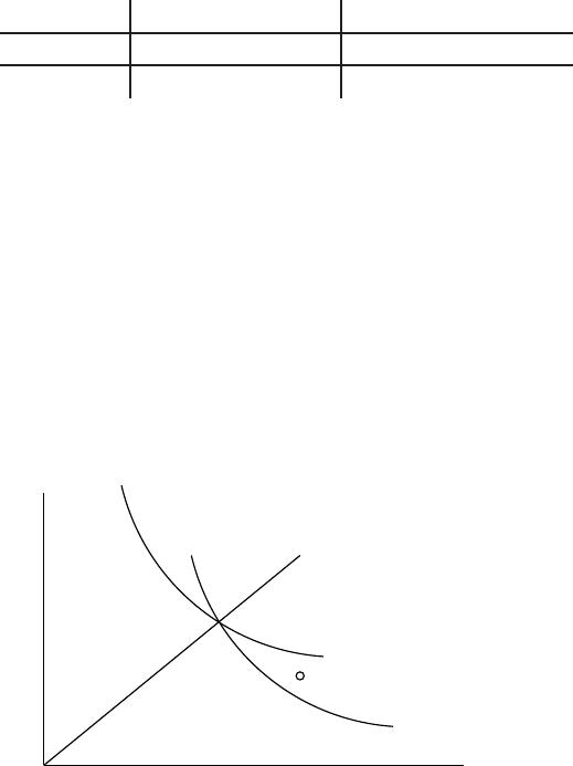
the so-called Mussa diagram. The Mussa diagram has factor prices on its axes. Let us
put wU(the wage or factor price of unskilled labor) on the horizontal and wS(the wage
of skilled labor) on the vertical axis.
P
wu
ws
p=c lowtech
p=c hightech
equilibrium ws/wu
Mussa diagram: zero profit lines
1
What we depict in this diagram are so-called zero profit lines. In case you wonder
why we are interested in zero profits: these models assume constant returns to scale
which implies constant marginal cost which in turn implies constant average or unit cost
that must equal marginal cost. In equilibrium price better equals this unit cost because
otherwise you want to produce an infinite amount (if p > c) or not at all (if p < c) and
that cannot be an equilibrium.
How do these zero profit lines look like. They must be negatively sloped because
when one factor price goes up the other one should go down to keep total unit cost equal
to price. Why do they have the convex shape as shown in the diagram? Recall from
micro that the cost function is concave in prices (turned over salad bowl). So if they
were straight lines cost would decrease as one moves northwest or southeast. But cost is
supposed to stay equal to price so they have to bend the way they do to counteract this
effect.
Let us find out what happens above and below these curves. Northeast both factor
prices are higher so unit cost is higher than price and we are incurring losses. Southwest
the opposite is true and the sector makes a profit.
Since in equilibrium both sectors make zero profits (see above) the ray through the