Question 2:
In the gss.sav file, the variable tvhours tells you how many hours per day GSS respondents say they
watch TV.
(a) Make a frequency table of the hours of television watched. Do any of the values strike you as
strange? Explain.
(b) Based on the frequency table, answer the following questions: Of the people who answered the
question, what percentage don’t watch any television? What percentage watch two hours or
less? Five hours or more? Of the people who watch TV, what percentage watch one hour? What
percentage watch four hours or less?
(c) From the frequency table, estimate the 25th, 50th, 75th, 95th percentiles. What is the value for the
Median, Mode?
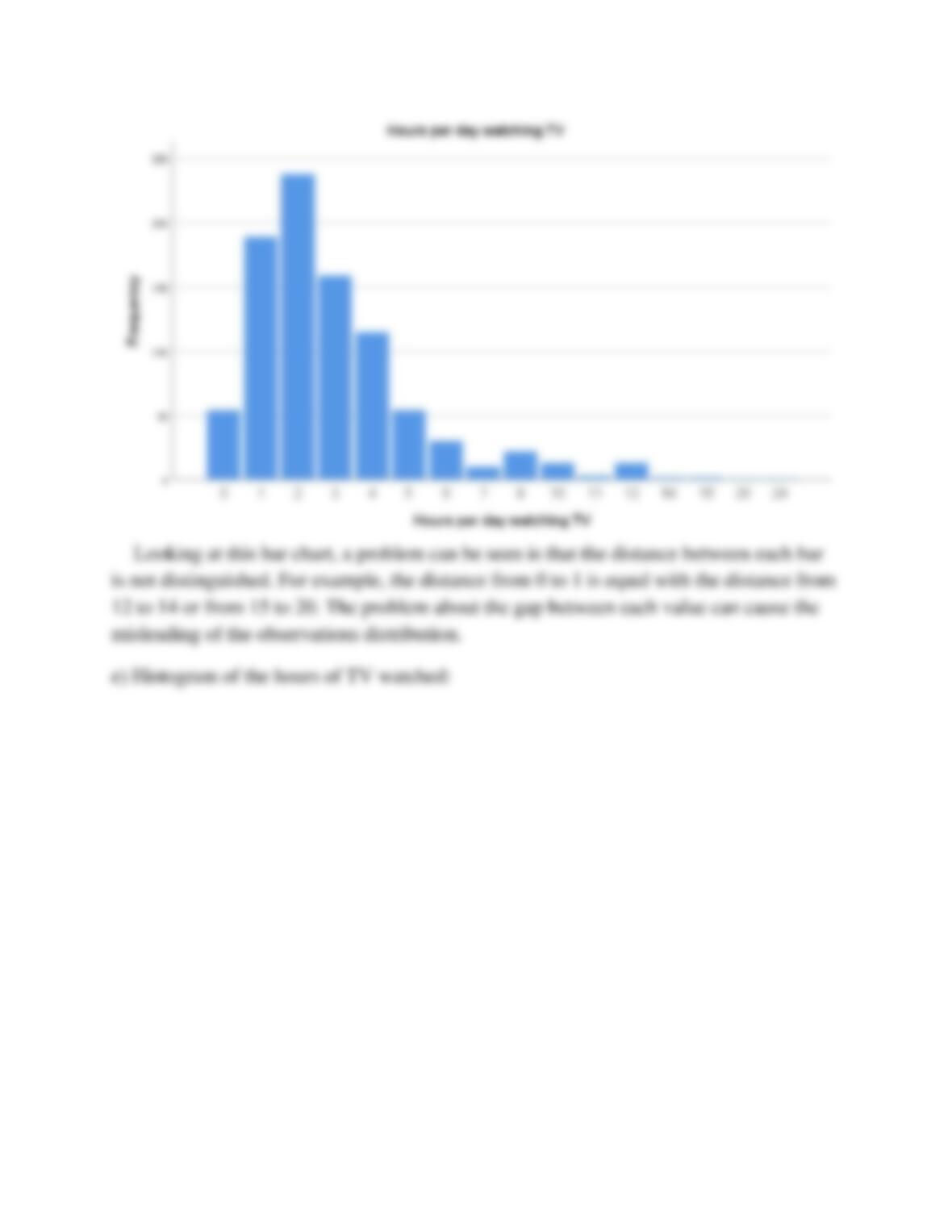
(d) Make a bar chart of the hours of TV watched. What problem do you see with this display?
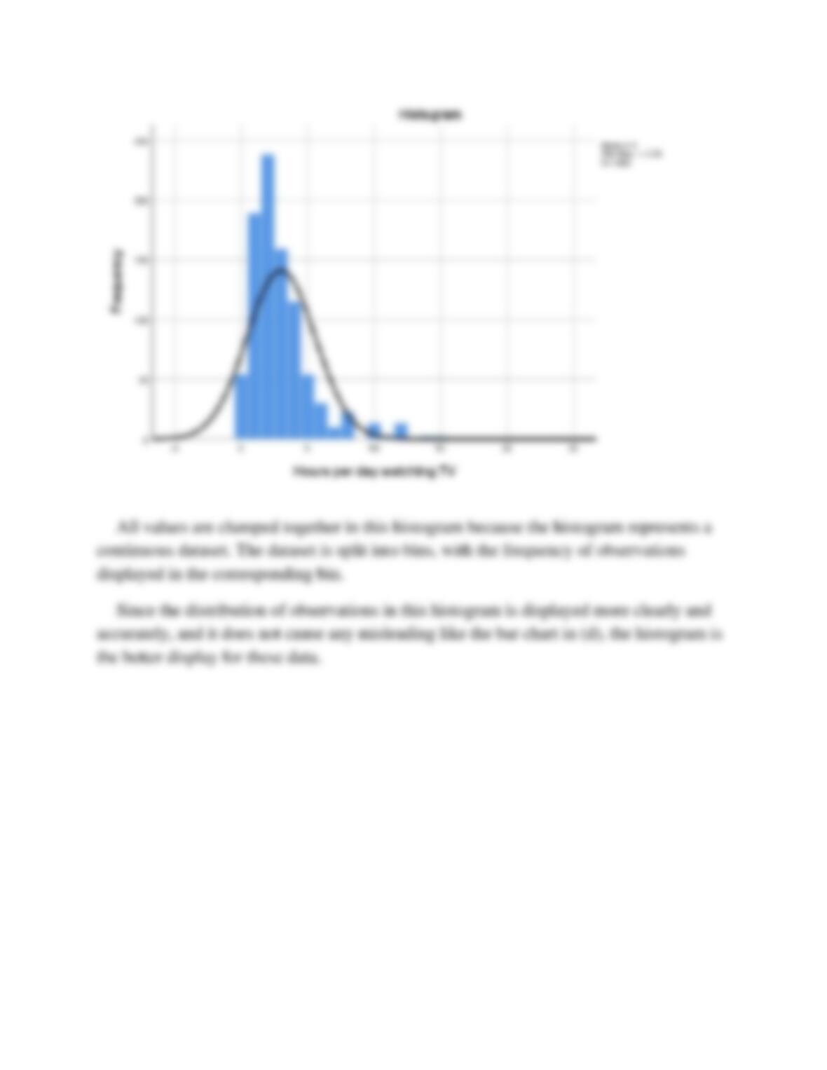
(e) Make a histogram of the hours of TV watched. What causes all of the values to be clumped
together? Compare this histogram to the bar chart you generated in question 2d. Which is a
better display for these data?
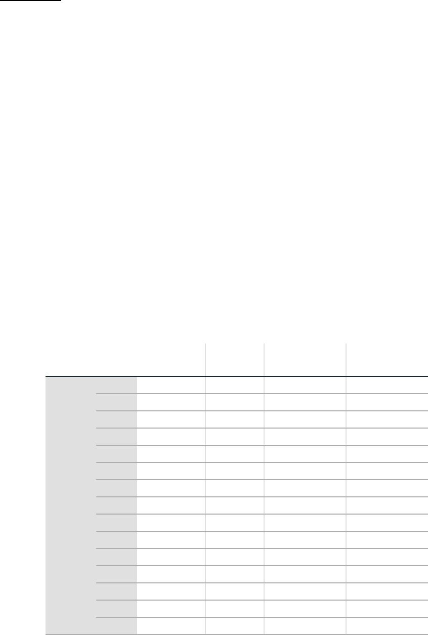
a)
Frequency table of the hours of television watched:
Hours per day watching TV
Frequency
Percent
Valid Percent
Cumulative
Percent
Valid
0
54
3.8
6.0
6.0
1
189
13.3
20.9
26.8
2
238
16.8
26.3
53.1
3
159
11.2
17.5
70.6
4
115
8.1
12.7
83.3
5
54
3.8
6.0
89.3
6
30
2.1
3.3
92.6
7
10
0.7
1.1
93.7
8
22
1.6
2.4
96.1
10
13
0.9
1.4
97.6
11
3
0.2
0.3
97.9
12
13
0.9
1.4
99.3
14
2
0.1
0.2
99.6
15
2
0.1
0.2
99.8
20
1
0.1
0.1
99.9
24
1
0.1
0.1
100.0
Total
906
63.8
100.0
Missing
NAP
486
34.2
NA
27
1.9
Total
513
36.2
Total
1419
100.0
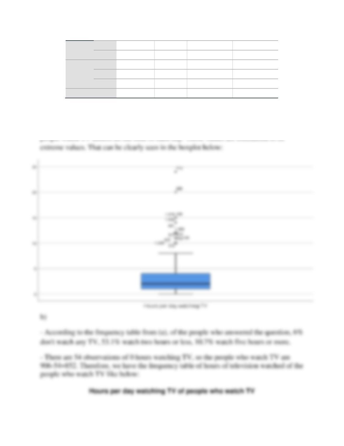
From the table, there are 4 strange values which are: 14, 15, 20, 24. Those values
just account for a very small percent of frequency and in actually, it is unlikely that